

As I have never worked with Indesign, I thought James’ tutorial was very useful in knowing the basic techniques within this software. I found the paragraph style very useful and the different layers you could add and lock so that it is easier to adjust specific images/text at a time.
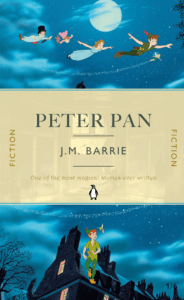
For my second book cover design, I did Peter Pan and got inspiration from the illustrations from the book and also the 2003 movie. For the background, I used a one of the scenes from the Peter Pan movie, where they are flying to Neverland and I really like how movement can be captured at the top, which will draw the reader into the book and make them question where they are going. For the bottom image, I used the same scene and just split the image in half so that the cover flows from top to bottom. For the middle section, I overlaid a yellow background on top of the scene where Wendy looks out of her window, with a big bright moon in the centre, adjusting the transparency levels to a 50% and 80%. I really like this result as again, this gives the reader a preview of the storyline, but also makes the book come to life in a way compared to if it was just a solid yellow background.
Overall, I am very happy with this design as the story of Peter Pan is meant to be described as magical and thrilling, and I think I have managed to achieve these two things with the vibrant colours, use of space, font and images.
If I were to improve part of it, I would maybe change the colour of the font where it says ‘One of the most magical stories ever written’, making it bolder or even brighter. I could have used the effects tool to add some glimmer/shine around it to enhance the ‘magical’ bit of the review.