
Brief
“A history of Northcourt Avenue was published through the typography department as a final year project by Claire Harrison in 1996. It was a local history project written and illustrated with love by local residents, based on memories of people who had lived all their lives in the avenue and reflected the richness of the cultural and intellectual life of the area, with its many links with the university, the Quaker community and businesses of the town. Nationally known wildlife artist Robert Gillmor was born and lived there for much of his life and he provided many of the illustrations as did his wife, Susan Norman and artist Elizabeth Heydeman, all members of the Reading Guild of Artists. We have photos dating from the 1920s and 1930s and one even features Margaret Thatcher at an event in the road.
The run of 500 copies sold out quickly; interest has continued to be shown: I have had inquiries from the US and Bristol in the last year. We hope therefore to reprint the book, we hope with some updated material.
We would appreciate the input of a student or students in the project. I do have an online copy of the book but there will be challenges in updating the technology I am sure. The reproduction of the photographs could perhaps be improved.
Deliverables
Item 1 – The setting of the text
Item 2 – The reproduction of drawings and maps and photos
Item 3 – The possible redesign of the book
Item 4 – The printing and publishing of the book“

The initial brief stated that this project was mostly a redesign of an existing book, with some updates such as new chapters, text, and images. Upon meeting with the client, a few details of what they’d like for this redesign were outlined:
- The client would like to move away from the large margin that had been used for some images and captions
- The client would like the redesign to feel more ‘modern’, stating that the current typefaces felt dated and that also in some cases type appeared small
- The only photos the client has from the original book are physical and would need scanning and editing for the new design
- Other photos would either be replaced with new versions or, in the case of the maps, would need recreating by myself
Main challenges
All of these challenges are things that I can learn from and improve on in future and I’m almost glad for them as now I’ll especially remember not to make the same mistakes again.
Lack of deadline setting in proposal
Some of the main struggles of this real job were born of my own fault when writing the restated brief, I failed to think forward properly and set finite deadlines for both myself and the client, things such as when the client would send me the text and image content, when final revisions to the text could be made, final deadlines for when images could be added to the book, deadlines for myself for when meetings with the client would happen, when I would make sure to have content ready to show the client, etc.
This led to the project being very relaxed throughout but also meant that I didn’t receive the text for the book until November 2023, nearly 7 months after the project officially began, until then I’d been working off of text-recognition copies of the text from an old pdf of the original book and screenshots of the images. I also hadn’t received all of the images for the book until long into the project and changes to imagery were frequent. It meant that the initial proposed deadline was relaxed and pushed back and even after the initial proposed deadline had passed, I was receiving changes to the text and images from the client.
Working around the client being away
Throughout this project the client would often take month-long absences, in which email contact was limited to none. For the most part, this led to elements of the project being pushed back while I waited on responses from the client, though I could’ve handled these periods better, myself, by making sure to get ample feedback time in with the client before they left so I had enough to work on while they were non-contact.
Miscommunications through emails
The majority of the communication for this project was done via email, however, at times, this led to dozens of email chains related to various parts of the book, as well as separate email chains being created over continuing in replies and corrections/amendments to emails being frequent, this led to some miscommunication issues throughout the project
Initial interior concepts
Initial typeface ideas
Typeface choices were notable for this design as the client had initially asked that the redesign felt more modern, specifically bringing attention to the original book’s typeface and raising legibility as an issue also.
I began this project working with two typeface concepts, both on the same broad layout ideas, these typefaces were Adobe Garamond Pro and Roboto, both concepts utilised their respective typeface for every element, including headings, captions, body copy, etc.


Later after feedback from my Supervisor and Friday meetings I moved towards a combination of the two concepts, looking at how it would function if Garamond was used for body copy elements and Roboto was used for headings. This combination of a sans serif typeface with a serif typeface would hopefully allow for a modern feel through the sans serif elements and the legibility and classic feel provided by the serif typeface as the client had initially proposed they were looking for.

Two format concepts
Looking at other local history books, they often are set on a smaller format than the original book had been, which was set at A4 size, as a result of this I began working on two designs for the book, making changes from feedback across both designs. One would be a smaller format to match other local history books, this would also allow for the removal of the wide margin without line lengths becoming too long, etc. The second followed the same format as the original book, A4, having both would allow the client to have a choice between the two and decide what they felt would be best for their book.


While developing two concepts for this book was a nice idea and gave me the chance to put forward what we thought might be a better solution for the book, it ended up taking a toll on the design process, development slowed as any changes/feedback had to be considered and made twice and inevitably after pitching it to the client and after they spoke with their colleagues they decided on continuing with the A4 format anyway.
In reflection, I could’ve limited the workload for this process to a single chapter or a few spreads to show as examples to manage how much working doubly would affect the development process, however, at the time it made sense to me to continue through the book as I had been in order to make sure both formats functioned adequately throughout the book.
Interior development
Layout and systems
The client had initially stated that they weren’t a fan of the wide margin used on the design of the original book, though I found, through testing and feedback, that for an A4 book line lengths would become extremely long when using regular sized margins without two columns or a wide margin, due to the nature of the content of the book and the abundance of images within it felt a struggle to do a two column layout so I opted for a reduced wide margin, not as wide as the original, but wide enough that it made the line lengths manageable. As a result of this reduced wide margin I also began using text wrap on some images, some images would splay into the wide column and the main text would wrap around them, this wasn’t used in abundance but was necessary to avoid adding too many pages or the images appearing too small

house headings
Throughout this book most of the chapters are split into subsections where the author writes about individual houses on the road, these are defined with house number headings, I’ve made further use of the wide margin by setting these house headings in this column, in a similar style to the original book, these headings utilise the sans typeface in bold. Further, as a result of feedback, while most paragraphs use an indent to denote a new paragraph beginning, the start of a new house’s section utilises a full line space and no indent.
captions
Captions most commonly sit either beneath an image or to the right of it, where captions appear to the right of an image they are aligned to the top of the given space. The alignment of captions is also dependant on the image itself, where there are images that aren’t perfect squares, such as some of the drawings, the caption will align to the most recognisable defined edge of the image, this comes from feedback suggesting to avoid captions feeling like they are floating.


A smaller factor that was iterated on throughout development was the positioning of captions in relation to imagery, how close captions are to imagery and how that corresponds to how close imagery appears to the main copy. For the most part, imagery has around a 2-baseline-sized gutter between it and any body copy on all sides.
Notable dates
Throughout the book the author has dropped in ‘notable dates’, dates that aren’t necessarily relevant to the text itself but add context of notable things that are happening elsewhere in the world at the same time. These notable dates have been set in italics with larger left and right indents and also line spacing above and below, where there are multiple dates one after another there is no line space between the individual dates but rather between them and the main text column.
imagery
Imagery is notably abundant within this book, compared to other books at least, with most spreads containing 2–3 images, almost all images are directly connected to lines within the text, meaning that they almost have predetermined position that they need to appear in, this often led to imagery being used to create space and move text along to allow for other images to appear in an appropriate position to their relevant text.
This balance of using imagery to artificially determine where text lands, placing the images close enough to where they’re referenced and making sure spreads felt unique in their appearance through the positioning of images led to a heavy focus on the imagery and managing the combination of these factors throughout the design process.
Another side note on the imagery placement: due to the nature of how the house headings appear within the design, images couldn’t appear at the beginning of a house’s section, leading to another thing to factor in when thinking about the imagery placement.


A final note on imagery placement, during feedback it was highlighted that images that text wrap should appear on the left side of the text in order to form a hard edge with the body text compared to the ragged edge that would appear on the right.
Typefaces
My initial idea for typefaces for the book was to utilise two, a serif for the main body copy and a sans serif for other items such as headings, captions, folios, running headers, etc. I initially chose Adobe Garamond Pro for the serif and Roboto for the sans serif, Garamond being a classic book typeface and Roboto giving a more modern feel to the design.

Later after feedback from my Supervisor and the Client, I revisited the typeface choices and decided on changing the serif typeface in favour of something more legible at smaller sizes and also hopefully more modern feeling, I looked for something with larger counters and a slightly higher x-height to achieve these goals, settling on Coranto which was designed for newspaper use meaning it was designed to be legible at much smaller sizes, so it would hopefully be suitable for my uses too. I also looked for a new sans serif typeface to better match Coranto, deciding on Adelle Sans as it had a similar feel to Roboto but allowed for better legibility in the captions.

This change and the use of a combination of sans serif and serif typefaces aligns better with the Client’s initial goals of a more legible, modern feel for the book.
Further, the running heads were later revisited, as a result of feedback, and changed to appear in small-caps in the serif typeface, this helps them be less visually distracting from the main copy of the book.


Scanning and editing physical images
The majority of images and photos for this book were given to me in physical form in a large A3 binder, with which I went image-by-image and scanned them all in, and then individually edited each of the photos in Photoshop in order to make sure they were all appropriate quality for appearing in the book, this mostly involved tweaking the levels of each photo and in some cases reducing the clutter or marks from the image or adding in backgrounds layers to images that had lost them so that they were squared out when viewed in the book. Feedback from my Supervisor and Friday meetings for these mostly revolved around making sure elements like the sky weren’t lost from photos, creating weird pseudo-cutout shapes when placed, and also making sure the photos were level when they were placed.


 Drawing maps
Images that hadn’t been physical copies also included a series of detailed maps of the avenue, originally drawn by Claire Harrison for the original book, each of these I redrew myself in order to make sure they appeared at an appropriate quality for the book and also so that I could replace text with the new chosen typefaces for the redesign. Feedback from Friday meetings for these mostly included making the maps more consistent with different element sizing when they appeared in the book, this meant resizing the original drawings and then placing them into InDesign without scaling them so that they remained consistent.

Iterations on feedback
Some minor changes made as a result of feedback from various sources including Client, Supervisor and Friday meetings.
“Chapter openings don’t feel like chapters”


“Typographer’s quotes”
A minor change raised, after placing new text into the book, was to make sure that punctuation was appearing correctly, notably quote and speech marks need to be changed from inch marks to regular, curved ‘typographer’s quotes’.
“Make margins bigger”


“Multiple alignments”


“Captions aligned to the top or bottom but not both”


“Avoid widows, orphans and hanging words”
Throughout the development process, minor points of feedback have included making sure widows and orphans are avoided where possible and that paragraph shapes are consistent and not ‘too ragged’ via avoiding hanging words.
“Make sure headings are aligned to text block”


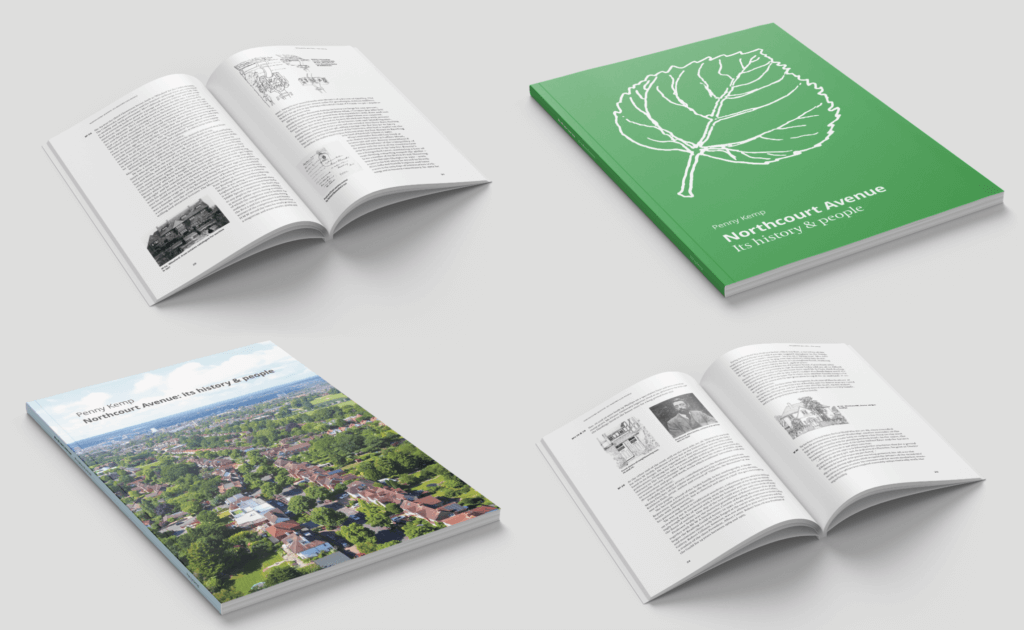
Cover development
Two concepts
For the cover of this book, I worked on two main concepts, one which was more of an evolution of the original book cover, utilising the same illustration with an updated layout and typefaces, the second concept used a new drone photograph of the avenue, supplied by the Client, both concepts used largely similar styling with different imagery and type positioning.

The first concept’s main visual is a leaf illustration, the same illustration found on the original book’s cover, however, I’ve made more of a feature of it displaying it in white and at a larger size for a more dynamic visual compared to how it was set originally, at a small size in black.
Ways of making the first concept more dynamic and interesting were also iterated on, including resizing the illustration, adding an additional band of colour, positioning of the typography. These might be visited further in the case of the Client deciding upon this cover.

Typography on the second cover was iterated on through feedback to sit in a wider horizontal space, compared to the green cover’s typography, in order to fill out the skyline. As the typography for the book’s title sits on one line together it also only utilises a single typeface rather than displaying both the sans serif and the serif.
Near final product
While this project isn’t finished just yet, current changes and feedback are very minor and content, the interior pages will hopefully soon be sent to the client for final proofreading, the cover concepts are being considered by the client currently, after those things happen this can be sent to print.


Closing thoughts
Overall, this project has been fun but tough, especially due to the size of this project, it is my first ambitiously-large Real Job; working on an entire book interior design, cover design, drawing up the detailed maps, scanning in and editing all the imagery, and doing it alone has been very challenging, but rewarding for the most part, helped by my own enjoyment for editorial design itself.
Going forward, I’ve learned, acutely, to make sure to set specific deadlines, for both myself and the Client, things like final dates for revisions/additions to text and images, when meetings will happen and how many rounds of feedback designs will go through, all of which I didn’t set up properly for this job and, amongst other things, led to delays and problems throughout the design process. Further, managing and scheduling my own time better is something that I’ve learnt to improve and has helped me catch up towards the end of this project but would’ve definitely helped throughout during times where my Client was non-contact.