
Category: TY1DP1
Work by Part 1 students as part of their ‘Design Practice’ module.
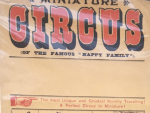
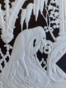
Circus Poster
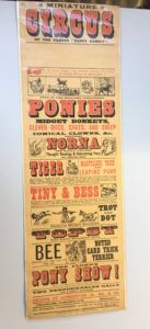
My chosen piece from the collections today was this circus poster. I was drawn to this poster because its helpful…but also not. It only gives generic information such as what they have to offer at the circus, but not specifics such as times and location. Therefore, making the poster unhelpful for public planning to attend. However, in the image below it shows a blank space below the title. I think this is where the timings and dates would have been placed but due to a circus constantly being on the move, it’s cheaper and easier to leave the space blank until needed. Another noticeable point in this poster is the size and shape of it. The image above shows the poster is a vertical rectangle. This type of shape would have been used firstly to reduce cost, but also for space on walls or lamppost to advertise. As the bigger the poster, the more likely it was to be cover by something else, therefore creating a poster this size helps to reduce those chances.
Further on to the poster being cheaply made, a lot of the print hasn’t managed to transfer properly. The image below shows an inconsistency in the blank print around the red letters. For example, on the letter T in tiger, there is a consistent black boarder around the letter. However, with the rest of the word there is a lack of black outline around the letter, compared to the word above, ‘Norna’. I think much of this is due to the poster being cheaply and quickly made. Hundreds of these would have been printed and they were only needed for a short amount of advertising time, so a small inconsistency in the print wouldn’t have meant much.
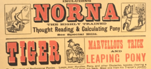
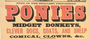
Due to the poster having no date or location, it makes it difficult to date the poster black to a specific time. The colours used are red and black, which were the favoured colours used in typography during the modernism movement, which helps to date it back to 1930s. Further to this, the image below shows that the circus was mainly made up of animal acts, which are now banned in the UK due to animal welfare. These types of acts were more popular and allowed around the 1930s, helping to date the poster back to the early to mid 20th century.
RFT
Formatting Cinema Listings
Design 1
Letter Shaping and Font Replication
Task 1 – Fill in the Blanks

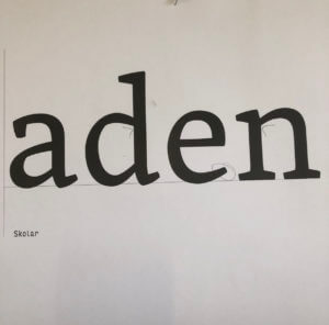
In the first of two tasks, I was given 4 letters in the font ‘Skolar’ with large portions missing, with me needing to fill in these spaces as accurately as possible. While initially sounding easy, I was surprised at the complexity and difficulty of this task.
I began with the ‘n’, which was missing the top curved portion, as I thought this would be the best starting place to ease myself into the task. I used a 6B to begin sketching a skeleton of the shape before switching to a 2B to define the outlines. While I think this was one of the closest letters to the original, the sizing was still off, making it taller than the actual Skolar lowercase ‘n’.
I then moved on to the ‘e’; I struggled on this one more, not knowing if a serif was present or not. From the remaining parts of the other letters, I could see some of the different possible serifs. However, after trying them and deciding they looked misplaced and visually off-putting, I resulted in a slightly tapered but curved edge. While the right choice for this font, my choice to make the letter closed instead of a more open sweeping stroke makes my letter look visibly different from the real font.

Although going in apprehensively, the ‘d’ was not as challenging as expected. By giving the sketching process time, I was able to slowly build onto the base skeleton lines to create a structure that somewhat matched the given portions of the letters. Upon reflection, the real font is more angular than mine, with the bowl joining onto the stem in a sharper manner. Despite this, I think that the curvature and slight descending nature on the bowl are accurate to the original, making this look like a reasonably close recreation.
The ‘a’, in my opinion, is the furthest from Skolar. In my addition to the given portion of the letter, I did not add the angled stress found in the original. The serif is similarly absent from this, making it noticeably different. I failed to capture the angled nature of the bowl, instead of creating a rounded curve with much less stress. However, with the given part of the letters, there was no real way of me inferring the angle or stress of the font. This task showed me the intricacies of type, helping me to spot subtle ques and motifs that run through the letters while allowing me to apply my sketching and drawing skills to a practical task.
Task 2 – Replicating Entire Letters

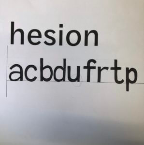
The second task was more challenging still; here, we were given six letters within a particular font and had to continue writing other letters of the alphabet, attempting to replicate the font. Now without the assisting portion of the letters, many more of the choices made were based on the other letters and existing knowledge of typography.
Beginning with the letter ‘a’, I presumed this would be a double story letter from the smooth, open strokes and chunky serifs. Looking back at this now, I think that the bowl of the ‘a’ descends too far below the baseline. While the counter is reasonably proportioned for the vertical stress of the letter, it is also apparent that the aperture of the overhanging stroke is too small, making the letter seem closed off. This does not follow the open nature of the example letters, forcing me to not include a serif and making it appear further from the typeface. However, in comparison to the FF Tisa Standard font I was attempting to replicate, I was not too far away from the real letter.
Following this, I then created a lower case ‘c’. The curvature became a challenge here, requiring a smooth curve and a definite decision on the inclusion of a serif. After looking at other letters, specifically the lower case ‘e’, I decided not to include any serifs, keeping the letter more visually simple. While the real letter does have a serif on the upper end of the stroke, I think that my choice was somewhat informed. With both serifs, the glyph looked out of place alongside the other letters, causing me to remove both serifs. The stress and proportional weighting of the lettering was good, but this task has helped me understand where my weak points are and where to continue independent research into typography and lettering.


Finally, with my remaining time, I drew out a lower case ‘b’. Here, I went the opposite direction, adding an upper and lower serif to the design. Although this is present on the lower case ‘d’, the ‘b’ in FF Tisa Standard only features an upper serif. The angled exit stoke of the curved bowl, stressed proportional weighting and slight descending curve are all accurate to the real font. However, the bowl is more squared off in the authentic typeface, with my recreation being too rounded by comparison.
Although these tasks were not flawless by any means, I think the lessons I have learned from completing them have been incredibly valuable. I looked at letterforms to a very minute depth, allowing me to make judgments and observations on minute aspects of the font. I have also been made aware of areas to improve, which I will pursue and try to actively improve within my studies and free time.
Practicing letter forms
I found this task was surprisingly difficult compared to how I had assumed it would be after reading the brief. I had thought that I had quite a precise hand for drawing and sketching, but the reality of the project showed me that I was not as detail orientated as I’d thought. There were details within the letters which I did not observe until they were pointed out to me.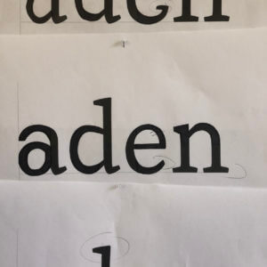
The first task was to fill in the gaps of letter parts of the typeface ‘Skolar’. I feel that I achieved the same style across the majority of areas but on seeing the original font afterwards could see that my ‘a’ was quite far off and some areas are a different weight than to the original.
We then were tasked to replicate what we thought the letters of a different font with letters that we’d not seen would look like. I found the rounded parts of the letters the most challenging, but focussed on creating a balanced weight across the letters. I, again, found the ‘a’ the most challenging shape to achieve but found evidence from the letters we were given to create the shapes across the other letters.
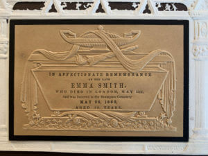
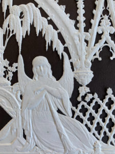
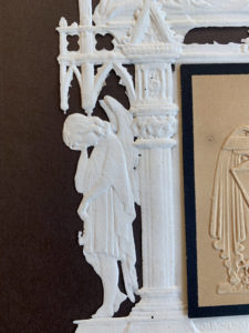
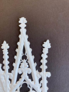
Memorial cards
During Emma’s session, we went through all the collections available in the typography department. Amongst all the collections, I was specifically interested in the memorial cards. Memorial cards were used in the Victorian era to demonstrate heartfelt mourning and it was fully expressed through the decorative cards. According to the book, The Encyclopaedia of Ephemera by Maurice Rickards, the memorial cards were ‘commonly 75x115mm’ and ‘relied for much its appeal on the austere extravagence of blind embossing.’ Here, blind embossing refers to the method of creating raised logos or characters without the use of ink and this is evident in this memorial card, as all the text, including the design, is done in blind embossing.
Printing Process
The printing process produced an uncoloured relief image, similar to company seals (The Encyclopaedia of Ephemera, Maurice Rickards). Images of angels, tombs and mourning figures were common elements found amongst these memorial cards to reflect the concept of mourning effectively.
Details and Texture
I was particularly intrigued by this card as its quite simple, with no colour except for in the middle part of the card, where all the text is allocated, yet, at the same time, the piece is a very detailed and sophisticated one. I was also told that this particular card was perhaps made for someone of higher class, thus the intricate details found in it. In terms of texture, I believe the material felt very thin and almost fragile, most probably made out of lace paper, due to the extensive decorations, and being able to create something out of this type of material is very interesting to me.
Lettering Style
In terms of the typeface style, all of the text is in serifs, varying in weight and size, to emphasise on the hierarchy of information to the targeted audience. The text is fully aligned in the centre, making it visually look neat and adjusted, with equal line spacing between each line.
Overall, this was a fun project since we got to see the collections available to us through Emma and have insights into how design has evolved over the years and the different elements that were prevalent during a certain era of design. I personally was able to learn a lot about the hierarchies of information, layouts and the use of colours in design.
RFT Poster for a Father with two Children
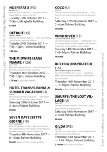
I have designed a film listing for Reading Film Theatres Autumn 2017 programme with my chosen user being a father with two children both under the age of 10. To accompany my choice of user, I have chosen a hierarchy which stands out in order of importance, in this case which is the age rating next to the title as the most significant, followed by the date, location and time along with how long the film is in bold which is another extremely important factor for this specific user. At the end of each film listing, I have incorporated the director and actors which I believe is the least significant pieces of information for this particular audience. I have used the colours red and black upon white which compliment each other well and is clear to understand, with both a serif and sans serif typefaces.
Apples, sausage dog and travel
I was given three words by Neve. Apples, sausage dog and travel. I decided to create an apple basket in the shape of a sausage dog because Neve said she “absolutely loves apples” and really wants a pet dog. So I wanted to combine both of her likes and interests into one useful product which she can use over and over again.
The Text Does Not Control You!!
While this task was mainly about establishing visual hierarchy, I ended up learning a lot more about how different types of information should be presented.
How to Format a Date
In the “raw text” all the dates were set out like this: Tuesday 24th October 2017. In the “Typographic style Handbook” it states “Only numbers should be used for the days, not 1st, 2nd, 3rd etc.” (Mitchell and Wightman 2017: 77). Before this task I didn’t know that dates had to be formatted without the “th” bit, so I listed serval of the different date options.
Tuesday 24 October 2017, Tue 24 Oct, 24 Oct, 24.11.207, 24/11/17
For the flyer aimed at family I chose to format the date as Tue 24 Oct, omitting the year 2017, it does say “Autumn 2017” in the title. Many families have weekly occurring events, for example every Wednesday is an extra curricular club, and so would have to work out which day the 24th is, and see if they are free next Tuesday.
For the flyer aimed at the old couple I left out the date, 24 October. With the assumption that if they really want to see this film they would make room for it rather than just wanting to fill their day.
How to Format Time
In the unformatted text there were a range of different foments for the time. Younger children struggle with reading the 24 hour time, and so I chose to use the 12 hour version, and kept the time in the 24 hours for the retired couple.
When to use an En dash
“A spaced en dash indicates spans of time” (Mitchell and Wightman 2017: 77).
How to Format Names
Names are important and so they should not be hyphenated over a line break, or having the name go over two lines. By using a “soft return” I was able to keep the list of names in the same paragraph but was able to respect the actors and keep their full name along one line.
Hierarchy
In the text there are 12 different pieces of information, listed here in alphabetical order:
Age Rating, Audi
o Descriptive, Building, Cast, Country of Origin, Date, Director, Film Title, F-Rated, Language, Time, Run Time, Year of Origin
![]() A new concept to me was brainstorming with having a user in mind, rather than just having ideas. When having a user in mind, you can make design decisions to support their needs.
A new concept to me was brainstorming with having a user in mind, rather than just having ideas. When having a user in mind, you can make design decisions to support their needs.
For the flyer aimed for families, this is how I ranked the information:
Film Title, Age rating, Date + Time + Run time, Building, Cast + Director, Year of origin + Country of origin, Audio descriptive, F rated, Language.
I grouped like information, that would be in the same paragraph style. This helped me to know how many chunks of information I had to design for.
Design Process
I found it helpful going over the printed version with a class mate, and could pick up on a lot of the silly mistakes, where the spacing or formatting is simply missed out. Printing out the flyer means I could see that the text was simply too small, and printing in italic yellow isn’t really that clear. Even now I have realised that for the 24 hour time I have typed “pm” which isn’t required. This has highlighted the importance of going over the printed copy and spotting errors, serval times.