
Category: Student work
Endless Labyrinth – Endless Book
Endless Book – Is there an end and a beginning needed?
No pagination and mirrors (made out of aluminium foil) reflecting the page before.
Is there an escape?
Happiness
The idea:
The image which immediately sprang to mind when considering “happiness” was a sunflower, maybe because of the colour yellow, or maybe because the word “sunflower” just sounds happy. I liked the idea of a whimsical character so I gave the sunflower a smiling expression. To turn this image on its head, I drew from the connection between a crop such as sunflowers which are used for oil, and the harmful effects of pesticides used in their production. It is well known that bees are dying at an alarming rate due to factors such as pesticides, so I thought to include dead bees to dampen the mood of this otherwise joyful scene.
The process:
I began by sketching the idea out and inking over it with a drawing pen. On Illustrator I then vectorized the image and coloured it on photoshop. Upon recommendation I animated a camera pan from the top of the image (the happy part) to the bottom (the sad part). I also duplicated the image and darkened it several times to give the animation more depth. I’d never made a GIF on photoshop before so this was a new experience for me
Reflection:
While I think I’ve achieved my goals well, when linking the outcome to the actual brief, I’ve realized that the link between happiness to ecocide is a bit tenuous. This is an important finding as to me, it highlights how it is easy to follow your own interpretation of a brief instead of the actual one.
‘City’
This project was firstly about creating an image which explained a noun. I was given the term ‘City’. In the first image I have drawn an outline of Earth which is surrounded by a few of some famous landmarks we have in our awesome cities. After sketching them in, I have painted over a wash of mixed watercolour over each of them. The 2 colours on every attraction symbolises the flags of their respective countries. After that, we had to take the image we had created and add a second element to change the original nature and meaning. The second image I have created has an educational aspect to it. I decided to incorporate the idea of LEDC’s and MEDC’s. I realised that a simple outline of any building skyline represents ‘Cities’ well, therefore I decided to circulate that outside the drawing of the Earth. I have included a collage of text (names of cities) which are written in an ordered way. Where the buildings are taller, the cities are more economically developed and where the buildings are shorter, the cities are less economically developed.
The first interpretation of the term ‘Cities’, gives us a flawless and perfect view of our Earth, however the second image changes this idea of perfection and encourages us to look deeper into the problems in our cities.


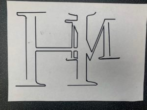
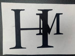
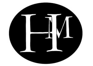
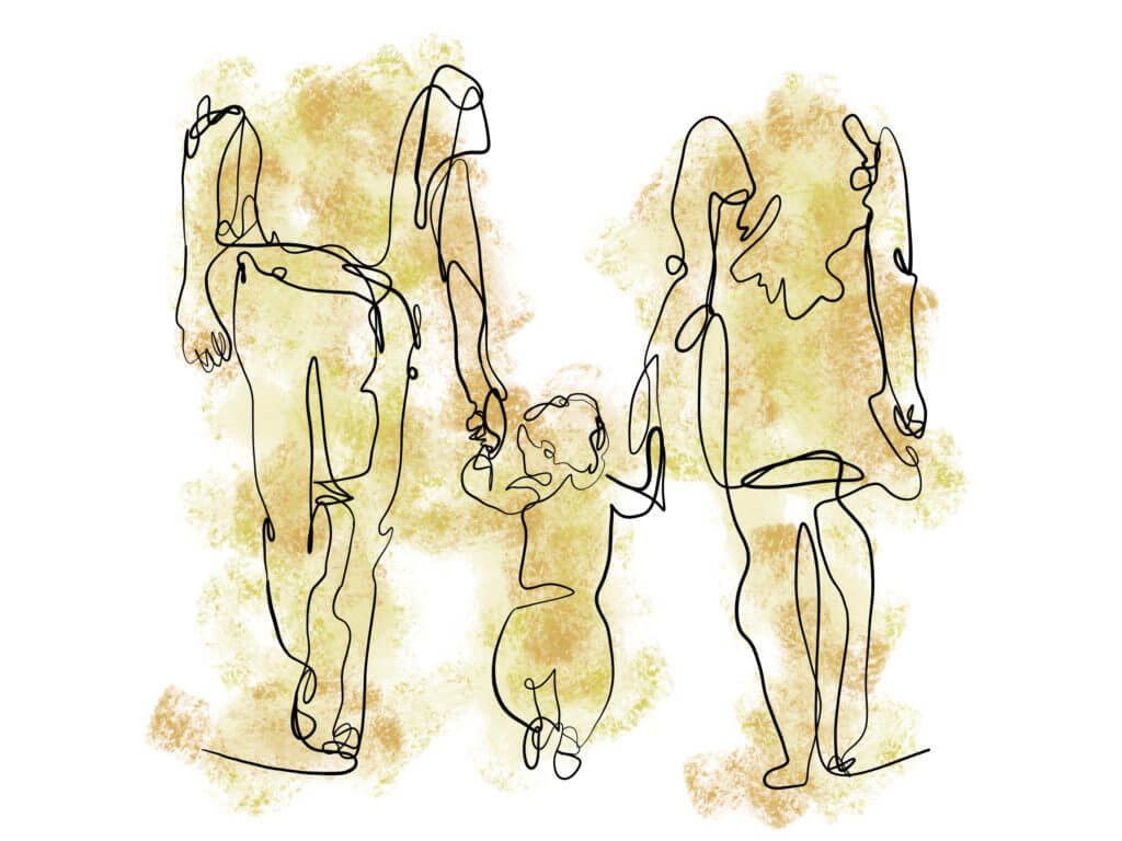
The H in my name deserves the hierarchy
At first I did a couple of sketches to see which type face I preferred and the different ways I could create a monogram.
![]()
![]()
I went with Garamond font as I liked the the flow of the letters more. I decided to take my bottom left sketch further as I liked the idea of having my first name Initial as the more dominant lettering, with my surname in the background. I thought it was ironic as in the name your last name is your family name whereas your first name is you.
I then draw it out as a line drawing and as a whole. I preferred the full type so took it further.
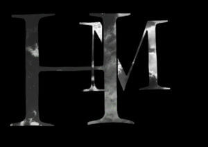
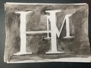
I played around with different media, from digital, collage to watercolour paint.
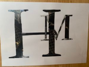
I researched some famous monograms and found that they consisted of 1 to 2 colours max, mainly black and white. which lead me to my final outcome.
The Good, The Bad… but not The Ugly
Introduction
Today I responded to ‘lettering in the environment’. The brief required me to explore the campus and the surrounding environment, whilst photographing as many types of typographic sources as possible. I personally decided to avoid taking pictures in the Typography building as I felt it was too easy to document. Instead I wanted to force myself to explore the surrounding environment. The University contains a range of newly implicated signage, giving the environment a clean and contemporary feel. I wanted to try and look for the forgotten and unloved pieces of typography, to find something to juxtapose the clean reformed style in the updated areas of campus.
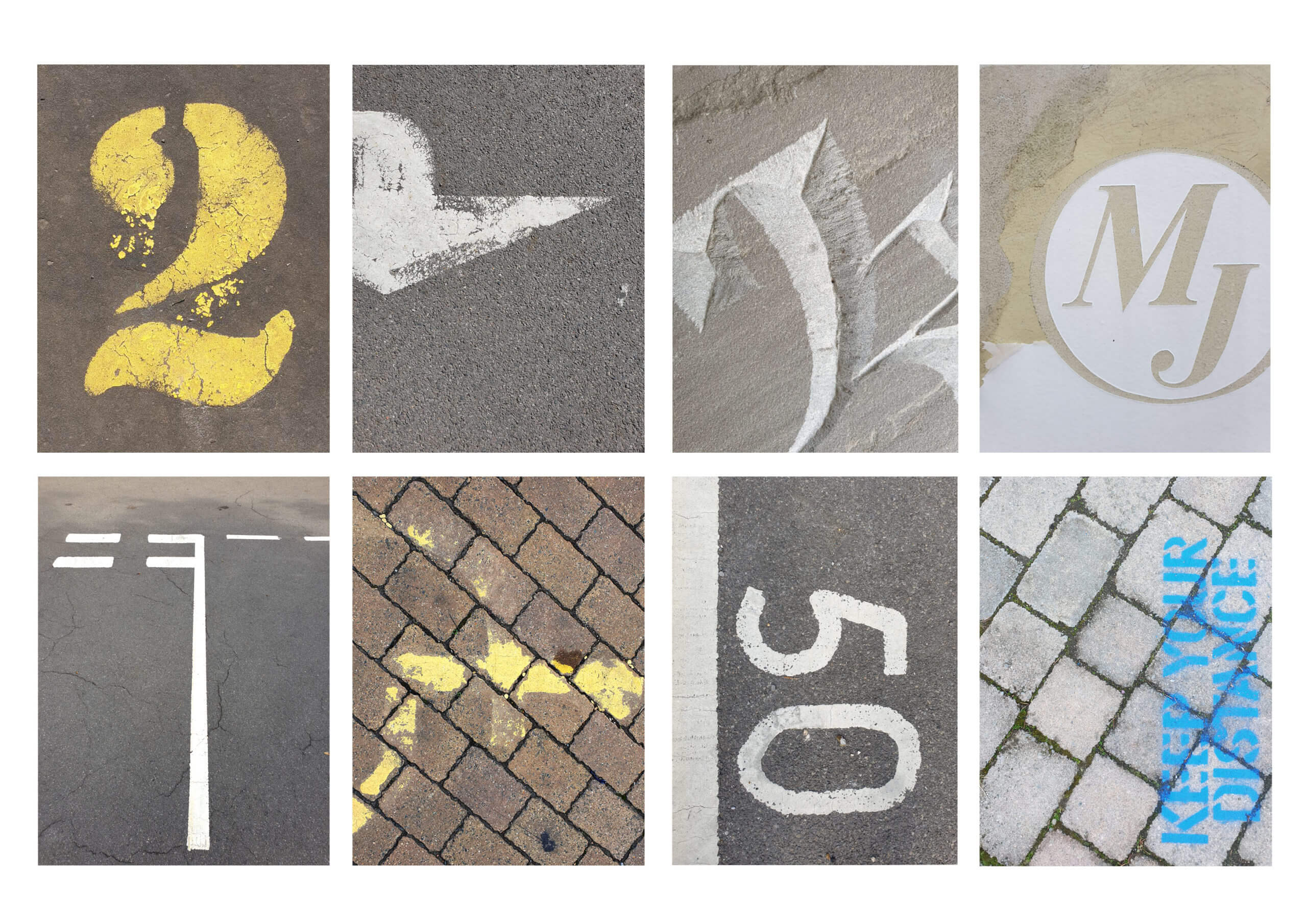
I started by circulating around the old Typography building, finding disregarded engravings made by students from years past. The engravings weren’t perfect and had flaws in consistency and quality. This resulted in the type forms becoming distorted and containing characteristics that varied from its base inspiration, giving it its own personality. I found myself slightly put off by the type forms until I started getting closer and observing the minute details engraved by the student, something not as visible from a distance. From a closer perspective I realised that the form didn’t have to be perfect or a near replica. Instead I tried photographing the source from up-close, getting tight framing to only capture elements. It remined me that the form didn’t have to be as aesthetically pleasing as its inspiration but could be in its own right. Instead of relying on the entire form to be carved well, I could take advantage of close framing and enjoy specific elements, freeing it from being type and allowing it to just be a form. These engravings can be described as bad type by some, but the fact that the form would never logically be recreated for use made it even more unique. I continued to look for letter forms that had been abused and unloved to find the same unique qualities.
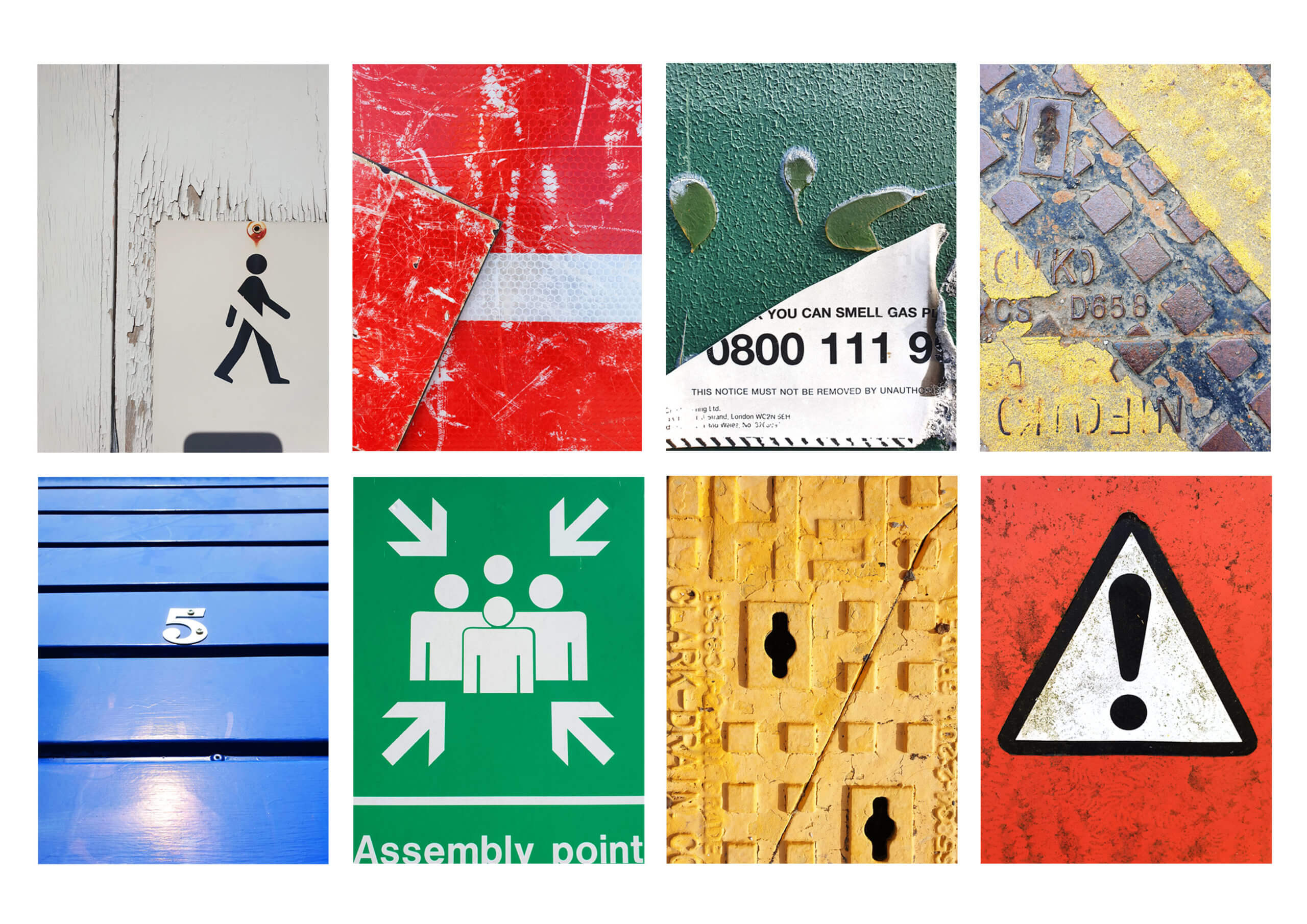
I found that some of the most inspiring sources were of metal signage. The signs are made from metal to endure the weather but over the years it can become dirty and the paint can chip and peal, generating unique markings and creating an overall texture to the sign. I think these elements, as well as close framing, allow the type to interact differently in comparison when it was originally displayed. The changes can result in type becoming less legible, becoming more of a form than a type form as well as creating contrasts in colour and tone from paint chipping. This can also be seen in a lot of signage painted on the roads. I found they offered a different style of texture due to concreate being more porus and tyre friction wearing away less aggressively. It resulted in a more organic and natural texture, leaving behind minimal speckle to big silhouettes.
I think these sources are a great source of inspiration and it would be useful to digitally scan them in and use them as textures in the future. After photographing all of the type I encountered, I grouped some of my favourite shots into three categories that I found were the most consistent in my research (Concrete, Metal and Plastic). I chose to group them via their matirial they were printed onto (or out of) as they shared similar characteristics of texture that I found interesting.
Conclusion
After completing the brief I realised how common these degrading sources of type are. It also confirmed a sad theory in that it takes a certain ignorance for these forms to still be present. This is because they need to be neglected and forgotten to gain their textures which give them personality. I think If I could respond differently, I would have photographed similar sources in the town centre and compare how the foot traffic and location could create variation in textures.
Chocolate
The dangers of chocolate
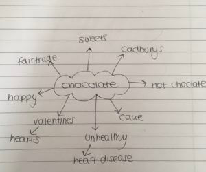
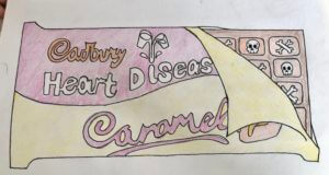
In Sara’s project i was given the noun ‘Chocolate’ The first image, which is shown in the featured image, clearly conveys chocolate. The hearts and smiley faces represent how chocolate makes us feel which is usually happy, The hearts are also linked to valentines day as chocolate is a typical valentines day gift. The above diagram shows ideas linked to chocolate i could use in my images. The below image is almost identical to the first however, the Dairy milk has been replaced with the words Heart disease and the hearts and smiley faces have been replaced with skulls and bones, this represents the danger of chocolate and what health problems it can lead too.
In this project i used paper, Pencils, pens and tracing paper. I liked the outcome of the project and how theres a clear link between the two images, However i think i could. have improved by making the presentation of the images more neat and clean.
Love
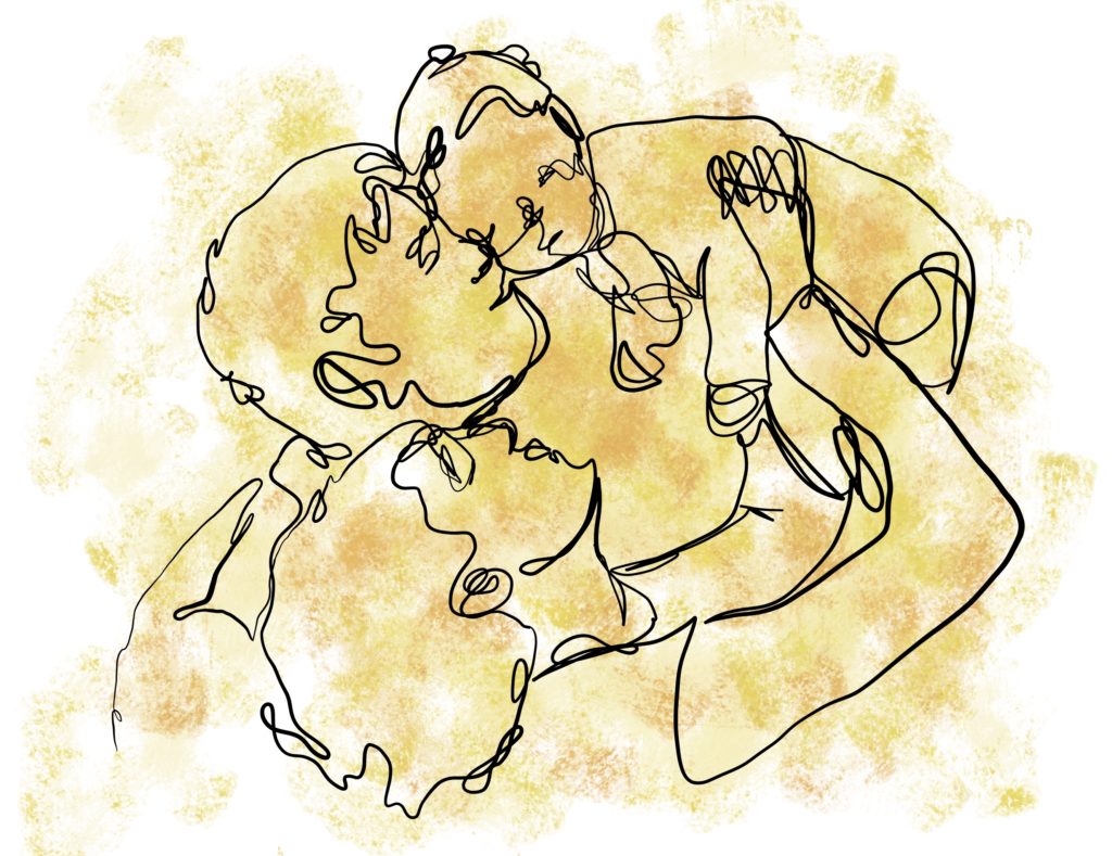
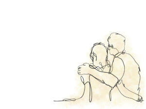
For Sara’s project, I created a series of images that capture ‘love’ in a meaningful manner. I decided to play with the idea of family and the love parents have for their child. I chose to use continuous lines to illustrate the parents with their baby. These lines link the family members together and can also represent the ‘timeline’, further playing with the idea of family love.
For the second image, I wanted to show the boy as a young child. Finally, for the third image, I portrayed the two parents standing beside each other. I wanted to capture the loss of the child, which left the parents alone with their heartbreak. I wanted to leave room for interpretation, and so my triptych can either be seen as the death of the child or as the boy had aged and moved away from his family home. On top of this, I decided to move the subjects to the left corner for my final image to help convey the emptiness they feel as a result of their loss.
To add contrast between the three images that I created, I decreased the saturation of the colour used in each.
If I were to do this project again, I would like to create more of a connection between my images to make them more of a single cohesive piece. I would also like to explore the use of animation to create a moving outcome rather than a 2D image.
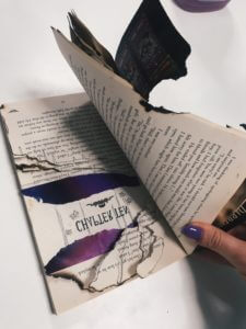
Burning Pages


Our first project required us to break the conventions of a typical book (the pages, cover and the binding) Rather than the ordinary text telling the narrative/theme, our task was to narrate the story through deconstructing the book physically. This allowed us to represent the visual dimension of the novel.
I chose the theme ‘Noise’. I discovered after reading the blub and researching about the book, that the narrative was very similar to the idea of the theme. In the theme, the brother and sister inherit family wealth and live a quiet life. They don’t understand the importance of this relationship until the very end where all they have is each other. Similarly, the novel explains how the different characters in the book have to compromise and see that even though there is a war present (set in WW2), that they have to stick together because in the end, your family is always there.


I have portrayed this link between the novel and theme through the deconstruction of the binding, pages and cover of the book. Firstly, the pages are tea-stained and burnt around the edges to represent the dangers and result the war leaves behind. As the pages continue, they get smaller and smaller. This signifies in the theme how the two siblings went into spaces which became smaller and smaller. At the end of the book, I have stuck a large amount of pages together as a whole to show the solidity and togetherness of family. I have also requoted what has been said at the back of the novel by the author on the edge of the pages I stuck together. At the very back, I have written down key words to summarise the book and the theme in a couple words which covers the blub of the book.


A Noisy Book
Broken Narratives
Noise
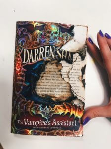
I chose at first to pick noise when experiment with our broken narratives project. I start first by tearing pages, cutting up words, doodling inside the book, to try and make it look chaotic, however, I was not satisfied with the results, and thought it didn’t look half chaotic enough, or exemplified a noisy book, or a noisy writer, where the story was almost trying to escape the book.
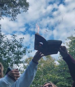
After some experimentation, I decided with a bit of help from my flatmates, to try and burn a hole through the book, starts with ripping out the centre of the first few pages and the cover, and as the front of the book is also covered in plastic this created a bubbling texture over the front. The book itself was a fantasy book about vampire hunter, which is what sparked the inspiration for setting the book on fire(as vampires, as we all know, burn in the sun). The colourful sheen of the front was magnified after the burning process, and made it look a lot more mystical in my opinion and created layering in the pages due to where the burning took, creating a very charred edge to it as well. I also included a picture of the process, where you can much more clearly see the hole now in the middle of the book while it’s still on fire.
(I also kept jug of water nearby for when necessary during this project).