
Flaminia Rossi and Samantha Whetton, owners of Design Print Bind talked to us about running a small studio, what it's like as a freelancer and the communities they are a part of.
Year: 2021
Seniz Husseyin: Shaping careers into the third sector
In week 5 of the Spring term, Baseline Shift welcomed Typography & Graphic Communication graduate Seniz Husseyin who talked to the students about her experience within the Department and how it shaped her into wanting to work for social change in the third sector. In June of last year Seniz started working with a charity in Reading called Launchpad and she also shared some of her experiences from there.
University and beyond
Seniz started her degree in 2017 and graduated in 2020. In the beginning she was nervous and doubting her capabilities, however she decided to ignore that and not let it get in the way.
Trying to get the best out of her university experience, Seniz joined the Department’s diversity team in her first year when it was first proposed and each year, along with the increasing opportunities from the team, her confidence and passion to continue working for good social causes grew. That really changed her perspective as a designer and shaped her future career choices. It was no surprise for her when she found out that the designer industry is mostly populated by white males and a lot of the history that is taught reflects the same. Learning about the cultures and ideas within design outside of the western canon was an opportunity she couldn’t miss.
For the years she was part of the diversity team, the team was able to help change the curriculum by incorporating more opportunities for diversity and inclusion to be taught such as the Design for Change module. The diversity team has since given presentations at the RUSU Partnership in Teaching and Learning Showcase and Baseline Shift. Being part of the team also allowed Seniz to meet people from all year groups and other departments, conduct two workshops at Tate Modern and create an annual diversity zine.

Seniz believes that these major parts of her university experience have shaped her into the designer she is today and built up her desire to work on projects for good causes or that will help bring change.
‘I am now more conscious of the companies I want to work for or who I apply for.’
Launchpad Reading

The inclusive experience Seniz had at university and her newly formed mindset towards work led her to apply for a marketing internship for the homeless charity at Launchpad Reading.
Seniz describes Launchpad as Reading’s leading homeless prevention charity. She said they provide information and support for individuals, couples and families who don’t have a stable place to live or are at risk of losing their home. They also provide temporary and permanent homes and rebuild lives through activities, supportive education, training and employment. Seniz was also pleased to find out that it was actually founded as a soup kitchen in 1979 by students at the University of Reading.
Wanting to be involved working for a charity, she thought that having new marketing experience would be really beneficial for her design work. Seniz found the internship through the Reading Internship Scheme, which she highly recommends for finding internships or even voluntary work since experience is extremely beneficial and can set one apart, especially at a time when employers are looking for staff with experience.
In the beginning of her career at Launchpad, she also completed a digital marketing and advertising online course because she wanted to make sure she had basic training while working with the Marketing Team.
Launchpad
Seniz initially started at Launchpad as a marketing intern through the Reading Internship Scheme but after three months of working with them she was offered a Marketing Assistant role.
Even though it was marketing, she was hired because of her design background which provided a huge overlap between both industries. Being able to get this marketing experience really helped Seniz improve as a designer too. Seniz was the first designer employed at the small charity and working with them she helped with their website, fundraising campaigns, social media, email newsletters, video editing and other tasks. Even though her title was Marketing Assistant, she did feel more like an in-house designer. If you are a designer, looking to become more business savvy, Seniz suggests learning some marketing knowledge.
‘Design and Marketing are two sides of the same coin, and what binds them together is the primary focus of understanding and appreciating the user or target consumer.’ Design So Journ, ‘The relationship between design and marketing‘ in designsojourn.com, 2010.
Big Sleep Out
The Big Sleep Out is Launchpad’s annual fundraising event and one of the major projects Seniz has worked on within the charity.

The event takes place on world homeless day – 7 October and 2020 was the fifteenth year the charity was running the event. Unfortunately, due to the pandemic, the event was made virtual but this was a daunting new challenge for everyone in the team to adapt to a virtual event.

However, because of that, Seniz felt that she was learning and contributing as much as everyone else on the team and created new digital materials that were specific to what people could use in their homes and plan new strategies. The 2020 event saw a big turnout of people from Berkshire which raised a total of over £50,000 that would go towards preventing homelessness in Reading. The sum was actually double their initial target. When creating the items for the event, Seniz worked with a logo created by an external designer to create all other materials for the event. Part of the promotion for the event was getting the word out to the public, so Seniz had to create large scale work with a visible call to action.

Other materials she designed include the event programme booklet, flyer design and social media banners, all of which were vital. She made sure the text in these was easy and visible to read while keeping engagement throughout.

Seniz aimed to make all of these consistent whilst also adjusting to the specifications. She also designed downloadable content that participants could use to create more recognition and support for the charity, such as the event pack.


Working through a pandemic
A big part for Seniz within this role was working through a pandemic. While new, it did come with some advantages. Knowing that everyone is going through it together for the first time actually made staff grow as a team. They learned new skills such as how to adapt in constant changing circumstances and within unknown times. Working from home also meant she had to do less travelling.

Some challenges included having most of the charity’s events cancelled, and when adapting to the new online way of doing things, there wasn’t enough time to plan it out properly. Starting a new job this way did feel overwhelming but Seniz never felt left out.
Recent work
Seniz is no longer working for Launchpad but some of her last projects for the charity included designing some of the external and internal signage at a new Life and Skill centre called Launchpad 135.

Another thing she was also working on was the charity’s brand refresh which included all publication materials. Overall she hopes to continue her career in the sector.

Closing thoughts
Seniz said if there is anything she would want us to take away from her presentation it would be to make use of everything the Department offers and pursue our interests in designing for good causes. Being able to see first hand how her work helped people through feedback and client stories was so motivating and she certainly didn’t have this mindset in first year but the Department really did help introduce her into this lane through certain modules and projects. Her advice is to grab all the different opportunities we have because they can open many doors and she definitely recommends being a part of these even if it is out of our comfort zone.
Students’ thoughts
‘It was nice to see how someone with a similar path and experience to me has gone on to do cool stuff and make a career. Very comforting especially that she managed it in this current chaos – shows how far hard work actually gets you!’ – Part 3 student
‘I always value the talks from past students because I feel like there’s a bit of a gap between uni and working in my head so it’s valuable to learn what others did afterwards to make that step.’ – Part 1 student
Achilles Gerokostopoulos: Design as a team sport
In week 4 of the Spring term, Baseline Shift had the pleasure to host a talk by Achilles Gerokostopoulos – a graduate of the department who has lots of experience in software, tech and corporate communication. Currently working at the Irish National Lottery in Dublin, Achilles’ career involves working in design teams which is what he talked about in the session.
Working in a team is the alpha and omega of design at the moment
Achilles’ career path is a very interesting one. He graduated from The University of Reading’s Typography & Graphic Communication department in 2004 and found work in various aspects of design after that. At first he was very interested in editorial design; working for art directed magazines such as Esquire in Greece while also doing some design consulting for newspapers. In fact, one of the newspapers he worked on in Greece – Eleftheros Typos, was awarded Best Designed European Newspaper in 2007. After the Greek economy crashed Achilles decided to move to Amsterdam where he got into tech design. There, he worked as a design director in the gaming sector and a while after he began a freelance career in design consultancy which led him to Dublin. At the moment he has just begun working as a design lead for the Irish National Lottery.
Through these numerous jobs Achilles gained a lot of knowledge on how teamwork happens and what it is like to work in product development – ‘One of the likeliest industries you might be absorbed in’, he says. That is why he decided to tell our students a bit more about design in product development as well as the inner circles and relationships between design teams, developers, businesses and users.
With the rise of digital businesses, design is emerging again
From his experience, Achilles suggests that more and more businesses are going digital. During this process they realise the importance of design and how it will help them develop further in the digital sphere. He also mentioned that old companies have recently bought design companies to have them as in-house teams, the trend of working with or alongside designers when developing a business is on the rise. This results in an increase of designers being absorbed in the business industry early on in their professional careers and working with stakeholders, businesses, users and development commonly.
Achilles continued with a graphic (shown below) of the core stakeholders in product design. He stated that any product starts with users and their needs.
‘In product development a lot of your work will be finding out as much as you can about the users.’
Then there is the business – it is set up to address a particular user or consumer need, and usually sells that as a product or service.
And finally, development – they are the group of people that are called upon to implement and produce the business’s idea.
‘Design sits at the intersection of all these.’
Working in product development, Achilles says, there will be people whose needs you’ll be needing to address and you have to balance a lot of people’s wishes and needs.

Design has two major sets of functions
Achilles explained how digital product development design can be seen to perform two major sets of functions.

First are the exploratory functions which mainly deal with exploring and defining the problem space. Designers answer questions such as: What needs to be designed and why? Some common practices in the process feature creating workshops, conducting user research, collaborative ideation and process / journey mapping.
Second are the prescriptive functions which deal with translating the requirements into specifications and design assets that development can implement. This includes design specifications, graphic design, interaction design, and design system development.
Once you understand these functions, Achilles said, especially in larger companies, you get to the organisation of the design teams which perform these functions most effectively within the context of a company or organisation.
Two models
From his experience Achilles suggests that there are two broad models for design in product development.

The agency model: where the design resources are concentrated and function like an internal agency – centralised design organisation using waterfall development, and the embedded design model: where design resources are distributed across various product teams, using agile development. Of course, these are only two edges of a full spectrum of models since companies differ in their implementation of design teams and one can definitely recognise some that are in between but Achilles points these two main ones out.


Achilles thinks that both models have their advantages and disadvantages, and largely depend on the structure of the company – the larger the company with a number of development teams, the more likely they’ll be using the embedded model.
Communication and coordination
After going over the different models, Achilles continued by describing the methods we can use to coordinate design efforts. He suggested that in either model, there will be several kinds of stakeholders and the designer is in the center. He showed a graphic where these are displayed in concentric circles by proximity of concerns to the Designer.

Design systems and common rituals
In order to communicate and coordinate with the stakeholders, Achilles recommended the use of design systems and common rituals.
Design systems consist of a common set of approaches to particular design problems, a common repository of design assets for use by all designers, a well maintained design documentation and a fully developed pattern library. Being a rather old concept, Achilles said that from his experience they have been an absolute necessity for most editorial design, especially newspapers. He also mentioned that recently there have been a lot of new tools emerging to help the development and use of digital design systems.

Common rituals, on the other hand, Achilles said, are one the easiest parts of the process, but also the one most commonly neglected. They, however, are very important in order to help the team and stakeholders with knowledge transfer, create a more cohesive team, promote spontaneous communication and avoid repeating the same mistakes.

What should you do?
To end his presentation Achilles decided to give some tips to our students if they ever find themselves being the new designer in a product development team. His three main insights were ASK, CODE, CHANGE.
First is to never be afraid to ask questions, Achilles said. As a young designer there will be a lot of things you don’t know, and you won’t come out of university fully formed. He suggests that your first job should be a learning experience.
Second, in a product design environment it is essential that you understand how technology works. Especially the closer you are to the visual design. You don’t need to become an expert but it helps to understand the underlying systems, but also some more abstract concepts. This will help with communicating with developers, but it will also greatly improve your design skills.
And third is to not be afraid of change. Life happens, things get thrown in your way and you’ll need to adapt. When things don’t work, and your circumstances aren’t conducive to your happiness, change your circumstances. It’s not easy, it’s not always fun, but it’s better than staying still.
Useful Links
Here is a document with some useful links Achilles suggested for students interested in this topic to look through: Links
Students’ thoughts
‘I really liked the general view of the sort of workflow for designers in the future, the small bits and pieces that you can only get from a designer who has been in the market for a while with a diverse background.’ – MA student
‘It was great to hear such professional insight on the real models of businesses concerning designers.’ – Part 1 student
Reimagining the wayfinding project during the pandemic
In spring term, our MA Communication Design students on the Information Design and Graphic Design pathways have the opportunity to undertake a wayfinding project, as one of their project choices. We usually collaborate with partners in the Reading community (for example, last year we collaborated with The Hexagon) and arrange visits to local sites. The pandemic provided an opportunity to develop new resources for teaching this project.
Wayfinding briefs provide great opportunities for strategic and creative user-centred design. Students have to consider how visual design supports decision-making and user experience of environments, as well as consider the needs and expectations of different users and stakeholders. They also require students to explore the interplay between functional problem-solving and cultural relevance and how branding and identity systems might need to work across a range of different materials and surfaces.
Wayfinding designer, and Reading alum, Joan Zalacain (http://www.zalacain.com/) leads this project. Joan says: “The importance of user-centred design is crucial to wayfinding but we also need systems that are appealing and sit harmoniously within their environment. We strive to convey this to our students as wayfinding is a growing area of international practice and our graduates need to be ready to deliver their best.”
This year, factoring in the impact of Covid-19 restrictions on mobility, we developed a new brief to ensure students did not need to conduct any site visits to undertake the project. Joan worked with architect Maciej Kozak to develop maps and models that students could work with. In professional wayfinding practice, buildings are often at the planning or development stage, so it’s realistic for wayfinding designers to work with these kinds of resources.
This year’s brief envisaged a new community arts centre for Reading. Students worked on either an indoor or an outdoor wayfinding proposal for the centre.

Information Design Pathway student, Fred Pena came to Reading because of his particular interest in wayfinding. He said: “The wayfinding project is a good opportunity to work on different aspects of design. Having to think about strategy, information architecture, user interaction, typography, and the development and application of physical objects in a three-dimensional environment really makes it a challenging endeavour. It’s about more than just making signage, but developing a whole system that has to be functional and visually engaging.”

Siobhan Bailey (Graphic Design Pathway and returning alum from our BA programme) said: “I really enjoyed the wayfinding project as it was a completely new area of Graphic Communication that I was not able to study at undergraduate level. Coming from an art and psychology background before graphics, it was a perfect mix of the two and required a high level of critical thinking to meet user needs and solve problems. The skills I have learned throughout this project will be essential for me in terms of wanting to head into the exhibition design, events or wayfinding sectors, and in general for careers which require strategic thinking and initiative. Joan’s passion for wayfinding and user centred design really inspired me and he pushed me to achieve my absolute best at every step of submission.”

The project also includes a range of inspiring contributions from professional designers and agencies who are part of the Department’s professional network. Thank you to May Chiang from Applied Wayfinding (London), Hayley Branston and Elena McLoughlin from Maynard (London), Anita Meier from Moniteurs (Berlin) who shared their professional insights and Reading PhD graduate, Dr Andrew McIlwraith who shared his expertise on mapping.
Evgenia Vrentzou (Graphic Design Pathway) said: “Through the wayfinding project I learnt to have a more inclusive thinking by considering both the needs of people and the parameters of environment, in order to make an effective, creative and functional system. All the talks during the spring term were very inspiring and we gained important knowledge on how to develop our projects. Wayfinding combines both creativity and strategic thinking and is a part of design that I would like to emphasise even more in the future.”

Evgenia also chose to explore wayfinding for her professional practice assignment. In this self-directed project, she designed a new wayfinding system for the coastal city of Heraklion. Her project built on the findings from participant studies she conducted to understand people’s mental maps of the area – a great example of how we incorporate user research into practical projects at Reading.
In his professional practice assignment, Fred extended his experience of wayfinding to consider a journey-planning app that responded to new considerations arising during the pandemic. His wellbeing and urban mobility app – Let’s Walk – focused on supporting people, who might have anxiety about going out during the pandemic but also need to get regular exercise, to identify appropriate places and routes to achieve their goals.
The wayfinding project is open to students on the MA Communication Design Graphic Design and Information Design pathways and MA Creative Enterprise Communication Design pathway. We look forward to running this successful project again with our new cohort in spring 2022.
Think Rethink – our graduate degree show – REGISTER NOW!
I wanted to take a moment, in the calm before the storm, to thank our wonderful team of Part 3 students working hard to deliver our degree show on Thursday 17 June.
This is our first year hosting our show online, and the students are learning new skills on the fly in an incredibly fast-moving field. The event is completely student-led, from the branding through to the final delivery. Reading has always had great strength in allowing students to experience a range of real world professional experiences as part of their studies, and for degree show team this is more true than ever.
If you haven’t already registered for the show, you can do so at thinkrethink.design, or directly via this link.
The show is traditionally a time when new graduates, employers, parents, alumni, staff and younger students come together to celebrate not only the graduating class, but everything that the Department represents. Looking at the list of registered attendees, it seems we will keep that atmosphere going in the switch to online. I’m looking forward to seeing so many people from our community on the night.
So well done to Alex Ganczarski, Caitlin Wilson, Rory Tellam, Edoardo Sarli, Matt Dawson and Darcie Richmond. Your work for your peers, and for the wider Reading Typography community is greatly appreciated. The design work looks wonderful, the attention to detail is fantastic, and your dedication to making an impact on the future careers of all your friends has been inspiring.
Roll on Thursday!
Research Fellowship in Ephemera Studies
Applications are invited for the Michael Twyman Research Fellowship in Ephemera Studies in the Department of Typography & Graphic Communication at the University of Reading.
The Fellowship is available from September 2021, or a mutually agreed date and for a period of up to 12 months (we estimate this would equate to 2 to 3 months full-time equivalent) and will attract a stipend of £5,000.
Find out more, and how to apply:
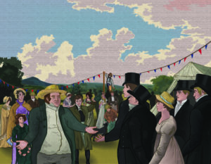
The Gentlemen Danes book illustration
Background
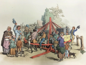
My client for this real job was an independent publisher based in Reading. The client is writing and publishing a new book that details historic events dating back to the early 19th century. The book tells the story of Danish prisoners of war, residing in Reading during the years of 1807 – 1814; mainly taking from the memoirs of one of the prisoners, who became better known in the town as the Gentlemen Danes (also fittingly the title of the book). The book is the first to detail the ventures of this particular group of war prisoners as the memoirs were recently recovered and have only been translated fully as of 2020. The story of the Gentlemen Danes follows the group mainly throughout Reading and different parts of Berkshire; describing their lived experiences that make for an interesting, historic read.
Restated Brief and deliverables
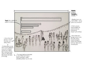
The job originally started off as a commission for an illustrative font cover with a rather quick turn-around; it entailed that I create an illustration that works as an eye catching, historically accurate front cover that did allowed ample bleed and did allowed for the integration of text for the title to exist in the same space also. To begin with there were not many reference images to work from, aside from one sketch that my supervisor had quickly drawn herself. Ultimately the illustration was described to me as a somewhat realistic illustration for The Gentlemen Danes history book that displays one fete (‘Revel’) as described in the text (the text was provided for me also). After emailing my supervisor who was in direct contact with the client, I then found out more about the nature of the illustration and some possible additional deliverables on top of the proposed illustration. It was being discussed if the cover would also serve as a smaller sized thumbnail image on the inside of the book also. I was also told to consider using the colours that were see in the Danish flag and that the exact colour values I use would have to be noted for possible use elsewhere on the book; perhaps for the titles or other text on the cover. This meant that I also had to think carefully about which tones would work on top of the illustration for it to be legible enough.
After going back and forth further with my supervisor and client however, we came to an understanding that the colour would be dropped as a deliverable and that the main focus was just the cover as an illustration. During this process the dimensions of the cover (275mm x 212mm) were given to me as well as how much bleed was required (3mm around all sides). From the start the illustration was set as being CMYK as it was definitely going to be printed, and the point was made that care would have to be taken to make sure all necessary detail was big enough to be see on a cover at the size it was. The other considerations that were very important that I think about carefully were the accuracies of not only the scene being depicted, but the clothing, hairstyles etc. of the time as well.
There were only two reasons where the brief had to be changed in a substantial way; one being because of the change of deadline and the second being because the main deliverable changed. During around December time the client decided to change his mind about what he wanted for the cover. I was told that he came across an original painting that displayed the Danish flag on its sales and he thought it to be a very good cover for what he was writing about. This did not mean that I had been designing for nothing however, and he made the compromise to keep a space left in the book for my illustration to be displayed. The brief had to be updated from a cover illustration to a general inside pages illustration; which fortunately meant that I would not have to change much except fill in the space where I left empty for text to be.
Schedule
The job to begin with was a rather quick turn-around of Around 5 weeks, of which I was confident in reaching on time. This did not go as planned however, and the level of accuracy and detail that my client required was more than initially expected. Not reaching the deadline I was given was not however a problem; I had warned my client before time that I may not reach the deadline I was given, which was originally the 15th of October and he explained that he truly wanted the illustration done by January. I assumed then that the original date given wasn’t entirely true to the sentiments of the client. Over the time it took to create the illustration, I believe that I have kept a steady, suitable pace, even when other commitments got in the way. In terms of communication with my supervisor and client this real job felt a little different than the average. My supervisor was a Masters student who was very busy a lot of the time, and it became apparent when her reply times were getting longer and longer. We came to a happy medium however where I would directly email and set up video meetings with the client instead of going to my supervisor first. This was agreed on by all parties and in retrospect made sense for this kind of job; I was making changes as per the clients request so the supervisor just being an extra messenger was not the most efficient. From this point in about early November, I would be meeting frequently with the client, and every so often emailing my supervisor with an update on the illustration process.
Process
At the beginning the job ran like a normal real job would. I contacted my supervisor for feedback, and when given the green light I would get feedback from the client. Often times my supervisor would be medium between us, but after a while it was established that I was better off getting feedback directly from him as it was his specification I was catering to. It also meant that I wouldn’t have to go through my supervisor just to get to my client. From then we were in agreement that this be the process for communication. In the first couple weeks the interaction between me and the client was mostly to do with general styles of illustration and the composition of the scene. We settled fairly quickly on a style, but the layout of the scene took a while longer to agree on. At this time I was still working with barely any detail and mainly would move rough stickmen figures to signify where a person would be in the illustration; perhaps the lack of detail and didn’t allow for a true representation of what the layout actually looked like at this time. In this part of development we went over a lot of changes in a period of time, building up the composition piece by piece.
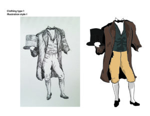
After a while of talking about research for the kind of clothing they would wear at the time, the client requested that I visit the Museum of English Rural life to get a more accurate and confident look and feel for this aspect. The visit was very fruitful, and the notes I took were very helpful to the character development over time. The books where I got the most useful information from were British Working Dress – occupational clothing 1750-1950 (Jayne Shrimpton) – Shire Library, and Pyne’s British Costumes (William H Pyne) It was the first time that I would have to an extended amount of research for an illustration. It was also a learning curve for me in terms of illustrating from descriptions in text.
Design
The first sketches I sent to the client were in pencil and were to get a feel for the number of people in the scene how the scene would be generally set up.
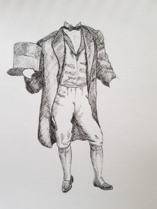
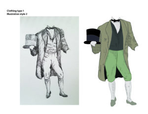
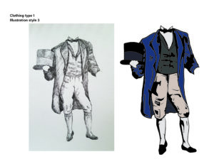
I would also draw in pencil a template for the styles I gave to the client to decide from. I had already been told that the client liked some of the styles shown on my portfolio, and I had also been told that the illustration was to be somewhat realistic. I drew the same human figure and took it to illustrator to create a few different styles of which the client picked the one that incorporated shading made up of hatching. The reason was that it resembled engraving and gave historical connotations in of itself.
From here we would simultaneously go through different characters and the accuracy their clothing, and the composition of the scene as whole. Up until the last one, every meeting with the client would result in either a major or minor change to the illustration.
For a while it was quite intense with the number of changes suggested, but I soon got the hang of it. I also learnt very quickly to work in a way that would allow for things to be moved easily around the illustration without any problems, i.e. ensuring each person was their own entity (by grouping their components) so if they were to be moved to the left or made bigger, it was an easy change. After a while colour was incorporated, many characters were changed around, taken out or added and the whole scene became a reality.
Reflection
The real job ended different to how it started in more ways than one. Firstly I didn’t realise how much detail and research was required for this illustration, and it came as a little bit of a shock to me how much time I would go on to dedicate to it; it stands to reason that the initial brief set false expectations due to it being advertised as a quick turn-around. Another area where there was a big change was the connection between me, the supervisor, and the client, with the supervisor eventually becoming an unnecessary step in getting feedback from the client. The final area was when the job illustration changed from being a for the cover to being for the inside content.
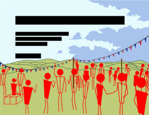
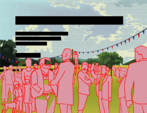
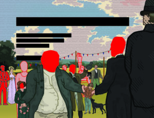
At the start there were a few things that the client wanted to explicitly be in the illustration in some way or another. The list consisted of a black and white dog, some of the Gentlemen Danes in the frame, one of the main Danes being very tall and skinny, a large famer welcoming them into the fete, a line of fete banner across the field they were on and some kids playing one of traditional summer game. With all of these worked into the illustration, the client seemed very happy with what was achieved. A word from the client that further justified this;
“Lewis put his name forward to do an illustration of a country event in Berkshire in the early nineteenth century for a forthcoming book. In order to be as historically accurate as possible Lewis had to do a lot of work in researching the costumes people were wearing at the time. After many online meetings, and a number of adjustments and modifications to the original brief, we finally honed it down to a picture that I was very happy with. Happy not only because it is an authentic reproduction of how the event might have appeared like, but also because it was done in Lewis’ own graphic style. It was a very pleasant experience to work with Lewis and I wish him great success in the future”
Overall I was very happy with how the job turned out, and although the prospect of having my illustration as a book cover was more exciting, I am still very glad and grateful that it even gets to be in a publication of some sorts. The end product felt deserved due to all of the time, research and effort that went into the work. Thank you to Libby Skipp and John Nixon.
Red Emerald Branding
Background
Red Emerald is a new business that aims to advise and support leaders in universities, colleges and government bodies on internationalisation strategies and activities. For example, supporting university students in achieving their goals to engage in an international experience indirectly through university staff. Red emerald also advises international students and their parents, wanting to study in the UK or UK students wanting to study/work abroad. The company with hold conferences with government bodies for which they will supply reports and other reading materials.
Restated Brief
Our aim was to create a brand identity for Red Emerald, that would appeal to the company’s broad target market. The brand needed to be consistently identifiable across all design outcomes whilst complimenting the different formats required. Competitors currently in the market mostly have a typographic logo, with a fairly muted colour scheme. The few that have a graphic logo reference a globe illustration, which our client wanted to avoid for individuality.
What we agreed to design:
- Logo
- Business cards
- Letter & Report Template
- Presentation slides template
Communication and Schedule
We were able to keep in touch with Charlene for the most part throughout the project, but there were times where we would not be in contact for a while due to the success of the business. This meant the proposed schedule was delayed; however, we kept our supervisor and the Real Jobs team up to date by attending Real Jobs meetings and staying in contact via email.
Delays in client meant that we could not meet the original deadline date for the project, we felt her feedback was crucial to creating successful outcomes that satisfied her expectations. However, the extended deadline allowed us more time to contemplate and make improvements to each of the design outcomes, so we do not feel that this had a negative impact on the work produced. An extension date was never finalised between the client and us, but our main priority was to ensure the client was happy with the final design outcomes. More consistent communication between Charlene and us may have enabled us to finish the project on time.
Research and ideation
Red Emerald currently has few competitors. In our initial client meeting we looked through some of their logos and discussed why we thought they were or were not successful. This helped us later in deciding the approach we wanted to take to our own design work. Most of the logos used a single block colour which was extended throughout their branding material, while others chose more intricate designs that featured shading to create a 3D effect. We also considered how each brand had a slightly different target market which led us on to identify the different user groups for Red Emerald and create user personas to represent these.

We explored some of our design ideas by creating mood boards. We took two approaches to this, the first explored the more blatant theme of creating a brand related to the individual words in the name: ‘red’ and ‘emerald’. On this board we explored different emerald cuts and shades of red, combined with a contemporary approach to typography using sans serif fonts.


On the second board we explored a subtler approach covering a floral theme as our client informed us that red emerald is also a plant. On this second mood board we looked at floral fonts that also incorporated a vintage aesthetic as this was something the client has also expressed an interest in.
Design Process
Logo
The client had a lot of input in the design of the logo with regard to their own ideation. In our initial meeting she provided us with a few sketches which we later used to brainstorm an array of initial sketches for further development. Charlene had expressed interest in using a floral theme throughout the branding which we found quite tricky as we needed to ensure that the logo was not gender oriented, so the nature of the business was not misidentified. We created a range of initial sketches on paper and then Adobe Illustrator to explore the possibilities of combining aspects of both of styles explored on our mood boards. A range of graphic elements were explored in this stage of the design process including; textures, colour gradients and shadows, but initial feedback led us to decide that block colour logos had the most impact. Block colour also did not compromise the legibility or clarity of the logo when adapted to different scales for the required documents and interfaces.
Charlene always kept us up to date with feedback she received from her colleagues regarding our ideas for the logo. To ensure Red Emerald presented a brand image that was appropriate to be presented to Government Organisations we quickly veered away from the original classic vintage style with serif typeface and moved towards a more contemporary style with a sans serif typeface. Floral elements no longer felt appropriate and we required a deeper exploration of the emerald cuts and shapes associated with them. This enabled a clear direction for ongoing development.
We explored typographic logos using the initials of the company but later decided this could be confusing for clients so we concluded that having the full name Red Emerald alongside the logo image would be more effective especially while the business is establishing itself.
Combining the text with image was one of the most challenging aspects but also helped to determine which was the strongest design. The design chosen provided us with a diamond graphic that fit comfortably alongside the name of the business and presented a corporate aesthetic which met the client’s needs.
Business cards
We initially took a more personal approach to designing the business cards and considered styles and patterns that Charlene had liked from our first logo designs. While dismissing the floral theme for the logo, we considered there may be an opportunity to incorporate it into the business cards to achieve this. However, we later decided, based on feedback from our supervisor and client, that while this was a valid experiment the outcome was not successful.


Developing the business card design involved exploring the possibility for a variety of layouts both portrait and landscape. As the project progressed, we began to think more about how the business cards could tie in with the other design outcomes. We ended up with a faint polygon pattern behind the logo on the front of the business cards which was then used on the report and letter template. The final business card design allowed for two text layout options on the back, one displayed the information that Charlene has available to her now and one shows the information that the business will have in the future once it is set up. The client decided to get the business cards printed using an external printer, so we created the appropriate files to enable her to do this. We discussed a variety of print finishes and in the end we chose a spot UV finish for the logo.
Report template
The primary function of the Report was to present information to a range of clients by aesthetically supporting the written content without distracting from it. We discussed with the client the kind of content that would be in the report to establish what components we needed to design. It was agreed that we would supply a range of paragraph styles to support hierarchy within the text and create a style for tables and charts, along with a colour scheme.


The final report template allows the client to add an image to the front cover or keep the logo watermark as shown. The paragraph styles present a range of heading options using fonts that are available on Microsoft Word and Apple Pages on multiple devices, to avoid complications when the template is being used by Charlene’s colleagues.
Letter template
The letter template was one of the last outcomes we designed, it was easy to create a successful design once the final logo had been confirmed. The polygon design used in the business card was recreated in the form of a banner which was positioned at the top of the page to help form the consistency in the brand that was required. The main difficulty with designing the letter template was that it introduced typographic restrictions as we had to consider the traditional layout of a letter and consider that most of the information would ideally sit on one A4 page. As with the report template, the letter template included types that are available in Microsoft Word and Apple Pages on all devices.

Slide show template
When designing the Presentation, the first consideration was to ensure coherence of the branding we had carried through the other documents. Using the red from the colour scheme and inspired by the geometric pattern used in the diamond graphic of the logo we began to create some slides incorporating the chosen serif typeface for the brand. In our first drafts of the Presentation slides the font was too small when we considered that presentations generally don’t contain large bodies of text and must be legible from a longer distance.
Progression of the design in the other documents, gave headway to the development of the Presentation, elements such as the subtle watermark and red polygon pattern on the business cards were brought in to keep consistency throughout, as well as the logo. We were unsure for a while what the best approach to the presentation slides was, so we had a range of options for the client to choose. From our Supervisor’s feedback we decided there was too many variants of slide backgrounds, and this surplus of choice was unnecessary as well as confusing for the user who really only needed one maybe two options. Peer feedback also implied that the all red background was too overwhelming on the eye, especially when considering the slides are likely to be presented on a large screen. The slide backgrounds that were decided on was a combination of the watermark and banner which influenced largely to mirror the report design.

The final important changes made, included the placement of the logo which needed to obtain to the agreed bordering space outlined in the brand guidelines and secondly it had to be exactly the same size and placement on all the slides. The watermark felt too opaque and infringed upon the editable presentation copy, so the transparency was increased to amend this.
Reflection
This project has given us a great insight into the design process for creating a brand identity. In each stage of the process the challenge of brand consistency presented itself which often meant that we had to rethink the logo or the fonts we were using. Better analysis of who we were designing for and what the company’s main activities are, would have helped us make more informed design decisions. We had a lot of ideas at the start but there are some styles we didn’t explore, and we could have created more initial sketches that potentially would have helped us decide on a final logo sooner.
“It has been a real pleasure working with both Aoife and Hannah. They have both been incredibly helpful with their thoughts, ideas and creativity. I have appreciated their suggestions being both creative but also academic in what works and what doesn’t work from a design learning perspective. They have always been willing to make changes and trying to come up with solutions that both work from a design perspective and what works for me as a client. They have always been quick to respond and have been very patient (as I haven’t always been able to respond as quickly!).
Their design work has been received very positively from the small market research I did as part of the development process. Comments received included ‘clean and bold’ ‘love the colours and how simple but affective the logo is’ and ‘It represents you really well…it will be attractive for your markets” – Charlene Allen, Managing Director of Red Emerald.
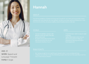
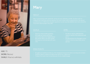
Infographics for PhD research thesis on aphasia
Background
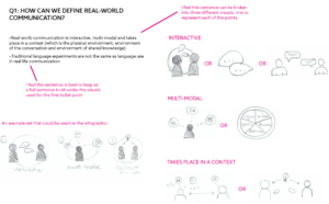
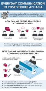
The client for this project is Willemijn Doedens, a PhD student in the School of Psychology and Clinical Language Sciences at the University of Reading. With a background in speech and language therapy, the client’s PhD research focuses on aphasia. Aphasia is a language and speech impairment occurring as a result of brain damage. Her research conclusions explore how real-world communications can be defined, how they can be clinically tested and the findings of her research experiments.
Restated Brief
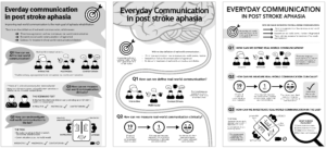
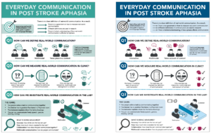
The client requested two infographics to summarise the conclusions she has drawn from her research project. The main infographic would be included within the research thesis, acting as a visual break from the written content. The second infographic would be used on social media to summarise the full infographic and promote the publication of her research paper. The crucial aim of the project was to make the infographics “aphasia-friendly”, so the client could share the research results with the participants of her experiments, who have aphasia. Although the main infographic was due to be submitted as a physical copy, COVID-19 meant that the client’s final thesis submission was digital. As a result, both deliverables for this project became digital files, with the view to being included within a printed thesis at a further date.
Design Process
Research
At the core of this project was gaining an understanding of how to design for those with aphasia. With little knowledge of aphasia, myself, collaborating with the client to gain an insight into the subject area became a vital tool for my research. Alongside discussions with the client, turning to the Stroke UK website, I came across resources directed at designing for those with aphasia. From this research, I gained far more perspective on the direction I would need to take the designs to make the infographics “aphasia-friendly”. For example, those with aphasia understand documents best when each part of the text is supported by a diagram.
Although designing for those with aphasia was key to this project, it was important to assess all the different users of the infographics. Creating user personas, it became clear that the design was directed towards those with both scientific knowledge of aphasia and the general public. As a result, the written content for the infographic became key to creating a successful design.
Content Transformation
Due to the scientific nature of this project, the client provided the copy to be used for the infographic. However, the copy was around 1500 words and needed to be reduced significantly whilst maintaining its academic integrity. Working in collaboration with the client, I worked to break down the content into digestible sentences. This was particularly challenging because in order to break down the content, I had to read it through many times and discuss it with the client to gain a basic understanding of it myself. Once I had gaining some basic understanding, I was able to work on reducing the content down into a more condensed format. However, as I had spent time discussing the content before condensing it, it was hard to gauge whether the content would make sense to someone who hadn’t read the original copy. Therefore, testing became vital at this stage of the process and I carried out many informal reviews of the content with family and friends. Through this testing, it became clear which parts of copy made sense and which didn’t. I also found it very beneficial to ask others to explain what they thought each part of the copy meant so I could compare their understanding to the original copy and see which parts were being misunderstood.
Illustrations
Alongside working on the written content, I worked on designing the illustrations to go with the copy. This was key to this project as much of the original copy could be translated into diagrams, saving many words and making the design far more aphasia-friendly. Working on the copy and illustrations simultaneously allowed me to adapt the content efficiently and reach a set of illustrations and copy which reflected the original 1500 words effectivity.
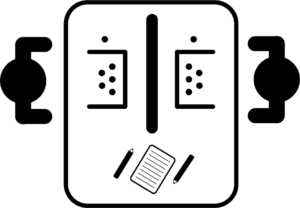
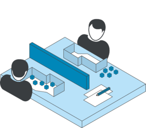
The client expressed an interest in having the experiment setup translated into a diagram but had no other specific requirements for the illustrations or styling. As a result, I researched into different styles of illustrations used for scientific content and examined different approaches that could be taken. With the key focus of the infographic being to make it easily understandable for those with and without aphasia, I decide that the most appropriate style for the illustrations was flat 2D vectors. However, for the experiment setup I trialled and tested both a 2D and 3D setup which led to the 3D diagram being used for the final design. This was due to the 3D version being more easily understood as users could see that the middle bar was a barrier without the need for a label.
Initial Layout Ideas
Having worked on the copy and illustrations to be included within the infographic, I worked to mockup three different layouts for the infographic. The client did suggest she wanted to avoid a design which looks like a scientific poster, so layout 3 was originally not the favourite. However once I had explained the benefits of layout 3 for those with aphasia, this was the design taken forward.
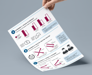
Data Interpretation
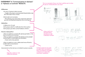
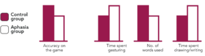
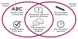
One of the hardest parts of the design process was creating illustrations for the experiment results. This was because the client didn’t want to use physical data on the infographic as it would be too complex for those with aphasia to understand. She did however really like the idea of using graphs to display the results. As a result, we had some long discussions about the use of graphs, as generally people assume graphs to accurately represent data. For this infographic though, these graphs would simply be a visual representation of a difference in results between the two groups of the experiment. Consequently, I provided the client with some different options for making the graphs as appropriate as possible and also an alternative Venn diagram. With these options the client did decide to use the bar and line graphs, in the knowledge that they are a visual representation not accurate bar graph. As a result, the graphs were changed and refined many times.
Use of colour
The client expressed the importance of having a reasonably simple colour scheme for the design to meet the needs of those with aphasia and suggested a plain white background would be most appropriate. I explore a few varying colour schemes, before coming to a scheme which took inspiration from scientific poster whilst also providing enough variation to make it stand out. I also explored the use of colour to benefit those with aphasia, for example, repeating the set of three red icons throughout the infographic to reinforce the main three parts of real-world communication.
Social Media Infographic
Having finished the infographic to be included within the thesis, I worked to design a summary version for use on social media. This was more challenging than I had anticipated, as I had to consider the context in which this social media version would be read. After making many edits to the copy for the summary, I arrived at a concise design which featured enough information to explain the research subject area to someone who would not have read the thesis itself.
Final Deliverables
The final deliverables were produced as digital files, with the main infographic being placed into the client’s research thesis and the social media version ready to be published on twitter (once the thesis is published next year). Below are the final outcomes of the project.
Reflection
When this project began, I felt quite daunted by the idea of working by myself having not completed one of these projects before. As a result, the working relationship I developed with the client, from the offset, was very important to me. From our first meeting, I felt very comfortable working with Willemijn on this project. As an academic herself, she recognised that my strength laid with the design of the infographic and avoided biasing my ideas with her own. At first this left me feeling very lost with endless ideas and options for the infographics, but by the end of the project I realised that as a result of her open views on the designing process, I felt far more confident in my own ability to design a successful outcome. Additionally, having to work through my ideas without the help of a team, I found that I became more confident in explaining my ideas to others and working through constructive feedback from both the client and my supervisor.
Having always struggled with time management, completing this real client project motivated me to stick to a schedule. Planning became vital for this project, particularly during the content transformation stage. I underestimated the amount of time that I would need to transform the content for the infographic. However, by working in collaboration with the client, I was able to transform the long content into a digestive amount of information which was appropriate for the general public and those with aphasia. Following this slight set back, I was a little rushed at the end of the project. But, thanks to the strong communication I developed with both the client and my supervisor, I was able to successfully finish the project on time.
Overall, I found this project extremely rewarding as it has given me more confidence in my ability to communicate with clients, execute my own ideas and work to a deadline. It was also lovely to know that my views on how the project went were replicated by my client, who provided me with some lovely feedback on submission of the final outcomes:
“You really understood the research from the start, and you were able to capture the key elements of the project right away. I thought the whole design process and collaboration with you went really well – above and beyond what I could have expected”
A Survival Guide to an Emotive World
Background
Young adults with a learning disability may struggle to go to university, not due to a lack of skills but due to confidence issues. Being a student studying Graphic Communication is exciting and where you experience unique things that are not known to people who aren’t students. Opening these young adults eyes to the graphic design world and life being a student, hopefully will build their confidence to be bolder to taking new opportunities.
Restated Brief
Objectives
The aim of this Real Job was to write and present a talk that explained my passion for graphic design and being a student. This needed to be presented in an engaging way that would trigger enthusiasm within the audience. I believe I was successful in achieving this as the students were responding to the presentation content throughout and some asked questions at the end.
Deliverables
The deliverables of this project were somewhat unique for a Real Job as the design work involved using a template that the client provided. The outcome of the project acted as the deliverable, this being the presentation slides. The presentation lasted 30 minutes and needed to cover the topics that were agreed and discussed with the clients. The content of the presentation was: Myself & Design, what is design that including examples of a film poster project, infographics, data visualisation and pictograms. These topics were chosen as they were able to be related to by the audience despite having no background knowledge to graphic design. The film poster project being specifically relatable as the films chosen were well known. There was discussion of a hand out however, considering the time restriction this was agreed not to be included.


Schedule
Due to the project being presented in the Easter holidays the client was flexible with the date of the presentation. I had the choice of three Fridays (the day that sessions were scheduled), my presentation was scheduled for the 17th April.
Process
Initial contact with the client
The initial meeting with the client was via Zoom so I was never able to meet the client face to face. However, the meetings were very relaxed and efficient as the client was clear with their objectives.
The client and myself maintained good communication, although we could’ve perhaps set a certain time each week to touch base because it was such a short project, there wasn’t time for mistakes. On the whole I felt this worked well. The client was clear with what she wanted to achieve and this was all outlined well in many exchanged emails. Overall, I felt that I worked with the client in a professional way where their vision was achieved.
Research
My audience were mostly adults aged 18–35 with learning difficulties who did not have the opportunity for university or further education, this being due to self-confidence problems. Every Friday, sessions are run for them to gain insight into a specific field that differs each week opening them to more opportunities. I needed to ensure that the presentation was appropriate and simple to understand, not bombarding them with too much information. The appropriateness for the audience was a way to manage the success as was measured by the engagement and enjoyment of the audience. To make the presentation engaging, I made sure that I covered a few topics in depth to fully explain to the audience the different processes and examples of graphic design, providing consistent structure to the presentation.


Design and Development
After deciding the content that I wanted to include I had to organise this in an appropriate and methodological way. Despite being given a template by the client I still had to design the slides so that they appeared intriguing yet clear to my audience. One challenge I did face was ensuring that the script was coherent to the slides and that everything I spoke about was demonstrated on the slide. To create a clear structure of my presentation I added an introductory slide that acted as a contents page to inform the audience what I will be speaking about. This helped me to create sections within my presentation ensuring that I spent an equal time on each topic. Conforming to a template was useful as it ensured that the students were familiar with the format and were forced to focus on what was on the slide rather than a new design.
Trello
Trello allowed me to organise and present my ideas effectively. I now have a better understanding of Trello so I am now able to use it more efficiently. Throughout this project I was able to upload developments of my work, explaining the rationale behind my decisions. I altered the checklists on Trello to suit my project, this helped me to manage my time well and to ensure I had achieved the requirements of the client. The Trello board also ensured communication with my supervisor so that they also were able to monitor my progress.
Final Stage
Feedback
The instant feedback that I gathered after completing the presentation was that the students asked some questions throughout showing that they were engaged. One student also stayed behind on the call to ask me some feedback on a website he had created, where he has put together a gaming portfolio to show to possible jobs related to gaming. The client also phoned me the following week to provide me with some feedback, she felt that my presentation remained professional whilst ensuring interaction with the students. It was also mentioned that reading from a script can sometimes make engagement hard but this was fine as I was able to come away from the script in order to speak directly to the students. Overall the client was pleased with my presentation and she felt that the students benefitted from my Student 101 greatly.
Reflection
Time Management
This was my first Real Job that I have completed so far. I feel as though I learnt many things this term, where I had to manage many other projects alongside this having to make my own decision as to when to prioritise different work.
Communication Skills
I found it insightful presenting to strangers where I was able to convey my passion for graphic design. It definitely benefitted me working on this project alone as it became a personal journey through the presentation where I essentially had the chance to showcase some of my favourite projects. This project will definitely help me when I have to present in the future whether this is at university or in my professional career as this was the first time I presented to strangers.
COVID-19
The deadline had to be met as the client and her students were relying on me to deliver my presentation on a specific date. The initial plan was for myself to come to Reading in the Easter holidays and to present in person, however due to Covid-19 this was changed to a Zoom presentation. I was initially unfamiliar with the software, however after doing practice presentations I felt more confident. Zoom did not restrict or limit my presentation but the challenge of engaging the students became harder as it was a greater challenge to give a talk that engaged people who were not in the same room. To try and help this I asked questions throughout the presentation at the end of each topic, rather than waiting till the very end where I opened them up to asking questions.
Personal Journey
Retrospectively, the outcome of my final presentation was pleasing and I was encouraged by the response of the students. I really hope that this benefitted the students and that I provided them with some confidence to explore graphic design and further opportunities in this field. My eyes were opened by one of the student’s website that he had designed by himself in his free time, seeing his passion was very uplifting as I became aware that I had pushed him to be confident enough to share his work with me. I thoroughly enjoyed this project working with the client and supervisor, where the final outcome was not just impactful on the audience but also myself. This unique project was quite refreshing taking me away from physical design work, making me think about why I am really passionate about graphic design.