
Background
The client for this project is Willemijn Doedens, a PhD student in the School of Psychology and Clinical Language Sciences at the University of Reading. With a background in speech and language therapy, the client’s PhD research focuses on aphasia. Aphasia is a language and speech impairment occurring as a result of brain damage. Her research conclusions explore how real-world communications can be defined, how they can be clinically tested and the findings of her research experiments.
Restated Brief
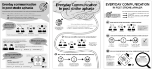
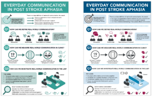
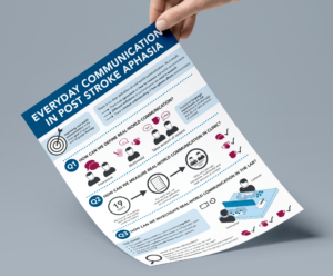
The client requested two infographics to summarise the conclusions she has drawn from her research project. The main infographic would be included within the research thesis, acting as a visual break from the written content. The second infographic would be used on social media to summarise the full infographic and promote the publication of her research paper. The crucial aim of the project was to make the infographics “aphasia-friendly”, so the client could share the research results with the participants of her experiments, who have aphasia. Although the main infographic was due to be submitted as a physical copy, COVID-19 meant that the client’s final thesis submission was digital. As a result, both deliverables for this project became digital files, with the view to being included within a printed thesis at a further date.
Design Process
Research
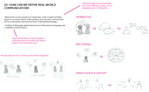
At the core of this project was gaining an understanding of how to design for those with aphasia. With little knowledge of aphasia, myself, collaborating with the client to gain an insight into the subject area became a vital tool for my research. Alongside discussions with the client, turning to the Stroke UK website, I came across resources directed at designing for those with aphasia. From this research, I gained far more perspective on the direction I would need to take the designs to make the infographics “aphasia-friendly”. For example, those with aphasia understand documents best when each part of the text is supported by a diagram.
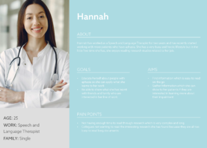
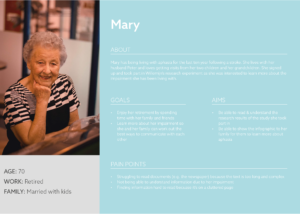
Although designing for those with aphasia was key to this project, it was important to assess all the different users of the infographics. Creating user personas, it became clear that the design was directed towards those with both scientific knowledge of aphasia and the general public. As a result, the written content for the infographic became key to creating a successful design.
Content Transformation
Due to the scientific nature of this project, the client provided the copy to be used for the infographic. However, the copy was around 1500 words and needed to be reduced significantly whilst maintaining its academic integrity. Working in collaboration with the client, I worked to break down the content into digestible sentences. This was particularly challenging because in order to break down the content, I had to read it through many times and discuss it with the client to gain a basic understanding of it myself. Once I had gaining some basic understanding, I was able to work on reducing the content down into a more condensed format. However, as I had spent time discussing the content before condensing it, it was hard to gauge whether the content would make sense to someone who hadn’t read the original copy. Therefore, testing became vital at this stage of the process and I carried out many informal reviews of the content with family and friends. Through this testing, it became clear which parts of copy made sense and which didn’t. I also found it very beneficial to ask others to explain what they thought each part of the copy meant so I could compare their understanding to the original copy and see which parts were being misunderstood.
Illustrations
Alongside working on the written content, I worked on designing the illustrations to go with the copy. This was key to this project as much of the original copy could be translated into diagrams, saving many words and making the design far more aphasia-friendly. Working on the copy and illustrations simultaneously allowed me to adapt the content efficiently and reach a set of illustrations and copy which reflected the original 1500 words effectivity.
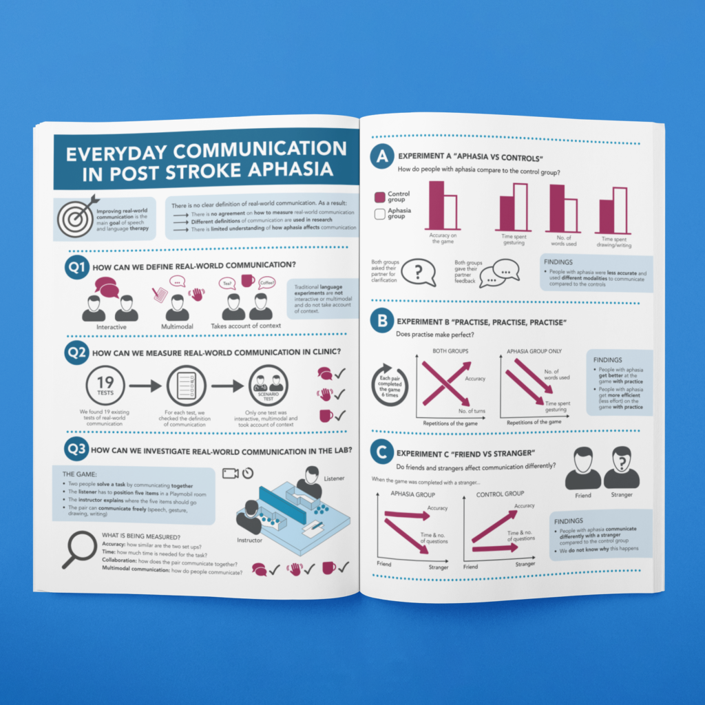
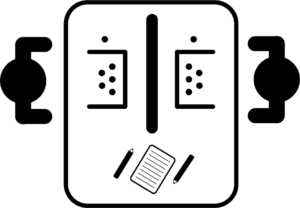
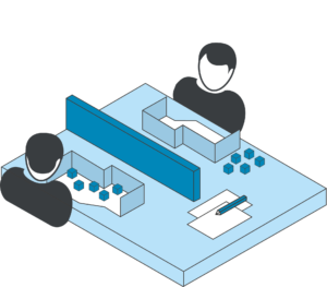
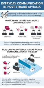
The client expressed an interest in having the experiment setup translated into a diagram but had no other specific requirements for the illustrations or styling. As a result, I researched into different styles of illustrations used for scientific content and examined different approaches that could be taken. With the key focus of the infographic being to make it easily understandable for those with and without aphasia, I decide that the most appropriate style for the illustrations was flat 2D vectors. However, for the experiment setup I trialled and tested both a 2D and 3D setup which led to the 3D diagram being used for the final design. This was due to the 3D version being more easily understood as users could see that the middle bar was a barrier without the need for a label.
Initial Layout Ideas
Having worked on the copy and illustrations to be included within the infographic, I worked to mockup three different layouts for the infographic. The client did suggest she wanted to avoid a design which looks like a scientific poster, so layout 3 was originally not the favourite. However once I had explained the benefits of layout 3 for those with aphasia, this was the design taken forward.
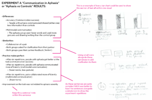
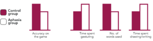
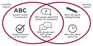
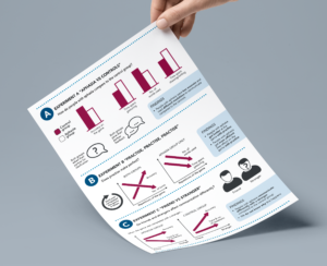
Data Interpretation
One of the hardest parts of the design process was creating illustrations for the experiment results. This was because the client didn’t want to use physical data on the infographic as it would be too complex for those with aphasia to understand. She did however really like the idea of using graphs to display the results. As a result, we had some long discussions about the use of graphs, as generally people assume graphs to accurately represent data. For this infographic though, these graphs would simply be a visual representation of a difference in results between the two groups of the experiment. Consequently, I provided the client with some different options for making the graphs as appropriate as possible and also an alternative Venn diagram. With these options the client did decide to use the bar and line graphs, in the knowledge that they are a visual representation not accurate bar graph. As a result, the graphs were changed and refined many times.
Use of colour
The client expressed the importance of having a reasonably simple colour scheme for the design to meet the needs of those with aphasia and suggested a plain white background would be most appropriate. I explore a few varying colour schemes, before coming to a scheme which took inspiration from scientific poster whilst also providing enough variation to make it stand out. I also explored the use of colour to benefit those with aphasia, for example, repeating the set of three red icons throughout the infographic to reinforce the main three parts of real-world communication.
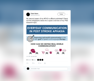
Social Media Infographic
Having finished the infographic to be included within the thesis, I worked to design a summary version for use on social media. This was more challenging than I had anticipated, as I had to consider the context in which this social media version would be read. After making many edits to the copy for the summary, I arrived at a concise design which featured enough information to explain the research subject area to someone who would not have read the thesis itself.
Final Deliverables
The final deliverables were produced as digital files, with the main infographic being placed into the client’s research thesis and the social media version ready to be published on twitter (once the thesis is published next year). Below are the final outcomes of the project.
Reflection
When this project began, I felt quite daunted by the idea of working by myself having not completed one of these projects before. As a result, the working relationship I developed with the client, from the offset, was very important to me. From our first meeting, I felt very comfortable working with Willemijn on this project. As an academic herself, she recognised that my strength laid with the design of the infographic and avoided biasing my ideas with her own. At first this left me feeling very lost with endless ideas and options for the infographics, but by the end of the project I realised that as a result of her open views on the designing process, I felt far more confident in my own ability to design a successful outcome. Additionally, having to work through my ideas without the help of a team, I found that I became more confident in explaining my ideas to others and working through constructive feedback from both the client and my supervisor.
Having always struggled with time management, completing this real client project motivated me to stick to a schedule. Planning became vital for this project, particularly during the content transformation stage. I underestimated the amount of time that I would need to transform the content for the infographic. However, by working in collaboration with the client, I was able to transform the long content into a digestive amount of information which was appropriate for the general public and those with aphasia. Following this slight set back, I was a little rushed at the end of the project. But, thanks to the strong communication I developed with both the client and my supervisor, I was able to successfully finish the project on time.
Overall, I found this project extremely rewarding as it has given me more confidence in my ability to communicate with clients, execute my own ideas and work to a deadline. It was also lovely to know that my views on how the project went were replicated by my client, who provided me with some lovely feedback on submission of the final outcomes:
“You really understood the research from the start, and you were able to capture the key elements of the project right away. I thought the whole design process and collaboration with you went really well – above and beyond what I could have expected”