
Background
Red Emerald is a new business that aims to advise and support leaders in universities, colleges and government bodies on internationalisation strategies and activities. For example, supporting university students in achieving their goals to engage in an international experience indirectly through university staff. Red emerald also advises international students and their parents, wanting to study in the UK or UK students wanting to study/work abroad. The company with hold conferences with government bodies for which they will supply reports and other reading materials.
Restated Brief
Our aim was to create a brand identity for Red Emerald, that would appeal to the company’s broad target market. The brand needed to be consistently identifiable across all design outcomes whilst complimenting the different formats required. Competitors currently in the market mostly have a typographic logo, with a fairly muted colour scheme. The few that have a graphic logo reference a globe illustration, which our client wanted to avoid for individuality.
What we agreed to design:
- Logo
- Business cards
- Letter & Report Template
- Presentation slides template
Communication and Schedule
We were able to keep in touch with Charlene for the most part throughout the project, but there were times where we would not be in contact for a while due to the success of the business. This meant the proposed schedule was delayed; however, we kept our supervisor and the Real Jobs team up to date by attending Real Jobs meetings and staying in contact via email.
Delays in client meant that we could not meet the original deadline date for the project, we felt her feedback was crucial to creating successful outcomes that satisfied her expectations. However, the extended deadline allowed us more time to contemplate and make improvements to each of the design outcomes, so we do not feel that this had a negative impact on the work produced. An extension date was never finalised between the client and us, but our main priority was to ensure the client was happy with the final design outcomes. More consistent communication between Charlene and us may have enabled us to finish the project on time.
Research and ideation
Red Emerald currently has few competitors. In our initial client meeting we looked through some of their logos and discussed why we thought they were or were not successful. This helped us later in deciding the approach we wanted to take to our own design work. Most of the logos used a single block colour which was extended throughout their branding material, while others chose more intricate designs that featured shading to create a 3D effect. We also considered how each brand had a slightly different target market which led us on to identify the different user groups for Red Emerald and create user personas to represent these.

We explored some of our design ideas by creating mood boards. We took two approaches to this, the first explored the more blatant theme of creating a brand related to the individual words in the name: ‘red’ and ‘emerald’. On this board we explored different emerald cuts and shades of red, combined with a contemporary approach to typography using sans serif fonts.


On the second board we explored a subtler approach covering a floral theme as our client informed us that red emerald is also a plant. On this second mood board we looked at floral fonts that also incorporated a vintage aesthetic as this was something the client has also expressed an interest in.
Design Process
Logo
The client had a lot of input in the design of the logo with regard to their own ideation. In our initial meeting she provided us with a few sketches which we later used to brainstorm an array of initial sketches for further development. Charlene had expressed interest in using a floral theme throughout the branding which we found quite tricky as we needed to ensure that the logo was not gender oriented, so the nature of the business was not misidentified. We created a range of initial sketches on paper and then Adobe Illustrator to explore the possibilities of combining aspects of both of styles explored on our mood boards. A range of graphic elements were explored in this stage of the design process including; textures, colour gradients and shadows, but initial feedback led us to decide that block colour logos had the most impact. Block colour also did not compromise the legibility or clarity of the logo when adapted to different scales for the required documents and interfaces.
Charlene always kept us up to date with feedback she received from her colleagues regarding our ideas for the logo. To ensure Red Emerald presented a brand image that was appropriate to be presented to Government Organisations we quickly veered away from the original classic vintage style with serif typeface and moved towards a more contemporary style with a sans serif typeface. Floral elements no longer felt appropriate and we required a deeper exploration of the emerald cuts and shapes associated with them. This enabled a clear direction for ongoing development.
We explored typographic logos using the initials of the company but later decided this could be confusing for clients so we concluded that having the full name Red Emerald alongside the logo image would be more effective especially while the business is establishing itself.
Combining the text with image was one of the most challenging aspects but also helped to determine which was the strongest design. The design chosen provided us with a diamond graphic that fit comfortably alongside the name of the business and presented a corporate aesthetic which met the client’s needs.
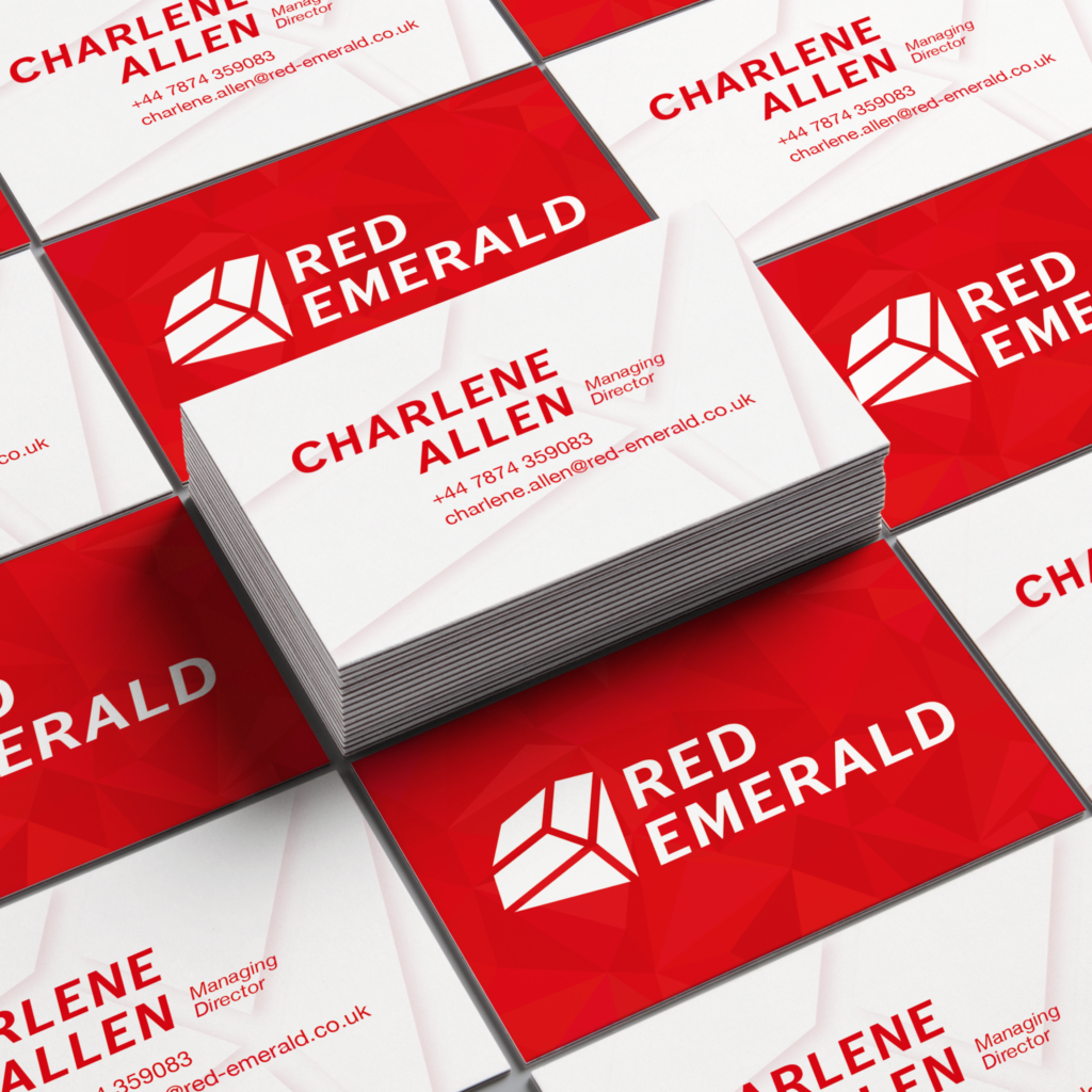
Business cards
We initially took a more personal approach to designing the business cards and considered styles and patterns that Charlene had liked from our first logo designs. While dismissing the floral theme for the logo, we considered there may be an opportunity to incorporate it into the business cards to achieve this. However, we later decided, based on feedback from our supervisor and client, that while this was a valid experiment the outcome was not successful.


Developing the business card design involved exploring the possibility for a variety of layouts both portrait and landscape. As the project progressed, we began to think more about how the business cards could tie in with the other design outcomes. We ended up with a faint polygon pattern behind the logo on the front of the business cards which was then used on the report and letter template. The final business card design allowed for two text layout options on the back, one displayed the information that Charlene has available to her now and one shows the information that the business will have in the future once it is set up. The client decided to get the business cards printed using an external printer, so we created the appropriate files to enable her to do this. We discussed a variety of print finishes and in the end we chose a spot UV finish for the logo.
Report template
The primary function of the Report was to present information to a range of clients by aesthetically supporting the written content without distracting from it. We discussed with the client the kind of content that would be in the report to establish what components we needed to design. It was agreed that we would supply a range of paragraph styles to support hierarchy within the text and create a style for tables and charts, along with a colour scheme.


The final report template allows the client to add an image to the front cover or keep the logo watermark as shown. The paragraph styles present a range of heading options using fonts that are available on Microsoft Word and Apple Pages on multiple devices, to avoid complications when the template is being used by Charlene’s colleagues.
Letter template
The letter template was one of the last outcomes we designed, it was easy to create a successful design once the final logo had been confirmed. The polygon design used in the business card was recreated in the form of a banner which was positioned at the top of the page to help form the consistency in the brand that was required. The main difficulty with designing the letter template was that it introduced typographic restrictions as we had to consider the traditional layout of a letter and consider that most of the information would ideally sit on one A4 page. As with the report template, the letter template included types that are available in Microsoft Word and Apple Pages on all devices.

Slide show template
When designing the Presentation, the first consideration was to ensure coherence of the branding we had carried through the other documents. Using the red from the colour scheme and inspired by the geometric pattern used in the diamond graphic of the logo we began to create some slides incorporating the chosen serif typeface for the brand. In our first drafts of the Presentation slides the font was too small when we considered that presentations generally don’t contain large bodies of text and must be legible from a longer distance.
Progression of the design in the other documents, gave headway to the development of the Presentation, elements such as the subtle watermark and red polygon pattern on the business cards were brought in to keep consistency throughout, as well as the logo. We were unsure for a while what the best approach to the presentation slides was, so we had a range of options for the client to choose. From our Supervisor’s feedback we decided there was too many variants of slide backgrounds, and this surplus of choice was unnecessary as well as confusing for the user who really only needed one maybe two options. Peer feedback also implied that the all red background was too overwhelming on the eye, especially when considering the slides are likely to be presented on a large screen. The slide backgrounds that were decided on was a combination of the watermark and banner which influenced largely to mirror the report design.

The final important changes made, included the placement of the logo which needed to obtain to the agreed bordering space outlined in the brand guidelines and secondly it had to be exactly the same size and placement on all the slides. The watermark felt too opaque and infringed upon the editable presentation copy, so the transparency was increased to amend this.
Reflection
This project has given us a great insight into the design process for creating a brand identity. In each stage of the process the challenge of brand consistency presented itself which often meant that we had to rethink the logo or the fonts we were using. Better analysis of who we were designing for and what the company’s main activities are, would have helped us make more informed design decisions. We had a lot of ideas at the start but there are some styles we didn’t explore, and we could have created more initial sketches that potentially would have helped us decide on a final logo sooner.
“It has been a real pleasure working with both Aoife and Hannah. They have both been incredibly helpful with their thoughts, ideas and creativity. I have appreciated their suggestions being both creative but also academic in what works and what doesn’t work from a design learning perspective. They have always been willing to make changes and trying to come up with solutions that both work from a design perspective and what works for me as a client. They have always been quick to respond and have been very patient (as I haven’t always been able to respond as quickly!).
Their design work has been received very positively from the small market research I did as part of the development process. Comments received included ‘clean and bold’ ‘love the colours and how simple but affective the logo is’ and ‘It represents you really well…it will be attractive for your markets” – Charlene Allen, Managing Director of Red Emerald.