The first mini project in design practice 1 module, to design an ideal gift to our partner base on three of their fun facts.
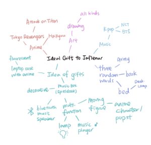
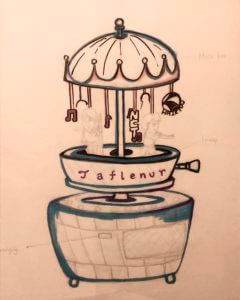
As my partner is a k-pop, anime and art lover, I first come up with the idea of designing a spieldose (music box) with moving anime characters. Fortunately, this idea is adopted and developed further into my final design.
In the developing stage, I have given three random words of ‘Army’, ‘Books’ and ‘Bed’. Nevertheless, I only chose ‘Bed’ as it is associated with an extended idea of a multi-functional desk lamp slash Bluetooth music player, which fitted with modern design, also best to play as a ‘Bedtime Toy’. By connecting her favourite k-pop music, switching on the aesthetic moving machine with anime characters, as well as a desk lamp for lighting purposes, it becomes her ideal gift.
Although the gift has multi-functions that suit her fun facts, the model may be too complicated in manufacturing. On the whole, some adjustments with the colour scheme and simplify modelling will be needed if it turns into an actual product.
After discussing three unusual/interesting facts with your partner, use these to design an ‘ideal gift’ for them using the ‘Double Diamond’ design process (Discover, Define, Develop, Deliver) by the Design Council .
Initial Ideas
The three facts I was given about my partner were:
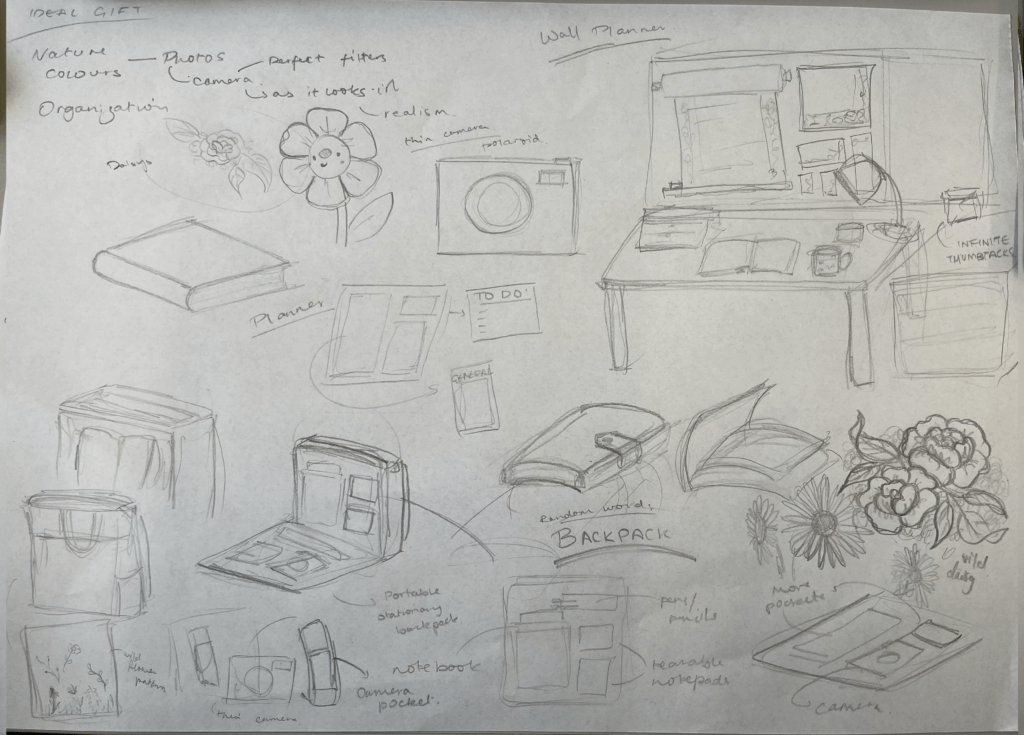
She likes things to be organised, yet she herself just uses scraps of paper to make notes
She enjoys nature, the colours of it as well as its forms- and especially taking photos of it
Her favourite colour is blue
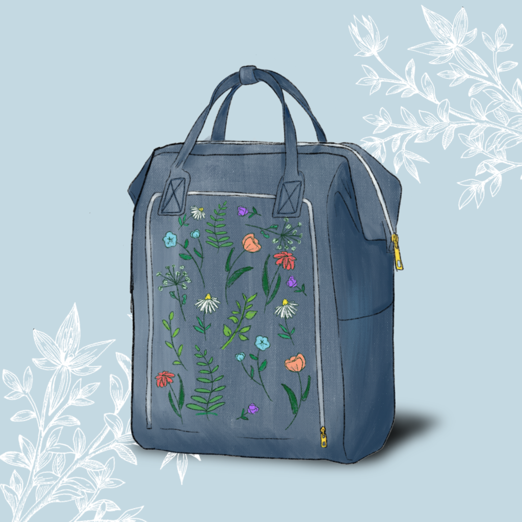
At first I considered going down a photography focused route by designing a camera that would take pictures exactly as she wanted. However it was difficult to incorporate the rest of her given facts into this. For this reason I decided to explore the fact that she likes things to be organised. I started this by thinking about the detail that she uses scraps of paper rather than a full notebook. This made me think of a wall planner to go above her desk with rolls of paper and small paper pads of varying sizes that she could tear off and use. To incorporate her love of nature, I added a wildflower design to the notepads to make the gift more visually appealing, and to create an overall theme for it.
Development
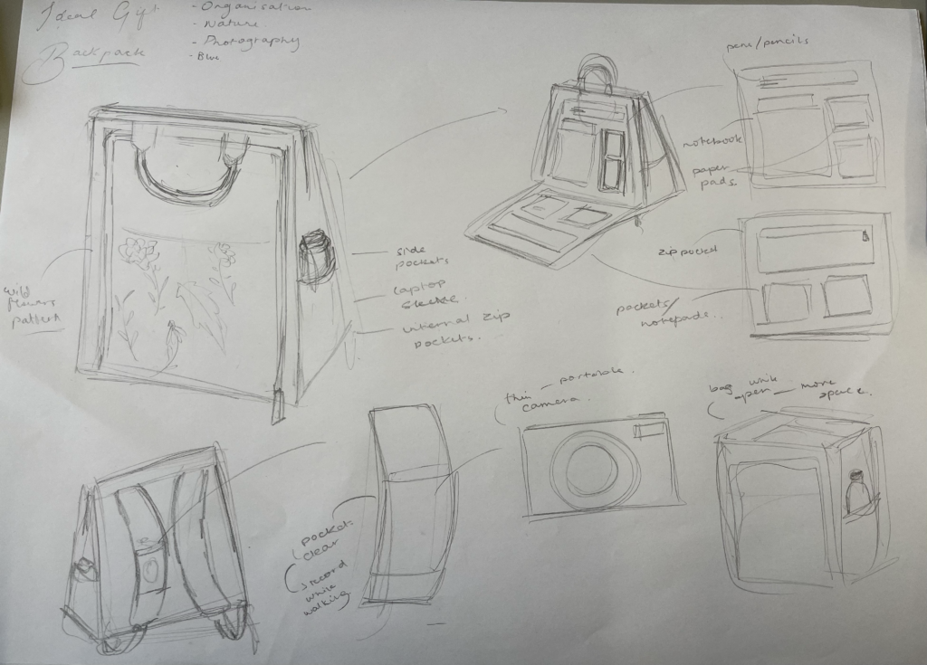
After finishing this design idea, I used the Random Word Technique so that I could develop this idea even further in more creative ways. The word I ended up with was BACKPACK. To incorporate this into my original idea, I took inspiration from a recently popular tote bag from IKEA which has gained a lot of attention for being versatile and practical. Using this bag as a starting point, I thought of ways to include a planner and camera into design. Rather than taking up the space inside of the bag for these, I thought of adding an extra pocket on the outside of the bad purely to hold small pads of paper, a notebook, pens, and pockets for anything extra. To include the photography aspect, I decided to add a small sleeve on the strap of the bag that could hold a slim camera, for example a Paper Shoot camera. Finally, to address her final fact- her favourite colour being blue, as well as her love of nature, I decided to make the bag blue, and add an embroidered wildflower pattern to it to add visual interest and adhere to her preferences.
Final Render
Initially I found it difficult to try and think of one object that could tie together three completely different facts, however I soon discovered that this was the goal of the project: to think outside of the box and generate creative solutions rather than trying to find something that already existed. For example. using the Random Word Technique was new and unfamiliar to me, but I it challenged me to explore different ideas and ways of experimenting during my design process.
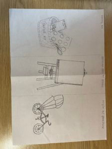
For this assignment, my partner’s name was Jess. The three facts she gave me were:
Enjoys art
Avoids cycling due to various injuries from it
Enjoys baking
With these facts, I drew a baking kit, an electronic easel where you can submit your work to an attached printer, and a bicycle with a parachute to avoid it ever flipping over. The electronic easel is personally my favorite if we had to choose just one.
Our first task was to create an ideal gift for someone we didn’t know, using three or more, fun or crazy facts about them. My partner was Luca, his facts were:
– Loves music (specifically Drake)
– Cooking (specifically carbonara)
– Is from Italy
– Loves basketball (Lakers)
My initial thought was to create a speaker and/or headphones in the shape of a basketball. I drew out a few sketches, but I wanted to be a bit more creative. I was thinking, if I did do the basketball idea, I wouldn’t know where to incorporate his love for cooking or his home country.
After some more thinking I came up with my final and complete gift. I created a lakers jersey where I added small details inspired by the facts I was given. For example, his age is the number seen on jersey and his sponsorships are from an Italian pasta brand (Barilla) and his home country. I also added an extra sponsorship from “Certified Lover Boy” (CLB) in the bottom right corner, which is Drakes new released album.
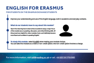
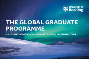
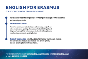
This branding project was for a new and upcoming module established by Daniela Standen, which will be part of what the University of Reading will soon be offering in the new academic year approaching. Our goal was to deliver a visual identity for the client which would essentially promote this new module. Our challenge was to make sure that collectively the final deliverables worked together using the same visual identity to promote and communicate across what the Global Graduates module has to offer for potential and existing students. By taking part, they have the opportunity to improve and extend the asset of skills they already have and take part in activities outside their subject to become a better citizen and stand out to future employers.
Brief
Both me and Hanorah worked on to create a cohesive brand identity across the three deliverables we agreed on with our client Daniela. We knew that to achieve this, we had to remind ourselves of the existing brand identity of the university itself to ensure this cohesiveness was implemented throughout all the final outcomes, whilst echoing the visual identity of the university. The set of deliverables agreed on were:
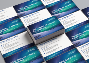
A set of postcards for each sub-module (x4)
A website banner (for the page corresponding to this programme on the university’s existing website)
A social media graphic (to be posted on platforms such as Instagram and Twitter)
These final outcomes were to be displayed ALL digitally, with the exception of the postcards which were to be printed as well to be handed out to new students during Welcome Week.
Research
User personas and needs
Establishing our target audience and generating ideas with them in mind was our first step. These outputs should promote the Global Graduates module to existing, new and global students and increase interest in taking part in this extra-curricular programme to build and enhance skills outside their degree course and academic development. We used the existing identity of the university and the brand guidelines provided by the client to ensure that the final outcomes echoed the identity of the university itself, whilst also bringing in a fresh and innovate design to distinguish the module. This approach ensured we targeted the user effectively – to have a professional design, whilst also keeping it fresh and engaging to attract the young people.
Visual references
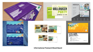
To give our client some design overview of what the final outcome could potentially be like, we decided to produce some mood boards for each deliverable. This got both parties to begin to think about appropriate genre, graphic style and typography treatment.
From the feedback we got from our client, she preferred the simpler designs (mood boards 3 and 4) We noticed a set of features used by both of these visuals alongside images we found for inspiration (for the other deliverables) which made them successful:
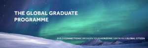
The background image has the most drama (instantly catches the audiences’ attention making them want to read the information.
Theme of photography and editing – a consistent style in terms of the imagery used and the way the images have been edited is a common theme. Experimenting with different depths and densities of the hue, saturation and the luminosity of an image can transform the images from looking dull and boring to them looking mesmerising and appealing to the younger audience.
Consistency of typefaces and sizing (use of the typeface Effra with minimal tracking)
The use of the different weights in the typeface differentiates the types of information which helps the audience navigate through the information better.
The use of white as the predominant colour for the typography acts as a nice contrast with the background colours.
The use of the university logo (typically placed on the right-hand corner – mood board 6) endorses the identity, again helping the audience to distinguish where it has come from.
Design developments
Postcards
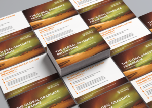
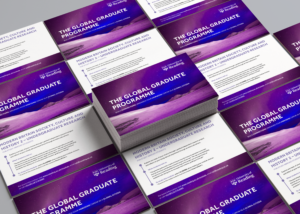
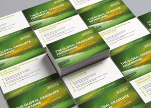
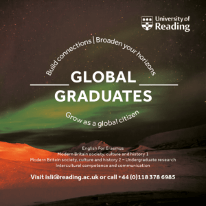
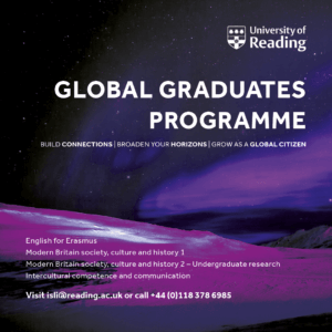
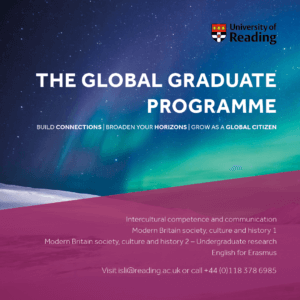
We had to produce a series of postcards which had a consistent visual identity across all, however still being differentiated by the different sub-modules. Our aim for our initial design (version 1) was to try and get all the elements (typography, imagery, logo) on the page. Although this design concept is neat, it was too simple, so our supervisor instructed us to add more innovativity to the design. As well as this, having this same background on all four postcards could make it seem as though they are all the same, when in fact they have different pieces of information behind them. When these are placed on a table at a welcoming event, students can easily assume this too and not pick them up. In light of this, we decided to edit the image we found on Pixabay, using Photoshop, inspired by the mood board we had made previously (mood board 4). After experimenting with different filters and luminosities, and changing the hue and saturations of the single image, we were able to compose four alike, yet different graphics which really helped make a big turn in our design developments (see graphics below).
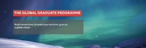
Postcard 2 shows a different layout of the elements with a more visual appeal. The timeline of the graphics draws the reader in and makes it more exciting to read as they are being guided through the postcard. We transferred the contact information at the back as the client wanted all the attention to be on the heading and slogan. We acted upon our feedback given by our supervisor to do something different with the slogan as the words had the ability to be manipulated in a way to be of more appeal. After capitalising the slogan and separating the phrases, we decided to increase the weight of the words “connections”, “horizons” and “global citizens” Accentuating these words intrigues and engages the audience as they want to have and be all these things. In the final outcome of the postcard (version 3) we also took out the anonymous icon graphic as it leaded towards the design getting overcrowded. We had to remember that when printed, it would be A5 and seeing all of this on such a small card can overwhelm the reader, leading onto them potentially showing no interest at all.
Postcard version 1
Background images edited for each postcard
Postcard version 2
Postcard version 3
Postcard mock-ups
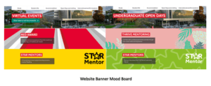
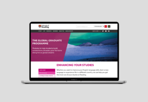
Website banner
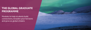
We began the website banner by taking inspiration from the existing page banners from the university’s website and implementing a similar style (website banner version 1) The red box around the heading was something we saw which came up quite frequently, however it did not collaborate, or work well with the design of the postcards. After we removed it, there was still something missing – we did not want to just replicate the design of the postcard onto the banner directly, it had to be a bit different. Therefore, we added a new element (shown in website banner version 3) with a left alignment and a lower opacity of the fill so that the background can show though. This enabled us to place the typographic elements easily also following a left-alignment. We decided to change the slogan as we thought that by writing a sentence would connect to the reader more and would act as an invite to the web page.
Website banner version 1Website banner version 2Website banner version 3Website banner mock-up
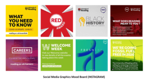
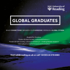
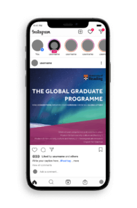
Social media graphic
Designing this deliverable was different as social media platforms need media which is firstly visual and secondly it needs to be easily read and accessible to readers. After completing version 1, we saw that it was difficult to read the small text due to the colour and how it sat on the background. We had taken the idea to surround the heading with a rectangle from the early stages of the website banner, however after being advised that we should use the same heading as the one on the postcard here too, this idea was not possible. Version 2 was also done in the early stages just for idea generation purposes as we felt as though giving the client more ideas to choose from was ideal for a better final outcome. This idea shows typographic manipulation; we wanted to make the shape of a globe, suggesting ‘global graduates.’ However, this idea was dismissed due to the heading we had to change and due to the fact how the white text did not sit right on this background either.
After further experimentation with the background and ensuring it shared the same visual identity as the postcards, we landed on our final idea (version 4) We thought that by introducing a background colour to the smaller text increased the legibility making it easier to read on a platform such as Instagram. All the elements here are left-aligned which cleans the design up, compared to the previous designs we had made which had multiple alignments which sometimes made the design messy and all over the place. We were advised by the client to change the university logo to the coloured-fill as it represented the university better in this context.
Social media graphic version 1Social media graphic version 2Social media graphic version 3Social media graphic version 4Social media graphic mock-up
Reflection
The series of designs we produced received positive feedback from the client and their team. We believe we have created a series of deliverables that work well as a set, but also fit their current theme on the website through the pink shape on the left (website banner and social media graphics). Our client was so pleased with the work we had completed for them that they made an additional contribution to the Real Jobs fund, which we were extremely proud of!
This job as a whole took a little bit longer to complete than we anticipated it would, however, we were told at the start that the submission date was flexible if the print deliverables were sent before July to work with the printing date. But, the digital submissions could be flexible. We feel as though because our project was over the summer, it was difficult as some people had been out of the office for the summer break. But this was all a learning experience for us, which has prepared us for the real world.
Top 10 tips from Ivalo Nedkov, a co-owner of Studio FourPlus, which is located in Sofia, Bulgaria. The studio specialises in branding and motion design.
In week 10 Baseline Shift welcomed back some graduates from the department who talked to us about their journey after graduation and current positions. Lined up we had book designer and art director Nikki Ellis, award-winning designer Anne Brady and 3D and 2D motion designer – Ed Hendry.
Nikki Ellis
‘It was fascinating and challenging, the books I worked on were varied.’ – Nikki Ellis
Nikki Ellis graduated in 2007 from a four year undergraduate master MDes course which was then offered by the department. When she graduated Nikki also managed to get a job as a result of the degree show at the end of her fourth year. ! The company was called Quadrille and it was a small publishing company which worked on books on food and drinks. She worked in Quadrille as a senior designer for 13 years. Nikki started as a design assistant, learning the ropes of book design in style sheets and layout. She designed cookbooks which she says were remarkably ‘challenging’ but interesting in their specific typography and text hierarchy. Nikki shared with us a few fantastic examples.
Chinese cooking book menu by Jeremy Pan, designed by Nikki.
This is a Chinese cooking book menu by Jeremy Pank; he wanted to make Chinese cooking accessible for everybody. There were lots of bullet points used in this book and icons, as the example above shows.
Another example of Nikki’s design of a cook book that included little art designs.
Another example was a book called ‘Porridge’, which allowed Nikki to experience being part of the photo shoot and also help out with it, which in her words was ‘amazing!’ Annie, the author of the book, wanted to have her book include her ‘art’, in the form of the porridge bowls she created like the one shown in the example above.
Niki’s experience in designing cookbooks made her better at typography, layout and page formatting, and the examples she brought in show her ambition in these aspects of design.
Nikki encourages designers not to force themselves to work within a set of rules and constraints but to have their creativity and ambitions go beyond limits and discover what their work without regulations and restrictions could be. An example of a principle Nikki uses within her work in designing books is making use of the colour black for fonts. Nikki also discussed another example: the line length in the text, which she tries to limit to no more than 13 words across, to suit comfortable reading. Some other things she looks out for are running feet, folios, subheadings, etc.
A Cook Book designed by Nikki.
However, Nikki has to comply with some rules, as the cookbooks are almost always distributed internationally, so there is a need to design in a way that is suitable for translation, and thus for different text extents.
Nikki’s main challenge when designing cookbooks is how to arrange content (images, recipe, commentary, notes) to create balance on the page to make it a user friendly reading experience.
One of Nikki’s examples of tight text, due to the big amount of bullet points or ingredients in text.
Space can be used to both separate and connect elements in a design, Nikki explained. Wider spaces separate elements from each other and narrower spaces connect elements to reveal relationships between them. The meaning of space is more critical than some consistent lining up for the sake of rigidity. Nikki has a stage for starting points, as in headings and subtitles but does not like to have a sense of constraint in her work. Therefore this is why she makes her own set of rules when designing a master page layout.
Cover of a cookbook (debossed title) – designed by Nikki.
‘Textured materiality.’ – Nikki Eliss
Cover design is also part of Nikki’s work. The example below shows a textured book cover with a background of a debossed grey rusty grain that Nikki designed, creating a debossed finish in the title.
These are some of the examples she showed in the session …
Anne Brady
‘I took a slightly different approach from Nikki.’ – Anne Brady
Anne graduated from the department in 1994, describing her experience at Reading as invaluable. Throughout her career, there have been a lot of changes in the design world and she says she has been trying to blend and merge her work into the digital world and has become much more interested in the dynamics of what digital delivery allows. Still, she says it was a great privilege to come from the printing background of the letterpress studios in Reading and understanding how typography (and technology) have developed over the last thousand years gave her a great headstart in her career.
Hired at the degree show by a studio called Jeffrey Design which only employed graduates of Typography and Graphic Communication, she considered herself ‘very lucky’ . She also said she learned and experienced the outside world of graphics through the Real Jobs she completed while at the department. Therefore, Anne suggested it is essential for us all to put ourselves into opportunities and collaborate in real work experiences while overcoming the challenges that will stop us achieving.
Through the studio she worked on a job at Cambridge University, with her boss back then – Sally. They designed the press sheet for ‘Cyclopedia Cambridge’. ‘It’s hard to imagine’, as Anne explained, ‘it was a 4000-page book which was separated into a series of editions.’ ‘It was an excellent piece of typographic design.’
After working with Sally for a few years, Anne was moved on to a job at the Museum of London, designing all of the marketing material including all of their publications and sometimes even organizing exhibitions. Her main task was to create exhibition designs and promote them. Anne enjoyed this experience and learnt a lot from the challenges.
‘As designers, we all have different skills.’ – Anne Brady
Anne returned to Dublin around 1998 and began working in a very corporate company – a design agency which worked on short films and TV shows. Anne was happy working there for about a year managing a team of 12 people. After that she decided to go solo and created her own design studio, called Vermillion, which is her focus to this day. It was hard at first when starting out but through the years she and her team started finding more and more clients and gaining their trust. Twenty-two years later, Anne’s team is still going strong, currently working on a chair exhibition for the National Museum of Ireland, working with the Department of foreign affairs and trade–designing lots of materials in 17 languages for 80 embassies around the world, which is fascinating. They are now also working on a book for the National Gallery of Ireland, which showcases all the paintings and artworks acquired by the Gallery over the last 15 years.
Photo of Anne’s team.
Anne shared this image (shown above) with us and with great pleasure and respect explained each person’s role in the team. Anne and her colleagues have worked as a team for ten years, creating a good collaboration, which is a very important aspect in the field of graphic communication. They are all different in terms of skills and abilities but working together makes a great team.
Anne’s ability was to always bring typography within a project but she also has some essential skills working with multimedia.
The National Library was one of their more significant clients as they have an incredible collection (National Library of Wales) Anne described the museum as one of the world’s leading museums of Islamic, Western and Eastern manuscripts.
Anne also talked about her experience in exhibition design. She shared with us that it is quite difficult to work with a living artist and design a cover for their exhibition. She and her team had an interesting experience when they put type on one of the artworks to create a poster for the exhibition and they had to design around 80 different variants of the poster before they got approved and published because a lot of Anne’s team’s designs were intruding too heavily with the artwork. As we all know, prototyping is always the key to success before launching. The National Gallery of Ireland was essential and one of the main clients they operated with, which made them have a good relationship with the studio.
The exhibition of the museum.
Anne’s team also worked on designing Dublin’s zoo map, as you can see in the image shown below. It was an exciting project the team worked on because most of the design decision were sensible, so they had to design the map and fix some of the icon errors.
These are examples of Anne’s team’s incredible work!
Dublin’s zoo map created by Anne and her team.
‘I have designed over 85 books for national and international publishing houses.’ – Anne Brady.
Ed Henry
Ed’ presentation was interesting since he has taken a very different, and more digital, career path. He now lives in Berlin and works as a senior motion designer at Delivery Hero. His work at the company mainly centres around creating motion designs and other types of promotion videos. However, what keeps Ed going is his obsession with music and 3D motion design. He has worked a lot with games and other animation projects for friends and colleagues who also work in the music industry. Ed shared his experiences and passion for his work and his motivations, which were astonishing to hear. The majority of Ed’s work in and out of his workplace is focused on 3D and motion design, including animations.
‘I found out that I could push myself to go into different directions.’ – Ed Hendry
Ed started his presentation explaining his experiences and flashbacks when he was at Reading University, which gave our students good ideas on how to use their time while studying.
Ed had the chance to go out and discover what drives his creativity and what pushes him out of his limits. One of his interests he discovered was motion design, which has a connection to 3D design. Motion design combines animation and motion typography and other types of fascinating video styles. After graduating, Ed managed to get an idea of what he likes and dislikes, which helped him get into the platform he is in.
Example of Ed’s work for a department project using 3D design.
Living in Berlin, Ed now works for an international company called Delivery Hero – one of the leading global online food delivery marketplaces. You can find more about them here: Delivery hero
Ed also had the opportunity to promote the company and design a new identity , using his skills and inspiration in 3D design and motion design.
Delivery Hero logo
‘This was a huge project that took me three months!’ Ed Hendry
As we all know, every project goes into our portfolio. This builds our recognition and progression from project to project.
However, unfortunately, it was not published by the his company due to technical problems. Still, Ed is very proud of his success in creating this type of motion design. The students learned a lot from his presentation including to even put work in their portfolios that did not get to be published. Certainly, this is for the sake of building your portfolio to show success ambition.
Ed is currently pushing his 3D work in slightly new directions, revisiting lettering, focusing on music and planning to get into VR sculpting!
These are some of Ed’s examples of 3D sculpting design.
Reflection
Nikki, Anne and Ed all inspire us to continue working and exploring what fascinates us – this will guide our way forwards! They suggested we all focus on building our social networks throughout our course, and seek internships and work experience wherever we can. We can also gain advantages by completing Real Jobs and getting a true insight into the industry of Graphic design, and especially client relationships.These things can empower us to develop a solid portfolio and be ready for full-time jobs.
Sometimes, students may not specifically know what interests them or what they want to do when they graduate, and that’s normal! If you have a dominant interest, you might aim to prototype your work project towards them during your experience on the course But it’s not expected that everyone recognises their destiny within the field. Research and explore, talk with our amazing tutors about your interests. By doing so, you will truly find your way.
Students’ Thoughts
‘Was really interesting to hear about different options for careers and the things past graduates have achieved!’ – Part 3 student
‘So many facets of design were covered, and it was so interesting to hear both the highs and lows of their projects. Just a nice reminder that even the big professionals have things go wrong sometimes!’ – Robin, Part 3 student
‘I really enjoyed learning about the guest speakers work and some of it was really inspiring.’ – Adam Powell, part 1 student

 Initially I found it difficult to try and think of one object that could tie together three completely different facts, however I soon discovered that this was the goal of the project: to think outside of the box and generate creative solutions rather than trying to find something that already existed. For example. using the Random Word Technique was new and unfamiliar to me, but I it challenged me to explore different ideas and ways of experimenting during my design process.