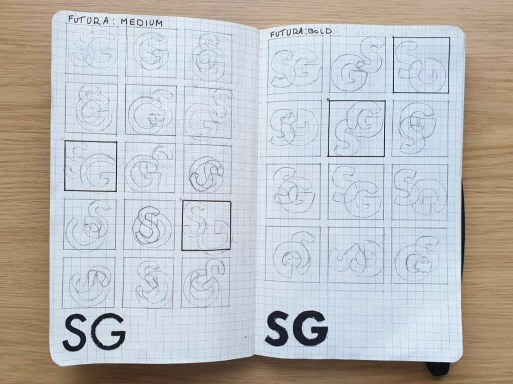
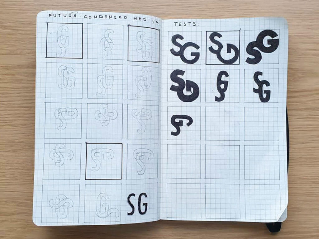
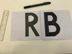
![]() The brief for this project required us to make and develop a representation of our initials, whilst using either the fonts Futura or Garamond. However, we did have the option to use both of these fonts simultaneously. For the start of this mini-project, I decided to draw a spread of sketches and brainstormed ideas to develop further. The whole purpose of this project was to create a monogram for the initials of our names. I personally chose the Futura font, as it is quite geometric compared to Garamond. This means that it would have been even more precise when I create the monograms with it.
The brief for this project required us to make and develop a representation of our initials, whilst using either the fonts Futura or Garamond. However, we did have the option to use both of these fonts simultaneously. For the start of this mini-project, I decided to draw a spread of sketches and brainstormed ideas to develop further. The whole purpose of this project was to create a monogram for the initials of our names. I personally chose the Futura font, as it is quite geometric compared to Garamond. This means that it would have been even more precise when I create the monograms with it.
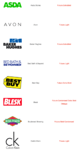
The main attraction with Futura for me, and why I chose it as a font is that it is one of the most geometric and linear. This means that it doesn’t have as many serifs as other fonts and as Garamond, therefore making it easier to create the monogram and was a lot more practical to produce my final design which was what the brief asked of us. I also took a lot of inspiration from certain brands that utilise and implement Futura into their Company names and logos. A few including; Gillette, Calvin Klein, Asda, etc. From looking at these fonts used by these companies, I gathered that they use very different weights and use either: ‘Medium’, ‘Bold’, and ‘Heavy’ for example. By doing this they ensure their logos and names are not stale and have variations and slight changes in the personality of the font.
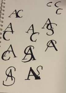
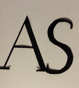
Development of initial ideas
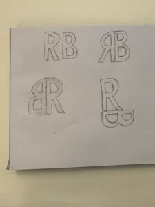

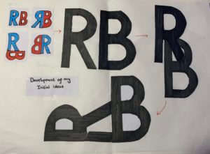
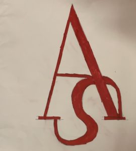
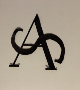
For the final design for this project, I tried to look at the future with a new perspective. By this I mean I used each of the individual letters to combine them both, for the initial designs I decided to look at the initials in an abstract way by putting the ‘R’ into the ‘B’. This then created a lot of options for me to flip and use different structures of the initials. I finally went for two colours, black and red which I did actually use for the first four initial ideas as well.

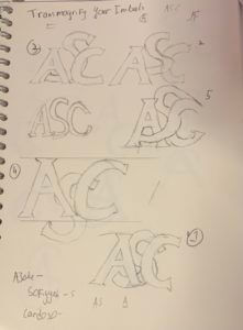 ram serif but later advised by Kim that 2 letters would be better and faster.
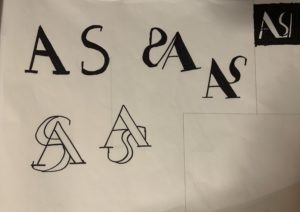
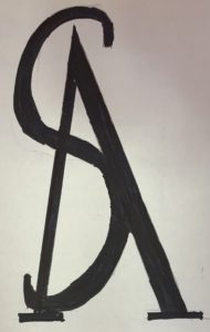
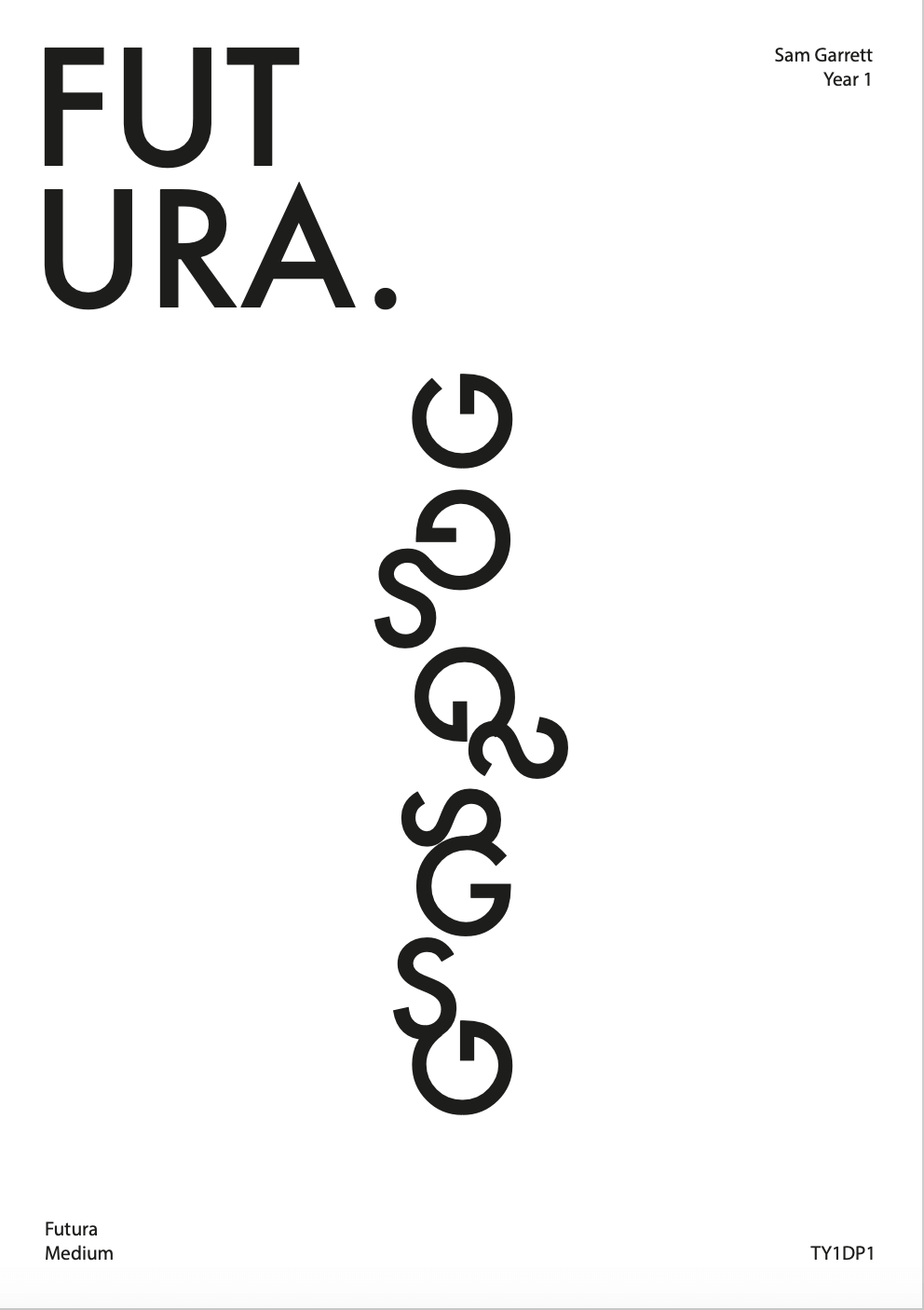
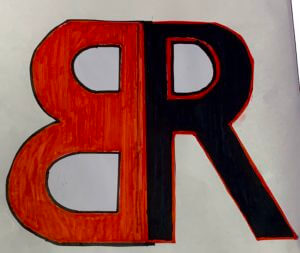
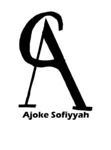 Final Work