RFL 01
Year: 2021
Extrapolating Type
Extrapolate means to “extend the application of (a method or conclusion) to an unknown situation by assuming that existing trends will continue or similar methods will be applicable”.
This is exactly what we were tasked to do, by looking at the letters and using the clues to work out what the other letters would look like. In this example the serif on the ascender of the “d” would be similar to that on the “n”. The letters “a”, “e” and “n” should all be the similar sort of height, reaching to just above the x-height.
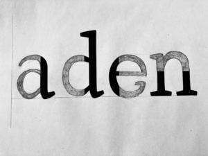 From this close inspection at the letter forms, I learnt that no “e” has a serif. The counter of both the “e” and “a” should roughly be the same space. This is to create balance and harmon within the typeface.
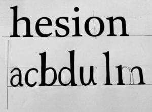 I found designing the rest of the letters, from the given letters, quite a bit harder than completing the letter form. How narrow or wide should the letter be? Where do the serifs go? What style should they be?
My letters are too thin, with not enough contrast between the thick and thin strokes. They are also too narrow, compare the “a” to the “e”.
From the exercise I learnt many things, I am happy enough to leave this to the type designer! But it made me more aware of the features, when blown up. Letters are usually only a few millimetres high, so the characteristics are so small to be noticed. When reading I hardly pay any attention to the typeface and the anatomy of the letters, but after spending a few hours really paying attention you notice these tiny difference in the characters.
Motion and branding for Sky Sports: Katarina Duvnjak
This week, the Baseline Shift team welcomed Katarina Duvjnak for a talk about her career in motion and branding for Sky sports, and her experiences after graduating from our department.
Branching out
After graduating in 2012, Katarina decided to study abroad for a semester in Australia. She went to Monash University, Melbourne, to study illustration. Shortly after that, through networking and successfully nailing the interview for Sky sports, she got into motion and branding design at Sky, even though she had little to no experience in using motion software at the time.

From these early steps as a graduate to an invigorating career as a senior designer at Sky Sports, Katarina learnt that developing multiple skills in different sectors was helpful in making her work visually captivating and different. With her experience in illustration at … university and her graphic communications degree from Reading, she has since landed multiple successful projects for Sky, such as the royal wedding of Megan Markle and Prince Harry, the Brexit countdown campaign and the Madeline McCann documentary tracing back to the early moments of the investigation.


The department’s Real Job scheme is an opportunity to do this searching of news skills during our studies at the department; the scheme offers an introduction into different areas of design– through the wide array of different opportunities and clients and working on different projects with different deliverable requirements. Real Jobs are a good way to test out multiple avenues, develop new skills and have a better idea of what we like and dislike. But there is so much more out there that we can explore; looking into different avenues outside of the department is part of the journey of being a successful designer. Trying to study design in a different country for instance could be a potential way for self and creative development!
Learning doesn’t stop at university
From the start of our studies at Reading to our first job interviews as graduates from the department, we will acquire a decent amount of technical and design skills, as well as relatively good knowledge of design theory. Even though Katarina had successfully graduated from the department and had acquired experience in Australia, her expectations of the interview with Sky were those that we’ll all get to experience at least once. Stressed, feeling like she was on trial for something and being blinded by the need to impress an employer. Feeling unworthy of a good professional opportunity is a trap we’re likely to fall into, especially as young designers who have just entered the industry.
However, Katarina’s talk was incredibly encouraging in that prospect; as designers, we have all the base knowledge we need to manage landing a good job. If we have a good design process and can show that we can solve design problems, we are very much able to get a job.
‘If you can sell an idea and you can show the research behind it, you’ve got a winner’
While Katarina started off at Sky with no knowledge of the motion software, she learned everything while being on the job, learning from senior designers, her team, through mistakes and being determined to keep going.
‘Always aim high and love what you do.’
Conclusion
As students, we still have a lot to learn. The course and doing real jobs are motivators in getting ourselves out there, finding out what we like and practising our skills in the real world. But Katarina’s experience shows us that learning doesn’t stop at university; we could travel, do something entirely different to graphic design, and still have so much more to learn once we land our first jobs. The journey to becoming a successful designer is through exposure, talking to peers, making friends, doing things that we love and showing how we got there.
Student quotes
“The talk was very interesting and exciting. Seeing designers who move to work in different disciplines is very helpful” – Part 3 student
“The way Katarina explained her design choices and reasoning helped me understand her thought process. As I have been watching Sky for years it was interesting to see the depth behind her design work and look past the end product. I also found her experience of studying abroad in Australia interesting and it has encouraged me to look into doing that later in my studies.” – Part 1 student
Alumni talks: Human centred design and setting boundaries
This week, the baseline shift team organised another Alumni Talk session. This week, we welcomed Jonathan Saunders and Luke Carter. Jonathan and Luke had plenty of well-meaning advice to give us during the session; from looking at the intricacies of studying a user problem, to the preservation of one’s health as a designer and knowing how to set boundaries.
Platforms of letters
For Gerry’s project, we looked at different typefaces and were given two tasks, which was using clues from the visible parts of letters and try to imagine how the rest of the letters may look like.
Task 1
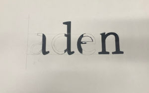
In the first task, we were given a sheet where half of the letters were printed and we were to draw the rest of the letters. The sheet I had chosen was the font ‘Rosetta Type Skolar’ and the word that spelt out after we were done was ‘aden’. I focused on the terminals of the letters and kind of replicated them when drawing the other halves of the letters, as I believe it was one of the main elements of the font. I had also drawn the x-height and the baseline of the letters in pencils (not very visible on camera), to help me with drawing the letters in the same height. Unfortunately, I was unable to finish filling in the letters with the black markers but Gerry had gone over the different fonts and explained to us the differences, the spacing and the context of the typefaces. This was very interesting to know as it would help us to choose what typefaces to use when we need them for future projects and we were also informed of where to get fonts from.
Task 2
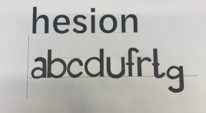
For the second task, we were given the word ‘hesion’ in a specific font and using that as a clue, we were to draw the letters ‘abcdufrtg’, figuring out how the letters look based on that font. In my sheet, I had the word in the font ‘Darden Studio Halyard’. I started off by drawing the x-height and the baseline on the paper. Then I measured the height of the letter ‘h’ to see how tall the stems of the letters should be. I had also measured the width of the stem of the letter, so as to draw the letters as accurately as possible. After all of this, I proceeded to draw the letters, using those measurements and also focusing on the shoulders and the variation of thicknesses of the letters.
Thoughts on this project
Overall, this project helped me in understanding typefaces even better and the amount of time and thinking that goes behind creating new fonts, whether its a variation of one or a completely new one from scratch. I was also revealed to the reality of the fact that it is indeed not easy to draw letters in a certain typefaces quickly and it takes years of practice to master this skill.
Comparing the designs on Menus
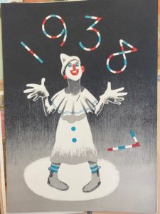
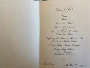
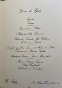
The Menus shown above were made in 1938 for The Ritz Hotel. I was initially drawn to the choice of design on the cover as it doesn’t reflect the brand identity of the upper- classed hotel, but the choice of a clown suggests the entertainment and classical element if the Ritz. The typography presented inside the menu demonstrates the traditional and glamorised element of the hotel, as they’ve used rather flamboyant serif fonts that almost like its been hand written. The layout for the menu is unusual for the time as it focuses on appearance rather presenting the information clear for customers.
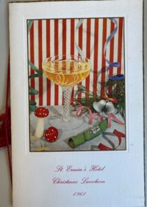
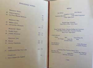
The menu above was created in 1967 for a slightly lower classed hotel. Again the menu uses a painting as their feature cover image as well as a decorative piece of string. But the main difference between the two menus is the layout of the menu and the use of a more simpler serif font. The menu has a more clearer list for customers and include the price of the food whereas the Ritz menu doesn’t. The ST. Ermin’s Hotel also includes the use of coloured ink reflecting the the evolvement of type design.
Paper wheel charts
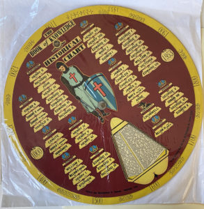
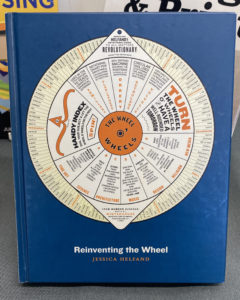
During this mini project I was drawn to these paper wheel charts, know as volvelle, that where displayed within the collection. These wheels where created to have answers to lots of different things by the different layers of the wheel that spin around, for example the one on my cover picture tells the user about gardening and the best times to be plating different things in your garden. They are often used to calculate different things in a fun and clear manner as you are able to get the answer you want by spinning the wheel. Reinventing the wheel was a book in the collection which gives lots of examples of different wheels for lots of different things all with very interesting designs some where very old and there where also more modern designs displayed within the book.
Staircase theme
For the broken narrative task I decided to chose the theme ‘staircase’. I really enjoyed working with this theme because I was able to create a staircase effect in the centre of the book. I cut this out to give a spiral staircase effect. As you go through the book (down the stairs) you can see the pages from inside start to get darker and the corners start to tears away. This symbolises how the man from the theme is getting more ill every time he goes down one floor of the sanatorium. Towards the end on the last page you can see the page fully turns black. This shows his sudden death.
Zee Graphics
For this mini-project we had to brand ourselves and create a logo, with research from a particular theme. I was struggling with my own theme at first as I chose 90’s. It was a lot harder than it looked. There were so many different themes and colours, styles and fashion so I decided to choose something a little more simple.
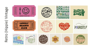 I was going for a “groovy” or “hippie” kind of aesthetic where the fonts are a little loose and wavy. The theme, as a whole, is very colourful and I loved how the words are distorted to fit into or create different shapes.
I found these movie tickets while researching my theme, and I thought I could use them as part of my final outcome for my logo. They matched the theme in my opinion as they shared similar aesthetics, colours and typefaces.
What’s on in Autumn 2017? – RFT flyer
Initial Process
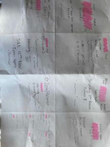
My first quick mock-ups of the cinema listing were all different however we can see that the first for examples very much focused on the title of the the movie (shown with the pink block). This was because my initial thought was that this is what was most important when designing the cinema listings and therefore was at the top of the hierarchy.
As my ideas developed we notice that this becomes the less prominent feature as I wanted to play around with putting the film title in different type fonts and sizes.
I carried this forward when designing my final two listings as I focused on the type of user which would therefor change the hierarchy in the text. I based my designs on the premise that the user would be university students visiting the Reading Film Theatre. Because of this, I believed the date would be the most important aspect following the film title as they would plan going to see a film around their schedule. Furthermore, with there being only 1 film showing a day, I did not want to follow the usual conventions, for example a popular cinema website, whereby they would first list the film title and then the dates and times of the showings and this would not have been practical with only one showing.
My second design shown above, I wanted to play around with the typeface sizing of the dates to make it more eye-catching. At first I just included the large numbers however after receiving feedback from my peers that this was hard to understand, I chose to do this alongside the large months shown above to indicate that these were in fact dates. The use of putting these in the same colour also helped me achieve this idea.
