Thursday 9 May marked the opening of the exhibition designed by Aaron James and Olivia Moors for the Global Goals campaign. Displayed in the University library were posters promoting the 17 Sustainable Development Goals, designed by Part 2 students in the Department of Typography & Graphic Communication. The project originated form a professional relationship between sessional lecturer Greg Bunbury and Project Everyone, a charity led by Richard Curtis.
The exhibition allowed students from across the University, not only our own department, to see the hard work the Part 2s had put in to bringing these goals to life. It was extremely rewarding to be able to see our own work on display for everyone to see. The opening event also allowed us to get a feel for how our posters could connect to the viewer, seeing how well the message came across, watching faces react, and hoping the work inspired change in people’s thinking or actions.
At the opening, there were short talks from James Lloyd, Eric Kindel, Greg Bunbury, and Hannah Cameron from Project Everyone. Everyone was sure to congratulate the students on their work, especially Aaron and Olivia for their contribution to the exhibition itself. But what stood out to me were Greg Bunbury’s words. He talked about creating work that means something. Creating work with a message. He mentioned that you should always create work that you care about, and that you believe in. I feel that this was the most important part of the project for the designers involved. We had the chance to create some meaningful work possibly for the first time, with the intention of getting a real message across. And through this exhibition, we were able to see the impact those messages can have.
Students and visitors exploring the impactful work
The client for this project was the Manuel Bravo Project, a free legal representation for asylum seekers and refugees based in Leeds. The organisation recently had a rebrand of their logos and letterheads, causing them to look for new physical outputs to help enhance the new branding. There are two different branches of the Manuel Bravo Project – In-house and Outreach. They are aiming to look for ways to appeal directly to these different target audiences.
Restated brief The client originally requested two leaflets to appeal to their separate target audience; In-house and Outreach. However, we suggested to help raise further brand awareness, therefore by having a physical banner, it would be a useful output for the organisation can use at charity events to help draw in new support and clients.
Due to the organisation’s two branches, our client wanted us to incorporate the different brand colours within the leaflets, to ensure the correct information is being received. With their green colour symbolising the Outreach audience, and red for the In-house casework audience. Our client has distinct target audiences – clients who are often new to the country with limited English, corporate/funder audiences who need to know a bit more about our background, and volunteers/partners who we recruit to help them with their work.
Final deliverables:
2 A5 2pp leaflets
2m portrait banner for physical use
Research
The first stage of the project began with research to understand the Manuel Bravo Project. We used information provided by the client as well as their website to gain a thorough understanding of the charity’s background and its mission, vision and core values. We identified that our main target audience was those who spoke minimal English and therefore knew our designs needed to cater to this. However, we also recognised a secondary audience such as volunteers and donators, so we wanted to make sure our design resonated with both demographics.
During the research process, we analysed various charity leaflets for inspiration. We noted that many of them tended to be overcrowded with information, potentially overwhelming for the readers. This was something we needed to avoid especially with our primary target audience. We aimed to structure the leaflets in a way that prioritised clarity and ease of understanding, by focusing on hierarchy and simple messaging.
Designing We commenced the design process by experimenting with various leaflet styles through sketches, considering different layouts. After visualising each exploration, we opted for a simple double-sided A5 leaflet design. We felt this choice was best suited for its intended target audience, as there was no complexity of what pages of the leaflet were to be read first. Our client agreed with this decision and during a feedback meeting with him, we further discussed his favoured options for text and image placement.
On the front of both leaflets, we highlighted the charity’s mission, vision, and approach as well as a concise overview description. For the back of the leaflets, we tailored the content more specifically to each branch of the organisation – In-house representation and Outreach services.
Furthermore, to address the main target audience, we thought it would be useful to enhance the accessibility of the leaflets for those whose first language isn’t English. We proposed the idea of a scannable QR code translator on both leaflets for users to access relevant information and resources in their chosen language.
Figure 1: Leaflet sketch 1
Figure 2: Leaflet sketch 2
Figure 3: Banner sketch 1 & 2
The banner was designed after the leaflets were finalised. Initially, we struggled with how to represent Manuel Bravo in a banner format. The real jobs meeting was extra helpful during this stage of the design process as tutors and peers helped us refine our banner design. We focused on maintaining consistency with the leaflet designs by carrying over key design elements such as typography and illustration style. One of our illustrations was adjusted to sit perfectly on the banner and it was able to fill in white space that we initially struggled with.
Meetings with the client and the real jobs team helped us guide our design decisions to create the most effective designs. The client was helpful in providing minor tweaks for us to change throughout the project.
Imagery We created engaging and unique illustrations to present on the front and back of the leaflets. The illustrations allowed us to depict diverse characters. The characters on each leaflet wear the corresponding colour attire to reinforce the differentiation between the different branches of the organisation and to maintain brand consistency.
We opted for illustrations over photography, as the organisation wanted to move away from the photography direction. Having previously used images of Manuel Bravo himself in promotional materials, it felt inappropriate to them to plaster his image all over their outputs and social media. Our illustrations provided a more respectful alternative and maintained privacy and sensitivity.
Figure 4: Initial line drawing illustration
Figure 5: In-house front page illustration
Figure 6: Back illustration for both leaflets in the In-house colour palette
Figure 7: Outreach front page illustration
Copy While specific body copy was not provided to us by the client, we took the initiative to select words that we felt best represented the Manuel Bravo Project’s ethos. Drawing from our research and understanding of the organisation, we chose messaging that we felt was most important to display and we are confident that our banner design will help Manuel Bravo Project raise awareness and gain additional support.
Figure 8: Leaflet version 1
Figure 9: Leaflet version 2
Figure 10: Leaflet version 3
Final outputs
Due to the client being based in Leeds, we weren’t able to see the deliverables go to print. To reduce printing costs we, sent our client print-ready PDFs of each of our deliverables. To help the client we also provided them with rough estimates of the print production costs from CPS. To help the client visualise our leaflets and banner designs, we provided him with mock-ups to showcase the final deliverables in their potential environment.
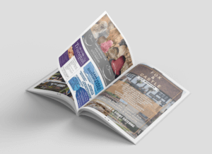
Figure 11: Mock up of finalised leaflets (front)
Figure 12: Mock up of finalised Outreach leaflet
Figure 13: Mock up of finalised leaflets (back)
Figure 14: Mock up of final banner
Reflection
Although the designs of this real job are simple, we wanted to ensure each of the deliverables were easily accessible and understandable for the client’s target audience. Therefore, by providing the client with the option of having a QR translation code, it gave the client’s target audience a quick and efficient understanding of what their organisation does.
The job did come with its challenges, with the client’s recent rebrand, and no printed documents prior to our deliverables, the client had only been provided with RGB-coloured logos. This meant that when the documents were to be printed the colours would come out slightly different. To prevent this, we decided to create a CMYK colour conversion for the client to use in future output designs to ensure all future printed materials match our deliverables. This will ensure their branding remains consistent.
Additionally, due to the client’s excitement about their rebranding and utilising their new logos, it caused a delay when providing us with other materials that we needed such as the body copy. They initially weren’t sure on the copy for these deliverables, which created some delays as we struggled to format the leaflets with the missing text.
Another problem faced was incorporating their new logos. The client sent us versions of the logo that weren’t useable in our outputs as they hadn’t been sent in a high enough quality. Eventually, the main In-house logo was sent to us in a high-quality format, but the client couldn’t seem to provide the same with for the Outreach logo. This meant we had to use the In-house logo he sent to recreate the Outreach logo. At the end of the project, we sent this new logo for them to use in all future designs.
Figure 15: Initial Outreach logo provided by client
Figure 16: Final Outreach logo created by us
Creating leaflets and banners was a new experience for both of us. This real job was invaluable and helped us develop new skills that we can take forward in similar future projects. We also got to experience real challenges that we may face in the industry.
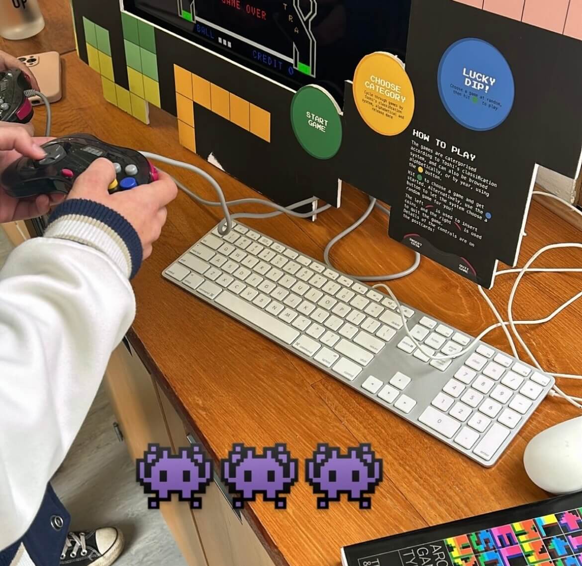
Students enjoying the game, in preparation for the event on the 4 October 2023
Working as part of the Baseline Shift team prior to this job, we knew we wanted to connect more with the guests we have and understand more about their career and experiences to allow ourselves the best insight into future design paths. We knew we wanted to take on board the Pixel Party job as not only did it link to Baseline Shift and build on the communication element but would also allow us to experiment with the deliverables that would help build our portfolios, for example Mia working on motion graphics and Habibah on branding. The freedom of this job would enable us both to incorporate our current strengths within design as well as build on those we are interested in.
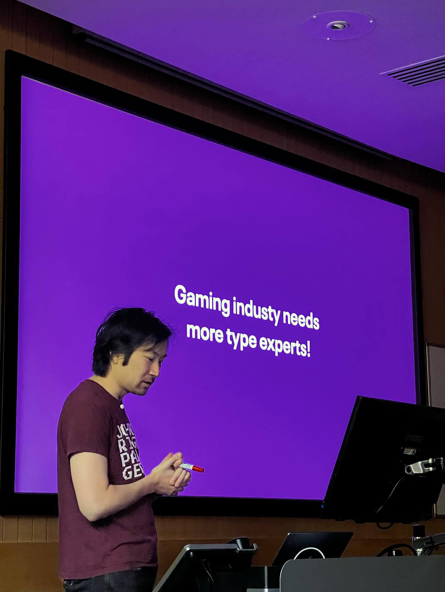
Toshi Omagari giving his talk for students and staff
About
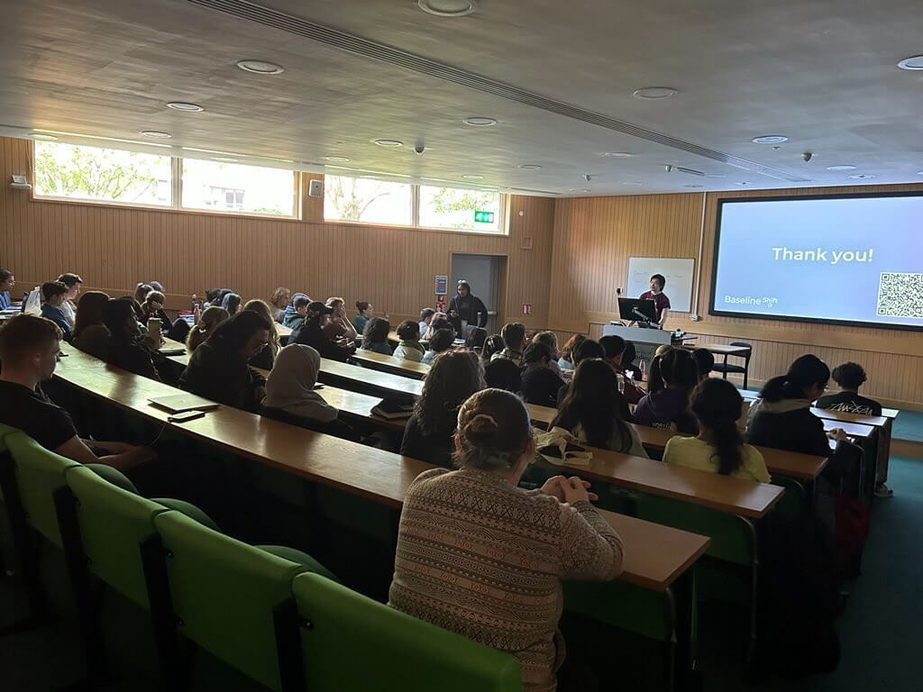
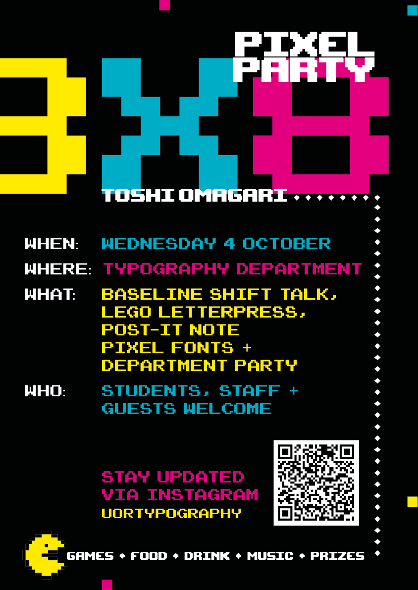
Week 2 of the Autumn Term kicked off with a whole day with Toshi Omagari returning to the department! The day consisted of an afternoon and evening full of typography fun starting with a Baseline Shift Talk also hosted and organised by ourselves followed by a Post-it note and Lego letterpress workshop, ending the day with a department party including food, drink, music and most importantly games.
Toshi Omagari is a typeface designer specialising in arcade game typography and alumni of the MA Typeface Design course at the University of Reading. His book, ‘Arcade Typography, focusses on pixel-fonts used in arcade games between the 70s and 90s and is available in the department. His passion for games is truly inspiring and the work he does within this field is profound.
Due to unforeseen circumstances, the original set date for the event was rescheduled from February to October. This gave us more time to work on furthering our deliverables and added a Post-it note storage system to our outputs.
Toshi’s talk
We started the day with Toshi’s Baseline Shift session, exploring his career in type design to both undergraduates, postgraduates as well as staff here in the department. He presented his in-depth research on arcade game typography and how they have developed over the years, specifically focussing on the characteristics of glyphs. It was very interesting to see the evolution of arcade typography from black and white to colour to the introduction of elements such as drop shadows and gradients. He also spoke about life after Reading and different fields in which he explored initially before finding his current passion. The very inspirational talk left many students feeling motivated with Part 1 student Ethan saying:
“It was an enthralling talk that really showed the lineage of digital fonts throughout video games – One of the best talks!”
Students and staff engaging in the Q&A session of the Baseline Shift talk
Workshops
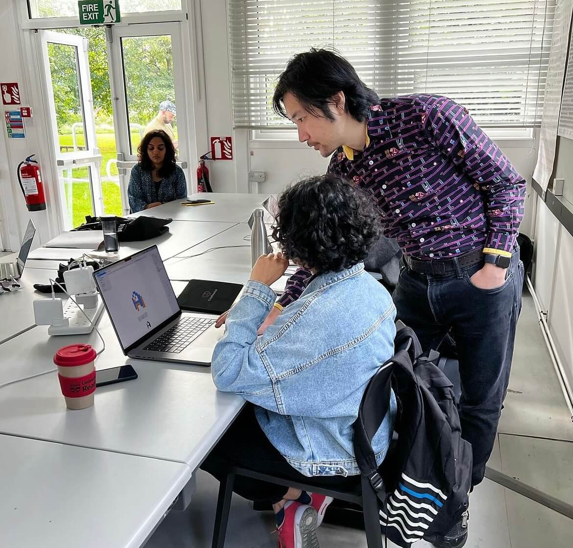
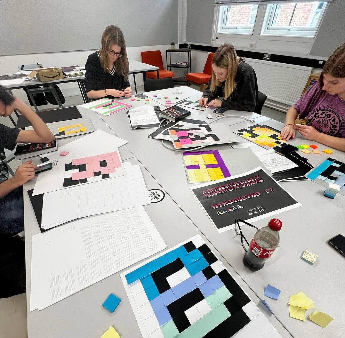
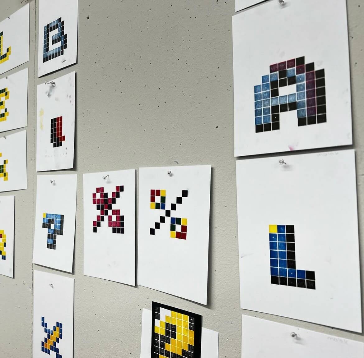
Following the talk, Toshi hosted a Master’s session on type design, and then assisted us in hosting a Pixel Post-It note and Lego Letterpress workshop for the students. This session consisted of creating glyphs using both Post-Its and Lego using colours to create depth and shadows, much like arcade typography.
Toshi during his master’s session.
The Post-it note workshop decided to work as a group to create an entire alphabet of pixel font letters. The posters used an 8×8 grid to format the letters, which students created based on fonts in the Arcade Typography book, however one student: Emma from Part 1 was recognised and awarded with a prize for the best designed letter!
Students in action for the Post-it note workshop.
The Lego letterpress workshop invited students to design 8×8 Lego plates to print their letters. As the only colours available were green, blue, purple and pink, some students chose to layer the available four inks to create a dynamic printed letter.
Lego letterpress productions.
These letters were then handed over to Toshi during the evening to announce a winner, Lydia from Part 3 taking the trophy home and saying:
“I thoroughly enjoyed the pixel font workshop, not only was it an interesting challenge, it was a perfect excuse to use the letterpress equipment! A massive thank you to those who organised it!”
Arcade evening
To round out the day, we hosted an arcade themed department social attended by students of the BA, MA and PHD design courses, as well as staff and friends. The attendees enjoyed the carefully curated arcade theme playlist, as well as the games, food, and drinks.
The event was a great opportunity to bring the department together and welcome the new Part 1 students of the BA course. We’d like to thank Toshi and everyone who attended for the awesome turnout!
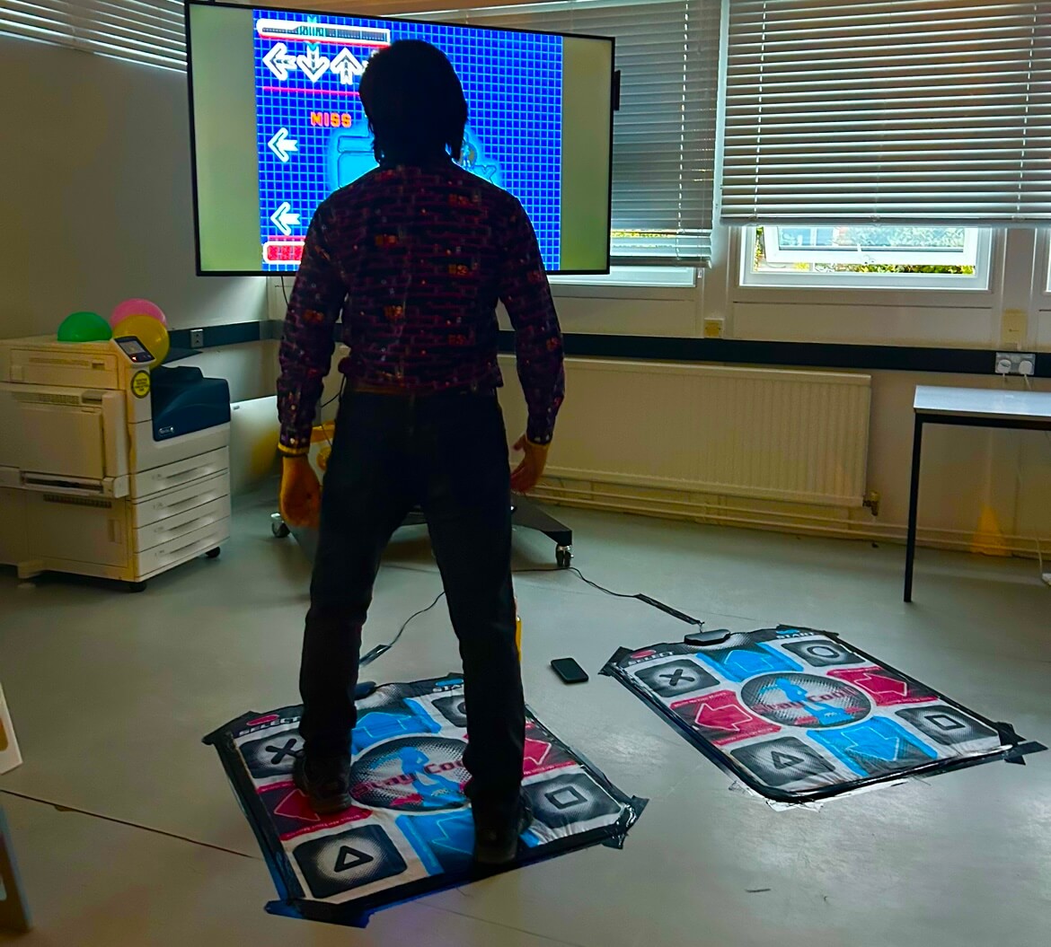
Toshi enjoying the dance mat
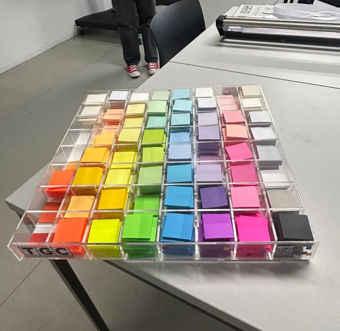
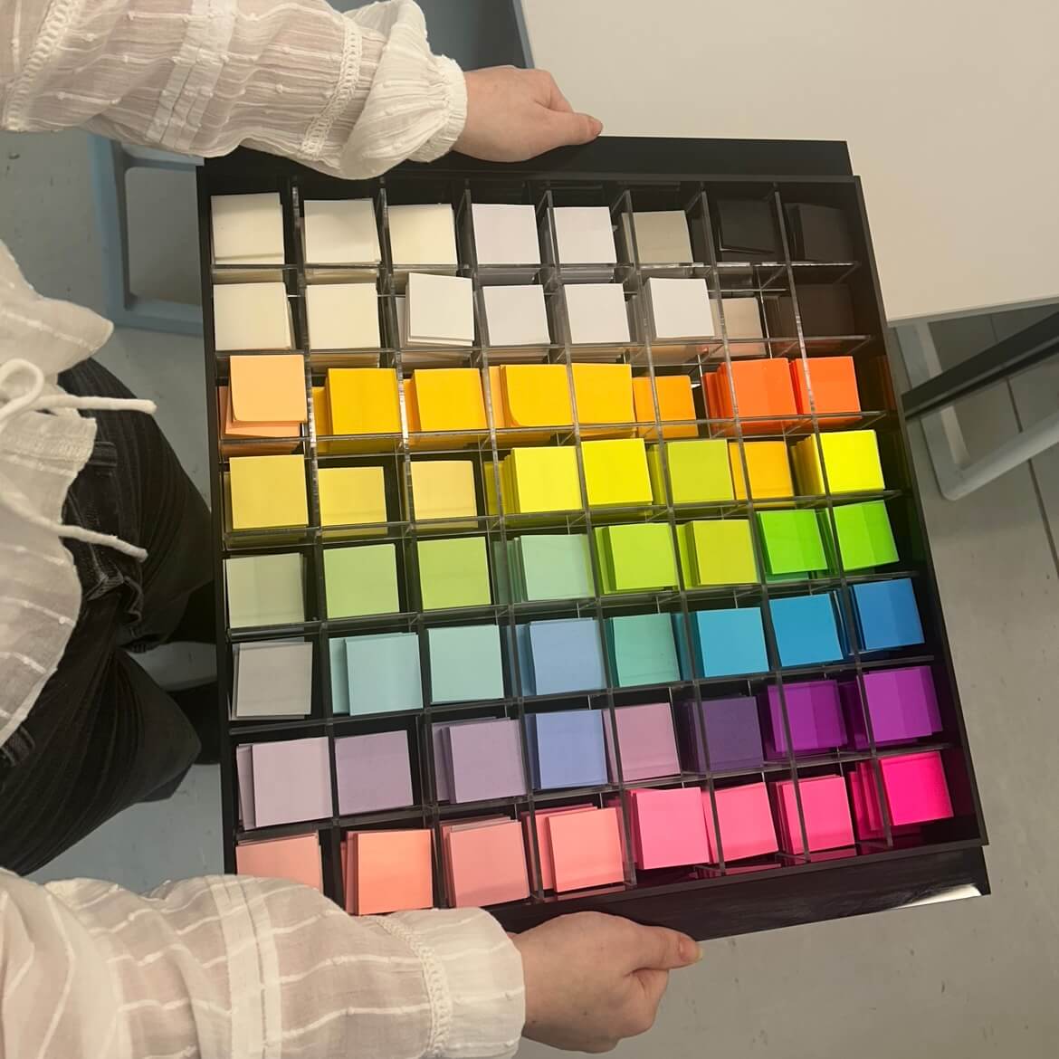
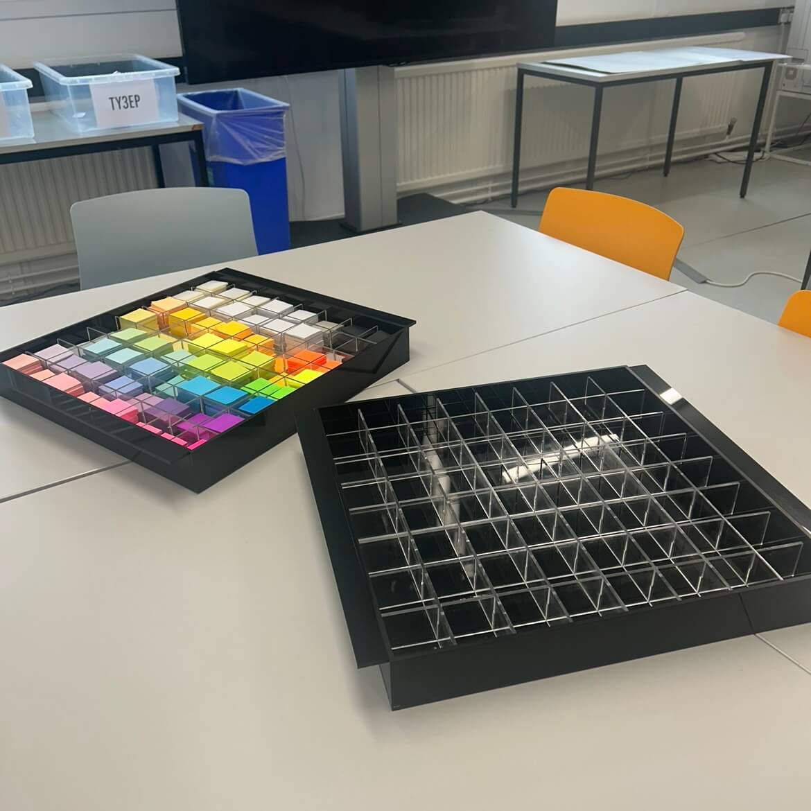
Post-it notes storage unit
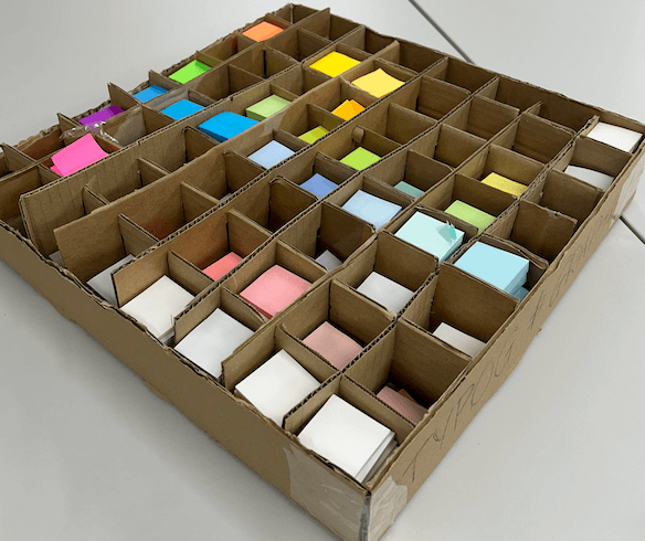
With the additional deliverable added as the deadline extended, we created prototypes to accommodate the hundreds of Post-it’s the departments holds. This began by measuring and counting stock and finding a way that we could display this in an aesthetic way.
Cardboard prototype
We chose to create a box, with 8×8 slots joining to create boxes for individual colours and found this worked well, so proceeded with materials involving acrylic and designing this complimenting existing branding. Experimenting with placement, we decided that organising the colours by hue and shade would be the best option for easy recognition and access of different variations.
Prototyped storage unit, created using the laser printer
Considering feedback and testing, we opted to order external acrylic boxes to house our grid in. Doing so allowed for a more stable unit, which is entirely square and the edges are flush. One issue we had building this using the laser printer was having to use multiple sheets of acrylic to build the base, which felt unstable. The glue used to attach elements also broke away after use, which showed we needed a stronger frame to hold the Post-it notes.
We chose to use a black acrylic for the external elements as it contrasted the colours of the paper and fit the branding of the event. This created a sleek appearance, which we decided did not need additional branding or decoration.
We made an additional unit for department displays and activities, recycling materials where possible from the prototypes. These units are stronger, and have handles to hold the weight more comfortably and manoeuvre more easily.
The completed Post-it note storage units
Posters
We designed the posters using relevant typography and decided on a black background with the colours of yellow, cyan, and pink. We based the design off of classic arcade games, and used Pac Man to attract students who were not overly familiar with arcade gaming. The box Pac Man follows groups the core information, with the main event title and decorative pixels aiming to show movement on the ‘screen’.
Poster design, printed and displayed around the department.
Animation
The animation featured on the department Instagram and Facebook. Social Media posts which are motion tend to increase engagement, which we wanted to take advantage of in promoting the event. The glitch and bounce mimic the movement of arcade games and served as a punchy teaser to build anticipation before the event.
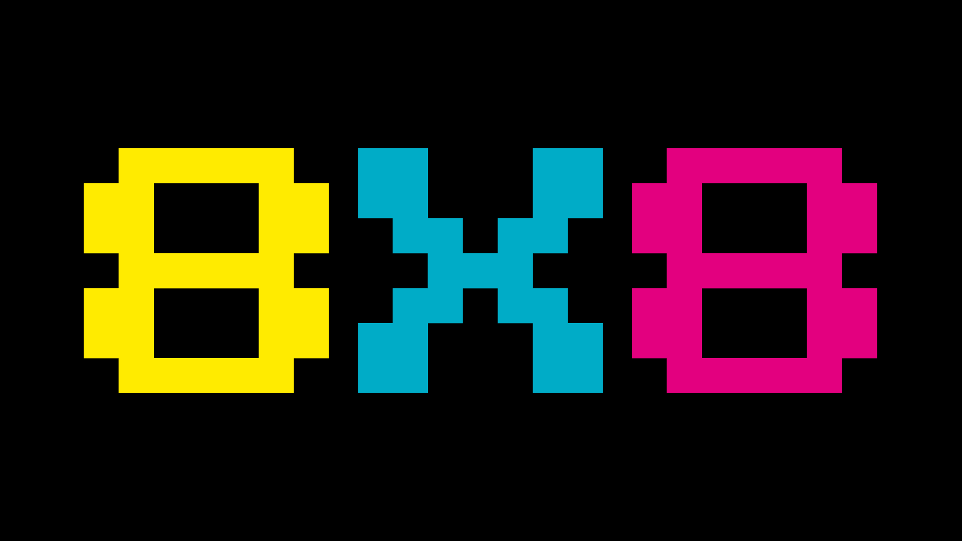
The main screen at the department featured the 8X8 logo, to remind students and staff of the upcoming event.
Department static screen
Social posts
Social media was the primary method of marketing, as the department Instagram is the most frequented point of contact for the BA students. These were shared on Instagram and our Facebook groups, as well as a daily countdown on the stories to further build anticipation and act as a reminder. Social media and email marketed the sign-up form for the workshops, which were fully booked for the day of the event. You can see the day unfold on our department Instagram story, where we documented the events @uortypography where the highlights are still available.
Example story countdown post
Playlist
Researching into arcade inspired music and games using ‘chip-tunes’, we carefully curated a playlist representative of this to be played throughout the night during the department social. As well as this, we additionally added some songs popular in the noughties party scene to cater for our young audience and create a livelier atmosphere.
We concluded that the food served throughout the party should reflect the theme so bought things served as shapes such as circles or squares and involving colour. Our shopping list involved pizza, marshmallows, and brightly coloured drinks, both alcoholic and non-alcoholic as well as many more.
Food and drinks being enjoyed by the attendees
Games Organisation
The games were a popular feature, with dance mats and arcade video games within two of the largest rooms in the department. To frame the iMac screens, we designed a foam board consisting of instructions on how to operate the controller and promote the branding for the vent further.
MA student enjoying the game, with the frame surround
Games room ready for the start of the event
Decoration
Finally, the last part of planning was organising decoration to revamp our standard department to something special for the night. We did this with paper chains and balloons representative of our colour scheme as well as lanterns, LED and fairy lights to create a arcade vibe.
The decoration for the rooms.
Conclusion
We both had a lot of fun planning this and seeing our ideas come to life with an amazing turnout. After overcoming organisational obstacles, it was all worthwhile and we thoroughly enjoyed connecting with everyone in the department more. As team leaders for Baseline Shift, it was valuable to take on another role more closely linked with the people we host, to build connections, network and prepare us for the future. It not only taught us event and time management, but how to collaborate with different people as well as develop our design skills along the way. We each were able to apply our existing knowledge in areas we were confident in (Habibah, branding and Mia motion graphics) and were open to learning new things, making the whole process a lot smoother.
For events like this in the future, we would find a longer run-up to the event useful. Unfortunately with only 2 weeks to promote, we felt numbers could have been higher but overall the turnout was good considering this. We would have also liked to encourage attendance across the year groups face-to-face or using printed material ourselves . Our supervisor helped us get the attention of the whole course through emails and verbal promotion, which we believe encouraged Part 1s to be particularly involved and present.
We struggled with time dedication and motivation to produce our storage deliverable. Without experience in product design, the novelty of this process was often challenging and tedious. Despite this, we did eventually find it rewarding to have a physical item alongside the iMac frames to show our hard work.
Thank you for everyone who attended, and we hope you have been inspired by the events of the day. Another massive thank you to Toshi, for doing this. It wouldn’t have been possible without you!
– Habibah Begum and Mia Bryan, 2024
*There is no Trello Board for this Real Job as advised by our supervisor*
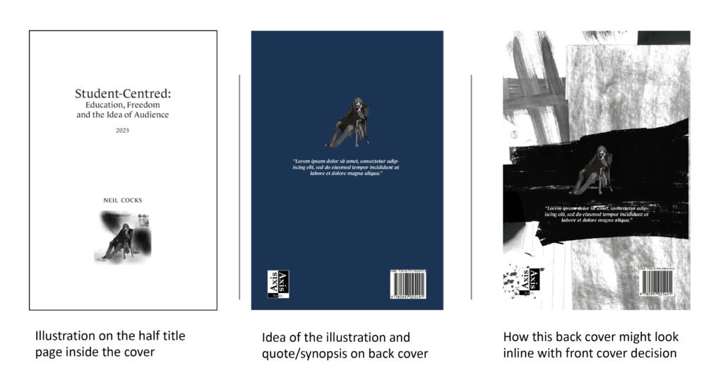
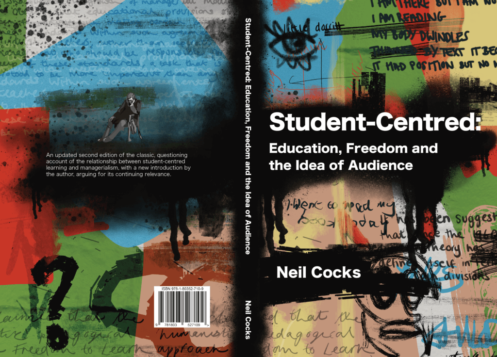
Neil Cocks is an English Professor for the University of Reading. He had previously published a textbook called Student Centred: Eucation Freedom and the Idea of Audience and was looking to publish a second updated version. The new version would include new chapters and changes to the previous text. Aswell as a completely new design for all pages and both the front and back cover.
The book is a look into different essays and passages of text into methods of teaching and is a critical engagement with arguments of different views on teaching, broken into three parts. It is written in continuous prose including footnotes, quotes and inserts from other texts.
Restated Brief
The Audience
The target audience is quite small and niche with only 20-30 copies being printed. They will be professionals, masters and PhD students specifically looking into this topic area, which the book will be recommended by Neil himself. They are presumably already highly knowledgeable into the practises of education and learning. It opposes the PGCE designs and ideas which the audience will already be aware about.
Goals
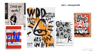
Something that was important for the client from the beginning of the project was that the design of the book had to mirror the themes throughout the book. The text itself is an argument into the strict parameters children and young adults face with the current schooling system. With that in mind, there are certain styles which were discussed to avoid to prevent a basic ‘handbook’ type feel of design. An example of this would be ‘The Routledge Education Studies Textbook’ design. The book was not meant to feel like a guide that teachers or students would just drop in and out from, rather a academic text that took a deeper more critical approach to understanding the topic.
With that, the client also wanted to show the more radical and anti-establishment approach on the cover, by having a design that goes against the grain with traditional text books about teaching. Punk revival and graffiti where just some of the original terms used to describe the feeling the client wished to infer with the front and back cover.
Deliverables
A 300+ page second edition text book with multiple chapters, footnotes, contents, bibliography and index.
A back and front cover design that accuratly portrays the themes inside of the book.
Research and Ideation
The client and I spent a lot of time going back and forth with ideas and moodboards over the whole project so that we had a really clear picture as to what he wanted out of this project. A lot of the ideation focused around the book cover, however I would use this to inform the layout of the inside pages. Figure 1 shows the orginial document the client had sent me when we started discussing where we wanted the project to go.
Figure 1: The clients moodboard on what he liked and disliked regarding academic books.
Inside Text Development
Body Text and Chapter Openers
From the extensive research and talking to my client, I knew going into the text page design roughly what kind of outcome he was looking for. I first provided three different documents of about 10 pages each with a different treatment of chapter openers and footnotes, ranging from a more tradition (Figures 2 and 3) style to contemporary (Figures 4 and 5). We agree to land somewhere in the middle with a two column footnote approach a right aligned headings. Something that client picked out in this first round of feedback was that he liked the large number spanning 3 lines for the chapter opening.
Figure 2: Version 1 (traditional) of chapter 1 opener.Figure 3: Version 1 (traditional) of chapter 1 textFigure 4: Version 2 (contemporary) of chapter 1 openerFigure 5: Version 1 (contemporary) of chapter 1 textFigure 6: Version 1 (middle) of chapter 1 openerFigure 7: Version 1 (middle) of chapter 1 text
One big issue we had with this stage of development was that through every revision, there was things in the text and footnotes that needed correcting such as spelling mistakes and adding new sentences (Figure 8 shows an example of some of the changes the client wanted). One thing I would do differently would be to check that the first word document I was given with text was the final edit of the content before starting to typeset the text. It definitely prolonged the timeline of the project, as not only was myself and the client needing to re-read every section but also when a footnote was added or removed, it would shift the layout of the whole book. So I would have to go back to the beginning and adjust column sizes and other attributes to make sure all the footnotes were on the correct corresponding pages.
Figure 8: A screenshot showing the type of feedback to the client from one of the iterations of changes
Part Openers
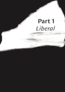
This book was split into three sections: Liberal, Radical, and Reactionary, each with their own chapters and authors. This meant that on a hierarchal level, there were lots of elements to the structure of the book that each had to have the appropriate level of prominence. To meet these needs, I gave the opening sections their own double spread. Another requirement for these pages was that they were in black and white along with the rest of the text to keep printing costs low.
The design of the part opening pages was actually completed after the cover design was agreed upon. This was because the client and myself agreed we wanted to bring aspects that were on the front cover of the book to the inside pages. It was after the graffiti and ‘messy’ style of the front cover that I produced these 4 different approaches. As we can see, some of these were a lot explicit in the graffiti to match the cover approach than others. Immediately the client like the full black bleed style (Figure 12) as he felt this would be a nice break to the white pages. It also worked nicely carrying the black background across the entire spread to further show the different hierarchal section of the book.
Figure 9: Version 1 of the ‘Liberal’ opening sectionFigure 10: Version 2 of the ‘Liberal’ opening sectionFigure 11: Version 3 of the ‘Liberal’ opening sectionFigure 12: Version 4 of the ‘Liberal’ opening section
Prelims and End matter
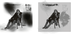
Another aspect the client wanted to include was an illustration of Charles Dickens. We were unsure where this was going to be used within the book but after sending some initial ideas on how this could be used (Figure 13) I advised the client that this would be best suited on the half-title page. This was because the illustration was a nod to the clients nickname between his colleagues, and it served little purpose as to what the book itself was about.
Figure 13: Different mockups sent to the client on how the Charles Dickens illustration could be used.Figure 14: The original JPEG illustration of Charles Dickens (Left) next to my reworked illustration (Right)
I also had to rework this illustration as the original image sent to me was a a poor quality JPEG so could not be used in printing (see Figure 14). Although a small element to change, it was a fun task for me to complete as it allowed me to develop my illustration skills whilst trying to keep the image as close to the original as possible. I sent my reworked art to the client and he was very happy with the outcome, the only thing he mentioned was that he preferred using the full image with the background instead of having just Charles Dickens himself.
Front Cover Development
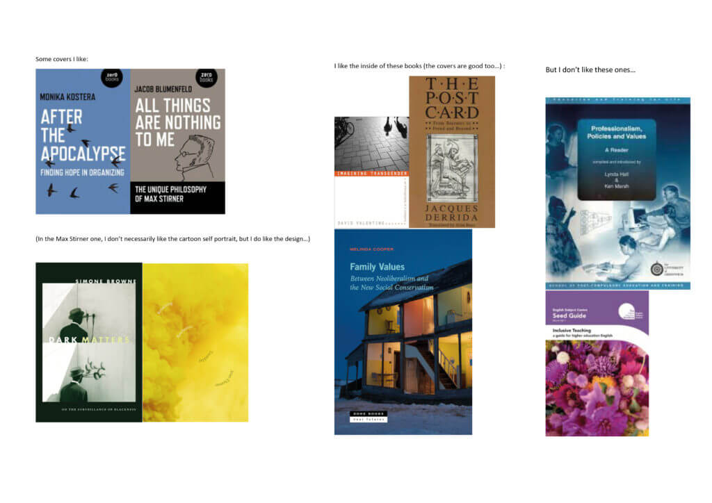
The first round of covers (Figure 15 and 16) I completed was not quite what the client was looking for and looking back at them now, I can see how they followed the conventional academic look of textbooks, using illustrations of stationary and other commonly used imagery in school, like speech bubbles. Although this was going in the wrong direction, there was some positive feedback from my client on specific elements of some covers such as the roughness of the illustration styles and the typography on the books, so I tried to focus on this and carry this forward.
Figure 15: 4 out of 7 of the different concepts of covers that I first sent to the clientFigure 16: 3 out of 7 of the different concepts of covers that I first sent to the client
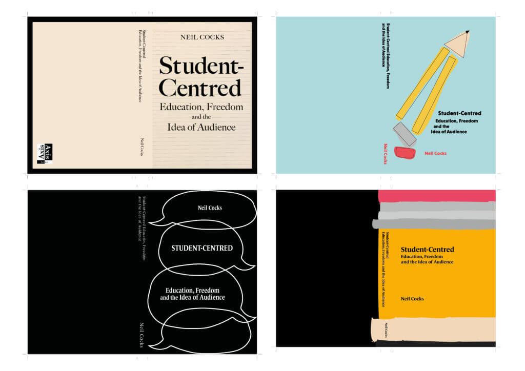
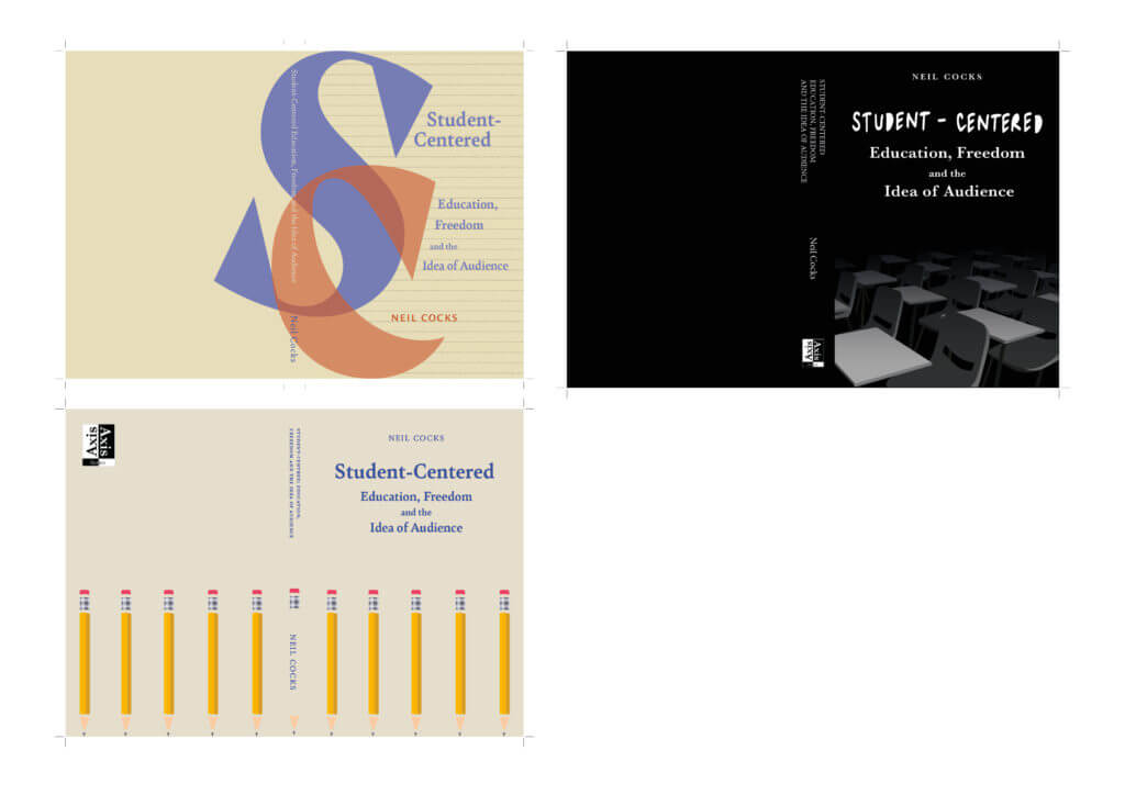
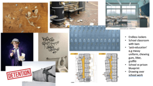
To help with moving onto the next step of the cover development, I spent a lot of time at this stage going back to square one and having detailed meetings with the client about what he was specifically after. Tis is where we moved on the idea of anti-establishment and graffiti. I then spent time crafting different moodboards (Figures 17, 18, 19 and 20) with different artistic styles and concepts which I also discussed with the client in detail. he was very happy with this direction and thought that all the images in the moodboards were very strong representations of what he wanted to portray on is cover.
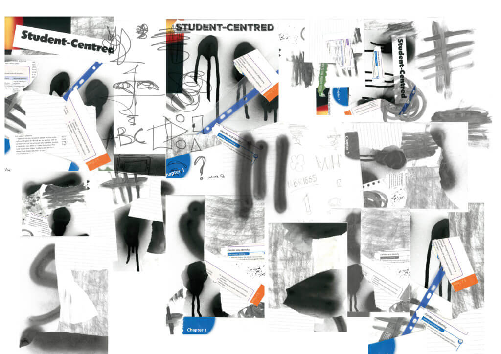
After discussing with my supervisor where to go from here, I decided to take a different approach with my covers. I started to have more fun and be experimental with what I could add to the cover. I purchased spray paint to see what types of marks I could create. I also spent a lot of time experimenting with scanning and layering different things such as ripped textbooks, pages, stationary and printed type. Figure 21 is a collage of just a small section of some of the scanning and spray painting I did during this period. I feel as though this was really showing the punk and ‘anti-school’ approach the client was after.
Figure 17: First moodboard showing a punk/ anti-establishment style approachFigure 18: Second moodboard showing a imagery of protestingFigure 19: Third moodboard showing a graffiti style of artFigure 20: Fourth moodboard showing ideas of school/concepts that could fit the theme
On top of this it also incorporated a type physicality and depth of concept that the previous approach to the covers was not. With both myself and my supervisor happy with how this was developing, I took all my scans and images into photoshop to further work on the layout and balance of these ‘graffiti’ style covers, including how I can then incorporate the typography of the title into this approach. I ended up with 6 solid covers to show my client shown in Figures 22, 23 and 24.
Figure 21: A collage showing a handful of the layered scans I attemptedFigure 22: Versions 1 and 2 of the final cover concepts sent to my clientFigure 23: Versions 3 and 4 of the final cover concepts sent to my clientFigure 24: Versions 5 and 6 of the final cover concepts sent to my client
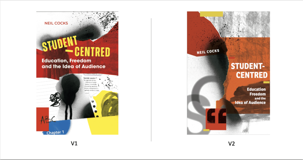
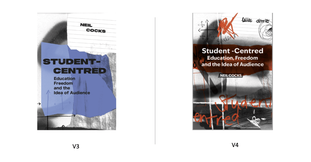
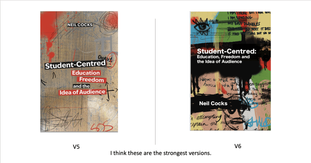
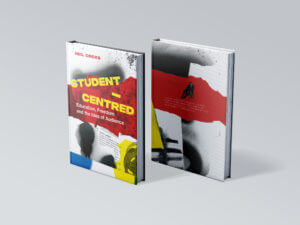
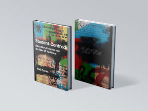
The feedback on this round of covers was really positive as he replied “These are all fantastic, Amy. My pick maybe is v1? But any of these would be fantastic – I do please choose the one you think works best. ” Since I also though V6 was also really strong we decided to go forward with both of these designs so he could see the full mock up of both with the back cover and spines.
Finally, this lead us to two final mock up versions shown in Figures 24 and 25.
The response to these two mockups was as follows:
‘Hi Amy, they both look AMAZING – it’s almost impossible to choose between them!
Is it OK if I take the weekend, show both to some trusted friends and colleagues, and come back to you with a final decision first thing Monday?
just to say – so well done on this – these really are perfect for the book”
Personally it was amazing to hear such good feedback to the point where he could not choose between the two. After having a small set with the first round of covers, I felt like I really had developed my understanding of how to listen to the clients needs and produce something that showed off both my creative skills and communication with the client. After getting feedback from his colleagues he decided to go with V6 of the cover.
Final Cover Design
Figure 25: The final PDF covers and spine sent to the printers
Reflection and Improvements
Upon completing the project, there are a few things I would do differently next time One of the main ones being the initial concept ideas for the cover. Although I went into detail with the client on what he wanted the cover to look like, it wasn’t until after showing initials designs that he was more confident in saying what he liked vs what he did not. To rectify this, I would come to the first few meetings with a greater variation of moodboards and cover examples to discuss so he could specifically pick out what was working concept wise and what was not.
Finally I would also communicate better with the client in terms of what I need from him at the start. The delay in getting a full edited version of the text cause the project to be pushed back a few weeks. By having the final text at the beginning would have prevented having to go back and constantly change/add new paragraphs into the already set text.
Overall I am very happy with how this project developed and the final outcome. Working on this project alone as my first real job brought many challenges however I am grateful to have worked with a client who wanted as much involvement as possible. Although the project went past the original deadline we had set, I felt as though the extra time and energy I put into crafting this book really paid off in the end.
Baseline Shift is a real job that involves a group of students collaborating to organise weekly lectures given by professional designers during autumn and summer term. These talks enable students of the Typography and Graphic Communication department to gain insight into the design industry and potential career options after graduation. The team held multiple responsibilities such as hosting lectures, writing blogs, and creating weekly printed material and social media posts for students of the department to be reminded about the upcoming guest lectures.
Baseline Shift 2022/23
During the Summer holidays of first year, this Real Job was announced for students in my year group to become involved with the Baseline Shift team. From reading the description I was adamant on joining the team. Having the opportunity to network with designers in the industry and working alongside my cohort were the main reasons I wanted to join the team; hoping the experience would enhance my skills that would become applicable once I graduated. At the start, I was introduced to my team leaders comprising of Sara Nogueira Pérez and Adam Powell, and students in my cohort, Mia Bryan, and Habibah Begum.
The Baseline Shift team 2022/23 outside department with book cover designer, David Pearson
After becoming acquainted, we began organising everyone’s primary role as part of the team, which lead me to take responsibility for blog posts and copywriting. This role played to my strengths, hoping to show the team that I could keep quality in all written aspects of the job. During the summer holidays it was my responsibility to produce a new logo for Baseline shift. After Habibah’s choice of the typeface Montserrat, I created a design that reflects InDesign’s Baseline shift function icon, replacing it with the team’s name. This was our brand identity throughout my time as a member of the team.
The Baseline Shift logo I designed, used for all promotional material
This first year of baseline shift encouraged me to engage with my team and being responsible for the roles I performed weekly. Blog writing was the main responsibility I had throughout second and third year, ensuring that blogs could be posted weekly. However, this was not always the case, as coursework and deadlines would collide with my role on the team, resulting in some blogs being posted later than expected. Managing to allocate time to this real job was the largest struggle during this period, as second year work began taking priority of my time. On occasions, the team would help me to write the blog posts by providing notes that could be used later for the blog development. Performing mine and other’s distributed roles allowed me to experience range of tasks that are applicable to designing in the industry. Working every week on this real job was very rewarding, being able to see the fruits of my labour each week through successful lectures with professional designers.
The job allowed me to develop a range of skills that I would not normally say I was confident with. Designing the Baseline Shift logo and writing weekly blogs helped me to further develop my ability to take criticism and continuing to pursue the best results for my work. The hosting role was intimidating for me before engaging with it later in my experience, this was because public speaking in front of a lecture theatre was out of my comfort zone. However, with preparation and support from the team I was able to become more comfortable with public speaking for in-person and online lectures. Receiving feedback for how we performed and the quality of the lectures was always a supportive reminder that the team benefitted the learning of all students.
Baseline Shift 2023/24
Becoming one of the leaders of Baseline Shift was exciting for me, as it was now my opportunity to see whether I could efficiently lead a team. Becoming leaders in third year meant that two second years would join the team to aid in Baseline Shift consistently performing tasks each week without hinderances. Tilly Dobson and Amber Jones joined the team in the summer of 2023, helping us throughout our final year on the team.
One of the most valuable ideologies I learnt was that building a rapport with team members is a main component to whether the job runs smoothy each week, with members needing to communicate effectively to ensure the future lectures happen successfully. Because the team managed to bond quickly, working with deadlines became less stressful as communication was easy. But, on several occasions members would forget to remind the team of other commitments and issues that would affect job roles and planned events. To overcome this, the team would construct new schedules to adapt to these slight hinderances, which in the end enabled the team to remain stable whilst organising the weekly lectures.
I have many favourite guest speakers, but one of my personal favourite guests was Malcolm Garret during my first year of Baseline Shift. Being an icon for graphic design in the music industry, I was amazed to hear about Malcolm’s experiences and thinking behind his wide array of design work. After the talks I would frequently chat to the speakers about their careers, hearing the guests share similar interests and providing me with insight into the design industry. Having the opportunity to talk to professional designers is always a beneficial experience, especially when this opportunity happens every week with designers from different career paths and design jobs. In addition, this allowed me to gain connections on LinkedIn which has become valuable to me when searching for potential jobs after graduation.
The Baseline Shift 2023/2024 team with Sky Creative designer Aanand Tank, our final in-person Baseline Shift session
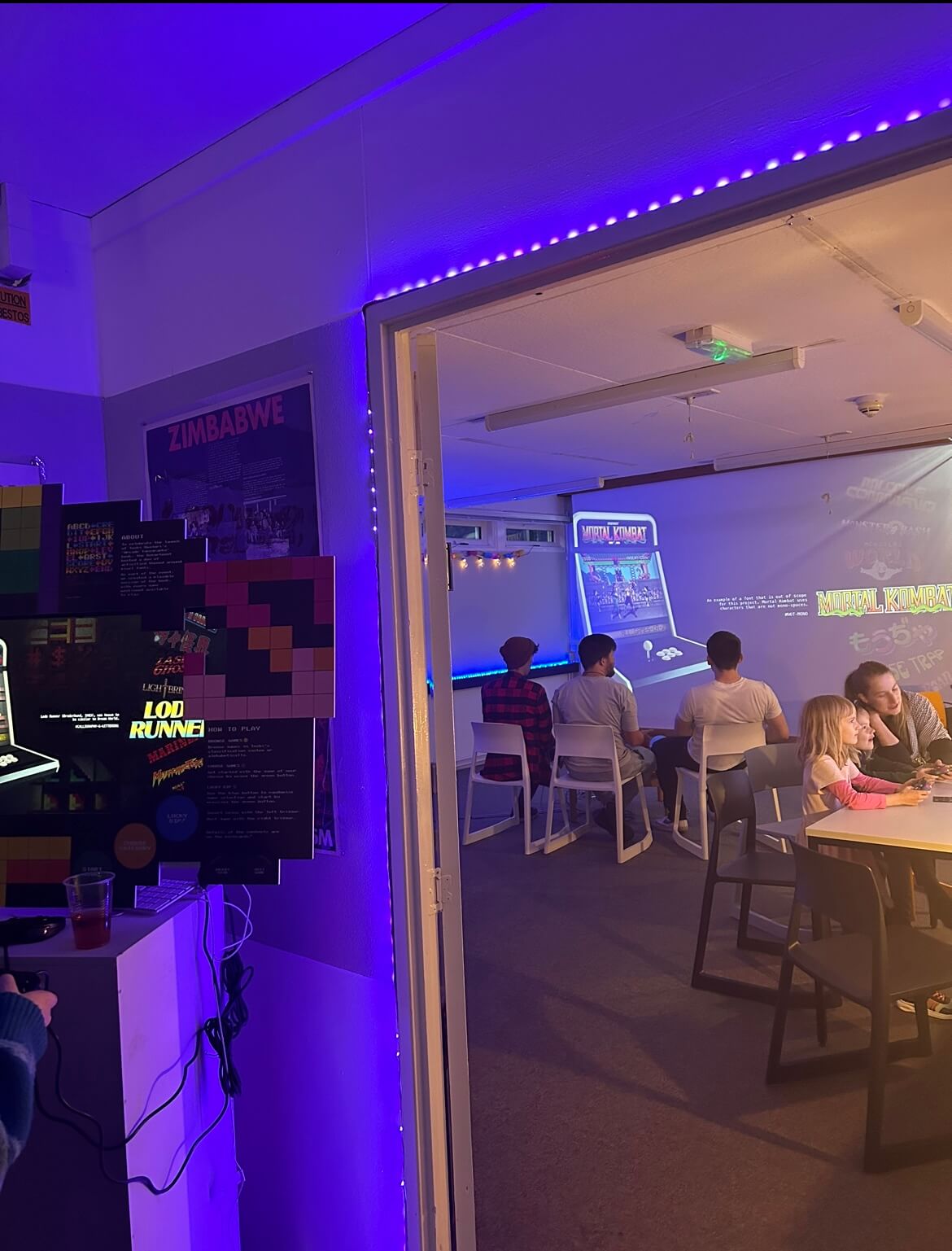
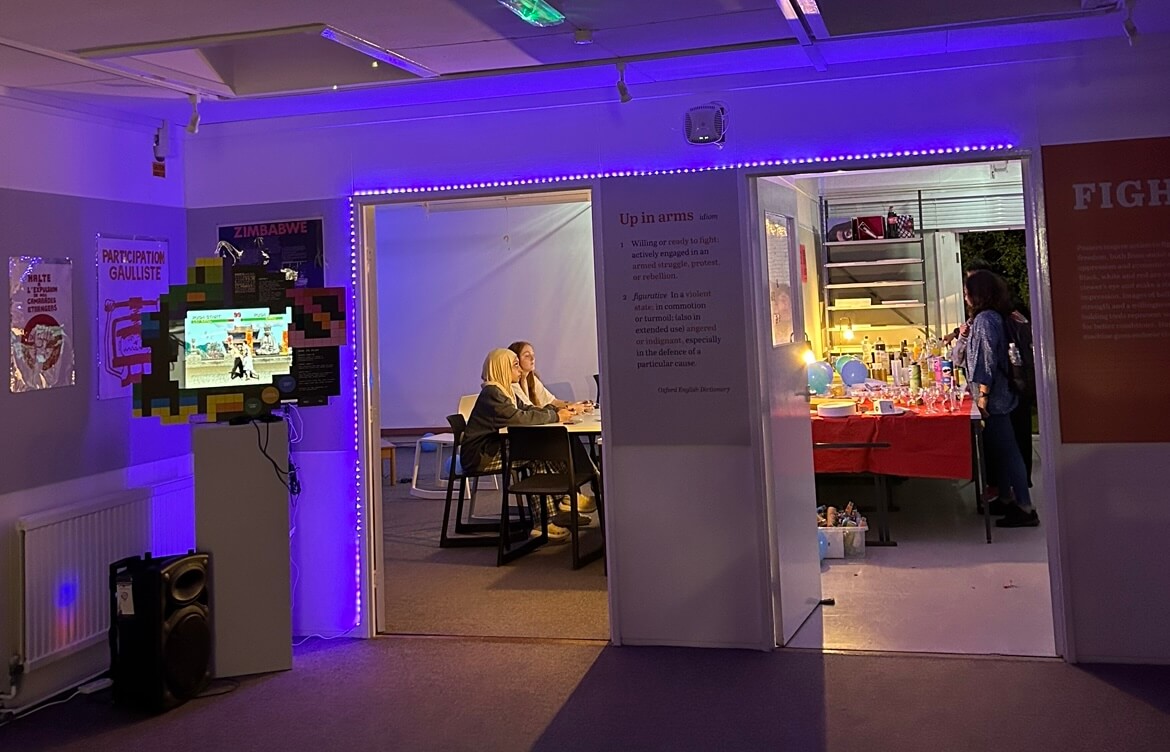
Another perk of joining the team was organising events in the department for when speakers would arrive for their scheduled talk. For example, with the arrival of the famous video game typographer Toshi Omagari, several typeface-making workshops had to be organised. Arranging rooms for the event was satisfying once completed as students engaged in the activities the team produced. A fond memory of mine was helping to setup an evening event that included arcade games and party games. Playing Mortal Kombat in the department was definitely a highlight for me!
Two of my course mates and I playing games at the Toshi Omagari Pixel Party
Final thoughts
Being part of the Baseline Shift team was one of the best decisions I had made for my future whilst studying the Typography and Graphic Communication course. This real job is one of the most rewarding amongst the selection that is offered to students on the course. The range of roles that members undertake, along with the amazing designers you are able to contact and network with are only some of the benefits to being part of the Baseline Shift team. If I was asked whether partaking in this real job would be worth it, it would be a definite yes. Any student willing to give their time to help run Baseline Shift will find it useful to their future career. I would recommend this job to any student looking to develop their skills towards professional practice and other applicable knowledge gained from two years of experience on the team.
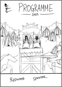
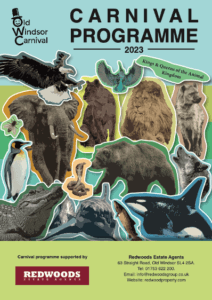
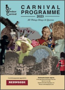
The Old Windsor Carnival which is in its 61st event is a thriving occasion that raises money for local charities and is known for bringing the community together. Each year comes a different theme, this year of 2023 the theme is Kings and Queens and is to be emphasised through the use of a carnival programme. The committee planned to print 2400 copies to share across the village of Old Windsor. The programme is the hub for sharing information and the schedule for the three-day event. The programme consists of a 50/50 split of adverts for local businesses and information around the carnival and its various events.
Restated Brief
From an extensive brief from the client, we aimed to create an inclusive cover design that is lively and eye-catching. The cover needs to depict the selected theme of ‘Kings and Queens’ in which the client has stated that they want the colour choices to be vibrant. So therefore, we aimed to implement this into the design. On top of this, to also design a sophisticated structure whereby a variety of advertisement sizes work on a fixed template alongside the editorial text ensuring an easy read for all audiences. Deliverables for this project consist of a printed events programme exhibiting an impactful cover.
Research and Ideation
With the theme of ‘Kings and Queens’ being prominent in the early stages of this project, the end product needed to convey this with aspects that all audiences would recognise. As it was being delivered to houses across Old Windsor and they actual event has activities for all ages, the target audience was extremely vast. Alongside the client we had various meetings into what can be exhibited on the covers. The obvious subject matter we spoke about was members of the Royal Family and previous kings and queens. We then ventured into the realm of kings and queens of the animal world as well as playing cards and chess pieces. Due to this list of potential ideas increasing every meeting we suggested to the client to produce a cover in a collage style as it can accommodate for all topics mentioned above. This would create a sense of community by combining contrasting imagery all in one place much like the carnival does for the community of Old Windsor. The list below was accumulated from these meetings:
Kings & Queens past and present
Crown
Sceptre
Sovereign’s orb
Coronation spoon
Chess pieces
Playing cards
King Cobra
King Penguin
King of the beasts – Lion
King of the birds – Eagle
Kingfisher
King Prawn
King Salmon
Queen Bee
Queen Snake
Queen Angelfish
Queen Alexandra’s Birdwing (largest butterfly in the world – 30cms wide!)
Queen Snapper
Queen Carola’s Parotia (bird of paradise)
Design Process
The Cover
As the cover will be the first thing our audience will see, this was a priority in the early stages of the project. We provided various different sketches around the subject matter in the list above. This was done to broaden our ideas and once receiving feedback from the carnival committee we were then able to refine these into a final cover concept.
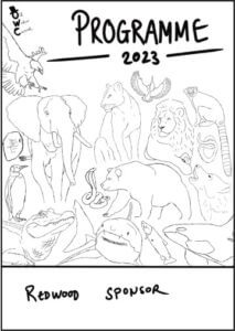
Figure 1. Sketch depicting a King and Queen surrounded by a carnival.
Figure 2. Sketch depicting a collage of the Kings and Queens in the animal kingdom.
Figure 3. Sketch depicting a collage combing both concepts in the previous sketches.
With feedback from the committee, it was made apparent that they thought an all animal or mixed collage would be best suited for the current theme of the carnival. The animal covers were approached as a scrap-book collage and each animal had an effect of a sticker. This was done to easily identify each animal as well as keeping the illustration style the same for a cohesive look. This also provided the cover with varying yet vibrant colours which is something the committee wanted to see within the cover. See Figures 4. & 5.
Figure 4. Sticker collage concept
Figure 5. Sticker collage concept
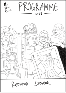
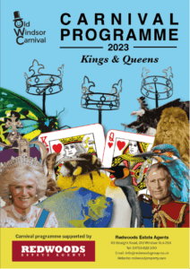
With these covers and from feedback from both committee and supervisors, this imagery did not directly link to the theme of ‘Kings and Queens’ and more linked to a theme relating to just animals. As a result of this information the committee favoured the concept of a mix between animals and royal paraphernalia.
Figure 6. First concept on mixing both animals and royal paraphernalia.
This cover included the right imagery but did not reach the objective of being vibrant and colourful. This meant going back over the illustrations of each element and manipulating the colours to stand out more. It also heavily emphasised the Royal family and royal paraphernalia over what the committee wanted to see. This being more of a mixture of aspects that could represent the theme of ‘Kings and Queens’. See Figure 6.
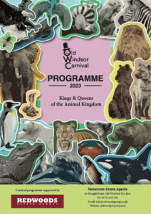
Figure 7. Final cover for the 2023 carnival programme.
The final cover seen in Figure 7. depicted the right amount of elements from the list both us and the clients came up with in our meetings. The clients felt this option was what they wanted to achieve with vibrant colours, recognisable elements relating to the theme and links to the village of Old Windsor. These links being the three crowns which is a statue positioned on entry to the village.
Pages and Their Contents
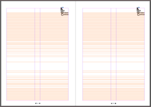
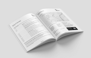
The inside pages of content were an extremely challenging component to this project due to multiple stakeholders sending content through via different formats. Each committee member is tasked with gathering information for different segments of the three-day event which meant dealing with multiple points of contacts. On top of this, information received had many inconsistencies in which needed to be mended. With lots of information coming in through different formats a well-structured document with fixed styles was needed to manage the content. With this project, content was still being sent the day before the print deadline, so the use of grids and paragraph styles made it easier to implement the content and pages throughout the programme remained consistent. Figure 8. shows the 2-column grid used for body copy throughout the programme. Light rules were also implemented to help assist in the navigation between pages which can be seen in Figure 9.
Figure 8. Grid system used for body text throughout the programme.
Figure 9. Mockup on how rules were used to distribute content.
Using paragraph styles ensured that the hierarchy was easily established and navigation was simple. This is something we wanted to focus on within the content of the programme as feedback from the committee about previous years mentioned that legibility and loose text made it difficult for readers to take in the information especially for the large elderly population in Old Windsor.
Figure 10. Paragraph styles used to keep hierarchy consistent.
Advertisements
Adverts play a huge role within this programme as the money made from organisations submitting adverts is what pays for the production of the 2400 copies. As companies were paying large sums of money for their space in the magazine it was essential to have a format in place to ensure the adverts were equally treated depending on how much they paid. Below is the template used for the adverts throughout the programme as well as an example of how this looked. Smaller organisations such as local businesses who purchased smaller advert spaces sent across files that did not fit within this template. With permission we were able to create our own versions which included the same content but was more malleable to the advert template.
Figure 11. Template for advertisements.
Figure 12. Example of what the adverts looked like in the programme.
Reflection
This project helped with an array of different elements into the professional world of graphic design and more specifically editorial design. One thing that was extremely beneficial was understanding the importance of a well structured document. Due to information being sent the day before the print deadline, a well structured document meant that we were able to manage this efficiently under the pressure of a tight deadline. This project also helped in developing communication skills with clients and setting realistic expectations for both parties involved. This made communication easier and created a scenario in which potentially letting down the client was not an option. Speaking with printers also helped in understanding what is needed in order for the printing process to move efficiently.
Huntercombe Prison have worked alongside Reading University’s typography students to create communication materials for the prisoners for many projects. Huntercombe is a Category C, foreign national deportation prison for adult males in Oxfordshire. The client wanted to improve the attitudes towards violence and make the inmates aware of the consequences in a clear, structured way that would be understandable even for inmates with poorer linguistic abilities. In order to ensure this, we collaborated with two English Language students from Reading.
Brief
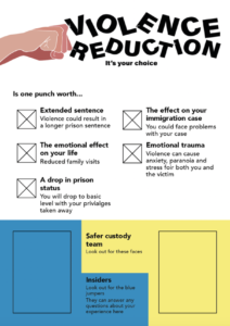
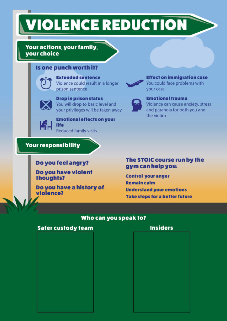
The brief for this project was to create an A0 printed poster on violence reduction which would replace an existing board of text heavy information that is regularly dismissed. The poster would aim to educate inmates on the importance of avoiding and resisting violence. Principally by explaining the consequences of committing such offences and provide information on who they can speak to in the prison for support or help.
Communication
All communication to the prison was done through Suzanne Portch, a teacher for the University’s Linguistics department who had previously worked at Huntercombe Prison. Suzanne supported us with the design of the poster and was readily available to answer any questions as communication to the prison is very slow. We also conversed with our supervisor about design and typographic features, though he admitted that most feedback about the suitability and content had to be done by the prison staff.
Visit to the Prison
On 30 January, we went on a trip to visit the prison to talk to the staff and inmates about what specifics they wanted from us. Upon our visit to the prison, both inmates and staff highlighted some features we needed to consider when designing the poster:
No complex language can be used due to many of the inmates having very limited language skills.
Inmates are not allowed to loiter in the corridors so therefore cannot stand and read the poster for a long duration of time.
Prison staff mentioned avoiding colours and imagery of a stimulating nature.
The inmates expressed a wish for the new design to be visually engaging as it is to replace the existing, boring notice board. This was made up of A4 sheets of white paper with large blocks of all-caps, black and red text.
The correct prison specific terminology must be used.
There must be an area of the poster not designed on, allocated for the staff to stick their own images on of people the inmates can turn to for help.
Development
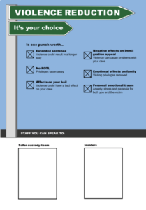
After visiting the prison, the team discussed the angle we wanted the poster to take. The poster needed to explain to inmates how their violent actions have consequences, such as impacting time they are serving or having their privileges removed. However, we decided that the poster would aim to connect with the inmates on a more emotional level which would help them properly understand the consequences of violence in a more human context. During the visit one of the inmates had made a comment saying avoiding violence is a choice that every inmate can make. This decision not only has an effect on them, but their family too as visiting privileges could be removed, or more severe punishment may be implemented. We decided this is a really important message to convey, particularly as it was bought up by the inmates themselves. It was therefore decided that we use this concept of ‘choice’ to inspire the design and the direction we took not only visually but linguistically.
Both design students brainstormed and sketched out a few ideas and as we progressed made sure to compare and discuss our potential ideas. Together we decided on our two strongest ideas which we presented to the rest of the group [fig.1&2]. Ultimately we decided the signpost concept was more effective [fig.1]. Though this design does not directly illustrate violence, it focusses more on the idea discussed previously of the inmate having the ‘choice’ to take the correct path for them and their family. Though the second idea [fig.2] of the fist is more obviously linked to violence, the imagery has the potential to be inappropriate or even stimulating for some inmates. This could risk encouraging violent tendencies and having the opposite result to the purpose of the poster.
Figure 1 Sign post concept: Representing the idea of choosing the right (non-violent) path.
Figure 2 Punching concept: Fist punching the text, symbolising the idea of breaking the norms.
To combat the poor language skills of some inmate’s and the fact they cannot loiter, we tried to use as little text as possible, in the simplest terms. This was challenging however as we were required to use the correct terminology. Therefore, in order to aid understandability of more complex terms we experimented with the use of icons. We designed them as simply as possible, so they were easily recognisable yet conveyed a lot of meaning. As the poster is so big there was room for the icons to have some detail and still be clear. Meaning the finished icons were both useful and visually interesting. We experimented with colour pallets to see what worked best for the text and icons to be most legible. Eventually deciding on a background colour scheme representative of a sun setting, which was chosen due to the calming manner of the tones. The text is largely set in navy blue as this colour is dark enough to be legible but not too harsh against the background.
In a further effort to increase readability we had to carefully consider the typeface used. During research we looked at typefaces used for education purposes that are highly legible, created for children who are developing their language skills. We considered using one of these to improve the readability of text. However when testing these typefaces found they were too juvenile and considering the subject matter and the adult audience would be inappropriate. The font we used for the final design is a bold sans serif typeface called FatFrank Heavy. This font has a similar feel to the educational ones we researched as it is quite thick, rounded and clear, yet it is not childish.
Working with linguistics students presented some challenges as well as benefits. It was useful to have more people with ideas and to get feedback from, but their job was far simpler and at times felt unnecessary. However, it was good to get experience working with and organising a team of members from multiple disciplines. Particularly as we gained valuable skills in communication both with clients and team members who are not designers.
Final design
The poster aims to make the prisoners think twice before lashing out or getting involved with violence. We hope this will make them consider the consequences and result in a reduction of violence at Huntercombe. The use of colour and imagery will make the poster stand out from the dull prison walls meaning the information is more likely to be read and absorbed by the inmates. We placed A4 rectangles at the bottom of the poster where images of staff members can be stuck who can support the inmates in dealing with violence. Having these areas blank mean that the images can be easily changed so the poster does not go out of date so fast. In comparison to the existing notice board of text heavy sheets of information, this poster embodies that same information in an interesting, calm manner that is useful and understandable for the inmates.
Final poster design
Feedback
Once the poster was finished, we had hoped to go and visit the prison again to showcase the design and receive feedback from the staff and inmates. However, due to complications with COVID-19 we were unable to deliver it in person. Despite this we still received positive feedback from Suzanne who thought the emotional direction of the poster was thoughtful and more beneficial for the prisoners. In addition, the overall design succeeds in presenting violence in a calm manner and bringing an element of colour and life into the prison. The feedback implies that the poster will be effective in this way and benefit the prison in tackling violence.
Conclusion
We found that working in a team of multiple disciplines was challenging at times, but it gave us the opportunity to learn communication skills and the importance of properly organising a team. We learnt that working with people other than designers means adjusting the design process slightly and being sure to articulate ideas and concepts as well as possible.
In terms of difficulties we faced when designing, tackling prison terminology was challenging, especially for programmes that are specific to Huntercombe. For this we communicated a lot with Suzanne, who had some knowledge of this, and the prison staff who were very helpful and ensured that the information on the poster is accurate. This element of the process was a good experience of designing within strict constraints, considering the appropriateness of all design elements and keeping good communication with the client.
We found that talking directly to the inmates was the most effective way to discover how the audience would respond to the poster. Male prisoners with limited language skills are an extremely niche audience to design for, meaning we had to consider things that other projects simply never present. By talking to the inmates, we learnt about prison life, the rules there, and how some inmates manage their mental health in an effort to avoid situations of violence and other offences. The group of inmates we worked with were of the highest level of education and comprehension who explained that they are more conscious of getting out of prison to see their family than committing any violent act. However, they explained that this is not the case for all prisoners and that is why this poster is so essential. This experience was extremely insightful and gave us an opportunity to design something that has the potential to educate and make difference to someone’s life. Encouraging and informing someone who has made mistakes to make good decisions and take steps for a better future.
Interested in MA Communication Design? Join us at our Open Mornings and discover our 4 study pathways. Visit the Department of Typography & Graphic Communication, chat with lecturers and current students, and get advice about how to apply.
Dates: Thursday 25 January 2024
Time: 11:00 am to 1:30 pm (UK time)
Where: Department of Typography & Graphic Communication, Whiteknights Campus, University of Reading
THIS IS AN IN-PERSON EVENT
After a welcome from Dr Ruth Blacksell, Department Director of Postgraduate Taught Studies, a presentation about MA Communication Design will focus on our 4 study pathways: Book Design, Information Design, Graphic Design, and Typeface Design. This will be followed by a walk around the Department and a look at our studios, special collections, and printing workshop, ending with a tour of the current Department exhibition.
The talk focused on Josefina and Sue’s experience of applying the research findings and the design approach to a set of documents explaining how to use a test for viral flu. The team developed a toolkit to support the creation of point-of-use instructions, taking account of views from diagnostic industry members to inform an understanding of how instructions are produced currently and what guidance might be helpful.
Plus, the IIID award ceremony closed the conference, and Josefina won an award in the Healthcare category for her work with CwPAMS on their Antimicrobial Stewardship Toolkit. Congratulations to Josefina!