Week 2 of autumn term this year saw David Pearson return to Baseline shift – although in pre-recorded form – to present his take on book cover design and his latest work. David is a renowned British book designer with a strong interest in typographic expression. He established his own design company, Type as Image, after leaving Penguin Books in 2007.
The power of type
Working in commercial book design, David’s covers must command attention at distance in book shops and supermarkets, and online at a small scale. They also need to be understandable at great speed. His primary tool of choice to do so is typography.
Once terrified of typography by the looming rules of good practice, his eyes were opened to the simple notion of looking at typography emotively: examining the ways in which different characters expressed themselves. He does not design type, but uses it to his advantage, embellishing it where logical. Now an advocate for letting type speak for itself, David argues that you don’t need to use both photography and type to illustrate the same thing. He strives for a sense of voice in type, and to create the relevant tone for the book. One way in which to ensure this is to use a typeface fitting for the time period in which the book was written.
David’s recent cover for the book ‘Hitler and Stalin: The Tyrants and the Second World War’. Previous covers illustrated the leaders with photography, but David’s choice of typefaces reflects their characters enough to stand alone.
Remember to consider whether you need all of the elements in your design; perhaps you can strip back for greater effect, without losing the ability to communicate the same message. In David’s opinion, sometimes the best option is to step out of the way as a designer and let the type do the work.
‘Let it sing on its own.’
David’s cover for ‘Politics and the English Language’ set in the typeface Caslon Rounded from Commercial Type.
Speed and rhythm
David considers speed an important factor in book cover design. The speed at which you create your work can affect your outcome. Work slow, and you may find you can more easily reflect the relaxed nature of a book. Or, try the opposite. Maybe this is something which can often get lost in our consideration of the design process, as we strive to create the right and relevant thing, sometimes at great pace.
‘If you work fast, that communicates… all of the energy is bound up within it.’
David also looks to create covers with a rhythm that mimics that of the story. Matching these more subtle connotations of the visuals to those of the writing should somewhat enhance the relevance of your cover and how well it fits your book.
‘The Librarian’.
Volume
When designing book covers, consider the size and temper of the type. Do you want to create a sense of power or urgency, or provoke a more intimate reaction between book and reader? Big, large type is direct and loud; it can shout at people. If the size of type you choose relates to the volume of the writing, then you will create a more relevant atmosphere and set the tone better. Volume is great for split second communication.
David pointed out that today we perhaps use big type way too often, and that we, as designers, should more often consider a slower release of information by utilising small type.
‘When everyone’s shouting at you, you can’t pick anything out. A whisper would stand out more prominently.’
Distressing type
David believes that there is more pressure to create a sense of place and drama when working with fiction, and that if you use straight type, in its plain stock form, you may struggle to portray this. In other words, distressing, manipulating or interfering with type may help you to increase intrigue, build a story, and invoke greater emotion within a cover.
David’s cover for ‘The Road’ displays prominent distressed type.
Illegibility, something heavily avoided in a lot of design contexts, can be a useful feature in book cover design. David argues that there is a sweet spot between legibility and complete illegibility where the reader is left to fill in the blanks.
Physicality
There is no doubt that we are increasingly bound to computers today, and this can often limit our creativity. Do not forget that physical tools can deepen your potential; if you’re stuck for inspiration then why not try something different. David advocates this. Also, it can be great fun.
‘When you’ve got an object in your hand… you create things that you weren’t necessarily looking for.’
Consider that when designing a book cover, you are creating a physical thing; it will be held, interacted with, pulled apart, sniffed, etc. Choosing the right materials and finishes is therefore key. David pointed out that the more tactile a cover is, the less likely a reader might be to put it down. Remember that a book exists in 3D space and has a spine and a back, not just the front.
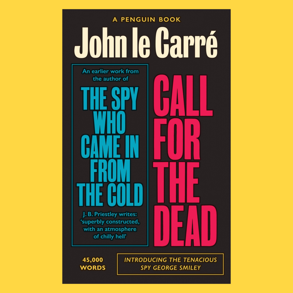
The Smiley Collection
This year, David has completed a redesign of the George Smiley novels by John le Carré, a renowned English writer of spy novels. His covers for the series break the trend of the genre: making use solely of type and lacking the typical silhouetted, black and white, misty photography.
David emphasised that he would not have been capable of writing the copy to such a standard himself; he worked with the writer Nick Asbury. On many of his other projects, he regularly hires illustrators. Ultimately you can’t always do everything yourself, and working with others will often improve your outcome.
‘I would urge you to work with other people. The beauty of working with other people really is that you ultimately end up liking the work better.’
Each cover in the series is different, yet retains likeness to the previous, much like the Penguin Great Ideas series which David has worked on over the course of 16 years. He argues that with series design, you can take more risks as multiple cover designs exist to support each other.
‘Change the gears. Mix things up and keep people guessing.’
The Smiley Collection book covers.
Reflection
Evidently there are many ways to approach book cover design; you can employ photography, illustration, typography, etc. No matter the graphic elements, you should ensure that the design reflects the book. David’s approach to book cover design provides us with a great starting point when designing for books, but equally we can apply these techniques to other avenues of design. David reminds us that we should carefully examine every visual aspect of our work in relation to what we are designing for. And, in doing so, that it may be beneficial to break convention by doing things such as allowing illegibility, in order to boost expression.
‘You don’t have to always settle for the standard.’
‘I thought it was very interesting. To try and find a creative approach to type with editorial cover work that is so hugely visual and largely illustration is a very interesting way to think. Usually your gut reaction to book covers is to illustrate.’ – Robin Smith, Part 3
‘David Pearson just gave a really good talk. His honesty and authentic sharing of experiences has been both humbling and encouraging. I just wish we had the chance to ask him some questions. His talk gave me a lot of insight and ideas for future projects.’ – Sophia Tai, MA student
‘Seeing some examples of the covers that didn’t make the final cut and listening to his experience in real world situations was a valuable part of David’s talk.’ – Tessa Vaughan, MA student