Category: TY1DP1

Work by Part 1 students as part of their ‘Design Practice’ module.

Funeral invitation

I was so intrigued by all the collections, however this funeral invitation caught my eye as it is something I have never seen before.

I was drawn to how thin and delicate it looked and how old it must’ve been for the reaosn that now we hardly see invitations like this and this big. The way it is, I believe it must’ve been for a well known rich special family possibly upper class.

To the left side, the black thing, I analysed it and I believe it is a wax seal as when the plastic was taken off the invitation I looked closely at it and I could see some designs and patterns on the wax seal, which again could represent wealthiness as maybe only rich upper class people could afford wax seals.

Funeral Card

The object I chose to write my blog post from Emma’s collection is a funeral invitation card. I chose this object because of the different typographic elements used.

Printing Process 

The art work has been printed in many different ways.For example, the name ‘Mr Biscoe’ is handwritten but the actual invitation information looks as though it has been typed using a typewriter. The details around the text such as the skulls, coffin and the signs etc all woodcut images that have been engraved into this thick material of card/wood. I think once the engraving was done a stamp or a press was used to spread black ink over the engraving to show all the little details more effectively, and then the writing was added in the empty white space.


Use of Colour 

The only colour used for this funeral card was black. And this could be to signify grief and solemnity. Black was a colour used in the 19th Century for mourning and the loss of an individual and if any women was seen in black when not in a mourning period was seen as dangerously eccentric. The black colour in contrast with the half white background makes the writing really stand out.


Lettering Style 

The letters used in the text is a serif font. The spacing between the lines is quite small. The writing seems together. But the spaces in-between words are quite bigger than a normal space. There is text used for the actual invite message but also in the engraving. The engraving has texts such as ‘remember to die’ and these texts in the graving are all in caps and this could be to ensure the text is bold and stands out.


Audience 

The audience was adults, those invited to the funeral. They had to bring this card with them.


Extrapolating Type

Extrapolate means to “extend the application of (a method or conclusion) to an unknown situation by assuming that existing trends will continue or similar methods will be applicable”. 

This is exactly what we were tasked to do, by looking at the letters and using the clues to work out what the other letters would look like. In this example the serif on the ascender of the “d” would be similar to that on the “n”. The letters “a”, “e” and “n” should all be the similar sort of height, reaching to just above the x-height. 

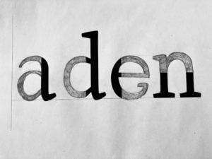
From this close inspection at the letter forms, I learnt that no “e” has a serif. The counter of both the “e” and “a” should roughly be the same space. This is to create balance and harmon within the typeface.

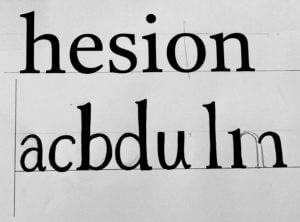
I found designing the rest of the letters, from the given letters, quite a bit harder than completing the letter form. How narrow or wide should the letter be? Where do the serifs go? What style should they be?

My letters are too thin, with not enough contrast between the thick and thin strokes. They are also too narrow, compare the “a” to the “e”.

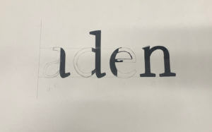
From the exercise I learnt many things, I am happy enough to leave this to the type designer! But it made me more aware of the features, when blown up. Letters are usually only a few millimetres high, so the characteristics are so small to be noticed. When reading I hardly pay any attention to the typeface and the anatomy of the letters, but after spending a few hours really paying attention you notice these tiny difference in the characters.

Platforms of letters

For Gerry’s project, we looked at different typefaces and were given two tasks, which was using clues from the visible parts of letters and try to imagine how the rest of the letters may look like.

Task 1

In the first task, we were given a sheet where half of the letters were printed and we were to draw the rest of the letters. The sheet I had chosen was the font ‘Rosetta Type Skolar’ and the word that spelt out after we were done was ‘aden’. I focused on the terminals of the letters and kind of replicated them when drawing the other halves of the letters, as I believe it was one of the main elements of the font. I had also drawn the x-height and the baseline of the letters in pencils (not very visible on camera), to help me with drawing the letters in the same height. Unfortunately, I was unable to finish filling in the letters with the black markers but Gerry had gone over the different fonts and explained to us the differences, the spacing and the context of the typefaces. This was very interesting to know as it would help us to choose what typefaces to use when we need them for future projects and we were also informed of where to get fonts from.

Task 1

Task 2

For the second task, we were given the word ‘hesion’ in a specific font and using that as a clue, we were to draw the letters ‘abcdufrtg’, figuring out how the letters look based on that font. In my sheet, I had the word in the font ‘Darden Studio Halyard’. I started off by drawing the x-height and the baseline on the paper. Then I measured the height of the letter ‘h’ to see how tall the stems of the letters should be. I had also measured the width of the stem  of the letter, so as to draw the letters as accurately as possible. After all of this, I proceeded to draw the letters, using those measurements and also focusing on the shoulders and the variation of thicknesses of the letters.

Task 2

Thoughts on this project

Overall, this project helped me in understanding typefaces even better and the amount of time and thinking that goes behind creating new fonts, whether its a variation of one or a completely new one from scratch. I was also revealed to the reality of the fact that it is indeed not easy to draw letters in a certain typefaces quickly and it takes years of practice to master this skill.


Comparing the designs on Menus


The Menus shown above were made in 1938 for The Ritz Hotel. I was initially drawn to the choice of design on the cover as it doesn’t reflect the brand identity of the upper- classed hotel, but the choice of a clown suggests the entertainment and classical element if the Ritz. The typography presented inside the menu demonstrates the traditional and glamorised element of the hotel, as they’ve used  rather flamboyant serif fonts that almost like its been hand written. The layout for the menu is unusual for the time as it focuses on appearance rather presenting the information clear for customers.

The menu above was created in 1967 for a slightly lower classed hotel. Again the menu uses a painting as their feature cover image as well as a decorative piece of string. But the main difference between the two menus is the layout of the menu and the use of a more simpler serif font. The menu has a more clearer list for customers and include the  price of the food whereas the Ritz menu doesn’t. The ST. Ermin’s Hotel also includes the use of coloured ink reflecting the the evolvement of type design.

Paper wheel charts

During this mini project I was drawn to these paper wheel charts, know as volvelle, that where displayed within the collection. These wheels where created to have answers to lots of different things by the different layers of the wheel that spin around, for example the one on my cover picture tells the user about gardening and the best times to be plating different things in your garden. They are often used to calculate different things in a fun and clear manner as you are able to get the answer you want by spinning the wheel. Reinventing the wheel was a book in the collection which gives lots of examples of different wheels for lots of different things all with very interesting designs some where very old and there where also more modern designs displayed within the book.


Staircase theme

For the broken narrative task I decided to chose the theme ‘staircase’. I really enjoyed working with this theme because I was able to create a staircase effect in the centre of the book. I cut this out to give a spiral staircase effect. As you go through the book (down the stairs) you can see the pages from inside start to get darker and the corners start to tears away. This symbolises how the man from the theme is getting more ill every time he goes down one floor of the sanatorium. Towards the end on the last page you can see the page fully turns black. This shows his sudden death.


Zee Graphics

For this mini-project we had to brand ourselves and create a logo, with research from a particular theme. I was struggling with my own theme at first as I chose 90’s. It was a lot harder than it looked. There were so many different themes and colours, styles and fashion so I decided to choose something a little more simple.

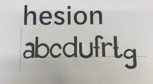
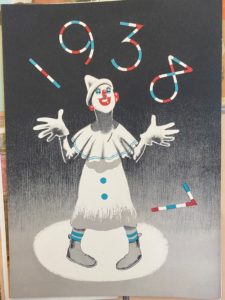
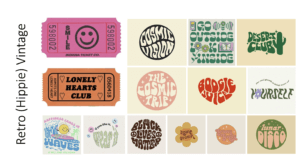
I was going for a “groovy” or “hippie” kind of aesthetic where the fonts are  a little loose and wavy. The theme, as a whole, is very colourful and I loved how the words are distorted to fit into or create different shapes.

I found these movie tickets while researching my theme, and I thought I could use them as part of my final outcome for my logo. They matched the theme in my opinion as they shared similar aesthetics, colours and typefaces.