
The object I chose to write my blog post from Emma’s collection is a funeral invitation card. I chose this object because of the different typographic elements used.
Printing Process
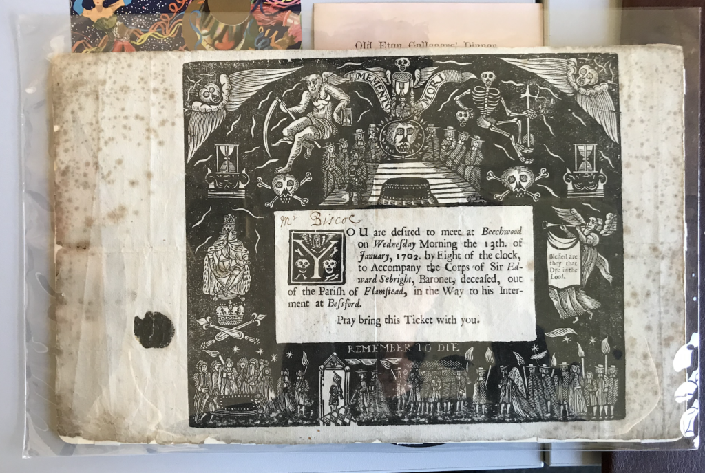
The art work has been printed in many different ways.For example, the name ‘Mr Biscoe’ is handwritten but the actual invitation information looks as though it has been typed using a typewriter. The details around the text such as the skulls, coffin and the signs etc all woodcut images that have been engraved into this thick material of card/wood. I think once the engraving was done a stamp or a press was used to spread black ink over the engraving to show all the little details more effectively, and then the writing was added in the empty white space.
Use of Colour
The only colour used for this funeral card was black. And this could be to signify grief and solemnity. Black was a colour used in the 19th Century for mourning and the loss of an individual and if any women was seen in black when not in a mourning period was seen as dangerously eccentric. The black colour in contrast with the half white background makes the writing really stand out.
Lettering Style
The letters used in the text is a serif font. The spacing between the lines is quite small. The writing seems together. But the spaces in-between words are quite bigger than a normal space. There is text used for the actual invite message but also in the engraving. The engraving has texts such as ‘remember to die’ and these texts in the graving are all in caps and this could be to ensure the text is bold and stands out.
Audience
The audience was adults, those invited to the funeral. They had to bring this card with them.