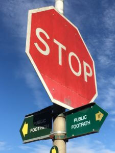
During the outbreak of COVID-19, social media has been quite literally an essential part in people’s lives. Social media has not only been used to find out new information or regulations put into place, but it has become a coping mechanism. It has somewhat distracted us from the real problem. This has been done by the use of memes. Instagram pages like ‘World Health Organisation’ use a different style within their posts compared to a page like ‘coronavirus_memes’. Although their posts are relating to the same topic, they both contribute differently to the social media bubble. Memes take out the seriousness the subject holds and adds a sense of humour and excitement to the post. Like in the example shown above, back when the lockdown was introduced, the public had gone through a mental craze. Shops were left empty and houses were full of bulk-bought items. Economically, this was a complete disaster, however nearly every meme showed a comical aspect. On the other hand, when we look at the ‘WHO’ Instagram page, we see instructive, clean and well-presented posts. Each new update is a thought out piece of artwork, compared to a meme which usually never has an organised finish. They intend for their message to reach an older and responsible target audience, whilst the meme pages target the younger demographic.

Additional collages made in the task:
https://l.facebook.com/l.php?u=https%3A%2F%2Finstagram.com%2Fcoronavirus_memes%3Figshid%3D130b3th5ncyig%26fbclid%3DIwAR06bGQ0lh8daQA0WIiTfzLSbabeZGzkidgk-gOj-l9ivuVWnb5l6SQfZJw&h=AT2TRevOTeH7FOBRERXmJvUvgYx3sgrPZ1Wj0ugVFE9NMMH41M_fcahUu56Y6xPQKnav4BSarMRedGkLNi_HkhrDwzz2dDYIEoMIQqPQI8DPfvLhr1XQqCtTZWjcDIxdHUBPaQbBxBs
https://l.facebook.com/l.php?u=https%3A%2F%2Finstagram.com%2Fwho%3Figshid%3Dn7s7kndnsf28%26fbclid%3DIwAR0Tq8gmj_rdBHIq_lzT1vBguU7cd7-kQ-_yxeK2iz-CcB6voSHbvcBb7yA&h=AT2TRevOTeH7FOBRERXmJvUvgYx3sgrPZ1Wj0ugVFE9NMMH41M_fcahUu56Y6xPQKnav4BSarMRedGkLNi_HkhrDwzz2dDYIEoMIQqPQI8DPfvLhr1XQqCtTZWjcDIxdHUBPaQbBxBs
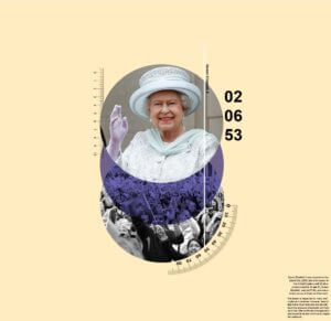
 For Sara project Impactful images, we were asked to design two images based on a topic given to us. One of the images should be direct and the other indirect towards the topic. The second image should be less subtle but still allow readers to be able to identify the theme of the topic.


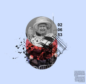 Instead of a blue circle, it changes to red to give a more aggressive tone. The blue background compliments the red and makes it more dynamic as it’s darker. Mark making were used to replaced the measurements to represent more chaos and irregularity. The photos of the fans were replaced with paparazzi to represent the invasion of privacy and loudness that they represent.