
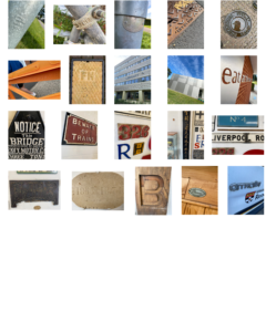
For my research, I went around campus looking for colourful type/signs that either catches your attention immediately, or blends into the background and go unnoticed. I found the main use of colour was for warning and informational signs, something to be expected when it is more likely to draw the eye to it.
This was an interesting task because signs are utilised by most members of society, but they are very easily overlooked when overwhelmed with other signs. For example, there was a construction site on campus that had a sign board with many different signs that were all competing with each other. The use of the board isn’t to guide the general public, but its still an insight into how design aids attention to important messages and notices.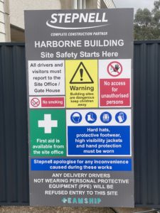
 When tasked to explore the university campus looking for use of typography in a 3d environment, I decided my focus would be on caution signs and what they have in common
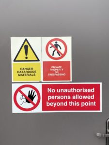
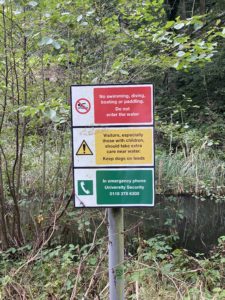
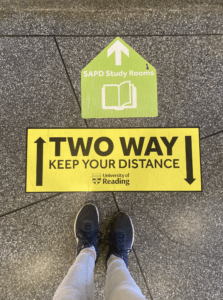 After collecting the photos I began to sort through them. I noticed that nearly all of them were circles with only a handful being rectangular. Within the circles, I organised the images by colour: white, green, yellow and red. They abided by the universal traffic light system with green meaning go and red meaning stop. Yellow is used to give instructions.