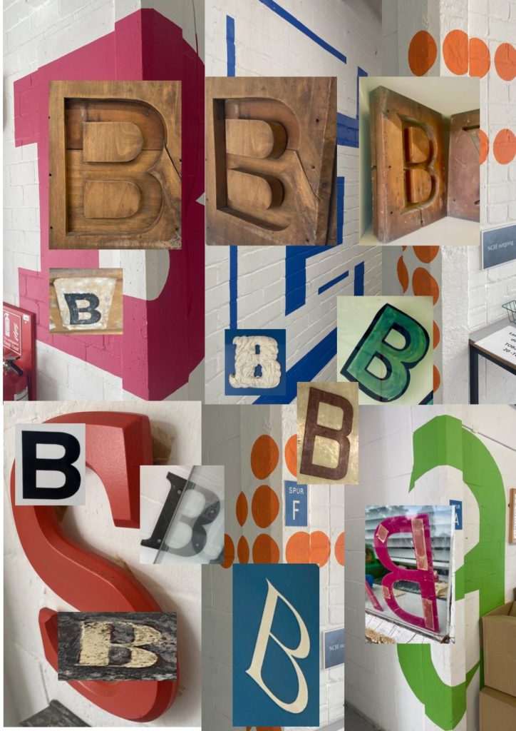
For this mini project I decided to focus on the different perspective of letters in the environment. I focused a lot on different angles of the letters and how this made the type even though they where the same look completely different. I took photos from high, low to each of the sides as well as zooming in and out. To really get to understand how the change in perspective happens. Something that I noticed as I focused on the letter B was how the different font, colour, text size and position all allowed for the same letter to look completely different some many times. I was then able to represent my findings on a document displaying how perspective and different varieties that go into the typography change the meaning and visual.