Category: Lettering in the environment (Eric’s project)

Lettering in the environment

Materials and Context Photography Across Campus

Eric Photography Document 2

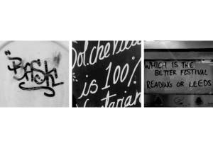
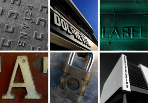
For this ‘Photography In the Environment’ task, I focused primarily on the materials the letters were placed on or made from. I became highly interested in the lettering of the mundane, the everyday lettering that goes largely ignored.

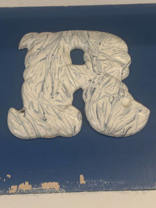
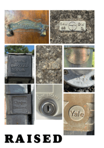
The texture, material and condition of the text was also of interest to me – It was an interesting thought process to consider how the lettering had been constructed and how that linked to it’s purpose or task. For example, the concrete lettering found on the base of an outdoor table tennis table is set deep into the supports in a thick, slab serif type. While having connotations of strength and stability, this also links to the lettering’s function, to communicate the brand name of the objects creator. Due to its intended usage being outside, both the material and method were appropriate.

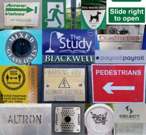
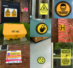
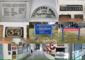
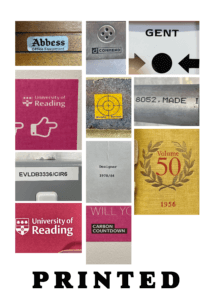
I then began thinking of the condition of the lettering – The ‘Please Close Lid’ sign, found within the Co-op, was immaculately clean and a clear, sans serif type in an assertive dark red shade. While helping to stand out and communicate the desired message, the cleanliness and visible shine over the letters reflects positively towards the shop as a whole. In contrast, the deteriorated, aged letter H found on a nearby block is clearly old and has been left unattended. The texture of the pain crumbling away, revealing the exposed brick underneath, was very different visually from much of the campus, which tended to all be newer lettering.

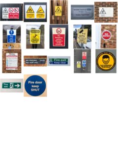
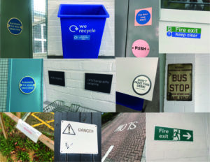
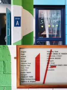
Looking back at these photos, the context of the lettering could have been explored further, with different distances allowing both the material and context to be shown optimally in separate shots. However, as in the Fire Exit image, I believe that this wasn’t always necessary, as that image captures both the material and context of the letters reasonably well.

Eye Line

This is a mini project looking at the different types of lettering in the environment. For this project I had a theme of ‘eye-line’ where I took various photos at signs around campus and looked at what features they had.

From looking at the various signs I found that all the signs at eye-line were important or warnings. This was emphasised by bright colours against a plain background and that the had bold sans serif fonts to grasp the viewers attention.

Serifs and Texture

Task

For Eric’s project we were tasked with finding Lettering in the environment with a theme in mind. At first I started taking pictures of all lettering that interested me and I started in the typography building. As I was taking pictures, I realised that most lettering were serifs so I decided to make serifs my theme. However, as I was taking the pictures, I realised there was a variety in the serifs as some letters had clear and traditional serifs and others were less clear but still had decorate ends.

As I continued taking pictures, both inside and out the department, I started to take pictures more focused on textured lettering, specifically, texture that had been a result of wear and age. This lead to taking pictures outside because I had found that text was more worn out there due to weather.

We then had to group our pictures into our themes and placed the smooth textured serifs at the top of my page as it was my first theme/idea and moved to textured serifs to textured lettering down the page to mimic the evolution of themes from just serif to textured lettering.

Signs Observation

By capturing all the signs found around the typography department, I have been more aware of the environment around that I usually not pay attention to. In these days, variety of signs, logos and numerals were designed to make our life full of convenient unknowingly. More signs are designed. For example, instruction signs designed to remain our behavior of social distancing and washing hands due to virus.

I categorized all the images according to their colors with particular functions. Primary colors that match with black and white letters have contrast effects, as well as use sharp paint to grab people attention.

  • PROHIBITION signs mainly in red

  • WARNING signs mainly in yellow

  • SAFETY signs are in green; MANDATORY signs are in blue with positive instruction

Besides the function of colors, similarities of signs are that it designed as simple as it can by linguistic and symbolic lettering, we can always get the message behind the signs in less than three seconds without hesitation. I compare them with tiny observations:

  1. Simple geometric shapes using in outshape of signs, and common symbols within signs are arrows, banning circle, exclamation triangle and recycling sign.
  2. Font of Sans serif are used in almost every sign due to its readability.
  3. Material and placing position are different between indoor and outdoor signs: Indoor signs are mainly placed on the wall with eye levels and using removable materials like binding metals or stickers, while outdoor signs are mostly bigger in size and use weather-resistant materials, as they are mainly designed for pedestrian and drivers.


Eye-catching Sign boards and Letters

For Eric’s lesson on 04/10/2021, we were given the task to explore around and outside the department and take photos of any sign boards or letters that we are interested on. We had to do this based on the brief we were given which said to ‘search for lettering around the campus based on a theme of your choosing and take photos of it.’ Therefore, I based my theme on signs and lettering that are eye catching or somewhat interesting. Overall, the experience was interesting as it made me pay attention to the details in the said signs and the amount of details put in each of them so that it catches the eyes of passerbys. This was done so in these sign boards through using bold and bright colours such as red, yellow and green. The use of the different fonts based on the modernity or the vintage ness of the sign boards is also very clearly evident in these photos. Taking all the photos were fairly easy, as I walked around campus and visited the same route I take when walking to the typography departmen, however, in the middle of my walk, it started raining, resulting in some of the photos having a blurry effect on them.

Since none of my photos had an ongoing colour scheme or focused on one specific thing, I collaged some of my favourites and appropriate ones to show the photos I took while walking around the campus. While doing so, I realised most of my photos were taken in a straight frame, almost symmetrical, which I think also conveys how someone might look at these lettering from their viewpoint.

For this particular lettering, I zoomed in on one of the letters to highlight the details in the letters itself. I found it quite interesting how the letters were sticking out and not laying flat on the surface and the overall marble texture of the letters made the whole lettering look visually pleasing to look at.

Lettering in the Environment

As I was taking pictures of different letter forms, I focused on texture, lighting and shadow. I like how each of the letters shown in the collage above either have a rough/smooth texture in the background or in the actual text. I found it really interesting how the blue ‘E’, painted on a white, textured brick wall, could still convey straight lines even though it was painted on an uneven wall. This is when I looked closer and noticed that the paint had been applied in a jagged format so when looking from a further distance, it almost created an illusion that the lines were straight, when in fact, they were actually uneven. Another form I liked was the ‘ROYAL’ one at the top right as the smooth texture that created reflections in the light and gold colour really brought out the ‘royalty’ of the text, making it really fit in with its purpose.

The Little Things

Brief

For this project, search for lettering around the campus based on a theme of your choosing and take photos of it. The theme can be whatever you like – or find, such as style, function, material, colour, texture, technique, and so on. Look everywhere – up, down, straight ahead; on buildings, objects (including cars), and bits of infrastructure (like lamp posts or utility covers). When you’re photographing, get up-close as well as shoot from distance.


Process

After the introduction to the project from Eric, we were left to take photographs for the remaining hour. As I wandered around the department to look for anything that stuck out to use as a theme, I stopped and thought to myself- ‘what if i did the exact opposite?’. So I decided to look for things that didn’t stick out, small examples of lettering that were passed by on a daily basis without anyone looking at them. I found engravings in the handrails outside of the department, university logos printed on the smallest of stickers and even a logo etched into the head of a nail.


Refinement

I decided to sort my photos into three sections: engraved, printed and raised.

I decided to do this to highlight the differences in materials, textures and creation methods behind each of my photos. For example, a majority of the raised and engraved letters are made from stone or metal, whereas the printed ones were on paper, plastic and canvas type materials. Making these connections made me think more deeply about the manufacturing process of these letters, and the different methods used, for example, after watching lectures from our Printing & Printmaking module, I considered whether metal casting similar to the process of making sorts was used for any of the small metal objects, such as the nail head.

It also made me realise, that while these small letters may not have any kind of significance to a majority of people, they still have uses to others. For example this small website at the very top of a bike rack- no one would ever bother to stop and read it, but if it were to break, the person repairing it would need that website to figure out who made it, and how to fix it.


Reflection

I really enjoyed doing this project as it was much more active and let us think for ourselves about a theme that we could apply to what we were looking for, essentially letting us each create our own unique brief as a development of the original. Doing this project also let me learn how lettering interacts with the environment, and that sometimes type is needed in even the smallest of things, as it can still communicate and has a purpose- not one noticed by many, but essential to some.

Font Finding


For Eric’s lesson on Monday we had to find lettering in our environment, eg around campus.

We got lucky with the weather being very sunny, and clear blue skies, as this meant a lot of light in our photographs, and a bright sky that on occasion helped add to the photo. I found signs, graffiti and stickers posted about campus. I also took a couple photos of the lettering in the typography department, however kept my focus to signs outside.

When it came to grouping our photos together and finding a common theme in them, my photos in honesty didn’t have much in common, when it came to font, topic, wording, or even colours. So I did create a collage of some of my favourites, editing them to have a common ground with yellow, blues and greens. And one similarity I did find between a couple photos was framing, where the type had been framed by a certain material, to be the centre of focus, such as, a window, wooden frame, or created on board and centred on a thin wall, giving it a frame.

After this project I will make an effort to look for more lettering in the environment, why it is used, and how communication varies from a sign being instruction (stop, slow down, caution. In bold capitals with bright warning colours). To creative welcoming advertising, for cafes or restaurants that use blues, or black and white for a professional sleek look.


Typography iSpy in UoR

During the 2nd week of mini-projects I was honoured to meet Eric Kindel who presented me with the brief, that, unlike many others, involved going out and exploring real-life examples of eye-catching type around us. These could have been photographs of logos, singular letters/numbers, 3D type etc. Quite luckily that day the weather was quite good, hence providing us with good lighting and subtle shadows that accentuated any raised type.
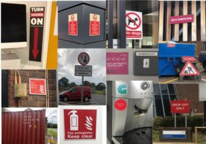
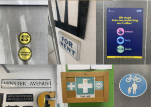
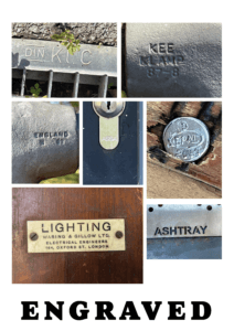
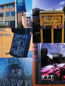
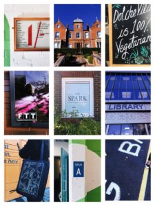
While outside I focused on finding hidden type, one that wasn’t visible straight away, or its features weren’t as obvious from the distance, as opposed to up close. I also tried photographing these examples of type from different angles, especially if it was raised, to see whether that affected how we see it. After we have taken the photos in the given amount of time, we were asked to produce visual collages based on the common similarities between the typography we have taken photographs of.

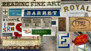
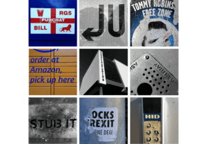
Beforehand, I edited any images I wished to use in this mini project via Adobe Photoshop, which allowed me to emphasise some of the features, and make sure that all images within the collage look visually similar to one another. In some cases, I have also straightened up the photographs, making sure that they have some logical perspective, and are overall pleasing to look at.

Working outdoors really reminded me of what it means to be a graphic designer. Having spent a year in London last year, I learnt that working from home is a challenge, as the best and easiest source of inspiration is the world that surrounds us. During this activity, I also consolidated my skills as a Typographer, as it taught me to explore and type that I haven’t paid much attention to in the past.

Lettering Around Campus

For Erics’s project we studied lettering in the environment. I tried to find lettering around the campus that i thought looked interesting. I liked a lot of the stencil lettering which there was a surprising amount of. After we had taken photographs we were asked to organise/arrange them in a way we thought was suitable. I decided to arrange mine by colour with the greens at the top, followed by the blues, yellows, reds and neutral tones. When looking at how my class mates had arranged theirs I realised mine was by far the least creative however Eric asked an interesting question about whether the colour groups I had split my photographs into had anything else in common. While the green lettering generally invoked safety or a message about the environment it was difficult to find correlations between the other colour groups.