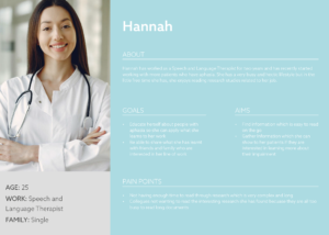
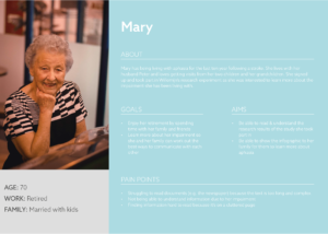
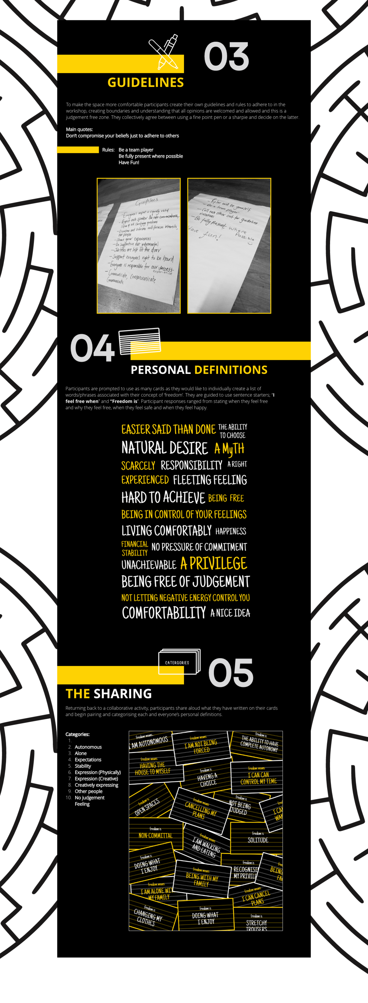
Overview
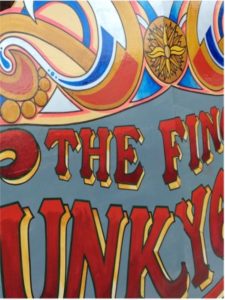
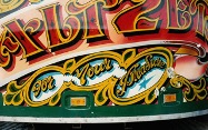
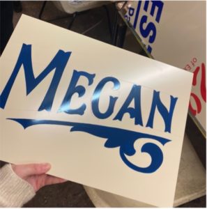
This Real Job comes in the form of a contest, something fairly unusual for these briefs. Following a recent social trip to Carter’s Steam fair, a traditional English travelling funfair, members of the department began talking with attraction owner, event organiser and sign-painter Joby Carter. After learning more about his incredible talent and passion for hand painting stunning fairground signs, this competition was developed, giving students an opportunity to experiment with this highly niche style. To me, this seemed like an amazing way of trying a new typographic style, experimenting, and playing with this fun concept.

Brief
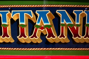
The brief of this work was very straightforward – to pick a brand and recreate its logo in the fairground style. While specifications of the deliverables were given, being digital or physical and being a 2000px square, the choice was left to us. Joby stated in the brief that he personally enjoys poking fun of serious topics and making the most of the jovial, light-hearted nature of fairground lettering.
Concept
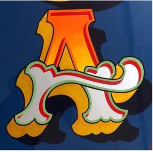
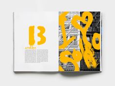
Immediately having read the brief, I began thinking about the most serious business that I could put a spin on with this decorative, over-the-top lettering style. My mind raced to topics like finance, law and banking which quickly led to Legal & General, a financial services provider that’s been in operation since 1836. The history of this company was really engaging, reminding me of old legal documents, such as those seen below. The typeface used are highly decorative and ornamental, being somewhat like the fairground typefaces linked to the fair, allowing this to marry well, being a suitable and engaging brand to remake in this unique style.

Initial Ideation
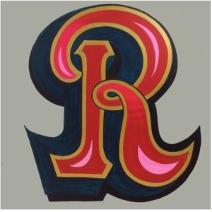
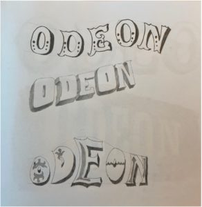
Beginning this work, I started sketching different letterforms and concepts for a Legal & General logo, having looked through Joby’s work online for inspiration. I was immediately faced with a challenge – my lack of artistic ability. I typically refrain from sketching and drawing, knowing I am stronger creating things digitally. While eager to move onto Photoshop and Illustrator, I knew the importance of these fast-paced, initial sketches. While many pagers were created, below shows the strongest concepts.

Digitising
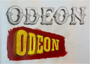
Before meeting with Joby, I wanted to refine the better concepts digitally, giving myself a clearer direction going into the imminent feedback session. With my sketches being very rough, this would give a much more blatant presentation of my idea and how it may be executed. I quickly generated these designs, using the umbrella element which I thought was the strongest from this ideation. While the lettering itself was just a standard font, this would be changed later following the feedback.


Meeting Joby Carter
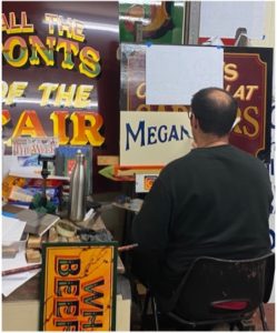
We then had the opportunity to meet Joby Carter, visiting his expansive workshop in Maidenhead. Hearing Joby talk about his work, his process and even watching him hand-paint some lettering was hugely informative for this project and style. The difference between typography and lettering was a really interesting idea mentioned by Joby, with his discussing how different they are treated and how lettering is a largely different skill. While getting masses of inspiration from Joby’s work and enthusiasm, it was clear this was not a skill that could be mastered quickly. I came to the conclusion that, while the hand-made, slightly imperfect appearance is key to the authenticity of this style, I would need to utilise some digital effects and techniques to get close to replicating the skill of professional lettering painters.

Following this event and the following feedback session, I decided to largely restart the concept. Knowing much more about lettering and sign-painting after meeting Joby, I decided to return to ideating, wanting a new concept that was more in line with how hand-painted lettering is constructed and designed.
Secondary Ideation
Going back to square one, I went back to sketching, now having more focus on this style of lettering. These sketches were much closer to what I’d learned about sign writing, providing much more engaging ideas focussed on the letterforms themselves, knowing the rest could come after. Placing the focus on constructing the letters allowed the outcomes of these sketches to being much better foundations for the final outcomes.

Secondary Digitising
For this process, there was much more switching between hand-drawing and digitally creating. Knowing that the imperfect style could only be achieved effectively by hand, I persevered with sketches alongside designing digitally. This allowed me to bring across the more rustic, authentic style of lettering without oversimplifying the designs digitally, using Adobe Illustrator to make things mathematically perfect. This also let me test designs digitally, deciding if the sketches adapt well into a digital space or not. While more time consuming, this meant that the idea I concluded was the best would undoubtably work. After some back and forth, I selected a sketch that was suitable, drawing out the key letters for the brands logo before digitising them. By creating the letterforms by hand, I knew that the end result would have the rich authenticity of hand formed text, but would likely be more challenging and time consuming to create.


I was already much happier with this concept than the previous design – this put much more focus on the lettering, adhering to both the brief and what I learned from Joby, with the careful crafting of the basic letterforms being the key to an effective, successful outcome.
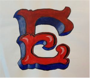
Over this time, there was extensive tweaking and refinement to the characters, with countless iterations being used to mark milestones and save a history of the process to compare changes. The image below illustrates part of this.

Feedback from Baseline Shift
Baseline Shift provided another outlet for feedback on this design. The weekly session happened to be centred around getting advice and tips from various designers in and out of the department, allowing us to get helpful guidance from people new to the project. Wanting to take any opportunity for advice, I presented my current digitised lettering.
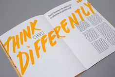
The main feedback I got from this was that it wasn’t fun enough. While this was partly down to the colouring, which hadn’t been considered yet, the overall composition was very linear and straight. The various typographers and calligraphers present all agreed that a more dynamic, free flowing structure would benefit this style much more, giving a more organic and fun sense to the letterforms and the overall branding.
I was also advised to use less strict lettering, ensuring duplicates of the same letter aren’t identical. This would allow the type to work better as a full flowing text, the letters adapting to work alongside those before and after. It also provides a much stronger sense of authenticity and a hand-crafted appearance, with each character seeming visually distinctive and individual.

Making Changes and Feedback
Wanting to inject some ‘fun’ into this lettering, I experimented with different layouts, using Joby’s work and other sign-painters works as examples for structuring text. After some quick trials, moving the two lines of text around, I settled on offsetting this and using exaggerated, large first letters. This more stylised appearance is more in-keeping with conventional letter painting conventions, immediately making it more fun and visually inviting. Adding vibrant colours and an offset drop shadow, common features of this genre, also helps quickly make this design feel more in line with the brief’s requirements.

Below are some variations of this concept, simply experimenting with colour combinations and for the main text, drop shadow and background. While still trying alternate background colours, Joby’s use of slightly off-white tiles for his lettering along with its function as a logo encourages me to use a plain white background. From here onwards, I would stick to a solid white background, feeling this had a stronger connection to Joby’s painted lettering.

At the feedback session, where I showed both my original and updated concepts, there was a resounding lean towards the newer concept. The more dynamic, varying design was much more visually interested and had the sign painting-esque appearance. I was given incredibly useful advice on the typographic balancing, and different parts of the letterforms to tweak to give more visual balance. However, I was told again to make the design more fun and inviting, potentially using perspective, distortion or warping to add further excitement.
While the added ampersand completed the logo, finishing the brands name with the simple & symbol, it was suggested that this could match the ornamentation below, adding more consistency to the overall design and making it feel more harmonious and unifying. With this knowledge, I will start making these changes, wanting to try adding a wave or warp stylisation to give the text even more dynamism.
One key takeaway from this stage was the colours – this designs dark green and murky pink complimented each other and the golden yellow ornaments well. I quickly concluded that this colour combination could be the basis for my final outcome, being highly suitable and similar to the wacky but visually pleasing choices of Joby Carter.

Refining the Letterforms and Warping
With this feedback in mind, I began to move forwards with the design. Despite my eagerness to play with the waving and distortion of this lettering, I knew I would have to correct the letterforms themselves before taking it further.
These corrections to the letterforms were very time consuming to alter – having created these letters by hand, these imbalances were much more prominent than having used an existing typeface by a more experienced typographer. But, as emphasised by Joby, a typographer and letter painter are very different professions, and building this type from hand ensures some imperfections and authenticity remains in the final outcome. The quantity of these changes is illustrated in the below images, where the key iterations are shown.

For example, the two ‘A’s are of particular interest. I altered the way the crossbar works on each one, the first having the curved stroke going inside the letter and the second going out. This tweak to the second instance allows much better balance, filling in the negative space and creating more visual engagement between the letters.

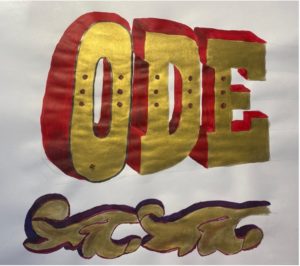
After a brief trial of warping the text in Illustrator, I concluded it would be simpler in Photoshop, applying a single wave effect to the whole design before reading the ampersand and ornamentation. Having quickly completing this, I created the drop shadow and a white stroke to separate the main text from this shadow. While beginning by offsetting a pink version of the letterforms beneath the main design, I then connected the two with hand, adding the outline in after. This subtly change made the design feel less artificial and impersonal, with the minor inconsistencies in perspective making the result seem much more personal and in-keeping with this disciple.

While not mentioned much, the ornamentation was something that subtly evolved throughout the design process. From its initial creation, this has been altered and tweaked, both in shape and style. I was advised to make this element have varying widths, looking less uniform and have a more hand-created style similar to the letters themselves.
While this began as a symmetrical component with the ‘EST. 1836’ text in the centre, I began experimenting with an asymmetric structure, creating more visual engagement and helping to account for the lettering’s visual balance. This structural change causes the umbrella to be removed from this element, but I knew it was a feature I wanted to include in the final design. Trialling different strokes and decorative flares (shown below), I found a solution which worked effectively, feeling balanced below the focal lettering.

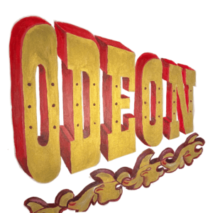
Final Amendments
During the final feedback session, there were much less tweaks to change (a reassuring sign). The main thing to note was the balance of the hanging ornament. It was said that fitting this ornament into the negative space below the wavey text, the whole concept would feel much more balanced and the two would marry together better. A straight bottom was also advised, helping to ground the flowing text to a horizontal line. This worked well, achieving both and giving a nice sense of visual balance.

I re-added the umbrella element, adjusting its stroke width to better fit the other similarly styled elements. Placing this below the enlarged ‘L’ and alongside the large ‘G’ helped to further balance this concept. It’s place here allowed it to be a relevant visual for the brand without over-complicating or crowding the design. The use of colour also helps keep the lettering distinguished from the ornamentation.

To add a final bit of depth and hand-made authenticity, I added a subtly gradient to the offset drop shadow by hand, allowing for some subtle imperfections. With this desire for a slight rustic feel being key to my design process and choices, I felt it important to continue it in every element.
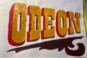
Final Outcome and Self-Reflection

Looking back at the final deliverable and my process, this has been undoubtably challenging but very rewarding to participate in. This style of design, particularly the hand-made nature, is out of my comfort zone as both a designer and typographer. Particularly when developing initial ideas, I found this Real Job tough. Meeting with Joby Carter was the first step in the right direction, with his knowledge on the subject really helping in each aspect of the following design phases. The continual feedback throughout this work also helped immensely, allowing me to show different ideas and get alternative opinions on work.
While I by no means compare my work to that of talented, trained professionals like Joby, I am happy with my outcome. I believe it achieves the brief well, fitting the style of fairground lettering and appearing hand-made and authentic despite being a digital asset. While this is not what I expected to be doing on a Graphic Communication course, this project has given me an immense appreciation for this disciple and the incredible talent and craftsmanship that goes into making such effortlessly stunning hand-painted lettering.


 .
.