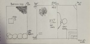
The story of Labyrinth is about a family that trapped inside their new house with unexpected spatial characteristics. They start a journey to find the front door. My initial idea is to create a pop up book with structured pages like a labyrinth.
To represent the story and my idea visually, I designed both for the book cover and inside pages:
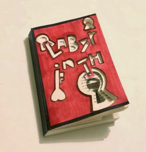
The word of ‘Labyrinth’ are cutted out asymmetrically as the book title, which symbolize the shifting rooms.
Symbols of keyhole added to features infinite doors to pass through.
Colour scheme: Red and black are used to represent the mysterious story plot and anger of the family getting lost.
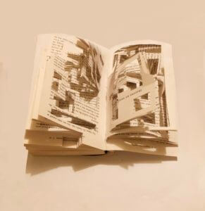
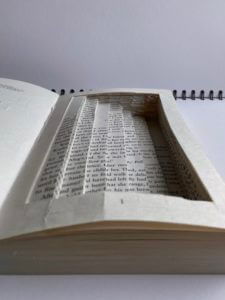
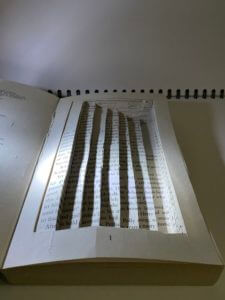
Book pages: Geometric rectangles are cutted out randomly and create a sense of confusion. It also visualises their journey of finding the front door in the house of labyrinth.
Overall, I have experimented with drawing and cutting techniques on the book materials and played with the structure of the book. Although the result is not that well as I expected, I have gained experience of communicating and representing an idea through design but not just emphazise on its aesthetic.
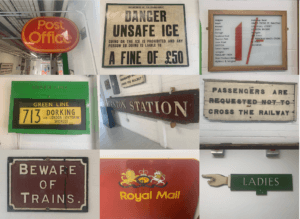
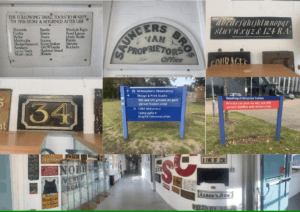
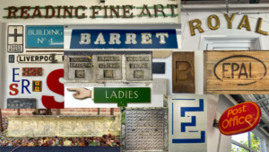
For Eric’s lesson on 04/10/2021, we were given the task to explore around and outside the department and take photos of any sign boards or letters that we are interested on. We had to do this based on the brief we were given which said to ‘search for lettering around the campus based on a theme of your choosing and take photos of it.’ Therefore, I based my theme on signs and lettering that are eye catching or somewhat interesting. Overall, the experience was interesting as it made me pay attention to the details in the said signs and the amount of details put in each of them so that it catches the eyes of passerbys. This was done so in these sign boards through using bold and bright colours such as red, yellow and green. The use of the different fonts based on the modernity or the vintage ness of the sign boards is also very clearly evident in these photos. Taking all the photos were fairly easy, as I walked around campus and visited the same route I take when walking to the typography departmen, however, in the middle of my walk, it started raining, resulting in some of the photos having a blurry effect on them.
Since none of my photos had an ongoing colour scheme or focused on one specific thing, I collaged some of my favourites and appropriate ones to show the photos I took while walking around the campus. While doing so, I realised most of my photos were taken in a straight frame, almost symmetrical, which I think also conveys how someone might look at these lettering from their viewpoint.
For this particular lettering, I zoomed in on one of the letters to highlight the details in the letters itself. I found it quite interesting how the letters were sticking out and not laying flat on the surface and the overall marble texture of the letters made the whole lettering look visually pleasing to look at.
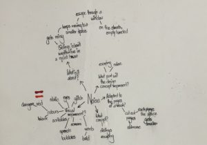
For Berta’s project, we were to chose a theme and based on it, we were asked to experiment on books, by manipulating the structure of the book, be it through disassembling the book part by part or changing the look of the whole book, in short, we were asked to just go crazy with it, as at the end of the day, this was a fun little experiment for us to learn about the different physical and material qualities of books. That being said, I chose the theme ‘noise’ as the brief about this theme really caught my interest and as I was reading the brief, I had already started to form some sort of ideas in my head about what I wanted to do with my book based on the theme. So, I started off by brainstorming my ideas and I made sure to answer the questions in the brief, which were:
What is this story about?
How can it be represented visually?
What concept would represent this story best?
How can it be adapted to the pages of a book?
What part of it will the design concept represent?
These questions helped me a lot to break down and arrange my ideas. Starting off with the first question, the story was about two siblings who had inherited their parents’ wealth and lived in a quiet house, until one day, they hear a noise and move to a small room. They continue to move into smaller spaces every time they hear a noise, until eventually, they escape through a window, and end up on the streets, empty-handed.
Brainstorming my ideas by linking them to the questionsSome of my first initial ideas regarding how I wanted to layout the book design
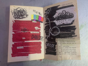
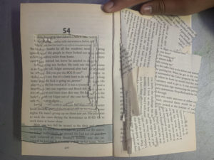
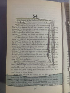
Based on that story, I wanted to design my book in a way that visualised the story in three different parts throughout the book. Therefore, in this first spread, which was at the beginning of the book, I used mainly the colours red and black; red to symbolise danger and black to symbolise the darkness the siblings were probably in as they were inside the rooms. For the left side of the spread, I had highlighted all the text using red marker, while leaving some words out that I thought related to the story, getting inspired by the works of Tom Phillips. I did the same on the other side of the spread, except on that page, I had covered up the whole text using black marker. I have also done some doodles and scribbles to visualise the concept of noise, through drawing the speech bubbles and sound effects, as well as drawing the glitch screen you would see in televisions when the signal went out, highlighting the isolation of the siblings inside the cramped rooms. Being interested in the art of stamping, I had also stamped out the word ‘help’ using letter stamps to show the desperation of the siblings to get rid of the noise. In the right corner of the spread, I had cut out shapes in a descending order, as if to show that as the siblings moved on to another room, the space kept getting smaller and smaller. Some minor details also include me fraying the edges and top of the pages by tearing them off or cutting through them using a craft knife and I have done this throughout the left side of the spread.
My first spread of the book
Close up details of the spread
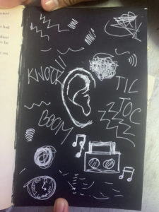
Moving on to my second design, after skipping a few pages of the book, roughly in the middle of the page, I covered one of the pages with black paper and drew an ear in the middle of the page using white pen. Around the ear, I doodled sound effects and symbols to show how the in the darkness, the siblings were on alert for any new noises.
Second page
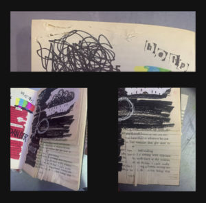
For my last and final spread, on the last pages of the book, I craved out a huge square on the middle of one of the pages, and I continued to do so, however, due to not having enough time, I wasn’t able to dig through to make the square deep enough but overall, I was satisfied with the result. I did this so as to symbolise the window and then underneath it, I drew a road horizontally, to visualise siblings being able to escape. on the opposite side, I glued on the scraps of paper messily to show the after effects of the journey the siblings just had.
Last spread of the bookClose up of the window
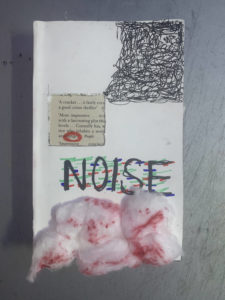
Lastly, for the book cover, I kept it simple by covering the original book cover with white paper. Then, I carved out a square through the page and the book cover, to represent the window, and from the corner of the book, I scribbled in a descending order, stopping when it reached the window. Inside the window, I circled the word ‘danger’ in red to show the danger of the situation. I wrote the title ‘noise’ in capitals, using red, blue and green markers to draw on top of the letters to kind of show that the letters are glitching. Finally, I ripped cotton balls and stuck them on at the bottom, and then coloured parts of them using red sharpie for texture. Overall, I kept the drawings messy and almost childish to represent the siblings, who I assumed, were children themselves.
I found this session because I’ve not used InDesign before, so it was a good introduction to the program and the tools it provides. I liked the usefulness of the paragraph styles and swatch styles and utilising these for recreating the same layout with different text made it so much easier.
For my ‘messed up book’ I did Harry Potter and the goblet of fire. I used one of the original cover designs for the book and took inspiration from the colours used and the image of the dragon on the front and tried to incorporate these into my design, using both the red and blue colours on my creation and also using illustrator to create the appearance of a small fire coming out of the penguin images mouth.
As I was taking pictures of different letter forms, I focused on texture, lighting and shadow. I like how each of the letters shown in the collage above either have a rough/smooth texture in the background or in the actual text. I found it really interesting how the blue ‘E’, painted on a white, textured brick wall, could still convey straight lines even though it was painted on an uneven wall. This is when I looked closer and noticed that the paint had been applied in a jagged format so when looking from a further distance, it almost created an illusion that the lines were straight, when in fact, they were actually uneven. Another form I liked was the ‘ROYAL’ one at the top right as the smooth texture that created reflections in the light and gold colour really brought out the ‘royalty’ of the text, making it really fit in with its purpose.
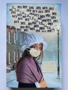
For my book design, I chose the theme ‘Staircase’ and started off with the front cover. The cover already had an image of a girl who looked quite scared with a building which looked like a Sanatorium behind her. Therefore, I instantly used the building and cut out its windows so viewers can have a mini preview into the building before properly entering/opening the book. I put a mask over the girl’s face to represent those with an unknown illness who are about to enter the Sanatorium. I covered the title using masking tape and wrote tally’s of 7 to represent the seven lives each of the patients have before death.
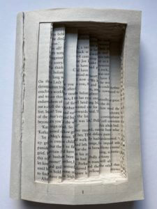
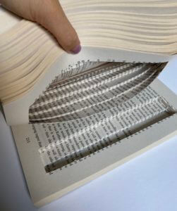
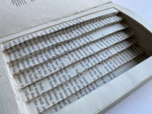
When designing the inside of the book, I created a staircase with seven steps, representing the seven floors in the Sanatorium. I created a border around it so the reader can still see the page numbers, but also so that when you close the book, it looks like a normal book, but in actual fact, the reader gets deceived when opening it, just like the man who was deceived when he was constantly moved down a floor until death.
I played around with light and shadow to create a more ominous atmosphere which I think was successful as you can really see the depth of each stair and how deep it really goes.
For this project, search for lettering around the campus based on a theme of your choosing and take photos of it. The theme can be whatever you like – or find, such as style, function, material, colour, texture, technique, and so on. Look everywhere – up, down, straight ahead; on buildings, objects (including cars), and bits of infrastructure (like lamp posts or utility covers). When you’re photographing, get up-close as well as shoot from distance.
Process
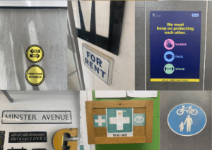
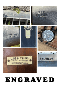
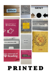
After the introduction to the project from Eric, we were left to take photographs for the remaining hour. As I wandered around the department to look for anything that stuck out to use as a theme, I stopped and thought to myself- ‘what if i did the exact opposite?’. So I decided to look for things that didn’t stick out, small examples of lettering that were passed by on a daily basis without anyone looking at them. I found engravings in the handrails outside of the department, university logos printed on the smallest of stickers and even a logo etched into the head of a nail.
Refinement
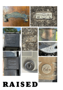
I decided to sort my photos into three sections: engraved, printed and raised.
I decided to do this to highlight the differences in materials, textures and creation methods behind each of my photos. For example, a majority of the raised and engraved letters are made from stone or metal, whereas the printed ones were on paper, plastic and canvas type materials. Making these connections made me think more deeply about the manufacturing process of these letters, and the different methods used, for example, after watching lectures from our Printing & Printmaking module, I considered whether metal casting similar to the process of making sorts was used for any of the small metal objects, such as the nail head.
It also made me realise, that while these small letters may not have any kind of significance to a majority of people, they still have uses to others. For example this small website at the very top of a bike rack- no one would ever bother to stop and read it, but if it were to break, the person repairing it would need that website to figure out who made it, and how to fix it.
Reflection
I really enjoyed doing this project as it was much more active and let us think for ourselves about a theme that we could apply to what we were looking for, essentially letting us each create our own unique brief as a development of the original. Doing this project also let me learn how lettering interacts with the environment, and that sometimes type is needed in even the smallest of things, as it can still communicate and has a purpose- not one noticed by many, but essential to some.
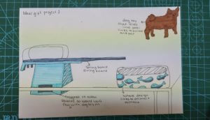
For our first project, we were tasked to give our partners three interesting facts about ourselves that can be used to create a perfect gift. My partner’s facts were that she likes animals (her pet dog), she used to dive and her family is from Australia. From this, I brainstormed and came up with two initial ideas.
My first idea was a wood statue of her dog but this was a little basic. However, this idea evolved into a little toy dog that could dive off a spring board, as my partner used to do spring board diving, into a mini pool. I added a pattern of whales around the pool as a link to the fact that her family is from Australia and whales are native to north Australia.
My random word was magnet which inspired me to add a magnet to the bottom of the springboard to allow for better stability so that the diving board will not fall when the toy dogs are placed on it to ‘jump’ into the pool as a diver would.
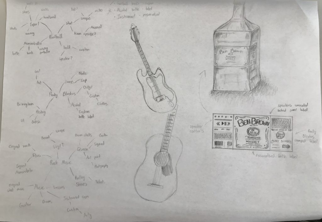
In the session, Ben told me that his interests include football, rock music and the Peaky Blinders TV series. After completing an initial brainstorm for each possible topic, I began thinking of ideas until I arrived at three potential items that would be personalized and adapted based on the information I knew.
A musical instrument (probably a guitar)
Football boots
A whiskey bottle
I began sketching out some of these ideas, but quickly decided that the whiskey bottle would likely be the best choice – The inclusion of text would allow it to be personal to him and could feature more of his preferences. While doing this, however, I decided that I could combine his interest in music with the bottle, turning it into a Bluetooth speaker with the exterior design of an older bottle of whiskey.
Having drawn out the bottle itself, I finished by drawing the label itself more carefully, including functional and decorative elements, putting his name as the name of the drink.
I designed a proposal for an ideal gift associated with a few of Zack’s interests/passions. I incorporated his love of rap and EMINEM with the Pop Vinyl figures to create a Vinyl figure of EMINEM that has a Bluetooth speaker that connects to Zack’s Spotify playlist.