
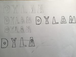
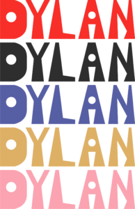
I had a lot of fun with this project. you can see from my mood board my inspiration, but my focus was a retro theme. by looking at many retro designs I saw a great emphasis on line work, bubble, and pop fonts, and either pastel or primary colors. these are the things I chose to incorporate into my design. this project was very fun and I learnt a lot on illustrato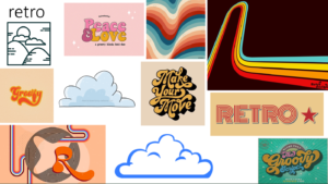
 r.
r.
Category: Logo trends
Logo trends
Working with technology
![]()
At first, I chose my theme modern furniture. Then, I started searching on how I can present my theme and develop it into a mood board. I thought about what feel I want to present to the reader and what typeface I wanna choose. For me, circle presents the most modern shape and therefore the best way to show my theme. I presented technology on the shape on the right as I wanted to show the connection between every smart object. I connected the lines to a lamp that shows modern furniture and tried to play with the colors In order to show the 3D effect. Then, I used the shape on the left to show the floating feel. Finally, I used a modern typography that represents technology and played with the characters size in order to balance my logo.
AK Design Studio
Brief
This project with Sophia White from the Brand Design Agency will help you look at design trends and understand how a mood board can be used to help you develop and design with this in mind. You will develop ideas for Logotype Trends for 2022-23 working with a specific theme in mind. This project will help you to look at trends and design logotypes for a specific theme. Using the selected theme, create a logo for yourself as a designer that you may use to promote your work/own design studio.
Process
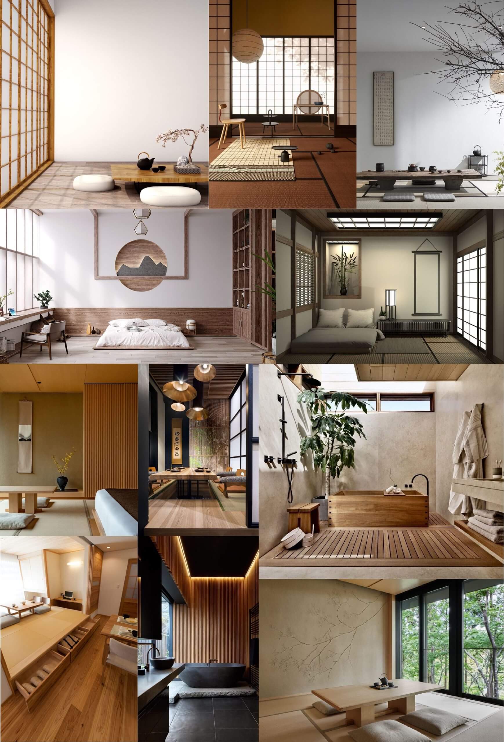
The first step I took to approaching this project was selecting a theme from this article that Sophia sent us in advance that lists 10 upcoming interior design trends for 2022. After looking through the different trends, I found that I was most drawn to the ‘Organic Materials’ theme. This is because I liked how it was very simple yet combining different elements still creates a clear contrast. Whilst looking at pictures associated with my chosen aesthetic, it reminded me of Japanese minimalist interior design so I decided to base my logo ideas around the elements of it. To get a better idea of the elements I wanted to use, I made a mood board of pictures so that I could start creating some sketches of possible logo ideas.
I isolated some prominent features of Japanese minimalist interior design and found the following:
- Organic shapes contrasting with geometric
- Block colours
- Simple lines
- Nature
- Clean cut aesthetic
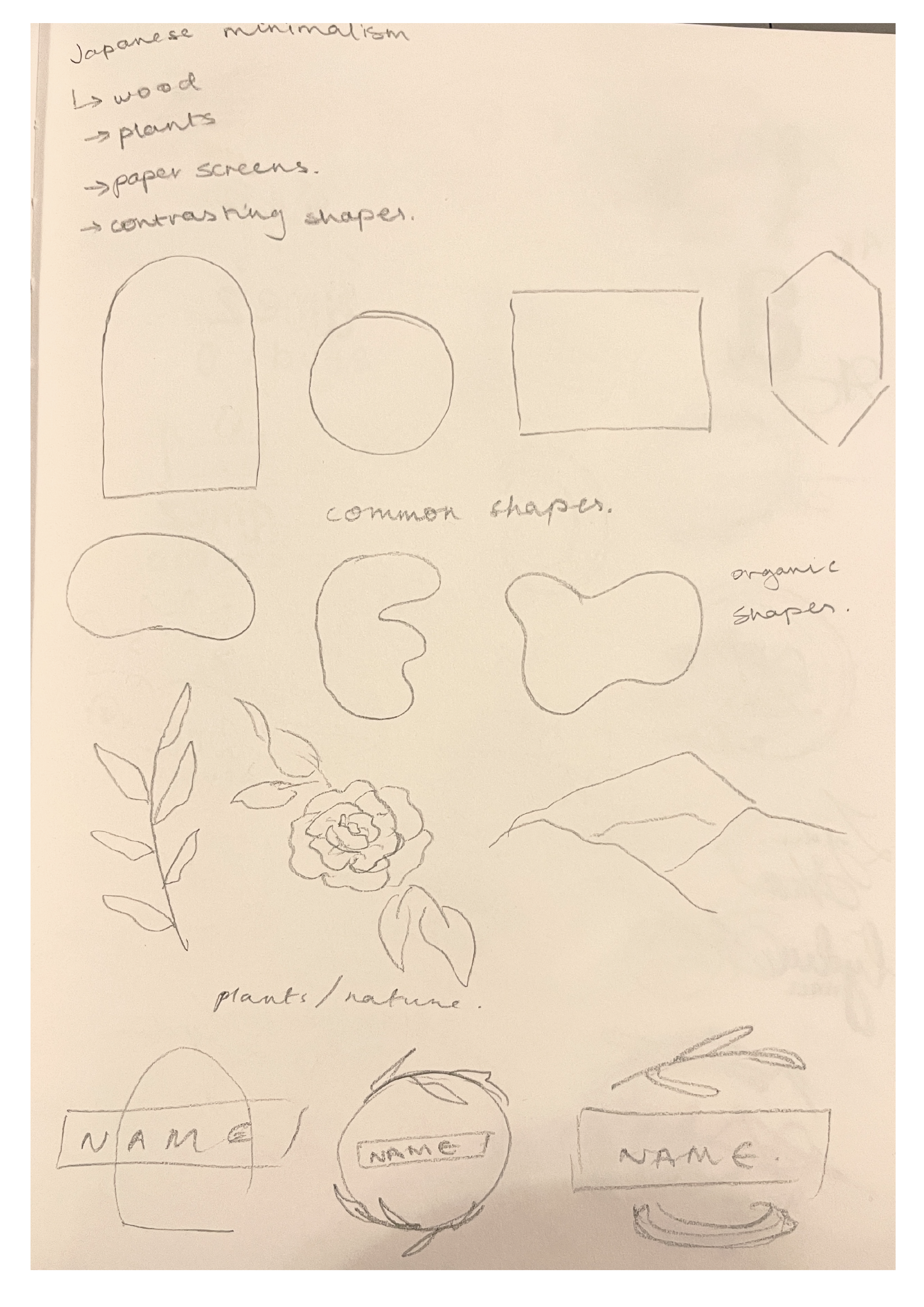
I began by sketching the different elements I found so that I could see them all in front of me and start thinking about how I could combine them into a logo that represents me while adhering to the theme. While considering the theme of the logo, I also had to decided how I would represent myself – either with my own name or a different one. In the end I decided to just use my own name – more specifically my initials ‘AK’ – as it is much more direct and clear; to showcase that the logo is for our own design company, I chose the name ‘AK Design Studio’, with my initials being the main focus. Because I decided to use my initials, I thought to use my signature, which makes the logo much more personal, as well as making it look more refined and clean. As for the inclusion of the theme, I quite liked my initial element sketches around the subheading ‘nature’, so my logo was steered in that direction.
Now that the main base of my logo was decided, I had to begin to try and incorporate the elements of the theme into it. To start this process, I sketched out my initials and drew circles and ovals around it. This is because my signature can create either a general square or rectangle shape, so by drawing a circle/oval around it creates the contrast similar to what I identified in my primary research. In order to add ‘nature’ into the logo, I replaced different sections of the ellipses with a branch of leaves, making them look like wreaths.
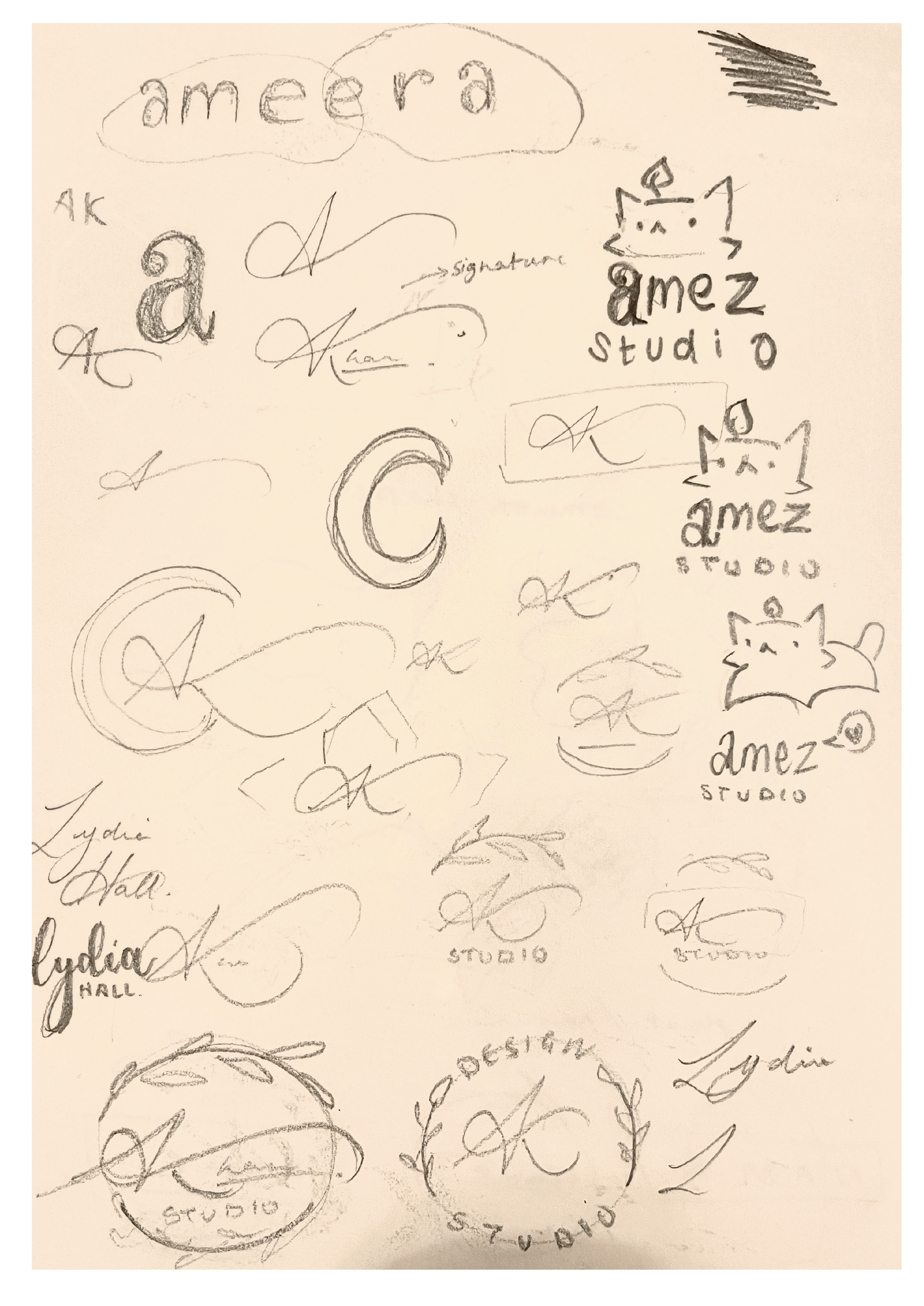
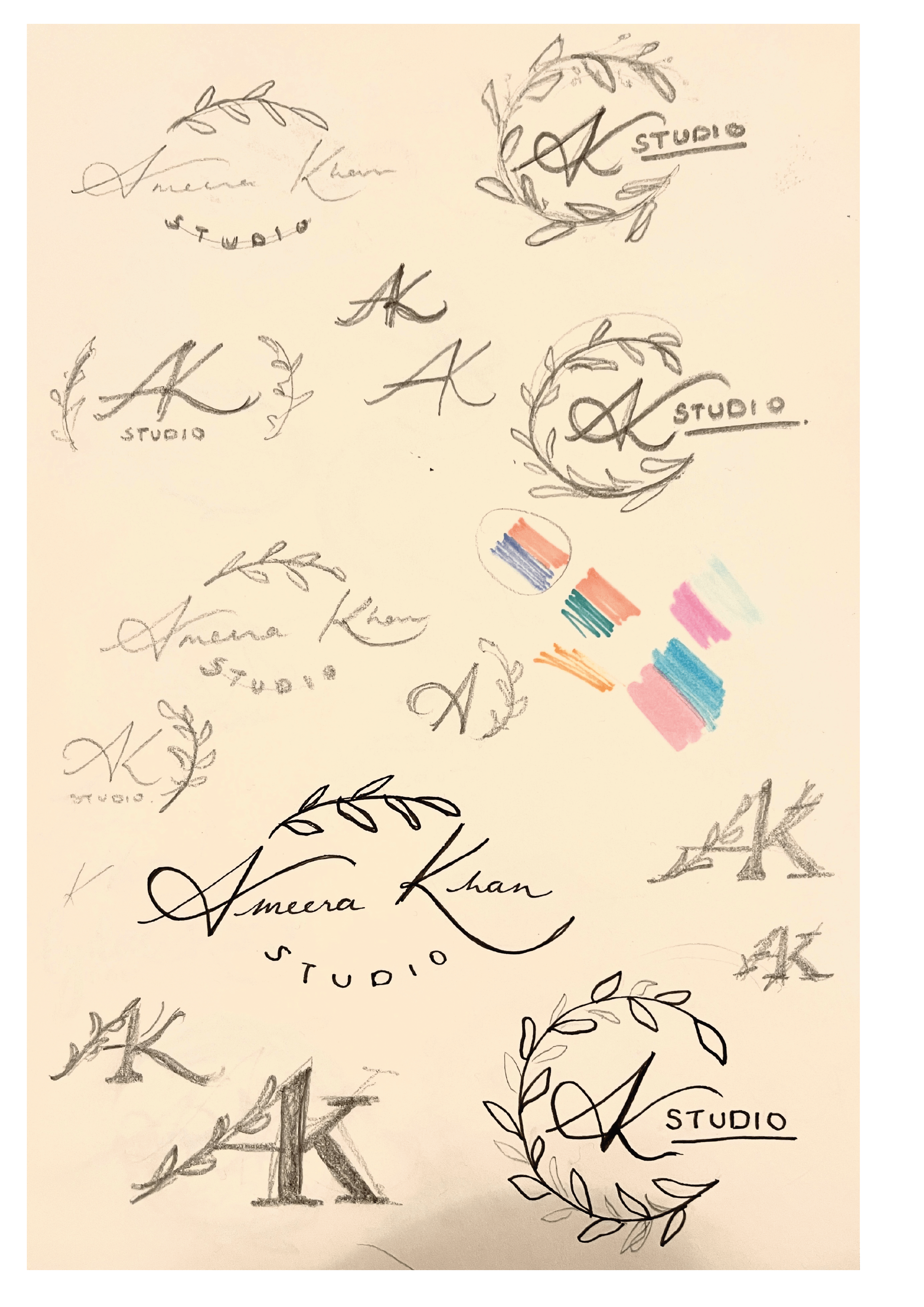
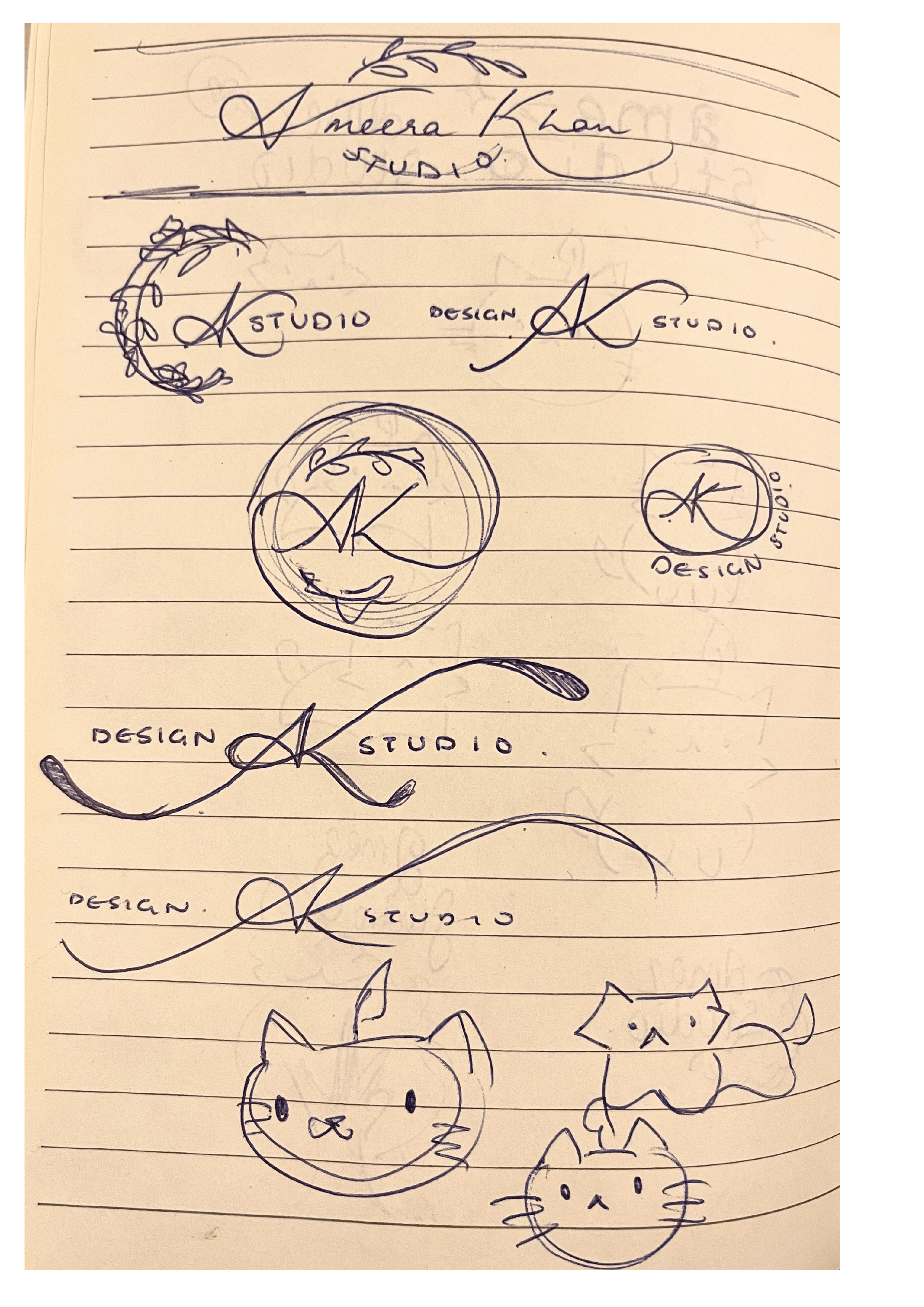
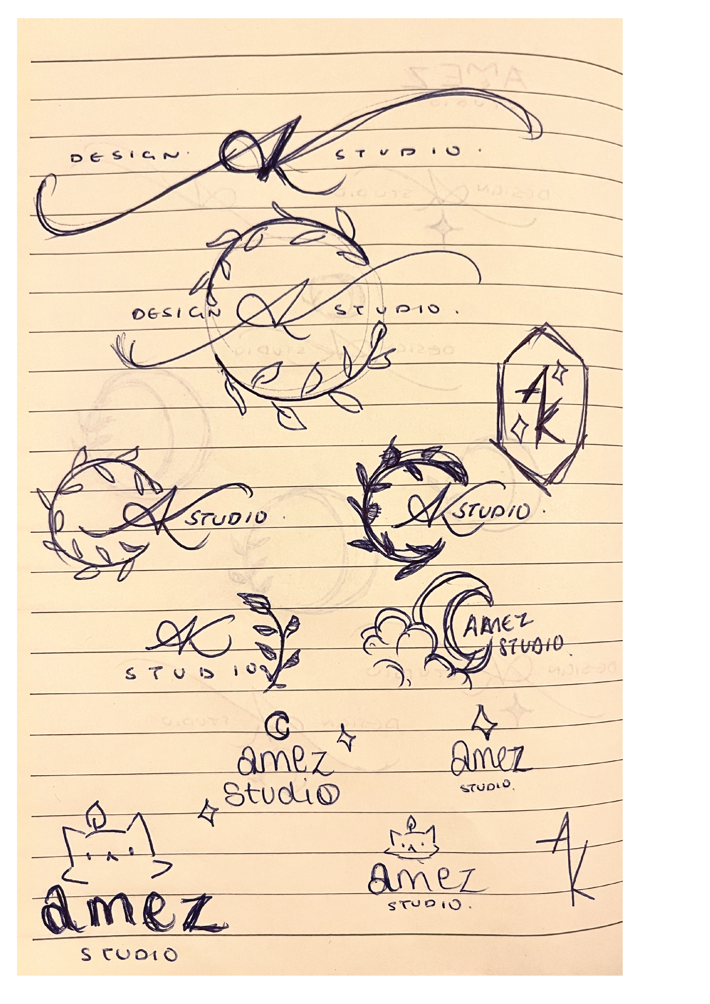
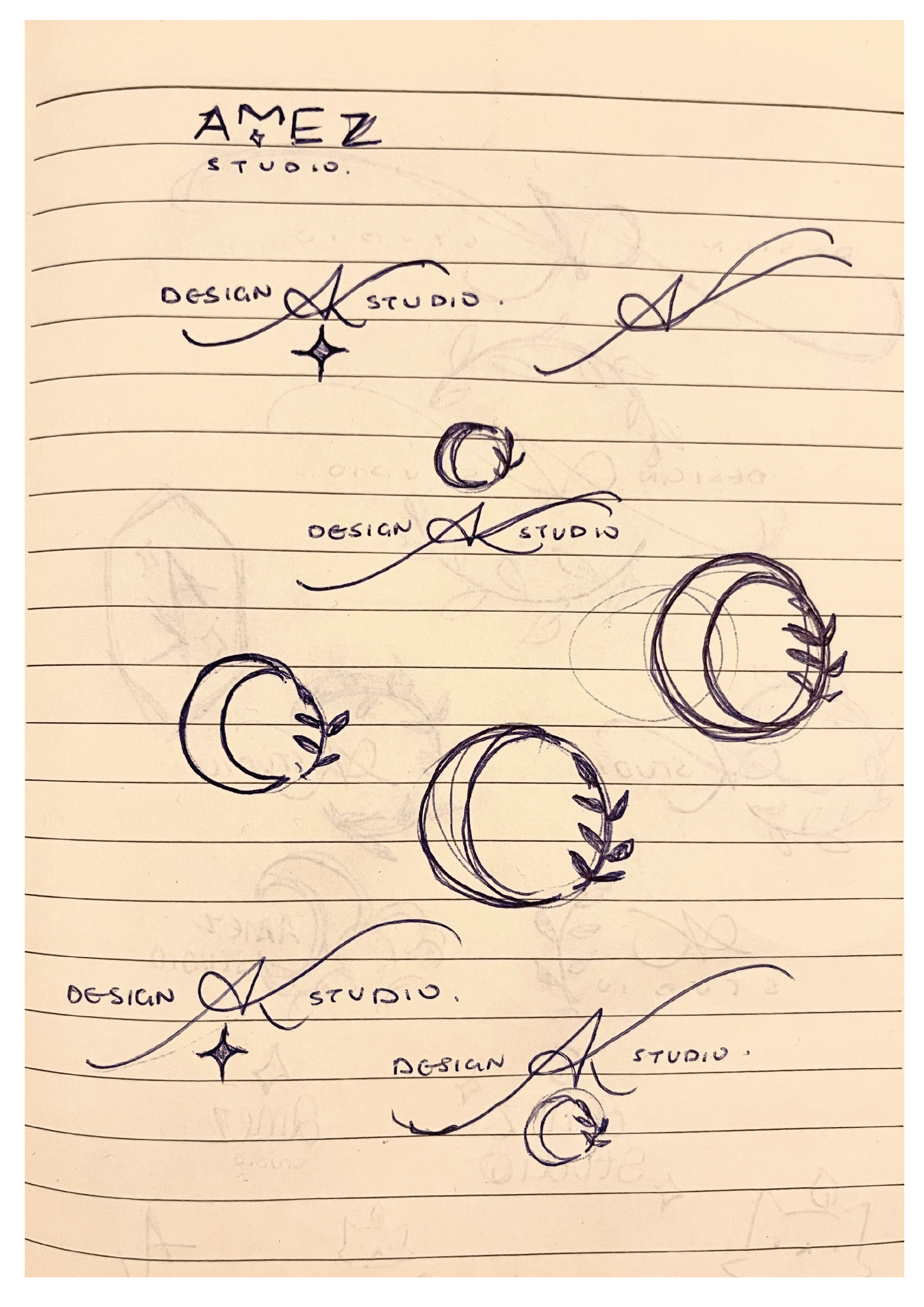
 After doing some more sketches experimenting with different placements, I saw that none of the ones I produced seemed to fit the result I was looking for. I then realised that I could venture into the concept of ‘nature’ a bit further, and use imagery such as moons and stars instead, as it still fit in with my original objective. Like before, I started sketching new ideas with these new images. Rather than trying to make the additional illustrative elements a main part of the logo, I decided to accentuate the initials by making the entrance and exit (which serves as the diagonal of the K) strokes longer; by elongating these strokes, it created a gap which I was able to fit the words ‘design studio’ into, hence making the title portion of the logo complete. Concerning the illustrative elements, I noticed the space underneath the ‘AK’ looked quite open, whereas the top half already had the point of the ‘A’ which was balanced out by the valleys either side of it. Because this open space made the logo look unbalanced, I decided to add a four-pointed star underneath. I made this decision as the other images I tried to add into that space didn’t work for the balance overall.
To make the final refined logo, I took a picture of the sketch and imported it into Procreate; this is because the way the letters are written is quite unique, and I couldn’t find a fold that was similar enough to manipulate to recreate them. I used a thin technical brush to trace the ‘AK’ so that I could get a tapered effect that calligraphic typefaces don’t have. After doing this, I took the finished trace into Illustrator and did Object > Image trace > Make & Expand, which recreated my drawing as a vector that I could then manipulate. I then added in the words ‘Design Studio’ using Baskerville, I chose this font as a serif font looks much more cohesive with script/calligraphic lettering. Once this was complete, I created the star by making an oval, the going to Effect > Distort & Transform > Pucker & Bloat, then puckered the oval to bring in the sides apart from the vertical and horizontal points, thus creating a four-pointed star. After this, I positioned all of the elements of my logo together and readjusted them accordingly, to ensure that the balance was correct.
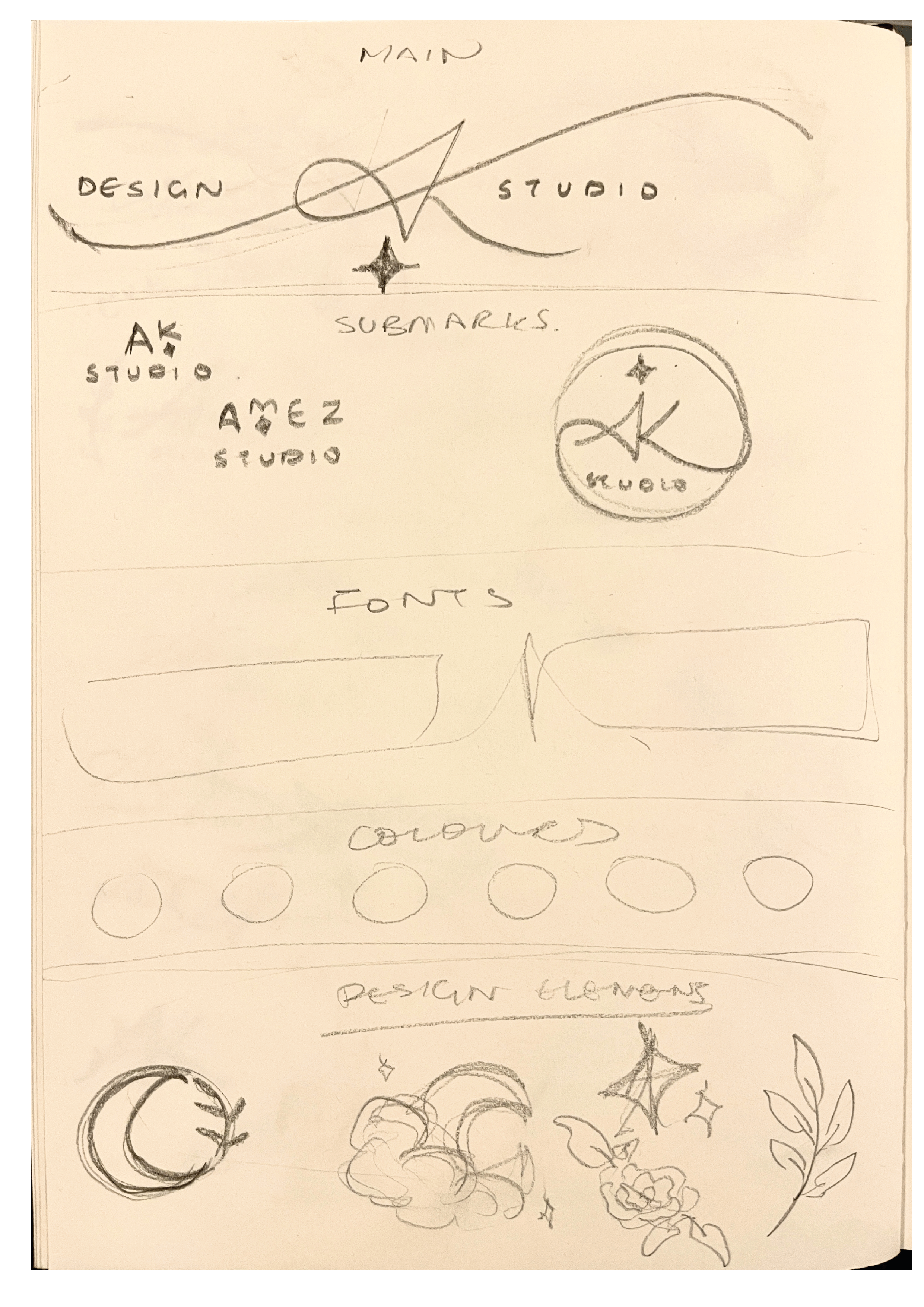
As this was a logo project, I thought that the most appropriate way to present it would be a brand board. In order to complete it, I made two simple submarks that still incorporated my initials and decorative elements. I also showed the fonts I would use in my brand, and displayed a simple colour palette.
Reflection
![]()
Overall, I really liked this project, as it allowed us to get an insight from a designer in the industry and showed us part of a professional’s process, which I thought was really interesting. Furthermore, I liked how much freedom the brief gave us, and there weren’t a long list of rules that we had to follow; the only ‘restriction’ being our chosen theme, which we still had freedom to pick. This project let us be creative in a way that was fun but also very useful to show us a real world application of our work, and how a typical project in the industry might proceed. As well as this, because we were able to create branding for ourselves, a lot of us may use these as either a starting point or how they are to develop an identity as a freelancer if we so wish.
Zee Graphics
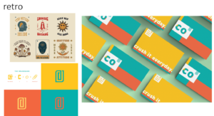
For this mini-project we had to brand ourselves and create a logo, with research from a particular theme. I was struggling with my own theme at first as I chose 90’s. It was a lot harder than it looked. There were so many different themes and colours, styles and fashion so I decided to choose something a little more simple.
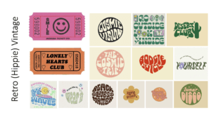 I was going for a “groovy” or “hippie” kind of aesthetic where the fonts are a little loose and wavy. The theme, as a whole, is very colourful and I loved how the words are distorted to fit into or create different shapes.
I found these movie tickets while researching my theme, and I thought I could use them as part of my final outcome for my logo. They matched the theme in my opinion as they shared similar aesthetics, colours and typefaces.
New Minimalism
For this mini project we were given 10 different themes to choose from. Originally I chose the 70s retro style, I began researching and creating mood boards of different colours, shapes and textures that I was inspired by.
When I started drafting my design ideas I found it really difficult to come up with an idea to represent me. I had experimented with three different designs which I did not like. I shorty realised that the colours of the theme I chose didn’t represent me as I wanted therefore, quite last minuet, I decided to change my theme to something I thought was more up my street. I love simple and elegant designs with a range of neutral colours and thought that the theme ‘New Minimalism’ was exactly that.
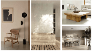 I started again by creating a first mood board of colours and textures that I found appealing that was related to my new theme, I focused on interior design and furniture from the website ‘interior trends’ which included; natural materials, raw woods, soft and earthy colours inspired by nature as well as some off whites and tobacco and browns. This is where my inspiration for the background and textured circle came from. I took an image of wood and used the image trace tool (3 colours) to make it look a little more smooth, more graphic looking rather than realistic. I also then took the image of the wooden bath tube and used the drop colour tool to get the colours for my final design.
I then created a second mood board focusing on fonts and design layouts, I decided to design my logo in a circle as I thought it looked a bit more structured and put together. I chose to work with two different fonts.
With regards to what I was going to name myself I experimented with a few different ideas these including my initials ‘NBM’, My full name ‘Nelly Bridger Morales’ which I found was too long. I then thought of just Nell as I didn’t want it to be just my name ‘Nelly’ as I thought that it was a bit too plain and basic. In the end I decided to use ‘Nelly’ as I realised it was quite a unique name and thought it was the perfect amount of letters.
70s logo
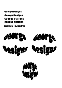
For this brief we had to pick a theme to develop ideas for upcoming logo type trends. My chosen theme was 70’s retro.
I first created a moon-board to start looking a different colours and shapes involved with the 70s. The retro 70’s theme also has a very warm toned colour palette, which is something I knew I wanted to incorporate into my design. I noticed there were a lot circles involved within the theme, along with a lot the fonts had rounded edges. I started experimenting with different bold ‘bubble letter’ type fonts, however as I started playing around I began putting the logo into different shapes. Once I put the type into the circle, I started playing with the leading, seeing how the type looks both up close and dispersed. For my final logo design, I decided to fit the text close to each other within the circle and use the warm toned colour palette.
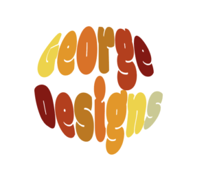
If I could change anything about my design I would have space out the lettering a bit more, as the two Gs are very close to each other. I would have also added a ‘S’ to George, making it ‘Georges Designs’, making both words 5 letters to equal out the colouring.
70’s neutrals
Initially, I started my logo thinking of mainly curved lines and neutral, warm tones. As I began to work in illustrator, I experimented with curved typefaces and settled on this chunky and organic shape font. I separated letters from my name to create a larger ‘M’ which allowed the letters to fit together better and create a more rounded appearance when alongside one another. I also decided to use a white stroke around the main name, to highlight this above the ‘designs’ below which I wanted to be secondary to the name and then closed off the negative space by using two circles and the ‘blend’ tool, to create a background reminiscent of vinyl records and in line with the curved lines I initially wanted to pull into the logo. I tweaked these variables until i found a balance i was happy with; however I would prefer to use this logo in a circular format rather than a square to eliminate some of the empty space and draw the eye back again to the centre logo.
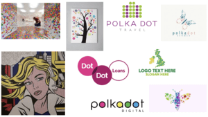
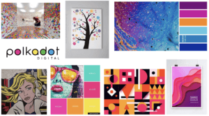
Polka Dots Logo Type Trends
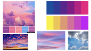
For this project, I chose the theme of polka dots. I created many mood-boards, my first consisting of general polka-dot-based branding. I then went onto creating one which incorporated polka dots and bright colours as I feel like bright colours represent me well. After not getting much inspiration from these mood-boards, I took the slightly different approach of researching into clouds as I am fascinated by them because they can be interpreted differently by everyone. And as a designer, I think it is effective when branding is created, to have a hidden meaning or multiple suggestions behind it.
Using Adobe Illustrator, I drew a continuous line drawing of 3 clouds, and then sticking to my theme of polka dots I added some circles of varying colours and sizes and placed them underneath the line drawing. The colour scheme reflects the sky with tinges of purple and pink to represent a sunset.
In terms of the text, I selected a minimalistic font as I think it is appropriate for complimenting the line drawing. It isn’t too bold so that it is distracting because I didn’t want it to take the attention away from the design of the branding itself.
70s Logotype
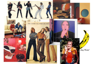
For this project I chose the theme: 70s retro. I started off with a mood board trying to capture the aesthetic of the decade. I compiled images from pop culture, such as Andy Warhol’s iconic banana graphic for the band ‘The Velvet Underground’, and added photos of things such as interior design. These images gave me a clear idea of some colours that were in at the time and, usefully, these colours complement each other well.
I took inspiration from the shape of flairs and invented a triangular, bottom heavy typeface. I tried to replicate the flair shape at the bottom of every stem. This led to some of the letters having a rather irregular shape to them – you can see that the space under the A’s crossbar is upside-down. I decided to refine the typeface further by experimenting with using circles as counters. This gave the font a more playful feel.
I took this concept into adobe illustrator and created a cleaner version of the typeface. I didn’t focus too much on making the shapes anatomically correct as the slight inaccuracies give the logotype character. It has an artisan look to it.

I sampled some colours from my mood board and made some coloured variations of the logotype. Bright colours were popular in the 1970s so I chose a bright red then used more muted colours that fit with this well. I think my design would also fit into the psychedelic 60s style – this was a notable influence on 70s culture.
Logotype trends 2022
My logotype originally stemmed from the 70s retro design. I was inspired by the colour palette of earthy and dull tones so tried to imitate this into my logotype with the green and beige colours. Whilst curating my moodpboard, I liked the idea to incorporating an old record into the design and I came up with focusing the ‘brand name’ around a circle alongside using fonts that still fit into the 70s aesthetic whilst also contrasting each other. The idea to add the leaves at the bottom was to give the logotype an eco feel along with the green colours as I also feel this represents my personal beliefs and style in the image.