When we were first set the task to photograph lettering in the environment I didn’t think it would be too much of a challenge. It wasn’t until I was around 30 photos into my shoot that I realised a lot of the lettering I had captured were all very similar. This made me have to think a little bit deeper into the task and how I was approaching it. A lot of what I had photographed in the beginning was part of the universities branding and signage so of course there was going to be a lot of repetition as many companies, including the university, stick to the same fonts across all there branding to keep it all connected and flowing well. Therefore, I had to start looking for the signs that weren’t so obvious. In the end, some of my favourite images of lettering that I captured I had found were stuck to the back of signs, welded on to lap posts and hidden in the far corners of the university campus.
The second part of our task was to organise our images into groups. I chose to split my photos into what their purpose was and the three groups I ended up with were; information, warn and advertise. Once I had organised my photos and presented them on PowerPoint (seen below), I soon realised that I had unintentionally also organised two of the categories into categories of colour. If I were to attempt this task again I would edit all my photos to be in black and white to take away the influence of the colours used and focus solely on the lettering alone.
In this modern world, do we really see the writing on the wall?
We go about our daily lives and don’t even realise how much writing we come across in the short walk to work. That road sign we’ve driven past 50 times last week and no longer pay attention… The graffiti by our shed, do you still see it?
Unless it’s shiny and new it holds no interest to us, the first time we drive to the new house we’re all bright eyed; that’s a pretty rose bush and that mural looks amazing… Yet we won’t be paying it any attention after we pass it a couple of times. We no longer care, no longer find it interesting and important.
And yet, there’s entire manufacturing process dedicated to each type of writing we no longer take in. We see it and yet we don’t. Those footprints on the ground? The first time you saw them you probably tried to stand on them and be exactly 2 metres from the person in front, right? Now though, a mere couple of month later? You just look for the colour to know where to line up.
The more I looked into the forgotten signs around campus the more intriguing they become once more, how many messages does colour alone convey? How many different ways do lamp posts around campus carry messages or information on them? Who made those signs and how? Why did they decide to put that metal writing on the side of a building and not use paint instead?
Throughout this project I realised how closed my eyes really were and how ignorant I was to the many ways letters are presented to me in my everyday life.
Lena Gomez, of our current MA Communication Design Information Design Pathway cohort, has been involved in an exciting collaboration with Lantana Publishing this year. Lantana is an award-winning children’s book publisher that focuses on diversity, social equality and environmental sustainability.
Alice Curry, Lantana’s founder and CEO had been talking to Pathway Lead Jeanne-Louise Moys about a potential collaboration in 2019. Lantana was looking for a holistic communications strategy that would reflect how their vision and ethos are evolving and work effectively for their different audiences and stakeholders. When Lena joined our MA cohort in autumn 2019, her strengths and interests mapped well to Lantana’s communication needs so Alice presented us with a brief that Lena undertook for her professional practice assignment.
Lena Gomez, MA Communication Design
Lena said: “Diversity in children’s literature was a large aspect of my undergraduate thesis research, so working with Lantana was the perfect fit for me. I was excited to take on the challenge of creating a communications strategy for a client that is in the middle of implementing exciting new changes”.
At the outset of the project, Lena visited Lantana and worked with them to understand their needs and priorities. She then conducted research to align her project with a broader understanding of current marketing and communication trends in the publishing industry and consider the specific customers, stakeholders and potential partners encompassed in the audience. Looking at user analytics on their existing website and social media and developing clear user personas to work with was an important part of her user-centred research. Lena also had to bear in mind how her design solutions needed to be easy and efficient to implement for an independent publisher and work with their existing systems.
Lena has also redesigned compliment slips for Lantana using her new logo design
Lena developed a range of initial approaches for Lantana. These included both visual design proposals and strategies for their implementation. Once a direction was agreed, Lena developed her ideas further producing a comprehensive strategy supported by a new logo design and style guide for the redesigned brand, compliment slips and corporate stationery, a series of infographics and proposals for the redesign of the website.
Reflecting on the project, Lena said: “Working with the team at Lantana has been a rewarding experience. Through collaboration and exploration, I feel that we came up with feasible solutions that aligned well with the goals and values of the company. I’m also happy with the range of designs that I had the opportunity to work on, from logo design to infographic design and more.”
Following submission of her project for University assessment, Lantana has contracted her to continue the redesign of the website. Alice said: “I feel the project has been beneficial for both of us, the relationship has been easy and professional, and I’ve really enjoyed working with her these past few weeks. Lena has brought some fresh, new ideas and insights to the project, giving our branding a fun, child-friendly yet professional new look, and we’re delighted. ”
This project is the first collaboration between Lantana and the Department of Typography & Communication. Jeanne-Louise said: “Working on live briefs is always incredibly valuable for our students. Lantana’s brief is particularly good as Lena needed to consider the needs of the publisher and their systems alongside the needs of their multifaceted audience. We look forward to future collaborations.”
Real Job: Our students asked if they could build and manage an Instagram account for the Department. https://www.instagram.com/uortypography/ @_timwatkins @UniofReading
On 11 June we are launching an online showcase of our students' work.
To stay updated, please fill in the form at https://forms.gle/aHAr1iQwZEdbrEpr5 . You can also follow us at https://www.instagram.com/greaterthanatoz/ for a preview.
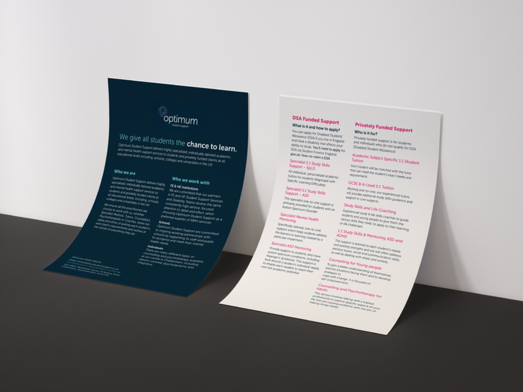
Our team was tasked to create a leaflet to promote the client’s company and the services they offered. The client also stated in the brief that she would like ‘other deliverables’. She was initially unsure of what these deliverables would be, but that would be discussed at a later date. The company, called ‘Optimum’, is devoted to helping young people within education to reach their full potential and help students with their self-growth. This was a moderately open brief which allowed us to have considerable freedom when designing the deliverables against a brand and choosing which ones to present to the client.
Research
Initially, we researched the client to understand the company’s ethos and their audience. This was the most valuable stage of the real jobs process as we learned what information we needed to prioritise. We created user personas to understand the audience that we would be designing for; this allowed us to acknowledge which formats, layouts and deliverables would best suit the needs of the audience and maximise user satisfaction. We created three user personas, as this allowed us to consider a range of users and to ensure that we made the designs as successful as possible. A moodboard was created which collated various existing leaflets into one space, allowing us to compare which colours, types and layouts would be most appropriate for our client.
The next stage of the research section was to consider the content structure. To get underway with this, we emailed the client to check if she had any specific requirements concerning content that should be included, or any initial ideas on the layout of the leaflet. She gave us a clear layout for the leaflet, but as a group we believed this would not be effective for the users, as we felt we needed more space for the information she specified we include, so we created other layouts to show the client (these are shown in the designing section). As a group, we had considered how to convince the client to understand the new layout proposals effectiveness, whilst still ensuring that we considered her ideas.
As a team, we worked together to decide which deliverables to propose to the client; we decided on a notepad for staff to use for taking notes when in meetings or on the phone, along with a poster to promote the Walking in Reading Events. The client decided to take on both of these deliverables. After discussing the format and materials with the client we created estimates to send to the client. However, the client decided to get the deliverables produced elsewhere. Regardless of this, creating a production specification and estimate was very helpful, as this taught us about the level of detail required when understanding the format and materials of your deliverables and understanding what materials would best suit the deliverables you are creating.
Restated Brief
The restated brief helped us to consider all aspects of the project and keep us organised. We aimed to create a clear brand identity throughout the deliverables that we produced, which was made easier by the brand guidelines given to us by the client. We found creating a restated brief extremely helpful, as it allowed us to look at the project as an overview and then again in detail, which eliminated any issues or queries before starting the project. One aspect of the real job we could have improved was considering how long each part of the process would take, because initially we had not considered how the planning section had to be changed and updated regularly.
Designing
As mentioned in the research section, we created a range of leaflet designs to give the client a choice concerning the layout. We had to comply with the brand guidelines given to us, while still creating a variety of options, which are presented below. We believe that creating these iterations to present to the client was helpful, as it allowed the client to pick the elements from each design that she felt were effective. This gave us a clear idea about which elements the client felt were effective for the leaflets and made the process of designing the other deliverables less complex for us as a team.
Brochure DesignBrochure Design 2Brochure Design 3
Once the leaflet design was finalised it was easier to design the notepad, as we had created a clear style that the client liked and we believed the users would like too. The client decided to get the poster designed elsewhere, but as a team we still wanted to work with these brand guidelines on a larger scale to test our abilities to adapt designs. This task encouraged us to work with the brand guidelines on a small scale like business cards. Taking the initiative to produce our own deliverables was very rewarding, as we were able to work on creating a brand on a range of scales and ensuring our design style was suited to both an A3 poster and business cards. This skill is very transferable to other projects that we will undertake in our design career. When creating the other deliverables, we felt that our team came together to help each other overcome these challenges, especially when making sure that the deliverables all were uniform and looked like a set; rather than it being obvious they were designed by individual people.
Business CardsPoster DesignNotepad Design
As a team we ensured we organised files clearly, so that when accessed by others there was no confusion when working on the designs. We worked collaboratively on each of the deliverables and gave feedback on each other’s work throughout. We felt that the collaborations between the team when creating all the deliverables made our designs more successful as we had multiple opinions on the designs before presenting it to the client. This helped us to remove any mistakes and push our designs to its limits within the brand guidelines given to us.
Real Job Meetings, Client and Supervisor Feedback
The real job meetings were attended by at least one of our team members each week. We gained feedback on the designs that we had been creating from the target audience which was University students. We also gained feedback on how to communicate with the client and the real jobs process itself; this was extremely helpful for our group as seeing everyone else’s progress each week pushed our group to continue to do our best. We had regular meetings with our supervisor who was happy with our progress and gave us feedback throughout, especially on the smaller details that you may miss out when looking at a design for a long period of time. Our client was very helpful with feedback and had a clear vision of what she wanted. She stated we were very professional when communicating with her and that we presented a good range of ideas. Our client left her job at the university mid-way through our design process, which we discovered as she wasn’t very responsive with her university email, this meant our communication method had to change to telephone calls; it was important for us to remember all of our questions and queries when speaking. The contact with both our supervisors and the client gave us good experience of communicating with others.
Reflection
We found this real job extremely rewarding because of the help that the deliverables gave to those who use the client’s services. It taught us both technical and soft skills that we can transfer into future projects and my career. Communicating with a client both in person and over email was very challenging at times; Lauren was the main contact for the client and learnt quickly how to cover many aspects of our project without overwhelming the client. We are pleased with how our team worked, due to our collaborative approach and helping each other when someone was struggling. We divided responsibilities effectively and this helped us to be as effective as possible and deliver our best work to suit our client’s needs. We feel we created a clean and coherent set of deliverables, which communicated the relevant information effectively.
The 'I am, we are… Different by design' team present their latest work: the second edition of their zine, and workshop at the Tate Exchange. They are looking for new members…