Year: 2021

Movies!

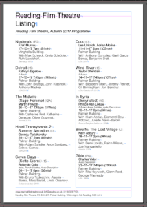
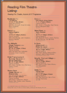
We were given a project to create a flyer for the Reading Film Theatre Autumn 2017 listings. We had to create two different designs based on the information given and our own research.

In the brief, we were asked to keep in mind the targeted audience when making the flyers and consider the layout and typography used and they were:

  • A father with two children under 10
  • A visiting professor working in Reading, but originally from Switzerland
  • A retired doctor and her husband, both of whom have a passion for old Hollywood

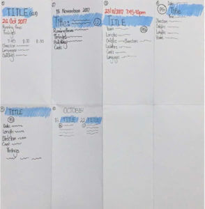
Firstly, I brainstormed the important details essential for each target audience and circled out the ones that was important amongst all of them. Then, I sketched out some potential layouts for the movie listings.
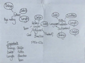
Brainstorming ideas
Sketches

After having some ideas of how I wanted my layout to be, I searched up the RFT logo and based on that, I chose the colour palette for my flyers. The main colours were red and grey. Then, I proceeded to edit the text information about the movies and its details and I noticed, obviously, that a lot of vital information, such as running times, country of origin, etc were missing.

Keeping the target audience in mind, therefore, for my first design, I went with a grey background with black and red text over it. I had used red for the movie titles, so that they stood out easily and I focused on making the movie running time, location of the theatre and languages available more visible, so as to make it easier for the target audiences to find these details easily, as I believe these are what the targeted audiences would look up for when searching up information of the movies. I kept my overall design simple and straightforward so that everything is accessible without much trouble.
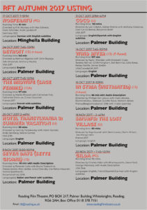
Design 1

For my second design, I decided to categorise the movies in terms of the months they were being aired in the theatre. I used a gradient of red, grey and orange for the heading, sub headings and movie titles, to reflect the colours of the RFT logo. I did the layout of the dates of the movies from left to right and I grouped the age ratings and running times together as I believe they were the most important in terms of the hierarchy of information. For the rest of the information, I had laid out the times and the location first and then the other bits. I had also kept this whole design simple to make it quick and easy to find the information needed.
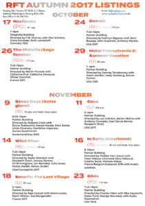
Design 2

Overall, I really enjoyed this project as I got to learn more in depth about InDesign and about layouts and hierarchies and I believe all the skills I have learned from this project will help me in my ‘Design for Reading’ book design project as well.

The PDF version of my flyer designs:

RFT film listings design 1

RFT film listings design 2


Blue and Pink Cinema Listings

With the two designs that I have created, I have decided to base them both on a similar layout however by changing the order of the movie listings through the use of various organisations and type weights, I was able to change the target demographic for each. For example I believe that the ‘Blue Listing’ appeals more to the “retired doctor and her husband, both of whom have a passion for old Hollywood”  as the hierarchy emphasises the directors, time and place of the movies creation and the cast, where the ‘Pink Listing’ is more targeted towards “a father with two children under 10” as the times and age ratings are more prevalent.

Cinema Listing (Pink) 01

Cinema Listing (Blue) 02

Autumn Film Festival

  • Draft 1: traditional (for retired people with old Hollywood passion)

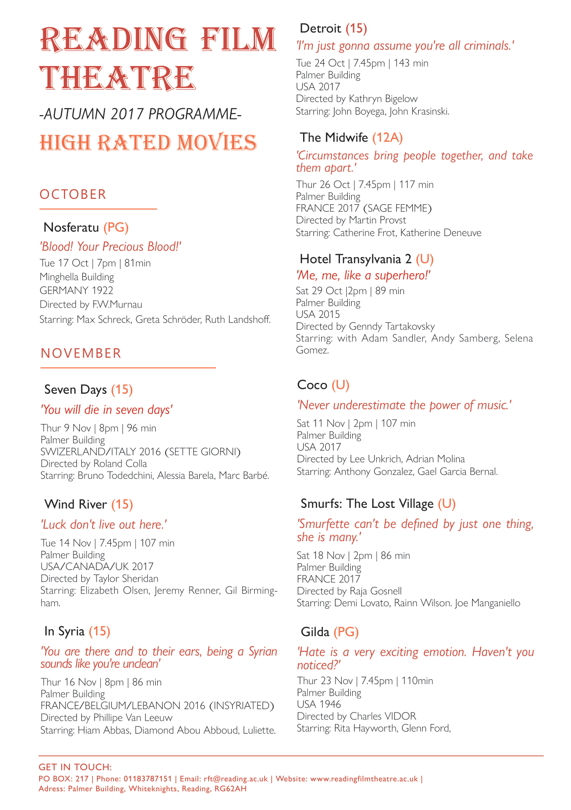
The first draft is design for retired people who have free time to watch film. By grouping films according to month and date, they won’t miss any filming date in schedule. Besides, retired people or someone who have passion for old Hollywood would extra focus on the context of the film, so I add a quote below each film name to attract these audience and priority their interest to the film. I also use a traditional and decorative font to the title of Reading Film Theatre and add text of High rated movies, so as to suit their characteristic and appeal my audience.

  • Draft 2: mordernist (for international / busy people/ families)

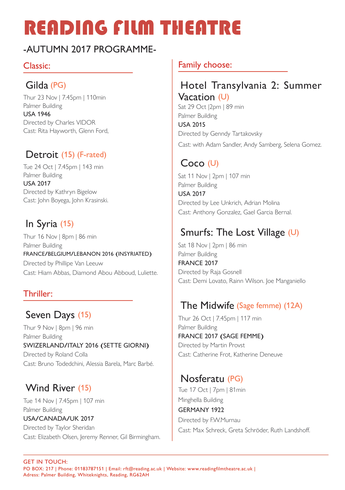
The second draft is a more modernist design. As I would like to focus on the target audience of international and busy people, so I designed the flyer to be clearer and simplicity. Rather than grouping the movies by months, I distinguish them according to the film genre include classic, thriller and family friendly movie, which makes it easier to choose specific genre and relevant information for first prioritise, correspond with their own interests and to have a faster decision.

  • Peers feedback

From the peer’s feedback, there are many typing and structure mistic that I can’t found by my own, such as wrong punctuation, type spacing, force line break to respect the cast, and repeated information found, which will be a serious mistake in real life situation, so I should be more aware on it for alternative designs.

Final decision

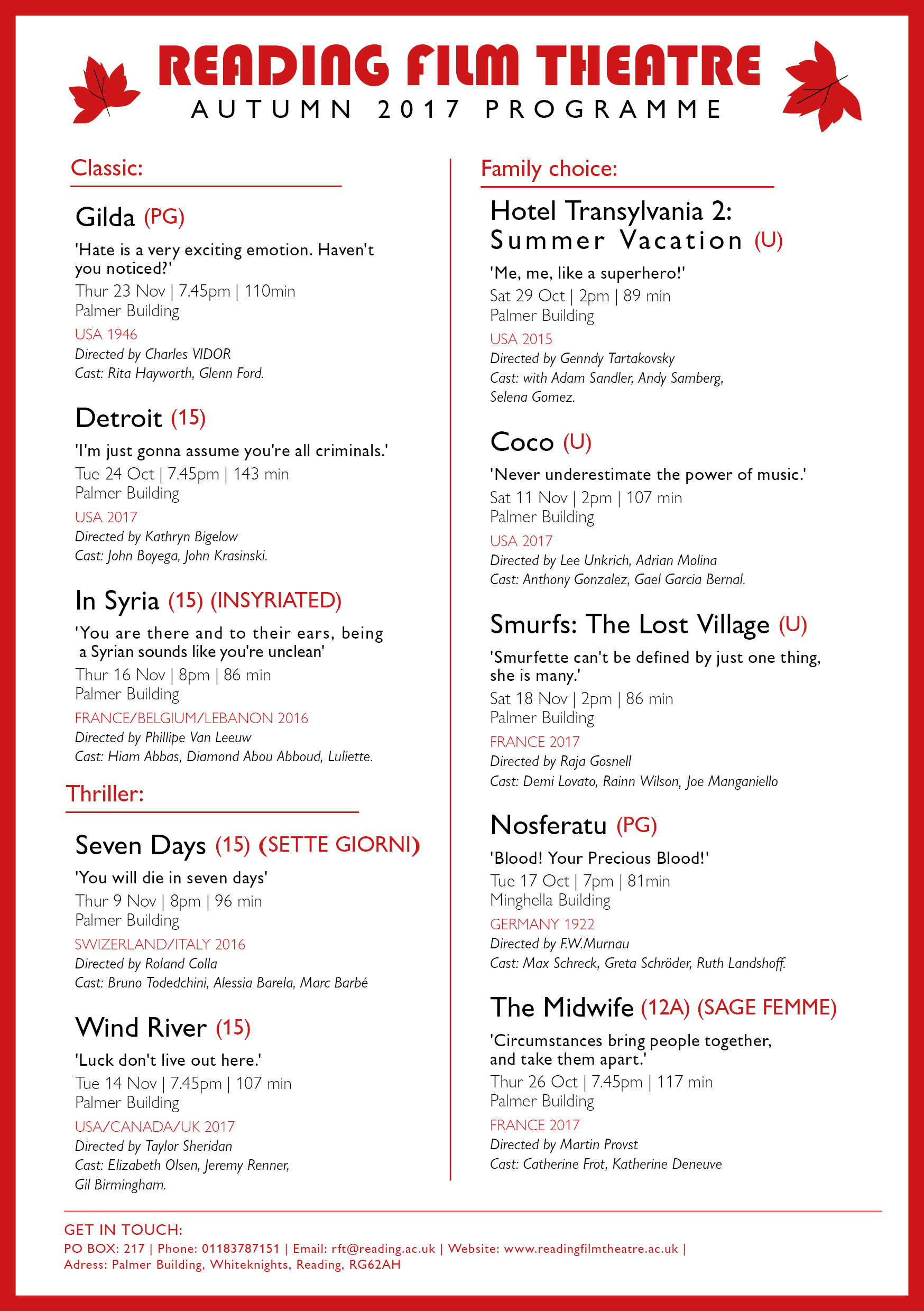
After adjusting the typing mistakes, I decided to combining the two designs above in mordernist way, as I reckon that it is better to benefit a wider range of target audiences, include retired people, families, internationals and people who have Hollywood passion,ect. I abandoned the month grouping version as the date is actually easily to find. I remain the film quote as to introduce the film little more and appeal different audiences.

As to let my audiences choose what information they prioritize to look at, I haven’t particularly emphasis on a single title or information. However, I group the text by intrinsic and extrinsic information, as well as slightly change in font colour, weight and style to separate different information, so it will be easier to read. For example, I use red font in country which helpful for international user, bold text for the quote to have emphasize effect,ect. Lastly, modern font are used, also a red frame is added to create focus point to the information in middle.

By reflecting on my flyer design, I think I can improve in the informational grouping and idea of structuring the layout design in terms of hierarchy. It is a bit vague to read and boring for now, as it better to have featured layout style for an appealling first impression. I can look at peers work in achieving a more stylish flyer later.

B.O.A.C

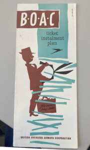
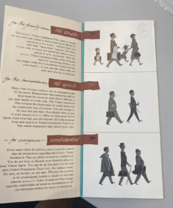
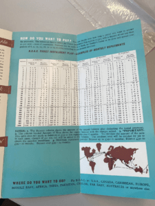
After initial research into this British Overseas Airway Corporation ticket installment plan brochure which dates back to 1960. The colours used throughout the brochure consist of brown, black and blue. There are san serif and serif fonts used throughout brochure with most of the more important information being bold and in a san serif font, making it more legible and obvious to the reader.

The brochure again hints at when it was dated through the use of predominantly male figures. The wording they use is also very ‘one gender dominant’ the last paragraph where it states ‘every man’. This clearly resembles a time similar to the 60s where women were seen as less than when compared to the man. This can also be seen in the images used where there is predominantly men.


While the colour choice is quite unique, using brown, it does still work effectively. The use of colour does not take away or distract the reader, it does rather the opposite and compliments the brochure. Although the use of colour has been implemented correctly, there are still a few issues that I had when looking through this collection piece. I felt the way that they presented the pricings for the ticket installments could have been presented a lot better than how they were originally. After first looking at the brochure I was hit with instant confusion, the way that the numbers have been presented.

1870s Vintage Sheet Music

Background information

The collection I chosen was a sheet music cover from Frank Laughlin: The Orphan, illustrated by T. W. Lee, and published by Chappell & Co Ltd (New Bond Street, 50 – London) in 1870.

Illustration: Cat and sheet music in 19th century

The reason I choose this sheet music is that I was appeal by the drawing of the kitten, which is realistic and cute. From the picture, we can see a woman that put on noble clothes and accessory was holding a wretched and little kitten by whole hand, which correspond with the title ‘The Orphan’ above. The picture creates a sense of sadness and helpless of the kitten, which I assume the target audience may be upper class woman, and the illustration arouse their sympathy and appeal them to listen the music. Besides, the text is in different typography style, which is decorative.

In 19th century’s sheet music cover, there are quite a lot illustrations found using cat as object.  It is said that animals were often used in advertising caught on in Victorian times, as using anthropomorphized animals in human activities more clearly demonstrates to the viewer an aspect of the character’s personality, thereby making the consumer more sympathetic with the animal in question.

Printing technique: Lithographic

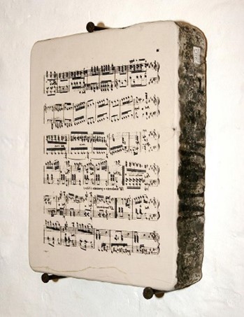
(An example of lithographic stone for printing music. The music is written backwards on the stone.)

Lithography is invented by Alois Senefelder in 1796, and was first used to print music in 1796 and the earliest music sheets to be illustrated by lithography were produced in this country in about 1820 and were coloured by hand.

According to the video on lithographic process and website of music printing history, the process involved drawing an image or text on a smooth piece of limestone with an oil-based ink. Then, acid was poured onto the stone to burn the image onto the surface. A water soluble solution was then applied, sticking only to the non-oily surface and sealing it. For printing, the water adhered to the gum arabic. The oily ink, however, repelled the water, thereby allowing for the printing of the images.

Overall, I have learnt the complicated printing process in lithography, the asthetic of vintage 19th century sheet music, and how illustrator attract the audience by animals in sheet music cover and advertisment. These advance me a lot in the history of printing and future album covers design.

Joyful Theatre

listingss

I started this project with some experimentations in indesign. I did some trials in the margins and columns as I tried to do landscape mode with 2 rows to fit the paper. I learned how to do the table in indesign so I could arrange the text equally along the page.  I began my search on past cinema listings and was inspired by many of them. I noticed how each listing has a different type of font that made the audience feel like they’re in the cinema. Then, I searched for fonts on google that fit well the movies theme and chose “Joyful Theatre” as my main font. I wanted a color that could be strong and independent above the white background so I chose black and dark blue. I tried playing around with the tint in some places too. Next, I added as many paragraph styles as I can in order to practice using them when there are many texts. I aligned the texts together and added a ruler guide for each line so every text would be aligned perfectly. I used Gill Sans Nova font to state the movie’s description, location, and date. I added paragraph rules below the movie title in order to align the date and location of the movie in a designed way. I tried to make the list easy for the eye to read so every age can be attracted to it. I believe I can use many of these stuff I learned in the book design project, especially the paragraph styles and ruler guides.

The Ritz Menu

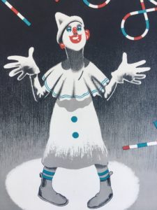
For this mini brief I’ve chosen to write about a menu for New Year’s Eve 1937 at The Ritz. This particular item grabbed my attention with its print design’s minimalist use of colour, and hints of Art Deco style. The gradient in the background shifts the viewer’s focus to the face of the clown and the type by giving the upper half of the design higher contrast between dark and light. The arch in the ‘1938’ frames the clown nicely and draws together the focal points of the image further. The design successfully conveys the theme of celebration which is appropriate for the occasion.
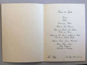
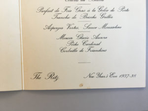
The fun outside cover of the menu is juxtaposed, on the inside, by a formal choice of typeface which matches the prestigious image of The Ritz Hotel. Rules are then used to break up the separate dishes on the menu — this is especially helpful seeing as the highly embellished ascenders tend to slightly obscure the lines. The layout is very simplistic and the items on the menu are ordered in a way that gives the body of text a diamond shape which is an elegant stylistic touch.


Cinema Listings Development

The Reading Film Theatre brief involved having to produce a pamphlet for the Reading Film Theatre Autumn 2017 Programme, presenting 10 films along with information about them on the page. It had to only include 2 colours (white does not count as a colour in this circumstance), 2 fonts, and possess 2 columns to present the information. Additionally, our design had to cater to a particular audience, such as a parent with 2 children and an elderly couple.

For my first draft, I included a gold gradient background along with black text to present the information. My initial ideas were to reference the “golden age” of Hollywood cinema, like the 1950s an 1960s; leading to me adding the gold background. My design was supposed to appeal to the older audiences, or connotate that it was of a classic cinema style, but I had not realised that I had already failed one of the briefs of having only 2 colours. Also, due to the text being the same colour and similar point size, it was fairly complicated to read upon first glance.  Furthermore, my inclusion of paragraph rules were not very helpful as they were the same colour as the text. Cinema Listing 1

With my second design I decided to only include a light blue colour and black text as I did not want my design to be as needlessly complicated to look at. However, in light of focusing on minimising my design I had forgotten about my chosen audience, which resulted with me becoming confused on what to do next. This, along with my lack of current Adobe InDesign knowledge, made me want to learn about how I could improve my design by seeking feedback from the Friday lesson. Cinema Listing 2

After, the feedback lesson I decided to simplify my design as well as not overcomplicate the visuals, along with editing general mistakes such as errors within the text. I decided to focus on the colours of the University logo that is usually depicted as red and white, to fit the colour scheme. The pdf file does not allow the font that I had chosen for the title, but for reference I had initially used a font called “Showtime”. This font had a Hollywood inspired text along with old film tape acting as borders above and below the title. I wanted my design to focus on being intended for the use of the elderly, as it was a simple design that became easier to read compared to my last concepts. The minimal use of red for the title as well as the titles for the films enhances the importance of the films and associates with the hierarchy of information, conveyed in Lonsdale and Twyman’s journals of typography. RFT Actual Design

Real mermaid

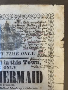
This was a news notice that I had found within the collections. This particularly stood out to me because someone had written on it in the top right corner. To me this made the piece much more personal and unique. I loved the look of the handwriting and how there was a slight bleed in the ink, giving it a more historical feel. The notice declares that a “mermaid” was caught alive on the coast of the Shetland Islands. However, the writer of the notice conveniently didn’t include an image of the mermaid to prove his claims. I think that was intentional to entice more people to pay and see the exhibition.

Mr Darlington’s note (in the top right corner) was very hard to decipher. I couldn’t figure out if he was amazed by the exhibition or if he was disappointed. To me, the description of the mermaid sounds a lot like a large fish with hair, I can’t say I was surprised, but I’m sure that this must of been news to spread around town. I think everyone would have their own opinions about whether it was true or not, even today.
RFT Listings

Reading Film Theatre Listings

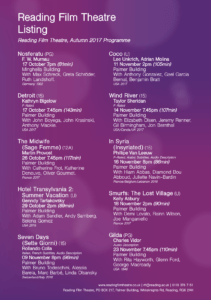
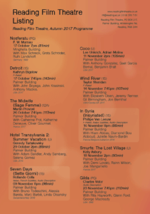
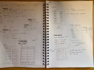
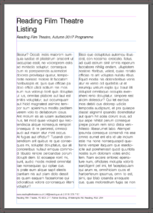
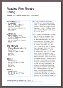
I started off this project by drawing up small sketches of my initial layout ideas, I’d quickly decided that I’d have the main heading left aligned at the top of the page and then the contact info at the bottom, deciding this early meant that I then had a determined space for my actual content of the page, this allowed me to appropriately size the rest of the page properly.
I’d also focused on my layout for specifically each block of information, my idea was to keep this page with as few rules and lines and boxes as possible to allow it to read easy and feel breathable almost, this meant my layout for the information had to be clear and consistent between each section.

I started by creating the general layout and the columns, then created a template for the format i’d decided on for the information. I found doing it this way that as i went along and input all of the information i was able to adjust the sizing appropriately when i input new information and i learnt what the spacing and sizing actually needed to be as i went along. My main focus was to keep a systematic format for each section so that once you’d read one section of information you’d be able to understand all of them, this proved awkward in areas such as “Hotel Transylvania 2” where the name was extra long and required 2 lines, this led to me deciding to use an ‘outdent’ for the main title of the film, further separating the sections but meaning that names that spanned over 2 lines were still just as readable as any other while not taking up an obnoxious amount of space horizontally on the page.

Another of my steps was creating a background, since my goal was to create a format of bolds/italics/sizes/lines to break up the information in a block into understandable sections this meant that my choice of colours was free to use for the background graphic, using a mesh gradient i created a purple and orange background which wouldn’t be overpowering to look at but gave it a friendly feeling still rather than a blocky full colour background, next for this i decided to add in lighter sections of blurred circles attempting to tie into the theme of cinemas with a pseudo lens flare effect on the background. I created this is illustrator and then placed it into the indesign document.