
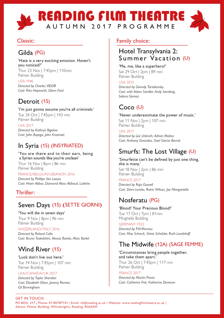
- Draft 1: traditional (for retired people with old Hollywood passion)
The first draft is design for retired people who have free time to watch film. By grouping films according to month and date, they won’t miss any filming date in schedule. Besides, retired people or someone who have passion for old Hollywood would extra focus on the context of the film, so I add a quote below each film name to attract these audience and priority their interest to the film. I also use a traditional and decorative font to the title of Reading Film Theatre and add text of High rated movies, so as to suit their characteristic and appeal my audience.
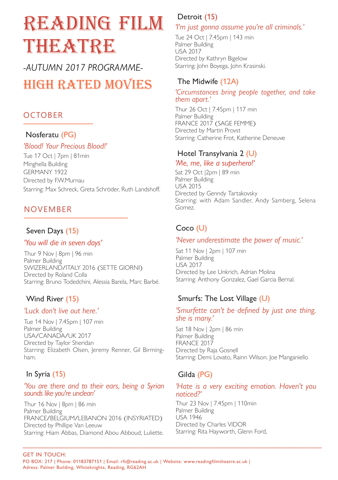
- Draft 2: mordernist (for international / busy people/ families)
The second draft is a more modernist design. As I would like to focus on the target audience of international and busy people, so I designed the flyer to be clearer and simplicity. Rather than grouping the movies by months, I distinguish them according to the film genre include classic, thriller and family friendly movie, which makes it easier to choose specific genre and relevant information for first prioritise, correspond with their own interests and to have a faster decision.
- Peers feedback
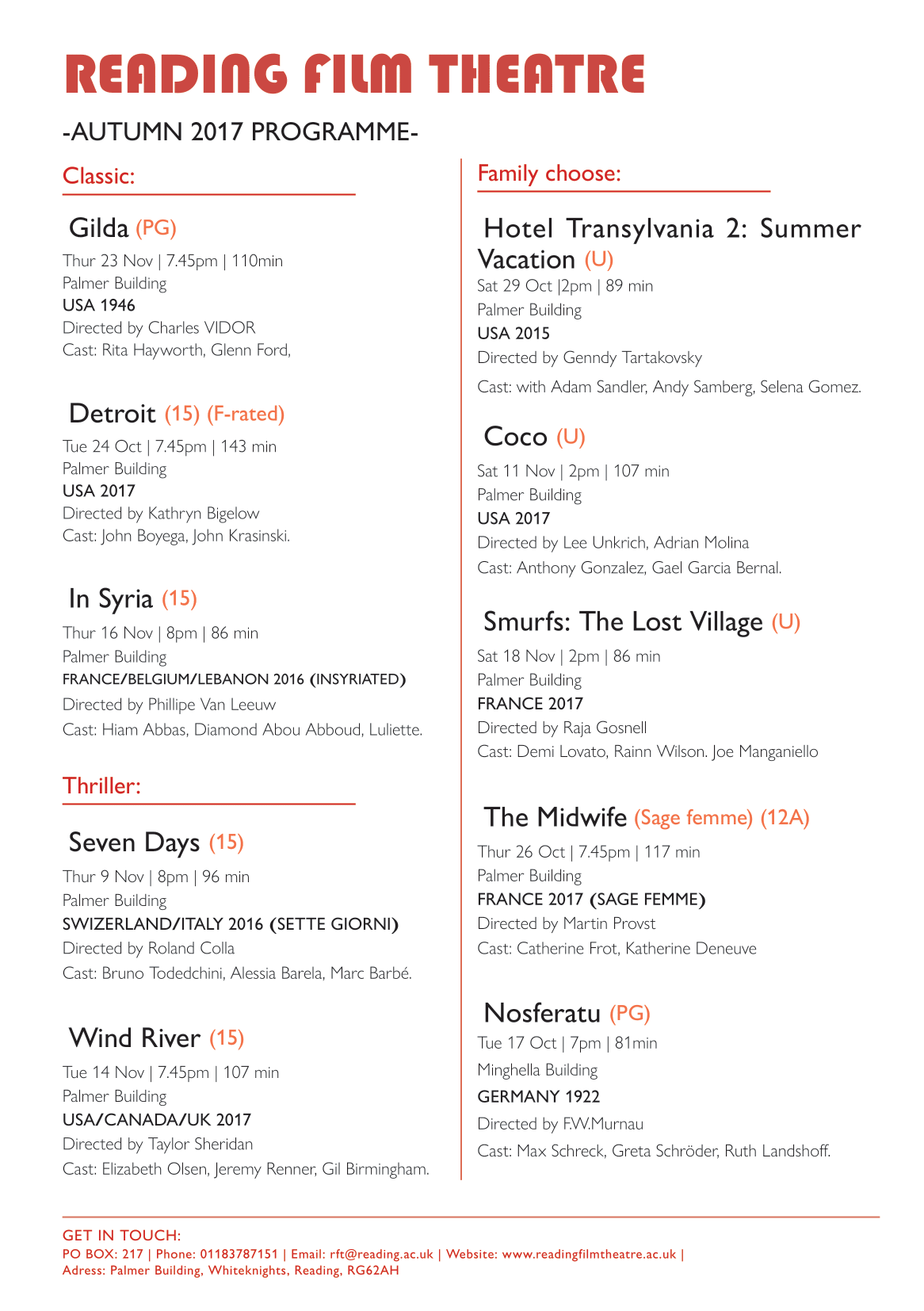
From the peer’s feedback, there are many typing and structure mistic that I can’t found by my own, such as wrong punctuation, type spacing, force line break to respect the cast, and repeated information found, which will be a serious mistake in real life situation, so I should be more aware on it for alternative designs.
Final decision
After adjusting the typing mistakes, I decided to combining the two designs above in mordernist way, as I reckon that it is better to benefit a wider range of target audiences, include retired people, families, internationals and people who have Hollywood passion,ect. I abandoned the month grouping version as the date is actually easily to find. I remain the film quote as to introduce the film little more and appeal different audiences.
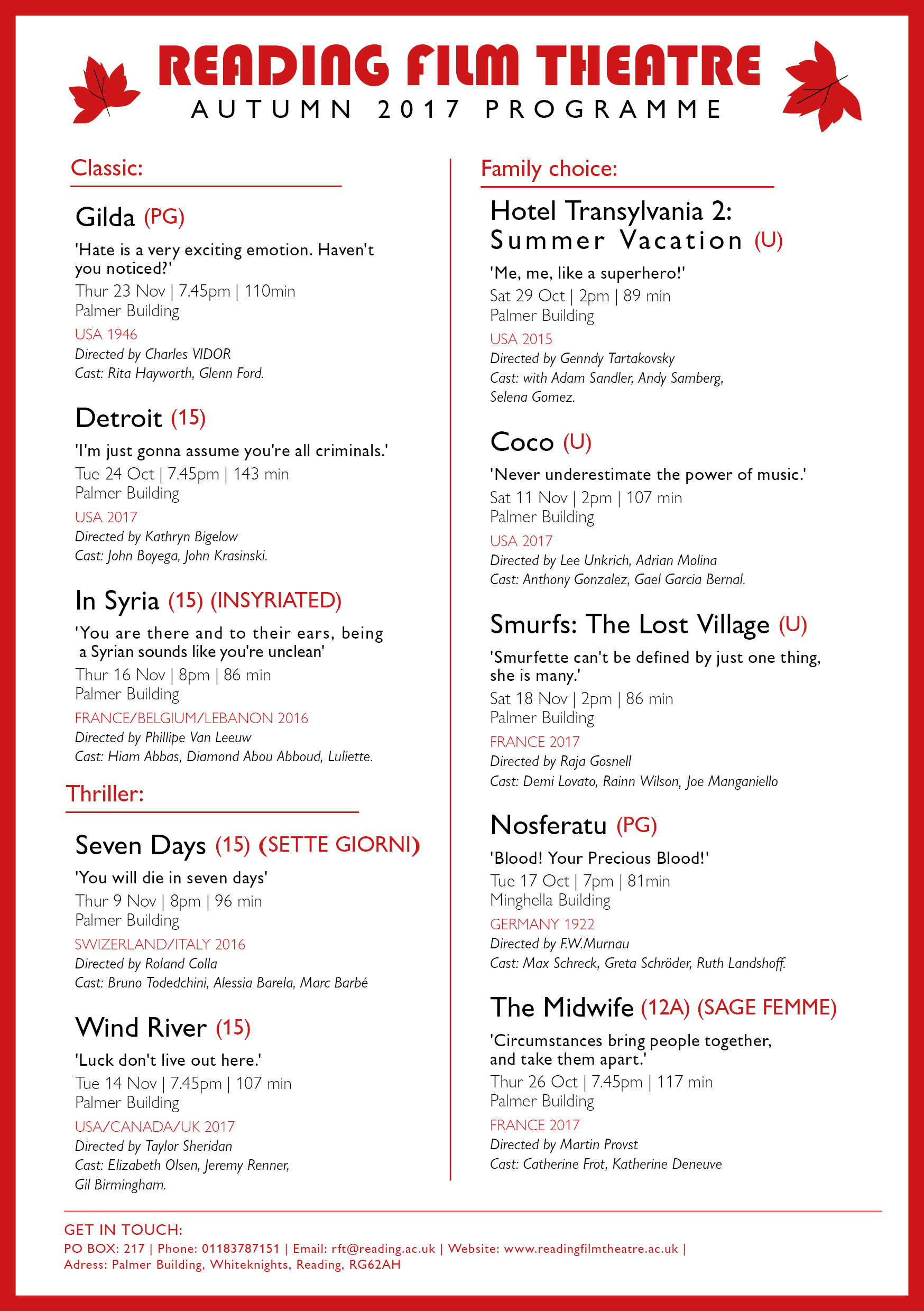
As to let my audiences choose what information they prioritize to look at, I haven’t particularly emphasis on a single title or information. However, I group the text by intrinsic and extrinsic information, as well as slightly change in font colour, weight and style to separate different information, so it will be easier to read. For example, I use red font in country which helpful for international user, bold text for the quote to have emphasize effect,ect. Lastly, modern font are used, also a red frame is added to create focus point to the information in middle.
By reflecting on my flyer design, I think I can improve in the informational grouping and idea of structuring the layout design in terms of hierarchy. It is a bit vague to read and boring for now, as it better to have featured layout style for an appealling first impression. I can look at peers work in achieving a more stylish flyer later.