Category: TY1SK

Work by Part 1 students as part of their ‘Skills for Design Practice’ module.

Emigre and halftones: exploring Photoshop

I’m Ethan Nunn, a first-year student on the BA Graphic Communication course hear at Reading. As part of our TY1 SK module, we were asked to reflect on one of our self-selected tasks we’ve been working on for the last few weeks; I have chosen to write about what I’ve learnt about Photoshop, especially in developing creative images.

I’m unfamiliar generally with developing creative images; I see myself predominately as someone who uses such images, not create them. Thus, my knowledge of Photoshop’s more creative features is lacking substantially. This week, I’ve chosen to start correcting this, to develop a breadth of knowledge across all of graphic communication.

Design ideas and design process

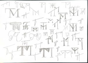
In this task, I had to develop three different designs – they’re shown below. In this article, though, I’ll be dealing with only one – design idea 3.

  • Design Idea 1 was used to develop skills related to curves and image editing generally, with a specific focus on colour in images.
  • Design Idea 2 was used to develop skills related to Photoshop’s Patterns feature, and also to develop skills related to Smart Objects and Filters.
  • Design Idea 3 was this design idea, and will be spoken about at more length in this article.

I’ve selected Design Idea 3 as the focus of this article as it contains by far the most interesting inspiration and goals besides technical improvement in Photoshop. Read on!

Design idea 3: Inspiration

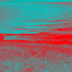
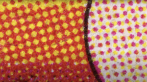
To begin with, let’s talk about inspiration. I was inspired predominately by a YouTube video I’ve recently watched – Dots by Posy, available here here on youtube.com. Below are a few stills that served as particular inspiration, from the same video:

I was also inspired, for this task, by a love of magazines, especially Emigre. The Emigre magazine was published between 1984 and 2005, and was known for its incredibly adventurous design, as well as its more nuanced debate around the interaction between writer and designer. One of our tutors, Eric Kindel, wrote an introduction to a the magazine and the discourse surrounding it in 2017 to promote the Department’s then-running exhibition – it’s well worth a read.

Specifically with Emigre, I was inspired by the enormous blocks of both type and graphic that drew attention to the chaos of the page layout. The rectangular blocks, however, still succeed in bringing some hierarchy to the page: clearly there is a grid involved somewhere, and across pages articles generally remain in the same place and in the same type.

Page 6 of issue 11 of Emigre magazine (actual page number 8), showing clearly large blocks of type and graphic “getting in the way” of reading the numerous articles printed on the page.

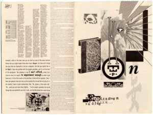
[Publishing information: Berkeley, Emigre Graphics, 1989; image credit: Letterform Archive.]

I set about designing an image that adopted the same principle of Emigre in that the work of the designer is above – not below – the content that it works with, but in a pictorial sense. I also wanted to include some referencing to colour halftones.

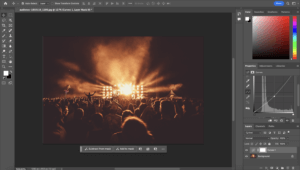
Design idea 3: Process and tutorials

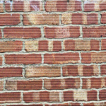
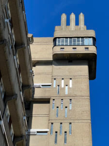
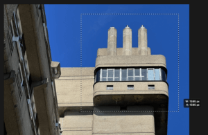
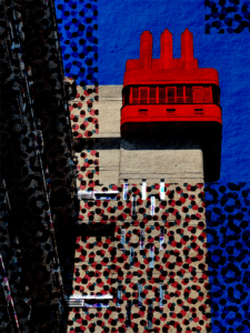
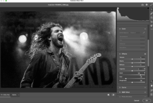
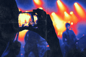
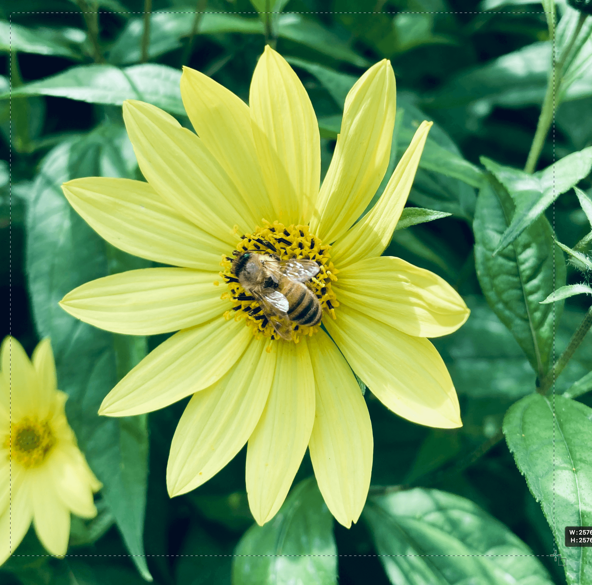
I started out by assessing which photograph I wanted to use. Eventually I settled on this photograph that I had taken over the winter break of Balfron Tower, located in Tower Hamlets, London, showing detail of its lift shaft. I liked particularly its perspective and colour palette, which is typical of a building in the brutalist style.

Balfron Tower lift shaft, London
My original picture, showing the top of the lift shaft of Balfron Tower, London

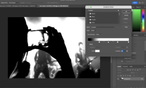
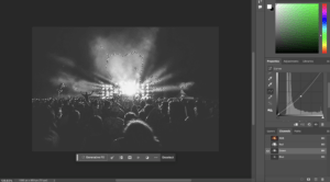
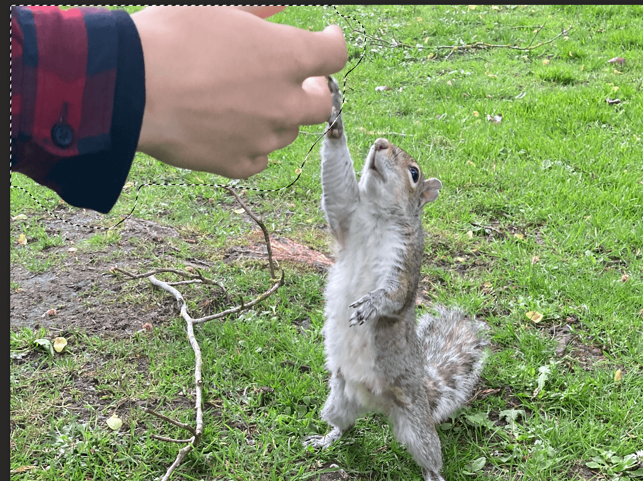
I then considered how I – as the “designer” – could become more involved in the photograph. I firstly considered cutting out the photograph using Select and Mask. I used this tutorial to remove the background of the photograph.

A screenshot of Adobe Photoshop with the Select and Mask workspace active
The process of using the Select and Mask tool to remove the blue background

But although this was the most obvious tool, it did not really inspire me – maybe because the background gave the photograph that rectangular framing that used to such a great (and successful) extent in Emigre. In addition, the magazine did unexpected things; removing the background was expected.

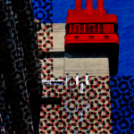
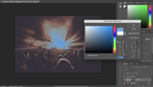
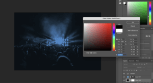
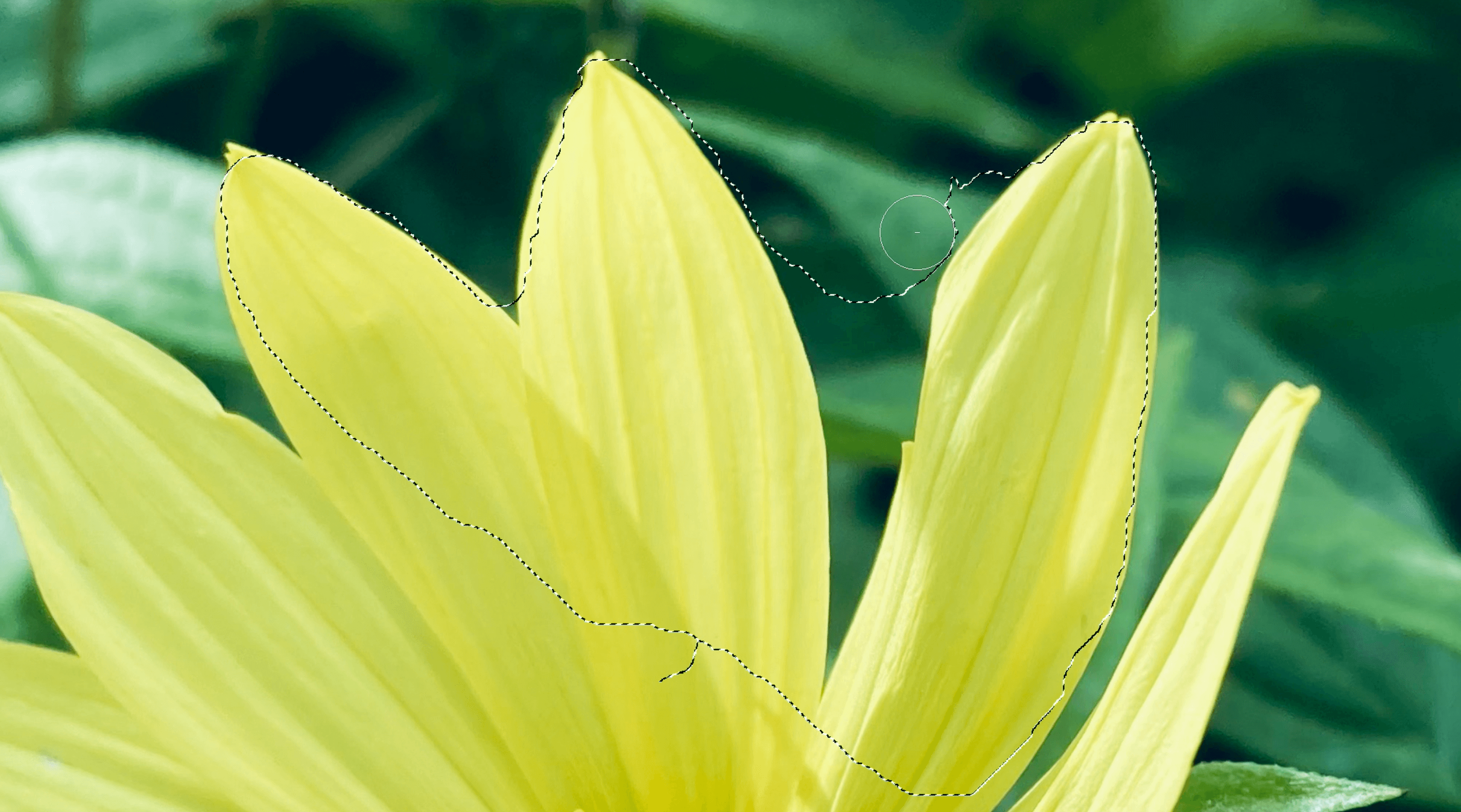
Reconsidering it, I came to an understanding – via its brutalist architecture, Balfron Tower represents equality – each floor is laid out the same, and the exterior finishing is the same across every storey – yellow-grey stonework. I thought, therefore, that it might be interesting – and unexpected – to undo the removal of the background and select the only thing in the photograph that isn’t the same – the lift machinery at the top.

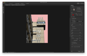
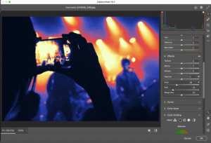
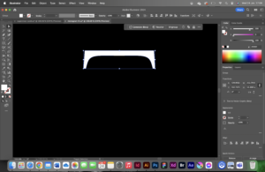
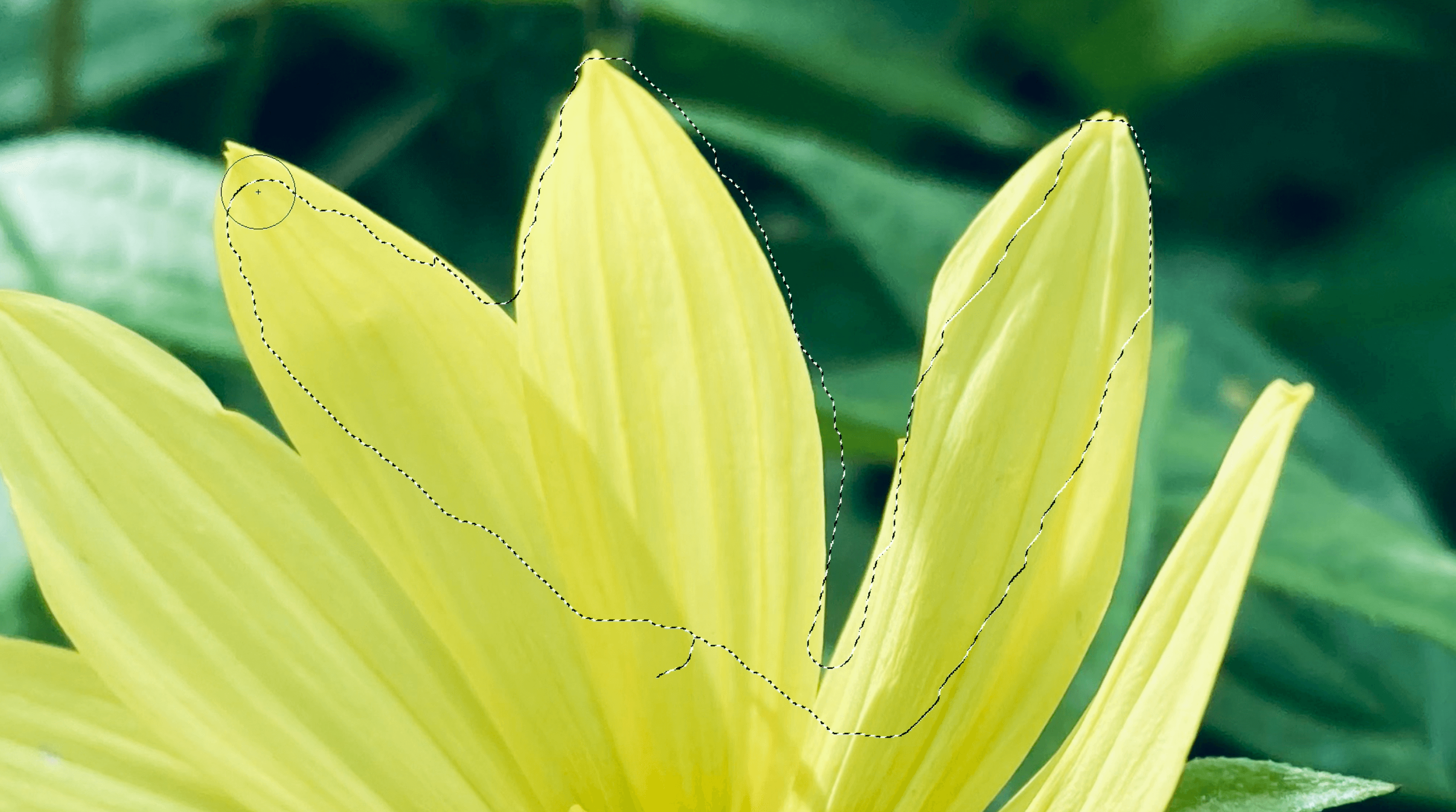
To select this part of the building, I used an entirely new tool – the Quick Selection tool (specifically, Marquee Quick Select), using another tutorial I found online. Dragging a rectangle shape over the lift machinery was a simple-enough operation – more difficult was the operation of refining the selection, which I needed to do with the brush tool.

A screenshot of Adobe Photoshop, using the Quick Select tool.
Using the Quick Select tool in Photoshop.

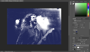
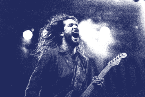
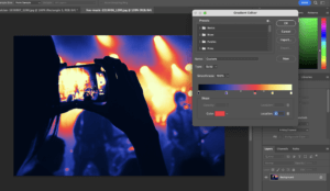
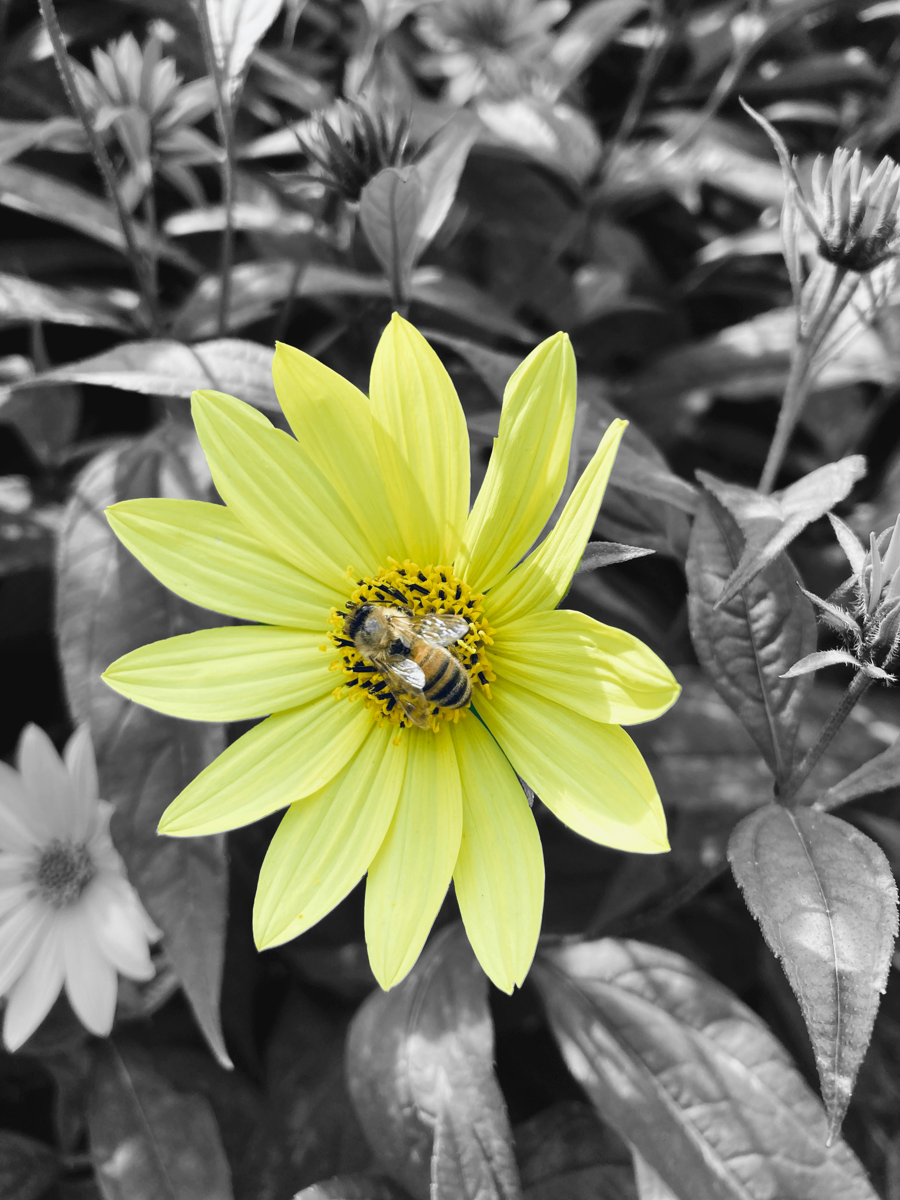
I then created a new colour fill layer and set the layer blend to Darken, after reading article on using blending modes. I was extremely happy with this result. Although I experimented with other colours, in the end I chose a full red: the contrast against the sky worked particularly well to create discomfort in the viewer and achieve the aim of not meeting users’ expectations.

The colour fill being applied to the mask made from the selection; layer blending mode: Darken.

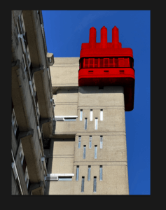
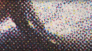
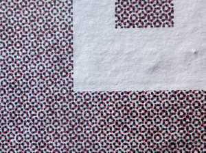
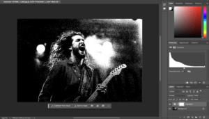
It was time now to insert the colour halftone layer. On the day of designing this poster, I had come across an extremely large billboard; approaching it at a human scale allowed me to take a close-up image of the CMYK dots the printers there had used. I cropped, distorted and enlarged (all three activities being outside the scope for explaining in this blog post) such that I had the following image:

Halftone dots on a billboard
The overlay image source, cropped and edited for exactly this task.
Screenshot of the Layers panel in Photoshop
The final layer tree for the file.

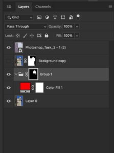
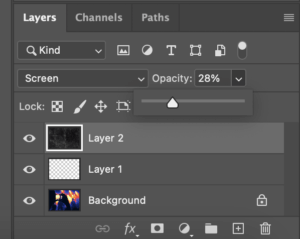
Applying it to the image that I had achieved an incredibly effective result, and resizing and moving the image, as well as setting the blending mode to pass through, yielded the final design idea, which I was extremely happy with.

A recoloured, retextured image of the lift machinery at Balfron Tower, London, with a CMYK "dots" overlay
The final design idea for this task. I believe it hits my aims reasonably well, but the colour halftone perhaps overly takes over the image and excessively removes the users’ understanding.

Reflecting on the design process and my knowledge of Photoshop

My knowledge of Photoshop has definitely increased since I started this task, and I suppose that the idea of going against the norm – through the inspiration provided to me with the Emigre magazine – helped that pheonomenally. I explored masking, selection tools and different types of fills; and perhaps, to me, the most confusing part of Photoshop – blending layer modes – is finally figured out.

Whilst I am happy with the final outcome, and have technically learnt lots, I am unhappy that the dots from the halftone effect perhaps excessively remove understanding from the user. It is a fine balance when positioning oneself as the middle person between the author and user, and here I feel as though I got somewhat carried away in the design I lost sight of the user, who may not even be able to understand that a tower block is being illustrated.

With that all said, my decisions were guided by my inspiration, and it cannot really be argued that Emigre represents the very best of layout and accessibility – indeed, its purpose is to not do this. In this way, my image does work. The likelihood of me using this same graphic style again is limited, but the tools I have learnt will be exceptionally useful as I traverse the world of Graphic Communication.

To develop my skills further, I could take a look at LinkedIn Learning or another online learning platform – but what works for me generally is trawling through the menus of an unfamiliar application and finding out what it can do from that. Now, just to find the time to do just that!

InDesign Flyer Formatting for ‘Rethink Fairness’

Design Ideas and Design Process

Since the Formatting Text task only briefed me to create one final outcome, it was a challenge for me to narrow down my expansive design thinking into a single concept! Pictured above is my finalised flyer, and I truly believe in creating this, I have learnt valuable skills for the future when using InDesign.

In starting this task, I applied colour to the parent page to formulate the background. I decided to make this a fair shade of pink since I felt like it reflected the name of the Radio 4 show – Rethink Fairness. Swiftly moving forward, I copied the assigned body into my text frame and started to apply paragraph and character styles. This stage was very important for me since it helped to create a textual hierarchy within the flyer, highlighting important elements by using different sizes and weights. One of my character styles was for a hyperlink, so it was crucial for me to link the Radio 4 show correctly to my ‘click here’ text. When applying my stylesheets, large amounts of white space were generated, and I struggled to tackle these initially. However, I quickly overcame this challenge and thought to experiment with the ellipse tool to create a decorative pattern using circles. To add contrast within the pattern, I altered the opacities, and this proved to be effective. I finished the flyer by changing the titular ‘Rethink Fairness’ text. Originally, I had made this sit on a straight line, (as seen in some of my screenshots below) but I felt that this wasn’t as exciting as it could be. Instead, I opted to use the ‘type on a path tool’ to curve the text, and I feel like this makes it work well in conjunction with the roundness from the circle pattern above.

Figure 1: Applying a solid, pink rectangle to my parent page
Figure 2: Applying paragraph styles to my body text
Figure 3: Applying character styles to make certain pieces of text bolder
Figure 4: Using the ellipse tool to create circles
Figure 5: Using the pen tool and type on a path tool to create my curved text
Figure 6: Changing the opacity of my circles

Software Tutorials

For most aspects of this flyer, I felt confident in exploring InDesign at my own accord. This is because I have recently become very familiar with using paragraph and character styles  in particular due to work from another module. However, I struggled with setting my ‘Rethink Fairness’ text in a way that was interesting, so I followed this helpful tutorial on how use the ‘type on a path tool’ effectively. In the video tutorial, I was initially prompted to use the pen tool to create a curved line. This took me several attempts since I wasn’t pleased with how some of the strokes appeared, but eventually I drew out two lines which were ready to be used. At the left edge of each line, I clicked using the ‘type on a path tool’ and entered the titular text. (‘Rethink’ on top, ‘Fairness’ on bottom) At this stage, I could play about with modifying new paragraph and character styles until I was satisfied with my final outcome. The tutorial I watched was simple, easy to use and helped me in learning a tool I hadn’t yet used in InDesign.

Design Resources and Articles

In my previous experience with using InDesign, I hadn’t needed to hyperlink any content before, so I was initially unsure of how to tackle this when needing to link the Radio 4 content for this Rethink Fairness flyer. However, I found this article which guided me through the steps on how to achieve this successfully, and how to stylise it properly. Firstly, I was prompted to select the text I wanted to hyperlink, and in my flyer, this was simply a ‘click here’ feature. I then navigated to Type > Hyperlinks & Cross-References > New Hyperlink, with a dialogue box appearing shortly after. Here is where I inputted the link for the ‘Rethink Fairness’ website. Submitting the changed settings in the dialogue box created a new character style for the hyperlink, so I altered this in order to make the text bolder, allowing it stand out from the rest of the body.

Figure 7: Adding a hyperlink to my flyer

Not only has this article aided me in this task, but the knowledge I’ve learnt from it will come in very handy for the future, especially when formatting bibliographies that include online resources!

Learning Throughout the Module

Throughout the Spring term tasks, I feel like I have hugely increased my confidence when working with Adobe programs. Although my quiz results from Autumn and Spring have remained the same, it shows that the volume of information I know hasn’t decreased by any measure. I believe these results aren’t a pure reflection of my learning within TY1SK because they highlight my general knowledge, rather than the valuable in-program skills that I have developed and prioritised in this module.

Nevertheless, my skills have improved vastly, particularly when working with InDesign and Photoshop since these were the two programs I knew the least about prior to the tasks set. From mastering stylesheets in InDesign to perfecting image editing in Photoshop – I am in a very comfortable position to use these effectively in the future! On the other hand, I have also grown my After Effects and Illustrator knowledge throughout doing these tasks. I already knew quite a bit about these programs, so I thought it may be a challenge to expand my pre-existing skills. However, I was able to learn new shortcuts and utilise effects I hadn’t before in the past within both programs, and it was super helpful!

Experimenting with Magazine Layouts with InDesign

Design ideas and design process

I was set the task of creating effective layouts in InDesign, to which I would create two magazine layouts and then choosing a final design that I was most satisfied with (Design 1) that I felt demonstrated the best and most effective layouts for a magazine.

Creating this design, I had to use typefaces that I had no prior experience to using, Suisse Int’l Book and Bembo. When forming ideas and my inspiration, I used an album cover as my main inspiration for my second design, as I had a particular interest in it as I loved the colours and typefaces that it used. I also believed the idea of using aspects from an album cover design (Figure 1) was something that wasn’t in trend nor had been explored much in the design world. The topic of the magazine has no relation to the album cover, I used it simply for inspiration in my design.

Figure 1. The 1975’s ‘Notes on a Conditional Form’ album cover, released in 2020

Having collated my inspiration for this design, I began by setting the grid and format for the document (Figure 2), opting to use a three column grid for this layout. In my previous experiment I used a two column grid that I thought felt too much like a book rather than a magazine (Figure 3). The three column grid allowed me to experiment with my text much more and allowed for an easier and smoother reading experience.

A screenshot demonstrating my process in setting up a three column grid in InDesign
Figure 2. Setting up a three column grid in InDesign
Figure 3. My first idea for creating a magazine layout, using a two column grid

I would use my knowledge of using paragraph styles in InDesign to typeset the text appropriately (Figures 4-6). Making it easy to differentiate between a header and the body text. I would also explore creating appropriate styles for different aspects of the magazine, such as audio links and titles for the books. By the end of my design, I would finish with around nine different paragraph styles that were used for my typesetting.

Figure 4. Use of sample text to demonstrate the 3 column grid, as well as some very basic typesetting
Figure 5. First iteration of typesetting with actual body text and headings included
Figure 6. Near Final iteration of typesetting, an appropriate use of spacing between paragraphs as well line length

Software Tutorials

As well as having inspiration for my design, I had support from many online tutorials to assist me in my work. A tutorial that I found most useful was a video that guided me on how to create a grid in InDesign. I wasn’t too familiar with the following process so I thought following a tutorial was the best route forward.

I would begin by creating a new document, exact to the standards set by the brief, turning to the ‘Layout’ tab at the top of the screen and setting a colour in the ‘Ruler Guides’ section. I would then return to the ‘Layout’ tab, then to ‘Create Guides’ where I would start setting the number of desired columns and rows, as well as the measurement of distance between these guides using a gutter. Before finalising my grid, I made sure to set the grid to align to the page.

I felt this tutorial was very beneficial to me in creating my magazine layout and solidified my knowledge and understanding of knowing how to use InDesign professionally.

Online Tutorial Used:
https://www.youtube.com/watch?v=9A3EtUZsPZE&ab_channel=TypeTwice

Design Resources & Articles

Along with the tutorials and inspirations used when creating my design, I found other resources in my research that I found useful to creating my designs. I looked at magazine design layouts that I could find online that were effective and that I felt demonstrated what was an effective layout. These helped me to develop a better idea of what a magazine layout actually looked like, and how they were handled by a user.

I would also use Pinterest for mood boards to generate ideas. I feel its a great and effective website tool to source inspiration for designs and I have used it in previous projects. I felt it very useful here as it gave me near endless amounts of inspiration, demonstrating different techniques of formatting images for a magazine layout, as well as different styles of grids and columns which I found very useful as I struggled to come up with ideas for designing an interesting format.

Online Resources Used:
https://www.marq.com/blog/14-magazine-layout-design-ideas-for-your-inspiration
https://www.pinterest.co.uk/dnacreativeshoppe/magazine-page-layouts/

Learning Throughout the Module

Having now used InDesign for this task, I feel so much more confident in creating formats using grids and guides when setting up my document. This was something that I had explored in this task and I feel I can use this in my other modules, especially when creating work files for any upcoming projects. I also covered other softwares such as Illustrator and Photoshop which I feel much more comfortable using.

Specifically for Photoshop, I learnt how to use adjustment layers more effectively, and how they can be used to alter the colour and brightness of an image. In Photoshop I learnt also how to remove certain aspects of an image using the select tool, and then the content-aware fill. This was one of the more useful skills that I learnt across the module and feel I can apply it in my works, whether it be personal or works related to the course.

In Illustrator, I got more comfortable with using typefaces and creating an outline to alter the design to my own needs and requirements. Though this was useful, I feel I still need to develop my skills further in Illustrator as there are many skills I am unfamiliar with.

Exploring filters in Photoshop

Design ideas and design processes

For the ‘Editing Images’ task, we had to make a change to an image. This included, but was not limited to, changing the colour of a part of a photo, lightening or darkening an image, or removal of objects from the background of an image.


Idea one

For my first idea, I chose to add the effects of noise and threshold. This effect is quite popular on media such as recreations of vintage horror posters and album cover art, so I decided to give it a go myself. For this image, I added noise through the camera raw filter instead of the filter gallery. This is because the grain on the camera raw filter is more precise and allows the user to adjust the amount of noise they want. I then applied threshold and adjusted it accordingly so that the background and foreground did not blend into each other. The background was fairly dark apart from a couple of bright stage lights, meaning that it was not difficult to get the balance right.  I wanted to add some colour to this rather than leaving it black and white, so I added a blue rectangle that covered the entire image on a layer on top of everything else. To apply this colour to the black parts of the image, I set the blending mode of this layer to screen.

Adding grain to 83 through the camera raw filter.
Adding threshold to the image in order to create a more distressed effect.
Adding a blue rectangle on a top layer, this will be my colour to replace the black.
Setting the blending mode of the layer to screen, this applied to colour.
Final product


Idea two

For idea number two, I experimented with gradient maps. I chose an image that I knew I could incorporate a lot of bright and colours with high contrast into. Going into gradient map automatically inputs one black and one white handle at either end of the gradient bar. I added more so I can add more colours into my gradient map. I chose vibrant colours that make the image look clearly distorted and more interesting. I then wanted to add texture to this image, so I added grain through the camera raw filter and a paper texture I found online on top. For the paper texture layer, I changed the blending mode to screen in order for the texture to be applied to the image. I also changed the opacity of this layer to 28% to avoid it being too overpowering. This is my favourite outcome from this task, as it is very visually interesting and eye catching.

Adding more handles to my gradient map.
Adding my chosen colours for the gradient map.
Going to camera raw filter, I added grain of size 36.
Changing the blending mode and opacity of the paper texture layer.
Final product.


Idea three

For the third idea, I created a duotone image. This involved working with channels, which I hadn’t done prior to this. Before starting the duotone, I adjusted the image using curves to increase the contrast of the image. I did this in order to get an effective final result that provides high contrast between the two colours. After doing this, I navigated to the channels and selected the RGB channel that provides the most contrast. In this case, it was green. I made the green channel a selection by clicking on the dotted circle icon at the bottom and pasted it on top of the background layer as a solid colour. This solid colour would be the highlights, so I chose a light blue. I then selected the background and made it a solid colour which would be the shadows, for which I chose black.

Adjusting the curves of the image to create a high contrast.
Selecting the green RGB channel.
Pasting the green channel on top of the background as a solid colour and choosing a light blue for the highlights.
Repeating the previous process with the background, I chose black for the shadows.
Final product.


Software tutorials

I did not know much about working with channels and how to create duotone images. I used a tutorial (https://youtu.be/TVJqG8HrJwc?si=nCwqflv4arL7hVF8) to help me with this. It gave me an understanding of RGB channels and when to use each channel to achieve different effects. I learnt that in order to create an effective duotone image, the channel with the highest amount of contrast should be selected. To create less visually intense duotone images, channels that provide less contrast should be selected.

To create the gradient map, I followed a YouTube tutorial (https://youtu.be/kjKfz9KXgPo?si=-KILb-3zMc9vX5_l) in order to achieve this effect. As I was new to this, I chose a tutorial that used vibrant colours rather than trying to piece different colours together myself. This was so I could get a basic understanding of gradient maps before personalising them completely. This video taught me that gradient maps are quite customisable, as extra handles can be added in places of the user’s choice.


Design resources and articles

Finding inspiration for this task was not difficult, as I took inspiration from images that I commonly see on social media. The work of Jesse Nyberg (https://jessenyberg.design/) features effects I attempted to recreate such as using noise and threshold. He also utilises gradient maps in his work, that mainly consists of posters. Looking at his work helped me develop my design ideas as it gave me an idea as to how to make my work look appealing. For example, I knew when to stop adding noise in order to make it look not too overbearing, and I chose colours in my gradient map and duotone image that were cohesive.

An article I found (https://proedu.com/blogs/photoshop-skills/what-is-threshold-in-photoshop) gave me further understanding into the threshold tool and included links to useful videos.


Learning throughout the module

Throughout this module, I have learnt a lot of new skills. During the first term, I developed basic skills in Photoshop, Indesign, and Illustrator. This was useful as I had no prior experience of using Adobe apps. I learnt how to work with adjustment layers and the filter gallery in Photoshop, along with learning how to deal with paragraph and character styles in Indesign. In Illustrator, I learnt how to manipulate type into shapes. During the second term, I used After effects for the first time. This was challenging but I learnt the basics of the app such as how to use graphs and add effects to texts such as glow. I also became more familiar with different Photoshop tools such as masks, channels, and how to use the pen tool to cut out images. In Illustrator, I learnt how to manipulate type itself rather than morph it into different shapes.


From Letters to Logos: The Elegance of Edited Type

Design ideas and design process.

Design idea 1

Monogram 01 (sophisticated)

This design takes inspiration from luxury brand monograms. I chose a serifed font, and through disconnected strokes, combined my initials ‘TM’. The simplicity and clarity makes this design very effective as a sophisticated logo.


Sketches of monogram

I began by sketching several variations of ‘TM’ monograms on paper, I find that using pencil and paper for this initial idea generation process allows for numerous quick generated designs that do not worry about being neat or technically perfect and instead focus on depicting the way in which the letters interact with one another or the feeling that they convey.


Screenshot of turning text into a vector image

Taking it into Illustrator, I started by typing a capital ‘T’ with the text tool in Illustrator. I used ‘create outlines’ to convert this type into an editable vector image.


Screenshot of using the direct selection tool to edit text

I edited the-now-vector letter by deleting anchor points with the direct selection tool.


Screenshot of using guidelines

I then shifted into wireframe mode and created guides to stick to, which is frequently used in logo design to create a uniform, clean, alignment.


Screenshot of editing the control handles

Finally, I looked at the finer details; to reflect the curve of the terminal on the ‘T’, I edited the control handles for the anchor points on the top of the ‘M’.


Design idea 2

Monogram 02 (playful)

This design idea takes a much more playful approach than the first. It pushes the boundaries of the concept of a monogram logo with its inflated 3D form, however, it still combines the letters ‘T’ and ‘M’. This type of design would be great for social media posts, possibly incorporating a short animation of the logo itself inflating.


Design idea 3

Monogram 03 (industrial)

This design took a more corporate, industrial approach, and captures a completely different feeling to the previous two. It relies on heavy geometric shapes, slightly softened by an applied transparency gradient .


Software tutorials

Throughout this project, I watched several video tutorials to assist in my illustrator learning.

I used this youtube video on the latest generative fill tips and tricks for illustrator, to help me gain a greater general understanding of current illustrator tools. This is where I thought of using generative fill to generate a pattern to apply over the monogram: Generative fill

Another tutorial that I relied on when creating the inflated monogram, was a tutorial on how to inflate shapes and objects in Illustrator, as I was keen to experiment with some sort of 3D elements within the module this term: 3D inflate tool

One of the software tutorials linked at the bottom of the brief that I used when creating my Monograms in Illustrator is how to outline fonts. This is a key step in editing type as a vector and this tutorial reminded me on how to use the shortcut “cmd+shift+o”: Outline type


Design resources and articles.

I suffer from relatively strong colour blindness, and therefore often rely on taking existing colour palettes from existing designs, or those that can be found in the real world. A resource that assists me in choosing colour combinations, is ‘Adobe Color’, which allows you to copy colours by their hex codes: Adobe Color

To inspire me with my design ideation process, I created a moodboard of existing monograms on Pinterest as advised in previous feedback from TY1SK1: Pinterest board


Learning throughout the module.

This module taught me many valuable software skills through the numerous tutorials that I read/watched and through pushing me out of my comfort zone and encouraging me to explore previously unused tools within the software. My biggest learning moment of the module was getting to grips with After Effects. I used in-depth design tutorials sourced from the website Skillshare which gave me a great understanding for the basics of the software. As Illustrator is the Adobe software that I feel most comfortable with, learning After Effects complimented this perfectly, as it builds on the vector images created in Illustrator.

Exploring InDesign Tables

Tables in InDesign can be very useful when organising content, making it quicker and easier to understand. Most people will have explored making tables in Word or Excel, but designing them in InDesign allows for more creativity and control.

I was tasked to design and format content into a table. Before this I had never made tables in InDesign before, however I now feel confident in using and explaining the basic features.

Software Tutorials

Since it was all new to me, I started off by reading through the materials given to me on the brief. I found that the information from the Adobe Website was a great way to learn the basics of creating tables. Another tutorial which I felt explained the basics but also went a bit further in giving more detail on styling tables was by Yes I’m a Designer on YouTube.

Design Ideas and Design Process

Initial Idea

Figure 1 – initial idea

My initial approach to the task was for the whole design and timetable to be portrait. The table size used in this design was 5 rows by 2 columns. I felt that the size of the table in this design was too squashed and so it made the information difficult to read as it was quite small. This lead me to think of having a landscape design as this would fit the content better and allow for the type size to be larger, improving legibility!

Final Design

Figure 2 – adding type

I started off by setting up my document with top & bottom margins of 14mm, and left & right margins of 10mm. I then began adding in the information that would not be kept inside a table: the title of the podcast and its description. The typeface for the title is Greycliff CF, and for the body text is Poppins.

Figure 3 – table dimensions

To create the table, I used the following dimensions: 2 Body Rows, 5 Columns; and for now I kept the default table style that InDesign sets.

Figure 4 – table added
Figure 5 – adding table data

I then added in each set of information to the corresponding cells, and used Paragraph Styles to style the text.

Figure 6 – removing table lines


Using the Table Styles panel, I chose to remove the lines surrounding each cell of the table as I felt they were unnecessary for my particular design since the content was already well divided enough.

Design Resources and Articles

Uxcel has some useful information to consider when designing tables. It discusses how to best design tables in terms of scannability, legibility, alignment, and styling.

Learning Throughout the Module

At the beginning of this module I had only just started to become familiar with using InDesign due to a book design project in another module; and before that I had only ever used InDesign once or twice during A levels. I feel that this project has taught me about many different design tools and skills, but has also helped me to become more comfortable when using Adobe software and its variety of features. This task in particular was helpful in discovering how to create & style tables, as well as getting me to make use of paragraph styles.

Discovering the pencil and pathfinder tools on Illustrator

Design ideas and design process

I have always found illustrator to be one of the areas of design that is most difficult. This is not only because I find the tools quite complicated to use sometimes, but also because I am not very confident in my drawing skills. This is why I want to focus more on my illustrator task and talk about how I have been able to improve my skills over this task.

Design 1

Figure 1: My original final first design, balloon inspired

When beginning this task, my original approach was to use the inflate tool to create a metallic balloon like logo (figure 1). Which I ultimately ended up scrapping because I could not figure out how to not have the effect be pixelated. This was a positive though as I then took a step back and made the design less complicated, I took a more vintage style approach to the design through the extreme curves and the smooth style of the typeface.

First of all, I found an appropriate balloon-like font on adobe fonts, which was Ziclets, and selected the type tool to place my initials onto the page. I then used this tutorial to outline the letters to make them editable (figure 2), this brings up anchor points which we will use to extent the letters. Afterwards this tutorial helped me figure out how to use the pencil tool to alter my type. This was done through selecting the pencil tool, clicking on the anchor point where I wanted to start the extension and then dragging it to the anchor point to where it should end (figure 3). I lowered the F down slightly so there was space on the right side of the J at the top and at the bottom of the F. Consequently, I used the pencil tool again to extend the ends of each letter so they are slightly wrapped around each other, and to make it more aesthetically pleasing I changed the colour to green, duplicated the layer and changed the colour to a lighter green on top to make a shadow effect (figure 4).

Figure 2: Outlined text to make letters editable


Figure 3: Extended letters using pencil tool


Figure 4: Final first design

Design 2

Figure 5: Highlighted grid and pathfinder tool used to connect boxes

For the second design, I followed this tutorial on making an initial logo using a grid and the pathfinder tool. I first drew a vertical line on the page, used the option key (⌥) and dragged to the right, then I pressed command ⌘ and D to duplicate the line across the page. I highlighted the lines used the option key (⌥) and dragged again, rotating until it made a diamond pattern, making sure that it is not rotated too far that the logo will appear too slanted in the end. Afterwards, I selected the pathfinder tool, and dragged across the boxes I wanted to use to make my letters (figure 5), adjusting the letterform and extending the grid wherever I need to (figure 6). Finally, I selected the extra lines outside of the filled boxes and deleted them leaving the logo, and to separate the letters, I found the line dividing the letters and changes the fill colour on each side to different colours.

Figure 6: Adjusted letterform and grid
Figure 7: Final second design

The software tutorials were the most important part here because I would not have known that using the pathfinder tool on a grid was a technique that I could use. The inspiration behind this design was sports logos, specifically adidas and the way that the logo is slanted towards one side which can be seen here, which is what I wanted to imitate in my design. I am not sure why I assumed that logos like this were done without a grid, but it makes much more sense after watching the tutorial. The final design is shown above (figure 7).

Design 3

For my final design, which is the one I feel is most effective, I went for a traditional calligraphic style logo where the serifs were altered and connected. Firstly I looked at my original sketches and found the one that I thought would be interesting to execute on illustrator.

Figure 8: Outlined initials

We start off with the letters being placed on the page, and here I used the typeface Rizado Script. Next, the text needed to be outlined which was done the same way it was in the first design, this is by selecting the text and right-clicking to bring up the menu, then selecting create outlines to make the text editable (figure 8). I then connected lines using the pen tool (figure 9), and used other letters from the typeface, applying the rubber tool to create the parts which I would employ to help connect the lines and the serifs together to make a fluid logo. I had not thought to use other aspects of other letters to enhance my logo if it were not for this tutorial which explains how you can use that technique as a feature of the design. As a result of this, I inserted the letter O into the file and used the curves from half of an O to falsify having looped serifs (figure 10 & 11).

Figure 9: Pencil tool to connect letters
Figure 10: Connecting extension to create new shape
Figure 11: Using character O to create new serif

The linked tutorial above really helped me for this logo, it also covers parts of illustrator which was provided through multiple links on the brief just in one video. Going into this task I thought that I would be using the pen tool for everything because that is what I have always done. I surprised myself though, specifically in this final design as pretty much only used tools which I did not know existed before I started this task. The final design is shown below (figure 12).

Figure 12: Final overall design

Software tutorials

Most of the tutorials I used were ones that I found on my own through YouTube, I did review the tutorials that were recommended on the brief, but I found that lots of the YouTube tutorials covered lots of the same things. I was able to find out about approaches that I had not considered before through video tutorials, such as using a grid and connecting the sections together to fill them.

Although some of the software tutorials such as the bubble text tutorial were just consolidating skills I already had, the ones that had completely new tools I feel have increased my confidence in Illustrator by a considerable amount. The tutorials I used for my task are linked in the walkthrough for each design.

I definitely still feel like there are more skills that I need to learn and develop on this software, like most people would as software is constantly changing and developing. Something specific which I would like to learn further is using the pen tool, as although I used it extensively in this task, it took me quite a lot of time to get used to it and make my work smooth and even. There are still gaps in my knowledge which I can improve by finding more tutorials.

Design resources and articles

The first thing I did after reading he brief was create a Pinterest board and started adding logos which I found to be effective and aesthetically pleasing (figure 16). I personally like Pinterest as it shows me what is trending in my own age range.

I also did what most people probably did for this task, which was just search up ‘initial logos’ to see what comes up. Through this I managed to find some images which were useful displaying different letterforms and styles, like (figure 17). Additionally, I browsed this website which includes different logos for a range of companies, which was one of the things that I think most people would think of when they hear the word logo. I liked these ones specifically because it just shows a list of a wide range of logos from clean sharp lines to elaborate, intense designs.

Learning throughout the module

Despite my scepticism in this module being self-directed, it has allowed me to work at my own pace and solidify my knowledge in software that I (naively) thought I knew well.

I began with previous knowledge of a few pieces of software, that being Photoshop and Illustrator, but through this module I have been able to learn about InDesign and After Effects which I did not know existed! Finding out about, and learning how to use these new software’s has been what I believe to be the most important part of my year. I now know the purpose for each of these individual software’s and what part of design they are mainly used in. Such as Illustrator being for logo design and InDesign for setting out any text.

Skills that I have improved while doing this module include cutting out hair in photoshop, especially curly hair which I found to be very challenging, but most importantly I have been able to improve my time management skills. Although last term my time management skills were not too bad, I definitely improved this skill during this half of the module. I was completing each task on a set day every week which has been a highlight for me because it has relieved some stress.

Understanding Layout and Hierarchy


Hierarchy: The classification or assortment of subjects regarding their importance.


Hierarchy in typography is arguably the most important consideration when creating layout. It writes subliminal messages within the page that tell the reader what’s important, what should they look at, what should they read first. This is why it is so important you don’t mess it up.

The task at hand was to format an effective layout for a double page spread. The content would be an article on novel characters which break character norms. The text would be supplied, but it was up to layout the content, edit the hierarchy and format an effective DPS.

Software Tutorials

Prior to the spring term my knowledge in Adobe software such as Photoshop and InDesign was already quite extensive and I have had much experience in these applications. However, I found that it is useful to have a refresher in some of the more niche or hidden features of these. To do so I have searched for a few tutorials, most notably in InDesign, to boost my knowledge in these fields and solidify my skills as a designer, and bring them to fruition.

I also came to use less familiar software, such as Illustrator, which posed as new and interesting challenges to overcome. While challenging at first, after a few tutorials I found myself quickly becoming more confident.

One of the more useful tutorials I used was a creative cloud download which ran down on the importance of tracking and leading in text and how this can be used in InDesign.

Change letter and line spacing in text (adobe.com)

Design Ideas and Design Process

I began by creating the InDesign file I’d be working in. This consisted of a double page A4 spread with facing pages. The margins were set at 16mm as this would create plenty of space in the center of the page for the body text, while keeping a healthy distance from the edge. It was after this I implemented the baseline grid, which would help me to layout my text later.

This feature in InDesign is vital to formatting a good layout as it allows you to evenly space the lines of text on your page. This is becomes especially prominent in the body copy where it can assist in organizing masses of text with just a few mouse clicks.

With this done, my next step was inserting the main body of text. This is where the Importance of layout and hierarchy became too apparent.

I found that there was too much going on, the text was in big chunks that was harder to digest. Some lines didn’t have enough space between them do divide the different subjects, and some had too much space, making something of minor importance seem more so. I believe this made the reading experience awkward and unrewarding.

I amended this by firstly splitting the text into columns which split the text into more digestible parts that wouldn’t fatigue the reader. I also spaced the paragraphs apart by an entire line to show that they are not connected, and bundled the “reading:” and the reading list onto the same line to establish their connection as before it appeared as though they were unrelated.

I then began establishing the typographical hierarchy, using different type styles and sizes to differentiate the relevance of the text. For example, the headings of the sections would use a semi-bold variant of Acumin Variable Concept, where as the body would remain in regular form. I saved these as paragraph styles, which would later help me to format the text far more efficiently and in uniform.

Following this, I created the left page, which consisted of images of some of the books mentioned in the article. It is important to involve graphics in double page spreads as it helps to create visual relation to the article content and also balances out the text, reducing the likeliness of a reader being discouraged by the masses of reading.

My final change was adding the title and introduction paragraph. I wanted to integrate these into the image page so separate them from the body text, but also didn’t want them to get dwarfed by the imagery. The solution to this problem was containing the text in a dark band, and using white text to create contrast to set out from the background. I also used italic type for the title, and increased the tracking, to set this text apart from the rest.

Design Resources and Articles

Before making too much progress on the layout design I found myself experimenting with some features to explore my options, as well as watching some tutorials on some of the features I was less familiar with to prepare me for the task ahead. For example, I needed to recap on how to more efficiently format text using paragraph styles using the tutorial below.

Format text (adobe.com)

I also revised how to set up a baseline grid as this was a feature I had only recently practiced and was not entirely confident in using, nor did I fully understand it’s utility. I feel however that this task has helped me to appreciate it’s uses.

For the image page, I used high quality jpeg covers of the books relevant to the article.

Learning Throughout the Module

Throughout this module I have picked up many new skills, as well as reinforced ones I knew already. One of which is understanding the importance of using a baseline grid in typography. The vitality of this feature has become obvious to me during this task and I have increased my understanding of how to set one up.

I also think my ability to create a pleasing and useful layout has been improved through not only looking at other material for reference, but through trial and error, and experimenting with the layout rather than keeping a tunnel vision on one idea.

However, next time I would try to be more ambitious with my layout. I think I could have created something much more interesting by having images placed on the same page as the body text. This would have posed some new challenges for me to overcome and offer more experience in how to establish the layout and hierarchy of a page.

Making Tables in InDesign – Going ON the Grid

Introduction

I think it’s important to start off by saying I had no idea how to make tables and grids in InDesign. Other than my limited use in the book design project and making work files, I haven’t used the software before. I was well aware that I’d have to start with the basics, but I’m glad this module gave me a chance to do this.


Software Tutorials

I, therefore, had to begin with the software tutorials, needing this information to progress with this challenge. I began with a YouTube tutorial by Amy Maher, which allowed me to grasp the basic technical aspects involved in grids and tables. This focussed on the foundational skills, a complete beginner’s guide to this tool which was perfect as I currently didn’t know anything about this.

Using my newly-gained knowledge, I opened InDesign to begin this project. I decided quickly that my first design would be an incredibly basic but functional table, making sure that I could adapt this to suit my needs, before moving on to a better designed and more visually appealing design.

Amy Maher’s video ‘Working with Tables in InDesign cc’, showed me the basics of tables in InDesign and how to amend sizes simply.

Design Ideas and Process 1

The process of creating a table and adjusting its characteristics to suit my information
My initial table with consistently sized cells – obviously not appropriate and taking up unnecessary space.

I started by closely following the tutorial – I used the ‘Create Table’ tool to add a table to my page I was then able to specify the specifics, altering the rows and columns to my requirements. I did a simple, linear format for these, not wanting to overcomplicate the design. This tool worked well (other than me needing to add an extra row to the top for the titles), allowing me to input the data into each cell.

As the tutorial said, I was then able to adjust the size of my cells, selecting a row or column to adjust a group at the same time, a quicker and more consistent method. Having done this, my simple table was complete and I was able to move on to the design aspect.

Having adjusted the cell sizes, I then added a title and began to style the page.
I then began adding other elements, creating visual hierarchy but attempting to keep the table as the focus.

I placed this table along the bottom of the page, adding text initially to create a clear hierarchy. I used knowledge from the previous terms InDesign class to allocate clear paragraph and character styles, while also knowing more about the alignment and structuring that would benefit my final design.

Finally, I added an image of the book and quotations along the right-hand side, allowing a more balanced design to be achieved and having typography and layout separating the different layers of information.

I am happy with this design, clearly a simple beginning, but allowing me to test this tool for the first time and gain more experience in InDesign, both technically with the software and enhancing my skills as a designer through more practice.

My first table design – a relatively simple but conveys the necessary information in a well-structured, visually appealing manner.


Software Tutorial/Article

Coming off the back of that example, I wanted to explore the styling aspect of the table more, breaking the conventional, linear structure. I began looking at articles and resources, finding a post by ScienceEditor about the best practices for table design. This added to the foundational knowledge, informing me of conventions of table design – these included the increased ease of comparing numbers when in columns rather than rows and the benefits of breaking up a long, linear table.

I also had to consult an article when hitting a problem – when having trouble adding a row into the table, I used a blog by Adobe to fix this minor issue.


Design Ideas and Process 2

The basic grid structure that my table will follow.
The same structure, now with the relevant data filled in.

I began by creating a more visually interesting layout for the table, stacking the two parts on top of one another and right aligning it. I then filled in the same data, ensuring that each entry has a consistent size to the next.

I was much happier with this structure for the information; although not linear, the information is still clear and creates much more interest through this less conventional shaping.

The ‘Table Options’ menu, allows me to adjust the colour and weight of the table
The result of my styling experiments – a much more engaging appearance with some clear areas to be altered, such as the black lines between the cells.


I added this coloured shape as a background element using the pen tool, looking to make something fluid-like but not overpowering. I used the colour picker to select an orange from the book cover. Looking at this with a black table, I knew I had to invert this to white, the contrast making the table and its data more readable.

However,  this was not as easy as I thought – I had to use the ‘Table Options’ menu to adjust the colouring, also allowing me to alter the line weight. The results of this were much more successful, with a clearer contrast helping the table stand out from the background.

The addition of these reputable quotes helps balance the positive and negative space.
The use of colour and font weight helps to create a clear reading structure and a better visual appearance.

Now being happy with the layout and colouring of the table, I moved on to the rest of the design. I began by adding two quotes into the remaining orange space, testing all three and deeming this too much.

I then went on to add the text (sources from the book’s summary) and the title to the top, again using size, font-weight, and spacing to create a structure and deliberate relationship between the levels of information.

Design Resources

Finally, I added the BBC Radio 4 logo (an online resource) to the design, feeling this provided some visual balance to the design and helped to complete the layout. However, the rest of this design was simple typographic work and shapes created by me, not wanting to overcomplicate the design with external images and resources.

My final design, adding the BBC Radio 4 Logo into the top right, helped to balance the design and make it a more realistic piece of promotional material.

This second design is a better design – visually, the page is much more striking and provides much more interest to a viewer and potential listener. The table itself is much more fun and unconventional layout that helps to draw the eye to this vital information without it dominating the page in size.


Learning Across the Module

I began this project with no knowledge of using grids and tables in InDesign. Although my first attempt was relatively basic (and not without issues), my second design is a visually engaging and effective table, working as an element within a successful and balanced full page. While I am sure there are more nuances to this process, I feel comfortable in creating a table, a skill that will certainly be necessary for later work. I have built up from nothing and am now able to use a brand new tool in InDesign, an integral piece of software I will likely use for the rest of my career.


Exploring Photoshop

Explore, verb: travel through (an unfamiliar area) in order to learn about it

Software Tutorials

Coming into the Spring Term I’ve built on my knowledge and skills in Photoshop, Illustrator, and InDesign. I’ve also met new software along the way, After Effects, Adobe XD, and Premiere Pro.

I have been exploring Photoshop in a more thorough way, rather than just an initial first look. For instance, the clone stamp tool is such a fundamental part to photo editing, but I didn’t even know it existed! Only by this in-depth exploration can I progress from just familiarity to a higher, more professional usage of any software.


Design Ideas and Design Process

Cutting Things Out

I started with the intention to change the background, following along with this given tutorial.

Previously I have used the ‘quick selection tool’, but the tutorial spoke about using the ‘object selection tool’. This was something that I’d never come across before, so I searched up how to use the this tool and came across this tutorial.

Firstly, I located the ‘object selection tool’, Figure 1, which was in the same place as the other selection tools. With the tool selected, I drew a box around the selected object, Figure 2. The computer then shrinks the line down to a shape it thinks you’re trying to select, Figure 3. This tool was pretty good at selecting most things, but I cleaned this up using the ‘quick selection tool’.

Figure 1
Figure 2
Figure 3
Figure 4
Figure 5  

By holding down the option key (⌥) you can toggle between adding a section or subtracting a section, Figure 4 & 5.

In the tutorial I was following, it also showed how to change the background to a black & white image. I kept the cut-out flower on another layer and applied the filter to the original image. This effect makes the foreground pop and is something that I would use again for photo manipulation.

Figure 6

Clone Stamp

I explored one of the given tutorials, which was a useful introduction to the ‘clone stamp’. It looked like magic, until you understood the logic behind it; of copying similar parts of the photo to erase unwanted sections. I used a photo of some ducks, Figure 7, to begin with.

Figure 7
Figure 8

I created a new layer so that the edits could be toggled on and off. The ‘clone tool’, like the ‘object selection tool’, is located on the left-hand toolbar, Figure 8.

Figure 9 
Figure 10

To choose which part to copy, hold down the option key, and you will notice that the cursor changes to a circle with a cross inside it, Figure 9. The selection is the part of the image which you are copying. When pasting this new selection, a small cross, Figure 10, shows you where this information is being copied from.

I  put this into practice and edited out some unwanted parts of a picture I took at the beach. I removed the dogs and wooden structures by copying other parts of the photo. I think it is successful because it’s done seamlessly, you can’t tell that I’ve copied other parts.

Figure 11

Content-Aware Fill 

Figure 12

I explored one last tutorial for my third design idea, which was how to remove objects with the ‘content-aware fill tool’. Firstly, use the ‘lasso tool’ to select the part you want to remove, this can be quite loose, in my case, it was the hand, Figure 13. Then locate the fill option, which is in the top menu bar, Figure 14. Choose content-aware fill, Figure 15, and this is the result, Figure 16.

The software does all the thinking about which parts to copy, similar to the steps taken in the clone stamp tool.

Figure 13
Figure 14

Figure 15

Learning Across the Module

I’ve found this module particularly helpful to my development as a designer and as a professional. I’ve been able to lead this module in ways that have been useful to me, in terms of learning new skills.

The skills that I have learnt across the module include: the clone stamp and content-aware fill in Photoshop, 3D text effects and the envelope warp tool in Illustrator, and making tables in InDesign.

However, the biggest thing I have learnt is how to use new software. This term I have had to learn three completely new software: After Effects, XD, and Premiere Pro. So, you get quite used to the process of accepting scary new software and simply just opening it. Thankfully the Adobe software is all fairly similar, which has made this process easier.

Skills I have improved on this module include: cutting things out in Photoshop, and using the pen tool and creating gradients in Illustrator. Other skills have been using Adobe fonts more, for instance I now know how to search by an image in order to match fonts. Finally, I have been able to build upon my time management and staying on top of the independent tasks, even when no one checks upon it!

Skills to continue to develop:

Two skills that I would like to develop are being able to make screencast and using Adobe XD in a fluent way. Making videos is a fundamental skill, especially in increasingly digital world, and is something that I’d like to build my confidence in.


Design Resources and Articles

In my current design work, I hardly use Photoshop. However, being able to use it to a higher standard would enable me to have a wider skill set. How to get to that stage? A wider exploration of the software, for instance opening up all the menus to see what everything does.

I could do a thorough LinkedIn learning course, which  would enable me to learn pretty much everything there is to know about Photoshop. Or I could continue to set myself design challenges, similar to this module, where I carry on with a strict regime of learning new skills. We never stop learning, even more so with software that is constantly changing and adapting.