Category: Logo trends

Logo trends

Minimalist Logo Concept

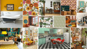
After being set the brief of 10 different themes, I decided to use the theme of New Minimalism. I did some preliminary research into this theme, providing me with a foundation knowledge on the topic.

New Minimalism Interior Design

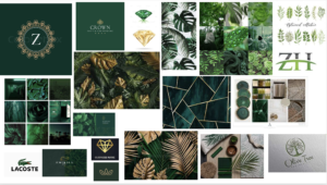
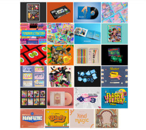
Following this research, I decided to look for appropriate images. I began on Pintrest, but quickly moved onto Behance, as I found these projects more complete and done with intention. I created a digital mood-board on there, collating ideas that would help to inspire and influence my choices.

https://www.behance.net/collection/188421593/Minimalist-Logos

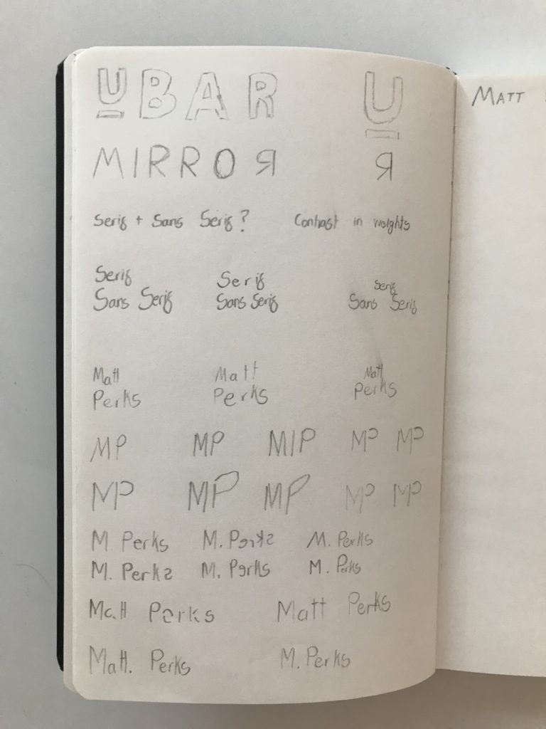
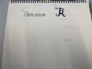
Next, I complete a round of quick sketches, allowing the swift generation and trial of ideas. This process was very valuable, providing a way of testing concepts and ideas with the ability of easy refinement.

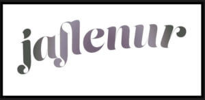
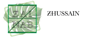
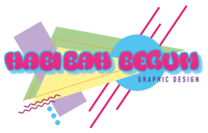
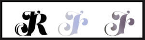
I then moved into Illustrator, allowing me to put together designs with more precision. I began by finding some appropriate fonts, using the Adobe Fonts library to provide a wider range of possibilities. Having compiled these, I began trialing different layouts of text for the design, trying to find the most appropriate for the minimal design focus. While more space would give a more airy and minimal appearance, the focus on functionality seen in the research gave reason to keep the kerning to a minimum. The combination of sans and serif typefaces also interested me, allowing some sense of style and personality to emerge from the logo design. After trialing these, I found a successful combination – the larger serif text allowed hierarchy to be built, with the lower sans serif typeface helping to keep the logo visually balanced.

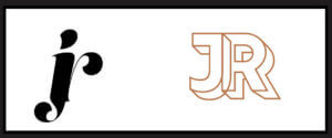
Wanting to experiment further, I began to create my two initial letters from lines and shapes. While the final design of this, seen on the final page, looks somewhat effective, I thought that it would likely not work within its desired context. While minimalistic, the design conveyed more of the contemporary aspects of type, while being too thin for many of the likely applications of the logo. For this reason, I decided to continue with the first complete logo design, presented on the third page.

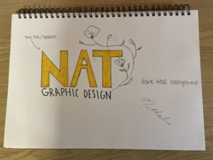
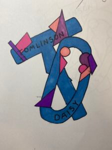
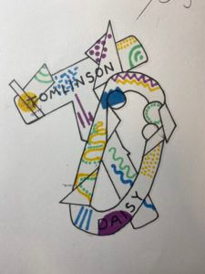
Here are the examples of the working document and my two basic design ideas –

Minimalist Logo Design

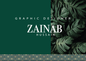
Having produced a final idea, I decided to apply it to a Photoshop Mock-up, allowing me to evaluate its success within the context of its use. Similarly, the minimalistic design style links more to the overall design than the individual elements. After finding a very simple Mock-up design, I applied my design just above the central line, drawing a viewers eye to that aspect of the focal image. I then added small text above and below, using the repetition of the sans serif font to create harmony and balance within the design.

With more time, I would likely look at more colour options, only using one to keep the design minimal and clean. However, when reflecting on the design, I think that this works well. The monochromatic colours work well within the context of the Mock-up, and the design is well balanced.

Brown Design

After selecting the theme “90s Urban Style” prior to the session on Thursday, I decided to create a brief mood board to quickly illustrate the instant ideas I had about my theme. 90s Urban

The 90s style made me instantly think of The Fresh Prince of Bel-Air (the famous TV series from the 90s), as the main character and the introduction to the show presents a typical “street themed” aesthetic. I noticed throughout the images I observed that there was a consistent theme of graffiti and vibrant (but minimalist) colour schemes. Taking inspiration from this, I pursued the graffiti style, as it perfectly fit the theme of noticeable and eye-catching logos.

Graffiti Design Experimentation Through using Adobe Illustrator, I wrote my name in many different fonts until I found the font “The Blacklist”, this font had joined letters and had varying thickness to the lines, which was a common graffiti style back in the 90s. Additionally, I made my own gradient to use for my lettering, as I wanted to adopt the vibrant hues that were present in the 90s street art. After adding the lines underneath the main text to accentuate the words as well as the overall theme I included a black drop shadow as this was commonly used to add to the 3D element of street art. I believe I have done well in producing a 90s inspired logo for myself with the software that I was provided, but if I was to improve my work I maybe would have experimented further with different gradients or extra layers on top of my text for a better effect.

70s Retro Themed Logo Design

For my logo trends design, I picked the theme of 70s retro style. I first created a mood board of the 70s retro styled interior design which featured lots of interesting patterns such as floral, geometric, seamless swirls, psychedelic patterns etc… I really liked how colourful and bold everything was, but still had an elegant feel to it. I then looked at fonts, logos and brands in this era which matched very well to this retro theme. I again really liked how the text is really vivd and eye-catching, with lots of colours, making me feel rather happy and excited.

And so with this research, I wanted to mirror this kind of excitement I felt when looking at this style and put it into my logo. I started off with the font and colours. I was inspired by the Bee Gees ‘Staying Alive’ title in my second mood board and decided to use these shades of pink and a similar font. 

I then created a ring of circles with pastel colours of the rainbow, imitating a vinyl to possibly have a music theme, linked with the Bee Gees and the retro themed music at the time. I got inspiration from my second mood board again where it looks like there are an array of records lined up beside each other. I thought this would be a good way to encapsulate my name (my brand) within the circle to give it a clear central focus. When putting my name in the middle, I thought it looked quite bland so looking back at my mood board, I saw a splatter-like shape and thought it would be nice to add behind my name to look like it was popping out, giving it more texture and depth. I originally drew a black splatter with a turquoise outline, however, it was slightly too harsh to the eye, so after some debate around colour, I changed it to white with a pastel purple outline, making it easier to read the logo.

Overall, I am generally happy with my design as I think it fits very well with the theme of 70s retro style. I also like how colourful it is which will capture the attention of viewers. If i had more time, I would probably reconfigure the splatter behind and continue to experiment with colours as I still think the white is too bland. Maybe I could have incorporated another retro themed pattern within it.

Logo – 90’s Theme

I created a logo on Adobe Illustrator for my own brand in the style of my chosen theme of Urban 90’s. First, i created a mood board on Powerpoint which was easily accessible as I was designing, to put all my ideas and inspirations in one. I gathered my favourite pictures and analysed what was common throughout to create my logo. I then began using regular shapes to compliment the lines and squiggles seen throughout the 90’s patterns as well as the font reflecting ‘The Fresh Prince of Bel-Air’ which went well with my theme. I then aligned a sans serif font to balance the logo as the next hierarchy of text to result in my finished logo. I like how this clearly reflects the theme, however some of the colours could be altered to adjust the readability.

Minimalist Branding

For this project, I decided to go with a minimalist branding approach. I love how clean this style is, and with the right color combinations, font, and graphics, you can create something that is eye-catching, yet simple. I feel as though a lot of “minimalist” brands these days look the same, so my goal was to keep these elements by adding texture and unique colors. The font I decided to go with was a bold Sans Serif that was all upper-case. The reason I decided to go with this instead of something thinner and lower-case was because the goal would be to use a gold foil/gradient effect for the letters. Additionally, I love the look of line drawing, so to add something extra, I decided to incorporate a flower that would frame the entire logo. As for colors, I think the gold foil details would look great with a dark teal background as featured in the mood board. The combination of all of these elements give a natural and organic look which is what I wanted to achieve with the photographs that I included as well.

70’s Retro

I decided to chose the theme of ’70’s Retro Style’ for creating my logo, as I wanted to experiment with in aesthetic of the 70’s as its still considered iconic for its fashion, patterns, colours and how even music influenced the style of typography. For my mood board I was looking into the different uses of colour and pattern, both vibrant and neutrals. Even though my mood board displays more vibrant colours and shades of pink I focused on the popularity of browns, reds and yellows. When creating my logo, I wanted to copy the 70’s use of shapes and swirls, so I chose an oval shape and tried to represent the classic 70’s shade of brown. For the text, I chose a font that was not on Adobe’s Illustrator and layered two pieces of different coloured text to create a 3D 70’s effect.

Nature Inspired Logo

My chosen theme was Organic Materials. I collected lots of inspiration for my mood board, and organised them into two sub-topics Plant Decor or Sustainable/Eco-Friendly.

When brainstorming my main icons forced around leaves, flowers and a neutral colour scheme. This is the first logo I created without the floral elements. It has a minimalistic and clean look, but doesn’t yet reflect the organic theme.

I came back to my brainstorm and experimented writing my name in a calligraphy style. I liked the flow that occurred in my first name of up, down, up from the lowercase ‘l’, ‘y’ and ‘d’. However my surname “Hall” didn’t carry this fluidity and looked all rather the same; which is why I have chosen to have my surname in capitals under my first name. 

In keeping with the original circle logo idea, I simply drew the leafy elements, following the outline of the circle. 

I did experiment with a blue colour but changed it to a neutral green to complement the aesthetics of a natural theme.

The overall logo does tick the box of a logo inspired by Organic Materials, but I think that the thickness of “Lydia” contrasts the thin outlines a bit too much, and is out of balance. 

Abstract Logo

For my logo design I decided to take a more abstract approach. I started off with my mood board where I collected images that sparked my interest. Most of the images I found had lots of vibrant colours and lots of geometric shapes. My mood board then inspired my logo as I incorporated bold bright colours all throughout. The starting point for my logo was my initials which are done in bubble writing and overlap each other. I then went onto add different shapes all through out the bubble writing.

To experiment with colour I created a few versions of the same design but used different variations of colour and patterns throughout. This allowed me to figure out which version I liked the best, I chose the grey back group logo as my favourite as I like how well all the primary colours stand out from the background.

Although this is only a paper drawing it allows me to see and understand what I would design on the computer having a higher ability to change up features. For example would off my ideas I wanted to try was to have the lettering inside the bubble writing white so it stands out from the colour better.


Self Branding

For our design class on 14/10/2021, we were joined by Sophia White who taught us about logotypes and the trends surrounding it. We were asked before hand to look at 10 of the themes she had given us and choose one that we liked. For me, I went with the 70s retro style and based on that, I did some prior research on the style and came up with these results:

Quick research

Sophia showed us some of the brands she had worked with and the process of creating for those brands, and we were taught a master class on creating mood boards, which was the first process in terms of creating something, as mood boards help with giving inspiration and visual ideas of what a theme is and so on.

mood board

After creating mood boards, I went straight to sketching ideas for logos for branding myself as this was the task given to us, however, I soon decided that I wanted to go straight onto InDesign to create my designs, but nevertheless, I did sketch some ideas on my sketchbook.

Sketching ideas


First design

For my first design, I started out with using my initials and I used the font ‘Lust Script’, which I downloaded from Adobe fonts. I typed out my intials in different ways:

  • all uppercase
  • all lowercase
  • normal

Then I proceeded to kern the letters together until they merged together. After this, I used the gradient tool to give colour to the design. I used a random colour I liked instead of using the colour palette for the retro style, as I was just experimenting with the elements.

Second design

Here is another design I did, where I also used my initials, but using the font ‘rig solid’ in bold and used one of the colours from the retro style colour palette. Similar to my first design, I also kerned the letters here until the letters merged to each other side to side.

Third design

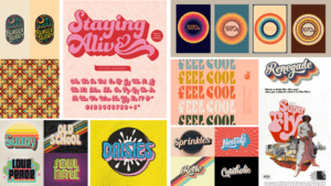
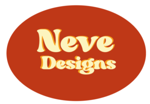
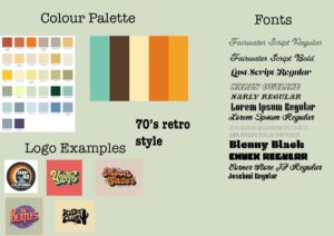
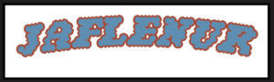
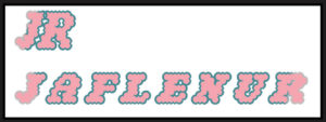
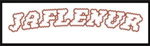
Onto my third design, I used the font ‘Narly’ in outline, and this time, I typed out my first name as I felt it would look much more nicer in this font. I really liked this design as I felt it expressed the retro style very effectively and was also simple in the same time. I had also tried it out using my initials as well and made two different versions using different colours from the colour palette.

second versions of the third design

I had also edited these designs and filled them in using the bucket tool on photoshop to test out how the design would look like when coloured in and I was satisfied with the results. I had used a colour wheel to find complementary colours to the outline of the words to fill the letters in.


For my fourth design, I took a different approach and tried to type out the letter in a curved shape. For this, I firstly used the ‘pen tool’ to draw out the line and using the move tool, shaped my line and then used the ‘type on a path tool’ to type out my first name on it. I had used the font ‘Lust Script’ for this. I was quite impressed with the results as this was something new I had tried out and for a first try, I believe I had done a good job in doing so.

Fourth design

For my fifth and last design, I took a whole different turn by designing my brand in the Bengali language, as it is my second language, and is reflective of my cultural background and ethnicity. I was quite shocked to find an Adobe font for the Bengali letters, and immediately thought of making a design using the font. First, I had typed out my first name and then I used the same process I used in my fourth design to create the branding design. It is quite simple but I do like it as a first try in terms of designing logos.

Last design

Overall, this session was very enjoyable as I was able to learn about the different steps of designing logos for brands, as well as got to try out different apps in the Adobe softwares. Although I think most, if not none, of my designs don’t reflect the 70’s retro style, I think this was a good practice for me for future projects.

Link to the PDF file of all of the designs together:

LogoType Own Branding

Shades of green

My mood board started off with different shades of the colour green. It then developed into a darker emerald/forest green, and then I incorporated leaves into the board along with the colour gold. The final colour theme I went for was emerald green and gold. I wanted the background to be green so I added a leaf texture effect on one side and a solid green on the other. And then I added a geometric gold and green pattern one on the bottom. I then went onto the text. I chose a serif font for my first name as I wanted my name to have a professional look, but I did the ‘graphic designer’ text in a sans serif font because I wanted that to stand out a little bit more to show what I do. I finally did my surname underneath and kept the spacing in-between both “A’s” in my first name to make it all equal. The leaf pattern was a good choice for me because when I think of green the first thing I think of is trees and leaves, so I feel it fit well in this context. One thing I would do to improve is make the text of my full name a little bigger or maybe spaced out a little more.


I also went on to creating a smaller logo design shown below. I wanted this logo to read my name but also represent my initials ‘ZH”, the square has my initials in it in a darker shade of green than the outside square and also added more squares to give it a geometric/ symmetrical effect which went well with the letters.