Category: Logo trends

Logo trends

Multiple shades of green

For Sophia’s logo trends project I was instantly drawn to the ‘Multiple shades of green’ theme. I chose this theme as it best resembles me as a person, being quite reserved, relaxed and very chilled. I wanted to show a sense of purity/naturalness in my logo and going off of the images that I had collated for my mood board it felt right to choose nature. I felt that choosing a more natural themed logo would be fitting as it fits with the green scheme and there is also a surge of a more ‘green’ approach to the way we live as people. It started off with a simple idea, by using photoshop tools I was able to duplicate a pattern of leaves which parts of it were then blurred. I then added a font that I found on DaFont, which I used my initials and name in design.


Green, nature inspired

Green, Nature inspired logo

The theme that I chose for this project was “green” because I liked the simplicity of it and the freedom to take it any direction.
I started off grabbing pictures from online of anything green and just throwing them together to see common themes amongst the colour, obviously nature and leaves cropped up quite often so i decided to use that.


I then created a second mood board of nature inspired logos or logos to do with nature to see common themes used or styles chosen for these logos. It was from these logos that i decided on the style of font that I’d like to use, because i saw it was quite a similar font used between all of the logos i’d picked out, so i decided to go with a bold blocky font.


I then started on ideas for the logo and settled on the use of a leaf in the design, once i’d created the leaf i decided i wanted it to sort of grow out of the R to tie into the theme of nature, i moved the leaf across created some cutouts on the R to make it seem the leaf was coming out of the R and then pushed the Z and R together to have the leaf sprawling over the Z aswell. my final decision was to change the R colour to green to tie back into the original theme of the logo.

Fox Design

When beginning this project I had some difficulty curating ideas for my logo. I had tried various methods to gain some inspiration such as creating mood boards, quick sketches and filtering through others’ logo ideas on Behance.

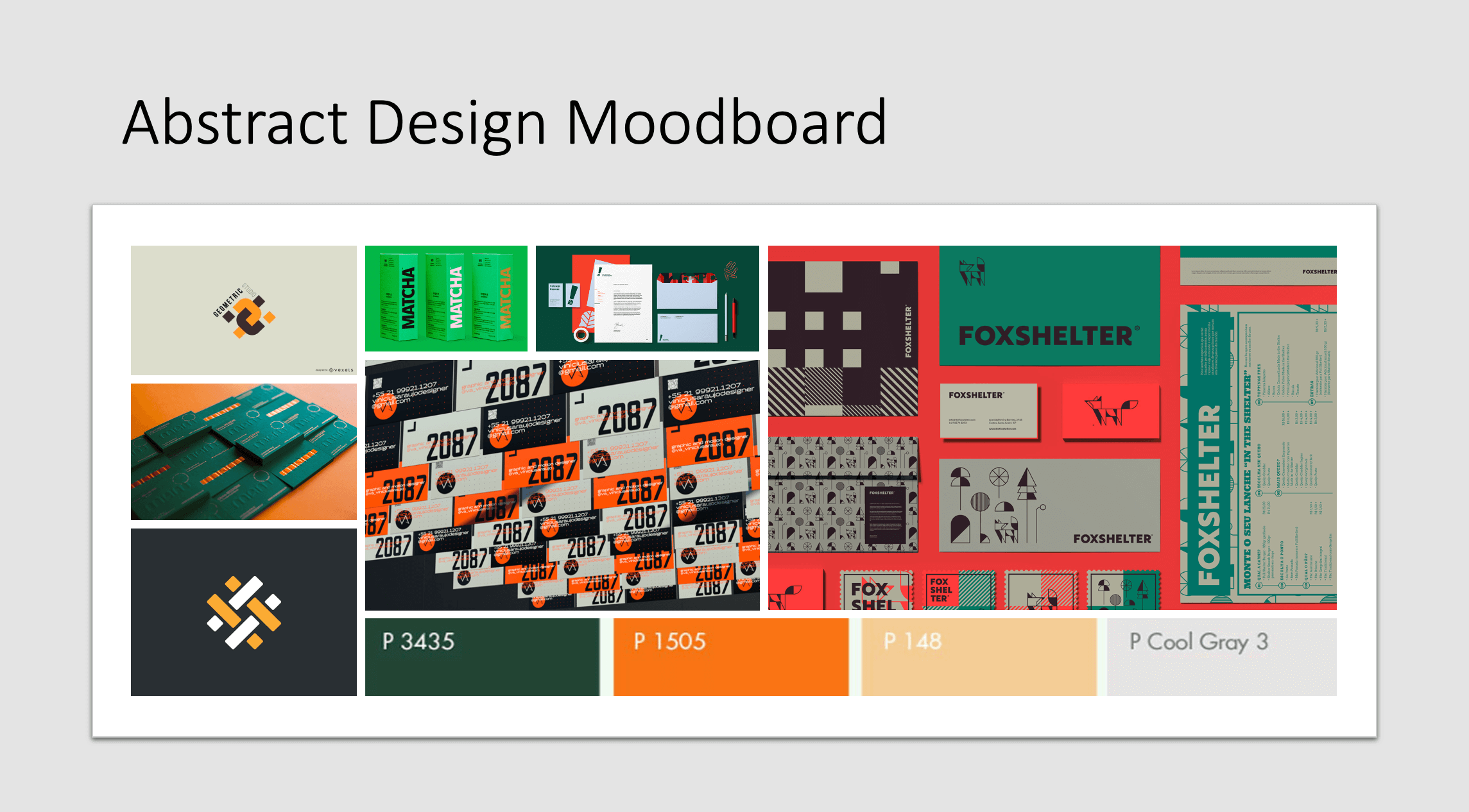
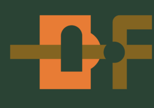
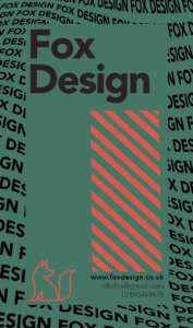
After this research, I decided on a colour theme and what aesthetic it would fit into. the choice I made was an abstract mix of deep forest green and a high contrast orange. In the first few hours, I could only muster up one idea for a logo design. the idea was that the letter F from my initials starts before the letter D and crosses through the middle of it. It took me quite some time to create as I was a little rusty in using adobe Indesign as it had been a while since I hadn’t done any projects like this. In the process of making this first draft of my logo, I realised how much of a challenge it was to mix my colour theme into my design. I considered changing my colour theme but I saw some great examples of the use of my colours and was determined to get a product using these colours. (see the use of colour in mood board)

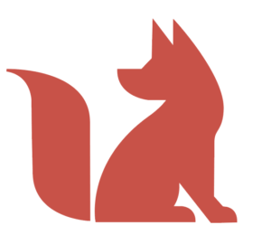
so I know now that the colour theme is not going to be my problem, now I can focus on what I can do to fix my design. After experimenting with the pen tool and getting myself familiar with Indesign again I decided I would attempt to draw a fox to use as part of my branding. And on my first attempt, it came out perfectly and exactly how I wanted it to be.

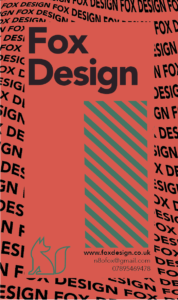
After I had my fox it was very straightforward from there. I started experimenting with how my name looks and how I can make the fox look back over behind him at my name. I even decided to add in some defining features that would make my brand recognisable if it was commonly seen on high streets etc…

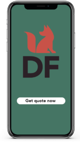
After I was happy with how my logo would look I decided to implement it onto some business card designs and an app interface to get a feel for how my logo would represent itself to the user.

I even asked some fellow students what their thoughts were on the design. from their feedback, I tweaked sizes of fonts to better match the premium feel of my brand.

Nasrin designer

My logo is based of the 90’s style clothing. My mood board shows the 90’s popular clothing, the colour schemes and fonts for most logos/brands, and some famous branding. I chose to create my logo as being bright and vibrant just like most posters,logos and or brands in the 90’s. I named it The 90’s style in the beginning then changed it to Nasrin designer. The font chosen is based of the fonts used mostly in the 90’s and the name in caps makes it stand out way more. I chose similar colours to what I have gathered in my mood board too.


OK Design Logo

70s furniture inspo

Attached is some research that I compiled into moodboards before starting my logo design task. I wanted to draw inspiration from the 70s aesthetic of smooth curves and very colourful palettes. The warm tones of orange and yellow are prevalent, and typography was also very colourful, with accents of blues being popular too.

I started by sketching out some motifs and patterns that could aid my design process: IMG_0060.HEIC  IMG_0061.HEIC
In these sketches, the model of a “K” became the focal point and I developed it into a vector on Illustrator, which was then matched with an “O” I drew. The counter of the “O” was comprised of the flower motif I drew as a response to the research and my own personal knowledge of the decade. 70s retro logo

I laid out the business card in a few configurations to see how text-heavy I wanted it to be. The final design contained my name, my email, and my logo design. The design behind it was a simple wavy design in 3 different colours to match the colour story from my inspiration.

Gemini Designs

For this project, we were asked to brand ourselves. I had chosen 70s retro style as my theme for my brand and I started by creating a moodboard of images from this theme that inspired me. I decided to name my brand after my own horoscope, which is gemini and this led to me find images of horoscopes designed in the 70s art style as well as horoscope designs from the 70s. I was especially inspired by the circular logos and the horoscopes in the circular drawings.

My first version was inspired by the abstract images from the moodboard and I made an oval shape with two alternating colors with my logo in the middle. However, as much as I liked the shape and text of the logo, I did not like the colors as I felt they did not fit the theme even though they were from the moodboard so I went back to look for more 70s color schemes and decided that brighter colors would fit my logo better.

I changed the colors to blue and pink in the logo shape instead of the muted tan colors and this both looked better and fit the theme better. This was successful because the the logo was more vibrant and stood out more.

i also made another version of my logo but in a circle shape however, I felt this was not funky enough for the 70s retro theme.

For the text, I used Marker Felt as my font as it fit the theme. I added multiple outlines to my text as it was common in 70s text. For this,  I used the same colors from the logo shape.

My 90s Logo

I was inspired by the 90s graphic designs that was full of abstract graphic elements and patterns influenced by fashion and the colorful 80s. It is appealling to me with its combination of colour palette and geometric shapes. Therefore, I create a mood board that shown above, in which I want my logo to have an energetic and colourful effects and adapt them in my final logo design.

  • Vibrant colors with bright yellow, pink, cerulean blue, etc, as to achieve a bold and eye-catching effect
  • Abstract shapes with bold, abstract, geometric shapes
  • Making the logo three dimension by dropping shadow behind.

Besides with the 90s style inspirations, I also tested out different combinations to my logo of my initials ‘KT’, and I finally choose the one which is more geometrical and recognizable.