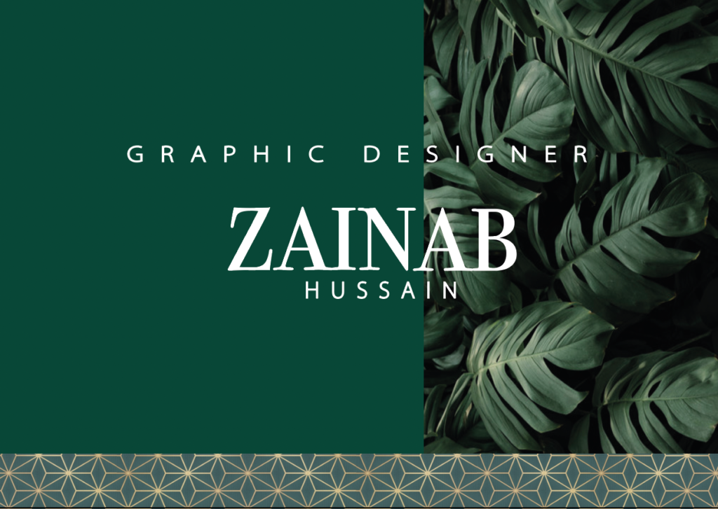
My mood board started off with different shades of the colour green. It then developed into a darker emerald/forest green, and then I incorporated leaves into the board along with the colour gold. The final colour theme I went for was emerald green and gold. I wanted the background to be green so I added a leaf texture effect on one side and a solid green on the other. And then I added a geometric gold and green pattern one on the bottom. I then went onto the text. I chose a serif font for my first name as I wanted my name to have a professional look, but I did the ‘graphic designer’ text in a sans serif font because I wanted that to stand out a little bit more to show what I do. I finally did my surname underneath and kept the spacing in-between both “A’s” in my first name to make it all equal. The leaf pattern was a good choice for me because when I think of green the first thing I think of is trees and leaves, so I feel it fit well in this context. One thing I would do to improve is make the text of my full name a little bigger or maybe spaced out a little more.

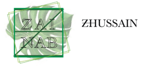
I also went on to creating a smaller logo design shown below. I wanted this logo to read my name but also represent my initials ‘ZH”, the square has my initials in it in a darker shade of green than the outside square and also added more squares to give it a geometric/ symmetrical effect which went well with the letters.