The client for this project is Willemijn Doedens, a PhD student in the School of Psychology and Clinical Language Sciences at the University of Reading. With a background in speech and language therapy, the client’s PhD research focuses on aphasia. Aphasia is a language and speech impairment occurring as a result of brain damage. Her research conclusions explore how real-world communications can be defined, how they can be clinically tested and the findings of her research experiments.
Restated Brief
The client requested two infographics to summarise the conclusions she has drawn from her research project. The main infographic would be included within the research thesis, acting as a visual break from the written content. The second infographic would be used on social media to summarise the full infographic and promote the publication of her research paper. The crucial aim of the project was to make the infographics “aphasia-friendly”, so the client could share the research results with the participants of her experiments, who have aphasia. Although the main infographic was due to be submitted as a physical copy, COVID-19 meant that the client’s final thesis submission was digital. As a result, both deliverables for this project became digital files, with the view to being included within a printed thesis at a further date.
Design Process
Research
At the core of this project was gaining an understanding of how to design for those with aphasia. With little knowledge of aphasia, myself, collaborating with the client to gain an insight into the subject area became a vital tool for my research. Alongside discussions with the client, turning to the Stroke UK website, I came across resources directed at designing for those with aphasia. From this research, I gained far more perspective on the direction I would need to take the designs to make the infographics “aphasia-friendly”. For example, those with aphasia understand documents best when each part of the text is supported by a diagram.
Although designing for those with aphasia was key to this project, it was important to assess all the different users of the infographics. Creating user personas, it became clear that the design was directed towards those with both scientific knowledge of aphasia and the general public. As a result, the written content for the infographic became key to creating a successful design.
One of the four user personas I created for this project
One of four user personas I created for this project
Content Transformation
Due to the scientific nature of this project, the client provided the copy to be used for the infographic. However, the copy was around 1500 words and needed to be reduced significantly whilst maintaining its academic integrity. Working in collaboration with the client, I worked to break down the content into digestible sentences. This was particularly challenging because in order to break down the content, I had to read it through many times and discuss it with the client to gain a basic understanding of it myself. Once I had gaining some basic understanding, I was able to work on reducing the content down into a more condensed format. However, as I had spent time discussing the content before condensing it, it was hard to gauge whether the content would make sense to someone who hadn’t read the original copy. Therefore, testing became vital at this stage of the process and I carried out many informal reviews of the content with family and friends. Through this testing, it became clear which parts of copy made sense and which didn’t. I also found it very beneficial to ask others to explain what they thought each part of the copy meant so I could compare their understanding to the original copy and see which parts were being misunderstood.
Illustrations
Alongside working on the written content, I worked on designing the illustrations to go with the copy. This was key to this project as much of the original copy could be translated into diagrams, saving many words and making the design far more aphasia-friendly. Working on the copy and illustrations simultaneously allowed me to adapt the content efficiently and reach a set of illustrations and copy which reflected the original 1500 words effectivity.
Illustration sketches alongside the corresponding copy for the infographicIllustration sketches alongside the corresponding copy for the infographic
The client expressed an interest in having the experiment setup translated into a diagram but had no other specific requirements for the illustrations or styling. As a result, I researched into different styles of illustrations used for scientific content and examined different approaches that could be taken. With the key focus of the infographic being to make it easily understandable for those with and without aphasia, I decide that the most appropriate style for the illustrations was flat 2D vectors. However, for the experiment setup I trialled and tested both a 2D and 3D setup which led to the 3D diagram being used for the final design. This was due to the 3D version being more easily understood as users could see that the middle bar was a barrier without the need for a label.
2D version of the experiment setup3D version of the experiment setup
Initial Layout Ideas
Having worked on the copy and illustrations to be included within the infographic, I worked to mockup three different layouts for the infographic. The client did suggest she wanted to avoid a design which looks like a scientific poster, so layout 3 was originally not the favourite. However once I had explained the benefits of layout 3 for those with aphasia, this was the design taken forward.
One of the hardest parts of the design process was creating illustrations for the experiment results. This was because the client didn’t want to use physical data on the infographic as it would be too complex for those with aphasia to understand. She did however really like the idea of using graphs to display the results. As a result, we had some long discussions about the use of graphs, as generally people assume graphs to accurately represent data. For this infographic though, these graphs would simply be a visual representation of a difference in results between the two groups of the experiment. Consequently, I provided the client with some different options for making the graphs as appropriate as possible and also an alternative Venn diagram. With these options the client did decide to use the bar and line graphs, in the knowledge that they are a visual representation not accurate bar graph. As a result, the graphs were changed and refined many times.
This was the final iteration for the Experiment A results as a bar graph (this was chosen for the final infographic)
This was the final iteration for the Experiment A results as a Venn diagram
Use of colour
The client expressed the importance of having a reasonably simple colour scheme for the design to meet the needs of those with aphasia and suggested a plain white background would be most appropriate. I explore a few varying colour schemes, before coming to a scheme which took inspiration from scientific poster whilst also providing enough variation to make it stand out. I also explored the use of colour to benefit those with aphasia, for example, repeating the set of three red icons throughout the infographic to reinforce the main three parts of real-world communication.
Two different colour schemes which were trialled for the infographic
Social Media Infographic
Having finished the infographic to be included within the thesis, I worked to design a summary version for use on social media. This was more challenging than I had anticipated, as I had to consider the context in which this social media version would be read. After making many edits to the copy for the summary, I arrived at a concise design which featured enough information to explain the research subject area to someone who would not have read the thesis itself.
This was the final outcome of the social media infographic
Final Deliverables
The final deliverables were produced as digital files, with the main infographic being placed into the client’s research thesis and the social media version ready to be published on twitter (once the thesis is published next year). Below are the final outcomes of the project.
Infographic to be included within the thesis (page 1)
Infographic to be included within the thesis (page 2)
Mock up of the social media summary infographic posted as a tweet
Reflection
When this project began, I felt quite daunted by the idea of working by myself having not completed one of these projects before. As a result, the working relationship I developed with the client, from the offset, was very important to me. From our first meeting, I felt very comfortable working with Willemijn on this project. As an academic herself, she recognised that my strength laid with the design of the infographic and avoided biasing my ideas with her own. At first this left me feeling very lost with endless ideas and options for the infographics, but by the end of the project I realised that as a result of her open views on the designing process, I felt far more confident in my own ability to design a successful outcome. Additionally, having to work through my ideas without the help of a team, I found that I became more confident in explaining my ideas to others and working through constructive feedback from both the client and my supervisor.
Having always struggled with time management, completing this real client project motivated me to stick to a schedule. Planning became vital for this project, particularly during the content transformation stage. I underestimated the amount of time that I would need to transform the content for the infographic. However, by working in collaboration with the client, I was able to transform the long content into a digestive amount of information which was appropriate for the general public and those with aphasia. Following this slight set back, I was a little rushed at the end of the project. But, thanks to the strong communication I developed with both the client and my supervisor, I was able to successfully finish the project on time.
Overall, I found this project extremely rewarding as it has given me more confidence in my ability to communicate with clients, execute my own ideas and work to a deadline. It was also lovely to know that my views on how the project went were replicated by my client, who provided me with some lovely feedback on submission of the final outcomes:
“You really understood the research from the start, and you were able to capture the key elements of the project right away. I thought the whole design process and collaboration with you went really well – above and beyond what I could have expected”
The Cowrie Scholarship Foundation was set up to allow economically disadvantaged black students to attend UK universities and with the foundation being very new our client needed a brand that looked youthful and energetic but professional and as a continuation from the branding project the website for the foundation needed to be upgraded to match the brand. The website needed to appeal to students and stakeholders alike therefore we needed to create a striking balance between the two to attract scholars and investors which is our client’s main goal.
Brief
The brief was to develop a website on an easily workable and adaptable platform. The client would be adding more universities and business they would need a website that they can easily add on to whilst still maintaining a good user experience. The secondary deliverable was to design social media posts for his Instagram and LinkedIn. The brief stated that the success of this project would be measured by the ease of use by the client to add on to and edit. This was essential to make sure there was consistency within the quality of the design and making a website that the client can use and work with without affecting the design quality. So far since the launch of the website the client has had no problems with adding unto and editing the website.
Communication
Throughout the design process, we had regular meetings with our client. This allowed us to keep our client up to date making progress by having weekly feedback session to creating a website the client was happy with. On the other hand, our contact with our supervisor was not as frequent as we would have wanted it to be although, in the sessions, we had our supervisor was happy with the progress we were making.
Schedule
The deadline for the website completion was met following the guide of the restated brief. During the second week, there were fears that the website would not be completed on time before the submission deadline due to complications of which programme we would be using to develop the website. During the real jobs meeting, we spoke to Geoff about the possible programmes we could use to develop the website and our choices were narrowed down to Squarespace and WordPress and we, therefore, needed to propose both options to our client. This process delayed the schedule by a week however once the client responded with Squarespace, we were then able to begin the design process and get back on track. After this, we had weekly feedback where we were able to progress weekly to provide the website that the client would be happy with which enabled us to hand over the website on the deadline.
Design process
The problem
5% of British students from black Caribbean families gained places in “high tariff” universities, compared with more than 10% of all students. While many issues are at play in why more Black British students do not enter university – the Cowrie Scholarship Foundation seeks to address one part of the jigsaw – the financial cost of university education.
Richard set up the Cowrie Foundation because of the murder of George Floyd in May 2020. Richard was inspired to create this foundation after being influenced to create change following the death of George Floyd. Cowrie is a very fresh organisation therefore there is an opportunity to bring something exciting and distinguishable as a brand. Cowrie Scholarship Foundation was set up to allow economically disadvantaged black students to get a university education at a Russell Group university.
The users
We identified three user groups: The student, the parent, and the shareholder. Each user group would have specific goals within the website. The student’s main aim is to apply to the scholarship through the website. The website needed to make this process as easy to understand as possible as one of the client’s aims is to get scholars into the scholarship. Secondly, the parent main aim is to provide opportunities for their children therefore the parent would be looking to the foundation values but also on past scholars to see if the foundation would be the right fit for their child. Lastly, the shareholder’s main purpose on the website would be to donate to the foundation however the process before that would be important. The shareholders would need to understand what the foundation is and how their money could help change lives.
Fig1 The site map showing how the target audience would navigate throughout the website.
Fig 2 Initial sketches for the website testing user experience and format.
Developing the website based on the specific needs of the user was important and the layout for each specific sector was the most important. The hardest part was making the website more concise with a lot of relative information it would be easier to have multiple pages however, this makes the website look unappealing therefore we decided having drop-down menus would make the website look less cramped together and more spacious. We decided on having a scholarship programme, about us, contact us and news.
Lo-fi wireframes
Fig 3 usability testing and the resultsFig 3 usability testing and the results
Now that we had a plan with the initial sketches, we decided to create lo-fi wireframes via XD to test the user experience of our proposed design layout. Following the user testing we able to identify what needs improvement and what was good to create a workable website that the users can use easily. With this information, we decided to start designing the high-fidelity website on Squarespace. The process of testing the prototype was a little bit tedious because we struggled to find a user that was similar to the target audience, but we eventually found someone.
The brand
During the branding project, we produced new logos for the client however the client decided to keep their current logos that we had to use.
The typeface that the client wanted us to use was Arial for the website. We selected a few weigh and size variants to differentiate headings, body and captions. Arial is a very legible sans-serif typeface and allows the users to easily gain and digest the information provided by the website.
The client requested us to make heavy use of the black and yellow colour scheme used for the initial website. After we utilised some of our colour schemes to help differentiate web-page’ sections or to help the overall design being more engaging. As previously mentioned black and yellow were the defining colour of the branding. Other colours such “Blue Magenta” or “Harvest Gold” were used respectively for clickable links or illustrations and elements throughout the website. Squarespace offers the possibility to choose a colour palette as one of its tools made of 5 colours and allowed us to create different colour themes to chose depending on what page or section we were working on.
The process of image selection started with us using license-free pictures mainly depicting black students revising, working or at university. All the images were then shown to the client for feedback and approval. This happened a few times as the images had to be appropriate for the website, not too corporate but the pictures also had to be relevant in the context of education, achieving and hardworking which are some of the core values of the foundation. The illustrations present on the website are the tiles and one illustration designed from the previous version of the website we developed for TY3BP that the client liked and wanted us to keep it. The tiles were made on Illustrator and they are part of a larger group of traditional Ghanian symbols called Adinkra symbols that represent concepts and aphorisms. The tiles are used to divide the first elements of each page from the rest of the content underneath.
Final design
The design of the final website was clear and accessible for the client and the user. The overall design was successful as the client was happy with it. We had an initial plan an idea that we felt could have enhanced the outcome however we were limited by the software and our ability to recreate the XD prototype. The design decisions were moderately made by us however the client had the final say in the majority of the final design decisions. This led to elements of the website that we did not particular felt met the quality that we felt was needed however we found ourselves having to put the client’s needs first which we felt we could have been more critical and outspoken for our own design decisions however, overall, we were mostly happy with the outcome.
Feedback
The feedback we received was mostly positive with the client writing; “It has been a pleasure to work with you both. The level of work, attention to detail and willingness to incorporate requested changes was greatly appreciated.” We have not yet received official feedback from our supervisor yet although from the last feedback session she advised us to take more control of the project as the designers which I believe we did towards the final week of the project.
Conclusion
The feedback shows that the website is effective and easy to use. This implies that we have been able to achieve the aims listed in our brief and seeing the website go live was a proud moment for both of us. We believe our client is happy with the outcome and we have seen that he has comfortably been able to make changes to the website which was his main aim for the brief. Overall creating the website has taught us important skills within UX design and development that we can both use in the future.
The website link: https://www.cowriescholarshipfoundation.org/
Every year, the art department hosts two art shows for finalist art students: the Winter Cabaret and the Summer Art Degree Show. Both shows always have a designated individual theme and branding. It is a moment for the students to showcase their work and make important connections. We will work together with a committee of art students to create a branding that clearly showcases what their year was about. At the time this report was submitted, the job was not yet completed, but in stages of near completion.
Brief/restated brief
This real job included two large projects: branding, a website, and social media assets for an event in December and branding, a website, social media assets, and a publication for the 2021 undergraduate art degree show. Initially, the job seemed to be smaller with a website that would be updated between the December event and the degree show and an overarching branding. However, after a meeting with the client and later with the art students, this job included two separate events. Our job was to work closely with the art students to produce visual identities that they were happy with and believe reflected the visions they had. The Art Degree Show committee had an estimated budget, dependent on grants and fundraising (generated from the December event for the degree show), which aimed to cover the cost of all deliverables:
To create two sets of branding. One that represents a chosen theme by art students for their annual December event, and one that successfully encapsulates the fine art’s graduating class of 2020/2021.
To design and create a website to showcase students’ work and the live stream for the December event, as well as create a separate website showcasing finalists’ work and their live stream for the degree show. These websites needed to successfully use the branding in the point above.
To create social media templates that will promote the events by showcasing students’ work and communicating important information, such as the link, date and time. This includes Instagram posts, icons, and live stream backgrounds.
To design and create a catalogue of student work for the degree show. As with the website, this also needed to successfully implement the branding. Despite the coronavirus, the intention was to print the catalogue, however, it also needs to be suitable as a PDF.
COVID–19
While this job already started during the pandemic, COVID-19 still posed several challenges. Our usual approaches to working with clients and in a group had to change. Instead of meeting face-to-face every week with the client and art students to go over work and discuss ideas, we held these meetings in Teams. Although this meant that we still had consistent meetings, our feedback was still compromised. It was more difficult to get responses from people behind screens than it would have been in an in-person setting. However, we worked through this, by following up with the students in a more informal setting when more feedback was needed.
Further, the nature of the exhibitions changed. The winter cabaret and degree show moved from being in the art department to being fully online. Usually, these events would require physical invites, posters, business cards, and other promotional materials. This year, the deliverables were narrowed down to social media assets, websites, and other digital media. However, the major publication would still be printed, but this also had to be available in PDF format for people who could not physically be at the degree show. While this might sound like less work, there was more emphasis on the importance of the website, what it looked like, and what it was capable of.
Allocating roles
As a team of four students, we knew it would be beneficial to split up the roles based on our strengths and what we wanted to learn. Charlotte was the only one in our team who had experience with making websites, specifically using Elementor on WordPress. However, Liselot wanted to learn these skills. So, for the Winter Cabaret, the roles were allocated to be that everybody would work on creating branding, and then the website would be made by Liselot and Charlotte, while Hiba and Shanzeh worked on the social media assets. For the degree show, the roles changed a little. Branding was still shared (at the end only one person made edits to assure there would be no file mixups), social media was allocated to Hiba, the brainstorming and planning for the publication was a team effort, but making edits and designing each individual page was left to Shanzeh, and the website was mainly Liselot’s job. Charlotte helped both with designing individual pages for the publication and with designing the website. However, the team is planning to get back together again to input all the content for each individual artists’ website pages. This way Shanzeh and Hiba get to learn about website building as well and the work will be done quicker.
The design process
Although this job was a two-in-one job, the design process for both was similar. However, by having two projects following each other so closely in time, we could apply what we had learned quickly. Our first approach assumed we would not need as much time to work on the branding. The schedule we had created and the client had signed off on reflected this. In the end, our branding took more weeks than we had planned, leaving us to create an entire website in less than two weeks. Although the winter cabaret had more of a time crunch than the degree show, we knew to expect to spend more time on the branding. Hence, we planned an entire term solely for perfecting the branding and how this would translate to the publication.
For the website, we figured out that less time was needed than we initially expected. Even though we worked overtime to get the Winter Cabaret website finished, we knew not to worry as much about the degree show. The first time around, three of us also had not used WordPress before other than to post these reports, meaning much time was spent on learning as well. For the degree show’s website, these skills only needed refreshing.
Themes
The themes for the events were solely chosen by the art students to best represent their year and work. To make both the December event and the degree show connect, the names were decided at the same time: Connectivité for the December event and Pièce de Distance for the degree show. They related both to how everything was online and at a distance the past year. Since Pièce de Distance is a play on pièce de résistance, the art students stayed within French-sounding names. For the design, we first focused on Connectivité, which was a mix of digital and renaissance. For the degree show, we made it its own event by having a complete opposite visual theme that focused heavily on technology and darker colours, meaning there was a contrast despite the unity. How we came to these visual themes is discussed below.
Research
In order to fully understand the subject of Connectivite, we underwent some initial research into both the themes of connecting and the French Renaissance. This enabled a deeper understanding of each theme and some potential ways in which we could link these all together in a way that was fresh yet kept some of the historical Renaissance-style work which the clients wished to have. To keep our research organised and collated in one place, we created a shared Pinterest board that the art students could also add to, where we saved inspiration for several of our deliverables; the website, catalogue and the branding.
We applied this process to brainstorm ideas for the degree show. By which we researched the theme “Pièce de résistance” in terms of context and the ways we can modernise it. According to the Merriam–Webster dictionary, the phrase translates to “An outstanding item or event, the showpiece.”Which is an immediate reflection of what the degree show is about, presenting the students best work forward. Similar to the winter cabaret, this theme still had French connections but leaned more on the theme of distancing, which was fitting because of the current pandemic and social distancing rules. Shown below are our Pinterest pages we used to collaborate with the students to brainstorm our initial ideas, allowing the students to add their own photos in order to better understand their vision. We did this both for the winter and summer shows, focusing on each one individually. This meant that we could work efficiently and bounce ideas between the members in a way that was quick and easy to do.
Branding
The branding for the events was based on the collaborative Pinterest boards with the art students. This way we could suggest visual themes and they could build on them as well as the other way around. It was clear that at the beginning of the design process of both the events, that there were many ideas. While the overarching theme of Connectivité was being connected digitally and in person, it still could be visually represented in different ways. The same was for Pièce de Distance, which was more about the distance. The design process for both of the events was very similar. We had a close collaboration with the art students due to our weekly meetings. Because of this, we were able to show multiple different directions we could take, narrow it down, and keep editing and narrowing it down further every week, which is shown in Figures 1–4 (for the winter cabaret) and Figures 5–9 (for the degree show) . Since the branding for the Winter Cabaret went smoothly, we knew that sticking to the process would also make branding the degree show go smoothly. One lesson for us after both these events, however, is to make sure to not show designs you are unsure of yourself (whether that is the logistics or the actual design), or else the client might fall in love with it.
Winter cabaret (connectivite)
Figure 1: Initial ideas
Figure 2: Developed ideas
Figure 3: Branding options
Figure 4: Final branding
Figure 4: Final branding
Art Degree show (Piece de Distance)
Figure 5: Initial ideas
Figure 6: Developed ideas
Figure 7: Developed ideas 2
Figure 8: Developed ideas 3
Figure 9: Final designs
Figure 9: Final designs
Social media
Because of the pandemic, the art students and ourselves were forced to adapt and switch to online communication. This shift applied to the promotional material of the events, social media presence became crucial than ever, in this case, the artists wanted Instagram to be their main social media outlet. For the social media pages for both the events, we combined both the students work with our branding to create a sense of cohesion among all platforms. The layout and size of elements within the logo were tested with the mockups to ensure that they were legible at any size required. The purpose of the Instagram page is to create a complete individual identity for the events. The profile picture for the winter cabaret was straightforward, unlike the degree show by which we struggled to scale down the logo whilst maintaining legibility because of the angle of type and 3D output. We simplified the logo for the social media posts, by choosing the key sports that needed to stand out along with the appropriate background colour. For the winter cabaret, we designed a specific set of posts to lie a complete image when viewing the profile (shown in the image below), this made the show’s feed visually appealing, however, it was not functional. Taking that into consideration, for the degree show the designers and students had separate posts that can be shuffled and published anytime, hence the Instagram posts were designed to be more flexible; creating separate filler posts and backgrounds for the images which can be posted in random order, shown in Figures 10.
Figure 10: Art Degree show Instagram feed
Catalogue
Since the Winter Cabaret was promoted digitally, we only designed a catalogue for the art degree show. This was unfamiliar territory, which required extensive research and experimentation. Luckily, we had enough time to understand the standard catalogue format and the rules that needed to be implemented, whilst exploring graphic treatments (on text, images and stock). Within the initial stages of design, we started with a traditional grid and page layout that held the contents; images and text. Which was developed into different formats and layouts that were later refined and the final layout was chosen by the art students, shown in Figures 11–12. In the next stage, we applied our branding on both the text and images, to see which works the best. This experimentation continued with the cover design, which required several iterations as the first few designs were not cohesive with the inside pages, shown in Figures 13–21.
Process
Figure 11: Initial ideasFigure 12: Developed ideas
The overall feedback that we received was to simplify the imagery in order to focus on the students’ work and display the information clearly. It was challenging to find a balance between the students’ requests to focus solely on the images whilst also including the design elements of the branding. We eventually found a middle ground for stylising the title text while leaving the rest of the page clean and legible. Because of the simple design of the inside contents we created more visually engaging pages for the prelims. Using solid blocks of colour for the background and changing the alignment of text and shapes elevated the catalogue, overall creating a dynamic visual output.
The website was created using WordPress. In our team, only Charlotte had experience with this. We were very lucky because this meant that she already knew about Elementor and how to use the basics. Before going to WordPress, we designed the website in Illustrator so we knew what we were working towards. However, it would have been useful to have a better look at what was capable with Elementor before we did that. We convinced the art students about our ideas and had clear visions of what we wanted just to later figure out that we could not make it a reality. These ideas were not far-fetched, so it was quite a surprise when we couldn’t figure it out. For example, we wanted images to open in a light box with a caption and extra information. However, the plugins would not allow us to add the extra information, meaning we had to work around it and create separate pages for each artwork. It was extremely stressful to have to figure out alternative solutions when we only had two weeks to make the website, but we did it in the end.
Because of what happened with the Connectivité website, we knew to better prepare ourselves for the constraints we would have. Although the art students had some great visions with 3D websites and moving elements, we knew this would not be possible with our capabilities. Luckily, they ended up liking our proposed design as well. While the website’s general structure was not as dynamic as everybody (both us and the art students) would have loved, we made up for it by applying the branding as much as possible and making it look as much as the catalogue we had designed and they loved. Further, we also made a GIF for the logo to give the illusion of a 3D aspect. It was all about compromise. Unfortunately, at the time this report was written, the website was still being made, so there might be more obstacles that came our way.
Despite its challenges, this project was useful and eye-opening, as we were introduced to different media, particularly WordPress. It was also interesting to gain a true understanding of client budgeting, as many design choices depending on their funding, particularly print finishes. This emphasised the importance of a design that was realistic and achievable, with the resources available. This was also challenging because of the number of students involved, which naturally led to fresh ideas and feedback. This forced us to promote different ideas we favoured or compromise our designs to be more suitable to the range of students. By designing for two separate types of projects, the winter cabaret and the art degree show, this helped identify previous strengths and weaknesses in the project. This reduced any issues or mistakes in the winter cabaret to occur in the art degree show. By establishing a strong client relationship, ideas and feedback were shared more openly, leading to a more suitable and attractive project that the students favoured.
Charles Mozley was an English artist whose paintings, illustrations and lithography was influenced by the style of French post-impressionism. After his death in 1991, his children and researchers have been dedicated to continuing his legacy through the Charles Mozley trust.
Painting (left) and lithography (right) by Charles Mozley
Brief
The founders of the Charles Mozley Trust required a website. It was clear that the design of the website would have a significant influence on the design of the Trust’s branding identity, which is yet to be established. The website would be an online presentation that displays the work of Charles Mozley and further information about the artist. It will be targeted towards people with an interest in British art between 1945–1990, gallery owners and academics. After a complete understanding of the client’s expectations, an objective of creating an online presence for the artist and initiating an online identity for the trust was formed.
Research
I looked into the style and work of Charles Mozley, and the client provided some resources to initiate a deeper understanding of the artist and his work. As an artist that works with different mediums, I wanted to place an emphasis on showcasing work that ranges from paintings, lithography and illustrations.
As my target market was individuals with an interest in British art between 1945–1990, I took a look at the website of different artists that were popular during that time period, such as Paul Guston. I admired how Paul Guston’s website was visual, containing a video that displayed images of the artist’s work. Although not relevant to the Charles Mozley style or time period, I also looked at some artists that I believed had an interesting website design such as Damien Hirst. Looking at the website of other artist’s initiated different approaches I could take to display the work of Charles Mozley on his website.
Screenshots of Paul Guston’s websiteScreenshots of Damien Hirst website
Designing
Before starting the design process, I meet with the clients to discuss their expectations and the general layout of the website. This information was useful when it came to visualising the navigation and format of the website. Based on the points provided by the client and my own judgement, I created a sitemap to display the different web pages and the navigation through the website. After creating a sitemap, a couple of sketches of different website layouts were selected. The wireframes show the different design concepts I had envisioned for the web pages. The clients stated that they preferred wireframe 2 and the design of the website proceeded to the next stage, creating the prototype. Initially, due to covid, the transfer of files that contained content for the website was delayed. I took it upon myself to use images available online of the low fidelity prototype, using the design concept from wireframe 2. The low fidelity prototype was sent to the clients, which they provided feedback and further suggestions on. The feedback and suggestions provided were carried forward into the next iteration of the website prototype. The client eventually managed to transfer a file of contents for the website, which was used to create the next iteration of the website prototype. Although they were overall satisfied with the initial prototype, the clients provided feedback and suggestions to develop the website further. They suggested a new layout for the “Artwork” webpage, where the images of the pieces of art would be arranged in one grid, regardless of medium unlike the initial concept where the pieces were showcased depending on the medium used to create them. To work with the material provided by the client, I sometimes had to break away from initial designs for certain web pages. For example, the initial design of the exhibition page contained images of the exhibition with some information, however, as the material provided was mainly text, the layout of the webpage had to be adapted.
Sitemap of website with potential webpagesWireframe design concepts. Wireframe 1 on the left, wireframe 2 on the rightLow fidelity prototype
Issues
The lockdown as a response to the COVID 19 pandemic had a significant impact on the progression of this real job. This real job was assigned to me a couple of days before the second lockdown had been announced. During that time period, I was able to create the sitemap and wireframes. However, the lockdowns that occurred between October—April meant that the client could not provide a majority of the material needed for the website as they were stored in the Typography Department or The University of Reading Museum. The material needed for the website was transferred to me towards the end of March and I have since been able to make some progress on the design of the website.
Current website prototype iteration
Reflection
Working on this real job continues to be a pleasure. The despite current circumstances, the client’s involvement and suggestions have been useful in producing new concepts to experiment with, deepening my knowledge of web design.
It is unfortunate that the lockdowns as a result of COVID 19 have prohibited the progression of the website, impacting the initial deadline of the website. The change in lockdown restrictions and current access to a majority of the material needed for the website will hopefully result in a smoother advancement of the website at a quicker rate. Although I am graduating this year, the client and I will continue to work together to complete this real job. I am excited to witness the final outcome of the website and the design skills that have thrived as a result of this real job.
Our clients; Jack Gillespie and Ash Stedman, were beginning a new business venture of brewing their own range of craft beers in July, 2020. The proposed name of their company was ‘Dizzy Milk Brewery”, and the USP of this brand was to sell the beers via an online subscription and to deliver them straight to the home address of the buyer. The closure of pubs during the first UK lockdown and the confinement that people had to maintain within their homes sparked this idea and the proposition that the beers would be distributed by milk men and women in the same fashion as their milk deliveries. With the clients looking to brew a series of experimental and interesting beer flavours, a series of beer label designs were required which brought Jack and Ash to the Real Jobs scheme.
Brief
At the beginning of the project, our clients asked for a series of three can label concepts, a logo and digital mock-ups for tap room signage and marketing collateral. In the initial briefing meeting for the project, the clients presented to us their existing logo and can concepts, alongside beer brands which were similar to the kind of brand identity that they wanted Dizzy Milk to have. They expressed to us that they wanted a series of designs which has a vibrant colour palette, unique artwork or imagery and created a bold, unique and recognisable brand identity. The project was initially aimed to have a 2 week turn around, so a restated brief was quickly established and the research and design process commenced very swiftly after the initial briefing.
Dizzy Milk’s initial logo concepts
Key words provided by the clients that guided our creative journey.
Communication and project structure
As a design team of three, we maintained weekly contact via online messaging, as well as regular webcam meetings. We maintained contact with our clients via email as well as Zoom meetings to present design iterations and receive feedback. While this communication remained strong and frequent during the first few months, the progress of the project became hindered due to our client’s external commitments. This, alongside evolving design suggestions lengthened the turnaround time for this project.
Understanding the audience
In order to find out more about Dizzy Milk and its consumers, we researched the market for Craft breweries and Microbreweries. This also educated us enough that we felt comfortable in our first client meeting. Our research made us aware that microbreweries emphasise quality, flavour and brewing technique. The team discovered that craft beers for microbreweries tend to cost more than big-name beers, which helped us understand that users are looking for a unique product that is high-quality. We also researched about the subscriptions market because it increased our knowledge about how many users are involved, and what they think is important.
Our research on Microbreweries (https://trello.com/c/gTcEdkqx/7-research-market)
To find out about a potential audience for Dizzy Milk, we created and distributed a survey. This was used as a tool to answer questions about who our users are, what they like to see in a product, and what issues they may encounter. We crafted a range of questions, specific to visual design, that would help us find vital information. The team created multiple choice questions and also devised a scale to give users the freedom to describe their experiences. It was vital that we left room for users to respond in their own way. The UX design of this survey was carefully thought out, as we didn’t want users to be confused by the layout, or unable to read questions. The survey was beneficial because it helped us identify pain points or specific problems that users are experiencing. We identified that users did not like dull colours as they are less interesting than bright colours. The survey results also told us that the users favoured more expressive and illustrative styles of artwork, which then guided our creative direction.
A few examples of surveys completed by potential users of Dizzy Milk.Analysing the results from our survey.
The team created 3 personas that represent various user types that might be consumers of Dizzy Milk. It was important to identify factors such as their interest in craft beer, their income, and their interent usage because it helped us discover what content people care about. When creating these personas, the team ensured not to stereotype the typical users of craft beer that we found through our research, as Dizzy Milk wanted to cater for all demographics – it is a product for everyone.
Establishing our user personas
Once we had clarity about the nature and extent of our content, and the fundamental goals of our users, we refined our design proposal to a more detailed level. We configured set deliverables, and analysed how they would meet our user needs. We also wrote down the inspiration for each deliverable, which was based upon information given to use by the clients, and also due to results of the survey.
An analysis of our proposed deliverables
After confirming the deliverables with the client, the team started designing. We created a mind map full of visual ideas that was devised of preferences from our survey results, and that would be suitable for the brief. The user testing told us that users preferred an illustrative style of design, therefore we use fineliner to create hand-drawn ideas for a logo. Another result from the survey was that the can design needs to reflect the ingredients, so we experimented by sketching different fruits. By creating a document of ideas, this helped us visually understand our users by seeing things they like.
Visual mindmap of ideas to aid our designing for the logo
Soon after proposing the deliverables, the clients sent us a document that expressed designs that they liked and disliked. This was useful because we could now group together their design preferences with the potential users we researched. It explained some of the designs the clients liked, which guided us in the right creative direction in developing Dizzy Milk’s visual identify. They did not like designs from Brewdog and Wild Beer because they didn’t scream “EXCITING”From this document provided by the clients, we took away that the clients were in search of designs that ‘SHOW DIVERSITY IN TERMS OF CREATIVE EXECUTION, WHILST SHOWING A STRONG BRAND IDENTITY AS A COLLECTION”. This was something which we took on board, right from the off on this project.
Beer can designs liked by the clients
Deya can designs/ logo liked by the clients.Basqueland can designs/ logo liked by the clients.
Beer can designs disliked by the clients
Brewdog can designs/ logo disliked by the clients.Wildbeer can designs/ logo disliked by the clients.
Finding a creative direction
We commenced the ideation process by creating individual mood boards and initial sketches of the illustration style and logo ideas which we could explore, informed by our clients needs and research into users and the craft beer industry. These mood boards were key in establishing a visual design route for the designs of Dizzy Milk’s can and logo designs. These mood boards and initial sketched were presented to the clients and from a varied selection of moodboards presented to the clients, the clients were happy to explore 3 different styles, as follows:
Spiral
Expressive/artistic
Utopian/Futuristic
The moodboards/ concepts chosen by the client that we would develop further.
Each of the three moodboards had its own distinct style and take on visualising and representing Dizzy Milk. The Spiral concept moodboards, had quite a colourful, physcaedlic like approach, compared to the expressive/artistic moodboard, which was the opposite of this. On the other hand, a utopian/futuristic moodboard was also explored too, with influence from brands such as Beavertown adding to this and how cartoon-like illustrations could be used on Dizzy Milk’s cans.
However, at this initial stage of the project, it became apparent, that our clients weren’t keen on using imagery of cows, dizziness or milk in the branding of the logo, as showcased by our series of logo moodboards presented to the clients alongside the different themes. The reasoning behind this, was due to the potential connotations that the product actually contained milk, or promoted alcohol intoxication through the theme of dizziness.
Initial logo designs based upon the keyword “Dizzy” and “Milk”.
“It is awesome to start to see the dizzy milk brand come to life” – Jack Gilesipie (Client)
Developing the logo and can designs
Using the mood boards and feedback, we were then able to start creating digital design variations for the logo and can designs, shown below. Anya experimented with free-form/ hand-drawn typography which intertwined with fantasy imagery, in an attempt to create a unique and recognisable visual style, alongside vibrant colours, as had been requested by the clients. Issy used her line drawing/ expressive visual style to create a detailed and original design. Harvin developed his utopian theme further by incorporating different animals that the clients expressed they liked, such as an octopus, as a suggestion was made that we could include animal imagery in the design.
Logo development with a strong emphasis on typography.Can designs in an expressive/ illustrative style.Can designs in a futuristic style.Can designs in a spiral style.
Alongside the can designs, we also created another set of logo iterations which steered away from cow, milk or dizziness imagery, as the clients did not want the logo to display any connotations to these words. The team experimented by creating logos that involved eyes, spilled beer, reflections and space. We also created logos in a variety of styles and weights, as at this point the clients had given us full creative freedom. Some of the logos also looked at incorporating a mascot into the Dizzy Milk logo such as the use of both the octopus and a narwhal, with the clients suggesting that the spiral-like features of these characters can hint subtly towards the theme of dizziness. We soon met with the clients to show them the beer can and logo designs. For the logo, they expressed that although they liked the illustrative and ‘hand-made’ style, they said they wanted a more substantial logo. As the logo needed to stand out against the artwork and be differentiated, we dismissed the expressive visual style and continued to develop ideas such as the eye design and the space theme. The clients also expressed that they wanted more of a focus on typography, so they are able to apply the name ‘Dizzy Milk’ to many products in the future so it appears typographically strong on all elements and ultimately, stands up against its competitors on the shop shelf.
First logo iterations by Anya.First logo iterations by Issy.
“Thanks for getting back to us, and to echo Ash’s feedback we are blown away with the progress here and feel like we are on the cusp of breaking through with the next round of amends” – Jack Gillespie, client
When presenting these three can styles to the clients, they expressed that the two concepts which they thought best represented the vision for Dizzy Milk were the utopian/futuristic theme, as well as the expressive, line-work style. They therefore asked that these two styles could be developed further in order to choose their favourite in the next meeting. For the illustrative style, the feedback we received was to make it more unique and not into a pattern because the illustration looked too repetitive and uninteresting. To overcome this, we re-drew some aspects of the design. To give an example, the can design for ‘El Secret’ only had a few faces repeating themselves, so we ensured that all the faces in the design were unique. Not only did this improve the uniqueness of the can, but it also makes users feel they are receiving a product of high quality. For the utopian/futuristic style, the team began to incorporate other animals into the designs, such as an octopus and dragonfly’s alongside the use of the sloth. Inclusion of several characters throughout this set of designs, was influenced from the clients feedback into how the introduction of more designed animals, could help to tell a story across the designs of the cans. Harvin’s rustic illustrative style helped to set an earthy tone for the can designs; making users feel that the beer is home-made and carefully configured. After receiving feedback from the clients that helped us know how to develop the two concepts, in addition to the logo designs, our roles within this project shifted at this stage. Issy and Harvin continued to develop can artwork, further progressing each of the two concepts taken forward by the clients, whilst Anya focused on refining the logo, working hard to create a memorable identity for Dizzy Milk.
First iteration of illustrative can designs.First iteration of futuristic can designs.
Due to the visually exciting and bold artwork used in Issy and Harvin’s can designs, the clients retracted their previous suggestions and expressed that a more simple logo would work best for Dizzy Milk, so as not to distract from or clash with the artwork. Anya therefore created a series of logos which featured more simple typography and visual elements, such as solid circular or rectangular borders. These can be seen from below, where both the logo designs and can designs went through another round of iteration, with the clients wanting to see one final extra round of iteration for each concept of beer can design, before informing us of which concept was to be taken forward. Issy’s artistic concepts, began to introduce photography which was integrated in and around the different illustrations for the cans, providing a successful balance in terms of the cans overall design. Harvins utopian concepts focused on adding small design elements to the cans such as the ‘El Secret’ beer flavour that used a textured background to represent an undercover like design theme, whilst these designs also looked at introducing playful design styles especially to the information on the back of the can.
First iteration of illustrative can designs.Second iteration of can designs in a futuristic style.Logo development with a stronger focus on typography.
“We are finding it near impossible to choose between the two to take one forward for the next stage” – Ash Steadman, client.
Dizzy Milk logo chosen by the clients.
After a lengthy delay, due to the clients taking their time on choosing a concept to progress and go forward with, a decision was finally reached on which concept to take forward. Our clients expressed that they were really impressed with all of the new iterations of can and logo designs, however they chose Issy’s line-work based cans to move forward in the project, as they mentioned that Harvin’s designs were quite similar to an existing brewery; Beavertown. With both designs perfectly viable for craft beers, the clients saw Issy’s designs having the advantage of standing out, in an already crowded craft beer market. From a selection of further refined logo concepts, they also chose one particular favourite to be used in the final set of can designs, shown below, due to its prominence and how it stood out.
Iteration of cans with photography incorporated.
“We really appreciate all of the amazing work that has gone into this round of revisions. Both iterations are great and worthy of being a beer brand’s design. We have loved watching this and all three of your styles evolve throughout the process.” – Jack Gillespie, client.
Exploring printing finishes
The clients had been interested in exploring and researching different types of print finishes which could also be explored such as the use of holographic printing. The clients emailed and informed us that they had been in contact with a company of their possibility of a holographic printing finish following Ash’s discussion with several printers. They expressed how they wanted to showcase the original dizzy milk logo having a holographic printing effect added to it.
The clients highlighted that considering print finishes would be great in terms of further expressing the creative possibilities with the can designs. We learned about the two methods at which a holographic effect could be applied. The first of which, is where the whole label is applied with a holographic finish (Basqueland), whilst the other (Otherhalf) showcases where the holographic effect could be applied in specific areas like a spot UV, in combination with a matte effect. The Basqueland beer label showcases how on a metallic surface, a holographic effect works particularly well, as seen from the image attached below.From this, the clients were interested to see what the possibilities of a finish such as this would be and were keen to know what the departments print studio would think of a finish such as this. The team organised a meeting following this with Geoff, to talk through the possibilities about a finish such as this. Following on from this, Geoff was able to provide us with the details about a company known as the labelmakers, who I would call to find out more details about the process about holographic printing. As the team continued in our creative journey, the idea of producing a holographic finish was no longer our focus, and instead the team focused on developing the can designs and logo. Although it was interesting for us to research and consider this print finish, we will ultimately leave it to the clients and supply them with the finalised files for them to then develop.
A holographic print finish explored by the clients.
Design refinements
With a series of can designs and a logo selected by the clients, we were then able to start making final refinements. Alterations needed to be made regarding the colour set of the cans, as our clients requested for us to explore some more coloured backgrounds of the artwork. We also needed to explore the placement of the logo and beer names, as well as the arrangement of the information for the backs of the cans.
Experimenting with different layouts for the back of the can.
We explored the possibility of including a white panel across the top of the cans, allowing for the logo to be placed alongside the artwork without clashing with it, which was the case in our designs which had the logo placed directly against the artwork. Other ideas explored included continuing the linework of the illustrations into the white panel, as well as only featuring the logo and beer name on the back of the can, allowing for the unique illustration style to carry the main brand identity of Dizzy Milk. When presenting these ideas to the clients, they expressed that the white banner including illustration linework was their desired concept. They also stated that they would prefer for the beer name to be on the back of the can to avoid obstructing the artwork, which they saw as the main selling point for the beer designs. The use of the banner, which the clients preferred worked well for the beer name to be placed on the back of the can, with the title sitting comfortably within the banner on the back facing side.
Beer can designs with name of flavour and logo on front of can .Beer can designs with logo and flavour on back.Beer can designs with white/ black bands to display the logo.
Our last round of refinements therefore included positioning the beer name, beer descriptions and ingredients comfortably on the back section of the label, printing the labels off to adjust the type-size used for the written content on the back of the cans to ensure suitable legibility, as well as cleaning up and finalising the artwork and setting the black parts of the label design to over-print, to ensure our files were as press-ready as possible and ready for delivery to our clients.
The final beer labels
Following a thorough process of exploring several possibilities of layout for the design concepts, our finalised labels for four of Dizzy Milk’s craft beers, can be seen from below, that were exported once all final tweaks and adjustments had been made in the aforementioned section.
Beer can designs featuring white band with continued illustration, approved by the clients as the final design.
An honest reflection
When reflecting upon the job as a whole, working on a project such as this was a fun and intriguing experience throughout and as a team, none of us had experienced a job quite like this before. In reflection of the job however, it would have been nice to have seen the full realisation of the job, seeing the labels we had designed go to print and be wrapped around a can of Dizzy Milk. Whilst we did supply our clients with these designs which they could take forward, it was a shame in reflection, that we could not quite take the labels to the next stage, where they are printed and could have a range of different finishes applied to them.
Whilst the project started extremely quickly with the initial quick turnaround for the job, several delays throughout the project seemed to curtail the progression of the job, with delays on the clients side.
Issy
“As this was my first Real Job, I was excited to get started in designing for real clients. By completing this job, I now have more confidence when talking to clients, and feel comfortable and confident enough to ask lots of questions. I have really enjoyed creating beer can designs for Dizzy Milk, and hope that they are more than satisfied with our final outcome.”
Harvin
“Designing for the Dizzy Milk Brew Co. has taught me that the need to set strict deadlines in place is a must. It was frustrating that the project ultimately drifted when it started off so promisingly with a very quick turnaround.”
Anya
“This project has taught me the importance of sticking to the original design schedule of a project as much as possible. I have really enjoyed working on this brief, particularly the ideation stage where we were able to explore fun and exciting design concepts.”
James Mosely is an expert in the field of typography and the history of letterforms and printing types, he has lectured at the University of Reading since 1964 and teaches BA and MA students as well as being an advisor to PHD students. It is important to continue James Mosely’s legacy and present his ideas and knowledge to future students, even when he is no longer able to do this in person. By digitalising and professionally producing his lectures to be available online, not only can they be watched more than once, but they can also be viewed by anyone at any time, including future students.
Restated brief
The aim of this project was to produce a coherent set of 20 lectures, each around an hour long. These were to be created via PowerPoint but made slick and professional via smooth transitions, small animations, images, consistent design, branding and a voice-over by James himself.
The set deliverables for this project were:
20 video lectures
20 PowerPoint files
Branding slides
Trailer
To go with the main outputs of the project we agreed upon these components essential to the content of the project:
Type: the creator of the lectures is a type expert, the design needs to reflect this.
Look: these digital lessons will be used for BA and Ma students and need to look good with a professional feel that is also easy to learn from.
Tasteful animations: small, smooth transitions and movements that combine the slides together and reflect what Mosely is saying.
James’ PowerPoint slides already existed as they were the same ones he uses for his in-person lectures, so these did not need to be created from scratch. But rather made consistent and implement the agreed branding.
Research and ideation
There was several areas I researched for this project going into it:
Trailers
Title sequences/animations
Existing online lecture logos and branding
Existing opening slides for online lectures about typography
User personas
Conference branding
I was surprised to find many examples of existing online lectures about typography, however, the ones I found did not offer much inspiration as they were rather unsuccessful and not the style I had in mind. Nevertheless, it was great to look at them. I also looked for any branding for online lectures on typography and graphic communication, I came across logos but couldn’t find examples of slides that used consistent branding. Furthermore, I looked into conference branding as it retains similarities to the project. I analysed the composition, colours, and different type used in these logo devices to see if there was a common theme or any ideas I could take away to inspire my initial sketches. Although this was useful research, the findings were still different from the subject matter of the lectures and what I would later find out was the client’s personal preference.
Existing branding for online lectures about typographyExisting logo devices for online lectures
At the start of this project, one of the deliverables was to have a trailer advertising James Mosley’s series of lectures as well as an animation title sequence. To come up with ideas for this I looked at documentaries and mini-series on Netflix. Specifically, I looked at the title sequence of a series on design, this was great as it included animations that used type as well as shapes and colour that transitioned and morphed seamlessly. At the time we felt something like this could be implemented using material from the existing lectures, to give a flavour of what the series was about, however, this was never put into motion.
Title sequence stills from design documentary ‘Abstract’
Finally, I completed two user personas to show the kind of people that will be watching and using the final deliverables of the project. These included an undergraduate typography student and a masters typography student. It was important to think about the different audiences varying levels of knowledge on the subject. As a result, the content and layout of the lectures needed to be easy to understand and cater for everyone, a way of doing this was including definitions of words undergraduate students may not be familiar with.
User personas
Design development
At the design stage of this project I started by creating initial ideas for the branding on paper. I then looked at typefaces, a colour palette, and logo device. Initially, I worked with a muted palette of greens and cream alongside grey and experimented with different images and layouts for two types of slide, the top level branding and lecture name. Originally I struggled to come up with designs as I was not sure what direction to go in and had never designed branding for a PowerPoint before. However I feel these were a good start, with a few potential directions and a variety of ideas which included decorative borders, textures and images picked out from the existing slides, flourishes, and bold text. I worked with the supervisor to develop these to produce more polished visuals ready to show the client.
Showing the initial designs to the client was insightful as although the designs were not bad, it made the client realise what branding he wanted to go alongside his work and that he did in fact have a style in mind. James Mosley provided examples of images that represent his ‘house style’, these included a colour scheme of black, white and red, with the typefaces ‘Scotia’ and ‘Elephant’ and decorative elements. I got on board with these straight away and combined design elements I already had with his preferred typeface and colours.
Branding slides development
In the restated brief the typeface ‘Zenon’ was to be used for display type, however, after experimenting and discussing designs with the client we decided ‘Elephant’ worked better as it is a traditional English extra-bold serif style. In the original set of PowerPoint lectures, the typefaces ‘Calibri’ and ‘Georgia’ had been used for the main text, in a variety of sizes. However Georgia was implemented throughout in two sizes consistently, this was chosen over Calibri because it is a serif font, therefore corresponding with the display typeface better.
The lecture slides presented to me usually consisted of a picture and caption but each one varied. To find what presentation layouts would work best I took a sample of slides from the first lecture and laid them out in different ways with different compositions and animations. From there the client and supervisor presented feedback and we agreed on a set of compositions to be repeated throughout the presentations for consistency. To implement these, master slides and grids were created to make sure elements were in the same position throughout. This will also benefit anyone in the future who wants to make changes or produce more lectures.
At the start of this process, the idea was the lectures would be more like fluid videos than PowerPoints with complex animations and seamless transitions. However, the client preferred a more simplistic approach with the image and text static to allow for easier watching. This was easily implemented and made sense as the branding also had a traditional approach and if the lectures were to be given in real life they would be simple. We still kept some fading transitions at the start for the top-level branding as it gives a more professional feel and provides an introduction to the lectures.
Example of experimentation with one slideExample of master slides used in the PowerPoint files
Final stages
The final deliverables are as follows:
20 video lectures
20 PowerPoint files
Branding slides
20 Lecture thumbnails
The 20 lectures were uploaded to Microsoft Streams, 10 at the start of Autumn term and the other 10 at the start of the spring term, each lecture contains the relevant branding slides, including the top-level, name of the lecture and a further reading list. Although slightly later than originally planned, they were uploaded to give enough time for the students. The raw PowerPoint files, including older versions alongside the branding slides, are all available on the Typography department OneDrive. This means that they can be added to and developed by members of the department in the future. The master slides are helpful here to allow others to pick up the design. Lastly, each lecture has a thumbnail which is a picture taken from the corresponding lecture and cropped to 16:9.
Examples of final branding
Reflection
Overall this was a successful and insightful project that gave me the opportunity to produce a unique series of work. I had the chance to learn new skills, including how to work closely with a client that has experience within the design field and has a vision of what they want the final outcome to look like. The closing words from the supervisor of the project were “This has been a pretty epic project with all kinds of challenges that might seem unusual to you, but are in fact a part of life for most practising designers. You’re just getting to experience that early, and with some unique components.”
During this project, I was able to do my own experimentation but also circle back to ensure it wasn’t too off-brand for the client. It was also important to maintain the clarity of the lectures and the flow between slides, the same as if the lecture were to be given in person.
If I were to start this project again I would make an effort to have more of an in-depth conversation with the client at the start. Ideally, this would save time in working out a visual direction, as initially most of the communication was done through the supervisor, however, it was also useful for me to do my own research and ideation. It would also be beneficial to create a more bulletproof system to work through the lectures, receive feedback, make changes, track these changes, and tick things off. I used Trello to make lists of what needed to be done for each lecture, which I ticked off as the project went on to keep track of what needed to be done. However this was only introduced towards the end of the work, a tracking or list system from the start could have helped keep the process consistent, but it took a while to figure out the best way of working through the lectures while both the client and supervisor reviewed them.
I would also work to improve time management on this job. I found instead of working at a steady pace there would be periods of time where I was not working on the project, then I would rush to get lots done when the lectures needed to be made available for the students. It was also important to keep the files organised, well named, and up to date on the OneDrive, as myself, the client and the supervisor needed to access them, and they will be needed again in the future. Towards the end of the project, I feel I got on top of this and left them in a good place for them to be picked back up. Nevertheless, if I were to do the project again I would aim to keep on top of the file names more, earlier lectures ended up with many different versions, yet later ones only have a couple, largely due to the fact I was comfortable with the design and fewer changes needed to be made.
Alana House women’s centre, a charity in Reading that provides a safe space for women to express themselves and strive towards their goals, approached the Real Jobs scheme with a recipe book project based on their community café. With contributions from the women, staff and volunteers, it would collate recipes, poems, creative writing, artwork and photography. Robin Smith and Cristèle Sarić worked with the Alana team to produce the book in its entirety. Aimed to be a symbol of a community coming together in solidarity and support of these women in need, the original deadline was to publish the book on International Women’s Day to align with this goal.
Understanding the brief
Once we had met with the clients from Alana House, our understanding of the job and its importance became clearer. We were able to pinpoint the specifics of what the clients envisioned and ensured we were on the same page. As the book was aimed at a wide audience as it would serve as a fundraiser, it was important to the clients that the book be designed with universal intentions. It should look and feel homely, but not be assuming of prior cooking experience. Because they were wanting a small book, the idea of a ‘scrapbook’ style was the main idea. It worked well with the wide array of content to be included, as well as being something that those that contributed could be proud of and feel belongs to them.
At this stage, we had to be mindful of design inspiration given the clients did not have an established budget as of yet. Given this would be a fundraiser, and the nature of the client business, we felt it would be more appropriate to keep costs as low as possible to maximise the gain to the service.
Initial research
User personas
To inform our decision making, we created user personas to help identify user needs and their goals. This was information because of the aforementioned universality, and thus we chose personas with a range of backgrounds and experience:
Our produced user personas
From then on, we were able to identify four key user needs:
The book would need to be be bound in such a way that it can lay flat on a countertop in order to follow recipes. This also means needing to be able to be read from a further distance
It needs to be enticing as a ‘coffee table book’ outside of cooking
Interactions should be accessible and easy for a range of age groups. This is particularly true when picking typeface, type size, space allowed to hold the book, etc.
Personify the community spirit of the contributors
Research into existing designs
To establish what is conventional, we looked at published books aimed at different age ranges to make a base set of ‘rules’ for us to follow. This helped us in understanding the average sizes, print specifications, layout methods, and understanding how navigation is used to aid in following instructions. This step proved to be essential as we started this project in the middle of a national lockdown, and thus we were very aware that we would not be able to test print any time soon. So, having a baseline to follow would lessen the risk of inappropriate design decisions when it came to that stage. Some of the books we looked at contained a wide range of designs within these specific rules which was helpful in generating conceptual ideas for the internal spreads and cover.
The overlap of the donut on the top example was the inspiration for the maintained continuity between the front and the back cover. The other examples aided in our final decision making in the size of the book and the layout of the internal spreads
With these in mind, we extended our research to looking at more umbrella styles. We had identified common practice already, and so wanted to develop these ideas further. So, we created multiple mood boards – each looking into different styles of eye catching book covers, user friendly inside spreads, and illustration styles that resembled the ‘scrapbook’ feel.
Examples from our mood boards. We felt these matched the more rustic feel of scrapbook design and achieved it through different methods of designThis illustration style that was chosen to create the scrapbook feel for the final product. These illustrations had a lot of layering which was something we were considering early in the projectThe use of icons and a similar typeface in this example was an inspiration to our choices made for the internal spreads
We had also looked into different binding methods and compared the best options that would align with both the scrapbook style, as well as the user needs. Based on these, we looked into the pros and cons of wiro spiral binding first. This would allow for durability – responding to our the users who would need a book that could withstand splashes and general wear and tear. However, this would have split the design of the internal spreads and limit the ability to be stacked. We also offered perfect binding to cater to the tight budget, but advised that this would mean going against the user needs of it lying flat on a countertop. This was thankfully agreed as being too much of a disadvantage, and thus agreed on section sewn binding – a more expensive choice, but worth the cost to make a more pleasurable user experience.
Our design process
Equipped with our research, we then went on to designing. This part of the process spanned roughly from October until final adjustments and sending to print in March.
Designing the internal pages
Creating sample spreads and cover designs to establish the clients’ perceived preferences was the first plan of action – the insides being tackled first as this would form the bulk of the book. We created three designs each in an attempt to provide a wider gamut of styles. Compiling all six, we whittled down our options to the three most successful that we would later take forward to the clients:
Earlier samples of our inside spreads, creative writing pages and covers shown to the clients
This was a useful method of working as it meant we explored the options but would not overwhelm the clients with too many ideas. It also meant we could still operate as a partnership – though created separately, we each had input in the design decisions going in through preliminary feedback and discussion. However, some of our ideas did end up being quite similar in styling. We may have benefitted from deciding a base set of 6–8 entirely different styles beforehand, some pushing the original ‘scrapbook’ and ‘handmade’ umbrella more than others, in order to avoid this overlap.
After a few rounds of feedback from our supervisor and the Alana House team, we ended up taking forward style 1 for the rough look of the inside pages.
The base styling of the recipe pages allowed enough space for handwritten notes from users, fit within the scrapbook theme without being too gimmicky, and was the most ‘clean’ to allow the food photography to be the attraction. However, we and the clients discussed that the scrapbook theme had been taken too far in some cases – particularly on the poetry and creative writing pages. The team favoured a ‘less is more’ approach, thus citing that the tape and coffee stains were perhaps a bit on the nose. This favouring a more subtle approach was taken into account for the rest of the design process.
A notable difference from our original sample and the printed design is the lack of backing illustrations. We had originally intended to host a workshop and encourage service users to produce these illustrations based on a list of ideas curated by us, which we would later render digitally and colour-correct. This idea would mean there was an extra form of participation from the women outside of their providing of content, and meant the book could really feel like their own creation. However, the workshop was unable to go forward due to poor weather conditions rendering participants unable to come in, and the subsequent national lockdown preventing a postponement. Taking on this responsibility for ourselves under the circumstances felt like too ambitious of an undertaking given the timing – and in hindsight, probably would have been too much even in the most ideal of scenarios. It also would have removed the personal touch of being made by the women themselves, something we felt was key, and thus decided to abandon this feature. That being said, the white space allowed from the lack of illustrations better mimics the minimalist approach preferred by the clients and the later printed cover – thus ultimately a better design decision anyway.
Designing the cover
Using the same process as before, the cover samples were created after implementation of content had begun on the inside spreads. This was decided in order for the book to appear as a unified package – we had the grids, typefaces and styling of the internal design to dictate the feel of the cover.
Earlier cover samples we presented to the client. The concept (middle left) ended up being the winner as it represented most the idea of a cookbook with the use of fruit and vegetables on the cover, and the clients liked the attractive centralised typeface and layout
The clients were very keen about discussing the cover and offered a lot of feedback for the samples – indicating a real passion for being involved in the decision making for this part specifically. In order to maintain this close client relationship and focus on their creative involvement, dedicating one person to lead the production of the cover seemed to be the most effective approach. This method of working separately on the same overall product is oftentimes risky. To avoid detachment of the cover to the insides, outside of using the same grids and typefaces, we wanted to best simulate a collaborative environment within our remote work setting. We made sure at every stage to offer feedback to each other first and foremost to keep the design stage as more of a discussion. Cristèle focused also on the illustrations to be used inside as well as designing the cover to maintain consistency in the styling, but also to ensure we each had some part in both ‘pieces’ of the cookbook. While this separated methodology did have limitations and was not the approach we originally intended, this was good professional practice of upholding good communication with your team when working individually. We also had more exciting content to show in client meetings as each part was happening simultaneously, and editing the inside pages before sending to print later was much easier as we could ensure the ‘rules’ were applied consistently.
After close collaboration with the clients, and further feedback from our supervisor to achieve a print-quality finish, we decided upon the cover:
The clients wanted to enhance the branding aspect by using Alana House’s official colours instead of the red. The subheading has also changed its placement by being slightly raised and centred. The title placement needed to be positioned so as to better balance its relationship with the illustrations. We also included the full title on the spine to indicate that this was a cookbook instead of the illustration indication we tried previously
Of all of our base styles, the clients expressed again that they favoured the more ‘minimalist’ approach taken with this sample. They also appreciated that the illustration style and typeface fit within the base theme of hand-making and ‘DIY’. With the other samples, they were hesitant about the more busy layering – something we wanted to try as a direct contrast to the heavier use of white space on the inside pages. Both the clients and our supervisor were also unsure of the balance between the textual elements and the frequency of the illustrations. The overall clarity of the fridge magnet design was also questioned, debating whether this was visually indicated well enough as being what it was in reference to.
‘“Love Trust Hope”, somewhat overwhelms the covers. I think you’ll need to seek a more meaningful balance between the main title and the subtitle, since it’s the subtitle that actually says what the book is about.’ Eric Kindel, project supervisor
This choice had flexible space for trying the textual elements in different positions, and allowed for the ‘yummiest’ colour palette for the food illustrations – a key consideration for cookbooks.
For both insides and outsides, the rest of the design process until sending to press was simply inputting the recipe content as it came in, as well as keeping in touch with the clients and our supervisor for feedback, updates, and rigorous detail-checking on each part of the book.
Getting more involved
Both we and the clients were keen to get involved in the development of the actual content as well as the design, and thankfully there were opportunities to do so. The recipe curator of the client team, Deborah Puxley, noted that they were short of vegan recipes but were eager to include more. Knowing veganism is popular amongst our age group, we offered to post a plea to our personal social platforms for friends to get involved in the cause. Because we had opened ourselves up to being involved in this way, we also were able to have a say in the selection of the best recipes to include in the book. This, in hindsight, was crucial as it meant we were able to prevent over-promising the amount of recipes that could be included per spread. Especially given the tight budget and limited number of pages, this control and advising of available space definitely saved some future heartache.
We were also able to provide more of an art directing role when it came to food photography. This was an initial worry given the restrictions of lockdown meaning we had to perform this role remotely. It would have been better to be there with student photographer Tara Fergueson (University of Bath) to physically see and direct the shoot. However, to substitute this level of collaboration, we discussed in a meeting prior roughly what direction would be best, and the technical aspects such as the file formats. Robin was also on call with Tara on the day of the shoot to check in and answer ongoing questions. While this was the best solution under the circumstances, it did mean there were some unexpected surprises in the finished photos:
Examples of some of the strategic cropping. The salmon (top) ended up being one of the more unsuccessful examples, and the soup (bottom) being one of the more successful
A number of them were shot in landscape, rather than the portrait formats we showed in our sample. This is something we should have clarified earlier, but was too late to rectify – an unfortunate lesson to takeaway for future projects. To work around the issue, we operated via strategic cropping and selecting the most delicious-looking piece of the image to zoom in on and create portraits. Most were able to be finessed well enough, but some were awkward to work with as a result and would have been better if we had just been more specific in the first place.
Pre-press checks and sending to print
When it came to sending the book to press, this is the area where we sought the most guidance and learned the most technical skills. Neither of us had sent a job of this kind and scale to press before, so figuring out how to specify finishes, what information is needed to request an accurate print specification, and what makes good file practice expected of a professional editorial designer were all covered during this stage. However, our deadline for sending to press was unfortunately pushed back twice – actually being finished in mid March.
We were receiving feedback from all parties up to the wire. While this proved difficult to navigate at times, this was somewhat inevitable given the vast amount of people involved in the team needing their say. This did prove useful, though, as it meant more rounds of proofreading and thus flagging all of the minor errors that went uncaught prior. While embarrassing that the occasional double space and typo slipped under the radar, it brought the realisation of how meticulous one must be when performing pre-press checks. Thankfully, our clients were open to pushing the deadline in order to finesse the final product more, and it definitely benefited from this extra time. The original aim of printing in time for International Women’s Day was no longer a priority as the clients had a second event at which to fundraise. The release of the book could thus align with this new date instead, and brought the extra few weeks of editing with it.
Outside of these factors, the process by which the book was sent to print was thankfully straightforward and we had relatively few changes before doing so.
Pictures of the printed book. We opted for a lavender fly leaf to enhance the quality given there were no special finishes on the cover
Reflection
Overall, this was a big learning curve for both of us. While difficult and frustrating at times, having the experience of what goes into good editorial design, liaising with a large client team, and how to send work to a professional press is invaluable. We ended up producing a cookbook that not only we and the Alana House team are happy with, but something the service users themselves can be proud of. We are glad to have been involved in providing a vessel and an outlet to these hugely creative women, and hope it is something they cherish.
‘Thanks Robin and Cristèle for all your work on this!’ Eva Chapman, PACT staff
Real Job: Couldn't end the year without at least ONE of our undergrads designing a typeface. Connie Worthington unpacks her excellent work in this report. She's keen for feedback from our Typeface Design tutors or MAs! #typedesign @FredSmeijers @typefacedesign @CAFOD
Real Job: The task of designing degree show invitations is a hallowed tradition in many design schools, and our students have been doing it for almost 50 years. COVID-19 put paid to printed invites this time, but Arianne Cantwell didn't let that stop her. https://greater-than-a-to-z.co.uk @Mailchimp

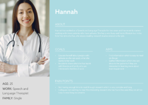
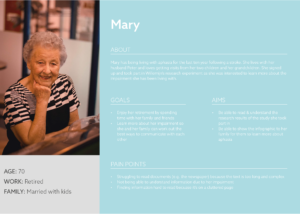
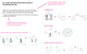
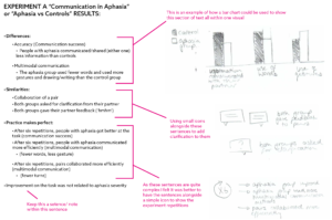
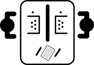
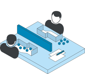
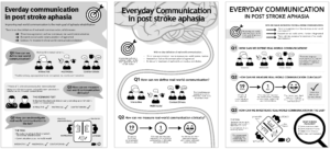
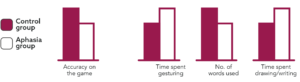
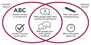
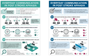
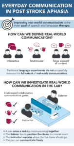
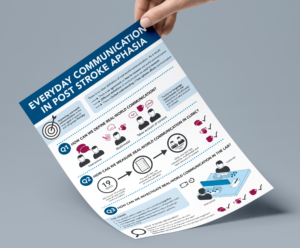
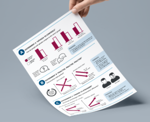
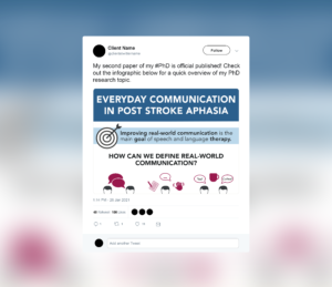
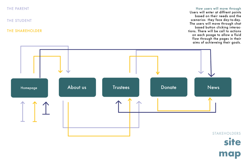

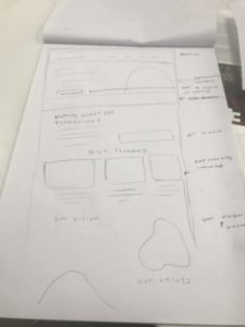
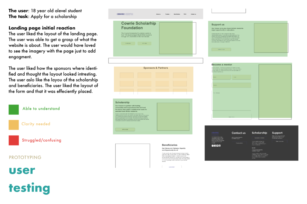
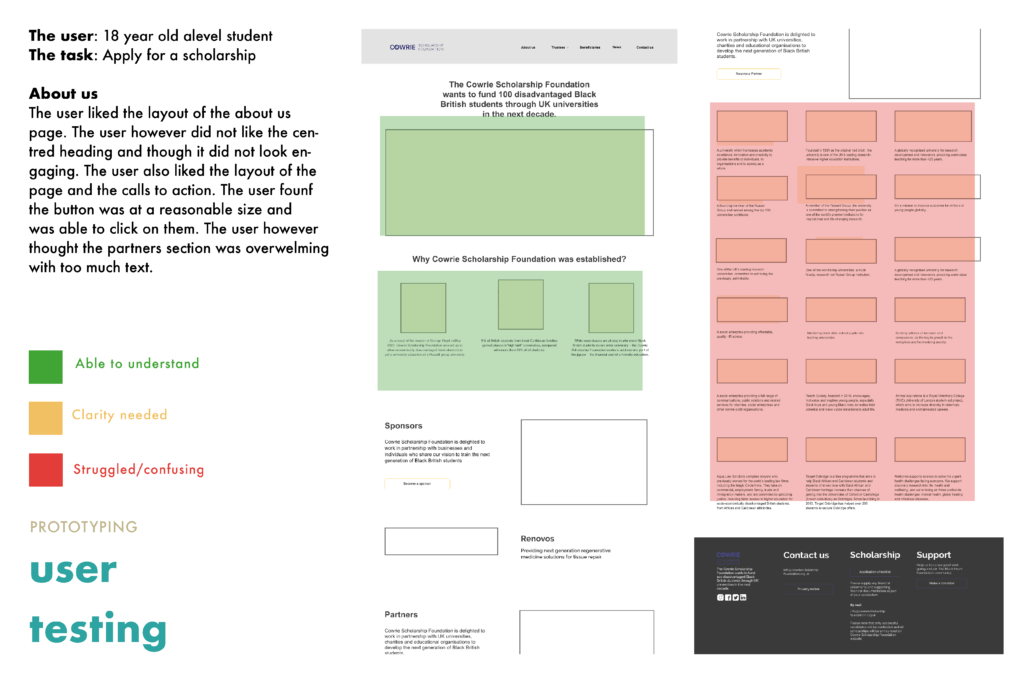
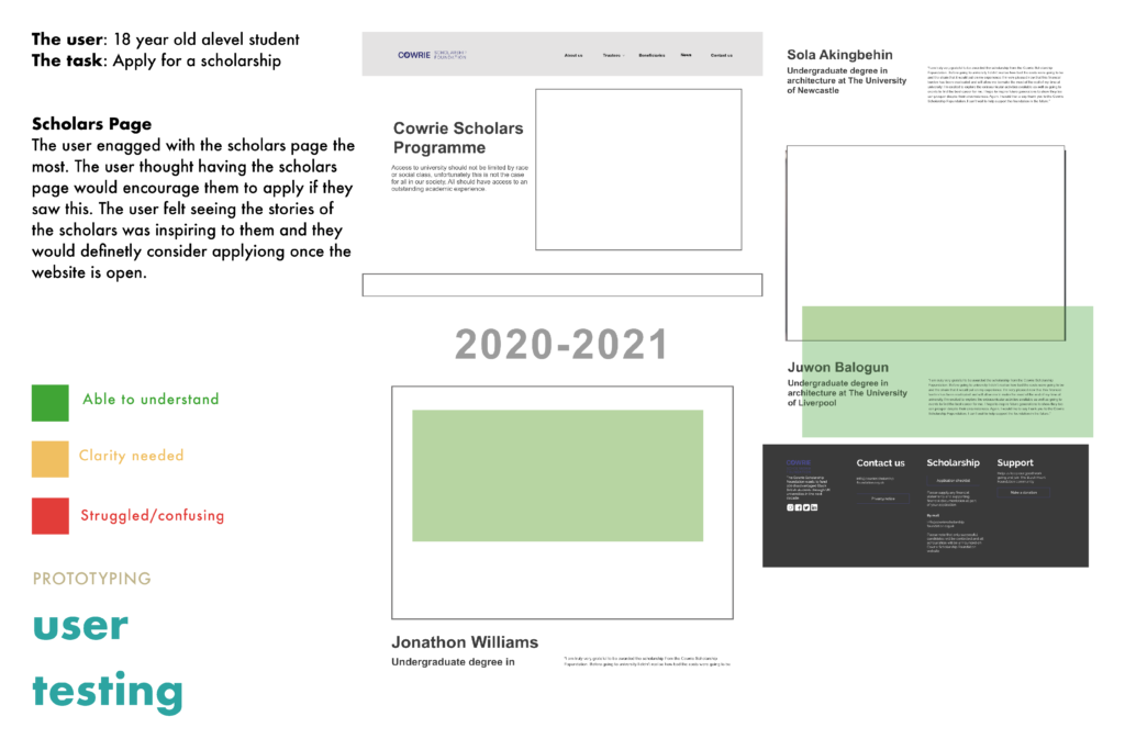
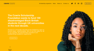
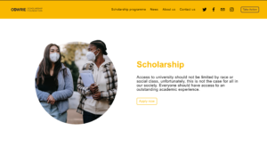
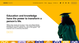
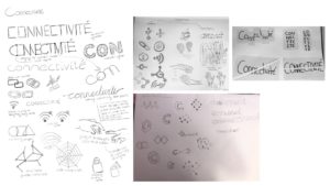
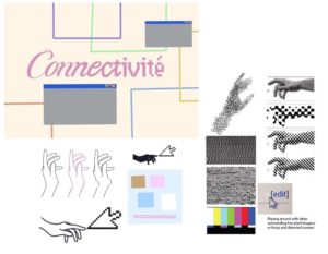
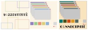

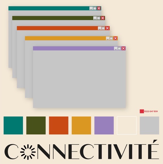
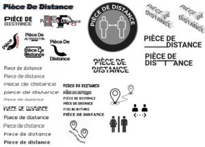
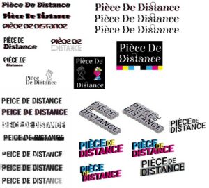
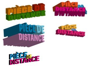
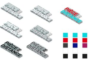
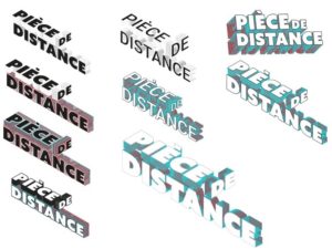

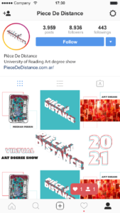
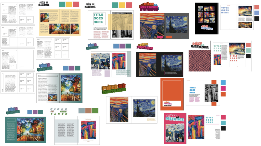
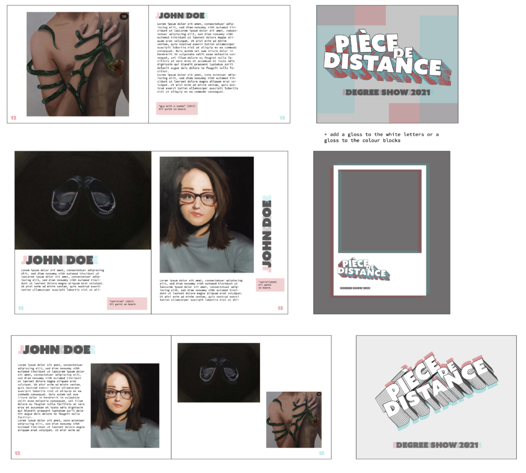
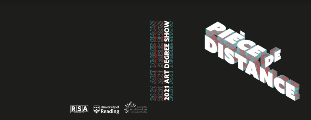
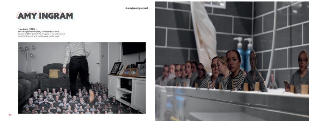
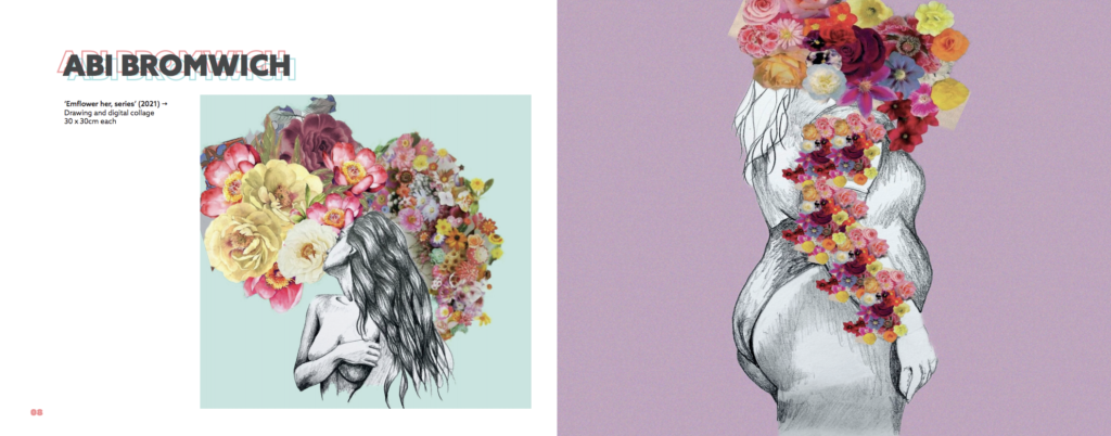
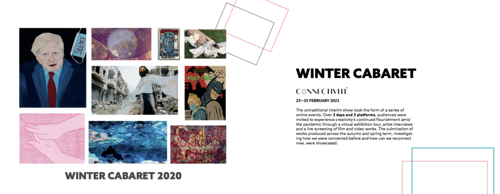
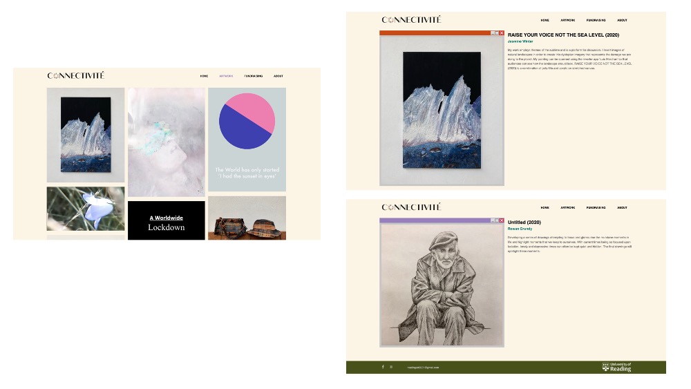


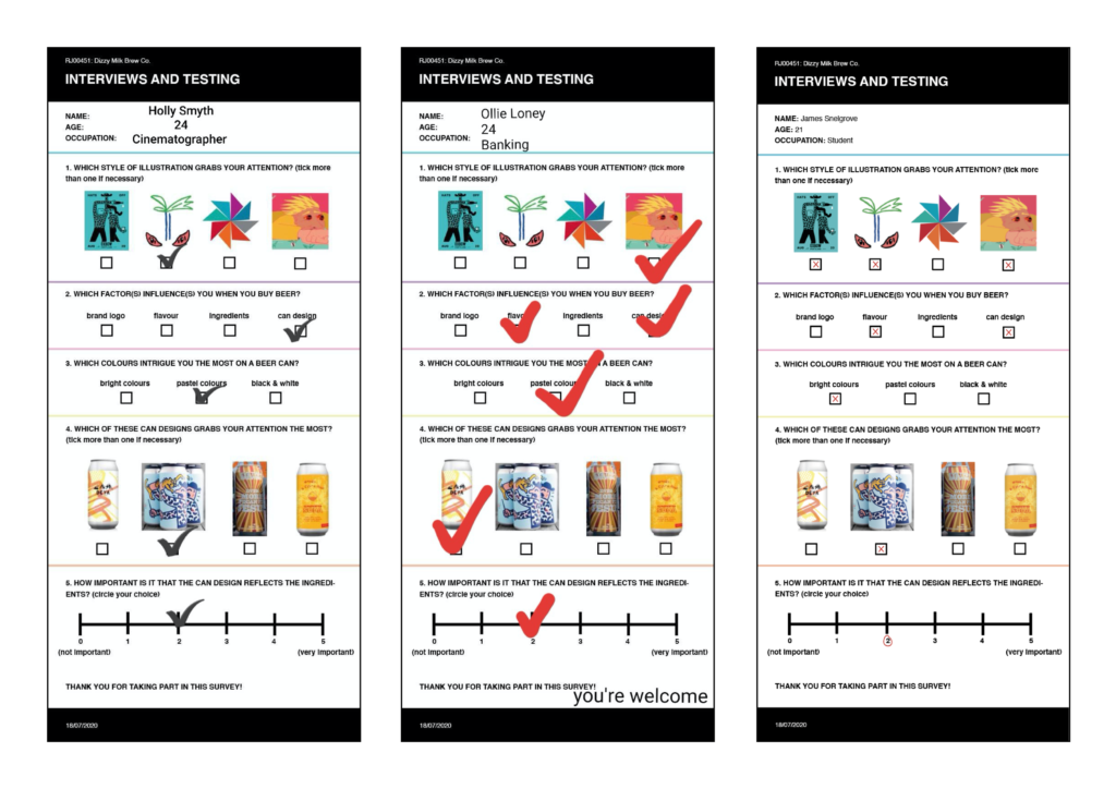
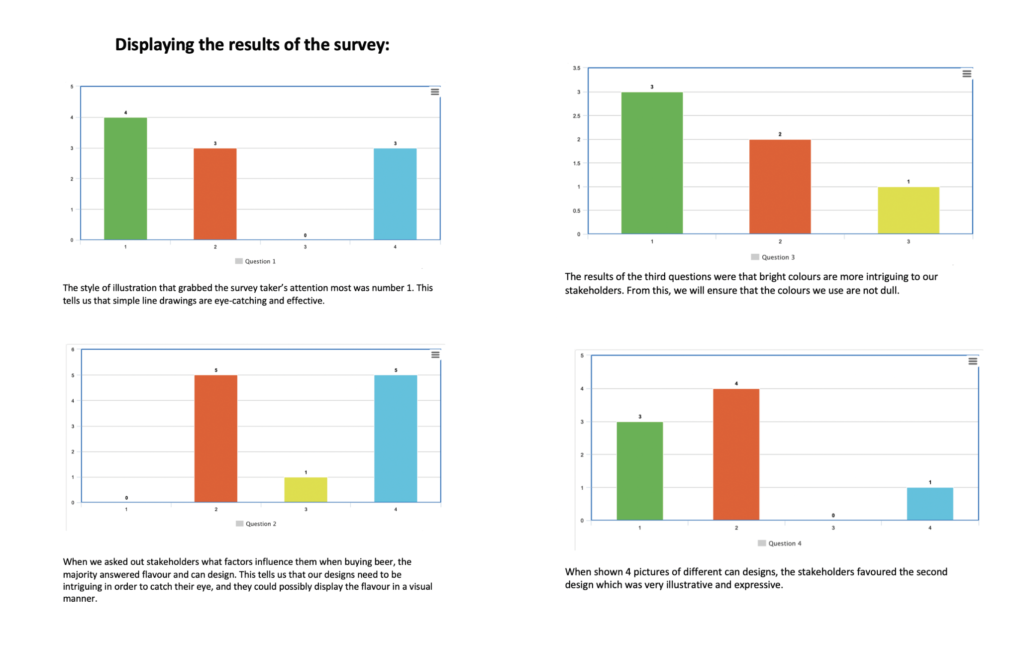
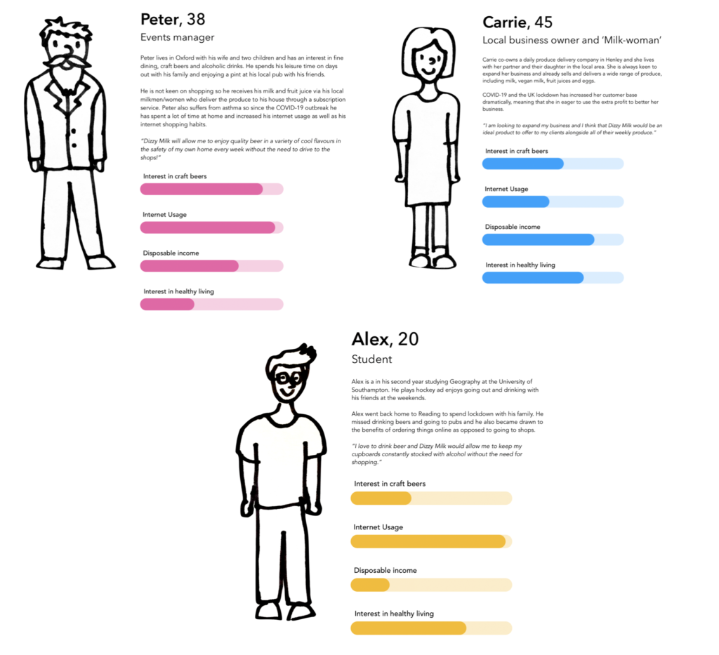
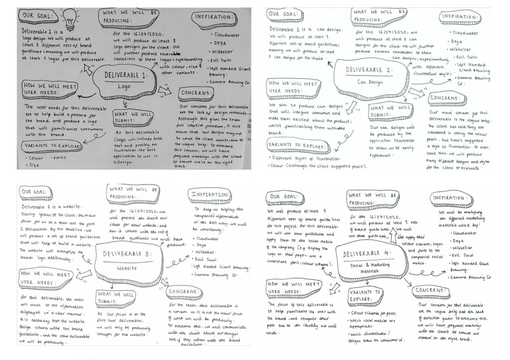
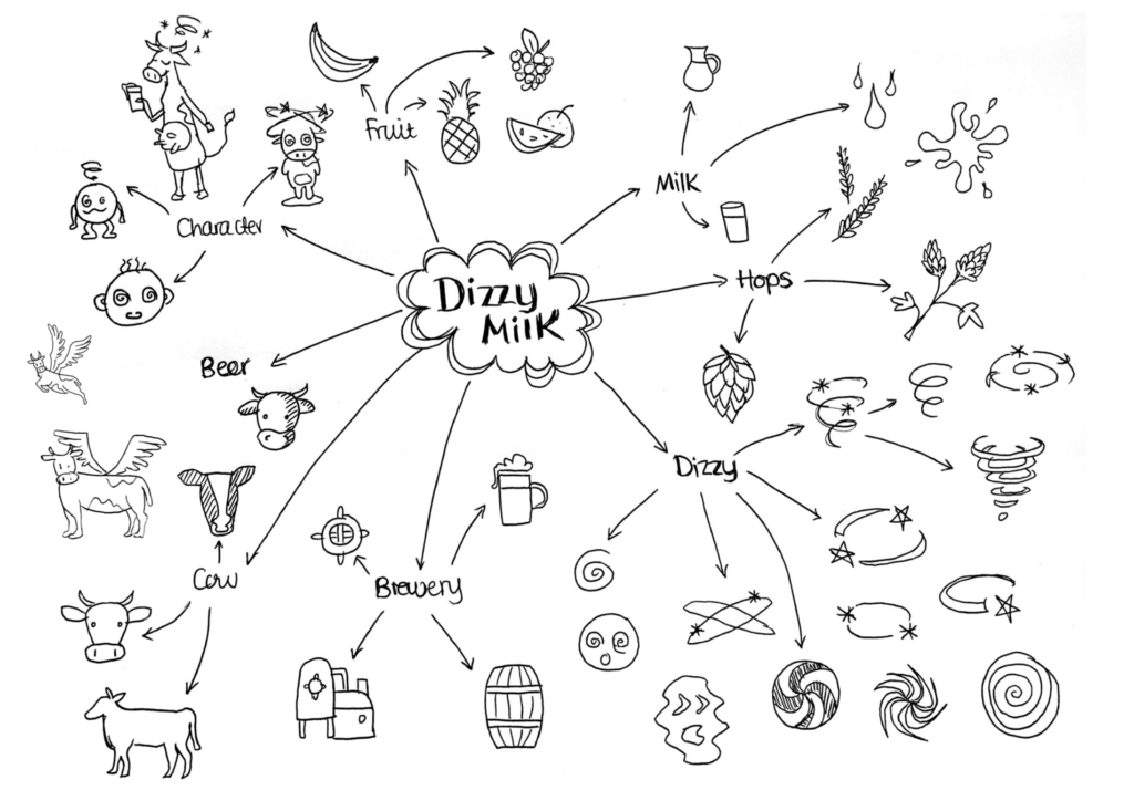
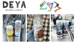
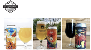
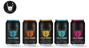
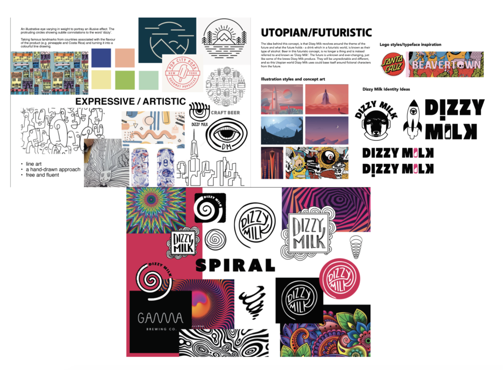
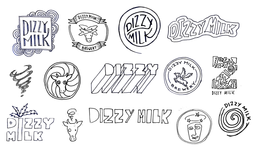
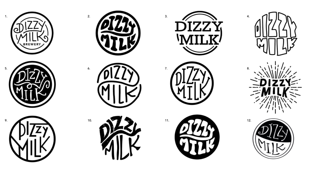
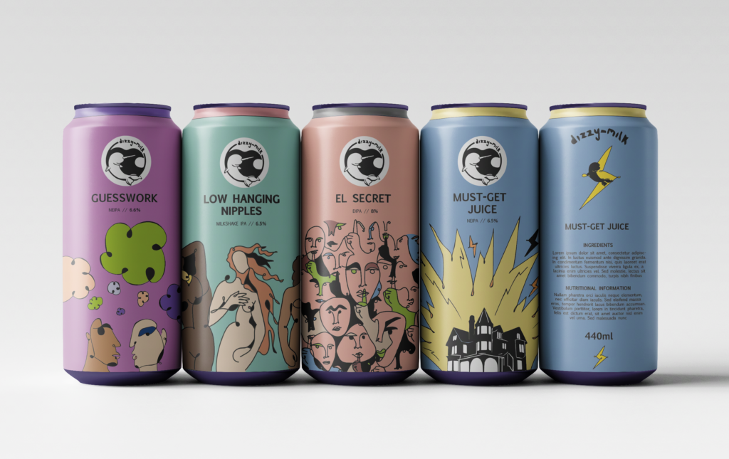
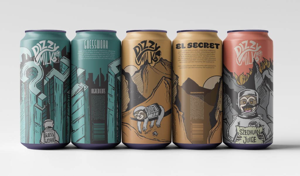
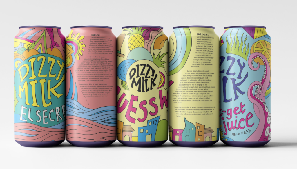
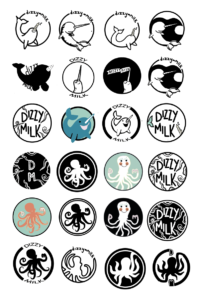
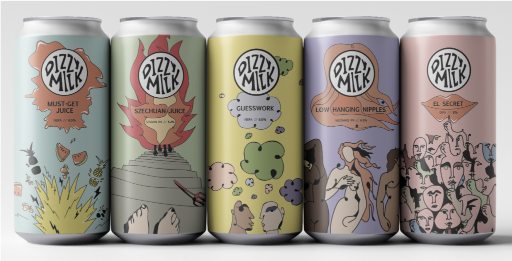
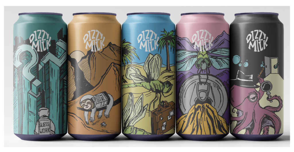
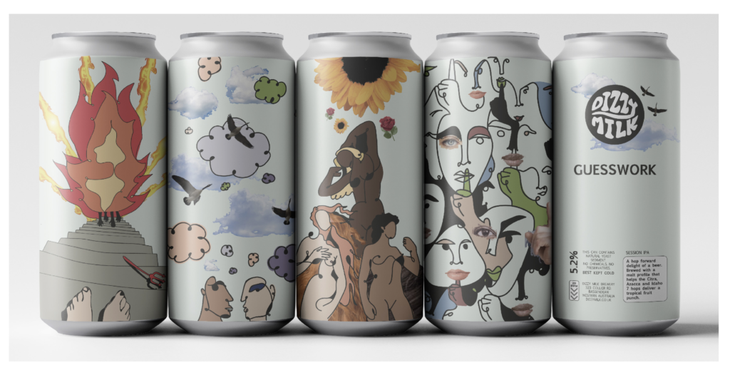
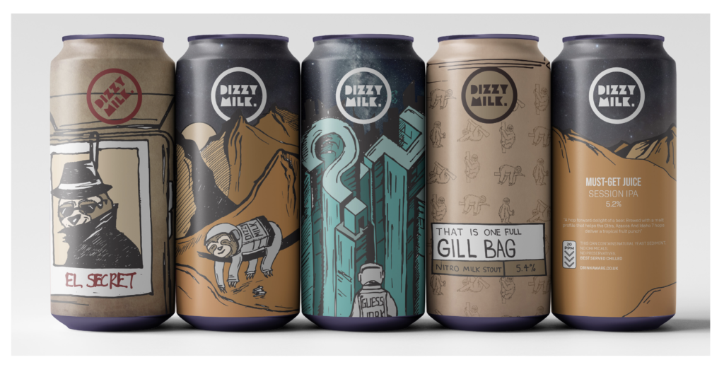
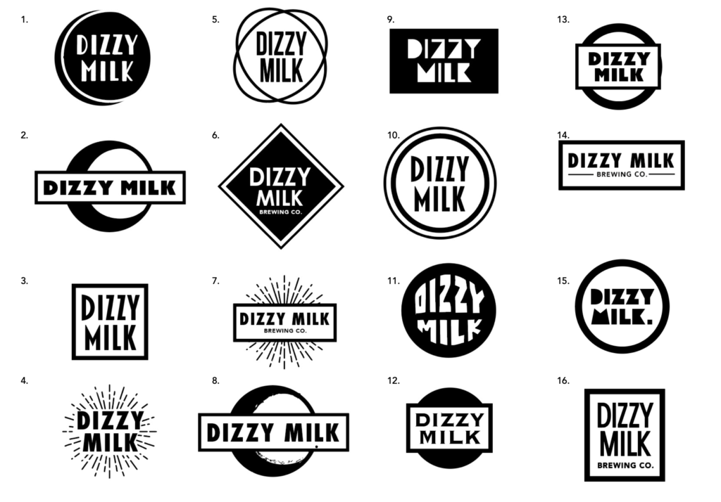
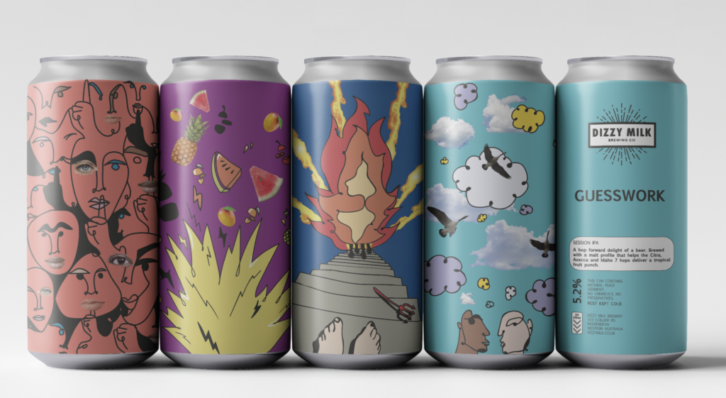
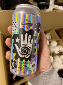
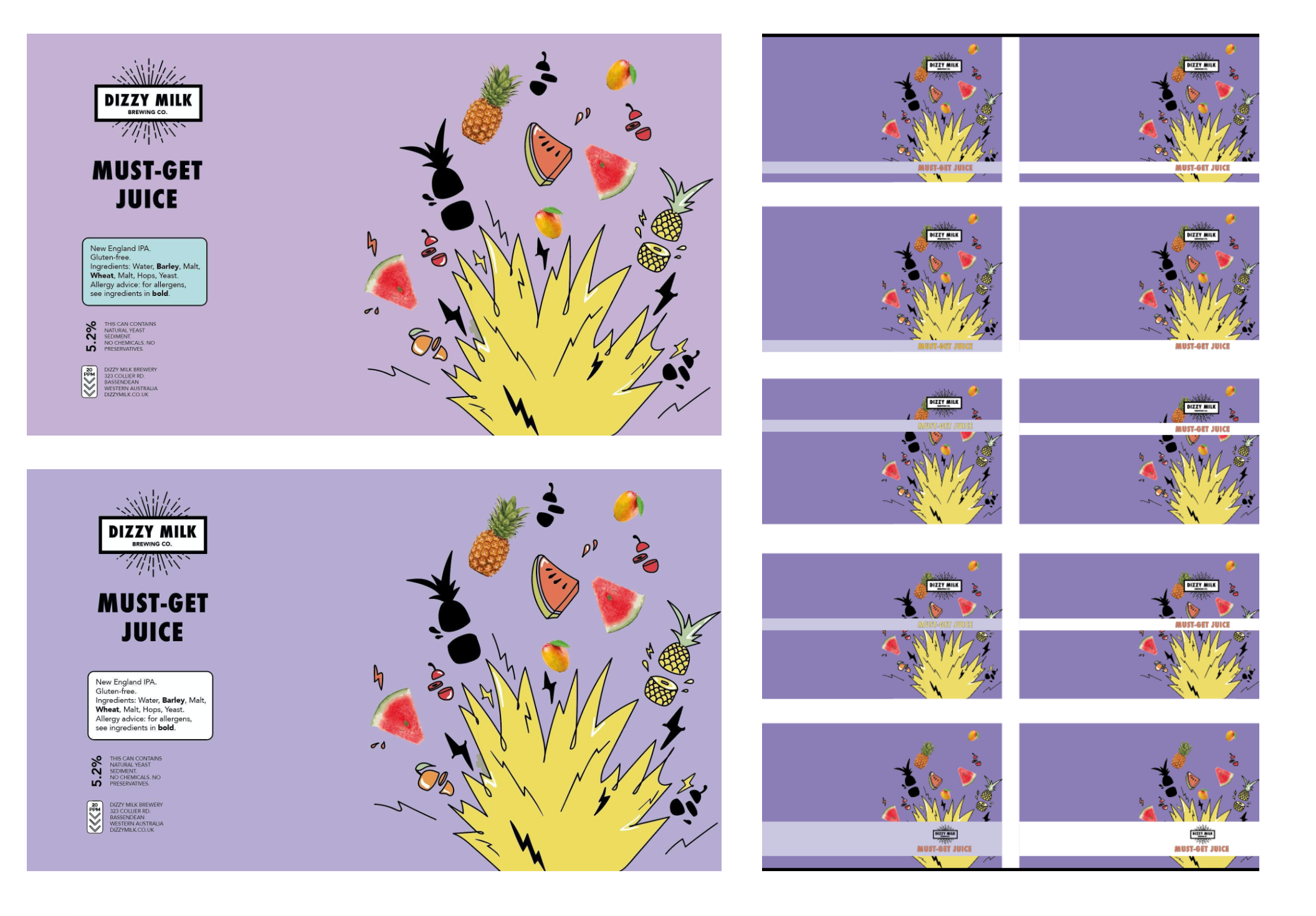
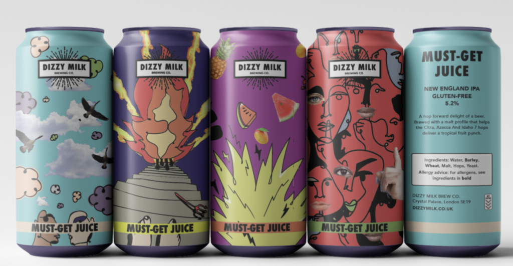
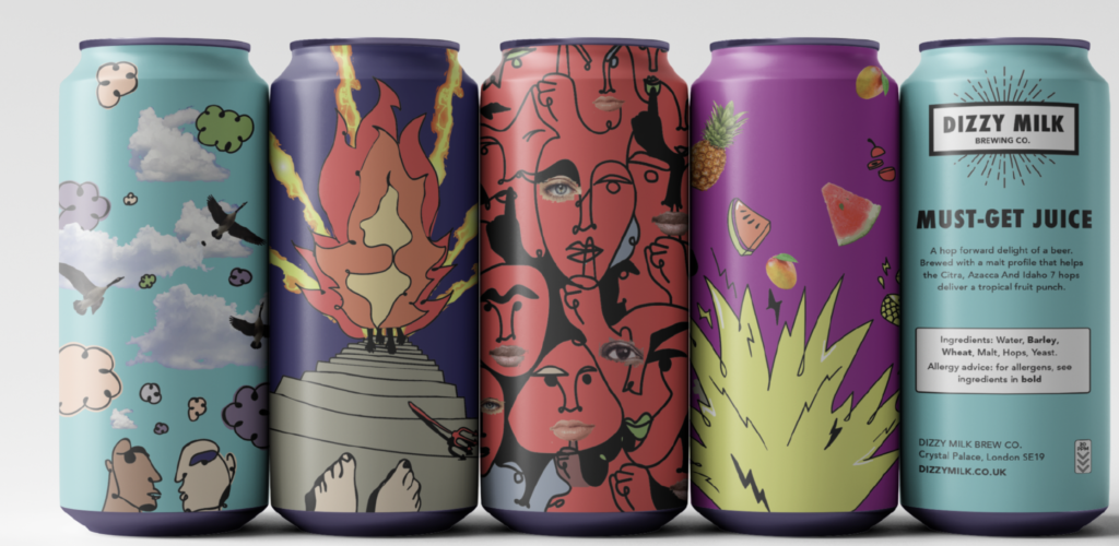
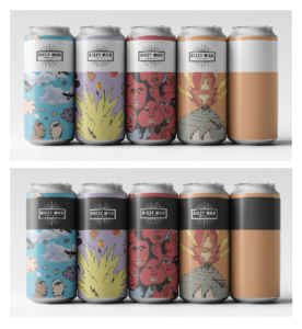
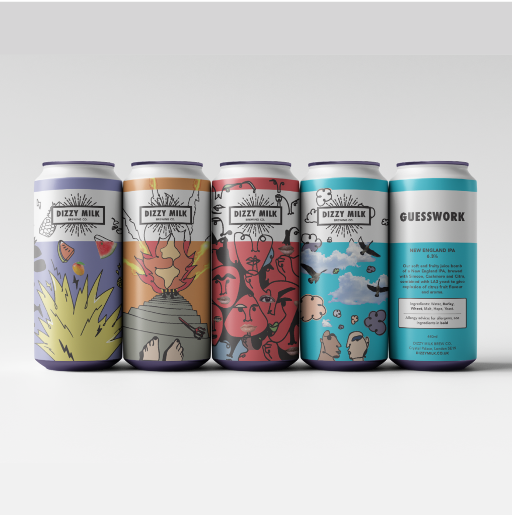
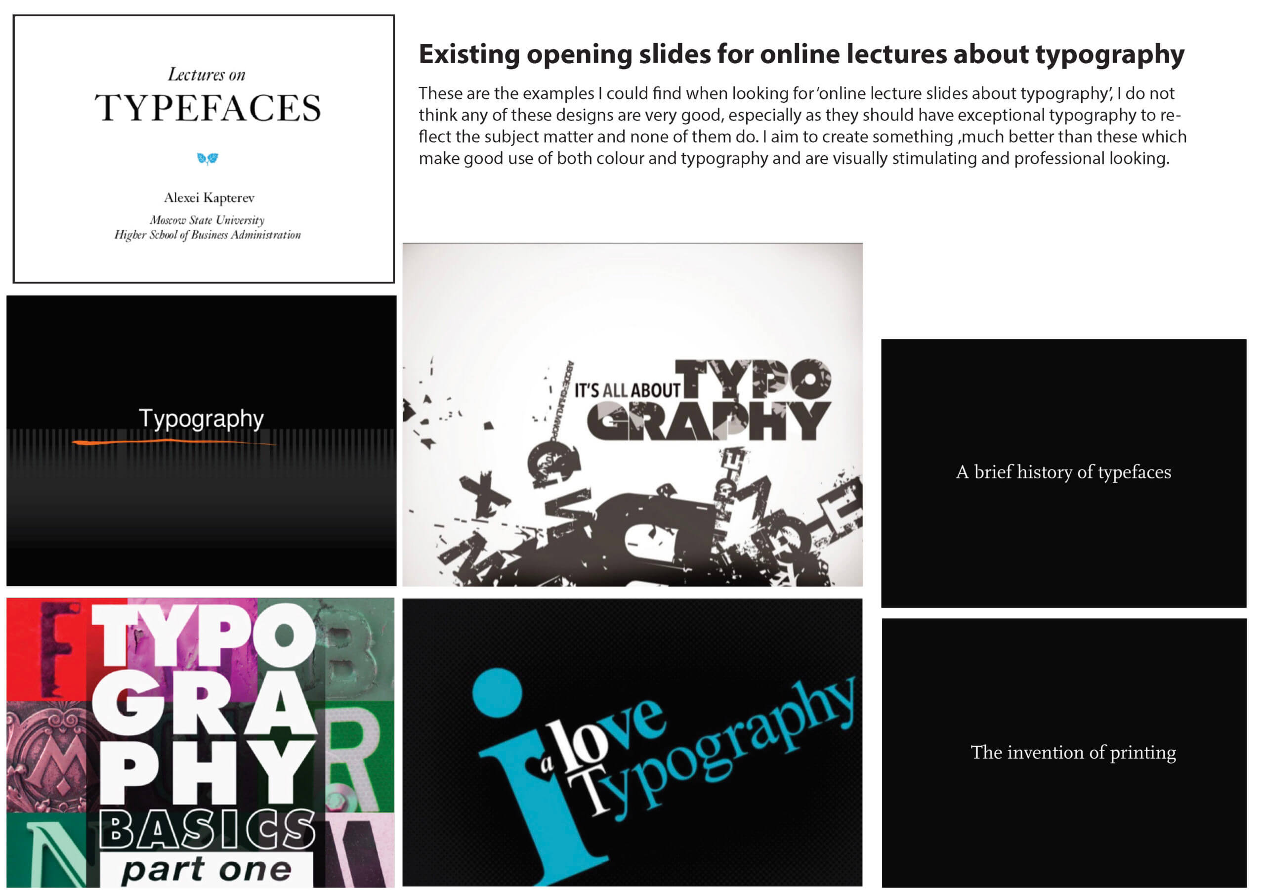
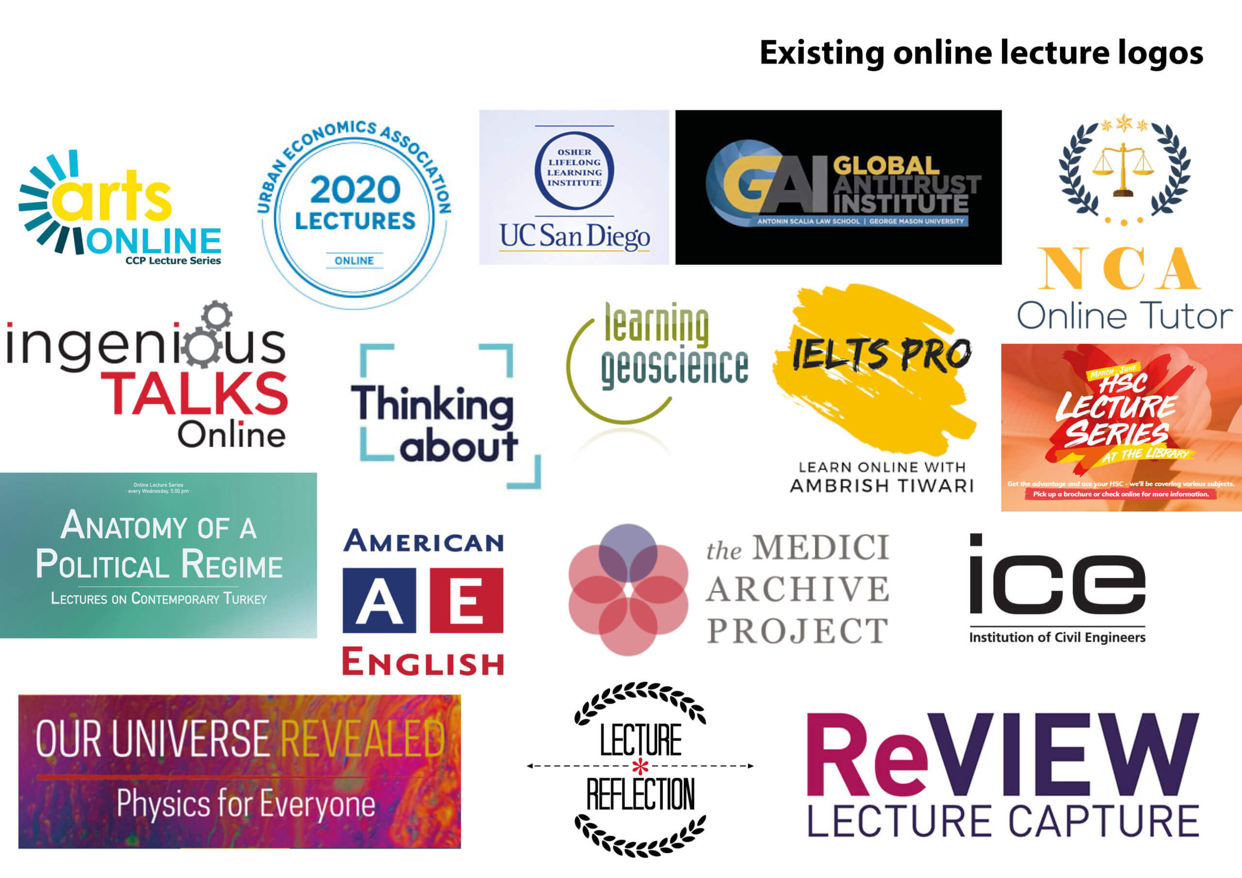
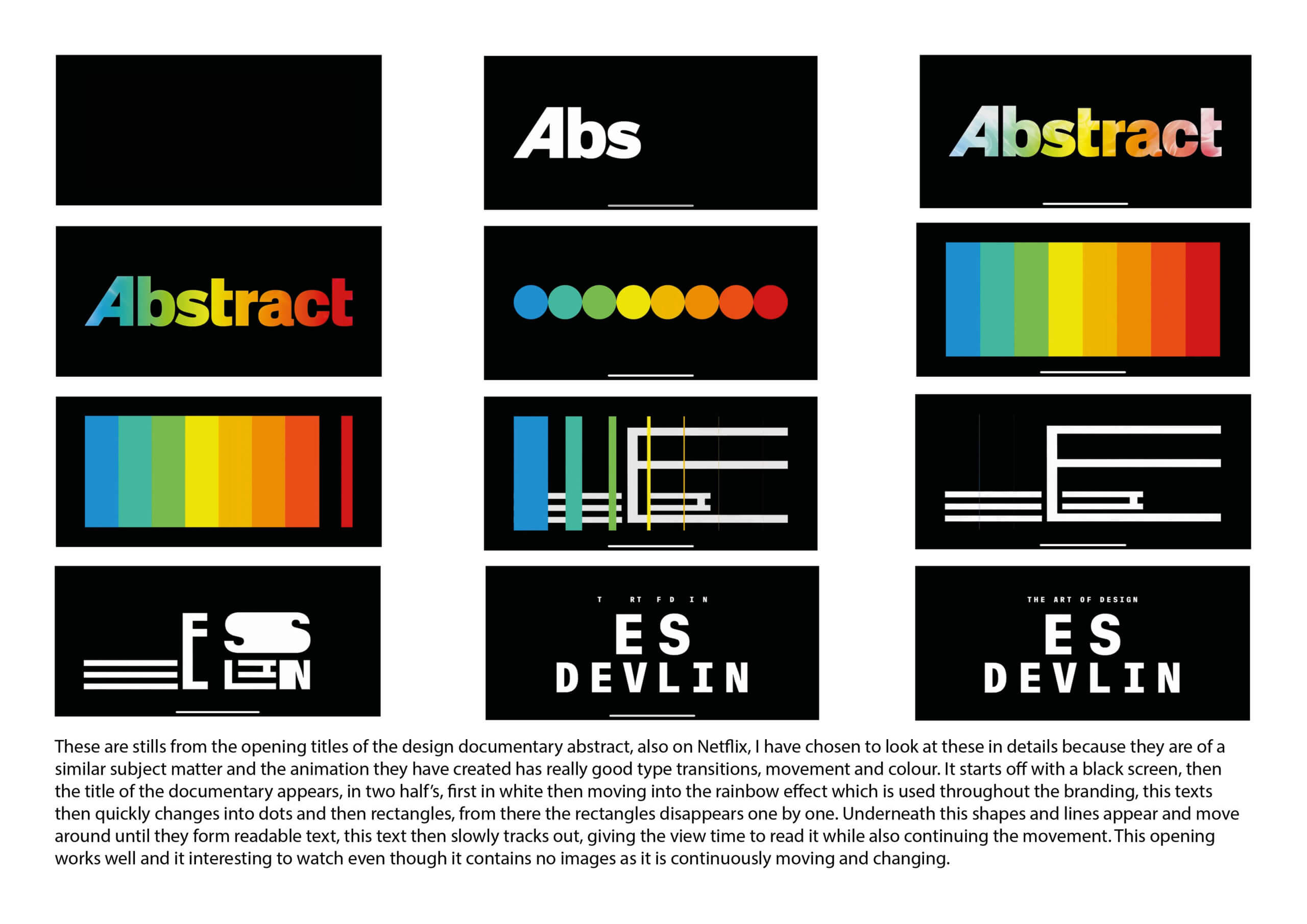
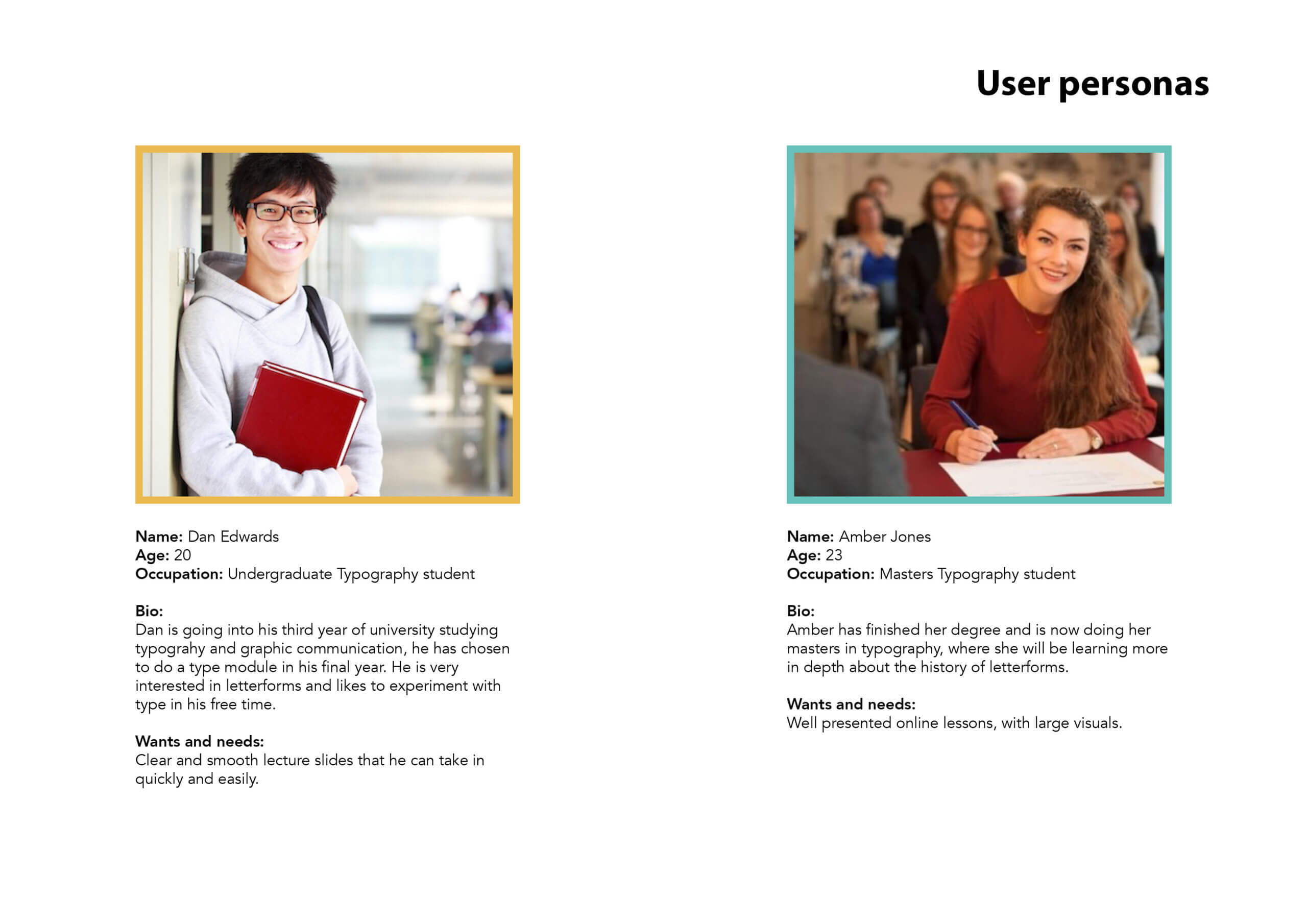
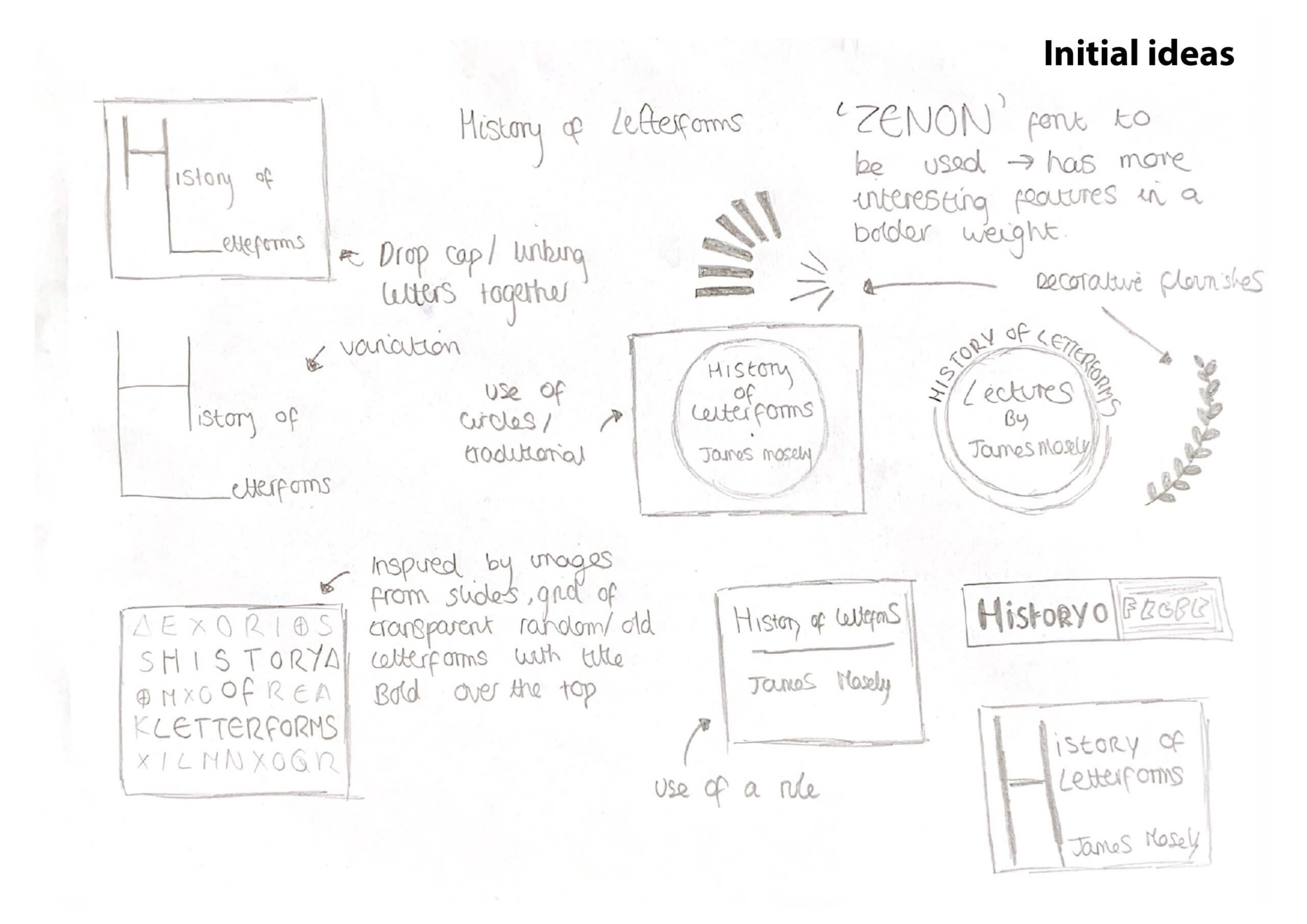
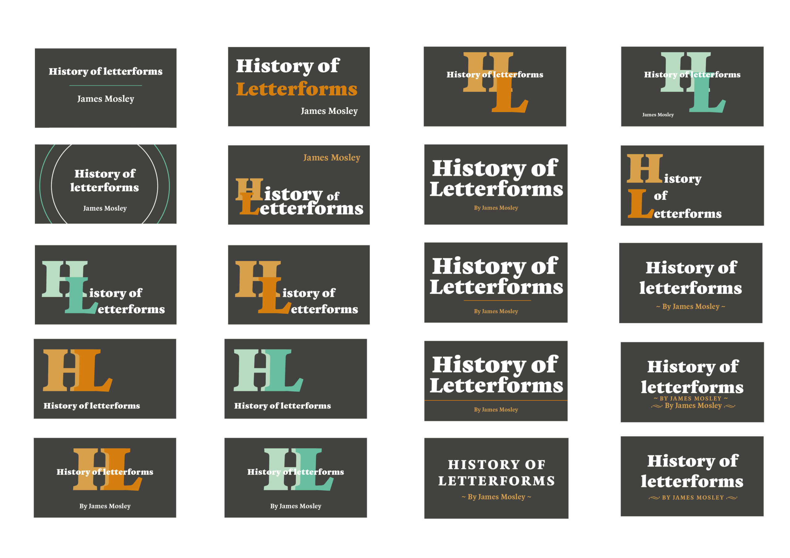
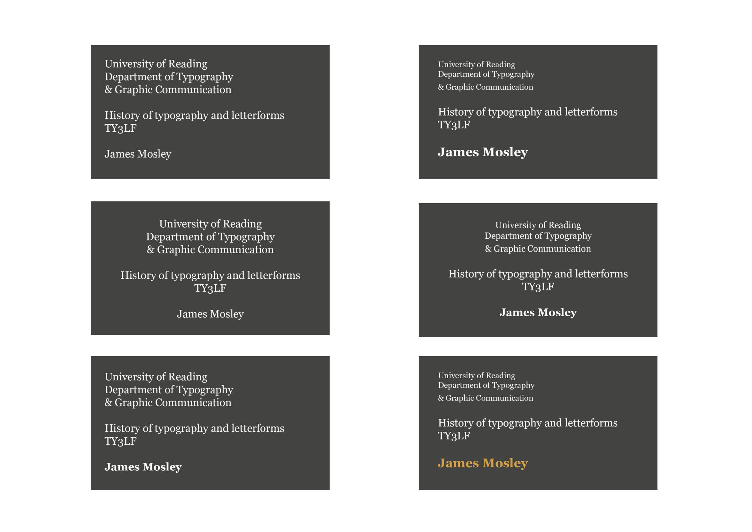
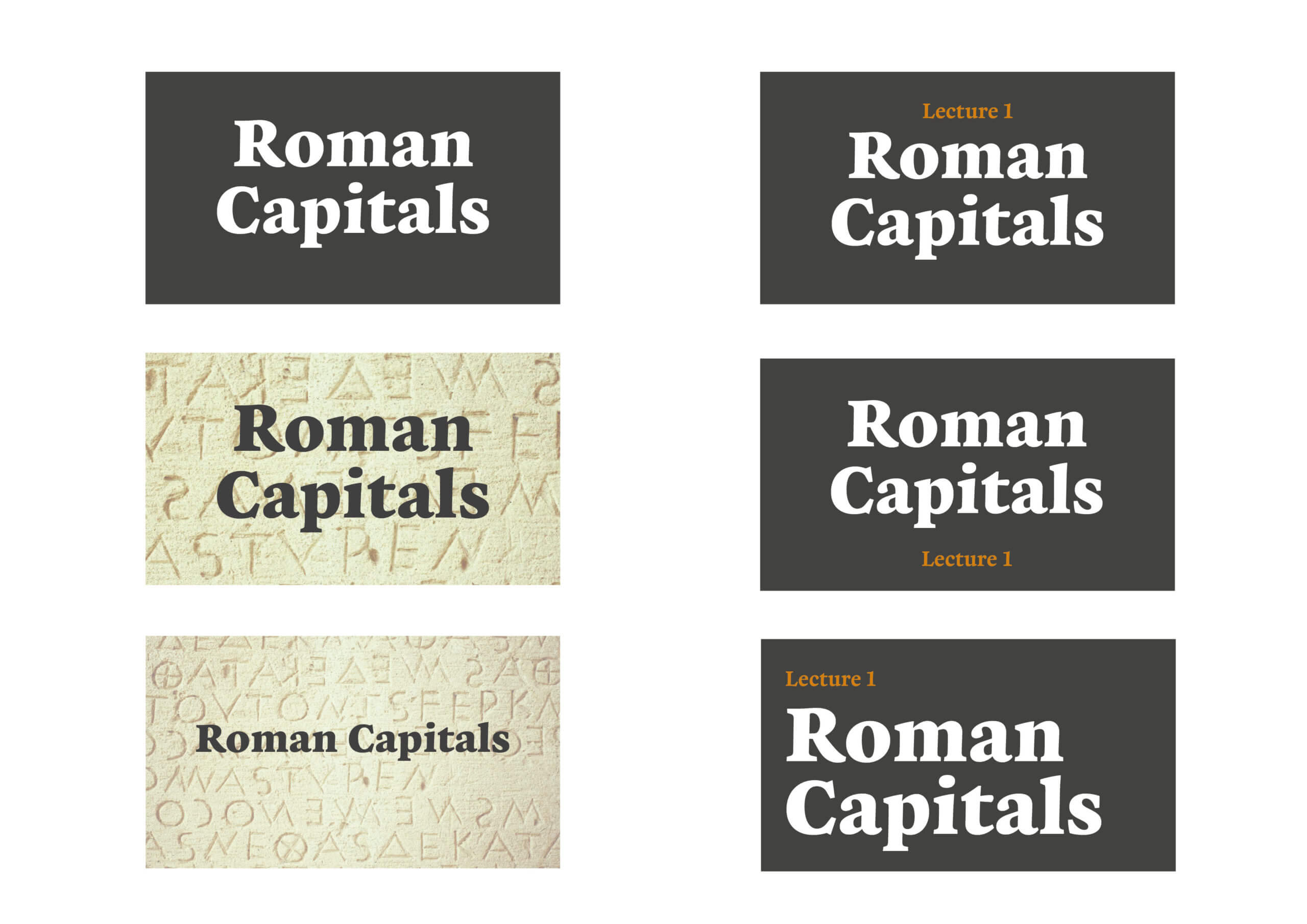
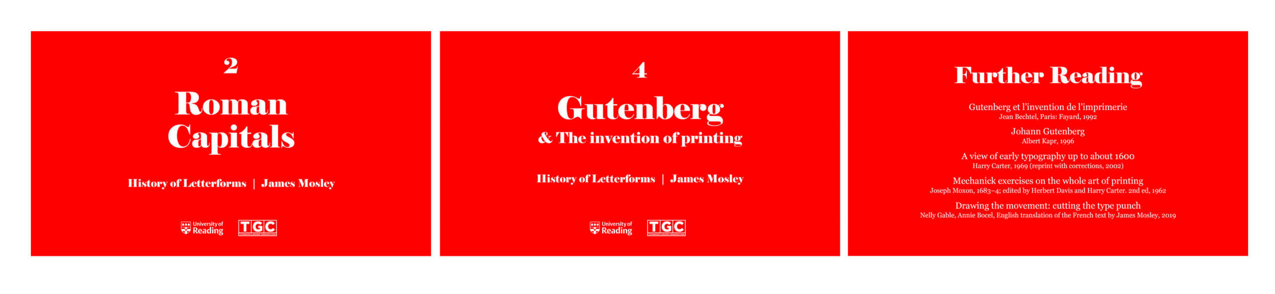


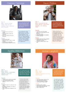
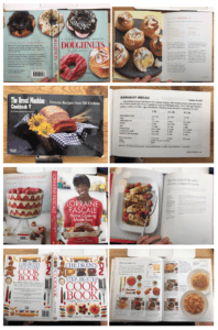
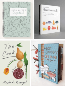
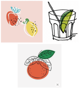
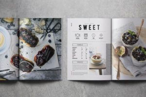
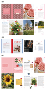
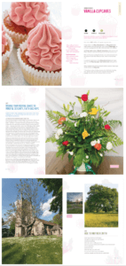
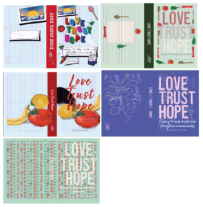
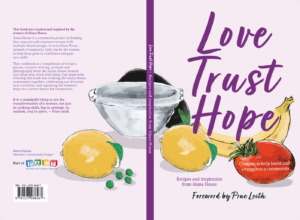
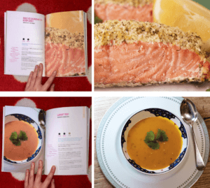
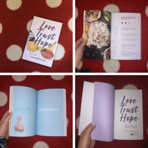