Our clients; Jack Gillespie and Ash Stedman, were beginning a new business venture of brewing their own range of craft beers in July, 2020. The proposed name of their company was ‘Dizzy Milk Brewery”, and the USP of this brand was to sell the beers via an online subscription and to deliver them straight to the home address of the buyer. The closure of pubs during the first UK lockdown and the confinement that people had to maintain within their homes sparked this idea and the proposition that the beers would be distributed by milk men and women in the same fashion as their milk deliveries. With the clients looking to brew a series of experimental and interesting beer flavours, a series of beer label designs were required which brought Jack and Ash to the Real Jobs scheme.
Brief
At the beginning of the project, our clients asked for a series of three can label concepts, a logo and digital mock-ups for tap room signage and marketing collateral. In the initial briefing meeting for the project, the clients presented to us their existing logo and can concepts, alongside beer brands which were similar to the kind of brand identity that they wanted Dizzy Milk to have. They expressed to us that they wanted a series of designs which has a vibrant colour palette, unique artwork or imagery and created a bold, unique and recognisable brand identity. The project was initially aimed to have a 2 week turn around, so a restated brief was quickly established and the research and design process commenced very swiftly after the initial briefing.
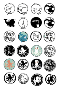
Dizzy Milk’s initial logo concepts
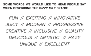
Key words provided by the clients that guided our creative journey.
Communication and project structure
As a design team of three, we maintained weekly contact via online messaging, as well as regular webcam meetings. We maintained contact with our clients via email as well as Zoom meetings to present design iterations and receive feedback. While this communication remained strong and frequent during the first few months, the progress of the project became hindered due to our client’s external commitments. This, alongside evolving design suggestions lengthened the turnaround time for this project.
Understanding the audience
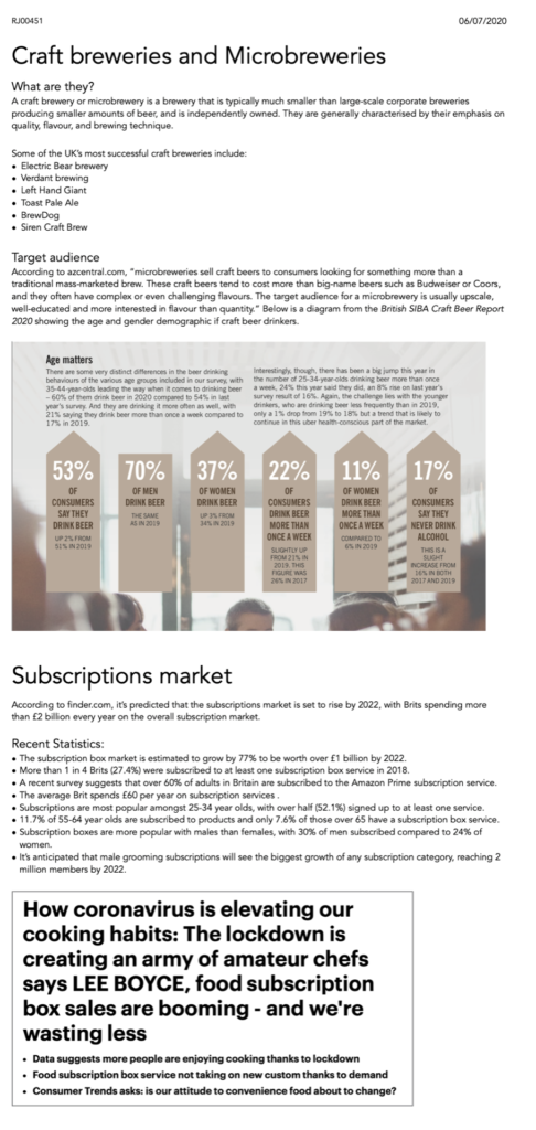
In order to find out more about Dizzy Milk and its consumers, we researched the market for Craft breweries and Microbreweries. This also educated us enough that we felt comfortable in our first client meeting. Our research made us aware that microbreweries emphasise quality, flavour and brewing technique. The team discovered that craft beers for microbreweries tend to cost more than big-name beers, which helped us understand that users are looking for a unique product that is high-quality. We also researched about the subscriptions market because it increased our knowledge about how many users are involved, and what they think is important.
Our research on Microbreweries (https://trello.com/c/gTcEdkqx/7-research-market)
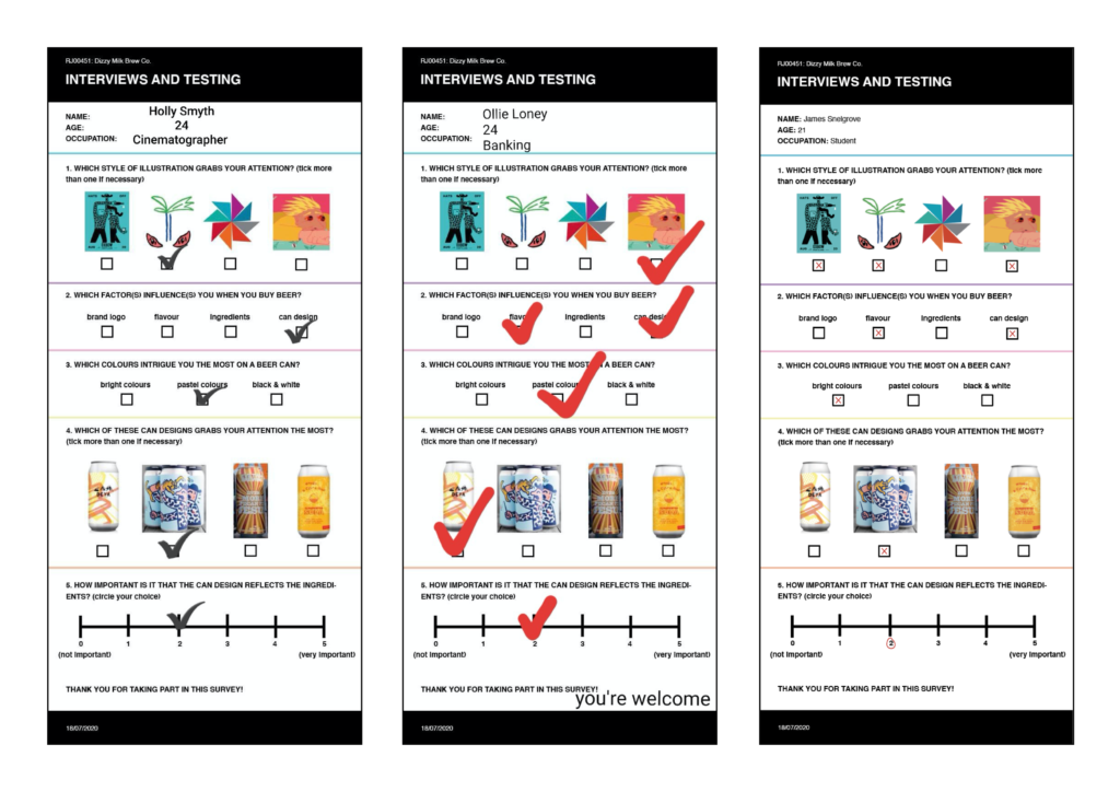
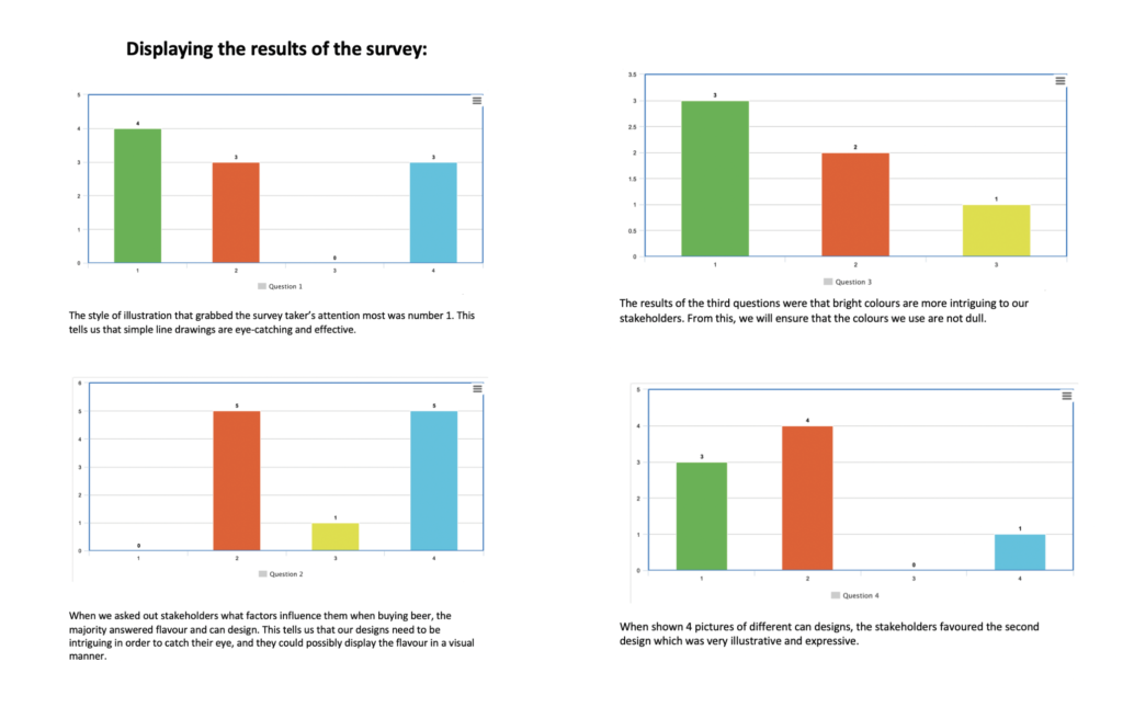
To find out about a potential audience for Dizzy Milk, we created and distributed a survey. This was used as a tool to answer questions about who our users are, what they like to see in a product, and what issues they may encounter. We crafted a range of questions, specific to visual design, that would help us find vital information. The team created multiple choice questions and also devised a scale to give users the freedom to describe their experiences. It was vital that we left room for users to respond in their own way. The UX design of this survey was carefully thought out, as we didn’t want users to be confused by the layout, or unable to read questions. The survey was beneficial because it helped us identify pain points or specific problems that users are experiencing. We identified that users did not like dull colours as they are less interesting than bright colours. The survey results also told us that the users favoured more expressive and illustrative styles of artwork, which then guided our creative direction.
A few examples of surveys completed by potential users of Dizzy Milk.Analysing the results from our survey.
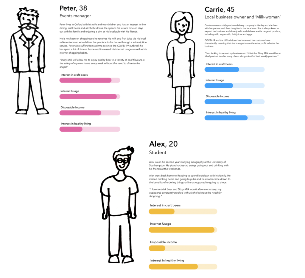
The team created 3 personas that represent various user types that might be consumers of Dizzy Milk. It was important to identify factors such as their interest in craft beer, their income, and their interent usage because it helped us discover what content people care about. When creating these personas, the team ensured not to stereotype the typical users of craft beer that we found through our research, as Dizzy Milk wanted to cater for all demographics – it is a product for everyone.
Establishing our user personas
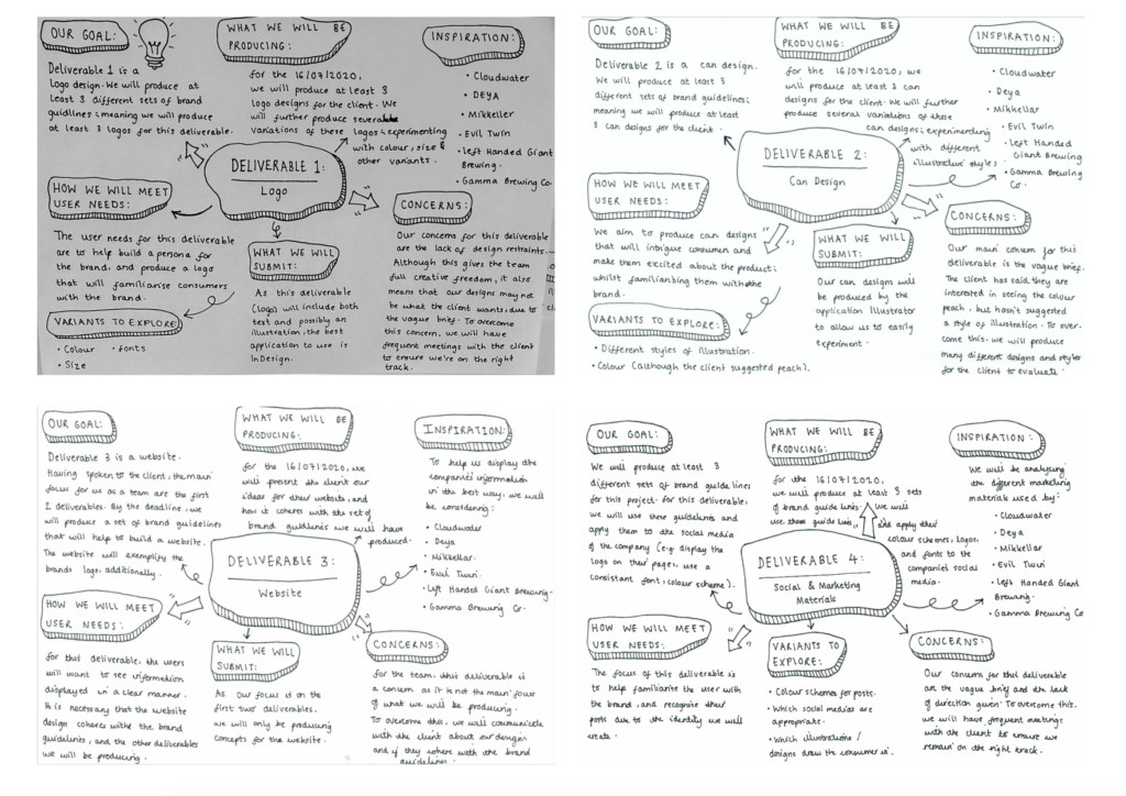
Once we had clarity about the nature and extent of our content, and the fundamental goals of our users, we refined our design proposal to a more detailed level. We configured set deliverables, and analysed how they would meet our user needs. We also wrote down the inspiration for each deliverable, which was based upon information given to use by the clients, and also due to results of the survey.
An analysis of our proposed deliverables
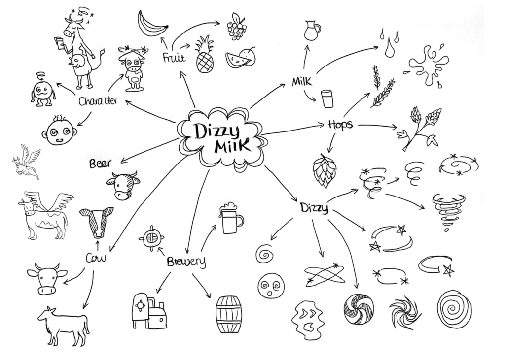
After confirming the deliverables with the client, the team started designing. We created a mind map full of visual ideas that was devised of preferences from our survey results, and that would be suitable for the brief. The user testing told us that users preferred an illustrative style of design, therefore we use fineliner to create hand-drawn ideas for a logo. Another result from the survey was that the can design needs to reflect the ingredients, so we experimented by sketching different fruits. By creating a document of ideas, this helped us visually understand our users by seeing things they like.
Visual mindmap of ideas to aid our designing for the logo
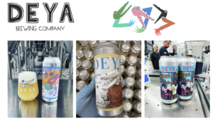
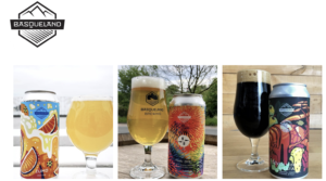
Soon after proposing the deliverables, the clients sent us a document that expressed designs that they liked and disliked. This was useful because we could now group together their design preferences with the potential users we researched. It explained some of the designs the clients liked, which guided us in the right creative direction in developing Dizzy Milk’s visual identify. They did not like designs from Brewdog and Wild Beer because they didn’t scream “EXCITING”From this document provided by the clients, we took away that the clients were in search of designs that ‘SHOW DIVERSITY IN TERMS OF CREATIVE EXECUTION, WHILST SHOWING A STRONG BRAND IDENTITY AS A COLLECTION”. This was something which we took on board, right from the off on this project.
Beer can designs liked by the clients
Deya can designs/ logo liked by the clients.Basqueland can designs/ logo liked by the clients.
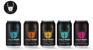
Beer can designs disliked by the clients
Brewdog can designs/ logo disliked by the clients.Wildbeer can designs/ logo disliked by the clients.
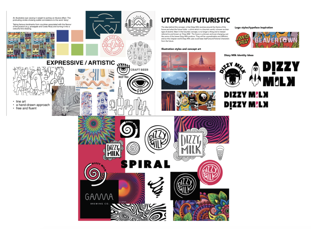
Finding a creative direction
We commenced the ideation process by creating individual mood boards and initial sketches of the illustration style and logo ideas which we could explore, informed by our clients needs and research into users and the craft beer industry. These mood boards were key in establishing a visual design route for the designs of Dizzy Milk’s can and logo designs. These mood boards and initial sketched were presented to the clients and from a varied selection of moodboards presented to the clients, the clients were happy to explore 3 different styles, as follows:
Spiral
Expressive/artistic
Utopian/Futuristic
The moodboards/ concepts chosen by the client that we would develop further.
Each of the three moodboards had its own distinct style and take on visualising and representing Dizzy Milk. The Spiral concept moodboards, had quite a colourful, physcaedlic like approach, compared to the expressive/artistic moodboard, which was the opposite of this. On the other hand, a utopian/futuristic moodboard was also explored too, with influence from brands such as Beavertown adding to this and how cartoon-like illustrations could be used on Dizzy Milk’s cans.
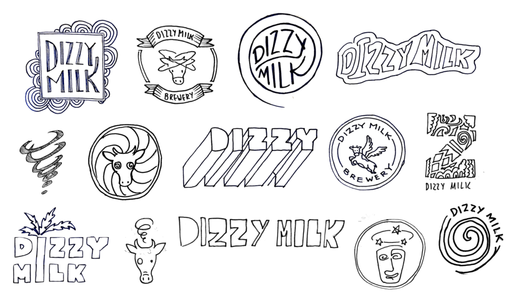
However, at this initial stage of the project, it became apparent, that our clients weren’t keen on using imagery of cows, dizziness or milk in the branding of the logo, as showcased by our series of logo moodboards presented to the clients alongside the different themes. The reasoning behind this, was due to the potential connotations that the product actually contained milk, or promoted alcohol intoxication through the theme of dizziness.
Initial logo designs based upon the keyword “Dizzy” and “Milk”.
“It is awesome to start to see the dizzy milk brand come to life” – Jack Gilesipie (Client)
Developing the logo and can designs
Using the mood boards and feedback, we were then able to start creating digital design variations for the logo and can designs, shown below. Anya experimented with free-form/ hand-drawn typography which intertwined with fantasy imagery, in an attempt to create a unique and recognisable visual style, alongside vibrant colours, as had been requested by the clients. Issy used her line drawing/ expressive visual style to create a detailed and original design. Harvin developed his utopian theme further by incorporating different animals that the clients expressed they liked, such as an octopus, as a suggestion was made that we could include animal imagery in the design.
Logo development with a strong emphasis on typography.Can designs in an expressive/ illustrative style.Can designs in a futuristic style.Can designs in a spiral style.
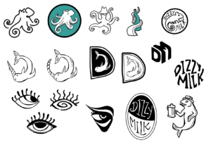
Alongside the can designs, we also created another set of logo iterations which steered away from cow, milk or dizziness imagery, as the clients did not want the logo to display any connotations to these words. The team experimented by creating logos that involved eyes, spilled beer, reflections and space. We also created logos in a variety of styles and weights, as at this point the clients had given us full creative freedom. Some of the logos also looked at incorporating a mascot into the Dizzy Milk logo such as the use of both the octopus and a narwhal, with the clients suggesting that the spiral-like features of these characters can hint subtly towards the theme of dizziness. We soon met with the clients to show them the beer can and logo designs. For the logo, they expressed that although they liked the illustrative and ‘hand-made’ style, they said they wanted a more substantial logo. As the logo needed to stand out against the artwork and be differentiated, we dismissed the expressive visual style and continued to develop ideas such as the eye design and the space theme. The clients also expressed that they wanted more of a focus on typography, so they are able to apply the name ‘Dizzy Milk’ to many products in the future so it appears typographically strong on all elements and ultimately, stands up against its competitors on the shop shelf.
First logo iterations by Anya.First logo iterations by Issy.
“Thanks for getting back to us, and to echo Ash’s feedback we are blown away with the progress here and feel like we are on the cusp of breaking through with the next round of amends” – Jack Gillespie, client
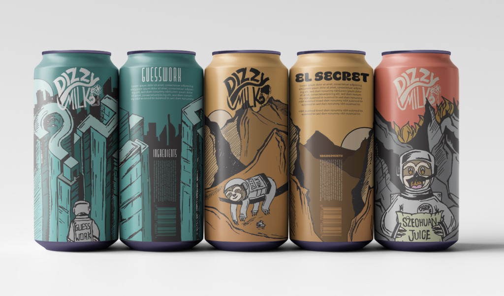
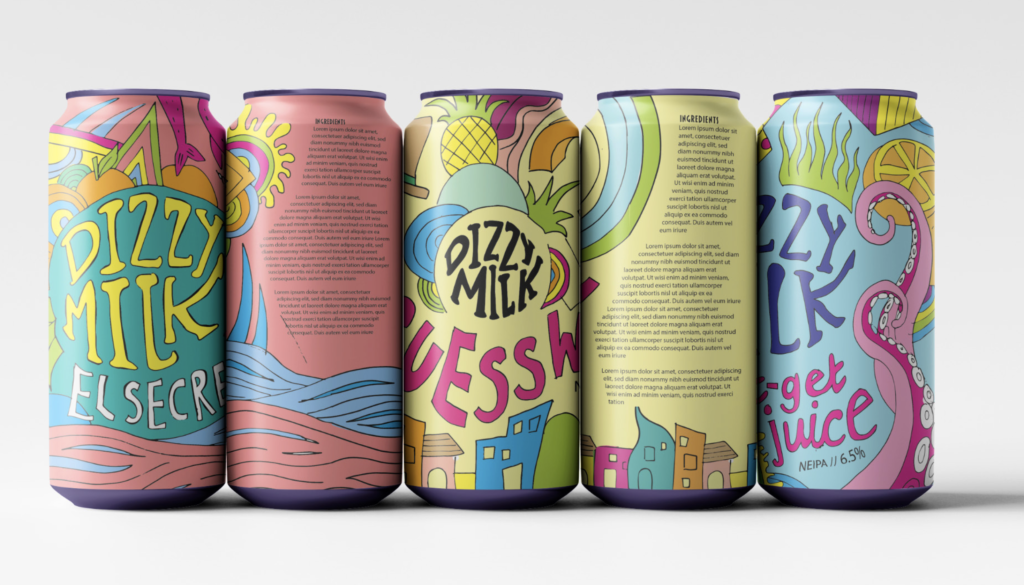
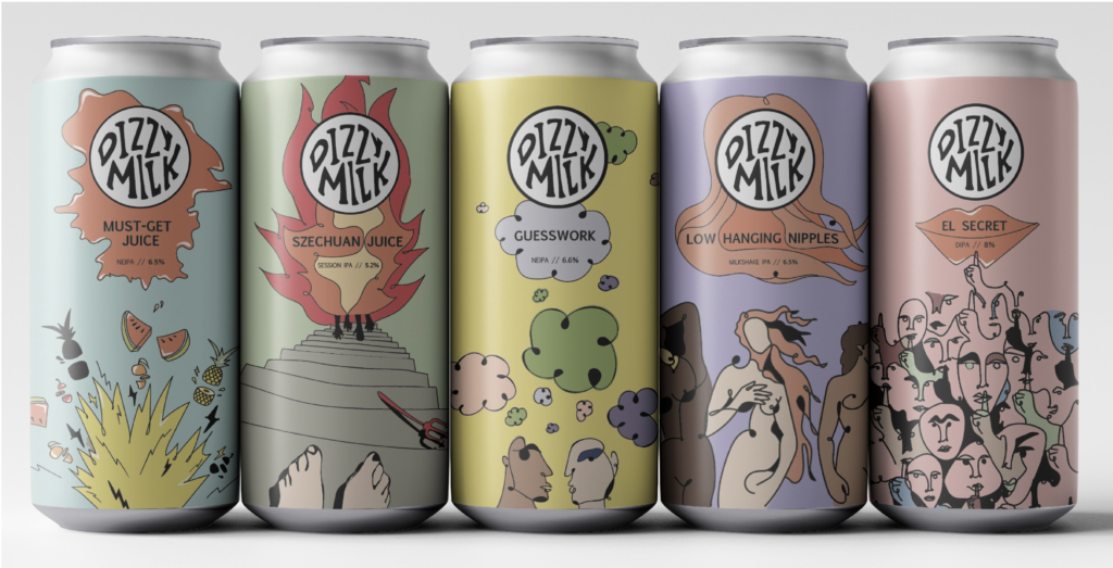
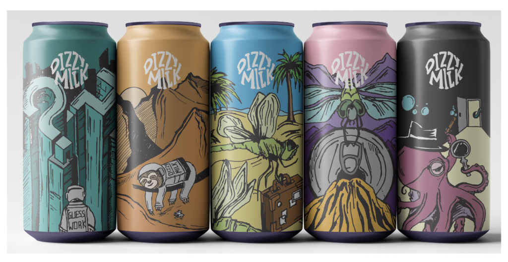
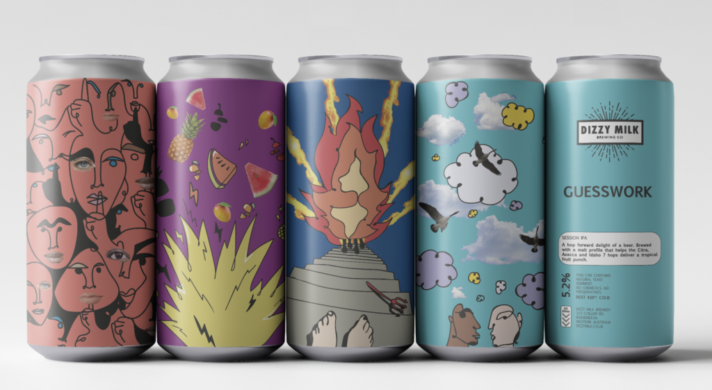
When presenting these three can styles to the clients, they expressed that the two concepts which they thought best represented the vision for Dizzy Milk were the utopian/futuristic theme, as well as the expressive, line-work style. They therefore asked that these two styles could be developed further in order to choose their favourite in the next meeting. For the illustrative style, the feedback we received was to make it more unique and not into a pattern because the illustration looked too repetitive and uninteresting. To overcome this, we re-drew some aspects of the design. To give an example, the can design for ‘El Secret’ only had a few faces repeating themselves, so we ensured that all the faces in the design were unique. Not only did this improve the uniqueness of the can, but it also makes users feel they are receiving a product of high quality. For the utopian/futuristic style, the team began to incorporate other animals into the designs, such as an octopus and dragonfly’s alongside the use of the sloth. Inclusion of several characters throughout this set of designs, was influenced from the clients feedback into how the introduction of more designed animals, could help to tell a story across the designs of the cans. Harvin’s rustic illustrative style helped to set an earthy tone for the can designs; making users feel that the beer is home-made and carefully configured. After receiving feedback from the clients that helped us know how to develop the two concepts, in addition to the logo designs, our roles within this project shifted at this stage. Issy and Harvin continued to develop can artwork, further progressing each of the two concepts taken forward by the clients, whilst Anya focused on refining the logo, working hard to create a memorable identity for Dizzy Milk.
First iteration of illustrative can designs.First iteration of futuristic can designs.
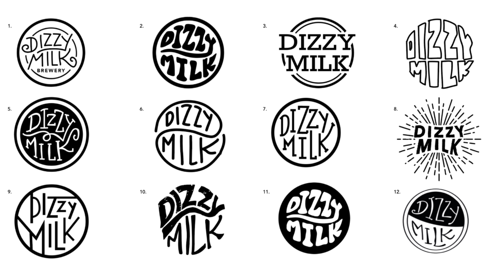
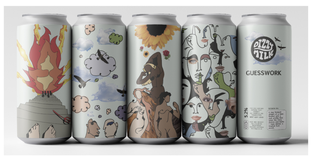
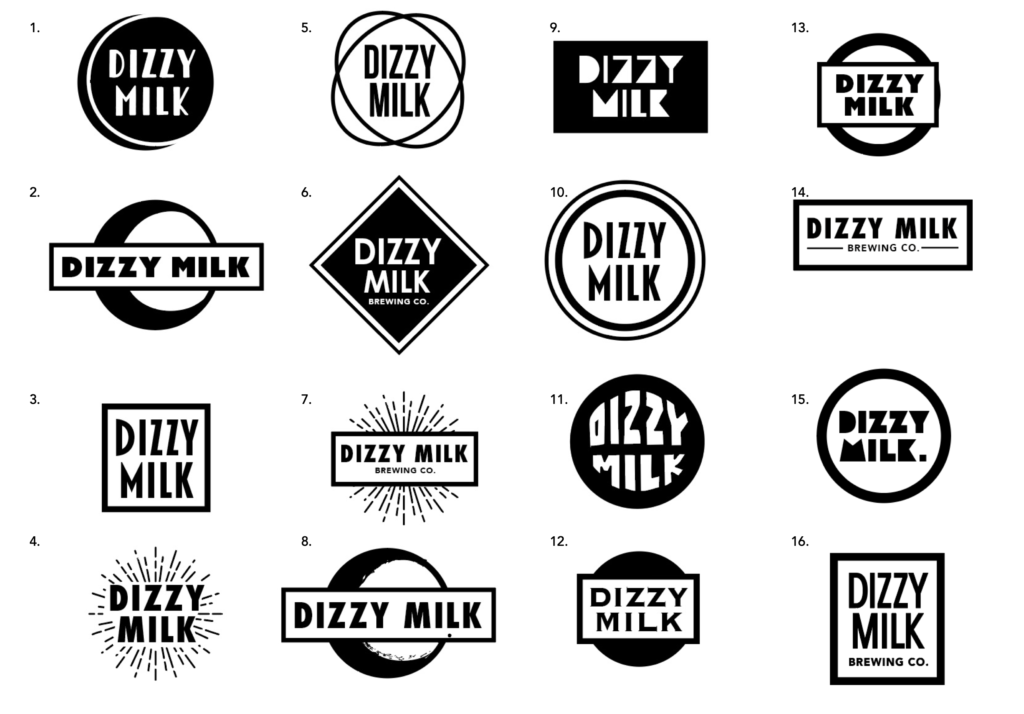
Due to the visually exciting and bold artwork used in Issy and Harvin’s can designs, the clients retracted their previous suggestions and expressed that a more simple logo would work best for Dizzy Milk, so as not to distract from or clash with the artwork. Anya therefore created a series of logos which featured more simple typography and visual elements, such as solid circular or rectangular borders. These can be seen from below, where both the logo designs and can designs went through another round of iteration, with the clients wanting to see one final extra round of iteration for each concept of beer can design, before informing us of which concept was to be taken forward. Issy’s artistic concepts, began to introduce photography which was integrated in and around the different illustrations for the cans, providing a successful balance in terms of the cans overall design. Harvins utopian concepts focused on adding small design elements to the cans such as the ‘El Secret’ beer flavour that used a textured background to represent an undercover like design theme, whilst these designs also looked at introducing playful design styles especially to the information on the back of the can.
First iteration of illustrative can designs.Second iteration of can designs in a futuristic style.Logo development with a stronger focus on typography.
“We are finding it near impossible to choose between the two to take one forward for the next stage” – Ash Steadman, client.
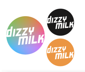
Dizzy Milk logo chosen by the clients.
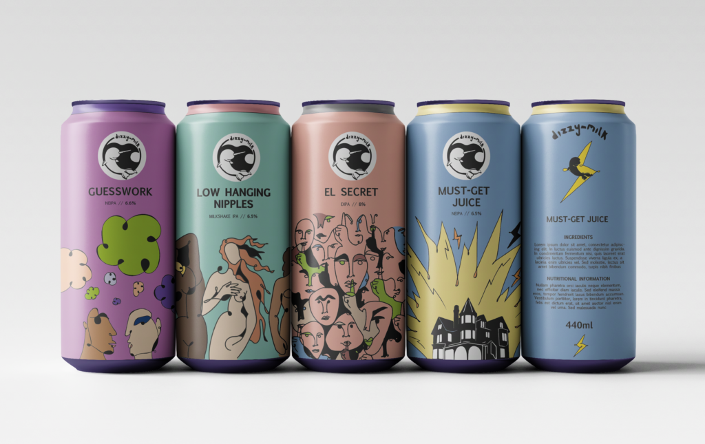
After a lengthy delay, due to the clients taking their time on choosing a concept to progress and go forward with, a decision was finally reached on which concept to take forward. Our clients expressed that they were really impressed with all of the new iterations of can and logo designs, however they chose Issy’s line-work based cans to move forward in the project, as they mentioned that Harvin’s designs were quite similar to an existing brewery; Beavertown. With both designs perfectly viable for craft beers, the clients saw Issy’s designs having the advantage of standing out, in an already crowded craft beer market. From a selection of further refined logo concepts, they also chose one particular favourite to be used in the final set of can designs, shown below, due to its prominence and how it stood out.
Iteration of cans with photography incorporated.
“We really appreciate all of the amazing work that has gone into this round of revisions. Both iterations are great and worthy of being a beer brand’s design. We have loved watching this and all three of your styles evolve throughout the process.” – Jack Gillespie, client.
Exploring printing finishes
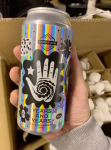
The clients had been interested in exploring and researching different types of print finishes which could also be explored such as the use of holographic printing. The clients emailed and informed us that they had been in contact with a company of their possibility of a holographic printing finish following Ash’s discussion with several printers. They expressed how they wanted to showcase the original dizzy milk logo having a holographic printing effect added to it.
The clients highlighted that considering print finishes would be great in terms of further expressing the creative possibilities with the can designs. We learned about the two methods at which a holographic effect could be applied. The first of which, is where the whole label is applied with a holographic finish (Basqueland), whilst the other (Otherhalf) showcases where the holographic effect could be applied in specific areas like a spot UV, in combination with a matte effect. The Basqueland beer label showcases how on a metallic surface, a holographic effect works particularly well, as seen from the image attached below.From this, the clients were interested to see what the possibilities of a finish such as this would be and were keen to know what the departments print studio would think of a finish such as this. The team organised a meeting following this with Geoff, to talk through the possibilities about a finish such as this. Following on from this, Geoff was able to provide us with the details about a company known as the labelmakers, who I would call to find out more details about the process about holographic printing. As the team continued in our creative journey, the idea of producing a holographic finish was no longer our focus, and instead the team focused on developing the can designs and logo. Although it was interesting for us to research and consider this print finish, we will ultimately leave it to the clients and supply them with the finalised files for them to then develop.
A holographic print finish explored by the clients.
Design refinements
With a series of can designs and a logo selected by the clients, we were then able to start making final refinements. Alterations needed to be made regarding the colour set of the cans, as our clients requested for us to explore some more coloured backgrounds of the artwork. We also needed to explore the placement of the logo and beer names, as well as the arrangement of the information for the backs of the cans.
Experimenting with different layouts for the back of the can.
We explored the possibility of including a white panel across the top of the cans, allowing for the logo to be placed alongside the artwork without clashing with it, which was the case in our designs which had the logo placed directly against the artwork. Other ideas explored included continuing the linework of the illustrations into the white panel, as well as only featuring the logo and beer name on the back of the can, allowing for the unique illustration style to carry the main brand identity of Dizzy Milk. When presenting these ideas to the clients, they expressed that the white banner including illustration linework was their desired concept. They also stated that they would prefer for the beer name to be on the back of the can to avoid obstructing the artwork, which they saw as the main selling point for the beer designs. The use of the banner, which the clients preferred worked well for the beer name to be placed on the back of the can, with the title sitting comfortably within the banner on the back facing side.
Beer can designs with name of flavour and logo on front of can .Beer can designs with logo and flavour on back.Beer can designs with white/ black bands to display the logo.
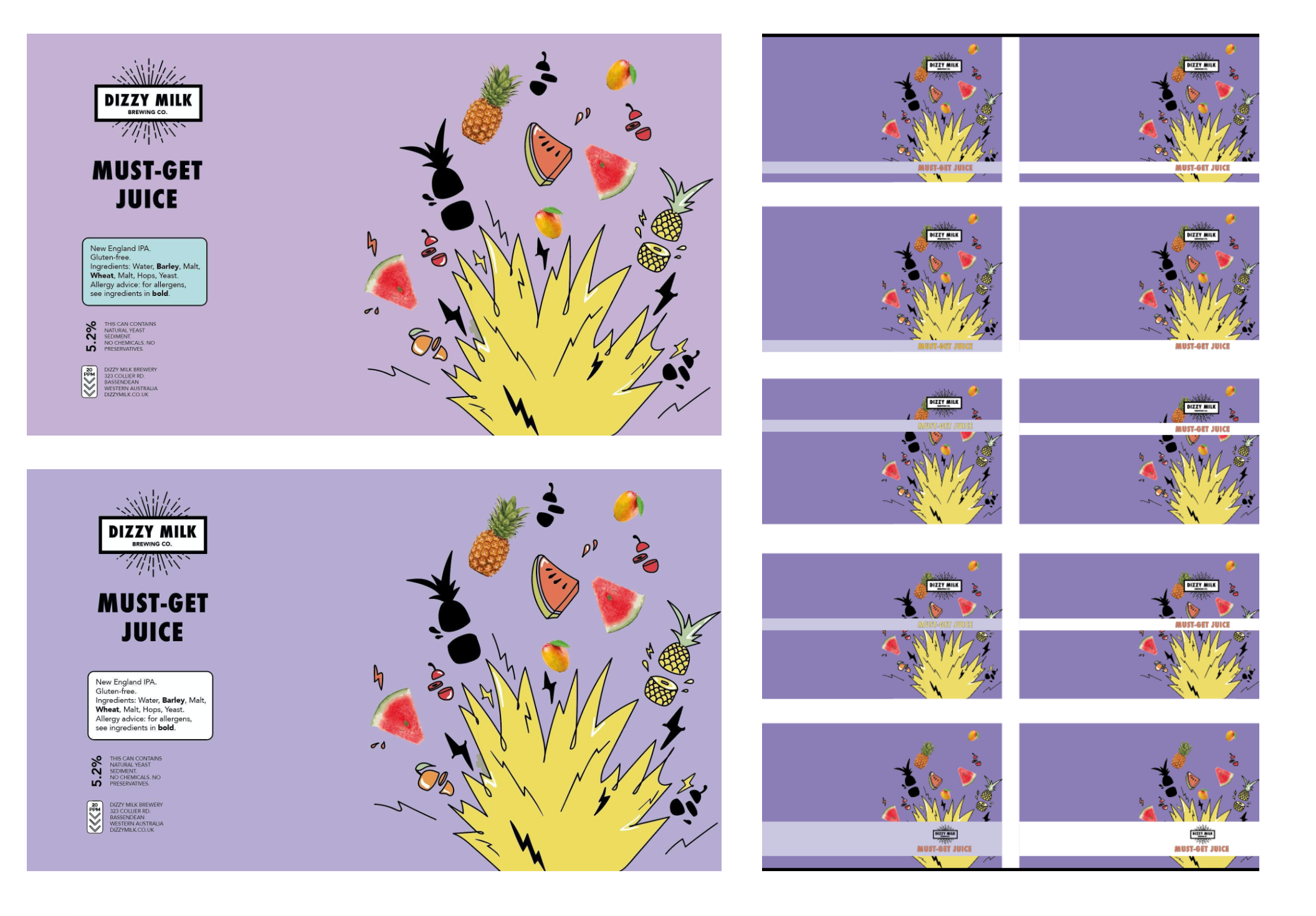
Our last round of refinements therefore included positioning the beer name, beer descriptions and ingredients comfortably on the back section of the label, printing the labels off to adjust the type-size used for the written content on the back of the cans to ensure suitable legibility, as well as cleaning up and finalising the artwork and setting the black parts of the label design to over-print, to ensure our files were as press-ready as possible and ready for delivery to our clients.
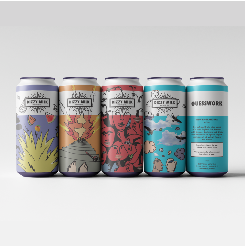
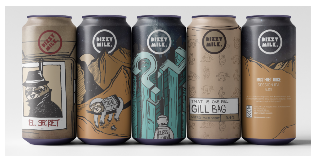
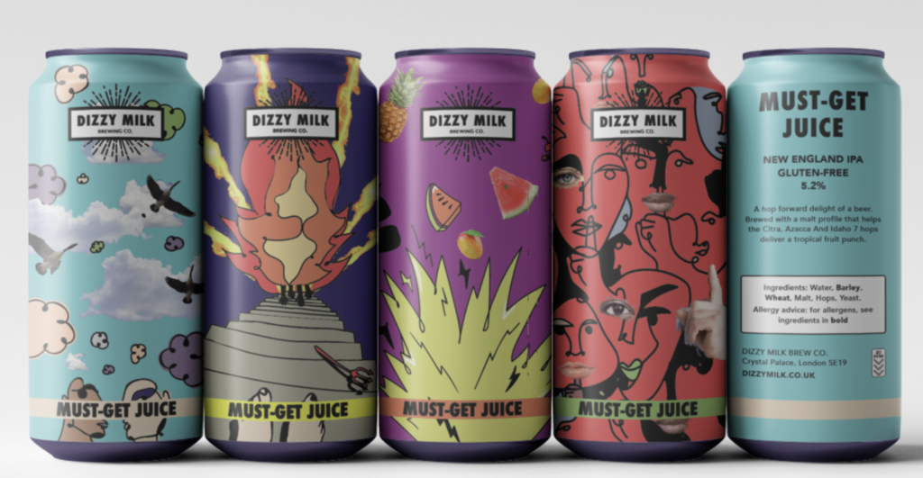
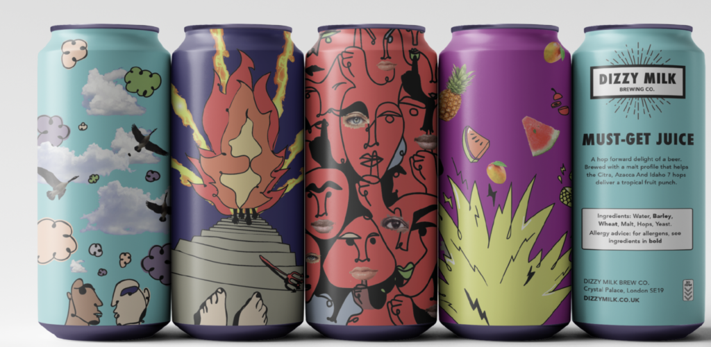
The final beer labels
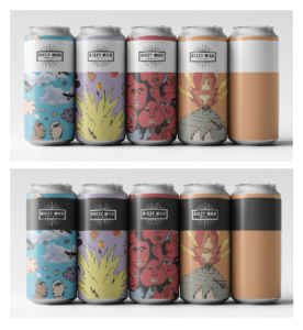
Following a thorough process of exploring several possibilities of layout for the design concepts, our finalised labels for four of Dizzy Milk’s craft beers, can be seen from below, that were exported once all final tweaks and adjustments had been made in the aforementioned section.
Beer can designs featuring white band with continued illustration, approved by the clients as the final design.
An honest reflection
When reflecting upon the job as a whole, working on a project such as this was a fun and intriguing experience throughout and as a team, none of us had experienced a job quite like this before. In reflection of the job however, it would have been nice to have seen the full realisation of the job, seeing the labels we had designed go to print and be wrapped around a can of Dizzy Milk. Whilst we did supply our clients with these designs which they could take forward, it was a shame in reflection, that we could not quite take the labels to the next stage, where they are printed and could have a range of different finishes applied to them.
Whilst the project started extremely quickly with the initial quick turnaround for the job, several delays throughout the project seemed to curtail the progression of the job, with delays on the clients side.
Issy
“As this was my first Real Job, I was excited to get started in designing for real clients. By completing this job, I now have more confidence when talking to clients, and feel comfortable and confident enough to ask lots of questions. I have really enjoyed creating beer can designs for Dizzy Milk, and hope that they are more than satisfied with our final outcome.”
Harvin
“Designing for the Dizzy Milk Brew Co. has taught me that the need to set strict deadlines in place is a must. It was frustrating that the project ultimately drifted when it started off so promisingly with a very quick turnaround.”
Anya
“This project has taught me the importance of sticking to the original design schedule of a project as much as possible. I have really enjoyed working on this brief, particularly the ideation stage where we were able to explore fun and exciting design concepts.”