
Background
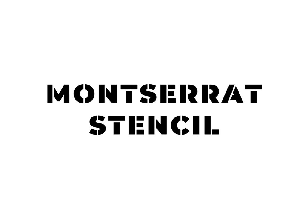
CAFOD is a Catholic aid charity in England and Wales. Their global Church network is one of the largest in the world. Funded by the Catholic community, the charity works to alleviate poverty in developing nations. Their brand identity uses the typeface Montserrat in all of their communications. The charity were seeking to expand their supporters for their emergency funding by developing a separate sub brand for the Emergency Response Team outputs (for both in print and online). Their design team decided they wanted a stencil version of Montserrat to use in their Emergency Response communications.
Restated brief
The CAFOD design team was requesting to adapt Montserrat into a stencil in the weights Black and Regular. They had permission to do so from the Argentinian font designer, Julietta Ulanovsky who initially created Montserrat (as long as it is strictly for CAFOD use). The stencil fonts will be use at some smaller sizes but will predominately be used for large headings.
Before starting this project, I had a meeting with two members of CAFOD’s design team at their offices. As preparation, they had made their own attempt at a version of a stencil . This was invaluable as they pointed out some the more challenging glyphs presented in this brief. The client and I discussed these glyphs at length in the our meeting; they will be elaborate further in the next section of this report. In this meeting there was also talk about the widths of the bridges. We concluded that it was something that needed further exploration within this project. There was also brief talk about having a version with fuzzy edges to make it look like it had been actually spray painted (see image below). But both the design team and I present it may not be the kind of look CAFOD really wanted in reality. These initial drafts formed the basis of my first attempts.


During the meeting, I asked whether they were interested in any accented characters. They later got back to me with the requested characters stating it was not necessary to make all glyphs with additional accents, but to make some accents as individual glyphs just in case they needed them at any point. Completing a full set of accented glyphs myself may be something I’ll revisit over the summer following this project.


The client and I agreed to organise two dates where I would send through updates about my progress. In these email exchanges, my main client contact with CAFOD, Roland, would circulate my work with the rest of the design team and send me any feedback. I also had these updates approved my supervisor before I sent them.
I had never made a useable type like this before. And more specifically I have never used the software Glyph before. So there was definitely a learning curve there becoming accustom with a new software. I’d made some stencil typography art in the past with ink but I didn’t have experience making them digitally for this kind of context for a real client.
Research
I started my research by briefly looking into the history of stencil typefaces. The art of stencilling itself has been around for thousands of years; hand stencils have been found in caves by blowing pigment over a hand held against a wall. But in terms of typography in modern use, stencils are either used in graffiti or by official organisations likes the military, utility companies, or governments. In the latter official use, it is placed to label objects, vehicles, or locations with a quick and clear application. When objects are labelled using a templated lettering like this, it makes it easier to identify their affiliation or source. This is the kind of intent CAFOD have with stencilling the typeface they use on all their visual outputs for their emergency response communications.
In general, I also researched a lot of san serif stencil typefaces for visual inspiration. It interesting to see different approaches to the idea. Some cut through glyphs vertically while others chose the horizontally or diagonal. I created a visual library to reference if I needed and continued build on that library throughout the project.


Before diving further in to this discussion, I should preface it with key terminology around stencils and stencilling. When you look a stencil design, you will usually see bridges which are the narrow sections he cut through a letter. Then there are islands which, in typographic terms, refers to things like counters. These are often connected by bridges to the rest of the negative space to stop the island from falling out of the design completely or becoming damaged with practical use.
Ideation & design development
I managed to open the original typeface in Glyphs, which was invaluable as it meant I could take the proportions of the cap height and the kerning of all the individual glyphs and apply them a new file. As this project focused on adapting an existing face, I knew that these sizes didn’t necessarily need to change. Within my workflow throughout the project, I had the original Montserrat weight I needed open in Glyphs. This was to confirm these sizes and positions when moving my Illustrator vectors in to the new Glyphs file.
I wanted to put the clients initial drafts to one side for my very first attempt just to consider what my instinctual approach would be. That way I could get some rich feedback on my own typography practices from supervisor. I started my work by thinking about my library of references and making my first run focus on just the 26 Latin letters in the Black weight for now. I decided to start with this weight due to the wider thickness making the bridges more obvious when compared to the Regular. In my initial attempt, I tried to keep all of the bridges vertical. I wanted to see how it would look if I concentrated on trying to keep all the cuts mostly consistent throughout.

There were a lot of flaws with this first attempt. Personally I felt that having nearly all the characters with vertical bridges didn’t feel correct at all. This is a particular issue in the K, V, W, and X. My supervisor informed me that next time the bridges should follow the axis of the strokes and make the direction of the bridges be consistent. This is similar to the approach made in the client’s drafts. Also in this first attempt, I felt that the widths of the bridges were too wide. So in my second attempt, I made the bridges thinner and followed the advice given to me about by my supervisor. See image below.

Some letters provided their own individual challenges. The Q in particular needed some serious surgery to adapt it into a stencil. In the original set the Q has a long tail that swoops underneath itself. However, adding a stencil bridge through the centre of this character would ruin the design of this glyph. This meant changing the tail so that is was more angular and moving it so that it didn’t start before the first half.

After sending this work to the client, they came back and said that they felt that the bridges on both versions were too thin. This was interesting feedback to me because I initially thought I made them too wide. But, for their needs, the client felt that they were too thin. I discussed this with my supervisor and he said that I should try and make the widths in proportion to the weight as a starting point. Then make minor adjustments by eye. From the client and supervisor feedback, I decided made a scale of different possible widths to compare. My first attempt was number five and my second attempt was number three.

Also following this feedback I considered is all the possible combinations of positions for stencil bridges. Knowing I improved some characters by embracing the flow of the stroke, I was curious to see if improvements could be made across the entire set. On a piece of paper I printed all the entire alphabet and used a pen to roughly mark the position where I could make a bridge. From this I found that in nearly all characters, placing bridges on the horizontal was inappropriate for Montserrat Black. But for some letters such as the J or the T, it is a welcome variation.


One of the other challenging letters was the S. I wasn’t really a fan of the approaches made in my clients drafts. But I had also received some feedback from my first update saying that the S was a little uncomfortable. Placing bridges all the way through the centre S seem to disrupt the flow of the glyph. The bridge cuts the S into three separate places. I tried multiple variations of this letter to consider the options better. In the end, my solution followed the clients original attempt while also improving upon the idea. The new S followed the vertical whilst separating the letter in to less pieces (S on the far left in image below).

In the second update, I provided the client two versions with varying widths of bridges. These versions would follow number six and eight on my scale. Number six is just less than a quarter of the stroke weight and number eight is just less than a third of the stroke weight. After creating these two trial versions, I sent both to the client in .ttf files so that they could test the typefaces in their documents so that they could make a more informed choice.


In both of these versions I created the numerals, punctuation and symbols. Most of the punctuation didn’t need stencilling. The only one that did need attention however was the number sign. I tried a similar approach to the letters by trying every conceivable approach for bridge placement, this time in Illustrator rather than being by hand. In both the symbols and the numerals there were a few challenges, particularly when considering the width of the bridge. The numerals could be changed more easily for both widths created for the client to try. But due to the intricate nature for some of the symbols, they needed their own treatment.


I also made the Regular for this update. Compared to the Black, this weight was hardly a challenge. I measured the width of the bridge by using the width of the stroke itself. Due to the amount of white space that surrounds these thinner letters, it was the perfect size relative to the shape of the character. I applied the same approach to the positions of the bridges in the Black to this weight too. This version actually worked out very well. It didn’t need much experimentation as it was much easier to work with and most of the experimentation in the bridge placements had already been completed doing the Black weight.

The feedback from both my supervisor and client was very positive after making these additions and adjustments. My supervisor commented that the consistent angles were much more plausible here and my handling of the J, 1, and 4 was very good even though they can be tricky. My client tested the typefaces on their physical communications as well as on their digitals ones (for web and phone screens). They decided to choose the thinner bridge of the two. They also requested adjustments to the positions of the bridges on the G, K and 7. The G needed adjustments to the bridge position due to the close resemblance to the C. A critical issue for them as both letters occur in the most important word they would be using – “EMERGENCY”. The K and 7 were simply stylistic preferences.


Final design


A few weeks after I sent the final files off to the client, they sent me an envelope with the printed work where the new typeface has been used. This included a leaflet, some letters and a donation envelope. All of which regarding their Coronavirus appeal. My client informed me that these pieces of print have been distributed to around 100,000 addresses. The typeface will of course continue to be used for other emergency appeals in the future.


Reflections
This has probably been one of my favourite projects that I’ve completed during my time at Reading. I genuinely had fun making this typeface. I found the feedback really interesting; I learnt more about typographic design along the way: and my client, Roland, was probably one of the nicest clients I have ever worked for which was it’s own huge bonus. I took this job because the third year Type Design module was cancelled. I’m glad I took up the opportunity to finish my degree with something like this now under my belt.
In terms of critiquing my own practices, I still have further to go in managing my time management which affected this project while I was juggling other universtiy work. With the design of the typeface overall, I feel I did rather well considering it was my first time making a typeface with vectors. However, this was merely adapting an existing typeface rather than making one from scratch. Designing something like that would be a completely different experience, but one I would still love to try at some point in my design career. In the beginning I was nervous about learning a new software. But Glyphs was actually very intuitive. This experience reminds me that I shouldn’t be nervous to learn new software or new skills more generally, you just need to put the hours in.
I would love to hear some critical opinions on my work from more typographers. My supervisor has been an wonderful guide for me throughout. I would simply be curious to know what other people in the field thought of my efforts. In addition to their opinions on stencil adaptions of existing typefaces more generally.
At the time of writing this, COVID-19 is still quite a prevalent issue. It’s been gratifying knowing that I had played a minor role to assist this charity in their aid efforts. I clearly can’t take all the credit, but it’s nice knowing that it may have helped in it’s own way. Even though I am not Catholic I think they’re a really great charity. From working with them, I even made my own small donation to their coronavirus fund.