
Brief
Every year, our department, Typography & Graphic Communication, hosts a degree show which showcases the best work from undergraduates and postgraduates. Originally, our brief was the same as in previous years, to produce a visual identity and supporting promotional material for our physical degree show. However, due to the Covid-19 pandemic, our physical degree show had to be cancelled which provided us with our second brief; to create a visual identity for our online degree show with supporting promotional material.
Originally, Connie, Sarah and I were the invite team and we were in charge of designing and producing the physical invitation as well as leading the formation of our concept and visualising it. This disbanded due to the degree shows priorities changing to adapt to our new brief. This led to Sarah joining the web team and Connie joining the social media team. I took on the role of developing the MailChimp e-invitations as these were our new version of the printed invites. As well as this I continued to refine the concept and write a blog post for typography.network about our degree show.
Aims
Our aims were still relevant to the new brief and led all design development in the correct direction. They were as follows:
- To work collaboratively with other typography students helping to design aspects for the degree show.
- Generate awareness of the event with e-invites.
- Create further collateral that enhances the degree show experience for students and visitors.
Our team
As our full degree show team consisted of nine people, we split into three groups: website team, social media team and invite team. This allowed everyone to have focused and clearly defined roles and aims. Aanand became the team leader of the degree show and he coordinated between the teams. Nine people is a lot for one team which did lead to some communication challenges at times especially when we were not able to have meetings in person. We did have physical meetings once a week which kept us on task and motivated. This became an invaluable time for getting feedback and generating ideas. As the smaller invite team, we would also have regular meetings to discuss progress and set ourselves individual tasks for the week. As well as this we had a large group chat, which became highly used when we could not have our physical weekly meetings. This was useful as it often warranted quick replies although it was not the same as having face-to-face meetings. We did have several video meetings which were exceedingly useful as they gave us a time to hear progress reports from the other sub-teams and gain an overall picture of the degree shows development.
Since taking on independent projects, having other people critique what I had been working on has become an effective way to find solutions and develop designs further. Communication at this point became more vital than previously. I had to make sure that visually all my design work adhered to the visual identity which continued to develop once the website became the prominent feature of our show.
Research
We explored the archive of previous degree show invites from our department. These examples provided the information needed on our invites. We felt that the previous years were really strong as it encapsulated the department and its values because of the colour schemes and materiality. We knew to achieve the same high standard we would have to take a different approach. We also looked at past degree shows from other universities which gave us new ideas and approaches that had not been done in our department before.
Spending time creating visual mood boards that we presented to the group gave us an initial direction for the visual design of the invite. As these design ideas developed, we even started to explore options with DPS about the possible physicality of the invite.
When developing our concept we focused heavily on capturing our ‘year group’s personality’ as well as what separates us from other courses. We wanted there to be reason and purpose behind our design choices as we were very conscious our choices had to be reflective of everyone in the year and our department’s reputation.

Concept, visual identity & physical invitation

I found this stage to be one of the more exciting phases of the project as there were so many ideas being generated. This stage happened when there was still a planned physical degree show as a result we developed our concept in tangent with the physical printed invite. Together these influenced our visual identity which evolved to become our final aesthetic and concept which can be seen in all our final outcomes from the website to the Instagram to the blogpost.
Figure 3 shows the chronological development of our printed invites. It documents our early ideas which explore a range of concepts to later developments which shows versions of what would have been our final physical invite.

Our concept boilerplate text behind our degree show design ended up being: “Communication has been the foundation of our development as designers. At Reading, we have built our design skills in many areas. In everything we have done, punctuation – graphic and typographic – has helped form our designing and refine our writing, bringing meaning, nuance and communication. Attention to detail defines our work: it is more than just A–Z.”
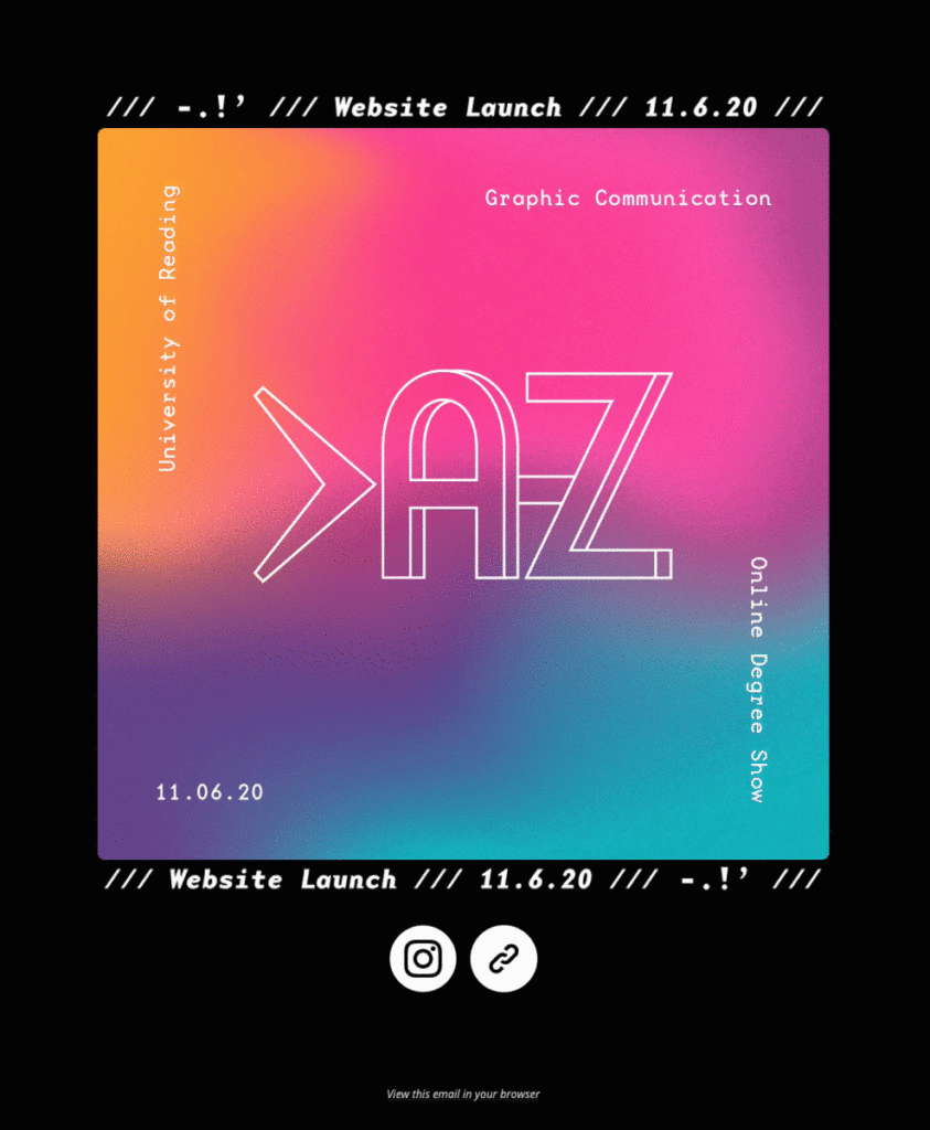
Our degree show is named >A–Z as it sums up our concept. Our final visuals heavily involve a vibrant gradient which originated from the idea that our printed invite which was going to contain holographic elements. The gradient was originally mimicking this physical attribute. We all agreed on the typeface, Base Mono, early on in the process as it echoed the functionality portrayed by our concept.

Blog post
A blog post was needed for the typography network to announce our degree show and website. This presented a challenge as it was here that the concept had to be perfectly communicated in a written form. Our first version read unconvincingly as there were flaws in our connection between punctuation and graphic design. Having responded to feedback, we were able to write a version of our concept that was more positive in spirit and appropriate for how the department wants to be portrayed.
I created a collage from multiple students work that served as a preview of what people would expect to find from our website. It accompanied the written concept and was quite playful in nature. It worked better than just showing a few people’s works because it was more interesting and inclusive of the whole year group.
MailChimp
It was originally decided that we wanted two MailChimp emails to be sent out. The first one announced the launch of our website and was sent one week before the launch. The second was sent on the day of the launch. However, due to IT issue with the website’s URL, we were not able to send the first invite out until later than planned so we took the decision to only send out one invite, on the day of the launch. Our degree show had already been announced through our Instagram account which became our main source of communication with the outside design community.
I found there was a learning curve when starting to use mail chimp as it has many design limitations. There is a massive difference in design quality between my first designs (fig. 5) and the final ones as I learnt how to work around the restrictions. The bulk of the two campaigns are images/gifs created with all the correct information, font and colours which helped to keep it visually on brand. I found previewing the email in a test email allowed me to properly gauge what the person receiving it would see. I gained feedback from the whole group through the group chat and when we had video meetings. I felt as though the purpose of these changed as our degree show changed; they become notifications rather than invitations.

The emailing list presented another challenge as we had to have the consent of a person before being allowed to send them a mass email. An online form was created which allowed people to enter their contact details and gave us permission to send them our email. We advertised this link heavily on the degree show and departments Instagram. As well as this I shared the link with people on LinkedIn and it has been shared on our profiles.

Reflection
As a design team and year group, we have faced a lot of challenges and disappointment from our degree show being cancelled. However, I believe we have been able to make the best out of a bad situation by refocusing on our online presence and reaching out to our audience this way.
Whilst it was disheartening that a lot of the preliminary design work we had done for the physical invite was never used, it was still a crucial stage in development for the entire degree show. It helped us develop our visual aesthetic and the concept behind it.
Overall, I have really enjoyed being able to see the diversity in the year group’s work from our showcasing. It has been rewarding to be able to work on this as the concluding project for my degree as we are still able to showcase everything we have worked towards over the past three years.