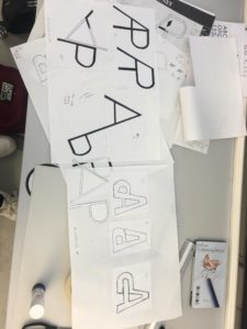
During our Integrated design methods technical session, we were practising using adobe InDesign and started out by replicating a classic Penguin Book cover. This really helped me get to know my way around the software as it was not something I was previously familiar with. It took a little time and patience for me to get thew hang of it, but I feel like I made significant progress in familiarising myself with adobe programmes. We were then asked to use what we had learnt from this session and apply it to our own version of a Penguin Book cover. This could be whatever we chose, but we had to make it ‘clever’. I chose to design a penguin themed book cover for ‘Fifty shades of Grey’ as I thought this would be an interesting theme. I achieved this by using the base of the classic penguin book cover that we created in this session and then began to change each section, take away parts and add new elements. I replaced the penguin books cloud logo at the top of the page with an image of lips, to echo the erotic and romantic nature of the book. In addition, I replaced the typical penguin icon at the bottom with a couple of romantic penguins as I thought this was a fun play on the original logo.
I found this task to be incredibly useful on developing my digital design skills and it gave me the freedom to create a playful design and have a bit of fun while experimenting and learning. There’s still a lot I need to learn when it comes to the technicalities of using InDesign but I already feel a lot more confident in working with adobe softwares as I had to use photoshop as well in order to create and cut out some of the images.


 I am new to all Adobe apps, so this was a fun experience, trying out the tools available to create each element of my book cover. I am pleased with my final outcome, however there are a few areas that I could improve on. I look forward to gaining a better understanding of InDesign and other Adobe apps in the future.
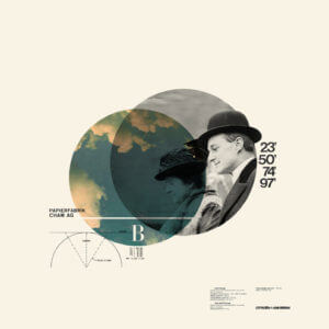
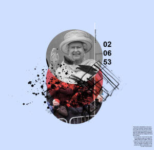 Instead of a blue circle, it changes to red to give a more aggressive tone. The blue background compliments the red and makes it more dynamic as it’s darker. Mark making were used to replaced the measurements to represent more chaos and irregularity. The photos of the fans were replaced with paparazzi to represent the invasion of privacy and loudness that they represent.