
reading film theatre flyer v3 pdf
In an A5 format, the Reading film festival flyer had to demonstrate the relevant information in a small space, which I found particularly challenging using this space efficiently to a positive aesthetical outcome. I used a dark blue colour background so that the black text could still be seen and understood. The age censor of the movies I wanted to be the most obvious to the audience and seen before anything else, this way, the audience know which movies they are allowed to watch i.e. If they are children they can watch; U, PG, or in some cases 12 if they are accompanied by an adult. The serif font , minion pro,(a mature font)shows information more orientated towards older people such as the director of the film , actors and where it is showing, the sort of info a child would arguably not be too concerned about past the title which is in serif , Acumin Variable Concept. Overall this flyer does the job it needs to do displaying the information in a format readable. However, I do believe it looks a bit squashed together and would benefit from more space by maybe using a smaller font and general layout the sheet. It also is fairly bland, aside from the 2 colour restriction, including black , I would like to have included more texture to create a more interesting looking design .
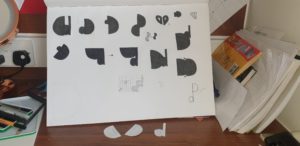
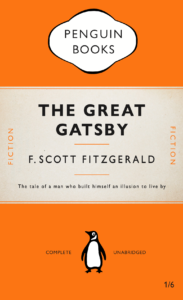
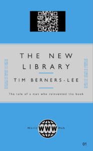
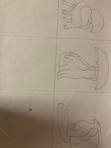
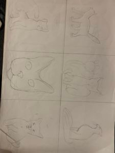
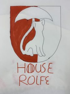 The project is to design a present for a classmate based on their interest and see how we can develop it with random words.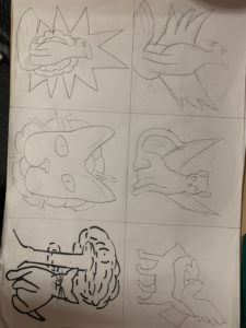
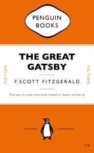

 I am new to all Adobe apps, so this was a fun experience, trying out the tools available to create each element of my book cover. I am pleased with my final outcome, however there are a few areas that I could improve on. I look forward to gaining a better understanding of InDesign and other Adobe apps in the future.
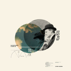
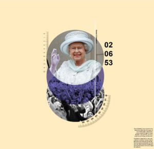
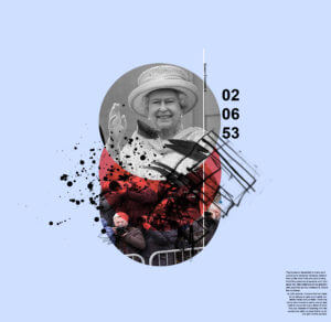 Instead of a blue circle, it changes to red to give a more aggressive tone. The blue background compliments the red and makes it more dynamic as it’s darker. Mark making were used to replaced the measurements to represent more chaos and irregularity. The photos of the fans were replaced with paparazzi to represent the invasion of privacy and loudness that they represent.