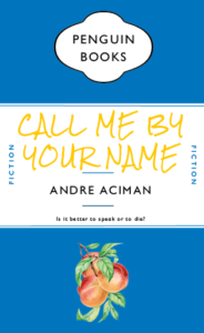
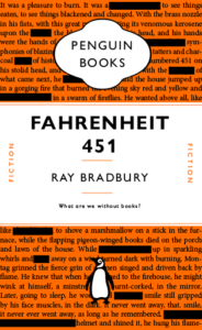
Initially we recreated a cover of the Great Gatsby in classic penguin style, I then used this template to create covers for some other books. I did however chnage some aspects of the template to better fit with the book contents. The Norwegian Wood cover is a deep red in fitting with the orignal cover, Call Me By Your Name uses a royal blue for the same reason. In this cover however I changed the penguin logo to a peach, the peach is a symbolic part of the book with a lot of relevance; I also used a font similar to the one used on the latest edition covers of the novel. My favourite design is the Fahrenheit 451 design, this book is an incredible look at censorship and the importance of literature in our society, i therefore have used text from the first page of novel but censored some of the words. I have chosen to keep the original penguin orange because it had good connotational links to Fahrenheit 451. 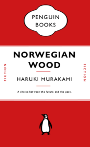
Category: TY1DP1
Work by Part 1 students as part of their ‘Design Practice’ module.
Transmogrification of my initials
Creating a monogram
Kim’s project
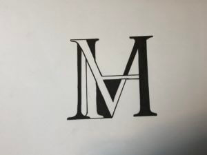
In today’s brief, our task was simple: to create a graphic representation of our initials. I began by sketching out some initial ideas using the Garamond font, as I liked the serifs that this typeface contained. I brainstormed some ways of how I could combine my initials ‘M’ and ‘H’. These two letters have similar forms, so I tested out different ways of intertwining them in an interesting way. I found that drawing the ‘M’ and ‘H’ separately and then photocopying them in different sizes allowed me to quickly experiment by cutting them out and rotating and shifting the letters to find a monogram that worked, before sticking them onto my page as a series of experiments. This was an efficient and effective way to work for me and produced quick results, rather than sketching out the letters each time to come up with a different design.

After having chosen the compositions that I liked best, I decided to develop my ideas further with use of colour. One idea I tried was inverting the white background and black letterform to create black negative space and a white monogram. I liked the finished look of this, and then proceeded to try a combination of black and white negative space, switching between the two in different sections of the letterform. I tried this with coloured pens as well, which i liked, but not as much as the black and white one. So, to finish, I drew out the black and white version in a slightly bigger size to produce a final, neat piece.
I really enjoyed this task and the way it encouraged me to think about design in simple letterforms, I effectively developed and created my own glyph based on my two initials which I thought was really fun and creative!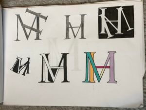
My name and finding ways to shape it
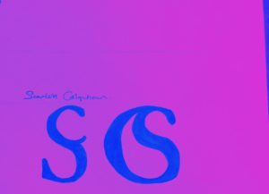
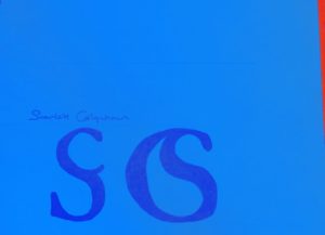
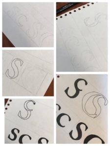

Creating a monogram. Today we took the time to experiment with making a monogram out of our initials, my initials being S and C, meant I did at times find it difficult to draw, and keep as clean cut at possible, however the curves in both letters meant I had a wide range of experimentation to do fitting the letters with each other. I started by just sketching the letters themselves and becoming familiar with their shapes. I drew them as both lower case and upper case. I then did a load of rough sketches on a piece of paper on how they could fit into one symbol and decided on two designs to make a final clean copy of.
I chose two designs, and each one containing where the S or C was large (being the letter that had the hierarchy in the design). The first design has a capital S, with a lowercase c in the top of it, I liked this design for its simplicity, and at first glace it almost looks like a normal S. The second design was a large C with the S fitted inside of it, I think this design was my favourite, just for how well the two letters fitted together, and I feel like it would be a good logo for a company to do with water (just as it looks like a drop of water in the centre). I manipulated the S slightly to make it fit better, and cut off part of its tail, but overall was quite happy with the outcome.
Lastly I experimented with a bit of colour using an app on my phone, just to see how they would look with different colour choices, but I still personally prefer the black and white.
From Political to Social issues
For this project I split my collection into 5 different categories:
- Magazines
- Posters
- Social distancing
- PDF downloads
- Covid-19 street art
For magazines I focused on Vogue and Time, as I found that they both covered controversial views on covid-19. I particularly liked these two covers from Times. (I found both images below in the vault for Times, under covers from 2020 https://time.com/vault/year/2020/)


If you are following the news at the moment you will find that America seems to believe that they are immune to covid-19. Or a better way to put it, is that it is a myth (according to their president Mr Trump).
I found the Trump cover ironic as when it was published (14th May 2020) it states “over the past 14 weeks 84,000 Americans died of Covid-19.” Yet America did not seem to be doing much to slow down the death toll. I found this magazine cover portraying the political side of covid-19. Bar the controversial message the image is portraying. I particularly liked the graphics and typography that was being used. It’s a fairly simple image with type and an illustration of Donald Trump with a mask (that is not being used affectively), yet it is clever. I like the message of the mask not cover his mouth, as he believed masks to be stupid; yet we all sat here wearing them everyday.
The second magazine cover, covers a social issue during the pandemic. Of the youths of this time and how this will shape their life forever. I found this one a good one to use, as we right now are in education and we are the youth being affective by this. The photographer Hannah, has been virtually photographing her classmates in quarantine. This imagery was done by a student which is why I think it is a good one to study. The issue Hannah wanted to portray was that she found that she was stuck in limbo due to covid-19. These years are the ones she’s meant to be transitioning into adult hood, yet she’s feels like she’s going backwards being stuck in her childhood bedroom for the past several months. I found this topic interesting as I don’t think its normally portrayed. I found a lot of social distancing and instructions graphics for covid. But this was the only ‘generation pandemic that I found. Which you would think there would be more off with the amount of students and people being effected in education by this.
For both these topics, I believe that the target audience is meant to be different, yet has ended up the same. They are both a cry for help to the general public of this issues following this pandemic; outside of the deaths.
Pairing ‘m’ and ‘b’
For this brief I wanted to experiment with different ways my two initials could be joined together to create a monogram. This was an interesting task as I felt as though it forced me to look closely at the specific details of letter forms. I wanted to keep my design simple and I wanted the letters still to be legible despite the brief stating that it was fine if they weren’t. I felt as though if I joined the letters in a way that made them no longer legible then the monogram would lose meaning. I developed my idea by playing around with colour and sizing of the two letters, this resulted in a few different outcomes that I was pleased with.
bunny’s penguin book cover 2
my own design for a penguin book cover, based on The rocky horror picture show.
Pinocchio
We all know Penguin books, but how much work goes into the design?
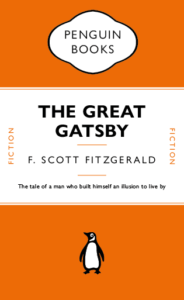
I for one, never realised that the lines between the headers weren’t just added in afterwards, they’re attached to the text itself and change with the text. This honestly surprised me a lot. I also did not know there were hidden characters used every time I write something, e.g. space (a dot placed near the top of the x-height). Just working on this cover made me appreciate just how much actually goes into the formatting of a book cover design.
This made me want to try to recreate a children’s book in a similar style without all the flare and illustrations surrounding them typically. A childhood favourite of mine was always Pinocchio. I like the idea that lies are visible straight away, there’s no hiding them they’ll catch up to you. It’s the ideal book to strip back and recreate in this style.
Poster: Icon vs Typography
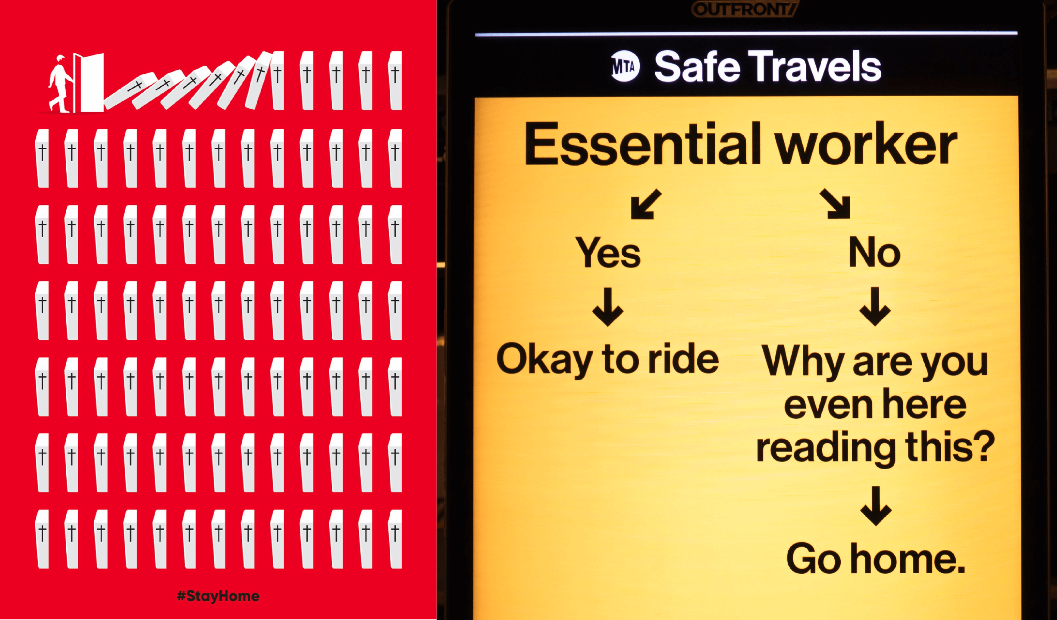
What are these posters trying to do?
These posters are designed to encourage people to stay at home to help stop the spread of COVID-19. In both of these designs they have chosen bright colours with strong connotations. Red is often associated with danger and yellow is associated with warning, particularly when combined with black. We also see that both are quite simple yet structured. There is a flow to both designs leading you to the same conclusion, but in two very different ways.
The red poster, titled ‘Stay Home’, has chosen a very stark way of conveying this message. Through focusing mostly on icons this very simply structured scene is almost graph like, implying the statistical impact of each person who chooses to endanger society when stepping out the front door. This poster has a very strong message, stay home or the knock on effects could be disastrous. I found this design to be quite shocking but massively impactful and effective. I especially like that they have chosen to include a very small amount of text at the very end; the two words say hardly anything and yet everything and they leave nothing to be questioned.
In contrast, the message to commuters is mostly text. We do have a few small icons to guide the reader but they are not necessarily the focal point in this design. I found this design to have much more attitude than the first. The choice of wording is very interesting, almost humorous in its bluntness, though I do not think this to be the intended effect. Similar to our first design it has a very straightforward message, unless you are an essential worker you should remain at home. However this poster is challenging the reader to confront their own actions in response to this pandemic whilst in the act. The use of a question here is quite provoking. Keeping the same typeface throughout, the reader is not distracted by decoration or overwhelmed by many different elements. I think it is in the simplicity of this design that its seriousness comes through.
Do different approaches produce different results?
I find the implied consequences in the first poster to provoke a stronger response in me than the second. I am not being told what to do or think but I am able to see and understand for myself how my role can affect the society in which I live and I think this greater understanding of context and consequence leaves a greater impression than the second poster which is correcting an action already taken.
References
Stay home. Image created by Barış Cihan Peşmen. Submitted for United Nations Global Call Out To Creatives – help stop the spread of COVID-19. Available at: https://unsplash.com/photos/jTK820WUr2k
Subway message for commuters. New York City, NY, USA. Available at: https://unsplash.com/photos/yCk_WyOdzAk
The end of Club Penguin R.I.P
Club Penguin is an online game that was loved and played by millions across the world, however, it sadly got shut down on March 29th, 2017. The tragedy left millions heartbroken as this game was what they loved playing. Many people sort out to create or find a new version of this beloved game. However, sadly the true club penguin could never be topped and replaced. 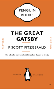
Wear a mask to stop the spread
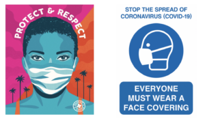
Our task for this project was to collect a wide range of communications relating to COVID-19. During this project, I learnt how to improve my searches on the internet to get the best and widest variety of results as I did the majority of my research online. I had discovered that the majority of the government official and NHS posters and signs were all in blue and white or yellow and black. The reason for this is most likely due to the NHS colours being blue and white and yellow and black signs used to stand out as they were usually associated with warning and poisonous signs. However, the issue is that they no longer stand out. I have found that we, as the consumers, have become accustomed to these warning signs now. They no longer grab our attention because we see them around so often.
In Los Angeles (L.A ) the mayor introduced an initiative called the L. A mask print project. They ask designers and artists from across L.A. to produce posters, like the one above on the left by Camilla Lonis at Studio Number One, they are then made available to be downloaded for free by local businesses and residents so that they can be put on display. I think these more creative and colourful posters work better as they’re much more noticeable than the government standard ones that we have now become accustomed to. Adding a face that’s not just a basic outline perhaps will make the message feel a lot more personal rather than robotic. If it feels more personal people are more likely to want to make a change and ultimately that’s what the creates of these posters want. they want people to make the decision for themselves to wear a mask, and usually, if it’s encouraged rather than enforced, you’ll get a better response, although this isn’t always the case.
I think it’s clear that the Losin poster is for a particular audience. People in L. A are known for there glamourous lifestyle, they also have a rather large art scene and so to grab the attention of the creative inclined, you need to put up posters and signs that are just as, if not more, creative and bold as they are. Whereas the Government official and NHS ones are for national use, therefore, need to be more neutral so to appeal to everyone. As the UK is also very multicultural and we have people from all over the world the signs need to be clear and concise on what they want from the public so everyone understands no matter their language. The decorative posters can sometimes have messages that are vague or have a double meaning.
