Category: Student work

A Penguin Book cover with a twist

During our Integrated design methods technical session, we were practising using adobe InDesign and started out by replicating a classic Penguin Book cover. This really helped me get to know my way around the software as it was not something I was previously familiar with. It took a little time and patience for me to get thew hang of it, but I feel like I made significant progress in familiarising myself with adobe programmes. We were then asked to use what we had learnt from this session and apply it to our own version of a Penguin Book cover. This could be whatever we chose, but we had to make it ‘clever’. I chose to design a penguin themed book cover for ‘Fifty shades of Grey’ as I thought this would be an interesting theme. I achieved this by using the base of the classic penguin book cover that we created in this session and then began to change each section, take away parts and add new elements. I replaced the penguin books cloud logo at the top of the page with an image of lips, to echo the erotic and romantic nature of the book. In addition, I replaced the typical penguin icon at the bottom with a couple of romantic penguins as I thought this was a fun play on the original logo.

I found this task to be incredibly useful on developing my digital design skills and it gave me the freedom to create a playful design and have a bit of fun while experimenting and learning. There’s still a lot I need to learn when it comes to the technicalities of using InDesign but I already feel a lot more confident in working with adobe softwares as I had to use photoshop as well in order to create and cut out some of the images.

Please mind the gap between your letters

Mind the gap

Gerry’s task 

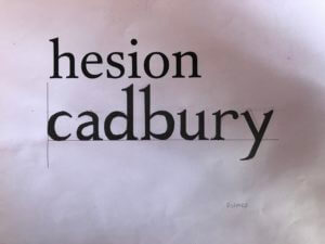
Gerry gave us two tasks for the day. The first was to look at the typeface that the word ‘hesion’ was written in for us, and to then imitate this and write ‘cadbury’ in the same font below. This was trickier than I thought as we had to imagine what the letters in ‘cadbury’ would look like, by using parts of the other letters in ‘hesion’ and analysing their shape, size and features. For example, one of the fonts had serifs and the other one didn’t, so I tried this task in both ways. I learnt that the most effective way for me to achieve the best outcome with my letters was to start by sketching out each letterform until it looked right. Then I would draw the outlines of each letter using a fine-liner and a ruler to sharpen the edges, and finally to fill in each shape using a thick marker pen. This way, I could achieve good, solid letterforms.

The afternoon task Gerry gave us was to fill in the gaps of letters which were only half printed and had missing parts. So we had to take what we could see from a section of each letter and use this to design the rest. There was some room to be creative, but we also had to make sure that the letters looked natural and each part blended in well to the other.

I liked this mini project, as it involved more hands-on sketching and enabled me to practice drawing different typefaces while encouraging me to look more closely at individual letters, rather than the font as a whole.

For someone who loves to travel

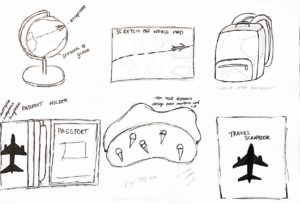
For Kim’s Project on Thursday we got into groups and learnt some interesting/unusual facts about each other. I learnt that my partner loved to travel. I decided to brainstorm and research ideal gifts that would be perfect for a frequent traveller to have and utilise. As seen in my sketches, I played around with mostly items you can take with you as you travel such as a backpack, a scrapbook, a sleep mask and more. I then looked at incorporating the second task into my designs which was to find a word from the random word list and see how I can add it into my designs. My first word was aeroplane and I experimented with how it would look and how I could make it fit in. I decided that the best design was the passport holder as I felt I could incorporate a lot into it and it was the best ideal gift out of the ones I had thought about.

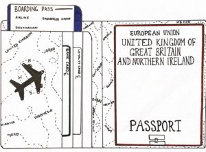
Sketching out my passport holder, I decided to draw a simple icon of an airplane which is of course fitting the theme. I decided to look at the second and third random words in which being compass and money. I included the navigations of the compass; north, east, south and west around the airplane in an order to visually mimic the layout of a compass. I then decided I could include the random word money by also illustrating things that can go in the holder along with the passport, which was bank cards and loyalty cards. I also added pound signs to further accentuate the use of the word money.

UK Government vs Australian Government

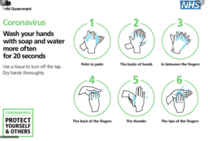
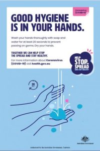
These two Covid-19 awareness posters communicate similar messages but use graphic language in different ways in order to present the information. The HM Government/NHS and Australian Government use graphic language to highlight that washing hands is a huge part of protecting ourselves and others from Coronavirus.

Both posters obtain similar audiences in which being the citizens of their Country. Whilst one being for the United Kingdom and the other Australia, they use similar approaches to convey the same message. Whilst the UK poster initially comes off as simplistic in comparison to the Australian one due to the lack of colour background, it makes up for it in a detailed set of pictograms which provide a thorough step by step process of correct hand-washing. This has been made easily identifiable with the use of numbering and green enclosing circles, allowing the pivotal message can be sent across to the audience effectively.

In comparison to the HM Government posters, the Australian awareness poster convey the message with less imagery and more text. The one simplistic image depicts hand-washing and although they just use one in comparison to the NHS six step process, the topic is still conveyed quickly. The audience know it’s about hand-washing due to the pictogram as well as by the accompanying title “GOOD HYGIENE IS IN YOUR HANDS’ in bold san-serif text allowing it to be easily legible.

However, to know the process of hand-washing the audience would have to actually read the writing which is seen comparatively small to the title. The informative text also isn’t detailed either which doesn’t exactly explain what good hand-washing is, only that it needs to be done and you should use soap and water for 20 seconds.

Due to this different approach the UK government/NHS’ poster convey their message better. Along with the step by step process, highlighting how to wash your hands thoroughly, they use text to further explain some key information. They include the 20 second rule along with extra precautionary steps on how to turn the tap off safely. This ultimately allows them to take the audience from A-Z without too much reading. Both posters do successfully present an eye-catching appeal with san-serif, allowing an easy read, with bold text where appropriate. They both nicely include a general message in their own box and bubble that we’re protecting ourselves and others and we can stop the spread through a collective effort.


Coraline Penguin cover transformation


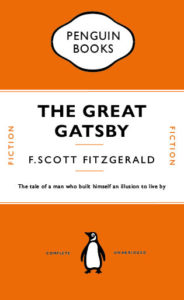
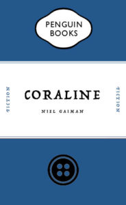
In Fridays integrated design technical session, we focused on the Adobe software ‘InDesign’ and practised recreating a conventional penguin book cover. We looked at the The Great Gatsby by F.Scott Fitzgerald. I learnt some very important skills which I hadn’t discovered before, for example using only one text box and creating complex shapes with tools I didn’t realise were available in InDesign. For the follow up task of creating a distorted cover with an ironic twist to it, I decided to base mine on the novel Coraline by Neil Gaiman. The novel follows the narrative of a young girl who finds a portal to a world similar to that of our own but the people in the other dimension have button eyes. The buttons are a heavy theme throughout the book as well as in the movie. So I decided to swap the penguin for the button. I decided to set the main colour as blue to represent the main characters hair colour and general aura of the novel.


Approaches

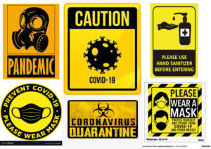
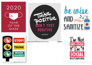
Covid-Signs designed by University of Reading.

Remarkable is that you can find a generic use of colours and shapes, which create a kind of branding.

You find these signs all over the campus, in every building, cafe or hall.

The strong yellow stands in contrast to the black.

By using these two colours together a message of warning and look of toxicity is conveyed to the adressee.


Shades of blue expressing cleanness, calmness and clarity

In these graphic instruction sheeds, the designer used clear and simple graphics, complemented by two to three words. Also he only works with three basic colours.

Thereby the instructions are easily to understand, they appear calm and create an educational message.


How is Coronavirus represented in the internet?

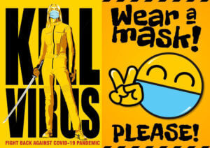
Creating an alarm signal by a small yellow box popping up on top of the screen.

The message to the receiver is warning and demands a reaction.

The real looking virus makes a dangerous and serious impression.


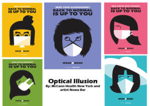
Fresh blue is catching attention

The fresh blue is used to bring the advise to keep distance out of the ground and to get the attention of people waiting there.

By implementing some more colours in the illustrations on the left the advices appear more friendly to the recipient.

Impressive how different colours can be used to create different types of messages for the adresse!


Minding the Gap Can Get Tricky

This task was quite straightforward as all the brief was, was to write the word ‘Cadbury’ in the typeface provided. This proved more tricky than I’d anticipated as I chose a serif font, so the structure of the lines was a lot more organic when compared to a sans serif font. This meant that getting the proportions right for every stroke involved was quite hard.

I thought I’d done a good job, but as Gerry pointed out, my serifs were way too pointy and my stroke width was very inconsistent.

For the second part of the task, we had to fill in the remaining parts of the letter from what we were given on the sheet. My serifs definitely improved this time but again, maintaining consistent stroke widths was hard.

Varying amounts of formality in Covid communications

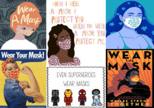
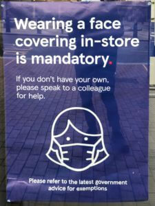
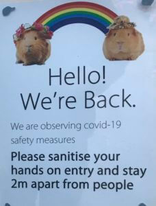
One of the interesting things about the pandemic is the wide range of graphic responses to it. Prom the government, to companies, to families in their homes, there is a massive variety of notices which have been put up, both formal and informal. Companies such as Tesco and Next will probably have their own in-house graphic designers while smaller businesses and families won’t. This means that some notices look very professional and on-brand, whereas others will appear more handmade and thrown together. Two noteworthy examples I found where those of Tesco and one at a shop in the oracle.


Tesco’s poster keeps the Tesco typeface and colour scheme as well as a fitting illustration. As a sidenote, I think it’s also quite interesting how a face mask has become so widely used and recognised. It’s as if simplistic representations of face masks have entered our vernacular. While the poster clearly mimics the Tesco styling, which the designer evidently intended, I would argue that this makes it too easy to ignore. In a Tesco store, there may be many similar posters with this styling, which means this porter may blend in to the point were it’s not actually paid attention to. This makes the design unsuccessful. I think mimicking the official Tesco aesthetic too much runs the risk of appearing too cold and official. I don’t think this design really speaks to the customer in the exact same way as intended as it’s styled almost more of an advertisement.

The other shop (which I unfortunately can’t remember the name of)  on the other hand, has appeared to have taken a rather different approach. They have included two guinea pigs with a rainbow between them. This is quite bizarre, but I think it actually does a lot to maybe make the company’s communication more informal and friendly. The rainbow has come to symbolise the NHS recently, and the guinea pigs may just be being used as symbols for a softer approach. I’m not sure if this is intended, but the rainbow between them makes it appear as if they were socially distant. It’s not exactly professional, but I think this actually communicates to the customer better by doing a lot to humanise the business and its effort for the pandemic. The guinea pigs almost give the business a vulnerable quality.

To conclude, I think the more personal, if less professional communication involving the guinea pigs is actually better, because it humanises the company and is less likely to be ignored.

Temple disc and Smart ring

My partners 3 facts were:

  • Enjoys listening to music, favourite artists are Krept & Konan, Headie one, AJ Tracey…
  • Likes to watch TV and films a lot. some examples are Brooklyn 99, Power, Fast and Furious…
  • Likes technology, using it, watching videos about it…

Below were my initial brain storm of ideas from his facts:

My three random words were:

  • Software
  • Game
  • Bomb

Below, are my concepts shown through the matrix grid. I came up with all these using one of the elements above, and sometimes mixing them.

From there I re-drew my two final ideas for the gift. These were: 1 pair of temple discs and a Smart ring. Can be seen below.

The concept behind the Temple Discs are that when you put them on, they link to your brain. They take you into a different reality, where you can live as a character in you favourite tv show/film. I thought this was a good idea and it is a new experience as instead of just watching you are living it too. I came up with this concept from his love of watching tv and films. But also from the two random words of game and software.

My second final idea is called Smart Ring. It links to your brain again, however this time you control it all. You can speak to it to find out information, can control music, read out a text for you, send texts and make calls for you. Lastly works as a camera by capturing what you see from your own eyes. I got to this idea from the random word of software and my partners love for music and technology.

Font Finding


For Eric’s lesson on Monday we had to find lettering in our environment, eg around campus.

We got lucky with the weather being very sunny, and clear blue skies, as this meant a lot of light in our photographs, and a bright sky that on occasion helped add to the photo. I found signs, graffiti and stickers posted about campus. I also took a couple photos of the lettering in the typography department, however kept my focus to signs outside.

When it came to grouping our photos together and finding a common theme in them, my photos in honesty didn’t have much in common, when it came to font, topic, wording, or even colours. So I did create a collage of some of my favourites, editing them to have a common ground with yellow, blues and greens. And one similarity I did find between a couple photos was framing, where the type had been framed by a certain material, to be the centre of focus, such as, a window, wooden frame, or created on board and centred on a thin wall, giving it a frame.

After this project I will make an effort to look for more lettering in the environment, why it is used, and how communication varies from a sign being instruction (stop, slow down, caution. In bold capitals with bright warning colours). To creative welcoming advertising, for cafes or restaurants that use blues, or black and white for a professional sleek look.