Category: Student work

Lettering and the relationships with the colours surrounding them

Signs around Campus

I decided to focus on the relationships between colour of letters and the background they are presented on for this project, where I found that the majority of lettering is white or black and surrounding by a bold and eye-catching colour. When looking at the majority of signs it is evident that this design choice is made to initially capture the attention of a passer by through a large body of bright colour and then have the lettering as the secondary, despite the text being the core of the sign. I found that this technique is more effective than say, a white sign with red lettering, since there is a larger body of white which does not grab the eye as efficiently as a bold colour.

Labyrinth

After choosing labyrinth as my selected word for the task, the start of the brief stated that the story started with a family entering a house. This encouraged me to use a scalpel to cut out the shape of windows, a door and a roof to connotate this. As the book progresses the pages start to slowly change and include different textures to link with how each room within the brief all look different, adding to the illusion that the characters are completely lost within the labyrinth.

Textures of lettering

Textures of Lettering Presentation

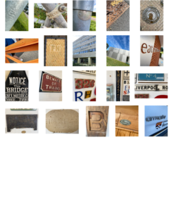
After wandering around the campus and taking photographs of typography within the department building as well as outside; I found that all of the examples I had taken had a very similar pattern. All of my photos displayed different styles of typography using different textures and techniques, for example the many carvings/engravings on stone and metal grates. Looking at the various font styles and techniques of how information had been conveyed, gave me a further understanding of how information that is conveyed for a purpose has to suit a particular style for what is being displayed.


Raised and Indented Lettering

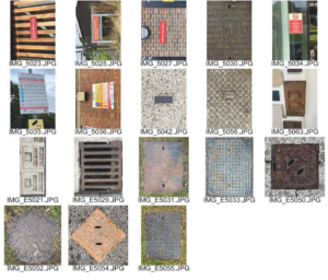
For my ‘Lettering in the Environment’ project, I decided to photograph the themes of raised and indented typography around campus. I chose this theme as walking through campus I realised how common place such techniques are in many areas such as construction, maintenance and even signage. That became apparent to me firstly from the many maintenance and manhole covers that where present an the pavement and the roads, which I believe were raised cast metal in order for the preservation of the type to be present for longer than a print based design. This technique can also be seen in building signs as the text is raised from the buildings wall however, unlike the sturdy maintenance based items, I believe this was designed with the attention of the reader in mind other than rigidity.

Floating Comic (Staircase)

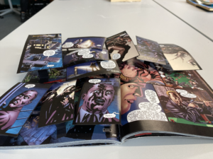
I chose this piece from the box as I thought it would give my work a little more variety from the other works with its comic book styling rather than a more traditional book. With this I decided to use the panels of the comic is a unique way in order for each individual panel to stand out and flow with the rest of the panels in a downward sloping fashion. I did this by allowing the panels at the top of the page to overlap the following panels to give the narrative a downwards sloping feel, sticking with my theme “staircase” (a downward spiral ascending into misery at the bottom). With this theme I also picked the prefect spread in the book as it starts with calm and contentless and slowly terns to despair as the characters a violently killed.

Exploring Patterns in Signs

To begin with I started to take pictures of anything that caught my eye, all the while trying to find a linking factor. When you’re looking for lettering you find out that it is everywhere! Instructions, directions and notices to name a few of the categories. Many of the signs around department and campus were to give instructions regarding social distancing requirements in relation to the pandemic. All of the signs were designed in the same way and so they formed a set and were consistent across the University. 
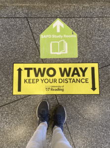
After collecting the photos I began to sort through them. I noticed that nearly all of them were circles with only a handful being rectangular. Within the circles, I organised the images by colour: white, green, yellow and red. They abided by the universal traffic light system with green meaning go and red meaning stop. Yellow is used to give instructions.

I could extend this way of categorising signs through shape and colour to see the different trends, not only on campus but in road signs too.


Obsession

For my theme I chose “Obsession”, for each stage of the story there is a section of the book to represent it. 

Firstly the story begins with a woman reading a book in the library, so I left the pages as they were. 

She is alone.

And starts to hear some noises, represented by the concentric circles.

In the later end of this section the reader gets a glimpse of the mouse, but never sees it again.

She starts to look for this mouse, and starts to look under objects, and gets more and more obsessed about finding the mouse and eventually tears up the floor board and carpet.

She finds nothing.