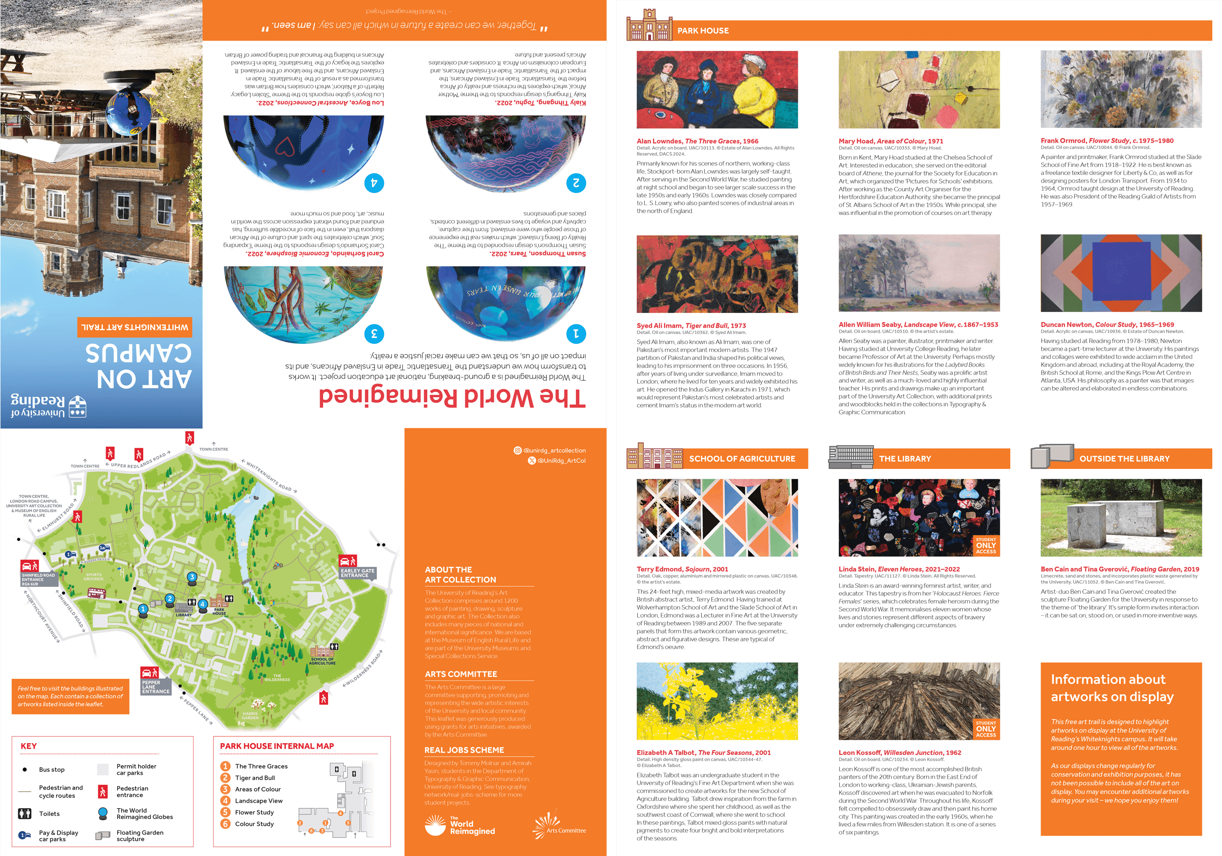
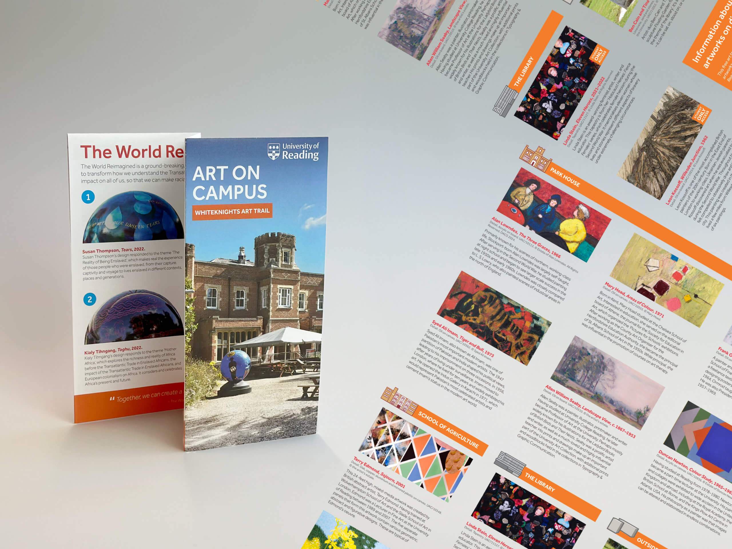
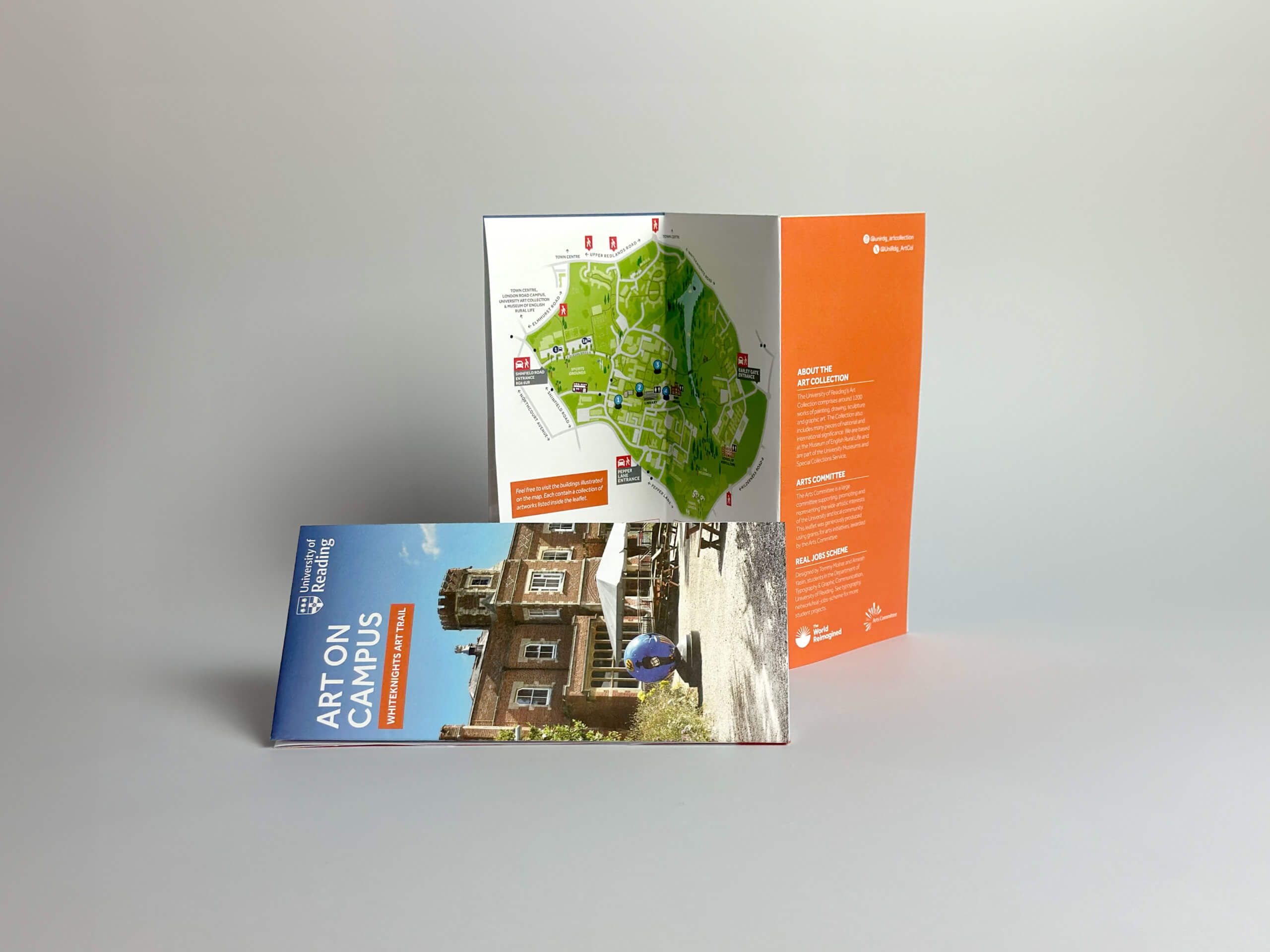
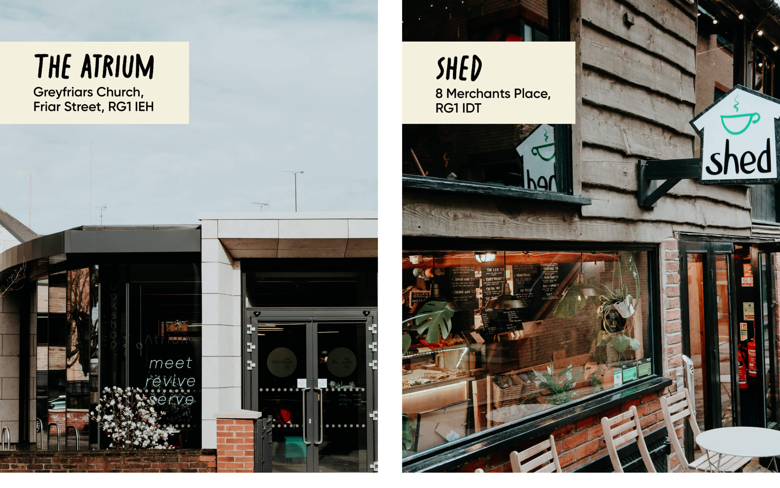
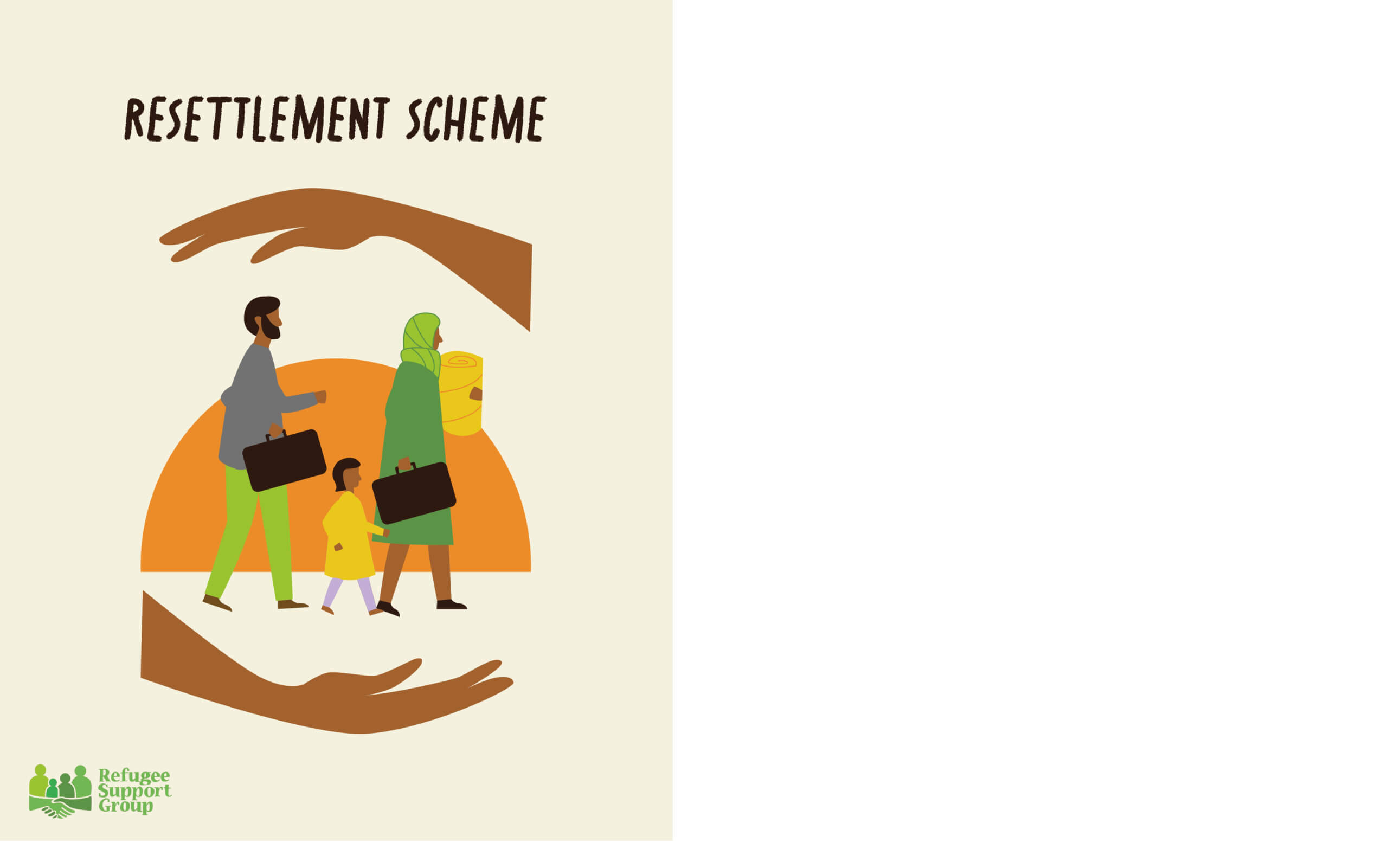
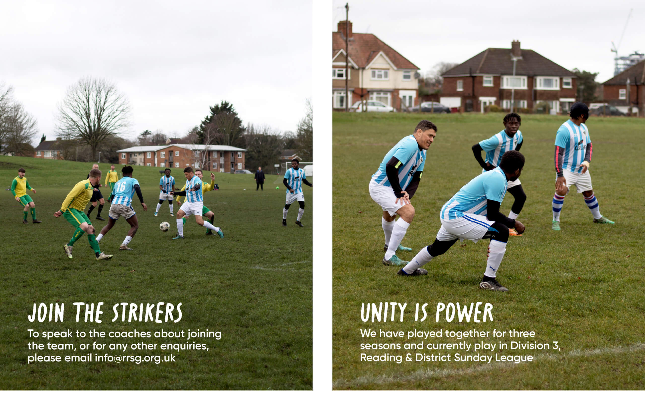
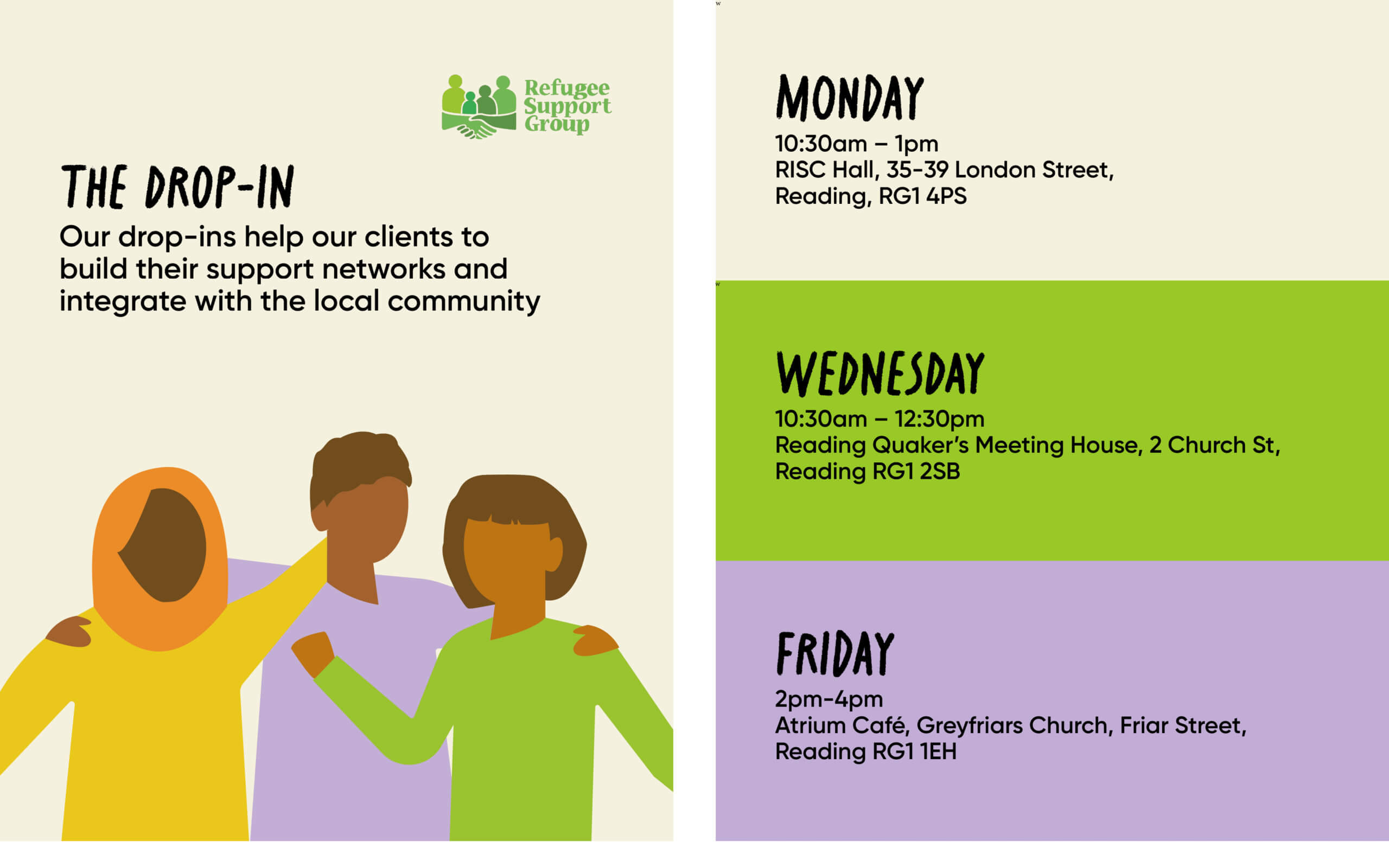
Background
Baseline Shift welcomes industry experts and Reading alumni alike, to the University of Reading, to give inspiring talks to students of all years, allowing them to see how speakers have progressed in their design career. Acknowledging their key insights in how they’ve overcome career challenges, Baseline Shift gives students a platform where they can ask questions, build networks, and consider new design paths.
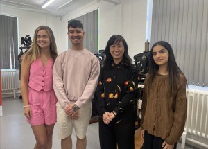
Meeting the team
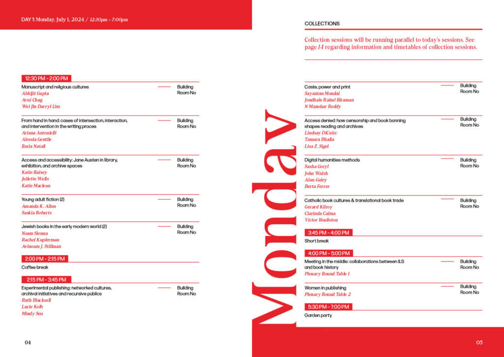
When I joined Baseline Shift, it was a student-led talk, run every Wednesday, with requirements including contacting speakers, creating timetables, promoting, hosting the sessions, and writing weekly blog posts. Our first team discussion after joining focused on defining our roles, and areas each of us currently excelled in. With some prior experience in public speaking, and a desire to build more confidence in pitching, co-hosting alongside Habibah felt like the right choice for me. The 2024/5 academic year required a re-brand in Baseline Shift, due to the change from terms to semesters, resulting in the module including only 10 sessions. With Baseline Shift decreasing the number of sessions, we had the opportunity to ideate ways to encourage student attendance.
Miho Aishma Baseline Shift talk
This year, our main aim was to present students with speakers from diverse design career paths, while ensuring the talks connected to current modules. In addition, we wanted to find ways to further persuade students to complete feedback forms, because their feedback is significantly valuable to us and informs how Baseline Shift runs.
Our main aims proposed:
- Creating printed media and social which were clear and consistent.
- Providing a timetable of guest speakers who align with students’ current modules
- Showing emphasis on the student-led typography page, through physical posts, stories, and reels.
- Keeping students updated on Baseline Shift changes, e.g., speaker cancellations.
A year after I had joined the Baseline Shift team, I had the opportunity to re-brand this module, this time as team leader. The promotion to team leader and project facilitator significantly enhanced my communication skills and leadership skills, especially when organising and contacting proposed speakers. Taking the initiative to compile a diverse lineup of speakers was a priority of the rebrand, and resulted in larger turnouts, an encouraging result, especially after a decline in talks this year. My leadership approach assisted the team in a balanced manner, without becoming overly directive. My initial meeting as team leader included highlighting the purpose of the ‘module’, analysing Baseline Shift’s established branding, and investigating strategies to improve students’ responsiveness to the module. We asked how students about their current opinions on Baseline Shift speakers, in order to identify areas of improvement.
The conclusions made were:
- Too many Baseline Shift talks are online, leading to a decrease in engagement.
- Q & A sessions at the end of the talk feel like a lot of pressure due to small audiences.
- Not enough information is shared about the upcoming speaker.
Our rebrand
To resolve these issues, Baseline Shift took a strategic approach to re-engage students and create anticipation for the upcoming speaker sessions. Each team member was assigned the task of comprising a list of speakers from different sectors and backgrounds. The outcome was a list of 10 speakers, supported by a list of reserves for designers identified as ‘ambitious’ due to their current design role and social media presence.
Given the long breaks within the module, establishing a social media presence which was captivating, and consistent with the surrounding branding elements, became a key focus. We conceptualised ideas on how we could facilitate students who wanted to engage with speakers before the upcoming sessions. Reframing Baseline Shift to be seen as a creative opportunity for students, rather than a weekly obligation, was made a priority; making Baseline Shift a space to gain real-world insight and build connections.
Upon joining the team as a part 2 student, it became evident that students were more inclined to attend Baseline Shift sessions which were promoted as in-person talks, rather than online talks. As a result, communicating the requirement for physical attendance to potential speakers on our initial contact was essential. In addition, a major change to the Baseline Shift scheme was compulsory attendance for first and second-year students, so we strived for exclusively in-person talks. This demonstrated our responsiveness to student feedback, as previously a students felt that “Baseline Shift should push for in-person talks as they help [me] gain confidence when talking to the speakers after the session to build a connection”.
Design outcomes
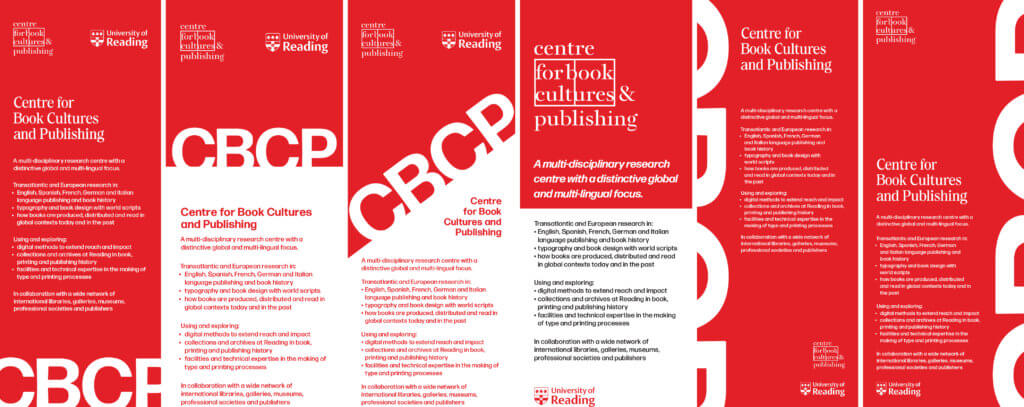
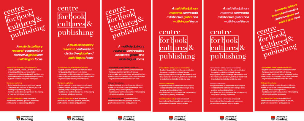
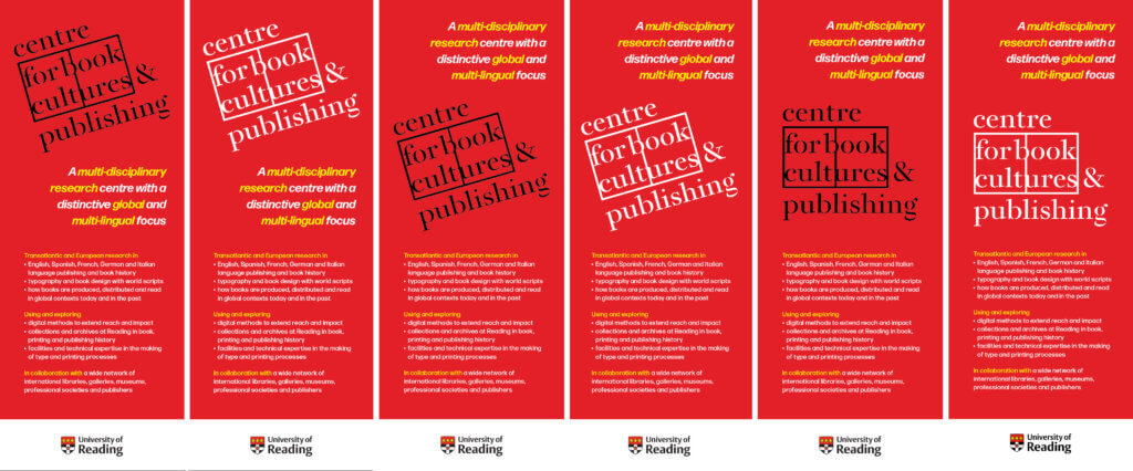
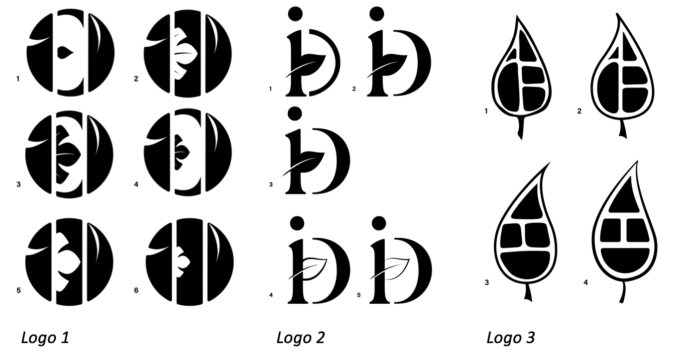
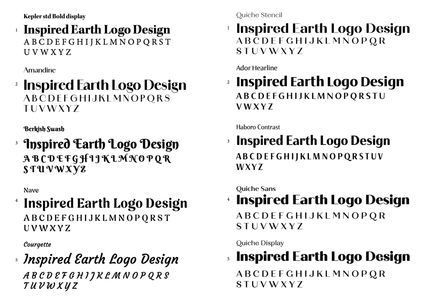
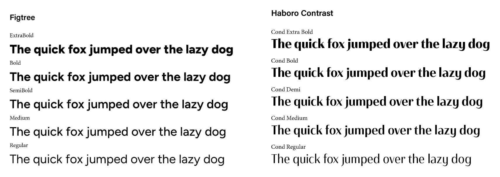
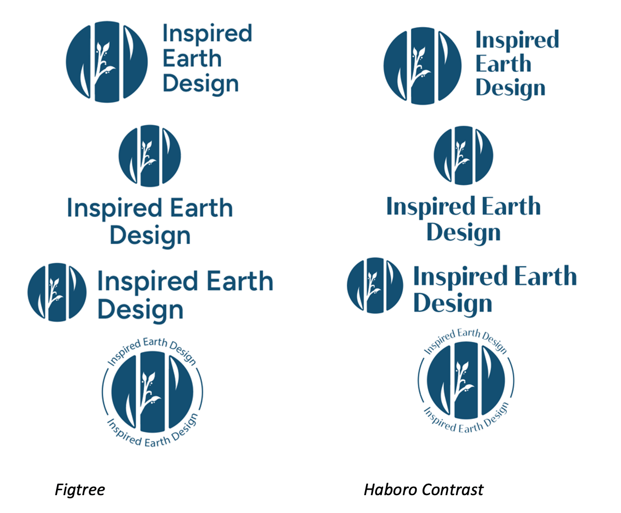
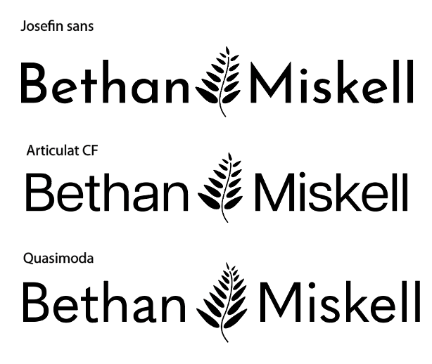
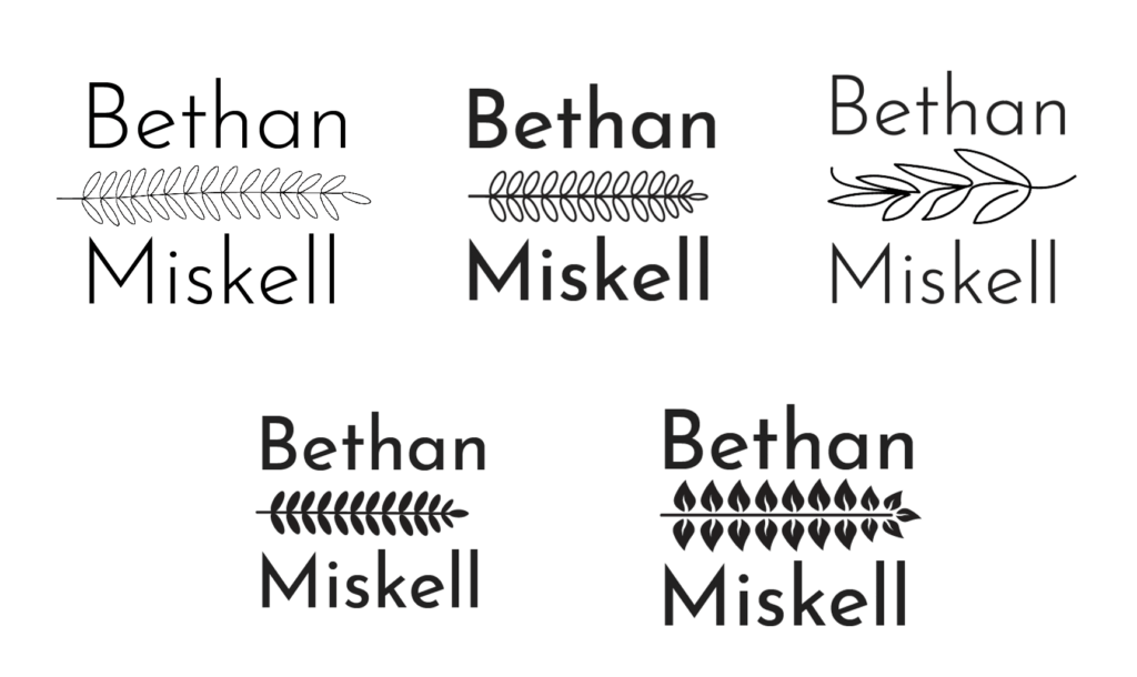
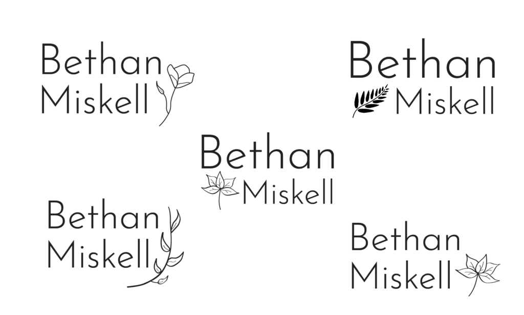
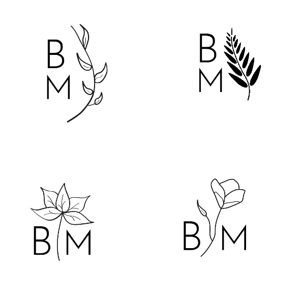
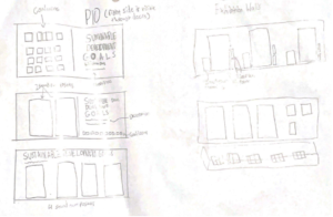
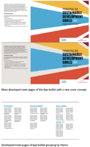
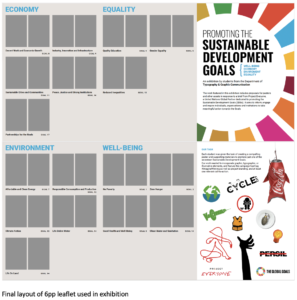
Our rebrand included design outcomes such as; a print-ready poster detailing the speakers, dates and times, a business card; and social media templates for consistent use throughout the year and a striking new logo. The logo needed to be dynamic and responsive – immediately engaging with students by reflecting the relevance of the speaker lineup. As project facilitator, it was essential to first lead a discussion on the limitations of the existing Baseline Shift logo, before assigning the task of creating initial logo sketches.
From this analysis we recognised our logo aims:
- To creatively illustrate the concept of shifting the baseline through a distinctive visual approach.
- To select a clear and communicative typeface, reinforcing the focus on connecting with professionals and portraying the diversity of our speakers.
- To Incorporate design elements to demonstrate the module as speaker-focused.
- To transition from a monochromatic colour scheme to a palette which engages with vibrant colours, ensuring consistency with all other design outcomes
The initial sketches played a fundamental role in developing our digital logo outcomes, considering the team’s ideation processes, with a particular focus on elements that effectively aligned with the module aims. The final logo effectively conveys Baseline Shift as an inspiring module, featuring speakers with diverse design journeys. The logo emphasises the importance of building connections through its integration of lines.
Baseline Shift 2024/2025 logo
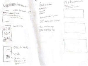
Our logo assisted our poster concepts, ensuring we showed visual consistency through a cohesive colour scheme and utilising the same typeface when presenting the speaker’s name. Tommy and I took charge of designing the promotional posters, informed by the team’s initial sketches. The poster serves as the first point of student engagement, making it essential to create an impactful design which would capture attention. Another role as project facilitator was collecting speaker images to use across social media and posters, this included drafting email templates to send to proposed speakers.

Nitya Thawani social media post
In previous years, the Baseline Shift poster followed a standard one-after-the-other format (2023/2024 promotional poster). This year, the decision was made to display the Baseline Shift rebrand through a central poster, accompanied by individual posters for each speaker (2024/2025 promotional posters) . Executing this concept proved challenging, especially when it came to finding a way for the poster to slide in and out. After discussing with Geoff, we explored solutions to eliminate any disruptions to the success of the design. A runner was made to allow the poster to reveal each upcoming speaker in line with our social media style. This outcome initially only displays their face and key details, then reveals an image of their work once they are the next speaker. This concept helped build anticipation for students.
![]() Baseline Shift 2023/2024 promotional poster
Baseline Shift 2023/2024 promotional poster
![]()
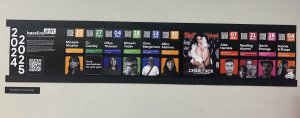
Baseline Shift 2024/2025 promotional posters
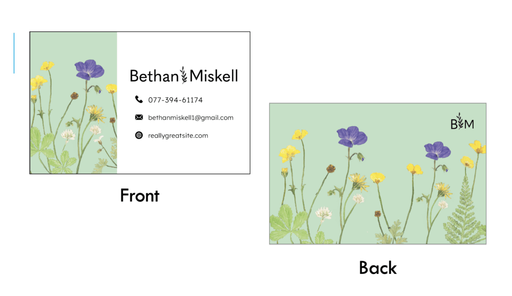
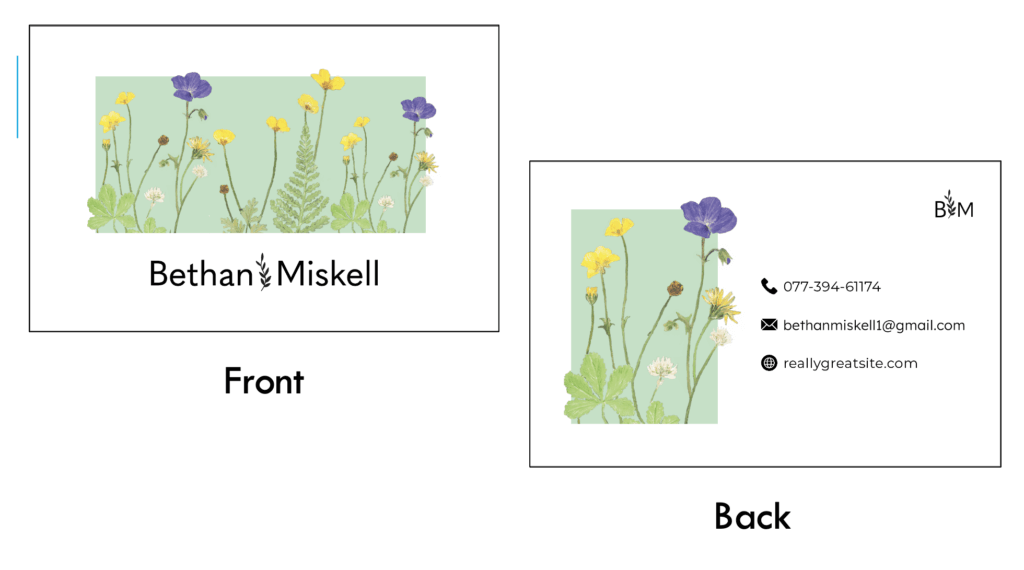
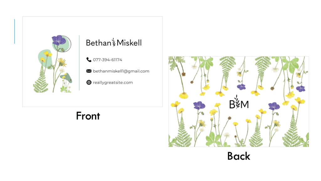
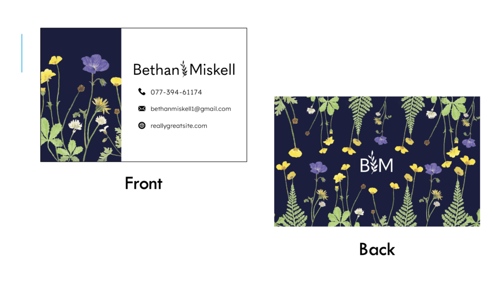
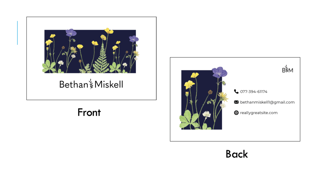
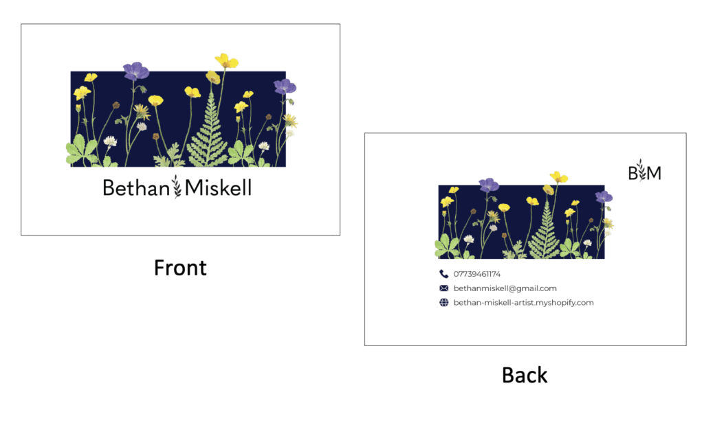
A year of experience working on Baseline Shift provided valuable insight into which outcomes were successful, and which required a different approach. The postcard was considered an unsuccessful outcome in our team’s analysis, due to its limited space and scale of type size, making the speakers appear insignificant. To highlight the importance of the module, we designed business cards as an alternative, these included a QR code, taking students to our digital timetable. These business cards were thoughtfully designed to emphasise the module’s focus on building connections, by having continuous lines that flowed seamlessly from the front to the back.
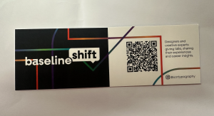
Baseline Shift 2024/2025 business cards
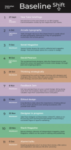
Our digital timetable concept was an important outcome, providing students with an easy way to access speaker details and previous blog posts by clicking on the speaker’s name. From the first year of working on Baseline Shift, one key takeaway was that some students felt out of touch with speaker updates. This led to emphasising the need for better communication with students, especially when managing social media content on the typography page.
Reflection
Being a project facilitator for Baseline Shift has been a fundamental factor in my growth and development as a designer on the course. Building connections with inspiring designers, organising the team with clear responsibilities, and contacting speakers were essential in increasing my communication skills and confidence. As the only third year continuing their journey on Baseline Shift, maintaining open communication and availability was crucial in strengthening the team dynamic. Presenting approachability to all year groups encouraged an increase in feedback and asking questions during sessions.
To gather students’ insight into their perception of the speaker’s talks we distributed a feedback link after every 3 sessions. This allowed us to learn about student’s favourite speakers, what they found most valuable from sessions, and any suggestions for improvement.
Working on Baseline Shift over the past two years has significantly improved my communication and writing skills, particularly in collaborating with designers and drafting blog posts. It has also illustrated the importance of LinkedIn connections for beginners in the design industry. Hosting sessions has enhanced my confidence and refined my tone of voice, allowing me to adapt my communication style when engaging with professionals.
This real job has challenged me when delegating tasks to team members, ensuring fairness and the value of collaborative work. Through using tools like OneDrive, we learnt how to share outcome updates and collaborate efficiently. If a student asked whether signing up for Baseline Shift was the current decision, my immediate response would be ‘Yes, It has been one of the most valuable decisions I’ve made in this course’.