
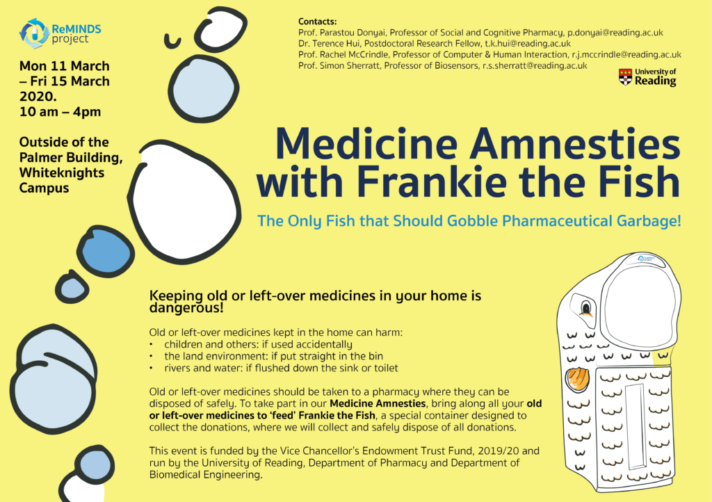
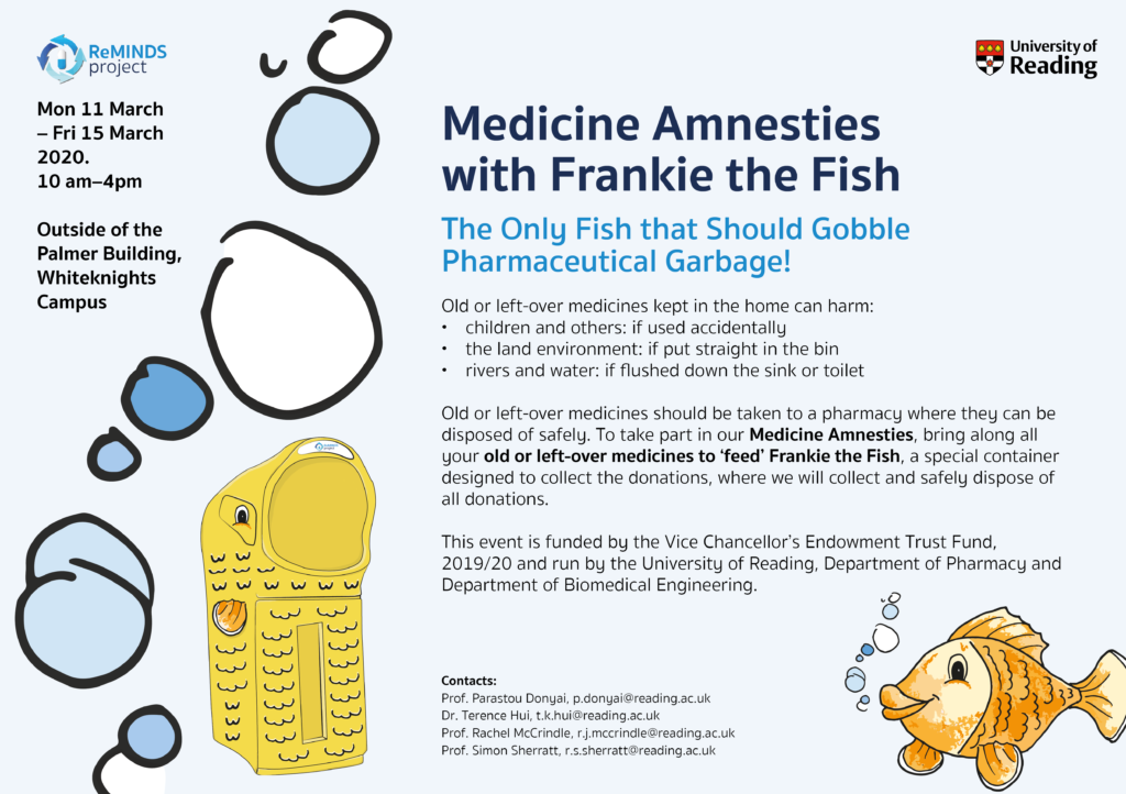
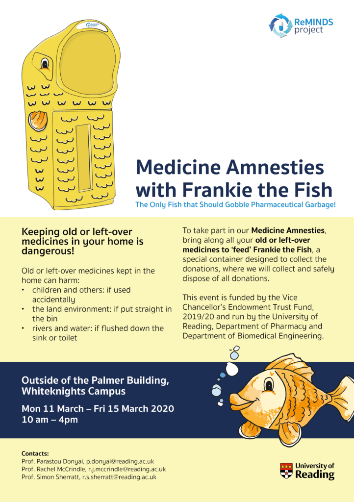
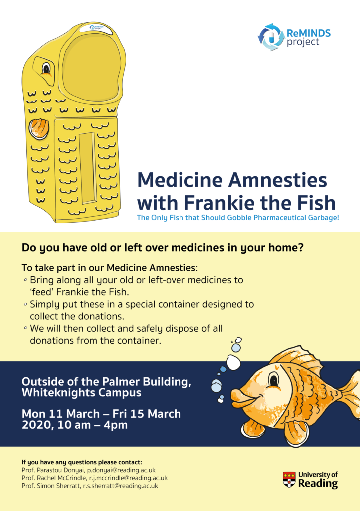
Background
Our client, Julie Williams, is part of a network called ‘Coaching Reading’, which is a community of people who are qualified and/or passionate about coaching. Together they offer executive and lifestyle coaching. They are a community of local coaching professionals who continue their professional development by learning new coaching techniques and offer free coaching to charities. The network needed a strong visual identity to help provide an online presence in order to build their profile in the Reading area. This project was taken on as a team of 2, Emma and Faith.
Restating and understanding the brief
We had an initial meeting with our client, who told us in detail what her network was and what their aims were for the future. Our client had a background in marketing with very large and corporate companies, which was a positive for us as we could trust her opinion was from professional experience. The initial signed off brief stated the client would like:
- A logo, including an inverted version
- Visual identity guidelines
- Social media banners
The main objectives were to make the visual identity “warm and professional, not cold and corporate, to appeal to both charities and businesses”. An initial suggestion from the client was to perhaps design a logo inspired by well-known monuments in Reading, such as the Forbury lion. After these initial deliverables were completed and approved by our client, she asked us if we wanted to produce some Word and PowerPoint templates, which we were happy to produce.
We would meet up with our client regularly over Zoom, and on occasion we would meet with her network during their scheduled meetings.
Research
To start the project we first developed user personas to help us gauge an understanding of the type of people the network work with.
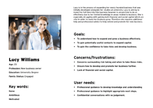
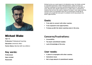
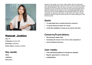
It helped us get into the ‘mind’ of a coach and what the logo we design needs to exude in terms of mood and design, so it is an accurate representation of Coaching Reading. As Coaching Reading work with charities, they need to come across as ‘professional’, yet ‘warm’ and ‘welcoming’.
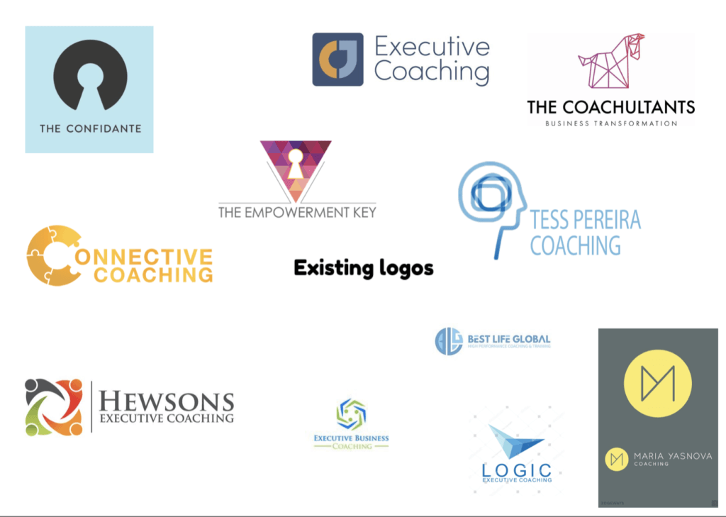
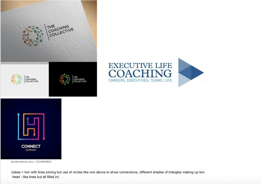
We also looked at existing logos of coaching companies. This wasn’t as useful as we initially thought; a lot of coaching companies are run by sole individuals, and so some of the designs we felt were a little generic or predictable, likely as they may not have had the time or money to invest in the design process. We wanted to try and keep the logo very understandable yet unpredictable, for example we tried to avoid any logos involving ‘mind’ imagery.
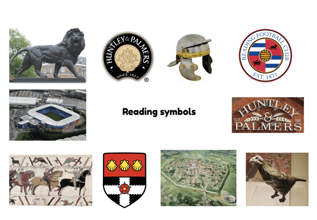
Here we looked at some ‘famous’ Reading monuments and symbols. Roman history is prominent within Reading so we were partially inspired by this.
After our first round of designs, members of the network in the Zoom meeting suggested we experience ‘coaching’ for ourselves, as it would help us understand their aims better, and what coaching is in general. We had these sessions and found them very valuable. Coaching is entirely confidential, and is mainly driven by the individual experiencing it. Coaching can help both personal issues as well as business/career related ones; the coach never gives ‘advice’, and instead asks questions about what we are saying, allowing us to talk through our thoughts and come to our own conclusions.
“By talking through my thoughts, I would subconsciously figure out a ‘story’ with my thoughts, connecting the dots and find options in resolving challenges.” – Faith
“The main focus was on me questioning my thought process and coming up with ways to solve the challenge through talking everything through, with the coach acting as guidance by asking questions to guide my thinking.” – Emma
Developing the logos
The development of the logo was by far the most time-consuming part of the project; it took us over two months to finalise a logo. However, we knew this was important to get right as the logo defined Coaching Reading, and would provide a huge stepping stone with the development of social media.
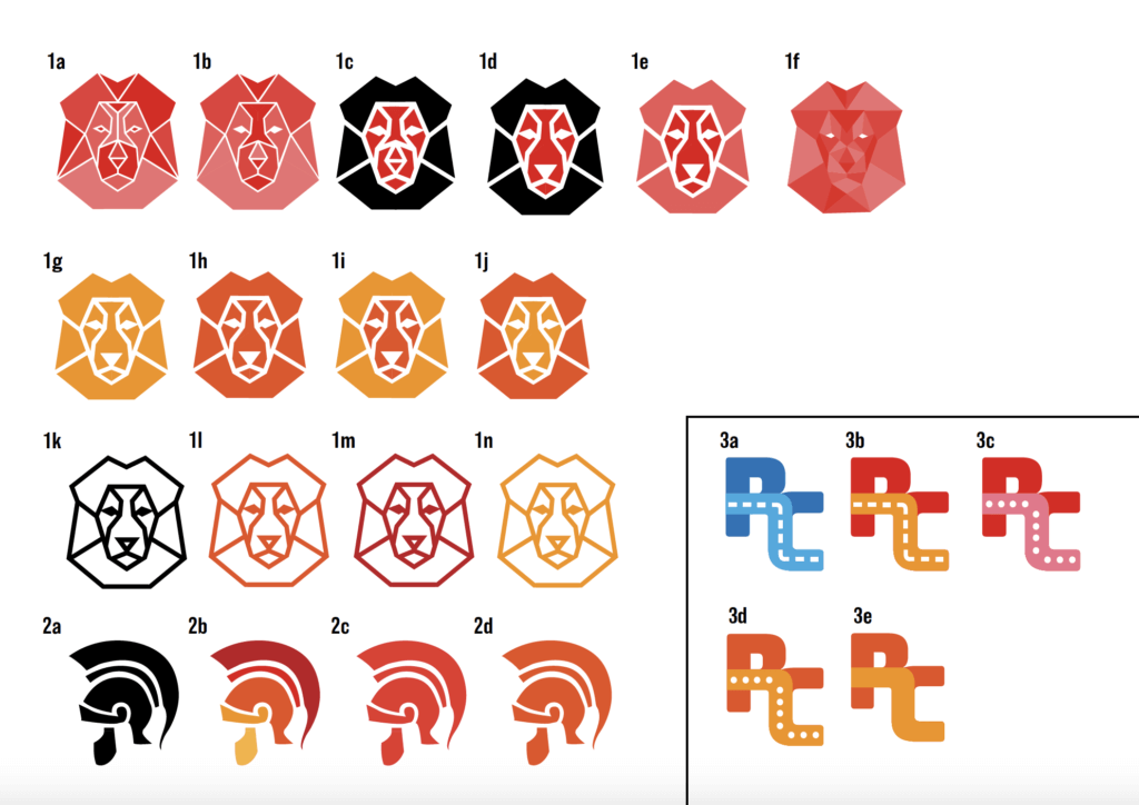
We initially made designs surrounding the Forbury Lion and the Roman history that Reading had. The Forbury lion was something that initially came up in discussion in the very first meeting we had with the Coaching Reading team over zoom. We showed these designs in a zoom meeting with the team, and they provided written feedback which our client sent to us the next day. The main feedback we received was that they didn’t feel like ‘coaching’ logos, the lion in particular looked more suitable for a sports brand. The extra letter logos in particular, which were meant to resemble a ‘road’ travelling through it, seemed to be the closest in terms of what the network liked, but we knew the letter logo could be more developed and refined, so this is the next stage we took.
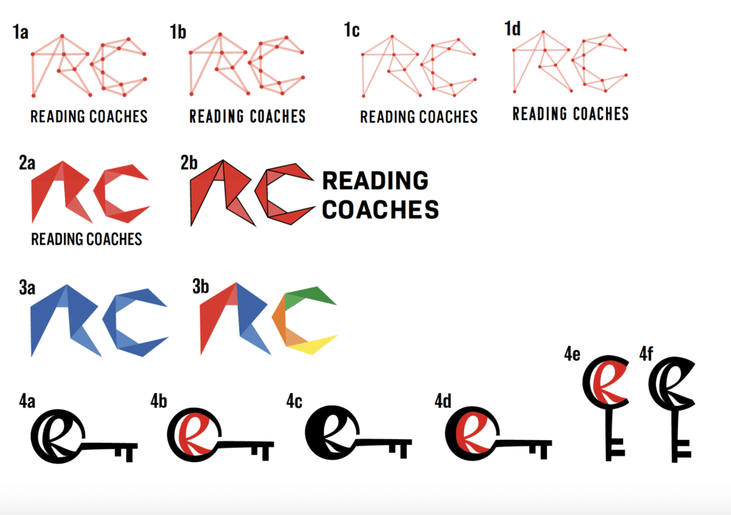
These letter logos were produced next and we showed these in the Real Jobs online meeting. Our idea with the first line of designs was ‘connecting the dots’ and doing this as a letter logo as the clients seemed to lean that way. The key idea was something we noticed in real examples, and we liked the symbolism of it. We didn’t show these designs to our client as feedback from the Real Jobs meeting suggested these ideas just weren’t strong enough yet. However, they did like the concept of letters with an object, so we kept this at the back of our minds continuing the design process.
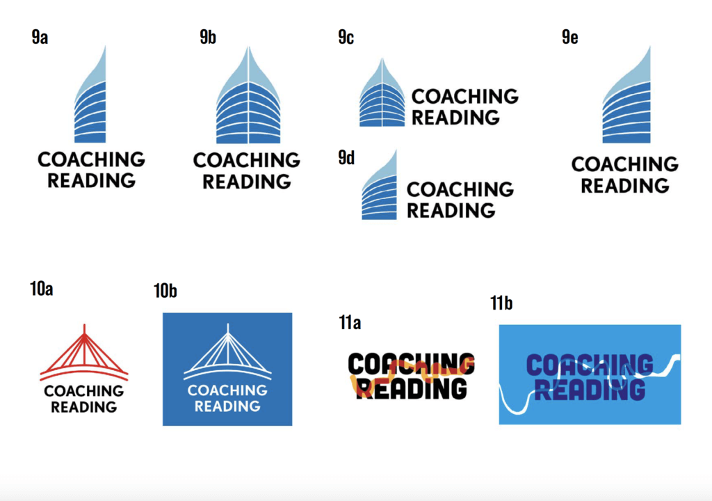
Our client then suggested perhaps being inspired by buildings, so we looked at ‘The Blade’ (top half), The Christchurch bridge and the river Thames. We used blue colours as we felt they were calming and muted; we tried to avoid ‘bold’ colours as we felt it wasn’t suitable for their visual identity, especially after experiencing coaching ourselves. After showing these designs to our supervisor, she didn’t think they quite ‘clicked’, from her perspective it “didn’t make sense” to have a building to represent coaching, and we agreed with her opinion.
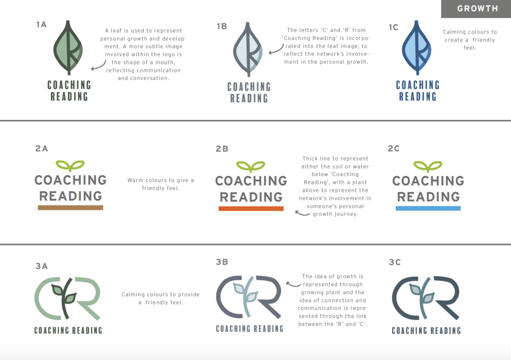
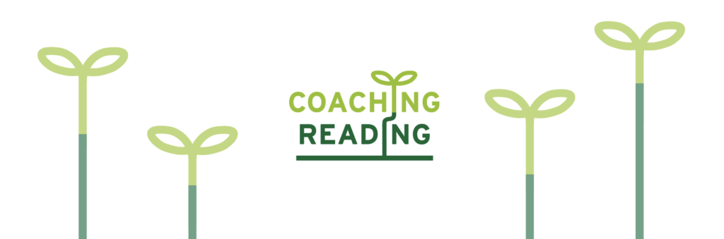
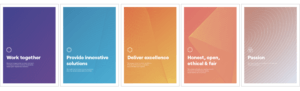
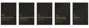
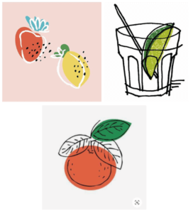
At this point we felt a little worried as none of the designs we produced so far felt ‘right’, so our supervisor suggested coming up with some core words to describe the aims of Coaching Reading, we came up with two main ones, being ‘growth’ and ‘journey’. With ‘growth’ there naturally came an idea of a leaf, and we liked this idea as it was ‘calming’. We showed these to the client in a Zoom meeting with her network and they seemed to like all of the designs. This was a real breakthrough for us, something finally ‘clicked’ and they said that this was something they could really see working for their visual identity.
They seemed to like the first design the most, so we tried to develop this through a ‘pick your own’ logo. We learned through our supervisor that this perhaps wasn’t the best approach as presenting a client with lots of options can confuse the client; we should make decisions on colour and line weight ourselves. We ultimately abandoned this idea as feedback from the client suggested we “strayed too far” from what her and her network initially liked.
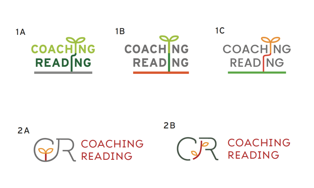
Here we went back to what Coaching Reading initially liked in the fourth round of concepts. We tried to refine the ideas, combining the imagery with the letters. We stripped back the options, and showed these to our Real Jobs group. They preferred 1A and 2B for its dynamic, and we added a third option by the request of our supervisor, but we wanted options 1 and 2 to shine as we really liked these. Before, the C and R in option 2 were hand-drawn, so we edited an existing typeface which we felt would fit in with the overall aesthetic of the ‘leaf’ design.

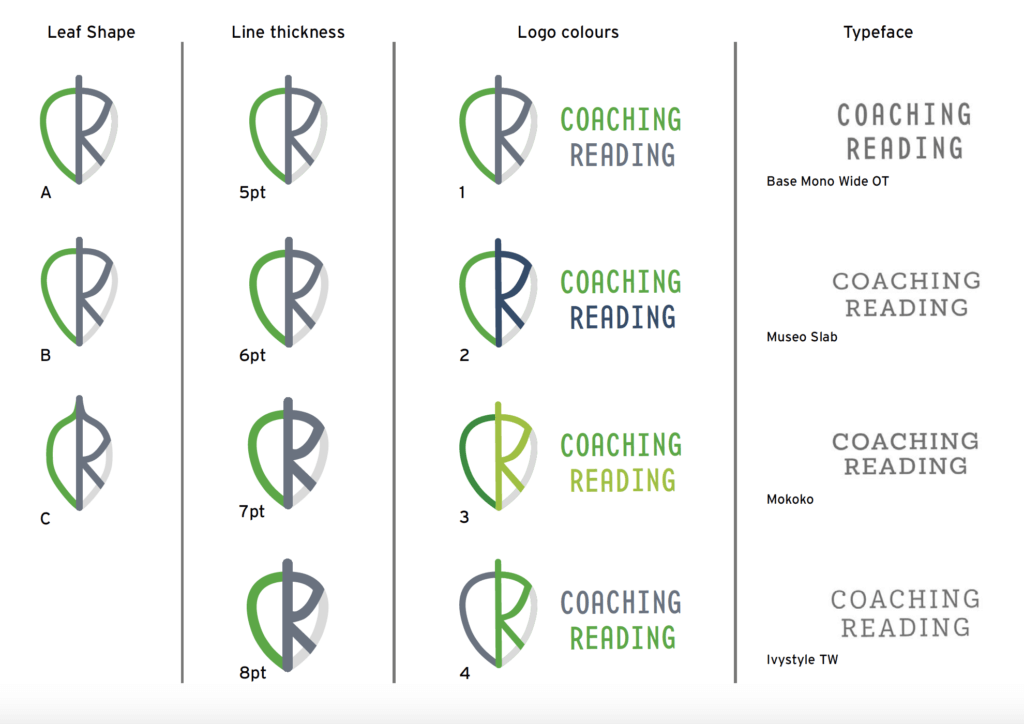
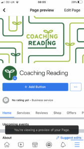
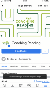
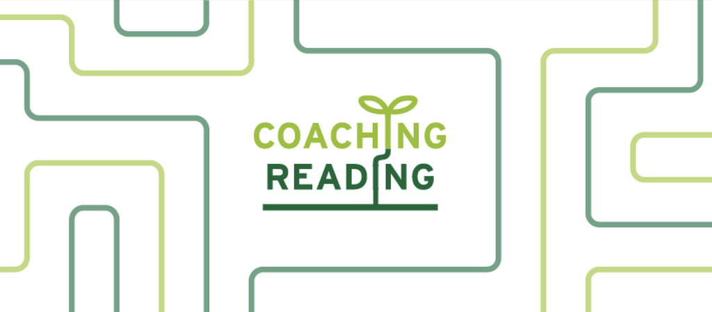
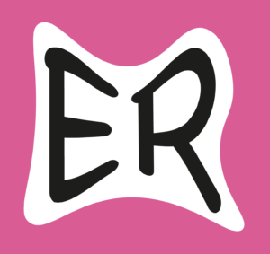
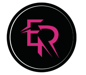
Ultimately, the client chose option 1. We decided to stick to just two colours as this flowed well. The client stated she liked this logo the best as it represents what Coaching Reading is, and when presenting this option in a network meeting they stated how they had not seen a coaching logo such as this before, which they liked. They seemed very happy with what we had produced and this gave us a lot of confidence in ourselves as designers. Fortunately, the logo works well inverted too, the leaf shape really pops out.
Development of social media
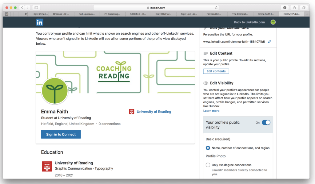
Now our logo was signed off, our next job was to develop social media display pictures and banners for Linkedin, Facebook, Twitter and Instagram.
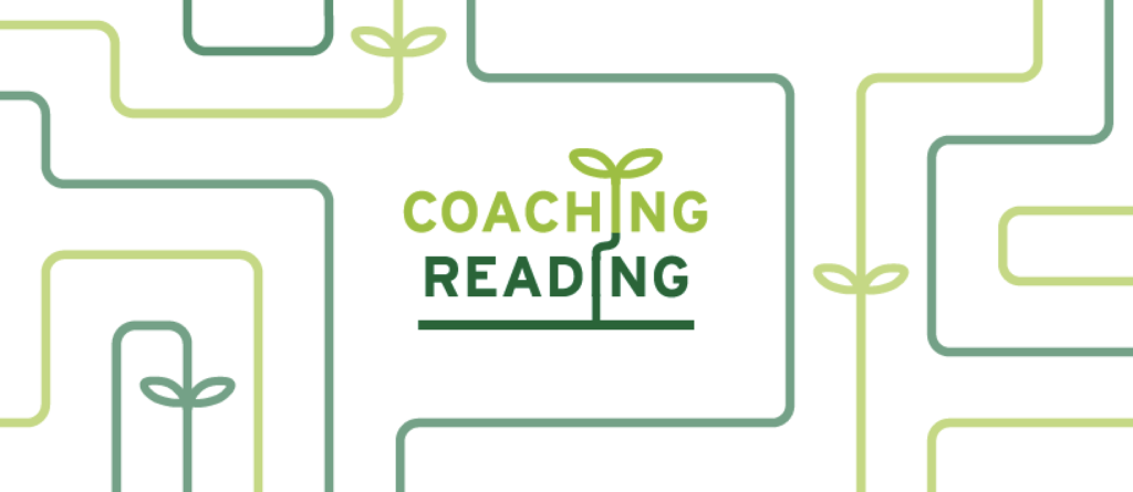
We took the leaves idea and decided to make it a pattern; we created a private ‘test’ account on Facebook just to see how it would look. For profile picture, we had the main logo option, but we also took the leaf from the logo and made it into a profile picture; this is something we noticed a lot of companies do if their logo may not be readable at a very small size. Initial feedback from our convenor was good, however he suggested using a grid in Illustrator to ensure the lines are an equal space apart, and with the icon the leaf stem can bleed outside the circle.
We provided some banner options as well as colour variants of the leaf icon. Ultimately our client chose to have banner option 3, with a light green and dark green leaf profile picture. With all four social medias, we had to use trial and error with ensuring the banners align properly within the space and nothing is cut off, so on submission we provided multiple versions for each social media.
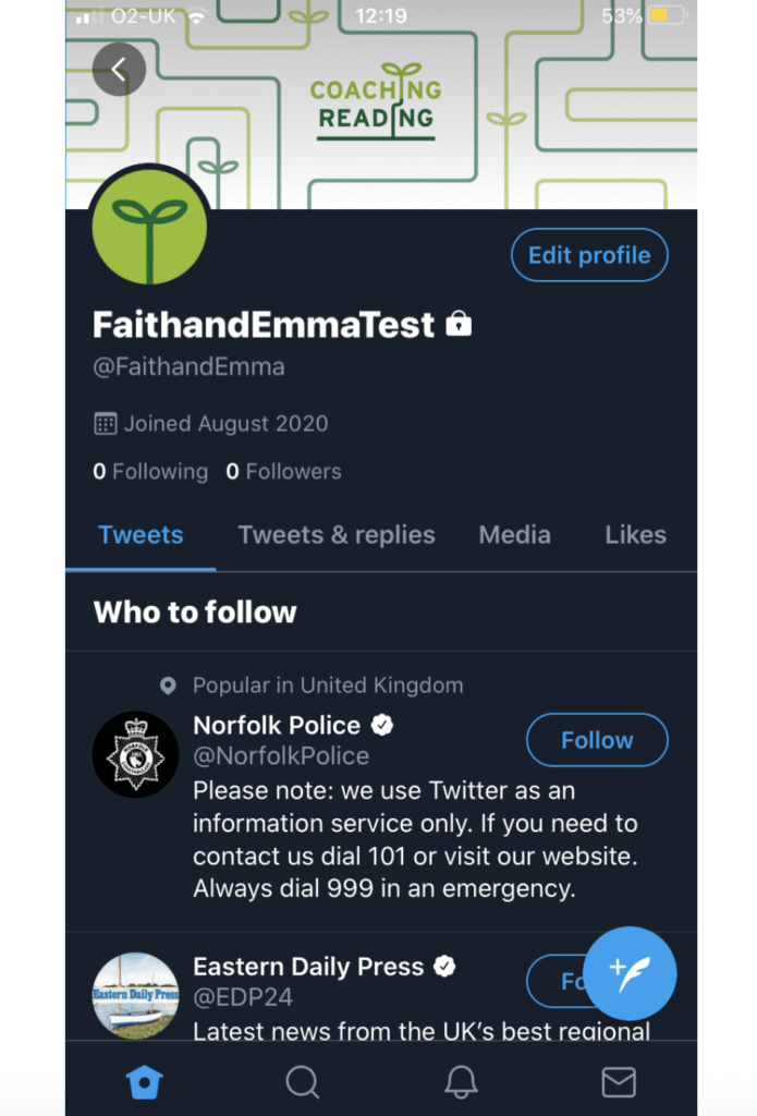
As seen above, we tested on both mobile and desktop to make sure it worked on both.
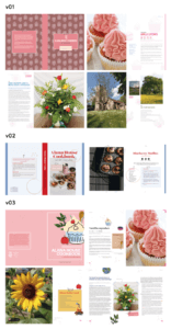
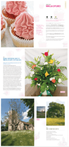
Development of templates
As stated before, the idea of creating templates for Microsoft PowerPoint and Word came much later in the process. Our client urged to us that we were not obliged to do this and it was voluntary, as she knew the start of term in September was approaching. However, we were happy to do this as we already had the logo and social media designs we could use, and it would also give us great experience. Though it was something we had never designed before, a discussion with our module convenor concluded that this was something we would definitely need to know for the future. Initially, our client asked us to produce ‘Word and PowerPoint templates’, however our module convenor suggested it would be better to produce both a letter template and a ‘pitch’ template with typefaces chosen, which we then suggested to our client. She was a little hesitant at first, as she was worried about the ease of use (most people using the templates don’t have much marketing experience), however we insisted it would really help finesse their visual identity and it would be easy to understand, so she eventually trusted us with that task.
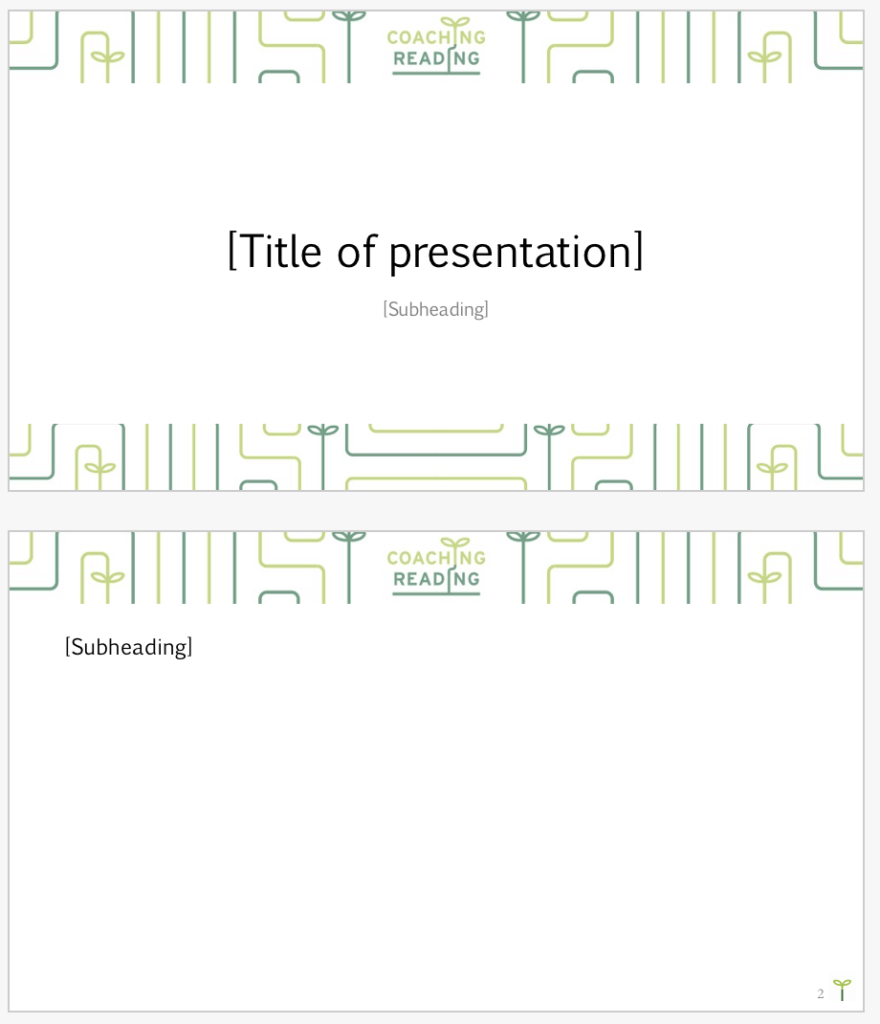

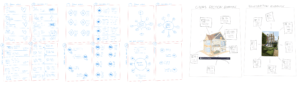
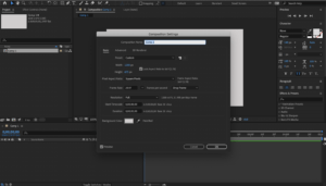
We first started to produce some powerpoint templates, as this was the ‘easiest’ to design. We took the pattern from the social media banners and extended it, we also put the leaf ‘icon’ to good use by sitting it next to the page number. We learned about master slides, and templates. By sending the client a .potx file, it will open as our blank template each time, and in the slides panel they can add our slide design to the next page.
The letter templates were a little more complex. We had to make sure the text box with the recipient address was in the exact place it would show in the window of an envelope. We researched this and allowed plenty of room in case any text overspills. Again, we used a .dotx file template to ensure it opens up looking like this each time.

Above is the ‘general document’ we produced, we provided a version with a cover, and one without, again as a .dotx file. With this and the letter, we provided a hierarchy guide. The typefaces we decided to choose were Euphemia for display text and Garamond for body text. We had to choose typefaces which were available with Microsoft Office so they were accessible to all. We felt a mixture of serif and sans serif would appear easier on the eye, as all serif typefaces may appear too corporate, which is what our client wanted to avoid (as stated in the brief). In this and the letter, we have space for Coaching Reading’s address at the bottom, however they can remove this when applicable.
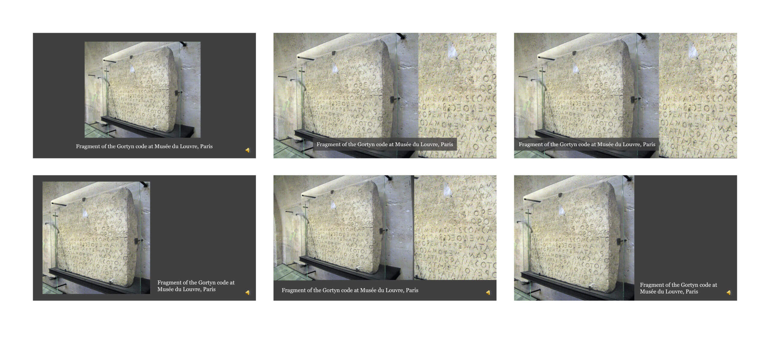
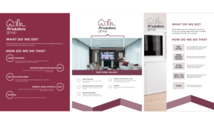
Visual identity guidelines
Our final task was to create the visual identity guidelines. This was done as a pdf document, and we had to ensure it was very clear and understandable; our client emphasised to us several times throughout the project that many people in her network don’t have very much experience with marketing/designing, so we had to ensure to not use too much technical language.
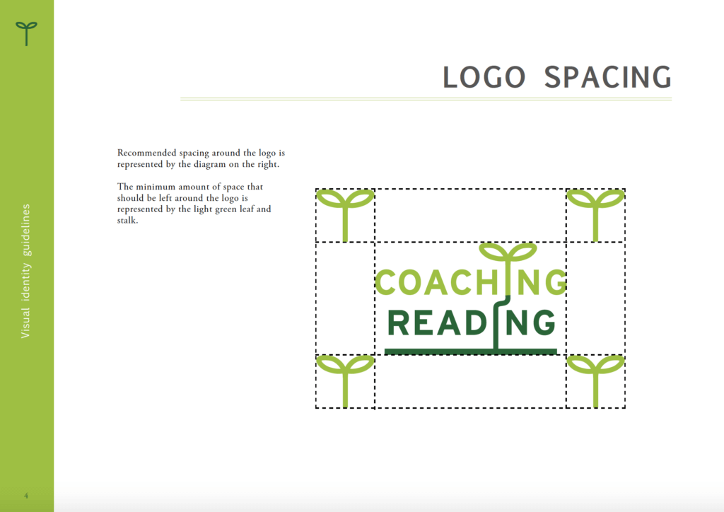
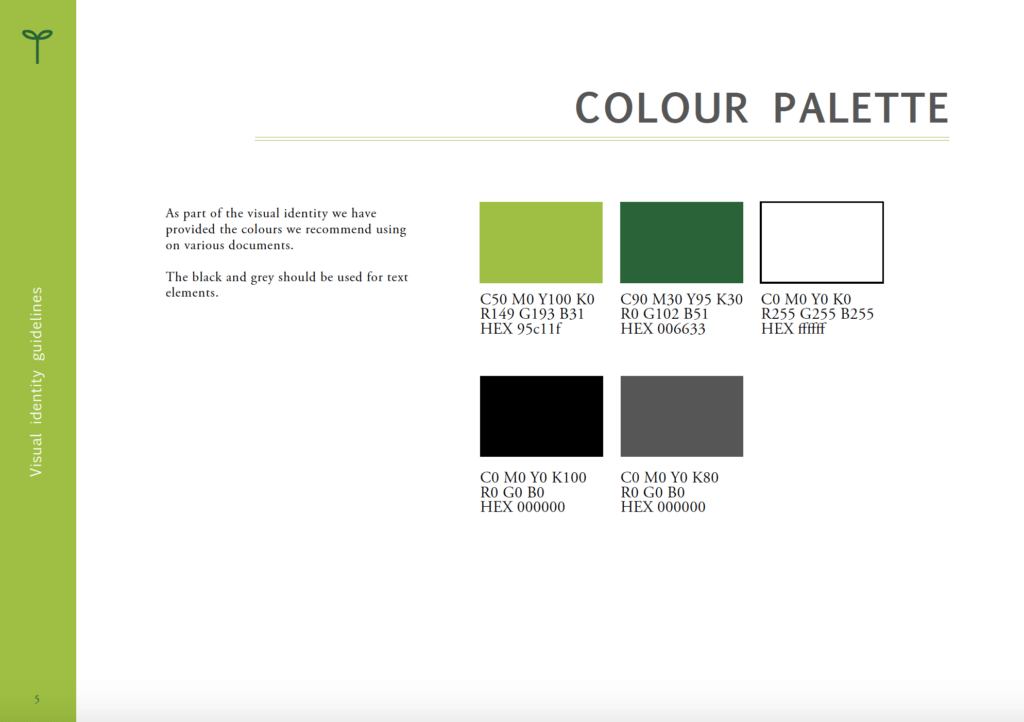
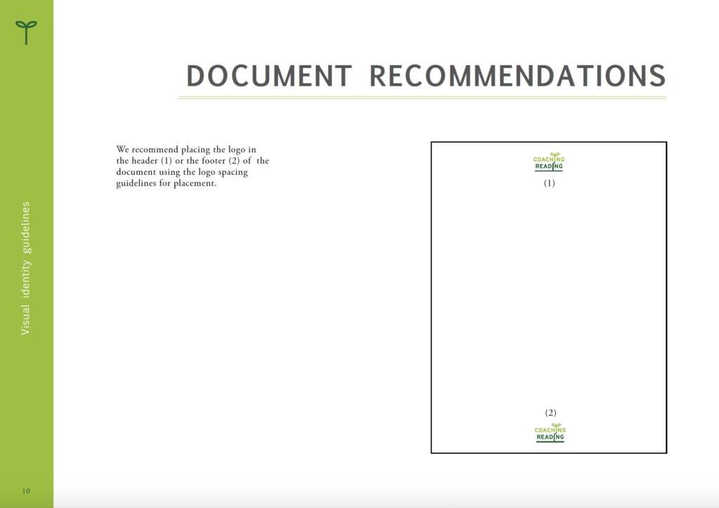
We had various pages showing where to place the logo on a document, how to use it etc. We made diagrams for an easy visual reference, as we used all the typefaces and colours we recommended within the guidelines to demonstrate how it looks. An issue that emerged when showing this to our convenor was the fact that we never considered Pantone colours; with projects which are printed this is important as colours can vary a lot, even with the correct CMYK key. This is something we will definitely remember for next time.
Reflection
The feeling when our logo got signed off was great, we had come a very long way and it gave us a huge confidence boost to know that we can do this, we can produce something very professional and unique. For our first time ever using style sheets and master slides, I feel we did a good job; Microsoft Office is incredibly limited in comparison to the Adobe Suite we are used to. Despite working on this project for a while, we never felt ‘bored’ with our logo, the colours are still calming to look at to this day, which I feel is a testament to us sticking to the design brief.
A fairly obvious challenge with this Real Job was having to complete it during the Covid-19 lockdown. We were never able to meet our client in person, and instead on Zoom and Microsoft Teams calls. This required us to be organised with our files as we transferred them to each other over OneDrive. Internet connection was also a very big negative factor for one of us in particular as we had to work from home, meaning we had to communicate clearly as there was rarely a strong internet connection between the three of us.
In terms of improvement, using Pantones would ensure peace of mind when printing, so this is something we will definitely bear in mind for upcoming projects requiring consistent and accurate colour printing. We also noticed perhaps the PowerPoint borders could be in a higher PPI; it did take us a long time to align everything on PowerPoint and PNGs were sometimes very annoying to work with when imported from Illustrator. This is something we didn’t notice until after sending the files over, and is something that can easily be fixed if requested. However, it likely isn’t that noticeable in a Zoom call (where they are currently using our templates) or if it were to be projected onto a wall.
We both learned a lot of new skills on this project. I (Faith) in particular was worried as I never felt too confident with branding, and for Emma it was her first real job, so there was pressure on both of us. Though there are things in hindsight we could have perhaps done better, such as using Pantone colours and editing some of the PNGs for the PowerPoint template, we both feel proud of this project, knowing we have essentially shaped the image of Coaching Reading. We have developed a very good rapport with our client, Julie, and we know if there are any potential issues we can always redesign things or re-send anything which may need fixing (we have kept all the files from the project just in case).
“They were both willing to participate in a coaching session delivered by two of our members. This experience and the fact that they took feedback on board led to development of some brilliant logo options which were very well received by the group.”
“The final logo, visual identity guidelines and social media banners plus Word and PowerPoint templates exceeded everyone’s expectations and the Word template has already been used by myself for meeting minutes.”
– Julie Williams, Coaching Reading


 Designs 1-3


