
Background
London AV Solutions is a family run business who provide smart home solutions using cutting-edge technology to simplify and enhance the lives of their clients. The services they provide include home cinema design and installation, smart home security system, hi-fi system installation and interior lighting control solutions.
The client has two offices, one based in London and the other in Surrey. For this project we worked with the Surrey branch to create visuals to display on their office walls.
Our supervisor for this project, Rachel Warner, had worked with the client previously so was invaluable in the process.For more information about London AV Solutions visit their website https://www.londonavsolutions.co.uk/
The brief
The client approached the typography department looking for a pair of designers to create them some large scale wall graphics to display within their Surrey offices. This was a valuable opportunity for us to work with a professional client outside of the university and to gain more experience when working in large scale print.
This project called for two different deliverables, firstly a collection of motivational posters to be displayed within the offices upstairs to inspire employees during the working day and secondly a set of four large scale boards to installed in the downstairs meeting room, these boards should showcase their previous work and their brand to new and existing clients they convene with here.
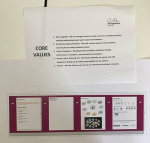
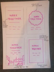
In our initial meeting the client provided us with a printout of their initial ideas for each of the four boards as well as the copy they would like included on the morale posters upstairs. We used these as our guide when we later began sketching out design ideas. They initially asked us to use the same burgundy and teal colour scheme that they had in their downstairs meeting room but this changed to black and gold later in the project.
The process of getting the restated brief signed off was more troublesome, as a professional working client we found that they were incredibly busy and wanted to see results as soon as possible. Because of this they were reluctant to take the time to go through the brief, we discussed this in real jobs meetings where James stressed the importance of the brief being officially signed off before starting design work, we went back to the client with this and they did eventually sign off on it.
Research
Competitors
When google searching “london av solutions” our client is not the top result even though that is their company name, the results that appear before them would therefore be some of their highest competitors. These included TenAV, ITSL group, Mechdyne and AV Contacts, all of these companies provide very similar smart technology services. TenAV, who are also based in Surrey and have been running for 16 years, throughout their website they really emphasise the point of putting the clients’ goals and needs first so we should try and include this ourselves. However, TenAV caters more to businesses but others such as AV Contacts are much more direct competitors as they also work on personal homes.
Users
The users for the posters upstairs are the AV Solutions staff, their goal is to get work done, the posters are there to inspire them and make the room more colourful and pleasant to be in. The posters will also remind them of the company’s core beliefs and motivations which should in turn make them feel motivated to work there.
The users for the boards downstairs audience are the customers. One user could be a brand new customer who has never used London AV Solutions before. Their goal will be to learn more about the company to see if they are worth hiring. Some of our boards will be used to advertise the company, showcase their core values and the type of technologies they can provide.
A third user could be a different customer who has already used London AV solutions. Their motivation could be to add more technological solutions to their house. They would therefore have a need to find out more about the different types of technologies that London AV provides, our boards will feature these as well as photography of particularly successful projects that showcase the clients best work and act as inspiration for their customers.
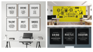
Design Inspiration
The project was temporarily put on hold because the client found themselves overloaded with other work. During this time I looked for inspiration and ideas from existing office murals and other motivational posters.
Professional corporate design:
- use of diagonal, coloured panels
- professional, clear, high quality photography
- blue and white tones
- clean design
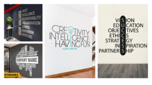
Company values in office space:
- large scale, oversized
- not framed, filling as much space as possible
- typographic
- very bold, easily read from anywhere in office
Office space wall art:
- framed options, smaller
- main motivational word with extra description underneath
- no imagery in frames, purely typographic
- illustrations used in yellow example, much more creative, probably less suitable for high end, corporate client
Designing
Morale Posters
Sketching
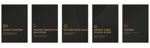
I began the design process by creating some basic sketches to explore different layouts and concepts that could be used for the morale posters in the office upstairs. I decided that the main message for each poster e.g. ‘work together’ should be large scale and in full caps so that it could be read by everyone, even the employee with the furthest desk from the wall. The posters could also feature some decorative elements such as a swirly border or a cityscape to make them more visually appealing as wall art. The cityscape concept was also inspired by the company’s logo.
Design progress
Moving on to the digital design process we felt that the posters may be more effective in colour, this way they would help create a more positive and cheerful atmosphere in the work room. I also created the cityscape concept but in monochrome to give the client more choice.
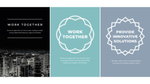
Both our supervisor and the client liked the artistic circles used in the second design concept so we developed these further, leaning more into the positive colourful approach.
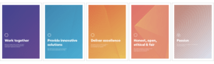
Part way through this real job a new project manager at London AV Solutions was brought in and had changes they wanted to make to the brand, specifically their colour scheme. They wanted to change to a black and gold scheme for a more opulent, high-end feeling, so we adapted our designs to meet this.
We had also been working on the designs for the boards, for the client meeting room downstairs, at the same time and so changed the circles for the symbols we created to coincide with the first board.
Final morale poster designs
Boards for client meeting room
Sketching
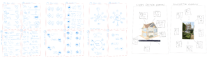
We began our design process by creating some sketches of different layouts we could use for each of the boards, this allowed us to quickly explore alternative ideas and concepts to see how they would work with all of the elements together before digitalising them and adding more detail.
Design progress
I then moved our designs into InDesign and created multiple concepts for each board for the clients to choose from. I created some concepts based on the artistic circle designs that I created for the morale posters which the clients liked. I also created some alternatives featuring a zig-zag pattern similar to the corporate styles of design I used for inspiration.
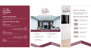
Optional design concepts for board 1 (showcasing company morales):
Board 2 was undecided at this point
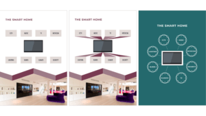
Design concepts for board 3 (includes a smart screen showing the different AV features the company provides):
Board 4 (showing different remote control options):
As discussed previously, the project manager then changed and she requested that we change the colour scheme to black and gold. From the previous concepts we showed her favourites were the zig-zag designs, she also had some additional changes and finally brought us an idea for the second board. All of which can be seen in the next major design phase:
She also requested that a graphic of a house be used instead of a photograph on the third board. The house graphic would act as a diagram to show where their various different products could be installed in a house. Anthony worked on creating a graphic for this but the client ultimately decided to provide one themselves.
We developed the designs further, using feedback from Rachel, our client and the real jobs team. James advised that the boards should have a design that flows seamlessly between them. I adapted the designs to accommodate for this so the zig-zag line connects them as one set.
Final grid
The grid did change as the design developed but the final grid where the zig-zag acted as a connector between the boards can be seen below. The grid was very useful as it allowed us to keep consistency in our placement of elements throughout the different designs for each border. This helped them look like a professional, cohesive set.
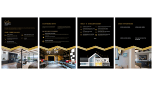
Final designs
Production
We spoke to DPS at the start of the project about the different printing options but when it actually came to getting the designs printed we discussed the options with Geoff and he said that the clients should use an external printer instead as it was such a unique large scale project and the offices were not in Reading. Although the client found the printers I still needed to send the artwork over to them myself, this taught me valuable lessons about communicating with an external printer and how to correctly export the board designs to be printed. I followed the blackboard checklist to prepare the final artwork and enlisted the help of James and Geoff to export the boards at the highest possible quality since at such a large scale a professional display piece could not afford to be pixelated.
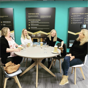
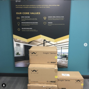
Final products in use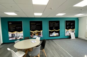
“Thank you so much Olivia and Anthony for your lovely designs, it was a pleasure working with you both”
“We love how our new meeting room looks”
Reflection
Working on this real job was a truly valuable experience as it allowed us to work with a high-end, professional client outside of the university which will be a fantastic work experience to include on our CVs and to talk about in future job interviews. It taught us lessons about managing such a busy client and emphasised the importance of key non-design elements such as having the restated brief signed off and how to export files for large scale print. It also further improved our InDesign skills and use of grids as well as bettering our professional communication skills.
Overall I am delighted with how this project turned out and look forward to showing it to future employers. If I could change anything about the outcome I would have loved to have been able to see the final boards and posters once that had been installed in the offices but unfortunately this was difficult due to coronavirus restrictions.