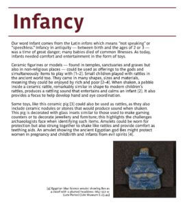
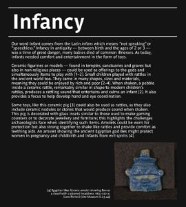
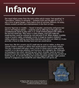
Category: Real Jobs

The Global Goals Exhibition

Background

The Global Goals, also known as the Sustainable Development Goals (SDGs), are a set of 17 goals established by the United Nations in 2015. These goals are part of the 2030 Agenda for Sustainable Development, a plan of action for people, planet, and prosperity. The SDGs aim to address global challenges such as poverty, inequality, climate change, environmental degradation, peace, and justice.

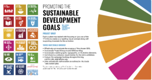
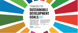
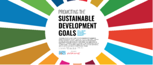
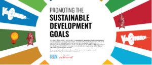
The Exhibition aims to showcase the poster designs of Part 2 students from The Department of Typography and Graphic Communication, completed as part of their design practice module led by Greg Bunbury in Autumn 2023. It provides a brief overview of the project, as well as a summary of each of the Goals themselves. Each student was randomly assigned one of the 17 goals to research and design a compelling poster and supporting assets with aims to inform, inspire and attract passers-by.

Restated brief

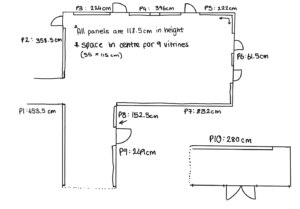
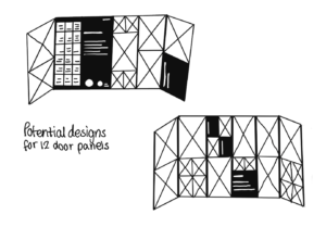
Restating the brief was crucial to receiving a grant to fund the production of the exhibitions, this entailed providing exact dimensions for each exhibition. We were lucky enough to have the measurements of the department exhibition space provided for us by the previous exhibition designer, as well as the colour profile of the grey paint used on the panels. We were told the exhibitions would be funded by the Arts Committee (provide logo) and we needed to provide estimated costs for 2 different options for the library exhibition. We had the option between a set of tall A2 stands or 12 interconnected door panels roughly 6 feet tall so we had to provide information about both options in our restated brief before we could apply for the grant.

A struggle we had when restating the brief was knowing the deadlines of each exhibition, these weren’t completely finalised until a few weeks after the brief was restated. Incidentally, our plan to provide a detailed schedule was neglected until we knew our timeframe.

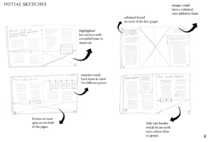
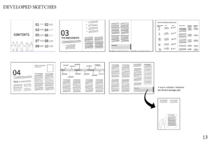
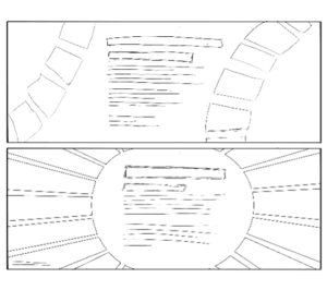
Part of the restated brief included prospective layout sketches to get a better understanding of the space we were working with.

Deliverables

After the grant application was accepted, we were able to finalise our exact deliverables for the job:

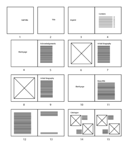
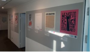
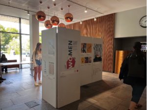
  • One exhibition to be held in The Department of Typography and Graphic Communication consisting of 2 large full-spread panels, 4 smaller information panels, and roughly 30 A2 posters.
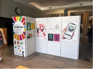
  • One exhibition to be held in the foyer of The University of Reading Library consisting of 12 interlocking door panels of equal size.
  • One online exhibition.

Research

GENERAL RESEARCH

Format and Design:

    • Consider the type of student work (visual arts, design, multimedia) and choose a format that effectively showcases it (Hein, 2018).
    • Interactive elements can enhance visitor engagement (Falk & Dierking, 2016).

Audience Engagement:

    • Design the exhibition with the target audience in mind (Hein, 2018).
    • Provide clear information and interactive elements to encourage participation (Sandifer, 2012).

Project Management:

    • Break down the exhibition development process into manageable stages (Hein, 2018).
    • Ensure clear communication and collaboration between students, faculty, and technical teams (Walker, 2013).

SPECIFIC ISSUES

One specific issue we encountered was placing posters too low in the library exhibition. This was done as an attempt to maximise the size of as many student posters as possible. However, feedback and research showed:

  • Studies in ergonomics suggest a preference for visual information placed within the comfortable viewing zone, which generally falls around eye level (Bernardini et al., 2018). Posters positioned too low force viewers to bend their necks downward, potentially causing discomfort and reducing engagement.
  • For people using wheelchairs or walkers, posters positioned too low might be difficult or impossible to see clearly.


Design process

Department Exhibition

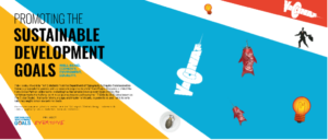
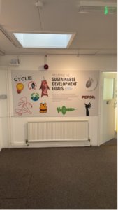
We began by completing some initial design sketches for what we labelled as ‘entrance panel’ (panel 10) and ‘corridor panel’ (panel 3).


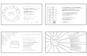
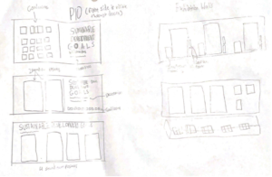
The next step was narrowing down ideas by creating these as digital mock ups in InDesign.

After the initial mock up stages, it was a matter of refining our ideas. Towards the end the ideas from the entrance panel and corridor panel were switched, our supervisor and others thought it was more welcoming to have the ‘sunburst’ design idea as an entrance to the department.

The final iterations of the entrance panel and corridor panel took place just before Christmas, this was then signed off by our supervisor and the next step was ensuring all of our classmates’ posters were available and usable.

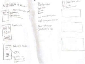
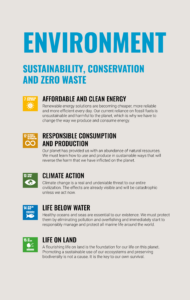
Information panels (Groupings)

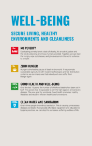
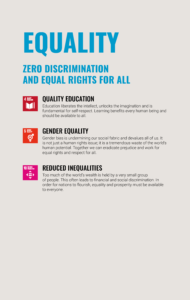
Inspired slightly by the ‘Up In Arms’ exhibition which was on show in the department during the research phase, we looked at having a similar idea of separating the posters into groups or categories so that we could organise the space and fill some of the sections of the department so it wouldn’t feel as empty. These ‘groupings’ were created based upon the overriding theme of each goal, for example, No Poverty and Zero Hunger both carried an overarching theme of well-being, so these were grouped into the same category. The categories were then made into posters to show information about each goal, the subsequent posters promoting these goals were then placed in this section of the exhibition. The grouping was carried across into the creation of the handout, where each page held each category.
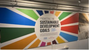
Library exhibition

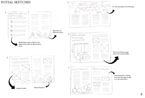
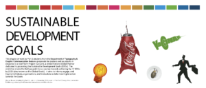
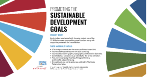
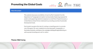
Completing the library exhibition was less hassle because the posters and captions were already prepared, and the assets didn’t have to change dramatically. The only changes made were: the size and shape format, the bottom bar across the posters, and the branding (the name of the exhibition had to be changed from ‘Promoting The Sustainable Development goals’ to ‘Promoting The Global Goals’) The process started with a few sketches to get an idea of layout.

To ensure a fair choosing of poster sizes, we asked the creative director of Project Everyone, Hannah Cameron, and our module teacher Greg Bunbury to choose the poster they felt went beyond the brief and demonstrated an impressive concept, they chose 4 posters between them and our supervisor Sara Chapman was especially impressed with another which we also included in the top 5. These posters showed in the library exhibition at full scale, and the rest were slightly smaller.

Leaflet

As part of both exhibitions, a leaflet was designed and handed out to the visitors of both exhibitions, as well as the launch of the library exhibition, this took similar levels of iteration and refinement.

The leaflet presented several similar challenges to what we see in many other formats of this exhibition. Due to the large number of posters, maximising their size has been an issue. Luckily, earlier on in the project it was found that the budget could afford a larger leaflet and a 6pp rather than 4pp was able to be used. This still however did not allow for student quotes to be featured, a compromise was made to leave this be and allow exhibition goers to find the quotes in exhibition.

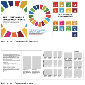
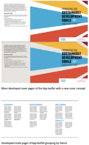
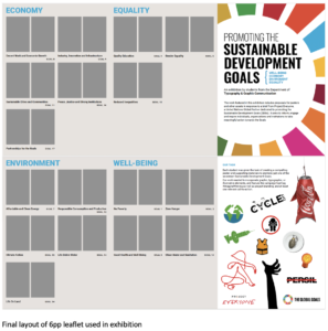
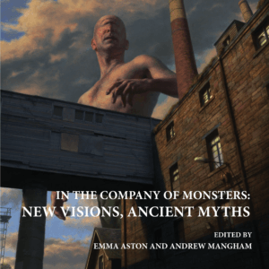
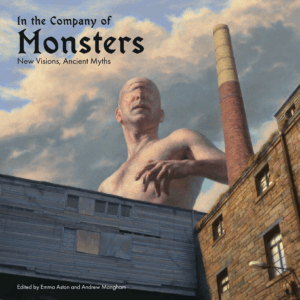
As seen in the above images, several changes were made to both layout and cover. The cover was adapted to take a similar approach to the department exhibition entrance, whilst the back took inspiration from ‘panel 3’. Furthermore, the fold was changed into a ‘z-fold’ to allow for maximisation of content due to the wasted back page in the previous fold.

This leaflet again however had to be adapted to the library exhibition, with branding changes announced by project everyone as well as changes to the copy.

Online exhibition

The online exhibition provided less design challenges compared to the other deliverables, however more learning opportunities. Having only completed previous real jobs reports on WordPress, the team found it difficult in the early stages of formatting the website. However, thanks to help from tutors, several hours of playing around with the software and finding its limitations allowed me to design within its boundaries.

Compiling the work

The assets required to complete the department exhibition included: Panel 10, Panel 3,
4 information panels (Environment, Well-being, Economy and Equality), a credits panel, a master file of all the posters, formatted quotes file, a leaflet and a layout plan.

The Library Exhibition required all of these compiled into one document, except the leaflet and layout plan.

The online exhibition required having to export all of the posters and assets to PNG.

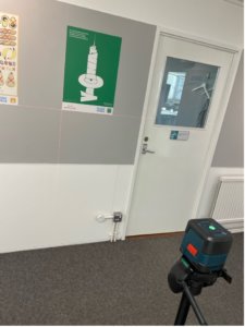
We used a level to ensure all student posters were at the same height.

Final products

Department exhibition

Library exhibition

Online exhibition

Installation

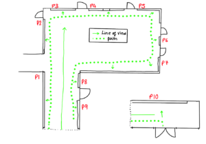
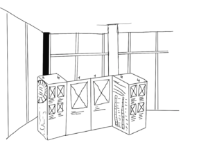
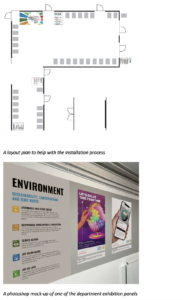
We produced a to-scale technical floor plan mock-up of the exhibition using PNG versions of the large graphics and scaled down A2 rectangles to plan the installation process of the department exhibition. To help visualise the layout, a mock-up was created to show how it should look.

We applied the large panels first, it was a group effort for the main panels, then Aaron and I applied the smaller panels and posters. The printed material was a sticky-backed vinyl which meant all we had to do was remove the backing and stick them to the walls.

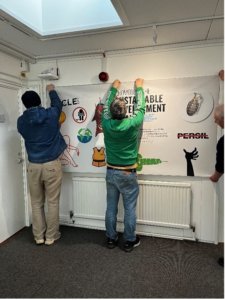
When the artwork had been printed, we had the exciting job of applying all the posters to the walls. We used the grouping system on the leaflet to apply the posters to the walls in the correct order. To ensure the posters were evenly spaced across each panel, we worked out the exact distance they needed to be apart from one another and cut a piece of card to that size to align the laser leveller to.

The library exhibition was installed by the Creative and Print Services.

Self reflection

The exhibition may have benefitted from more initial research, especially print testing on the material we decided to use, the colour printed on the vinyl material was a lot paler than anticipated which made a lot of the posters look very different from the way it appeared on elements of fire. Another reflection is that the exhibition didn’t show off the full amount of work produced during the project, alongside the posters, all part 2 students produced accompanying leaflets and animations or digital assets. These secondary assets could have been included in the exhibition; however, this might have been out of our reach, and we may have had to have a 3rd member of our team to help organise this.

AARON

Designing this large-scale exhibition pushed my boundaries, whilst collaborating with student artists honed my communication skills, and navigating space limitations required creative problem-solving. This project has led me to gain an interest in exhibition design, and my passion for leadership is still strong. This project included several challenges but I am glad that the team could bind together and provide something for our fellow students to be proud of.

OLIVIA

Being such an important part of this exhibition was an amazing experience. To be given the opportunity to showcase the incredible artwork of my peer’s while overcoming difficult challenges and restraints gave me a new insight into the world of design. It was a thrilling process with an energising amount of responsibility and an immensely appreciated outcome, I am happy to have worked well as a team and overcome the challenges we faced. To have such an impactful piece of work as the first item in my portfolio is a great stepping stone in my career.

‘I am, We are…different by design zine’ issue 4

Real Job: Georgina Wade, Lydia Hall and Taria Khan wrote and designed the fourth issue of the Typography and Graphic Communications’ ‘I am, we are… different by design zine’. 

Background:
The ‘I am, we are, different by design’ is a zine created by students from the Department of Typography & Graphic Communication. The zine aims inspire a conversation by showcasing a diverse set of perspectives on design practice from students, alumni and design practitioners. This student-led project advocates for diversity and how to design with an inclusive mindset. We all got involved with the entire process of the zine, from planning and interviewing, to writing and designing. The opportunity to collaborate and learn from a variety of different creative perspectives we an inspiring part of the project to us. Seeing as this would be the fourth issue in the different by design, it made sense to continue the zine being A5. 

Audience:
The zine is particularly aimed at those who have an interest in the creative field and would like to be educated in how to become an inclusive designer. The main audience would be those associated with the Typography and Graphic Communication department, such as fellow students and tutors but also prospective students.   

Figure 1: We planned out the pages to craeate visual rhythm and visual difference.

Research:
The first task was to come up with topics that would suit the next issue of the zine. Coming up with the content proved to be a lengthy process, therefore as a team we brainstormed a variety of different topics we could potentially include within the zine. We created a mind map and came up with a few articles which we were very interested. We wanted to ensure our topic choices were diverse, yet still focused on diversity and inclusion. Initially, we looked at a variety of popular and current topics happening across the world, including the BLM movement or the Russo-Ukraini war. Additionally, we began looking at wider topics such as mental health, focusing on post pandemic mental health and the effects caused by the pandemic. Alongside our diverse range of topics, we wanted to showcase different artists and designers. Whilst also looking at a range of popular and current diversity topics happening across the world, we also wanted to include topics that were personal to us. 

Figure 2: We planned out the pages, and assigned the articles

Interviews:
The first interview stage involved looking for a range of designers which specific interests to our zine topics about diversity and inclusion. As a group, we were each assigned one interview topic each to follow up and research. Since all our interviews featured our interviewees work, it was important to have the ethics approved before conducting our interviews. Our initial contact with our interviewees was conducted over email, enabling us to arrange our interviews online through emails or zoom calls. Our interviewing process allowed us to develop our own professional skills due to the professional nature that comes with conducting interviews. As well as giving us first-hand insight into diversity and inclusion about our chosen topics.  

After collecting all our interview content, we then set about writing up our articles. All our interviewees had provided us with a wealth of information to work with, especially the Sky interview with Aanand and the ‘Design Can’ interview with Sabine. Copy writing the information to fit the zine proved challenging to us to ensure all out topics fit into the zine. By copywriting the information down it enabled us to consider our audience more and how they might engage with the zine’s content. 

Copy Writing:
After one member of the team left, we had three people, we all spent the entire summer and autumn term collecting data for articles. For all the articles we read appropriate books, articles and other online resources to help us understand what we wanted to show to our readers.  

Designing:
We started our design development stages by looking at the previous zines, focusing on the individual styles within each of the zines. This enabled us to get a better understanding of how we might create the potential style and layout of our zine. We eventually decided that each article would have its own personality, which each related to the subject of the article, whilst still also being consistent to the rest of the zine. By ensuring that each article had its own theme, it enabled us to demonstrate a diverse range of article designs throughout the zine. Additionally, this also enabled us to experiment with a range of different design methods, such as designing with an inclusive mindset through colour blindness, as well as culturally through Pakistani truck art and Urdu. 

Typography:
Our choice of main text typeface was Halyard, as it was already being used in the latest issue to help created a sense of branding amongst the ‘Different by Design’ zines. By using existing paragraph styles from the suggested zine layout, it helped create the typography consistent throughout the zine. Each article then had a heading typeface which was related to the content, this allowed each article to have it’s own personality.  

Grid:
Lydia provided the group with a grid layout, that was to be used for all the articles. Since the design of our articles were all different, it was essential that our page layout was consistent. One challenge that we faced was caused by the nature of our topics, it was important that our page layout didn’t appear rigid. Our grid system was an A5 page, that consisted of 6 columns with a 10pt gutter. The left and right margins were set as the default (36pts), with the top and bottom margins set to 39.638pts and baseline grid set at 12pts. By having these column widths, it enabled us to have more flexibility with image size and column width for each of our articles. 

Figure 3: The 6-column grid which underlies all of the pages

Interview sticker: 
To help differentiate the interviews and book reviews from our other articles, we created different coloured stickers at the top right-hand corner of the zine to help the reader find each of the interviews easily. The interview stickers are blue, and the book review stickers are pink.  

Example 1
Below are some of the developed spreads, from the first version to the final product. 

Figure 4: Page development
Figure 5: Page development
Figure 6: Page development

Example 2
Below are some of the developed spreads, from the second version to the final product. 

Figure 7: Page development
Figure 8: Page development
Figure 9: Printed spread of ‘Extra Bold’

Production: 

The specifications of the zine: 

  • A5 portrait booklet 
  • 36pp text prints 4/4 on Edixion 120gsm 
  • 4pp cover prints 4/4 on Edixion 250gsm 
  • Saddle stitched 
  • 1000 copies 

After Rachel and Eric had approved the zine, we created the press ready pdfs and sent them off to print. Geoff, our in-house print technician, was incredibly helpful in this stage of the project and suggested to make a few minor changes, such as changing the photos from RGB to CYMK. We were really excited to receive his email saying that the printed zines had arrived, there’s nothing quite seeing the printed object which we had written and designed!   

Reflection: 

Taria:
We felt like if the zine had some kind of branding which would make it consistent to all the past and future zines. For example, we had troubles with the typeface if we had consistent branding it would limit the errors. 

George:
Being part of this team helped me build on my communication and teamwork skills, enabling me to learn how to become more responsive and learn about methods such as ethics approval, which will be useful for the dissertation module. Having more freedom to choose and explore our own topics of interest for this zine was something I really enjoyed, as this is a unique opportunity on this course therefore it helped me to stay more focused and involved in the project. The challenges I faced were mainly focused on the Russo-Ukrainian poster, as this is something very personal to me therefore, something I really wanted to perfect.  

Lydia:
I really enjoyed being on a wonderful team of designers and collaborating with my peers. With a zine about diversity and inclusion it makes sense to have a team of people with different backgrounds and experiences. This project was different to others in the sense that there wasn’t really a hard deadline, while this was good in some aspects, I did struggle to motivate myself and to move the project forward. I have learnt that creating those deadlines for myself and the rest of the team will help to keep the project going.  

Figure 10: Contents page

Monsters exhibition catalogue

Background

Andrew Mangham and Emma Aston from the Classics department at the University of Reading anranged for an exhibition presented in the Madjeski Gallery at the Reading Museum, showcasing works of painter Paul Reid and sculptor Eleanor Crook. This exhibition looks at the ‘the biological and artistic meaning of diversity and difference, and the vital role that history plays in our understandings of the dynamic working of natural history’.

Restated brief

The brief was to design a catalogue entitled In the Company of Monsters: New Visions, Ancient Myths for the exhibition presented in the Madjeski Gallery at the Reading Museum and to design and send this to print in time for their exhibition by the 25th August 2023 (dated decided on towards the end of the project). The catalogue will showcase feature short essays from experts in ancient history, literature, fine art, and gaming  as well as images of paintings and sculptures by artists, Paul Reid and Eleanor Crook.

deliverables
  • Design of front/spine/back cover
    • Identify images by Paul Reid to create a front cover with presence.
  • Design of front matter including:
      • Title page
      • Table of contents
      • Acknowledgements
      • Foreword
      • Layout of 6 x 1000 word essays including provided
        illustrations

      • Illustrations for decoration and for essays as
        requested/suggested by client

      • Layout of catalogue of artworks on display, exact
        number of artworks and images thereof to be

        provided. Details are: title/date/medium

Design process

Research

In our initial meeting with the client we found that the aim of the catalogue was to create a catalogue that will effectively showcase the the paintings and short essays. The layout should assist the reader in way-finding in the exhibition.We began by looking at Rubens to Sickert: The Study of Drawing,  a previous exhibition book as our client said they would like the catalogue to have a similar design and format. 

Rubens to Sickert: The Study of Drawing Exhibition Catalogue
Rubens to Sickert: The Study of Drawing Cover art
Rubens to Sickert: The Study of Drawing Exhibition Catalogue
Rubens to Sickert: The Study of Drawing Inside page
Rubens to Sickert: The Study of Drawing Exhibition Catalogue
Rubens to Sickert: The Study of Drawing Catalogue pages

Ideation

inside pages

We began by researching what similar catalogue books had done for their page composition. After looking at  ‘Rubens to Sickert: The Study of Drawing’ we kept our book in a square format as well and kept some of the same composition like keeping all text on the left with a wide margin for references. 

Basic catalogue layout
Cover

After meeting with our client we learnt that would like to have the painintg ‘The Cyclops’ by artist Paul Reid who is an artist featured in the catalogue and the exhibition.

The Cyclops, 2021
Digital Painting

We designed two possible cover ideas, proposal 1 following the themes of the inside pages where it used the same typefaces and alignment and proposal two was a little more experimental using a a more gothic typeface to link more with the topic of the catalogue. After the meeting the feedback was:

  • Proposal 1:
    Likes the serif typeface as it gives a professional quality to catalogue
Proposal 1
  • Proposal 2:
    Likes that the original image wasn’t edited and kept to the correct brightness
Proposal 2


  • Overall:
    Wants the cover to match the seriousness of the pages inside the catalogue.

We decided to continue with proposal one as it was the most liked by the client as it still kept elements from the inside of the book and seemed like it was all part of the same catalogue.

Design development

Typography

Meta Pro
Arno Pro

Cover

At this stage, Richard had graduated and left and I worked on continuing with this project. I had continued with proposal one but following feedback, the typography and alignment of the inside pages had changed and so I changed the text on the cover to match the inside pages.

Developed cover

Inside pages – Essay

Following feedback, I worked on  two different page compositions for the essay portion of the catalogue. Layout one still continued with the long text block on the right side of the page with a wide margin and with the facing page image left aligned. This layout  had a lot of white space and made the pages look asymmetrical and a little empty.  Layout two used the margin space for the essay author’s biography which helped to fill the space and had a reduced line length for the body copy. The facing page image was now smaller and aligned with the author name on the following page. This layout had better flow and so I chose to continue working on this design.

Layout one
Layout two

Inside pages – Catalogue images

I received the images towards the end of the project but as I had a basic page layout plan, I placed the imaged according to it. I quickly realised my planned layout wouldn’t work as my layout had squared images. I changed my layout so that bigger images would have their own page and grouped smaller images where I could so that the images weren’t too spread out.  I felt that layout two had better flow to the pages and continued with designing this version.

Layout one
Layout two

Final stages

I received an unexpected and sudden deadline of a week left to complete the catalogue. During this week, I had to work on completing the catalogue images section. This was a little difficult as I didn’t have all the images till halfway through the week but once receiving them I was able to place them into my planned layout. Through this week I also worked on finalised the cover of the catalogue and carried the decisions I made on the cover through to the title page.

Final cover

Final essay pages

Final catalogue pages

Reflection

We regularly communicated with a clients through teams calls once every fortnight and  received relatively quick responses which was helpful during the designing stage as we weren’t waiting on the clients response. However, we had been brought into the project long before we were needed as when we had joined in March, the client didn’t have finalised copy until September and the images for the catalogue images till towards the end of the project.  We received a lot of positive feedback after the catalogue was printed and it was well received.

Locus Lodi Exhibition

Background

The Ure Museum of Greek Archaeology in the University of Reading had held the exhibition Locus Ludi: Anyone can play! from 5th September – 30th November, showcasing the games played in the ancient world and understanding the educational, societal, and integrative role of play in the past, which is important to understand the present and widen the debate on high tech toys and new forms of sociability. The exhibition’s aim was to show everyone that people of all demographics can engage in playing games and this will be showcased through the exhibition of objects related to various games, ranging from childhood to adulthood. The exhibition aimed to teach the audience about the different games played during the Ludic culture and engage in the interactive activities included in the exhibition and send out the message that everyone enjoys engaging in various games, no matter what age. The exhibition was targeted towards everyone of all demographics as the objects on display range from childbirth to adulthood, as well as including objects related to after death.

Restated Brief

The brief was to design the physical materials for the Locus Ludi: Anyone can play! Exhibition. This included display panels, promotional banner, an online exhibition booklet and educational outreach materials, all of which would be displayed during the exhibition, with the booklet being available online. Most of the details of the deliverables were undecided at this point of the brief and was subject to change during the process of this project, however, having visited the exhibition space in person, it was ready to go forward with drafting ideas.

Deliverables

After discussion with the client on what would work best for each of the deliverables, this is what was decided on:

  • Display panels:
    • To be placed in each display space to inform audience of the collections, an overall summary of the exhibition space.
  • 2 promotional banners promoting the exhibition:
    • First one would be a roll up banner, which would be placed in the corridor of the building for promotion.
    • The second one would be at the front entrance of the exhibition room.
  • Information booklet:
    • An interactive PDF file in A4 format.
  • Educational outreach materials:
    • Including information about the games on display

All of the deliverables mentioned above would be submitted to the client in PDF format but was subject to change if needed.

Research

As there was a lack of resources provided during the research stages, there was little research conducted. However, the client had kindly provided us with their house style in terms of typefaces and brand colour, which helped with developing initial ideas for the deliverables. Furthermore, having also paid a visit to the exhibition space to find out the measurements for the display cases, helped with designing the display panels, which would work as supporting materials for the exhibition display items. Research was also limited due to not gaining enough information from the client and poor communication from both sides, leading to months of no work being done from both ends.

display case for where the museum items were to be displayed
display case for where the second half of museum items were to be displayed

Colour palette

Brand colour chosen for the exhibition

To match the museum’s branding, the client had decided on the colour Purpurrot as the brand colour of the exhibition, as it complimented well with the museum’s branding. Both the HEX code (#691B23) and Pantone code (491 C) was provided, which then helped with developing the deliverables and implementing the branding onto them.

Typefaces

Typefaces used for body text, headings and logo

According to the Museum’s house style, Parisine was chosen as the typeface for body text within the family, the regular, italic, bold and bold italic weights were to be used for body and label texts. The bold weight was also to be used for titles and subtitles.


For listings and item numbers on labels, the client had requested that Parisine Clair was to be used and had also provided an example how all of the styles combined would look like when used in designing the panels and banners.

Example of the house style for text copy
The Ure Museum of Greek Archaeology logo

The museum logo was already provided; therefore, it wasn’t needed to create anything new for that, but nonetheless, the client had provided us with the typeface name used in their logo, in case it was needed.

Other important things to consider was that the terms BC and AD when mentioning years were to be used in small caps and that hanging numbers were to be used in body text but lining numbers to be used in object numbers and case numbers. Their house style also indicated that they preferred Italics over quotes for use-mention distinction and use open punctuation for label text.

Design process

Starting off with designing the display panels first, there was three concepts in total. For the first concept, to keep it simple, the brand colour was used for the headings of each section with lines both on top and bottom of the heading. For the text, the house style’s typeface Parisine was applied. Furthermore, images were added on the display panels to support the body copy within them, with added captions to assist readers in understanding the references used throughout, as well as when they walk around in the exhibition space.

For the second concept, the same layout was kept, except for changing the background to black to try and make the display panels fit into the aesthetics of the display items. The third concept reflected more of the brand colour of the museum with a gradient background of dark red fading into black. All three of these concepts were also applied onto the introductory panels that were to be used in the exhibition space.

Concept 1
Concept 2


Concept 3
Introductory panel concept 1
Introductory panel concept 2
Introductory panel concept 3

The design for the banner was kept similar to the banner that was on display during the duration of the existing exhibition and therefore the same layout was used. Modifications for the banner were made based on feedback from my supervisor, including a layout idea suggested by my supervisor himself. The main focus of the banner was information about the exhibition itself, so I tried to emphasise that by using different typesizes and weights to create hierarchy between the sets of information on the banner and balance it out with images related to the exhibition.

Version 1
Version 2
Version 3
Version 4
Layout suggestion by supervisor
Banner of the exhibition that was open during the process of this Real Job


The design suggested by my supervisor focused on using one image to bring impact to the banner. He suggested making the Ure Museum of Greek Archaelogy logo smaller to avoid attention to it. The aim of this layout was to make the title more. As mentioned in one of his feedbacks: “In general the design lacks impact. Partly because nothing is really big, and partly because there isn’t a lot of space. You can achieve this by making more of the good image and dropping the other one. If not and it has to be small, you could try making Locus Ludi bigger – it could be across two lines in caps.”

For the educational outreach materials, nothing much was done for it as the client had requested it to be a typical A4 sheet of paper of game rules and instructions and therefore, I only designed A4 sheets containing the game rules and added illustrations, which were provided and then refined by me, onto the document, using different typesizes, weights and spacing to make it presentable

Duodecim Scripta game rules sheet
Ludus Latrunculorum game rules sheet
Pente Grammai game rules sheet

.


Final product

During the final stage, due to poor communication, most of the deliverables were not delivered to the clients on time and as a result, the design ideas for each deliverable did not progress further. However, the client was still willing for me to work on the educational outreach materials and therefore over the next week, progress was made on the materials.

In the mid process of refining the materials, the client had requested to submit the educational outreach materials as it was and after making quick adjustments to the files, thet were all submitted to the client.

Duodecim Scripta Game Rules

Ludus Latrunculorum Game Rules

Pente Grammai Game Rules

Self-reflection

As this was my first real job, it was a challenge to tackle, with communication being one of the biggest challenges during the whole process. However, the support from the Real Jobs tutors and my supervisor helped me with progressing further with this, despite the final results not being what was expected or desired. Having started off this Real Job as a two person job meant that the responsibilities would have essentially been divided between me and my partner, however, by the end of this Real Job, things had changed and it became a one person job, however, I took this as an opportunity to challenge myself and get as much done as possible. Overall, this was an interesting project to work on as it allowed me to look at the behind the scenes of setting up an exhibition and the thoughts and efforts that go into the whole process. All the skills I had developed and learnt during this project are valuable and I hope to implement them in my future works as well.

Connectedness reports

What are the Connectedness reports?

A set of three reports summarising past conferences taking place at Manchester University that will be given out at the June 2023 conference, Connectivity and Inclusivity in HEIs – A solution-based approach. The first report focuses on creativity and inclusivity in higher education and women in environmental science, followed by a smaller booklet that summarises key outcomes from the Women in Science report.

The Creativity and Inclusivity in Higher Education report showcases engaging and accessible resources which convey the methods, processes, and outcomes to key audiences and stakeholders. While also addressing the need for equality, diversity, inclusion, and accessibility (EDIA) initiatives to recognise lived experiences as essential to knowledge sharing and to directly inform practice.

The Women in Environmental Science report focuses on the way that the climate crisis will impact women, how we can bring women together with diverse backgrounds, lived experiences, ethnicities, and disciplines, to promote inclusiveness, widen participation and foster discussion, help to inspire women to engage with their environment and environmental sciences. Focusing on the key themes of Women’s rights and issues that comes with this, climate change, sustainability, leadership, community, relationships, and communication.

Brief

The brief was to create three reports that would be printed and handed out at the next conference, we also had to create interactive PDFs for each report that would be showcased on the website. While also combining elements from the different stakeholders, Manchester University, and the co-brand Engaging Environments.

Our goal was to create an interactive and engaging set of reports containing a strong super-graphic and illustrations throughout to capture the reader’s attention as the content was very text-heavy. The super-graphic we created needed to represent ‘connectedness’ as it was used throughout the documents, tying them together visually.

Deliverables:
Design x3 documents that will be hosted as PDFs with a limited print run.
Deliverables:
PDFs and limited print runs of:
• Women in Environmental Science report (A4)
• Women in Environmental Science Toolkit (A5 Booklet)
• Creativity and Inclusive in Higher Education report (A4)
• Super-graphic

Branding

For the branding of the reports, we needed to use both Manchester University and Engaging Sciences branding. We were given guidelines from both brands which showed us the appropriate usage of logos and typography.

Audience

Looking into the audience and stakeholders was an important part of the process of coming up with a visual identity. Looking at past events from Manchester University which was provided by a video from our client allowed us to create a list of potential users for each report:

Women in Environmental Science

  • Women working in or with an interest in environmental sciences.
  • Equality, Diversity, Inclusivity & Accessibility (EDIA) practitioners
  • Higher education professionals
  • Policymakers in environmental science
  • Students
  • Early career researchers

Creativity and Inclusivity in Higher Education

  • EDIA practitioners
  • Academics staff
  • Students
  • Researchers from the UoM comprising diverse ages, ethnicities, and career stages.
  • Friends and community partners of UoM
  • Communities and participants from all parts of the UK

After researching and speaking with our client we came up with a list to cater our work to the specific audience. The client was very open with what he wanted the design to be but put emphasis on using bright colours whilst avoiding gender stereotypes. The client also wanted bold and assertive graphics throughout as opposed to illustrations that could be seen as passive. Our main goal was to create a design is visually appealing, assessable, clear headings, navigation and easily understood data.

Finding a creative direction

After understanding the content of the reports and the target audience we began creating some mood boards and investigated some existing reports. Showing our client our mood boards allowed us to make sure we were heading in the right direction while also being able to ensure the client was on board with our aesthetic approach before designing.

Mood board
Mood board

Design development

As we had a lot of creative control over this project, we began with some initial sketches based on the mood boards. Overall, the client was excited about these initial ideas but commented how they wanted the front covers to focus less on science and more on hearing different people’s voices while showcasing diversity.

Initial sketches
Initial sketches
Front cover sketches

We then went on to develop some front cover sketches based on the client’s feedback by incorporating different women and avoiding science or gender stereotypes.

Developed sketches
Developed sketches

Feedback from our supervisor, we decided it would be better for the pages to be landscape as the content was text-heavy and contained multiple graphs and tables. After further feedback, our client liked concept three as it included a vibrant colour palette and the text in four columns made it legible.

Concept 1
Concept 2
Concept 3

Super-graphic

Our client wanted a logo/super-graphic that would be used to tie all three reports together. The three examples shown were given to us for inspiration, and we then began to create some sketches focusing on “connectiveness and community linking to the natural world element. Nature and ecology”. After speaking to both our client and supervisor, we decided to take a different approach and create something a bit simpler that could be spread across each of the pages as well as shown on the front covers.

Super-graphic sketches

The final super-graphic shows connectedness through two circles overlapping each other, this also helps add visual interest and break up the text-heavy pages.

Final supergraphic
Supergraphic in use

Women in Environmental Science Report (WIES)

For the WiES report, we wanted to use bright colours and powerful illustrations that would be relevant and helpful alongside the text. Finding an illustration style was something we found quite difficult at first due to the content being very text-heavy there would therefore be lots of illustrations throughout. To help with this we came up with another mood board to help with some visual directions.

These two images show two different illustration styles that we experimented with showing the use of block colours and female empowerment.

Illustration style 1
Illustration style 2

Here are the illustration styles that we implemented throughout the reports. Showcasing women in different relevant elements of the report. We decided on this style as it is simplistic and easy to replicate in many forms while still being visually interesting.

The inside pages consisted of us using different colours for each of the different sections. This worked well in separating each section and carries through in the titles and super-graphics of each page. Through making this report we worked hard in creating visual interest in each page through different illustrations and images. We aimed to keep the pages different and not too text-heavy as this would bore the reader. This visual interest was upheld using speech bubbles are boxes to emphasise the standout information in the report.

A challenge that we faced was coming up with a way to show clear information in a table.  Below shows an initial table where we used different shades and lines to separate the information. However, this wasn’t a viable option as it is difficult to read with the line width being too small and not engaging for the reader. In the end, we had to think of a new way to display this information and decided to scrap the table idea and take the information out into its own sections. As you can see this way of displaying information works a lot better as the reader can take a glance and understand the text through the strong visual hierarchy that has been used.

Table development
Final table layout

Creativity and Inclusivity in Higher Education Report (C&I)

The client wanted us to focus this report more on nature and humans connecting with the environment. To do so we used blue, green and earth tones for the different sections as well as incorporating illustrations of trees, water, and rivers throughout. Although the two reports have different themes and content, we kept the same structure and illustration style as the WIES report.

C&I page examples

Lessons from Women in Environmental Science (The WiES toolkit)

This report is a summary of the main WiES report but follows a different structure of an A5 landscape booklet. As this report is a summary it has a lot less text but still contains elements of visual interest with a clear structure.

WiES toolkit page examples

Front covers

For the front covers we wanted them to reflect the content inside while also appealing to the reader. We began experimenting with different front covers the first being using an image that spread across the whole page and the other being more of an illustrative approach.

Front cover experiments

However, we decided that both of these didn’t fit and also didn’t give the reader an insight into what the report was about. The final cover designs that we came up with use typography and illustrations in a fun and engaging way that makes it clear what each report is about and follows the design inside.

Reflection

Feedback from are client was very positive. “Both of you worked extremely well on the Real Jobs project for Engaging Environments and our partner University of Manchester earlier in 2023. You absorbed a lot of complex information contained within the reports and on our calls regarding the project to produce designed outputs that were of a really high standard and reflected the themes of the work. Our partner was extremely happy with the reports, to the extent that they would like to produce a final report on Pt 3 of the C&I workshop in the same style, and the materials were also very well-received by the intended audiences at the event where these were shared.

You also worked to very tight deadlines, which was impressive given the size and scale of the reports that needed to be produced, and the commitment you showed to the projects throughout was very much appreciated.

I wouldn’t have any negative comments, I thought you both did a great job.”

Overall, this project has taught us many things with the main thing being time management and prioritisation. As it was such a big project with just over two months to complete three printed reports and three interactive PDF’s we needed to be realistic with what we could achieve in this time frame and didn’t have months of planning and sketching time like other projects would traditionally have. We were able to split the project up well to showcase both of our strengths while also allowing us to stay efficient in work production.

After this project we can both say that we have gained a lot more experience in editorial design as well as interacting with a client. We worked on our project management skills making sure the reports were ready for the event. We learnt to take on board feedback from both our clients and supervisors and create different revisions based on our feedback. Worked with branding guidelines, making sure that all the logos were placed correctly and maintained brand consistency. We learnt to address design challenges creatively and find solutions that met our client’s objectives.

Where to find the reports

All three reports can be found on Manchester University’s website under the WiES sections.

Reports used at confrence

https://www.meri.manchester.ac.uk/wies/research/resources/