
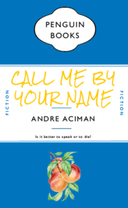
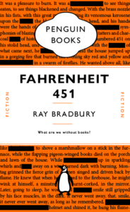
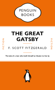
Initially we recreated a cover of the Great Gatsby in classic penguin style, I then used this template to create covers for some other books. I did however chnage some aspects of the template to better fit with the book contents. The Norwegian Wood cover is a deep red in fitting with the orignal cover, Call Me By Your Name uses a royal blue for the same reason. In this cover however I changed the penguin logo to a peach, the peach is a symbolic part of the book with a lot of relevance; I also used a font similar to the one used on the latest edition covers of the novel. My favourite design is the Fahrenheit 451 design, this book is an incredible look at censorship and the importance of literature in our society, i therefore have used text from the first page of novel but censored some of the words. I have chosen to keep the original penguin orange because it had good connotational links to Fahrenheit 451. 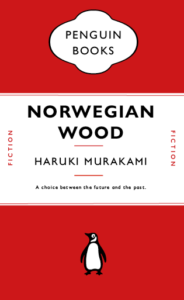
Category: Penguin cover (James’s project)
Penguin cover
bunny’s penguin book cover 2
my own design for a penguin book cover, based on The rocky horror picture show.
Pinocchio
We all know Penguin books, but how much work goes into the design?
I for one, never realised that the lines between the headers weren’t just added in afterwards, they’re attached to the text itself and change with the text. This honestly surprised me a lot. I also did not know there were hidden characters used every time I write something, e.g. space (a dot placed near the top of the x-height). Just working on this cover made me appreciate just how much actually goes into the formatting of a book cover design.
This made me want to try to recreate a children’s book in a similar style without all the flare and illustrations surrounding them typically. A childhood favourite of mine was always Pinocchio. I like the idea that lies are visible straight away, there’s no hiding them they’ll catch up to you. It’s the ideal book to strip back and recreate in this style.
The end of Club Penguin R.I.P
Club Penguin is an online game that was loved and played by millions across the world, however, it sadly got shut down on March 29th, 2017. The tragedy left millions heartbroken as this game was what they loved playing. Many people sort out to create or find a new version of this beloved game. However, sadly the true club penguin could never be topped and replaced. 
The actual main cover of my book design is purple with white text. This design has an image of a penguin from the game Club penguin on the bottom. The font that I used was quite different from the original book cover of the Great Gatsby, however, i thought that it would add some personality to the design, along with a bit of playfulness to it.
I also attempted to include even more images than the Great Gatsby did as well, to ensure the reader would be more engaged with the design. I did however stick to the main theme and layout of the penguin layout , however in the end included images and text that related to ‘Club Penguin’
Happy Feet
The class
Through this class I gained a much better practical understanding of the appropriate use of spacing tools such as tracking, leading and space before, and the guidelines with which spacing within text should be considered. I had not used paragraph rules before and so I was very glad to have discovered this particular tool. I also enjoyed learning how to create a template, in this case replicating a classic Penguin book cover and then using this template as the foundation for experimentation.
The cover
For my cover I chose to focus on the penguin logo. It has become so iconic but is often not designed to be the focus piece of any cover designs. It is almost always positioned in the middle of the bottom third of the cover on a blank background. The movie ‘Happy Feet’ singles out one penguin from the rest as being different and unusual so I wanted to play around with the use of the penguin, it’s colour and it’s position to create the background of the top and bottom thirds whilst echoing the storyline of the movie.

Emily In Paris
On Friday’s TY1INT practical session, we copied the design of a classic penguin book in InDesign. I found this task reasonably simple to follow and it helped me get to grips with using InDesign for the first time. I found making the shape at the top of the book most challenging, however, once we went through it a couple more times I managed to get the hang of it. We were then briefed to change some parts of the design and to create a new book cover for a book or film we have enjoyed recently.
Here was my first attempt at the task to change our existing book cover into a different penguin book. – TY1INT PENGUIN03
I have been watching Emily in Paris, a series on Netflix, at the moment and decided to recreate that in the form of a traditional penguin book cover for the task.
My initial idea was to have a silhouette of the Eifel tower as an ‘A’ in the word ‘Paris’. However, as I experimented more with the text alignment, I noticed that the top of the Eifel tower PNG formed the ‘I’ in ‘Emily’ as well. I thought this was a fun way to bring the cover together and tried to make it look as visually pleasing as possible. I also changed the colours in the book to the colours of the French flag.
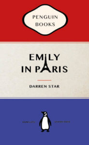
Overall, I found this task fun and very helpful to get started on InDesign. If I were to do it again, I’d like to break the traditional structure of the book a bit more. However, I do enjoy the subtle differences I have made to encapsulate the essence of the series.
Snow White and the Seven Dwarfs
The Original Version

For this task, we were asked to copy exactly how the book cover from Penguin Books looks like by using InDesign. I have heard about adobe before but never really use it at all. This was my very first time trying this software, and I found it is quite difficult to understand how it functions at the beginning, it took me about an hour to figure out its basic controls.
My Version of the Book Cover


The drawing process of each character IMG_2542
I used the penguin logo as the body of each character, including snow white and those seven dwarfs. I drew out their representative clothes to make them look more identical to readers. I found out that many fairy tale book covers are generally in dark colours, I believe it is probably because this colour scheme can create a mystical sensation. Therefore, I chose to use dark green as the background colour and added the pale yellow frame as a decorative purpose.

Self-reflection
I really enjoyed doing this task, because it gave me a chance to create or design whatever I wanted. It was indeed a cool working experience with InDesign, it is not easy to use and it takes time to learn. When I was using the software, it felt much more professional compared to any apps that I have used before. I cannot wait to try other software from adobe later the term and create works from it.
The Matrix
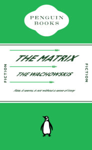
For this project we were asked to create a film, book or even a meme in the form of a classic penguin book cover. For mine I decided to create a penguin book cover for the matrix. I started by getting the green color pallet a lot of people associate with the film. I then distorted the type to make it look like it was dodging the bullets, (a reference to the film) however I’d say this was semi successful as Its quite difficult to tell what my intentions were. Overall though I like the green and really enjoyed this project.
PULP FICTION
In todays session I learnt how to recreate the format of the iconic Penguin Classic book series. I recreated The Great Gatsby by F. Scott Fitzgerald. I learnt how to manipulate the type of the cover as one element, experimenting with leading, type size, font and paragraph rules to replicate the aesthetic of the original copy. along the way I picked up on how to create Pantone swatches from classic covers and use them within shapes for the design.
This came into effect when I had to adapt my remakes format into a new cover. I chose Pulp Fiction as Tarantino is one of my favourite directors. The format allowed me to change the name and subtitles whilst maintaining the same proportions. I decided to use a slightly dull yellow to represent the colour scheme in the movie title. I also imported elements such as the 10c sign and the silhouette of Mia and Vince dancing from one of the iconic scenes, which can be linked to the quotes I used from Vince in the last line of the sub-title. As a call back to the scene where Vince accidentally shoots Marvin, I decided to incorporate blood in the foreground and background by sandwiching them in-between the colour block layers. I adjusted the opacity in the foreground to show the characters trying to cover it up with Jimmie’s bed sheets.
The links above are of my original copy and my Pulp Fiction adaptation
Stranger Things.
In class, we learnt how to design a classic penguin cover on InDesign and know the basic format of it. We were also showed the important tools that are used on a regular basis when using and how to use it.
I am not particularly fond of InDesign for cover design cause I find the program confusing to understand and tricky to use and I prefer photoshop but with the seminar, I was able to use and understand much more tools than before
There were many tryout and errors when designing the cover since the task for the day was to replicate it as much as possible. The hardest was designing the penguin logo cause it involved so many steps to get to the final product thou I believe my logo isn’t accurate with more practice I can do better.
Messed Up Version.
For my second tasked I did a book cover for one of my favourite series using a classic penguin book cover as inspiration. The series is called ‘Stranger Things’, It is a Fantasy, Horror TV Series on Netflix.
Stranger thing has an iconic bold logo that is recognizable anywhere. The font is ITC Benguiat, it’s a serif typeface with all letters stretched vertically. The colour theme for the cover is Red, white, and black because the logo for the series is a red or red outline with either a white or black background.
I turn the penguin upside down to represent a dimension in the series called ‘the upside-down’. The scratch marks represent the demon of the book and the marks that show that this film is horror.
The series Stranger Thing is a series I love because it has a 1983 theme, and I enjoyed the vintage layout in which the film is produced. It is influenced by Stephan king horror books so I wanted the theme of my cover to be dark.
I like the simplicity of the book and I feel like it communicates to viewers what can of the series cover is based on at the same time without giving to much information.