
In addition to recreating the penguin book design from scratch, we would put our own spin on the classic design with more modern fiction. I did mine on the 2008 movie Kung Fu Panda from DreamWorks. In order to reflect the main characters loving persona, a warm colour that can appeal to kids, the target audience of the movie. I switched out the classic orange for a warm purple colour. Further alterations are that of Po the Panda in the place of the famous Penguin and where the writer of the books name would usually be, the name of the voice actor Jack Black is there. I chose to use him as it is a recognisable name and arguably more recognisable than the writer of the movie. Penguin books also always have a tagline, I used one from a poster for the movie, ‘Prepare for awesomeness. Summertime is Panda time. He’s not a big fat panda… he’s THE big fat panda! ‘a humorous quote to help depicts the comedic tone of the movie. If I were to make any alterations, I would like to make more changed to make the Penguin book design less recognisable, maybe to do so I would have to pull from a more complex source such as a different movie or book.
Category: Penguin cover (James’s project)
Penguin cover
Twilight
As part of this mini project, we were asked to, not only complete a copy of our own penguin book by creating an identical frame, but to also interpret this into our own concept through the inspirations of anything we can get our hands on. I decided to base my idea on The twilight saga. I wanted to use the colours red and black, as I felt these are the colours most associated with the movie series. As you can see, I also created the vampire fangs with dripping blood, hanging from ‘penguin books’, to really capture the vampire characteristics.
Creation of the Penguin Cover
 Original Cover
On Tuesday, we have been given a task of creating a penguin cover. It was a first time I was using and an InDesign program. I found it very confusing at first, but we had been given a recorded video which helped a lot. The most confusing part was the creating of Penguin Books logos, as we had select, crop, reflect and then shaped the ovals, that were added to one shape. I have spent a lot of time on completing the task, but it was worth it! 😀
 Cover created by me
The cover of my book was inspired by a Netflix television series, which was “Emily in Paris”. I have chosen “red” as a main color, because it represents “Love” for me and “Emily in Paris” is all about romance. I have decided to place the penguin at Trocadero, as it would reflect the theme of the book more. The title of the book is also in red color, as it creates a connection between the upper and the lower part of the book. Initially, the file was in PDF format, but as i converted it in JPG, it lost its quality. Overall, I have enjoyed the freedom of designing the cover, as it let my put all thoughts and creativity in it.
The Diary Of A Wimpy Kid Penguin Cover
For Tuesdays task, we began using InDesign and started by creating a book cover. To do this, we replicated a Penguin book cover. I really enjoyed this task of learning how to manoeuvre the software and found most of easy to follow along with. I found the top logo of ‘Penguin Books’ the most difficult to create.
I then went on to create my own cover, using the style of the Penguin books. I changed the colour to a purple and chose the book of ‘The Diary Of A Wimpy Kid’ as this was one of my favourite books when I was growing up. I changed the image of the penguin to a black and white one to fit in with the illustrations used within the book. I enjoyed making this, however found that as I exported it into a PDF, the quality of the images were lost. I then also included ‘My Diary’ for comedy to refer to the fact that I was the w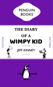 impy kid.
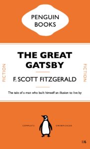
The new library:


In the first task, we were given an original Penguin copy of ‘The Great Gatsby’ to recreate to the best of our ability in InDesign. This allowed us to understand and get to grips with the fundamentals of the InDesign design program whilst also getting a good look at a very widespread and professional design. With this new knowledge and design template, I was able to create a design of my own called ‘The New Library’ where I used a QR code to the Wiki page as the title, binary that translates to ‘Safari’ in the side text and the author being named ‘Tim Berners-Lee’ as the man who helped invent the internet. This idea was inspired by the way the internet has changed the face of research and reading as a whole whilst still holding its origins in the cover of a book.
Eat, Pray, Love, Repeat
In TY1INT Indesign practical session, we had to all create a copy of a classical Penguin book cover. We were then asked to experiment with that book and perhaps change the colour and title of the book.

I chose to change the cover to another classical penguin book.
We were then asked to design our own book/film cover, including an element of wittiness. We had to stick to the basic rules of our first classical penguin book cover.
I chose the book ‘Eat, Pay, Love’, because it is about a woman who had everything; a house, a successful career, and a husband. However, she loses everything, and loses sight of what is important to her in life. She sets out on a journey, stepping out of her comfort zone, and she builds her life back together again, coming back a stronger woman. To me this book conveyed such a powerful and important message.
We can all relate to Eating, Praying and Loving in a very personal and eclectic way, but there are also universal ideas and emotions about these concepts that we can sometimes joke about. In this case I am playing with sarcasm and the notion of food as a comfort, but also as a source of guilt. In a society where women are constantly beating themselves up for wanting to eat (a lot and not necessarily healthy)and always chasing the unattainable perfect body, you have to appreciate the encouragement to eat as much as you can, praying that you don’t expand beyond your most comfortable outfit. And when you ticked the first two boxes, Loving the chef is easy. I added Repeat to highlight the fact that humans are creatures of habit and we sometimes struggle to move away from our repetitive lifestyles and routines.
Stuart Little
This week in our technical session we were learning some of the essential basics we needed to use Adobe InDesign. To do this we had to create an exact copy of the cover of The Great Gatsby. Throughout this process, I learnt how to appropriately use tracking and the ‘space before’ feature as well as how to great separate paragraphs within one textbox. These are key skills that we needed to learn as they can enhance are designs and perhaps even speed up our design process. For example, the ‘space before’ feature allows for much more control over the space between lines of text compared to just pressing the return key. This also means that no matter what text is inputted into that paragraph, the spacing will always be how it was originally intended to be, making the design easily adaptable. The image below is my copy of The Great Gatsby cover

We were then asked to use our copy of The Great Gatsby cover as a template for a new book cover for our choice of book, movie poem etc. I chose Stuart Little. I decided that every time the word ‘little’ appeared it would be in 8pt text and everything else would be in the same size as the original template. My reason for this is because ‘Stuart Little’ is about a mouse living in the human world so most things around him are much larger than him and so I wanted this to be reflected on the book cover. I also changed the typeface of the title into one that was more like a script font as this is a children’s book and I felt gill sans was too harsh and not playful enough.
Alice in Wonderland
For this task, we were asked to create a Penguin Book cover in InDesign. From here we had to develop our own design based on a topic of our choice.


A Penguin Book cover with a twist
During our Integrated design methods technical session, we were practising using adobe InDesign and started out by replicating a classic Penguin Book cover. This really helped me get to know my way around the software as it was not something I was previously familiar with. It took a little time and patience for me to get thew hang of it, but I feel like I made significant progress in familiarising myself with adobe programmes. We were then asked to use what we had learnt from this session and apply it to our own version of a Penguin Book cover. This could be whatever we chose, but we had to make it ‘clever’. I chose to design a penguin themed book cover for ‘Fifty shades of Grey’ as I thought this would be an interesting theme. I achieved this by using the base of the classic penguin book cover that we created in this session and then began to change each section, take away parts and add new elements. I replaced the penguin books cloud logo at the top of the page with an image of lips, to echo the erotic and romantic nature of the book. In addition, I replaced the typical penguin icon at the bottom with a couple of romantic penguins as I thought this was a fun play on the original logo.
I found this task to be incredibly useful on developing my digital design skills and it gave me the freedom to create a playful design and have a bit of fun while experimenting and learning. There’s still a lot I need to learn when it comes to the technicalities of using InDesign but I already feel a lot more confident in working with adobe softwares as I had to use photoshop as well in order to create and cut out some of the images.
Coraline Penguin cover transformation

In Fridays integrated design technical session, we focused on the Adobe software ‘InDesign’ and practised recreating a conventional penguin book cover. We looked at the The Great Gatsby by F.Scott Fitzgerald. I learnt some very important skills which I hadn’t discovered before, for example using only one text box and creating complex shapes with tools I didn’t realise were available in InDesign. For the follow up task of creating a distorted cover with an ironic twist to it, I decided to base mine on the novel Coraline by Neil Gaiman. The novel follows the narrative of a young girl who finds a portal to a world similar to that of our own but the people in the other dimension have button eyes. The buttons are a heavy theme throughout the book as well as in the movie. So I decided to swap the penguin for the button. I decided to set the main colour as blue to represent the main characters hair colour and general aura of the novel.
