Category: TY1DP1

Work by Part 1 students as part of their ‘Design Practice’ module.

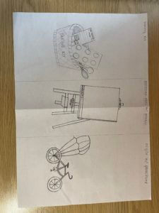
Electronic Easel

For this assignment, my partner’s name was Jess. The three facts she gave me were:

  1. Enjoys art
  2. Avoids cycling due to various injuries from it
  3. Enjoys baking

With these facts, I drew a baking kit, an electronic easel where you can submit your work to an attached printer, and a bicycle with a parachute to avoid it ever flipping over. The electronic easel is personally my favorite if we had to choose just one.

Lakers Jersey

Our first task was to create an ideal gift for someone we didn’t know, using three or more, fun or crazy facts about them. My partner was Luca, his facts were:
– Loves music (specifically Drake)
– Cooking (specifically carbonara)
– Is from Italy
– Loves basketball (Lakers)

My initial thought was to create a speaker and/or headphones in the shape of a basketball. I drew out a few sketches, but I wanted to be a bit more creative. I was thinking, if I did do the basketball idea, I wouldn’t know where to incorporate his love for cooking or his home country.

After some more thinking I came up with my final and complete gift. I created a lakers jersey where I added small details inspired by the facts I was given. For example, his age is the number seen on jersey and his sponsorships are from an Italian pasta brand (Barilla) and his home country. I also added an extra sponsorship from “Certified Lover Boy” (CLB) in the bottom right corner, which is Drakes new released album.
The hidden help

When I think of cinema listings my immediate thought is of the little image displayed by the title, e.g. a still from the movie. Something it gives you a glimpse of what it may be about, other times it catches your attention or causes curiosity. This made the task a bit more difficult to me as we weren’t meant to utilise images merely type.

Having said this I found the challenge quite fun to do as we needed to highlight things such as subtitles, audio subscriptions as well as ratings, whilst also highlighting the date, time and location of the screening and what is being screened amongst other things. We weren’t given the movie blurb which to me meant we were given the bare necessities so this made highlighting particular things more difficult and I really had to think about the importance and hierarchy. Creating this myself made me realise how much help these leaflets have always given me without me realising it – the hierarchy and layout themselves ensure we understand everything and can easily navigate the cinema listings without really having to think too much.

Furthermore, this task truly taught me the importance of ensuring I utilise the correct document size before I start designing in InDesign. You cannot make it smaller once it’s been designed – it will chop the design down and you’ll end up with only a small section. If the brief says A5 don’t create it on A4 accidentally.

CINEMA.LISTING

CINEMA.LISTING

As part of this task, we were asked to recreate a cinema flyer using some information provided to enable us a better understanding about how it works  in the professional world, when working with clients. We were given the opportunity to create our own categories according to what we felt was appropriate regarding our target audience. I split mine into three categories ensuring that the wording was fun and engaging just like it would be on a flyer. In these categories I put the films in order of the dates they were being aired to allow easy reading and navigation.  I’ve used a san-serif typeface  for similar reasons and to allow more of a modern feel.

I decided on black and white as a colour scheme to keep it relatively simple but I also felt like black was a colour commonly associated with cinemas and therefore fitted the criteria nicely. I’ve tried to create an order of hierarchy with the name of the theatre being the most important. The times of the movies are at the bottom of the criteria but i’ve done this because i thought the names of the movies were more important and if the consumer is interested in a movie they can easily see when and where it is below.

I’ve added the recognisable  age certificates to not only add a pop of colour but too again, allow for easier navigation. One of the target audiences we were given was a family and so they would only be interested in the U or PG movies so they know where to look straight away. following on from this i wanted to create the same effect with the Audio Description and F-rated movies so I made sure to include to certificates for these.

Space ship


Ideal gift, what is is?


We have been give an assignment to create an ideal gift for one of our group partners. My partner was fond of traveling, sailing and astronomy. I have decided to make a spaceship for her, so she can travel to the space. Also, I have decided to create a pattern for her.

The color for the background is browny grey, it brings out the colors of the front objects and creates the visual layers.

Challenging

reading film theatre flyer v3 pdf

In an A5 format, the Reading film festival flyer had to demonstrate the relevant information in a small space, which I found particularly challenging using this space efficiently to a positive aesthetical outcome. I used a dark blue colour background so that the black text could still be seen and understood. The age censor of the movies I wanted to be the most obvious to the audience and seen before anything else, this way, the audience know which movies they are allowed to watch i.e. If they are children they can watch; U, PG, or in some cases 12 if they are accompanied by an adult. The serif font , minion pro,(a mature font)shows information more orientated towards older people such as the director of the film , actors and where it is showing, the sort of info a child would arguably not be too concerned about past the title which is in serif , Acumin Variable Concept. Overall this flyer does the job it needs to do displaying the information in a format readable. However, I do believe it looks a bit squashed together and would benefit from more space by maybe using a smaller font and general layout the sheet. It also is fairly bland, aside from the 2 colour restriction, including black , I would like to have included more texture to create a more interesting looking design .

Kung Fu Panda

ty1int- panda PDF1

In addition to recreating the penguin book design from scratch, we would put our own spin on the classic design with more modern fiction. I did mine on the 2008 movie Kung Fu Panda from DreamWorks.  In order to reflect the main characters loving persona, a warm colour that can appeal to kids, the target audience of the movie. I switched out the classic orange for a warm purple colour. Further alterations are that of Po the Panda in the place of the famous Penguin and where the writer of the books name would usually be, the name of the voice actor Jack Black is there. I chose to use him as it is a recognisable name and arguably more recognisable than the writer of the movie. Penguin books also always have a tagline, I used one from a poster for the movie, ‘Prepare for awesomeness. Summertime is Panda time. He’s not a big fat panda… he’s THE big fat panda! ‘a humorous quote to help depicts the comedic tone of the movie. If I were to make any alterations, I would like to make more changed to make the Penguin book design less recognisable, maybe to do so I would have to pull from a more complex source such as a different movie or book.

Rolling Stone Race Car

The perfect gift. My partner for the project gave me three interesting facts, these facts were that he like F1, met Richard Branson before, and that he has four siblings.  A had a couple ideas, but my first thought was to make a racing car for five people, which ending up looking almost like a sort of space shuttle. I wanted to include something about Richard Branson as well, he owns a lot of airlines, and the label that owned The Rolling Stones, so I thought to name the car ‘The Rolling Stone’. With a bit more time I would’ve made the car a bit more detailed, or added colour to car, probably focusing on black and red.