Category: Covid 19 (Sue and Emma’s project)

Varying amounts of formality in Covid communications

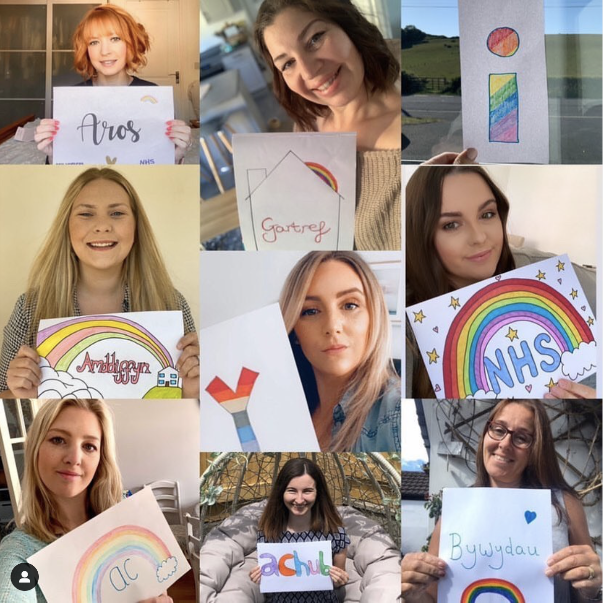
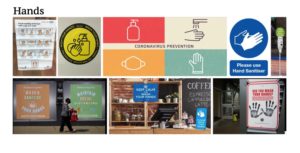
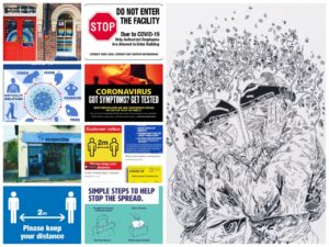
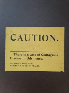
One of the interesting things about the pandemic is the wide range of graphic responses to it. Prom the government, to companies, to families in their homes, there is a massive variety of notices which have been put up, both formal and informal. Companies such as Tesco and Next will probably have their own in-house graphic designers while smaller businesses and families won’t. This means that some notices look very professional and on-brand, whereas others will appear more handmade and thrown together. Two noteworthy examples I found where those of Tesco and one at a shop in the oracle.


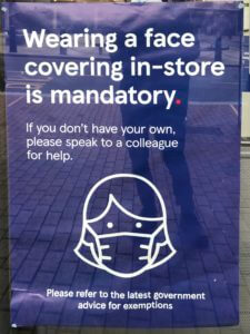
Tesco’s poster keeps the Tesco typeface and colour scheme as well as a fitting illustration. As a sidenote, I think it’s also quite interesting how a face mask has become so widely used and recognised. It’s as if simplistic representations of face masks have entered our vernacular. While the poster clearly mimics the Tesco styling, which the designer evidently intended, I would argue that this makes it too easy to ignore. In a Tesco store, there may be many similar posters with this styling, which means this porter may blend in to the point were it’s not actually paid attention to. This makes the design unsuccessful. I think mimicking the official Tesco aesthetic too much runs the risk of appearing too cold and official. I don’t think this design really speaks to the customer in the exact same way as intended as it’s styled almost more of an advertisement.

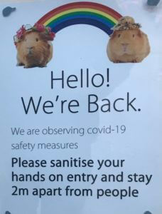
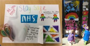
The other shop (which I unfortunately can’t remember the name of)  on the other hand, has appeared to have taken a rather different approach. They have included two guinea pigs with a rainbow between them. This is quite bizarre, but I think it actually does a lot to maybe make the company’s communication more informal and friendly. The rainbow has come to symbolise the NHS recently, and the guinea pigs may just be being used as symbols for a softer approach. I’m not sure if this is intended, but the rainbow between them makes it appear as if they were socially distant. It’s not exactly professional, but I think this actually communicates to the customer better by doing a lot to humanise the business and its effort for the pandemic. The guinea pigs almost give the business a vulnerable quality.

To conclude, I think the more personal, if less professional communication involving the guinea pigs is actually better, because it humanises the company and is less likely to be ignored.

Covid in Britain

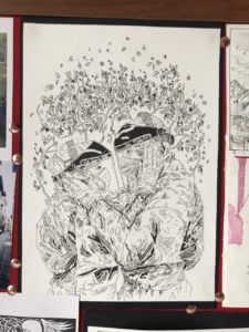
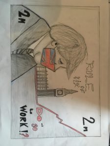
With the design brief , Britain in mind, I thought , as opposed to depicting Britain in a traditional sense, such as with big red buses and telephone boxes, i would display Britain in its current climate during the coronavirus pandemic. This image is a recreation of the British £5 note , with a covid 19 era Boris in place as the key figure on display , using a Great Britain facemask. As a famous landmark, always featured on notes , Big Ben can be seen , this is also to further familiarise the audience with its setting on Britain .The base on Big Ben transitions into the chart for infections on the rise. Further alterations to the original £5 design are the , 2m instead of £5 , in referance to how people had to keep a 2 metre distance from each other during lockdown. The rule of six text replaces, the Bank of England.The final element of text ‘ DOnt go to work ‘ has colour to emphaise how the quote can mean either do or do not go to work , a reflection of the confiusion caused by the Prime ministers speeches.Colour i used sparingly as a display of the dark times we are living in , however, some colour shows that there is still hope . A final addition i wished to have made was to feature a map of Britain in the background behind Boris and Big Ben in the upper half of the note .

From Political to Social issues

For this project I split my collection into 5 different categories:

  • Magazines
  • Posters
  • Social distancing
  • PDF downloads
  • Covid-19 street art

For magazines I focused on Vogue and Time, as I found that they both covered controversial views on covid-19. I particularly liked these two covers from Times. (I found both images below in the vault for Times, under covers from 2020 https://time.com/vault/year/2020/)


If you are following the news at the moment you will find that America seems to believe that they are immune to covid-19. Or a better way to put it, is that it is a myth (according to their president Mr Trump).

I found the Trump cover ironic as when it was published (14th May 2020) it states “over the past 14 weeks 84,000 Americans died of Covid-19.” Yet America did not seem to be doing much to slow down the death toll. I found this magazine cover portraying the political     side of covid-19. Bar the controversial message the image is portraying. I particularly liked the graphics and typography that was being used. It’s a fairly simple image with type and an illustration of Donald Trump with a mask (that is not being used affectively), yet it is clever. I like the message of the mask not cover his mouth, as he believed masks to be stupid; yet we all sat here wearing them everyday.

The second magazine cover, covers a social issue during the pandemic. Of the youths of this time and how this will shape their life forever. I found this one a good one to use, as we right now are in education and we are the youth being affective by this. The photographer Hannah, has been virtually photographing her classmates in quarantine. This imagery was done by a student which is why I think it is a good one to study. The issue Hannah wanted to portray was that she found that she was stuck in limbo due to covid-19. These years are the ones she’s meant to be transitioning into adult hood, yet she’s feels like she’s going backwards being stuck in her childhood bedroom for the past several months. I found this topic interesting as I don’t think its normally portrayed. I found a lot of social distancing and instructions graphics for covid. But this was the only ‘generation pandemic that I found. Which you would think there would be more off with the amount of students and people being effected in education by this.

For both these topics, I believe that the target audience is meant to be different, yet has ended up the same. They are both a cry for help to the general public of this issues following this pandemic; outside of the deaths.

Poster: Icon vs Typography

What are these posters trying to do?

These posters are designed to encourage people to stay at home to help stop the spread of COVID-19. In both of these designs they have chosen bright colours with strong connotations. Red is often associated with danger and yellow is associated with warning, particularly when combined with black. We also see that both are quite simple yet structured. There is a flow to both designs leading you to the same conclusion, but in two very different ways.

The red poster, titled ‘Stay Home’, has chosen a very stark way of conveying this message. Through focusing mostly on icons this very simply structured scene is almost graph like, implying the statistical impact of each person who chooses to endanger society when stepping out the front door. This poster has a very strong message, stay home or the knock on effects could be disastrous. I found this design to be quite shocking but massively impactful and effective. I especially like that they have chosen to include a very small amount of text at the very end; the two words say hardly anything and yet everything and they leave nothing to be questioned.

In contrast, the message to commuters is mostly text. We do have a few small icons to guide the reader but they are not necessarily the focal point in this design. I found this design to have much more attitude than the first. The choice of wording is very interesting, almost humorous in its bluntness, though I do not think this to be the intended effect. Similar to our first design it has a very straightforward message, unless you are an essential worker you should remain at home. However this poster is challenging the reader to confront their own actions in response to this pandemic whilst in the act. The use of a question here is quite provoking. Keeping the same typeface throughout, the reader is not distracted by decoration or overwhelmed by many different elements. I think it is in the simplicity of this design that its seriousness comes through.


Do different approaches produce different results?

I find the implied consequences in the first poster to provoke a stronger response in me than the second. I am not being told what to do or think but I am able to see and understand for myself how my role can affect the society in which I live and I think this greater understanding of context and consequence leaves a greater impression than the second poster which is correcting an action already taken.


References

Stay home. Image created by Barış Cihan Peşmen. Submitted for United Nations Global Call Out To Creatives – help stop the spread of COVID-19. Available at: https://unsplash.com/photos/jTK820WUr2k

Subway message for commuters. New York City, NY, USA. Available at: https://unsplash.com/photos/yCk_WyOdzAk

Wear a mask to stop the spread

Our task for this project was to collect a wide range of communications relating to COVID-19. During this project, I learnt how to improve my searches on the internet to get the best and widest variety of results as I did the majority of my research online. I had discovered that the majority of the government official and NHS posters and signs were all in blue and white or yellow and black. The reason for this is most likely due to the NHS colours being blue and white and yellow and black signs used to stand out as they were usually associated with warning and poisonous signs. However, the issue is that they no longer stand out. I have found that we, as the consumers, have become accustomed to these warning signs now. They no longer grab our attention because we see them around so often.

In Los Angeles (L.A ) the mayor introduced an initiative called the L. A mask print project. They ask designers and artists from across L.A. to produce posters, like the one above on the left by Camilla Lonis at Studio Number One, they are then made available to be downloaded for free by local businesses and residents so that they can be put on display. I think these more creative and colourful posters work better as they’re much more noticeable than the government standard ones that we have now become accustomed to. Adding a face that’s not just a basic outline perhaps will make the message feel a lot more personal rather than robotic. If it feels more personal people are more likely to want to make a change and ultimately that’s what the creates of these posters want. they want people to make the decision for themselves to wear a mask, and usually, if it’s encouraged rather than enforced, you’ll get a better response, although this isn’t always the case.

I think it’s clear that the Losin poster is for a particular audience. People in L. A are known for there glamourous lifestyle, they also have a rather large art scene and so to grab the attention of the creative inclined, you need to put up posters and signs that are just as, if not more, creative and bold as they are. Whereas the Government official and NHS ones are for national use, therefore, need to be more neutral so to appeal to everyone. As the UK is also very multicultural and we have people from all over the world the signs need to be clear and concise on what they want from the public so everyone understands no matter their language. The decorative posters can sometimes have messages that are vague or have a double meaning.

‘Caroni’

Today for Emma’s project, I researched all the different types of Covid 19 signage. I wanted to get a diverse range of material from different areas from all over the world so I decided to use the hashtag #covid19signs. this would source all the covid 19 signs from the perspective of the civilians and the companies/ businesses. this showed the signs as people interacted with them, for example the picture would be of a sign on a door from the perspective of someone who would interact with it in that given example. It also showed the different examples of mock-ups that businesses used for promoting safe signage in their businesses. i also encountered the different examples of NHS signage. Instead of focussing on the rules and advice, i also wanted to look for the supportive signs towards NHS workers and see if i could see a trend. I noticed that the typical signage that informed people of the rules used bold outlines or solid pictograms as well as sans serif type all on a bright yellow or dark yellow to head urgent  warnings. the consistency in geometric weight in type and graphics accompanied with the high contrast background lends itself to a more serious tone in message. its clear to see that the NHS signs that thank workers take an opposite approach to stand out from the boring consistency in  signage. Instead of using sans serif type that conveys efficiency, they hand draw their text in a curvaceous and forgiving  inconsistent style, showing  imperfections to convey that a person drew this, making the message feel genuine. for colour pallets they also use a softer blue  for the backgrounds to symbolise the NHS and typically incorporate a rainbow to symbolise hope. The colours are also typically coloured in by hand for the previous reason and i think it is a nice distinction from the overwhelmingly bright yellow from official signs as the subtle colours are easier to digest and helps create a relaxed and warm tone to the message. Consumers of covid19 signs have adapted to the pandemic, making the official signage less efficient in standing out and conveying the importance of their message as they all blend into together in a persons given day. The different approach to the NHS signage helps stand out as people aren’t conveying such relaxed tones in the the recent average signage. Despite typically being drawn by a 9 yr old with their parents, its arguable that they are more effective in attracting the common eye in the open environment in some cases.

Safe in space

When studying my images( combination of own photographs and internet images), it made sense to divide them into four categories, Hands, Face, Space and Safe. It links with the meme ‘Wash hands, cover face, make space’ created by Boris Johnson. I felt the need to add ‘Safe’ to it to accommodate a category of pictures that I find necessary.

My categories share similarities in how they communicate, convey information, create awareness and offer warnings. All the categories share the aim of helping people with their decisions based on the information they see. They are similar in communicating information to the same audience/readers, and in how they use a range of verbal and non-verbal elements to convey a message. Similarities are also found across the four categories in how some signs are less effective than others due to overcrowding or illegibility. That reduces the impact and clarity of the message, and would surely cause difficulty with reading and comprehension, so people would move on and miss the message. There are also good signs in all four categories, which are easy to read,  communicate concisely with few words and draw attention. The use of colour is also quite similar is all four categories. Colours that come up mostly are amber, blue and red. That is not a coincidence, but a result of the psychological effect that colours have on people. Amber is associated with caution, whereas red implies danger or warning. Blue stands for informing, trust and building relationships.

Differences between the categories are seen when it comes to the specific areas of focus. The Hands category emphasises the importance of washing hands and using hand sanitiser to protect ourselves from getting or spreading germs, whereas the Face category concerns itself with face coverings and protecting others. Space has the biggest variety of signs and its aim is to discourage physical contact. They vary from markings on pavements to socially distance, to road signs and various forms of signs in shops, all directed at encouraging consumers to distance from others. The category Safe is different from the rest in that it plays on the notion that people are unified through circumstances that affect everyone, and that we all play a role to keep ‘us’ safe. I also like that some of the images are more personalised and encouraging when compared to those that are purely functional and impersonal.


References for Face images:

Wear a face covering (electronic display)

Look after one another

Kissing masked

Wash hands, cover face, make space

The five other images were taken by me on campus and in the Oracle shopping centre, Reading.


References for Hands Images:

Coronavirus Prevention

Please Sign before entering

Keep calm and wash your hands

Wash and sanitise your hands

Please use hand sanitiser

The two other images were taken by me, also on campus and in the Oracle shopping centre, Reading.


References for Safe images:

Covid 19 Decision making tool

The sun will rise again

Community Spirit, be kind

Stay alert, control the virus

Your grandparents

Help prevent coronavirus

The two other images were taken by me in Reading town.


References for Space images:

Please do not hug

Stop Covid-19

No standing/socialising anytime

Covid-19 Keep apart

Pedestrians Reminder

Keep 2 metres apart

Two of the images were taken by me on campus and in the Oracle shopping centre, Reading.


The Signs of COVID-19

Today we were told to source signs made about COVID-19, signs made online, around us, at campus, homemade, government made and even asked if we had made anything ourselves. During lockdown I was bored and spent a lot of time on walks, and when doing so I would look for homemade signs around my town, so already had a few of these. I also found signs in our halls, on our stairs, our pin board, around reception. Then looked for government official posters, and NHS ones online, finding a wide range in total of things to look at and observe.

One key thing I noticed was the use of yellow, red and black colours, to draw attention and for a high level of contrast. Red and yellow are all associated with danger and warning signs so its easy to recognise. The use of bold founts and capitals letters was also very common, and the people sign(you see at airports and on toilets) with arrows between them, keeping them apart, recognising it as being government official from just the people sign, and a visual short hand communication that tells the public to all keep a distance from another.

A key point that we talked about in the class after as well was the lack of imagery on the posters, and how they were so impersonal. Compared to for example the packing for smoking, where they show coughing up blood, blackened lungs, and a baby inhaling smoke, the covid-19 posters showed very few side effects, no emotive imagery, no one ill or in pain or dying. Which did relate with how many people also feel, as if the situation hasn’t been taken seriously enough, the posters also correlate with that feeling, where they blend into road signs and street signs, they are so easy to walk past that they give no sense of danger anymore, and don’t properly symbolise the severity of the situation.

I did in my own time an illustration of an image during lockdown, of a husband and wife, both nurse anaesthetics getting ready for a shift with COVID-19 patients on the airway team. In the image they are both geared head to toe in plastic, and masks, and screen, and gloves, and holding on to another’s faces to say their goodbye, and good luck, right before their shift. The image for me struck how hard it must have been for your loved one to be sent to work, and to not know if they were going to get ill, how long they’d be ill for, and if they’d, like many others, be a number on the news death toll later that month. I can’t imagine how so many families managed to cope with isolating from loved ones for months on end for their job, and the awful things they would’ve had to see at their work, and the conditions that the NHS staff must have been put through. Wearing a mask, and keeping a distance, should be encouragement enough for people to comply with guidelines, and I wish they had used much more emotive tactics, in their signs, cause signs can be so powerful, to make more people take the situation much more seriously.


Social media in a PANDEMIC!

During the outbreak of COVID-19, social media has been quite literally an essential part in people’s lives. Social media has not only been used to find out new information or regulations put into place, but it has become a coping mechanism. It has somewhat distracted us from the real problem. This has been done by the use of memes. Instagram pages like ‘World Health Organisation’ use a different style within their posts compared to a page like ‘coronavirus_memes’. Although their posts are relating to the same topic, they both contribute differently to the social media bubble. Memes take out the seriousness the subject holds and adds a sense of humour and excitement to the post. Like in the example shown above, back when the lockdown was introduced, the public had gone through a mental craze. Shops were left empty and houses were full of bulk-bought items. Economically, this was a complete disaster, however nearly every meme showed a comical aspect. On the other hand, when we look at the ‘WHO’ Instagram page, we see instructive, clean and well-presented posts. Each new update is a thought out piece of artwork, compared to a meme which usually never has an organised finish. They intend for their message to reach an older and responsible target audience, whilst the meme pages target the younger demographic.

No description available.

Additional collages made in the task:


https://l.facebook.com/l.php?u=https%3A%2F%2Finstagram.com%2Fcoronavirus_memes%3Figshid%3D130b3th5ncyig%26fbclid%3DIwAR06bGQ0lh8daQA0WIiTfzLSbabeZGzkidgk-gOj-l9ivuVWnb5l6SQfZJw&h=AT2TRevOTeH7FOBRERXmJvUvgYx3sgrPZ1Wj0ugVFE9NMMH41M_fcahUu56Y6xPQKnav4BSarMRedGkLNi_HkhrDwzz2dDYIEoMIQqPQI8DPfvLhr1XQqCtTZWjcDIxdHUBPaQbBxBs

https://l.facebook.com/l.php?u=https%3A%2F%2Finstagram.com%2Fwho%3Figshid%3Dn7s7kndnsf28%26fbclid%3DIwAR0Tq8gmj_rdBHIq_lzT1vBguU7cd7-kQ-_yxeK2iz-CcB6voSHbvcBb7yA&h=AT2TRevOTeH7FOBRERXmJvUvgYx3sgrPZ1Wj0ugVFE9NMMH41M_fcahUu56Y6xPQKnav4BSarMRedGkLNi_HkhrDwzz2dDYIEoMIQqPQI8DPfvLhr1XQqCtTZWjcDIxdHUBPaQbBxBs


Covid 19 In Reading Town

Today for Sue’s and Emma’s Covid 19 project I headed into to town to find any kind of sign or poster that portrayed a warning or instruction about Corona Virus. We then grouped back together to share all of our images and talk about them. We discussed how the general public are growing accustomed to the shear abundance of Covid posters to the point where we have built up a sort of tolerance to them. I personally barley notice these signs anymore and they only really catch my eye when I’m actively looking for them. It was interesting to look at posters that were perhaps not made by professional designers and were a bit more creative and fun. A lot of the signs had a very lighthearted aesthetic to them which is strange considering the disease has killed thousands of people. As a group we evaluated whether we thought these signs might be taken more seriously and further catch the eye if they used scare tactics like on the packaging of cigarettes. The top right image shows a warning poster from decades ago (from the collection) and the image to the left of that is a poster I found around the campus today, it is interesting to see the visual similarities between these to two.