Category: Student work

Boris

Brief:

Create two images which convey ‘Politician‘. The first image should convey the word directly. The second image must have one addition to change the feeling or the meaning of the first image. Export into a GIF.

Process:

When I think of a politician the first image I see is a man in a suit behind a podium. It is quickly accompanied by the impression of greed, deception and power. Image is considered everything and so is public perception. This makes many political environments very controlled and staged. I wanted to create something which would pull back the curtain and reveal what people really want to know. We always watch these press conferences and wonder what is not being said, or very much wish they would just say what we are all thinking or know to be true.

My first image is of a political scene as they are often portrayed. My second image has defaced the first with a message we would rather was being shared or admitted.

I was going to create a generic man to represent the ‘politician’, but my classmates suggested a well known figure would make the piece more personable and therefore more impactful, as it relates to this brief. Therefore I chose an image of Boris Johnson at one of the latest COVID news conferences. At first I had thought to deface this image through imposing a monkey over his face, or some other image to suggest foolishness often associated with politicians. However I found this to be too gimmicky and not quite message I was wanting the image to create.

Instead I went for the crude sort of style we often see in text books and on posters. I like how it so effortlessly defaces the controlled and sophisticated front trying to be conveyed by the politicians and brings an element of chaos to the scene. I chose to desaturate the image to further the contrast between their staged presentation and our desire for all the information, however shocking.

To create this loop I first created each image in Illustrator and exported them to Photoshop. In Photoshop I was able to make each layer a 0.5 second clip to play on repeat. From here I could export it as a GIF.

Reflections:

I like how it is as if the message breaking through the mask here is that the podium is saying what Boris isn’t. The simplicity of the design puts the point across clean and clear and I am pleased with how well this has fulfilled the brief. I also learnt how to make a GIF on Photoshop, a function I didn’t know about before.

Royalty


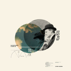
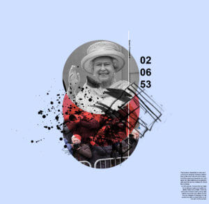
Cristiana Couciero was my inspiration for this work. She has a simple photomontage style that I thought would be appropriate for the style i am going for.

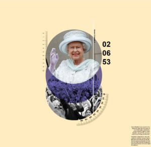
Using the image shown, I implemented the circle to show the main image. The ruler and protractor outlines show order and depth to the image. The number that I chose in my final work was the day Queen Elizabeth II was crowned. This added more meaning to photomontage. Couciero’s work is centered towards the middle and leaves the outer space empty. The use of black space  allows balance and the text creates more texture.


The first image represents supporters and followers. The colour blue gives a calm ambiance to the image and the lighter peach background exudes warmth. Overall, the image is giving a positive aesthetic.


Instead of a blue circle, it changes to red to give a more aggressive tone. The blue background compliments the red and makes it more dynamic as it’s darker. Mark making were used to replaced the measurements to represent more chaos and irregularity.  The photos of the fans were replaced with paparazzi to represent the invasion of privacy and loudness that they represent.
Lettering in the Environment

Lettering in the Environment

lettering in the environment

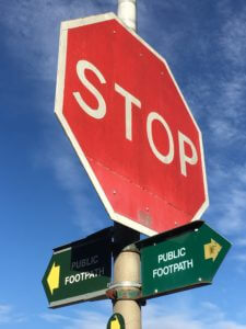
In Eric’s lesson we explored the campus for interesting pieces of typography. The powerpoint above the stop sign image has all the photos i took in the lesson. I feel as though i could’ve arranged them into better categories.

I enjoyed taking photos of different pieces of type around the campus, this activity also helped me explore the campus further. My favourite image i took is the one above, this is because i like the angle it was shot at and also how the bright red of the sign stands out among the blue background making it the focus point of the whole image.

Protests

Why do people protest? They believe in a cause and want to make their voices heard, to cause change. One such occasion was Brexit:


In June 2016 the British public voted to leave the European Union. Leading up to this people all over Europe participated in a kissing chain to demonstrate their love for Great Britain, there were Brexit protests in London, buildings had the Union Jack lit up on their sides. It was a protest as loving as they come in many ways.
 

Despite the vote affecting everyone in the UK and the British Citizens living abroad, a large chunk of people this effects were not permitted to have their voice be heard in the polls. This was due to their nationality, age, criminal record, and various other reasons. Their voices do not count when it counts.

The Dark Side Of Gaming:

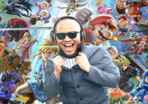
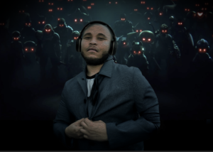
Being tasked with the word ‘gaming’, I decided to represent the contrast between the innocent excitement that games can give to the masses, but also the toxic and scary side of gaming from cyberbullying to hacking. In my first piece, the bright lights and excentric colour tones present freedom and excitement to the theme of gaming in addition to the facial expression and body language. In the second piece, the colour tone and body language are very much darkly toned muted colours in addition to the red glows in the eyes all represent the danger underneath the excitement of gaming.

Transmogrify – HS

Transmogrify – HS

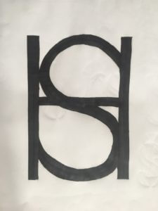
In Kim’s project we experimented with the initials of our names and created a monogram with both of the letters combined, the final outcome is in the featured image and image above.

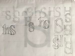
First i brainstormed ideas, i copied the letters H, S in the different fonts: Futura and Garamond. I drew both of the initials in lowercase and uppercase mixing them together. I used pens, pencils, markers, a ruler, a rubber and layout paper to create these brief designs.

I really liked the bottom right design and the one on top of it. I liked how the main strokes of the H were extended down to match the S, However i chose the one above as i like how the letters blended together better.

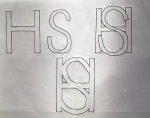
Here i drew the process of how the initials merged to make a monogram.

Too improve i would create these designs  online so they would have a more polished finish and also so i could experiment with colour.

Loop…

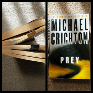
LOOP  PREY  MURDER  TIME

‘Original’ book
Clean slate


What is a book? Why are we so scared to damage them? Why is this format invincible?

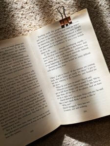
This mini brief required us to question the ‘concept’ of books, alongside with their composition, layout, binding etc. True enough, I had never thought or even considered the importance of visual dimension within books. We have all become so accustomed to flipping the pages in a certain pace, holding the spine in a particular manner and feeling the repetitive texture of paper, that all of these aspects are almost ‘forgotten’ by our conscious self. And bringing in this element of ‘connection’ to a reader, can help to create powerful and immersive experience.

With ‘loop’ as my chosen theme, I decided to narrow down some factors aside from the provided storyline/narrative (which is based on a female, that hired to kill her partner, with the help of an assassin, who is reading a book about, female, that hired to kill her partner, with the help of an assassin, in reality).

The creation of loop sits on-top of the temporal dimension: time. Without the fourth dimension, a loop wouldn’t exist (whether it may be in the narrative or in reality). Instantly, I knew that alongside with the murder narrative, the blend of time could add in an interesting imagery.

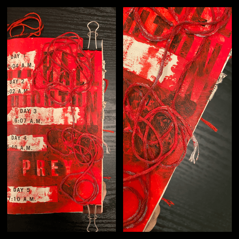
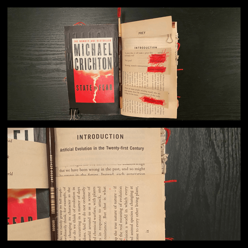
The cover of the book, focusing on repetitive days and time variations, alongside with texture
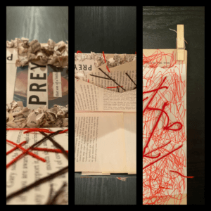
Striking red acrylic paint, with haphazard brush strokes to portray the ‘soon to be’ murder scene

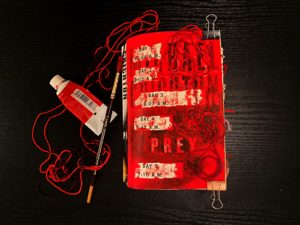
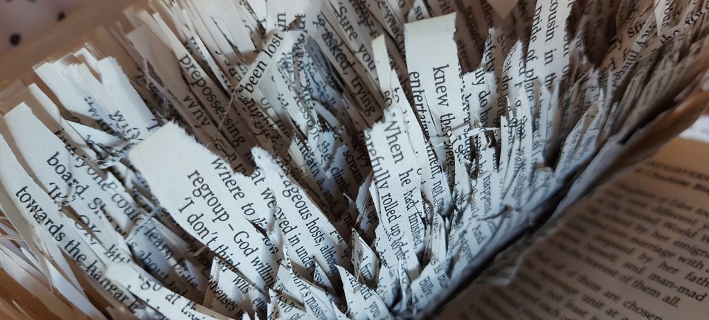
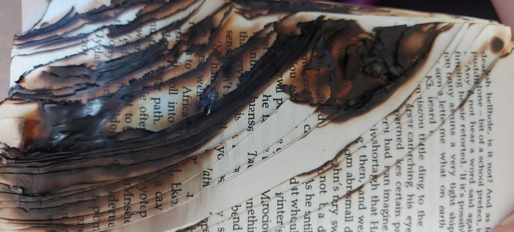
I have always been extremely interested with texture and the sensations it can provide, therefore I wanted to draw severe attention towards it. But the material couldn’t just be anything. It also had a make a connection with loop or the narrative of murder. After some quick research, fabrics, especially threads seem to have a portrayal of ‘loops.’ With their never ending entwining threads curling each other, they almost seem to reflect some aspects of loops and temporal dimension. Thus, the need to experiment with threads seemed very important. Whether they may be glued on or stitched into the texts.

The introduction page stripped down to important words, with a layout change, to slow down the pace of turning pages
A combination of materials and techniques

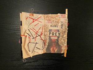
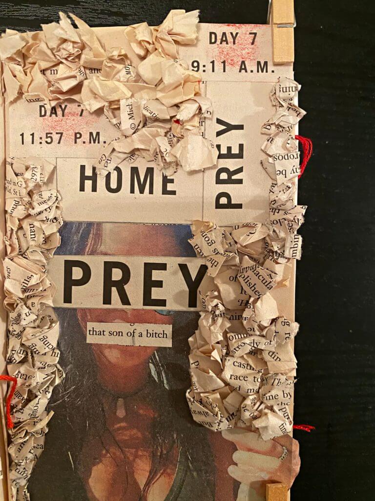
For one the ‘main’ concept page, I decided to create a collage based on the predator (who is a female and hired to kill her partner, with the help of an assassin, in the book he is reading, in reality) before linking it with the prey (who is the man). Of course, I also wanted to created some repetition from the cover, so I brought in the element of time (and day) to mimic the loop of reality and fiction. Lastly, I paired it with some sewn in lines, to support the madness, that a loop in time could create, especially with a murder.

A close up look at the texture
The texture representing the madness

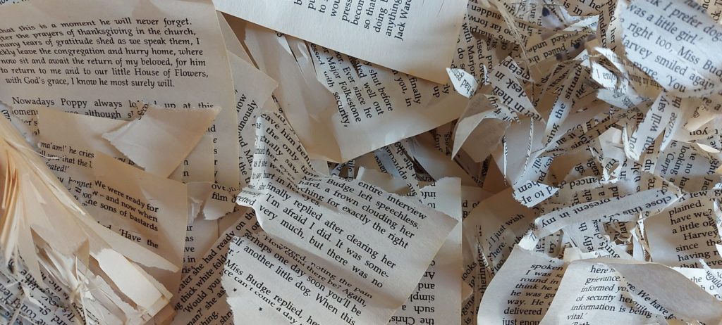
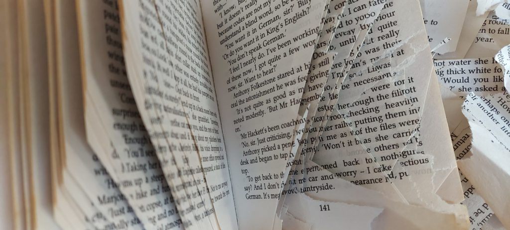
The ‘taboo’ of not destroying books. The page flipping pace. The feel of paper.

These ideologies can easily be altered through movement, sound, pace, time, involvement, shape, space, 3d, scale, texture etc and in return, they can make the reader more connected with books physically and realise that we have all been missing out a lot on the ‘experience’ of reading.

AP

Using the Futura typeface, both medium and bold, I experimented with how the 2 letters – A and P could be incorporated together as a single unit, motif or symbol. I began by merging the letters next to each other, however it seemed that it could easily be misread as a letter R. Therefore, I explored flipping one of the letters upside down, leading to my 7th and final design solution, where the cross bar of the A merges into the the counter of the P. This creates an interesting ‘impossible staircase’ type aesthetic. I would like to further explore with colour .