Category: Student work

Safe in space

When studying my images( combination of own photographs and internet images), it made sense to divide them into four categories, Hands, Face, Space and Safe. It links with the meme ‘Wash hands, cover face, make space’ created by Boris Johnson. I felt the need to add ‘Safe’ to it to accommodate a category of pictures that I find necessary.

My categories share similarities in how they communicate, convey information, create awareness and offer warnings. All the categories share the aim of helping people with their decisions based on the information they see. They are similar in communicating information to the same audience/readers, and in how they use a range of verbal and non-verbal elements to convey a message. Similarities are also found across the four categories in how some signs are less effective than others due to overcrowding or illegibility. That reduces the impact and clarity of the message, and would surely cause difficulty with reading and comprehension, so people would move on and miss the message. There are also good signs in all four categories, which are easy to read,  communicate concisely with few words and draw attention. The use of colour is also quite similar is all four categories. Colours that come up mostly are amber, blue and red. That is not a coincidence, but a result of the psychological effect that colours have on people. Amber is associated with caution, whereas red implies danger or warning. Blue stands for informing, trust and building relationships.

Differences between the categories are seen when it comes to the specific areas of focus. The Hands category emphasises the importance of washing hands and using hand sanitiser to protect ourselves from getting or spreading germs, whereas the Face category concerns itself with face coverings and protecting others. Space has the biggest variety of signs and its aim is to discourage physical contact. They vary from markings on pavements to socially distance, to road signs and various forms of signs in shops, all directed at encouraging consumers to distance from others. The category Safe is different from the rest in that it plays on the notion that people are unified through circumstances that affect everyone, and that we all play a role to keep ‘us’ safe. I also like that some of the images are more personalised and encouraging when compared to those that are purely functional and impersonal.
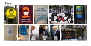
 

References for Face images:

Wear a face covering (electronic display)

Look after one another

Kissing masked

Wash hands, cover face, make space

The five other images were taken by me on campus and in the Oracle shopping centre, Reading.
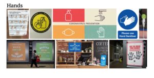
 

References for Hands Images:

Coronavirus Prevention

Please Sign before entering

Keep calm and wash your hands

Wash and sanitise your hands

Please use hand sanitiser

The two other images were taken by me, also on campus and in the Oracle shopping centre, Reading.
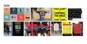
 

References for Safe images:

Covid 19 Decision making tool

The sun will rise again

Community Spirit, be kind

Stay alert, control the virus

Your grandparents

Help prevent coronavirus

The two other images were taken by me in Reading town.
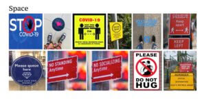
 

References for Space images:

Please do not hug

Stop Covid-19

No standing/socialising anytime

Covid-19 Keep apart

Pedestrians Reminder

Keep 2 metres apart

Two of the images were taken by me on campus and in the Oracle shopping centre, Reading.


Cateye

Brief

Gather three interesting facts about your partner. Use these three facts to design the ideal gift for them, whilst following the ‘Discover, Define, Develop, Deliver’ method from Design Council.


Process

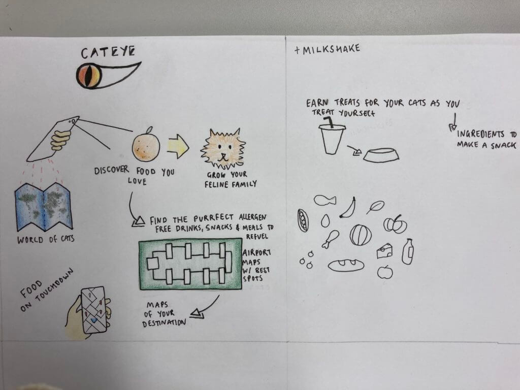
My first three words were cat, travel, food. I started looking into what I could create based on the cat, there is so much cat paraphernalia out there however that this on its own wasn’t proving to be very interesting. So I experimented with incorporating the travel and food elements more. One of my earlier ideas was an app that you could use in the airport to direct you to allergen friendly foods for those on restricted diets. This is because one of my partners said they were gluten intolerant.

On the hour each hour for three hours we had to add a random word into the mix. The first word I was given was bird. When I think of birds I think of birdsong, vibrant colours and flight. Flight fit perfectly with the theme of travel and so I incorporated a birds wing into my Cateye logo. I went for ‘cateye’ as a play on words from red eye flights. My second word was game. I realised that this app could be both functional and playful. By expanding the cat theme to become a Pokemon-go style collection game, I could integrate the second word pretty well. The idea being that when you find and scan your vegan wrap, you unlock the Cheshire Cat avatar to add yo your family of cats, etc. My third and final random word was milkshake. So I expanded the game idea and included treats to be earned for the cats you have collected.


Reflection

At first I found it really hard to just scratch out a bunch of ideas freely that related to my initial three words. I found I was trying to think of something, rather than just jot down all the ideas that were coming to mind. It was then made much more difficult when throwing in really random words at different points along the process. However, I really enjoyed stretching myself in the idea forming process. This wasn’t a method I had tried before, and though it was a challenge I really appreciated how it encouraged me to push my ideas further and experiment more.

Alfred as Godzilla

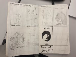
For todays session we were tasked with making an ‘ideal gift’ for one of our group members. we started the group discussion with three interesting facts about ourselves. the person I chose to focus on responding to liked to travel, painted custom shoes for clients and also owns a bearded dragon. I started by drawing out initial sketches to these three ideas, mainly focussing on the lizard for the subject. I started by drawing sketches that combined all three elements. as the session progressed, we had to pick three words at random. mine had been ‘drink’, ‘Monster’ and ‘post office’. In the end stages of my sketches I decided to finalise my best sketch that was influenced by the word ‘monster’. I decided to respond to this word by making a Godzilla poster using the lizards picture. I got a couple of images of the lizard from the team member and played around with framing within the sketches. once I chose my final one I finalised it in photoshop. I did this by erasing the background of the lizards image through a combination of the section and eraser tool. unfortunately the picture was low quality so I had to resort to using both. I then experimented with increasing the exposure and contrast to create more contrast in shadows as well as soften the edges of the lizard. I then turned it to black and white and added a red circle behind the image and setting the blend option to darken which created a spotlight effect. the circle also represents Japan which is one of the scenes of some of the Godzilla films, also linking back to my team members hobby of traveling. I decided to finalise the image by adding some png logos of the recent film ‘Godzilla, king of the monsters’ to make the message more clear.

Alfred as Godzilla Poster

The Traveling Map

The person who’s ideal gift I designed had the following 3 facts:

  • Born in Pakistan, moved to the UK at age 16
  • Love make-up and fashion
  • Want to travel

At first I came up with various ideas e.g. a suitcase which cleans and folds all the clothes and stops them from getting wrinkles, a make-up kit which never runs out of supplies, etc.

So I developed my ideas and found that the originally most basic idea of a map showing the places they’ve traveled had the most meaning behind it. It shows you where you’ve been and where you’re still going to go.
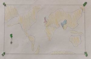
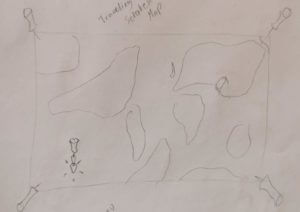
 

I continued to develop my idea. Turning it into a world scratch map, so only the countries they’ve been and the one they are in stand out.


Building on that some more the map gained to ability to transport the person to the country they scratch. So when they scratch Italy for example they will automatically be teleported to Italy.


My 3 random words were as follows:

  1. cycle
  2. paintbrush
  3. vulture

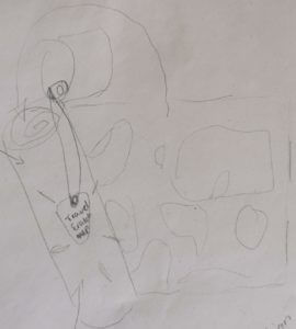
In order to incorporate “cycle”  I  gave  the  map it’s own  traveling case, with a button-strap in the  lid so  they can attach their scratching pick. This traveling case also protects the map from all the elements (e.g. water) as well as being the perfect size to fit into a bicycles’ water bottle carrier.
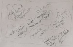


Having successfully incorporated “cycle” I began to think about how I could incorporate “paintbrush”. I began thinking about what a paintbrush is used for rather the brush itself. This lead me to the idea that this magical gift map could show the person some landmarks in the current country to educate them a bit, as well as look pretty. Hence the back of the map will now show them some of the amazing landmarks in the UK, until they travel abroad in which case it may turn into the Sagrada Famila or the Coluseum, etc.
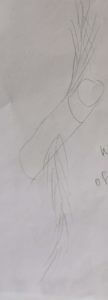
Short of adding a “vulture” painting on the back or front I soon realised I needed to again not think of the vulture directly in order to incorporate it into the gift design. After a while I got thinking about the ideas of vultures flying, so what’s to say this magical scratch map couldn’t do so as well? Taking a bit of inspiration from the golden snitch as well I turned the map’s wings into feathers. To ensure this magical map couldn’t get lost or stolen it will come to the owner when they want it and only opens for them.
 

Thus came to be the Traveling Map gift idea.

Recreating Type


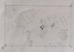
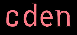
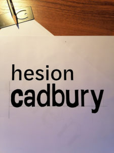
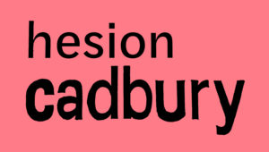
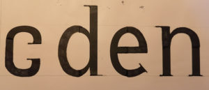
For Gerry’s project, our first task was to create the word ‘cadbury’ in the same font as the word hesion above it. I found this particularly challenging. Mimicking a typeface with only the option to view a very selective range of its characters is something I have never done before but I gave it my best shot. Gerry pointed out my U in cadbury should look more like an upside down n with a stem.

For the second task we were given some letters that looked as if each character had been cut in half, It was our job to fill in the rest of the figures. It was interesting to see the different interpretations of the first letter, only the top half of the character stroke was revealed so I incorrectly thought it was a C, others thought it was an S, when it was in fact an A. I added some serifs to my letters just to make them more interesting.


DC

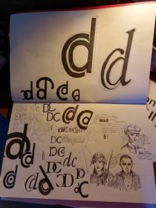
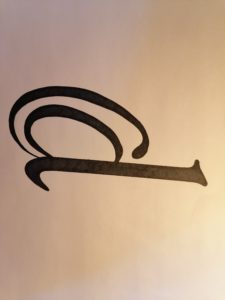
For Kim’s Project we were tasked with creating a logo like symbol that merged our first initial and last initial. I experimented around a lot to create many number of variations however in the end I decided to go with the lower case d inside the upper case C. I then played with the style of the glyph giving it serifs and adding an italic angle to it. I really liked the final outcome even if it does resemble the @ symbol.

Lettering Around Campus

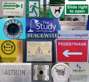
For Erics’s project we studied lettering in the environment. I tried to find lettering around the campus that i thought looked interesting. I liked a lot of the stencil lettering which there was a surprising amount of. After we had taken photographs we were asked to organise/arrange them in a way we thought was suitable. I decided to arrange mine by colour with the greens at the top, followed by the blues, yellows, reds and neutral tones. When looking at how my class mates had arranged theirs I realised mine was by far the least creative however Eric asked an interesting question about whether the colour groups I had split my photographs into had anything else in common. While the green lettering generally invoked safety or a message about the environment it was difficult to find correlations between the other colour groups.

The Matrix

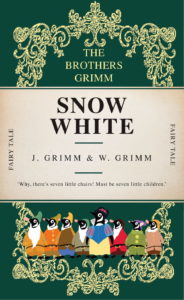
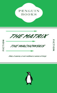
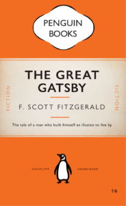
For this project we were asked to create a film, book or even a meme in the form of a classic penguin book cover. For mine I decided to create a penguin book cover for the matrix. I started by getting the green color pallet a lot of people associate with the film. I then distorted the type to make it look like it was dodging the bullets, (a reference to the film) however I’d say this was semi successful as Its quite difficult to tell what my intentions were. Overall though I like the green and really enjoyed this project.

matrix vs 02

Paint by numbers

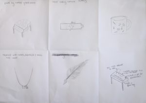
For Kim’s project, we were partnered up with someone from our class and we had to tell each other three interesting facts about ourselves. From that, we then had to come up with an ideal gift for our partner. My partner’s facts about herself were that she plays the piano and loves photography and painting. We then had to pick 3 numbers from 1-210 and these matched up with random words on a list that Kim gave us. My 3 words were, necklace, cup and feather. We had to use these words to help us come up with more ideas for our ideal gift, here were some of my initial ideas.

I ended up going with one of the original ideas that I came up for my final design which you can see at the top of the page. This was a paint by numbers grand piano with cameras fitted on the inside of the piano facing outwards to capture the reactions of her audience. On reflection I think I could have also developed one of my other ideas which was a desk with a small keyboard built into the front of it, a paintbrush put fitted in the desk, a mini easel fitted on top and a lockable camera storage box also fitted on the inside (sketch in the bottom left corner)

Typeface Design

For Gerry’s project, we had two tasks.  Firstly, using the provided letters ‘h e s i o n’ , to give us clues on the characteristics of the typeface, we had to draw the letters ‘c a d b u r y’. We had to pay attention to the contrasts of stroke sizes as well as the x height and many other aspects of the typeface. Overall, I was pleased with my outcome for this task, all though, there are definitely a few letters, such as the ‘aand ‘b’ that needed alterations.


For the second task, we had to draw the missing parts of the letter forms. My outcome for this task can be seen below.

I found this typeface design project interesting as I was able to look at letter forms in more detail. I inspected the dimensions and angles of each character and discovered the relationships between different letters.