my own design for a penguin book cover, based on The rocky horror picture show.
Category: Student work
Pinocchio
We all know Penguin books, but how much work goes into the design?
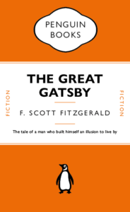
I for one, never realised that the lines between the headers weren’t just added in afterwards, they’re attached to the text itself and change with the text. This honestly surprised me a lot. I also did not know there were hidden characters used every time I write something, e.g. space (a dot placed near the top of the x-height). Just working on this cover made me appreciate just how much actually goes into the formatting of a book cover design.
This made me want to try to recreate a children’s book in a similar style without all the flare and illustrations surrounding them typically. A childhood favourite of mine was always Pinocchio. I like the idea that lies are visible straight away, there’s no hiding them they’ll catch up to you. It’s the ideal book to strip back and recreate in this style.
Poster: Icon vs Typography
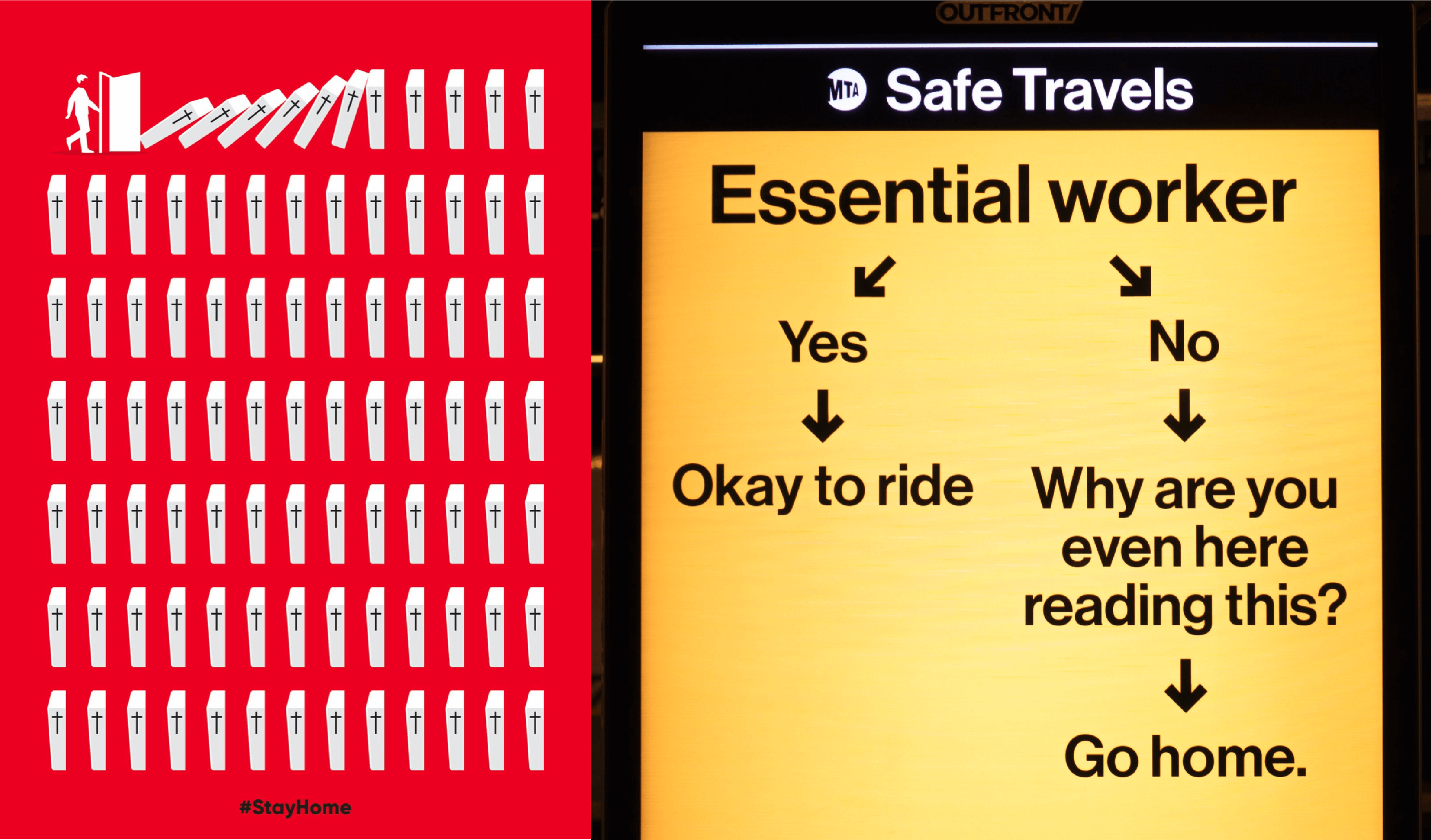
What are these posters trying to do?
These posters are designed to encourage people to stay at home to help stop the spread of COVID-19. In both of these designs they have chosen bright colours with strong connotations. Red is often associated with danger and yellow is associated with warning, particularly when combined with black. We also see that both are quite simple yet structured. There is a flow to both designs leading you to the same conclusion, but in two very different ways.
The red poster, titled ‘Stay Home’, has chosen a very stark way of conveying this message. Through focusing mostly on icons this very simply structured scene is almost graph like, implying the statistical impact of each person who chooses to endanger society when stepping out the front door. This poster has a very strong message, stay home or the knock on effects could be disastrous. I found this design to be quite shocking but massively impactful and effective. I especially like that they have chosen to include a very small amount of text at the very end; the two words say hardly anything and yet everything and they leave nothing to be questioned.
In contrast, the message to commuters is mostly text. We do have a few small icons to guide the reader but they are not necessarily the focal point in this design. I found this design to have much more attitude than the first. The choice of wording is very interesting, almost humorous in its bluntness, though I do not think this to be the intended effect. Similar to our first design it has a very straightforward message, unless you are an essential worker you should remain at home. However this poster is challenging the reader to confront their own actions in response to this pandemic whilst in the act. The use of a question here is quite provoking. Keeping the same typeface throughout, the reader is not distracted by decoration or overwhelmed by many different elements. I think it is in the simplicity of this design that its seriousness comes through.
Do different approaches produce different results?
I find the implied consequences in the first poster to provoke a stronger response in me than the second. I am not being told what to do or think but I am able to see and understand for myself how my role can affect the society in which I live and I think this greater understanding of context and consequence leaves a greater impression than the second poster which is correcting an action already taken.
References
Stay home. Image created by Barış Cihan Peşmen. Submitted for United Nations Global Call Out To Creatives – help stop the spread of COVID-19. Available at: https://unsplash.com/photos/jTK820WUr2k
Subway message for commuters. New York City, NY, USA. Available at: https://unsplash.com/photos/yCk_WyOdzAk
The end of Club Penguin R.I.P
Club Penguin is an online game that was loved and played by millions across the world, however, it sadly got shut down on March 29th, 2017. The tragedy left millions heartbroken as this game was what they loved playing. Many people sort out to create or find a new version of this beloved game. However, sadly the true club penguin could never be topped and replaced. 
Wear a mask to stop the spread
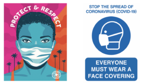
Our task for this project was to collect a wide range of communications relating to COVID-19. During this project, I learnt how to improve my searches on the internet to get the best and widest variety of results as I did the majority of my research online. I had discovered that the majority of the government official and NHS posters and signs were all in blue and white or yellow and black. The reason for this is most likely due to the NHS colours being blue and white and yellow and black signs used to stand out as they were usually associated with warning and poisonous signs. However, the issue is that they no longer stand out. I have found that we, as the consumers, have become accustomed to these warning signs now. They no longer grab our attention because we see them around so often.
In Los Angeles (L.A ) the mayor introduced an initiative called the L. A mask print project. They ask designers and artists from across L.A. to produce posters, like the one above on the left by Camilla Lonis at Studio Number One, they are then made available to be downloaded for free by local businesses and residents so that they can be put on display. I think these more creative and colourful posters work better as they’re much more noticeable than the government standard ones that we have now become accustomed to. Adding a face that’s not just a basic outline perhaps will make the message feel a lot more personal rather than robotic. If it feels more personal people are more likely to want to make a change and ultimately that’s what the creates of these posters want. they want people to make the decision for themselves to wear a mask, and usually, if it’s encouraged rather than enforced, you’ll get a better response, although this isn’t always the case.
I think it’s clear that the Losin poster is for a particular audience. People in L. A are known for there glamourous lifestyle, they also have a rather large art scene and so to grab the attention of the creative inclined, you need to put up posters and signs that are just as, if not more, creative and bold as they are. Whereas the Government official and NHS ones are for national use, therefore, need to be more neutral so to appeal to everyone. As the UK is also very multicultural and we have people from all over the world the signs need to be clear and concise on what they want from the public so everyone understands no matter their language. The decorative posters can sometimes have messages that are vague or have a double meaning.
My job was easy
My initials, R and A are really similar in terms of shape, so I think I had an easier time with this brief than most. That doesn’t mean it was that straightforward though. Because of their similar shape, when I tried to blend the characters together it tended to look a lot more like A and P rather than A and R. I found that the solution was to morph one of the legs of the A into one of the legs of the R by making it curve off at each end. T think this has worked pretty well as it should look a lot more like A and R in the final image than it does in the process photos. This has taught me that even when a brief appears to be easy, there will still be graphical problem solving that requires creative thinking.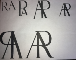
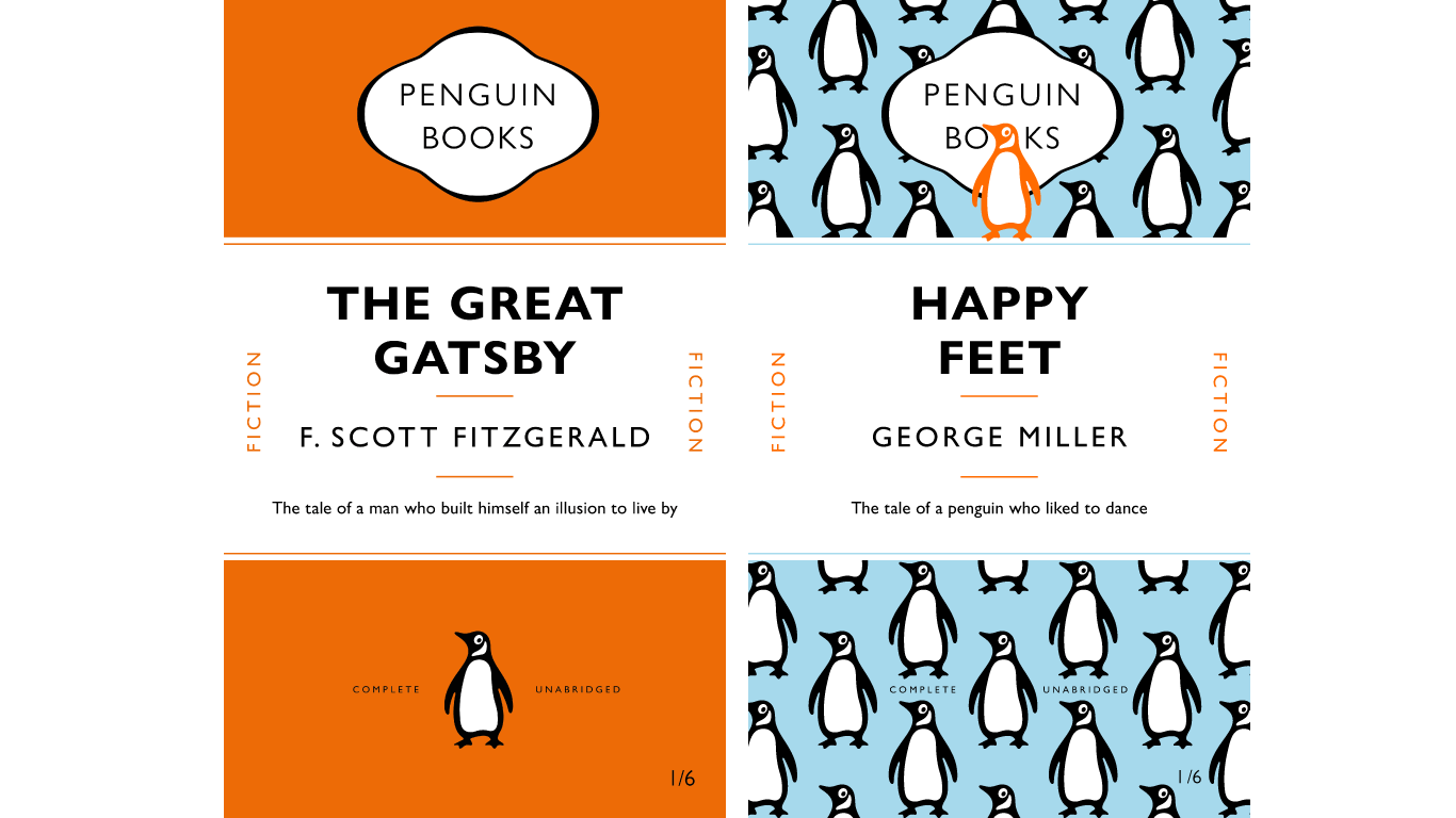
Happy Feet
The class
Through this class I gained a much better practical understanding of the appropriate use of spacing tools such as tracking, leading and space before, and the guidelines with which spacing within text should be considered. I had not used paragraph rules before and so I was very glad to have discovered this particular tool. I also enjoyed learning how to create a template, in this case replicating a classic Penguin book cover and then using this template as the foundation for experimentation.
The cover
For my cover I chose to focus on the penguin logo. It has become so iconic but is often not designed to be the focus piece of any cover designs. It is almost always positioned in the middle of the bottom third of the cover on a blank background. The movie ‘Happy Feet’ singles out one penguin from the rest as being different and unusual so I wanted to play around with the use of the penguin, it’s colour and it’s position to create the background of the top and bottom thirds whilst echoing the storyline of the movie.
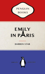
Emily In Paris
On Friday’s TY1INT practical session, we copied the design of a classic penguin book in InDesign. I found this task reasonably simple to follow and it helped me get to grips with using InDesign for the first time. I found making the shape at the top of the book most challenging, however, once we went through it a couple more times I managed to get the hang of it. We were then briefed to change some parts of the design and to create a new book cover for a book or film we have enjoyed recently.
Here was my first attempt at the task to change our existing book cover into a different penguin book. – TY1INT PENGUIN03
I have been watching Emily in Paris, a series on Netflix, at the moment and decided to recreate that in the form of a traditional penguin book cover for the task.
My initial idea was to have a silhouette of the Eifel tower as an ‘A’ in the word ‘Paris’. However, as I experimented more with the text alignment, I noticed that the top of the Eifel tower PNG formed the ‘I’ in ‘Emily’ as well. I thought this was a fun way to bring the cover together and tried to make it look as visually pleasing as possible. I also changed the colours in the book to the colours of the French flag.
Overall, I found this task fun and very helpful to get started on InDesign. If I were to do it again, I’d like to break the traditional structure of the book a bit more. However, I do enjoy the subtle differences I have made to encapsulate the essence of the series.
Drake’s choice
My partners 3 facts were:
- likes chocolate
- likes R&B
- has a bulldog
my 3 random words were:
- teeth
- treadmill
- sandwich
i decided to focus on 2 topics of R&B and sandwich. This resulted in a final product of a sandwich which was sponsored by a well known R&B singer Drake, and his chosen sandwih choice.
‘Caroni’
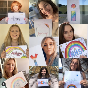
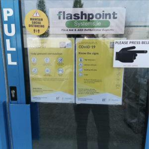
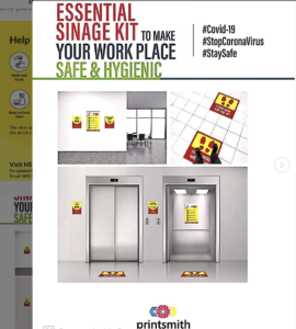
Today for Emma’s project, I researched all the different types of Covid 19 signage. I wanted to get a diverse range of material from different areas from all over the world so I decided to use the hashtag #covid19signs. this would source all the covid 19 signs from the perspective of the civilians and the companies/ businesses. this showed the signs as people interacted with them, for example the picture would be of a sign on a door from the perspective of someone who would interact with it in that given example. It also showed the different examples of mock-ups that businesses used for promoting safe signage in their businesses. i also encountered the different examples of NHS signage. Instead of focussing on the rules and advice, i also wanted to look for the supportive signs towards NHS workers and see if i could see a trend. I noticed that the typical signage that informed people of the rules used bold outlines or solid pictograms as well as sans serif type all on a bright yellow or dark yellow to head urgent warnings. the consistency in geometric weight in type and graphics accompanied with the high contrast background lends itself to a more serious tone in message. its clear to see that the NHS signs that thank workers take an opposite approach to stand out from the boring consistency in signage. Instead of using sans serif type that conveys efficiency, they hand draw their text in a curvaceous and forgiving inconsistent style, showing imperfections to convey that a person drew this, making the message feel genuine. for colour pallets they also use a softer blue for the backgrounds to symbolise the NHS and typically incorporate a rainbow to symbolise hope. The colours are also typically coloured in by hand for the previous reason and i think it is a nice distinction from the overwhelmingly bright yellow from official signs as the subtle colours are easier to digest and helps create a relaxed and warm tone to the message. Consumers of covid19 signs have adapted to the pandemic, making the official signage less efficient in standing out and conveying the importance of their message as they all blend into together in a persons given day. The different approach to the NHS signage helps stand out as people aren’t conveying such relaxed tones in the the recent average signage. Despite typically being drawn by a 9 yr old with their parents, its arguable that they are more effective in attracting the common eye in the open environment in some cases.

