Category: Student work

Illustration Vs Typography

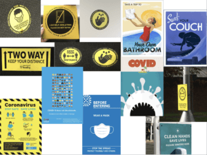
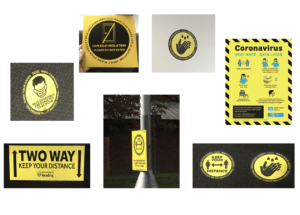
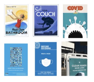
For this task I wanted to look at the differences between graphic design that has been released as a part of a government campaign and graphic design that his been done by individuals not employed by the government. I found some really interesting pieces of design from something called ‘the visual art project’ which is a virtual art gallery that invites graphic designers and artists to submit original poster designs that respond visually to the Covid-19 pandemic. The project was created by Mark Kelner (a DC-based artist), Ben Ostrower (a graphic designer specialising in political campaign branding who founded (wide eye), and Zachary Levine (a historian and curator who runs throughline collaborative).

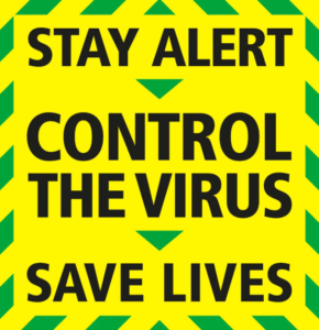
I thought this would be a good source of comparative work as the designers haven’t had to work with a specific client like the government released Designs. Obviously the two designs have different intentions in terms of sending a message about covid but I think both are effective in their own way. The government design uses a very bold sans serif type in all caps which creates an extremely legible message. The message of ‘control the virus’ is also in a larger type which creates an almost summary of the governments instruction. In comparison to the poster regarding hand washing, the governments design is much more accessible. Not only could this design be read a lot further away (impacting more people) it is just easier to read in general with the centre alligned, large type. The colours used also give this design some sense of urgency for the reader. The border of the design look almost like some kind of hazardous tape which alerts the reader to read the warning.

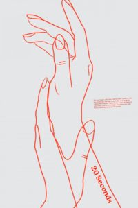
The hand washing poster uses an extremely small type to elaborate on the message of ’20 seconds’. The use of such a small font here could work in either one of two ways. Some people could be intrigued at the fact that they cannot read the words at first glance or alternatively, someone may simply not be bothered to read it as it requires more effort to look closer. This designer is almost allowed to take this risk as they have not been employed by the key people responsible for controlling the virus. For such an important message perhaps it is best to stick to legible type.

Another large difference between the two designs is that the hand washing poster used illustration to portray a message. A line drawing is used to resemble the washing of hands. Again this could of have varying impact. A line drawing is not something that is bold or even legible at all from a certain distance. This leads to similar implications of the small font choice.. Some may be interested by this, it looks like a piece of art.. however some may hardly notice the subtly of this design which means a failure to pass a crucial message on.


these-excellent-covid-19-posters-are-both-beautiful-and-beneficial

I can’t tell where “d” ends and “D” begins

This project involved reducing my initials to basic geometric shapes or silhouettes and merging them in different ways. My initials are the same letter, so I used both capital and lowercase to gain some variation between round and sharp edges. In my final transmogrification, I used watercolour as a medium to emphasise the theme of fluidity.

A useful time-saving technique that I will take from this task was cutting out my initials to trial different combinations of positions and letter casing without needing to draw them out.

Shoes design present

As my partner Hannah had a passion and business in designing custom trainers, I came up with a custom design of my own. Going through some ideas I found that there could be a lot done to the design on a shoe and that the opportunities are great. I was given the three random words ‘fire’, ‘electricity’ and ‘clown’ to work with so I decided to go for a very light expired design with bright colours and a floodlight at the back to represent ‘electricity’. For ‘fire’ I came up with the idea to put a fire hazard symbol for safety on the side of the shoe next to the floodlight as the having such I bright light next to fabric could cause a hazard. And as for ‘clown’, I first tried to incorporate a clown nose onto the back lip of the shoe, however, I did not like the outcome of the product. After that, I decided to try and let colour represent the ‘clown’ and a came up with this final product. Sadly the colour does not represent the clown as much as I would like but the colourfulness in addition to the eeriness did make a connection for me.

The new library:

In the first task, we were given an original Penguin copy of ‘The Great Gatsby’ to recreate to the best of our ability in InDesign. This allowed us to understand and get to grips with the fundamentals of the InDesign design program whilst also getting a good look at a very widespread and professional design. With this new knowledge and design template, I was able to create a design of my own called ‘The New Library’ where I used a QR code to the Wiki page as the title, binary that translates to ‘Safari’ in the side text and the author being named ‘Tim Berners-Lee’ as the man who helped invent the internet. This idea was inspired by the way the internet has changed the face of research and reading as a whole whilst still holding its origins in the cover of a book.


Eat, Pray, Love, Repeat

In TY1INT Indesign practical session, we had to all create a copy of a classical Penguin book cover. We were then asked to experiment with that book and perhaps change the colour and title of the book.

I chose to change the cover to another classical penguin book.

We were then asked to design our own book/film cover, including an element of wittiness. We had to stick to the basic rules of our first classical penguin book cover.

I chose the book ‘Eat, Pay, Love’, because it is about a woman who had everything; a house, a successful career, and a husband. However, she loses everything, and loses sight of what is important to her in life. She sets out on a journey, stepping out of her comfort zone, and she builds her life back together again, coming back a stronger woman. To me this book conveyed such a powerful and important message.

We can all relate to Eating, Praying and Loving in a very personal and eclectic way, but there are also universal ideas and emotions about these concepts that we can sometimes joke about. In this case I am playing with sarcasm and the notion of food as a comfort, but also as a source of guilt. In a society where women are constantly beating themselves up for wanting to eat (a lot and not necessarily healthy)and always chasing the unattainable perfect body, you have to appreciate the encouragement to eat as much as you can, praying that you don’t expand beyond your most comfortable outfit. And when you ticked the first two boxes, Loving the chef is easy. I added Repeat to highlight the fact that humans are creatures of habit and we sometimes struggle to move away from our repetitive lifestyles and routines.

Stuart Little

This week in our technical session we were learning some of the essential basics we needed to use Adobe InDesign. To do this we had to create an exact copy of the cover of The Great Gatsby. Throughout this process, I learnt how to appropriately use tracking and the ‘space before’ feature as well as how to great separate paragraphs within one textbox. These are key skills that we needed to learn as they can enhance are designs and perhaps even speed up our design process. For example, the ‘space before’ feature allows for much more control over the space between lines of text compared to just pressing the return key. This also means that no matter what text is inputted into that paragraph, the spacing will always be how it was originally intended to be, making the design easily adaptable. The image below is my copy of The Great Gatsby cover

We were then asked to use our copy of The Great Gatsby cover as a template for a new book cover for our choice of book, movie poem etc. I chose Stuart Little. I decided that every time the word ‘little’ appeared it would be in 8pt text and everything else would be in the same size as the original template. My reason for this is because ‘Stuart Little’ is about a mouse living in the human world so most things around him are much larger than him and so I wanted this to be reflected on the book cover. I also changed the typeface of the title into one that was more like a script font as this is a children’s book and I felt gill sans was too harsh and not playful enough.

House Rolfe -GOT

The project is to design a present for a classmate based on their interest and see how we can develop it with random words.

Ideal Gift was an interesting project to do because I got to learn more about my classmate interests and see what kind of work, they can do based on my interests.

One of my partner favourite tv show is called a game of thrones and His favourite animal is a cat and I used the cat as a symbol in his Game of Thrones house,  In GOT they have houses logo to represent their surnames.

My random words were birds, explosion, and umbrella I experimented with all those words and choose an umbrella with the cat as my best. The final work resembled that of an Egyptian symbol which I found very interesting and I felt it suits the theme of Game of Thrones.

My Experiment


Hands, Face, Space: Covid-19

For Sue and Emma’s project, we looked at the graphic language of Covid-19 signs and posters, both on the Whiteknights Campus and from the internet. I began this project by exploring campus to take photographs of all the Covid-19 signs that I could find. I then used social media and google to find some more examples of posters that use imagery and typography to convey information or messages about the Corona Virus. It became clear to me, that there was a wide range of approaches that could be used to create eye-catching and visually appealing designs. One technique most of these signs and posters adopted, was the use of colour. Vibrant reds and bright yellows are often associated with danger and warnings, hence why these colours appear frequently in the Covid-19 signs.

To organise my images, I created powerpoint sides, grouping the signs into the following categories: hands, face, space.

Covid Colour Signs and posters

COVID-19 – POSTERS AND SIGNS

In todays task we found posters and signs online and in person related to covid 19.

i’ve separated the images into two categories related to the theme of colour, blue and yellow. I’ve realised during the group call a lot of the posters include these colours, i think the creators of these posters and signs choose these colours as they aren’t alarming to the target audience but are still clear and attention grabbing.

i found all but one of these signs around campus, they all use sans serif type and use the colours black and yellow, the poster also uses a little bit of blue. Most of the signs also use circles with bold black outlines. I’ve also grouped these together as they’re instructions rather than informing the audience. The colours are bold as they’re suppose to catch your attention when you walk past them. They’re also quick, simple and easy to read and understand.

I found these posters online, i grouped them together as they all use different variations of blue. The first three posters are more of decoration, they’re all telling the public to stay at home. The first poster is an image of a woman in the bath holding toilet paper while smiling, this has connotations towards the toilet paper running out in shops, it uses decorative black type. The second poster is an illustration of someone surfing while on their phone, the type is again decorative and is in white and black. The third poster mimics the jaws poster, the covid atom is the shark and the woman is the home, The text is bold and in red making it seem like the situation is a horror. The bottom two posters are used to inform the readers of what covid is and how to prevent it, both posters have a lot of text and would usually be put in places where the reader has a lot of time to read it. They both use white, sans serif typefaces. The last sign is put in this group due its colour, the type is also in white and uses a sans serif typeface, instead of informing the reader it instructs the reader to ‘wash your hands’ the poster uses a similar calm blue, its eye catching and calming with a strong message , it doesn’t scare or intimidate the reader.