
Real Job: Students designed a campaign booklet and postcard to raise awareness about the work EAPPI carry out in Palestine and Israel. #EAPPI @eappiukireland @eappi
Category: Real Jobs
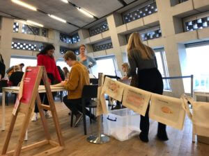
Leading the Tate Exchange 2019 Workshop
Real Jobs: Seniz Husseyin and Martha Macri led a team of students from @UniofReading in promoting diversity and individuality in the arts at @TateExchange.
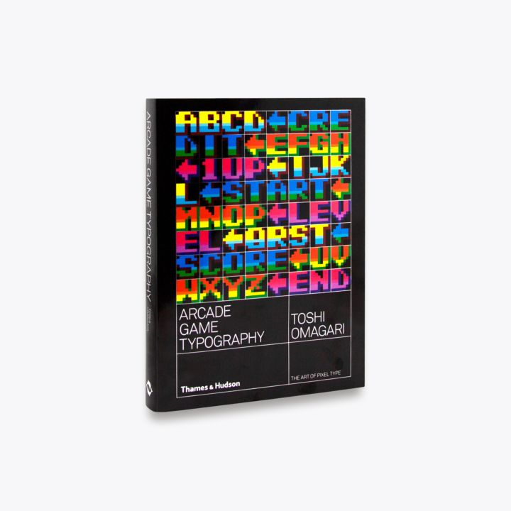
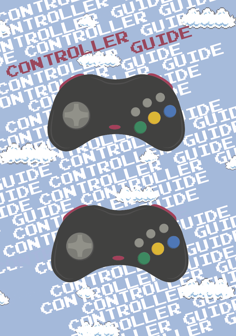
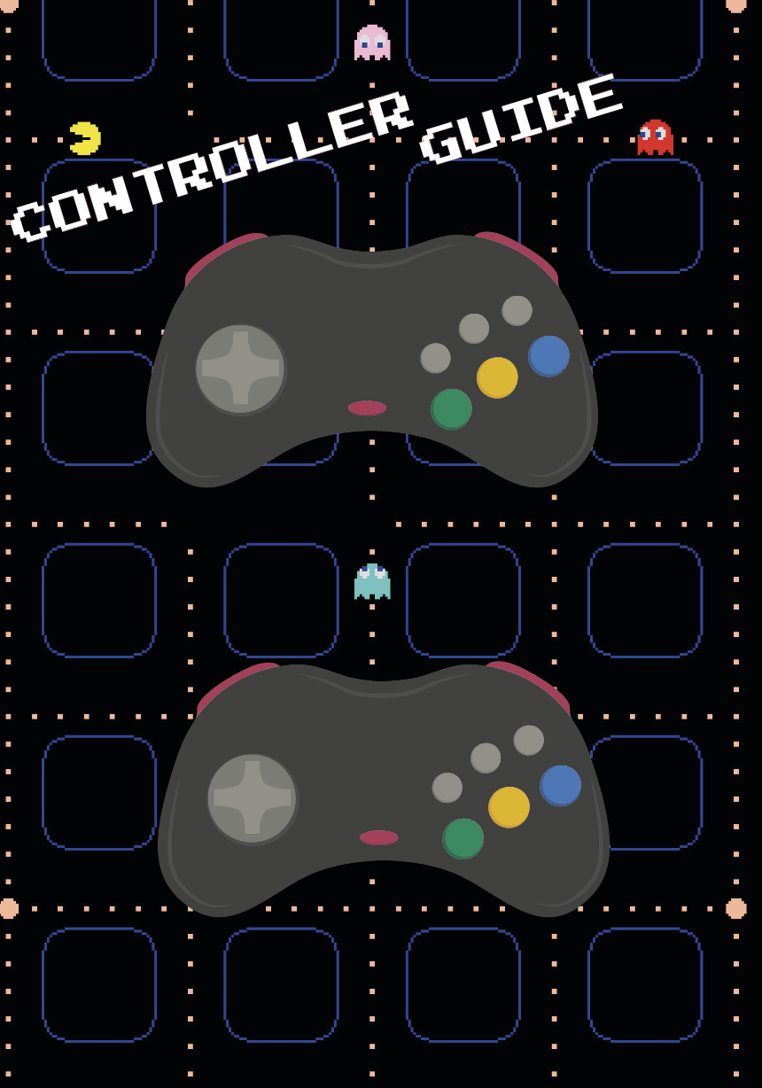
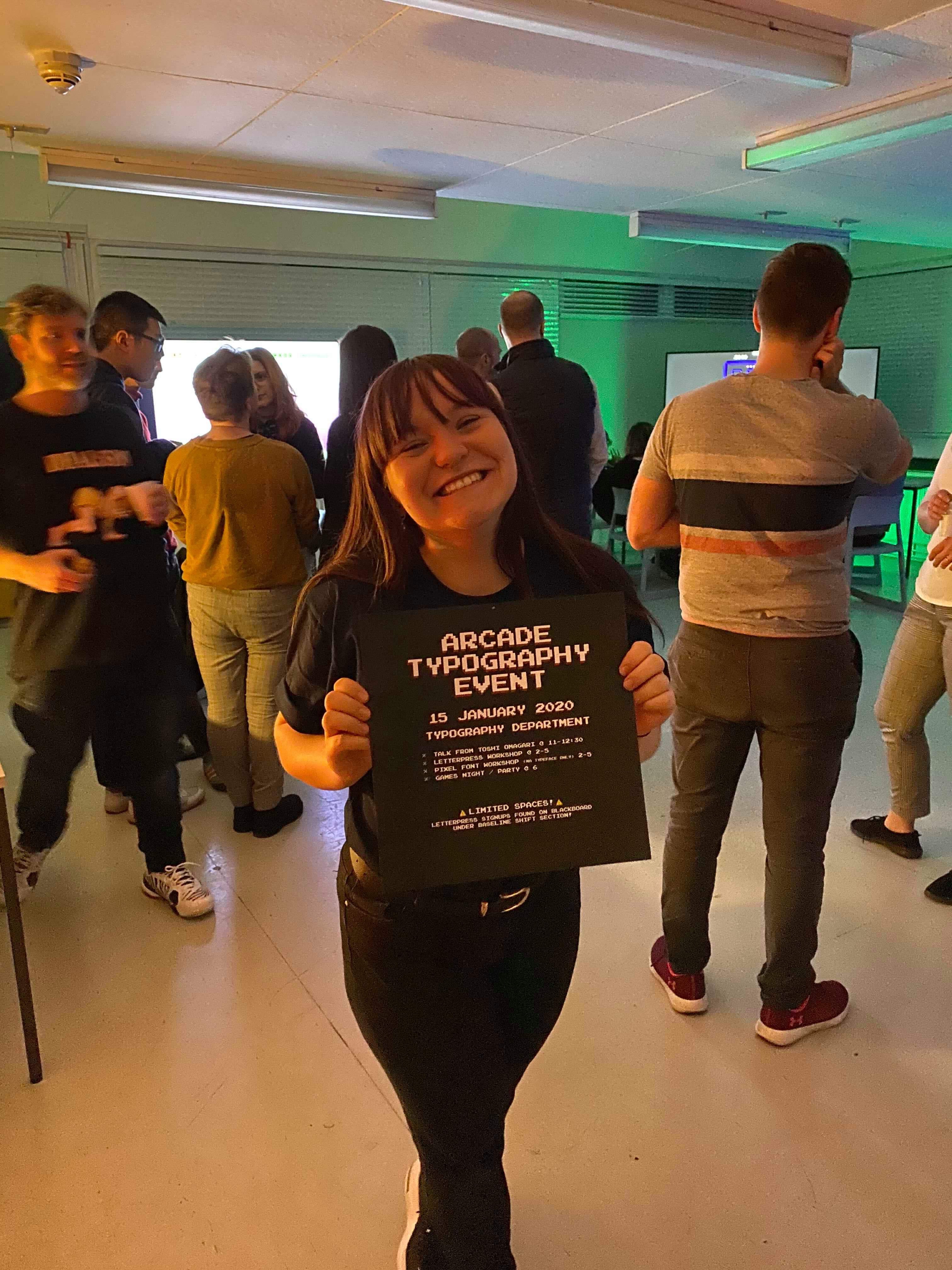
Arcade Game Typography Event Promotion (RJ00389)
‘Ideas, materials, social media and activities in support of an evening of Typography-themed video-gaming in the Department, centred on Arcade Game Typography: The Art of Pixel Type by Toshi Omagari’.
Overview and Aims
This real job is designed to support and promote Toshi Omagari, graduate of the University of Reading’s Typeface Design masters’ course, and his book ‘Arcade Game Typography: The Art of Pixel Type’. In order to do this, an evening of typography themed videogames will be played in the department and activities will be carried out during the day.
The main aim is to promote and celebrate Toshi Omagari and his book of arcade game typography, however, we also want to educate and challenge the knowledge that everyone has on the creation of arcade game typography.
Planning
The main deliverable for this project was the event itself, and so planning what we wanted to do on the actual day was critical. Some ideas that came out of planning were:
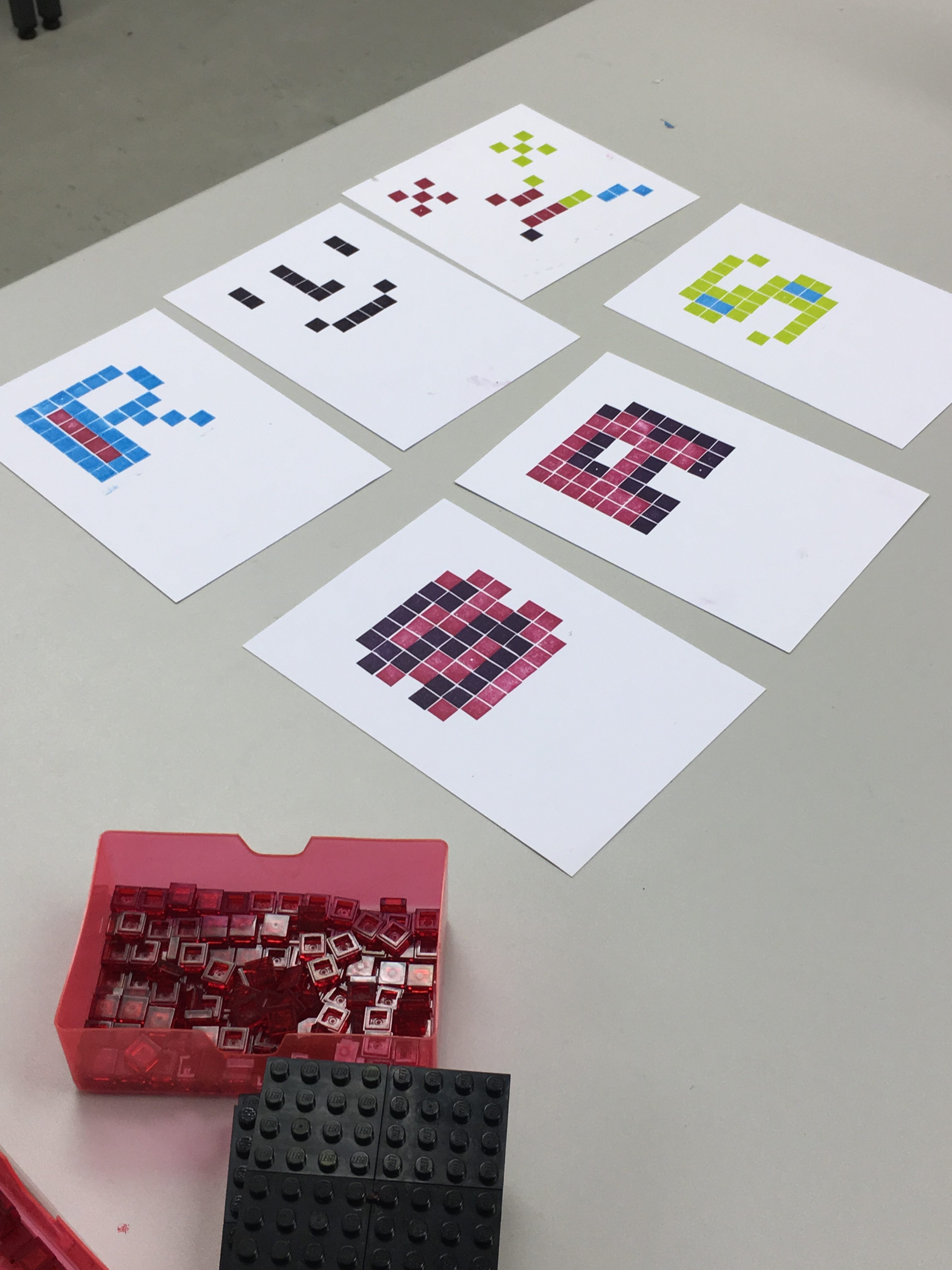
- Letterpress pixel fonts on 8×8, with overprinting – run it like a lego mosaic building workshop?
- Output a set of prints for Toshi?
- Screensaver for the video game screens
- Use pixel fonts masks in front of demo videos
- Demo vids could be blown up big
- Controller key guide for controlling MAME
- Mint some coins to use use as ‘I got next?
- Google sheet-based comments (UG column, PG column)
- Some way of customising the book with our outputs?
- Some way of hosting a digital record of the event and of our thoughts on the fonts?
- Live stream?
- Book signing / selling?
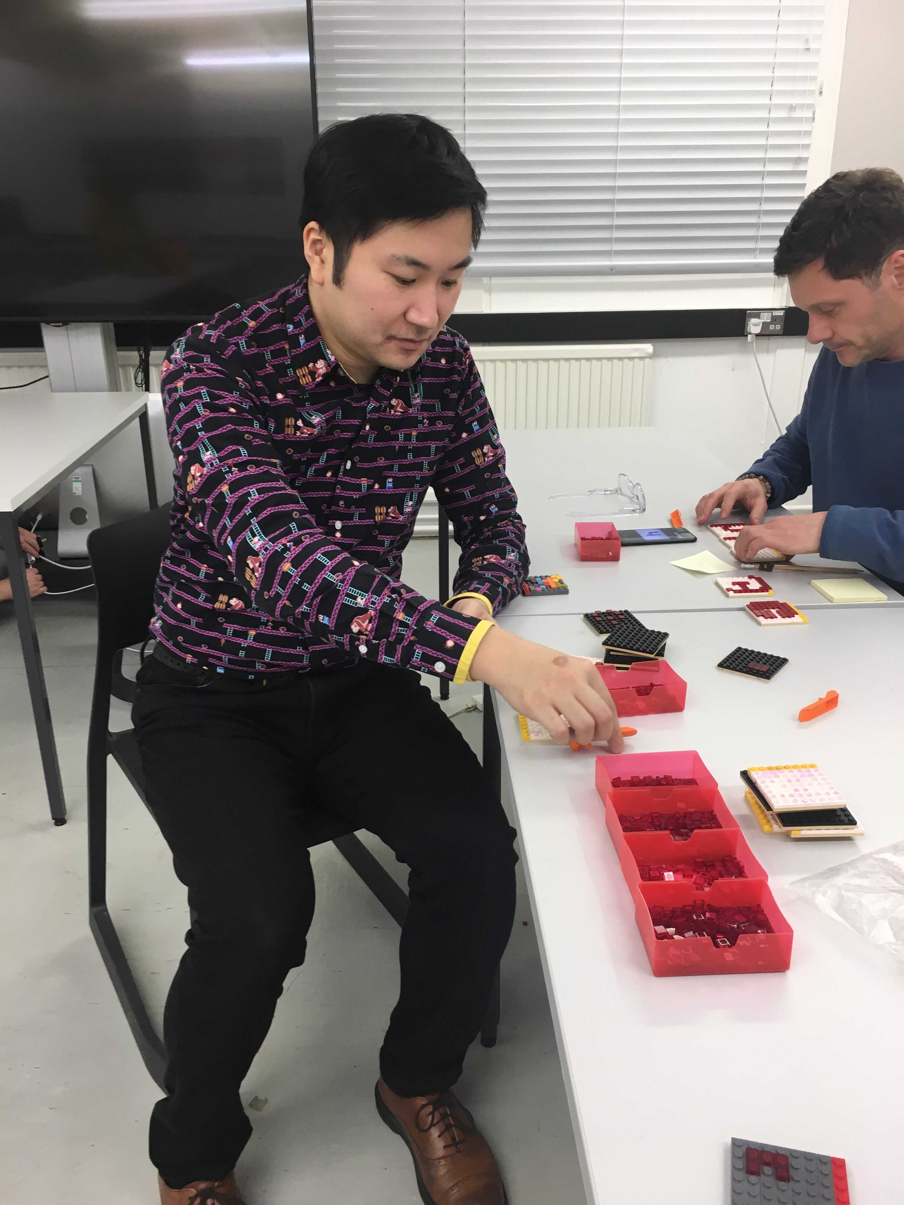
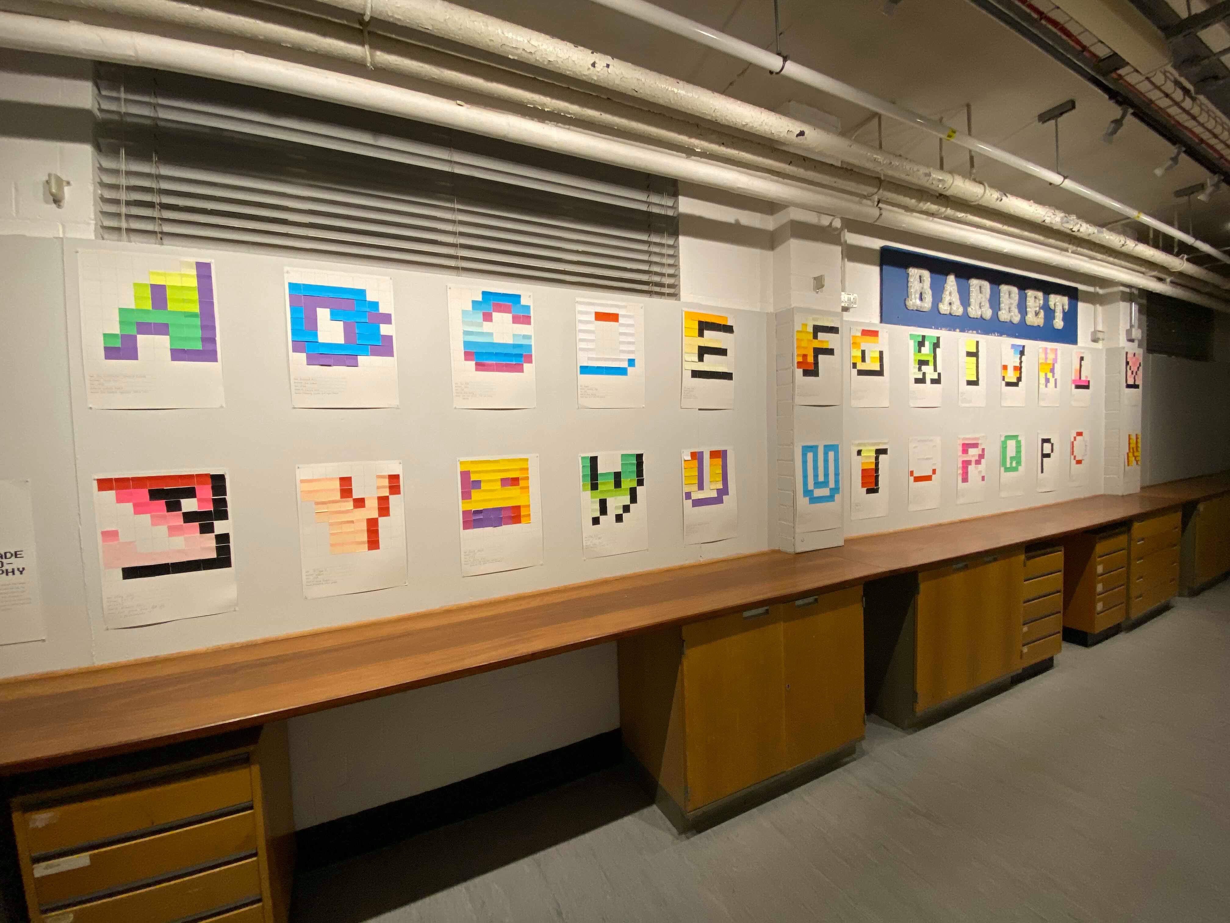
Whilst sifting through these ideas, the activities that were decided upon were to have a LEGO letterpress workshop, where students would create their own 8×8 pixel fonts, later to be joined by a similar workshop involving post-it-notes, where students would fill in an 8×8 grid using post-it-notes with their favourite designs from the book. Book signing and selling was something which commenced after Toshi’s fantastic baseline shift talk.
‘Whether you have grown up with video games or not, whether you are familiar with letterforms or not, I think there is something for anyone to enjoy in these pixel fonts. I also encourage you to make a colourful one yourself; you will appreciate the subtlety and craftsmanship of the art even more!’ – Toshi Omagari
Deliverables
As well as planning the event itself, I also had the challenge of creating all the promotional material that went along with it. Thankfully, I signed up to a Real Job I knew I would love designing for, and so thoroughly enjoyed the design process of all the following deliverables:
- Event itself; planning and catering
- Promotional poster(s)
- Instruction manual for controller
- Display screen advert
- Promotional videos: one for instagram, one to promote letterpress, and one for the department main entrance screen
- Instruction sheet for ‘hi-score’ Bubble Bobble game
Whilst trying to stick to this guide of deliverables, I ended up making a couple of extra bits for the event and modifying ones we already had in mind.
Skills
With the idea of having promotional videos, I knew that that meant I would have to learn some animation. I had never looked into animation before, but it’s something I’ve always been interested in learning, and so this was the perfect time to do so. The videos / gifs I made were done solely in Photoshop with the timeline feature, and I decided that I would ‘learn on the job’. Despite this, I’m incredibly proud of how these videos turned out, and I genuinely shocked myself with how quickly I picked up all the skills needed.
Another main skill I needed to focus on developing was solely planning an event. I had never planned an event before, and so learning how to best promote the event and go about catering for it was incredibly important. The success of the event determined how well I had promoted it, and essentially sold it to the students.
Video Advertisements
As well as the video seen above, in figure 2, I also created three other short videos for the promotion of the event, and for the night itself. Figure 3 shows the video made for the entrance screen, which would promote the event during the week. Figure 4 displays the promotion for the letterpress workshop, in order to promote the places left on the workshop list. Finally, figure 5 shows the video which was displayed on the entrance board on the night of the event, to act as a signpost.
Poster Design
For the poster design, I took inspiration from a couple of other ‘games night’ posters in order to get a grasp of the kind of atmosphere and feel I wanted my poster and branding to have.
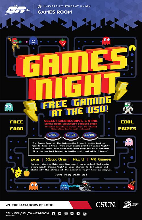
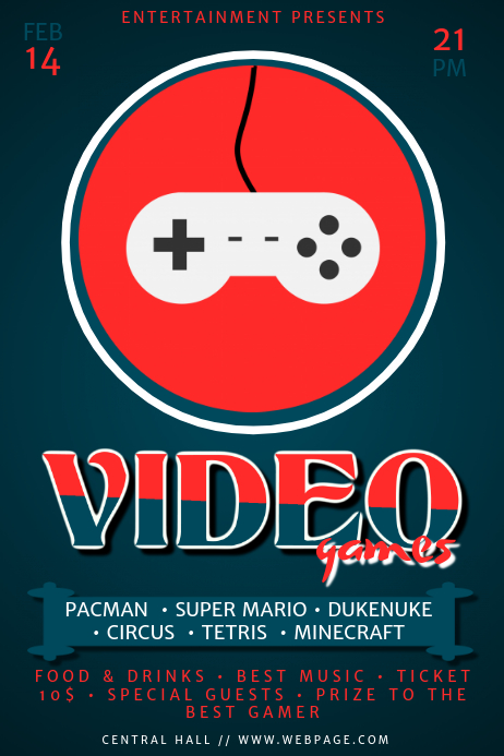
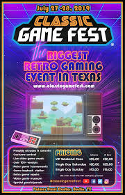
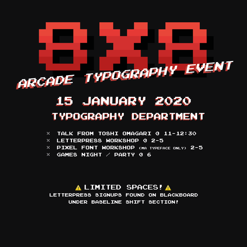
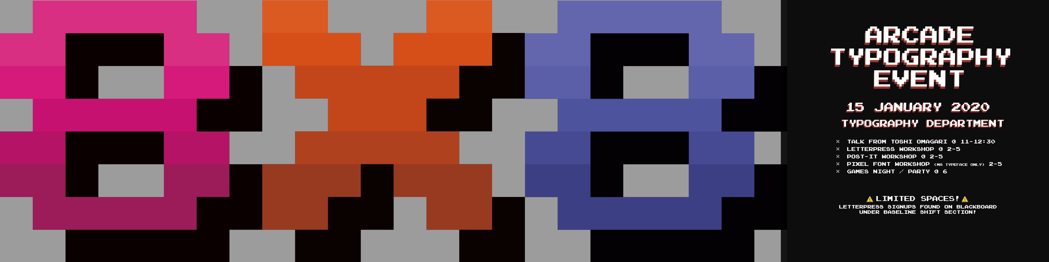
Figure 9 shows the first draft of my poster, which saw me take inspiration from figure 6 and 7, with the dark background and the pops of red. The logo is also seen here (8×8) and is seen in all publications whether this colour or recoloured (as seen in figure 10). The final, approved poster design was a set of four which would be displayed in a long line (see figure 10). The thought behind this was that the 8 X 8 would bring in the attention of the audience, and lead the eye to the final panel with all the information on which was displayed on a bold black background. As the posters were to be displayed around the department, it didn’t matter how much space we took up; there weren’t any constraints.
A couple of notes on the logo itself; originally I wanted to create a logo with the entire ‘8×8’ in an 8 pixel grid, and although this taught me a lot about the constraints involved when designing within so few pixels, it didn’t make for a very good logo in the end. Therefore, we scrapped that idea and moved on to creating a single character within the 8×8 grid, which was a lot easier, however there were still a lot of constraints when designing. The process of designing in this small space was so eyeopening, and was really interesting to see just what could be created with 64 pixels. In terms of the logo characters, I based my designs off the Atari typeface (Quiz Show), which is mentioned frequently throughout Toshi’s book.
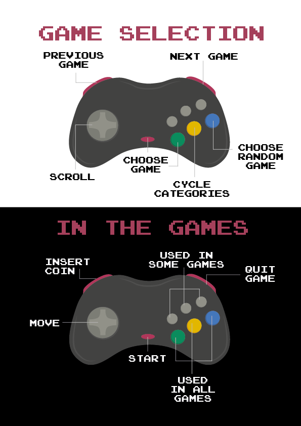
Controller guide / postcard
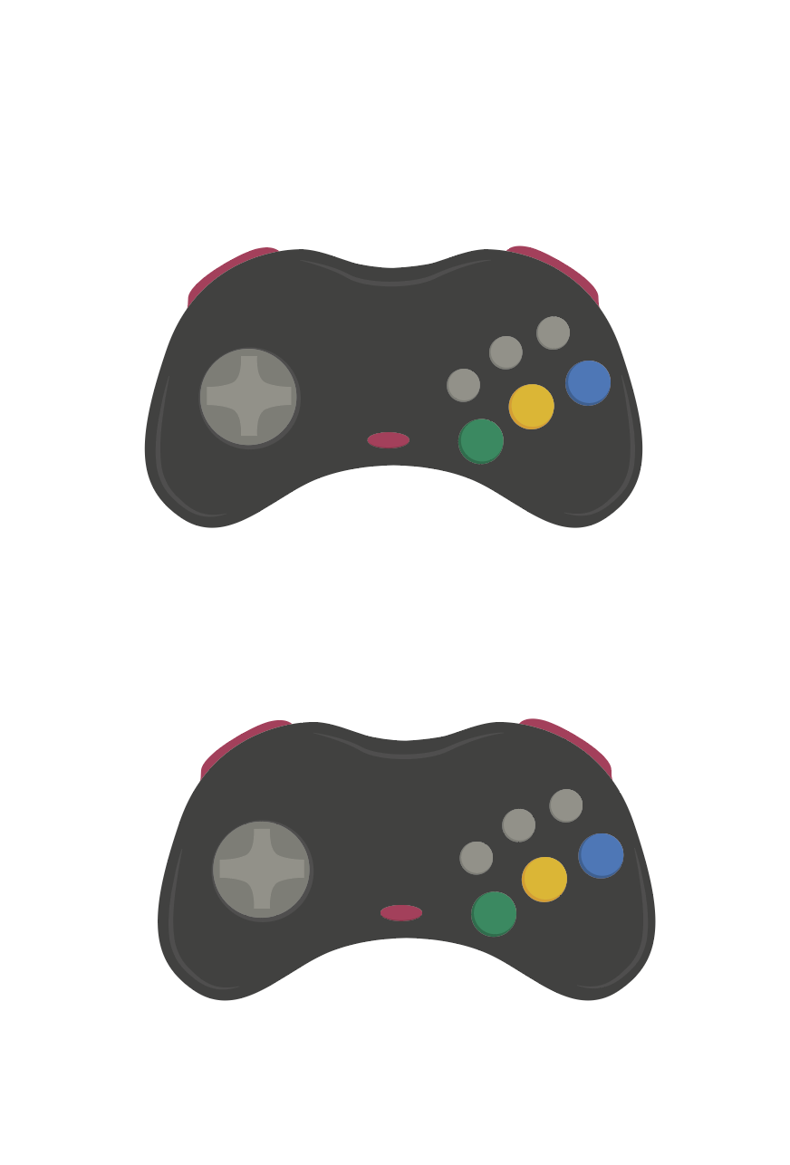
As the SEGA Saturn controller isn’t very commonly used nowadays, it was decided that an instruction guide should be made for students to use when they came to the games night. Figure 11 shows my illustration of the controllers, which would be labelled up as shown below. The images below show a couple of different ideas I had prior to the approved design (Figure 14/15), however, it was decided that the guide should be kept simple and so the separation of black and white on figure 14 shows the division between the two sets of controller buttons. It was later decided that these could be postcard size and taken away from the event as a souvenir, therefore, the back (figure 15) was designed to reflect the format of a postcard, with the intention that students / attendees of the games night would be able to get Toshi to write them a little message on the back.
Technical Skills
Along with all the design work, I helped with typing out all of the text for each game as seen in Toshi’s book, in order to display them on the screen alongside the games on the arcade MAME system. This was incredibly time consuming, however, it was very rewarding once it was finished and we could see all of the text within the database (see figure 16).
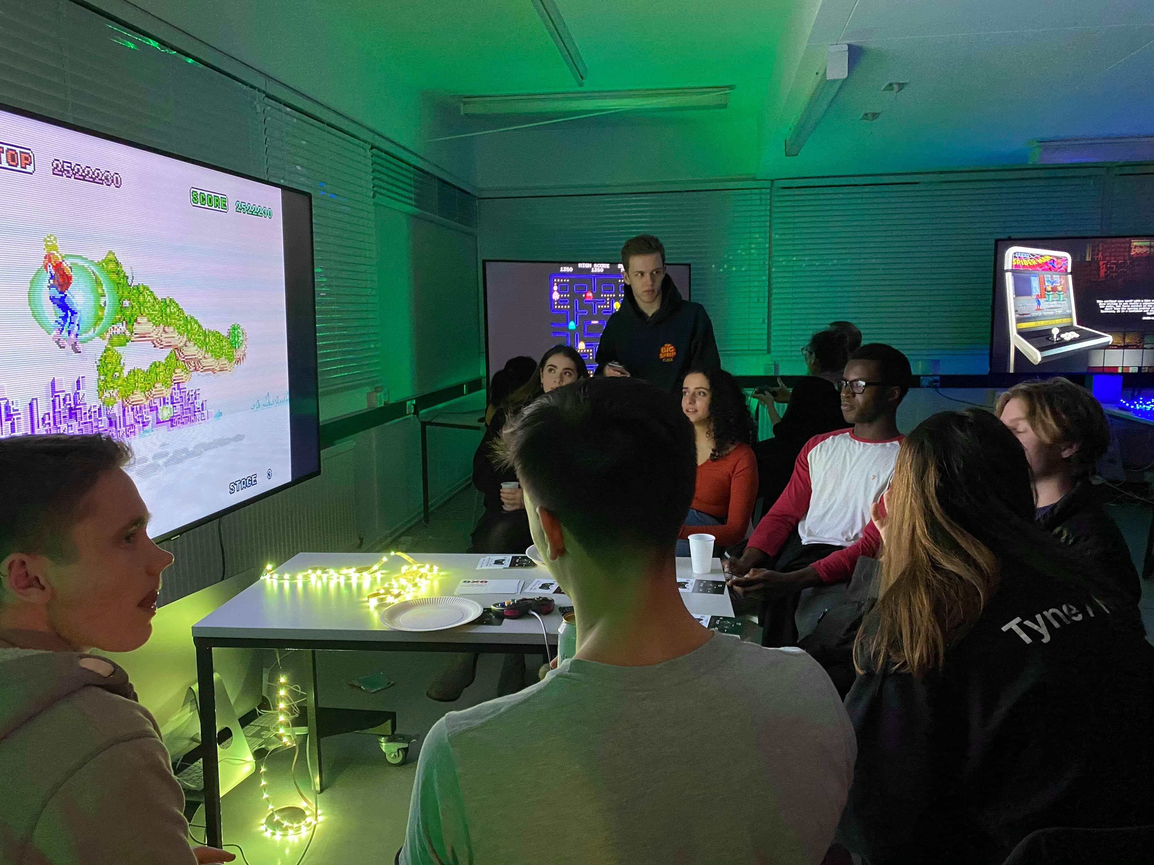
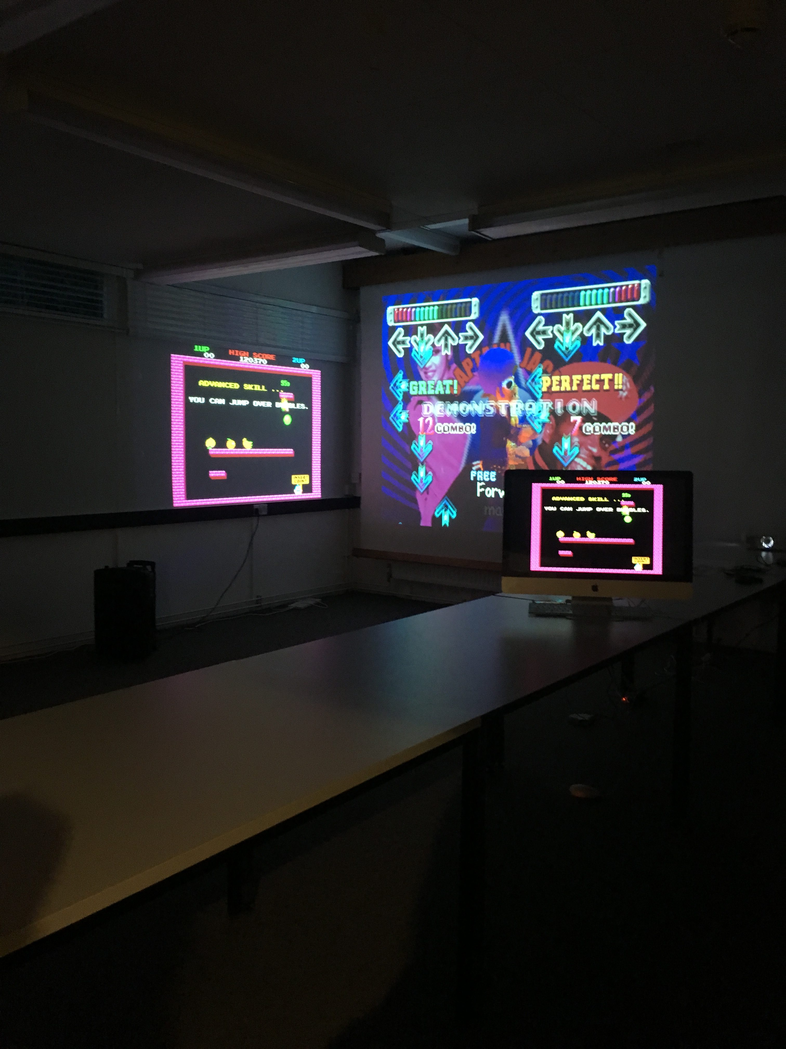
The Event
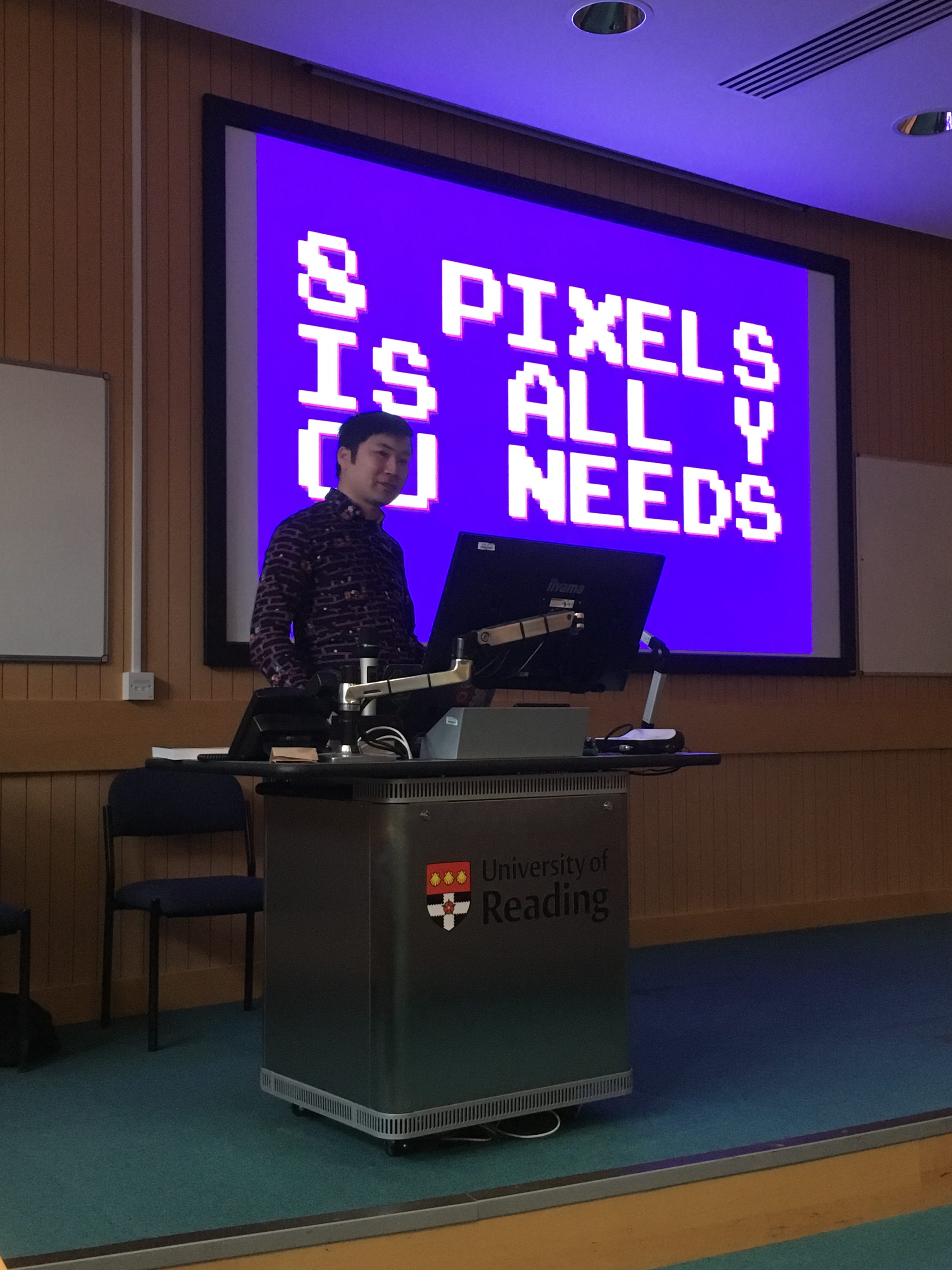
The success of this Real Job was down to the success of the event; if we could create enough hype for the event then it should be a very successful day and evening. We started the day with a talk from Toshi Omagari (figure 17), which was really insightful, especially for students who hadn’t picked up the book before.
‘Really intriguing to see a different side of typeface design compared to the usual serifs and san serifs. Seeing the changes in different pixel typefaces and how they have developed was really interesting’ – Joanne Tunbridge
‘Very interesting and different to all the other Baseline shift talks we’ve attended, would have been even better if I had background knowledge of the original games in the first place!’ – Ruth Bartley
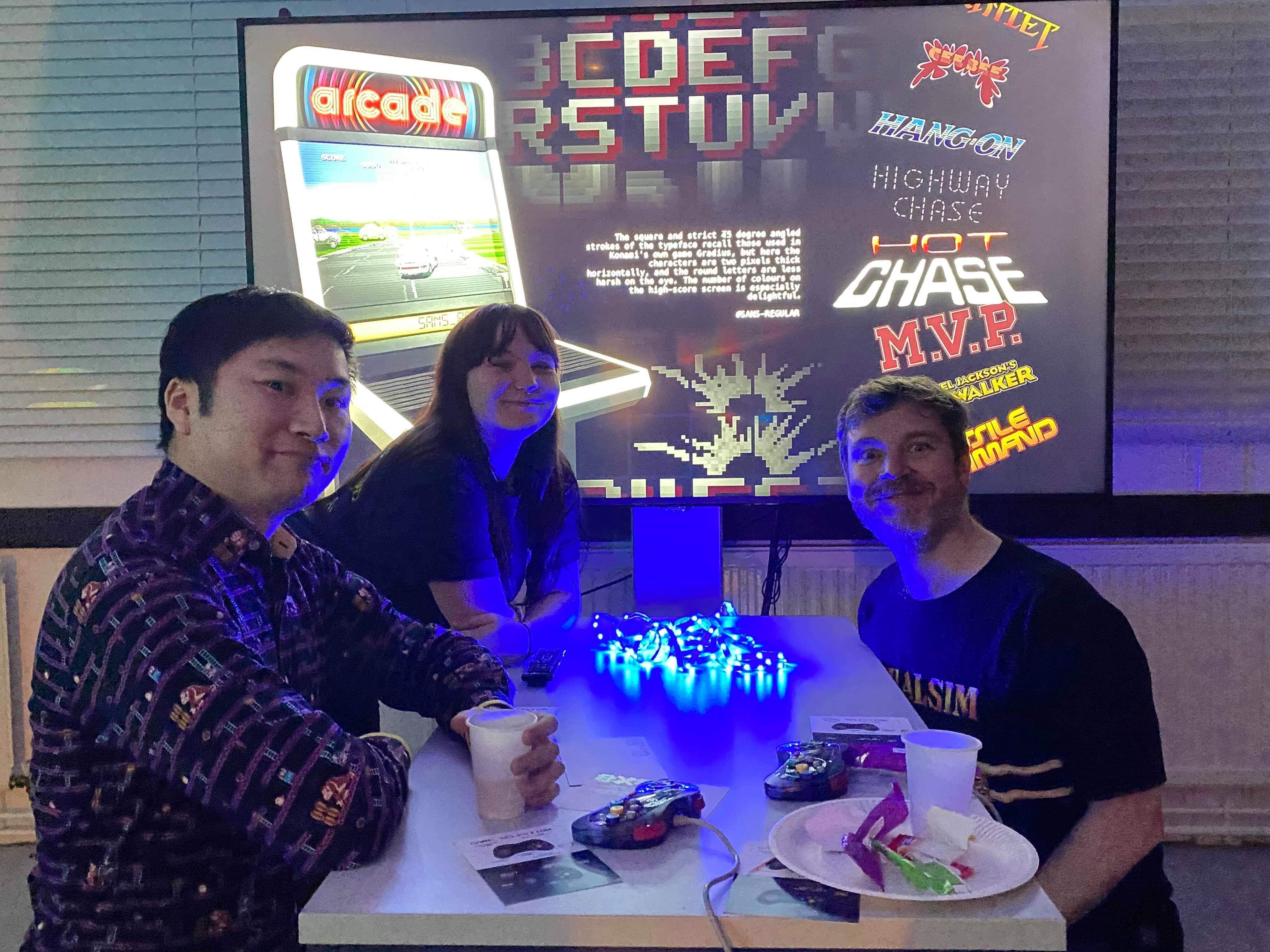
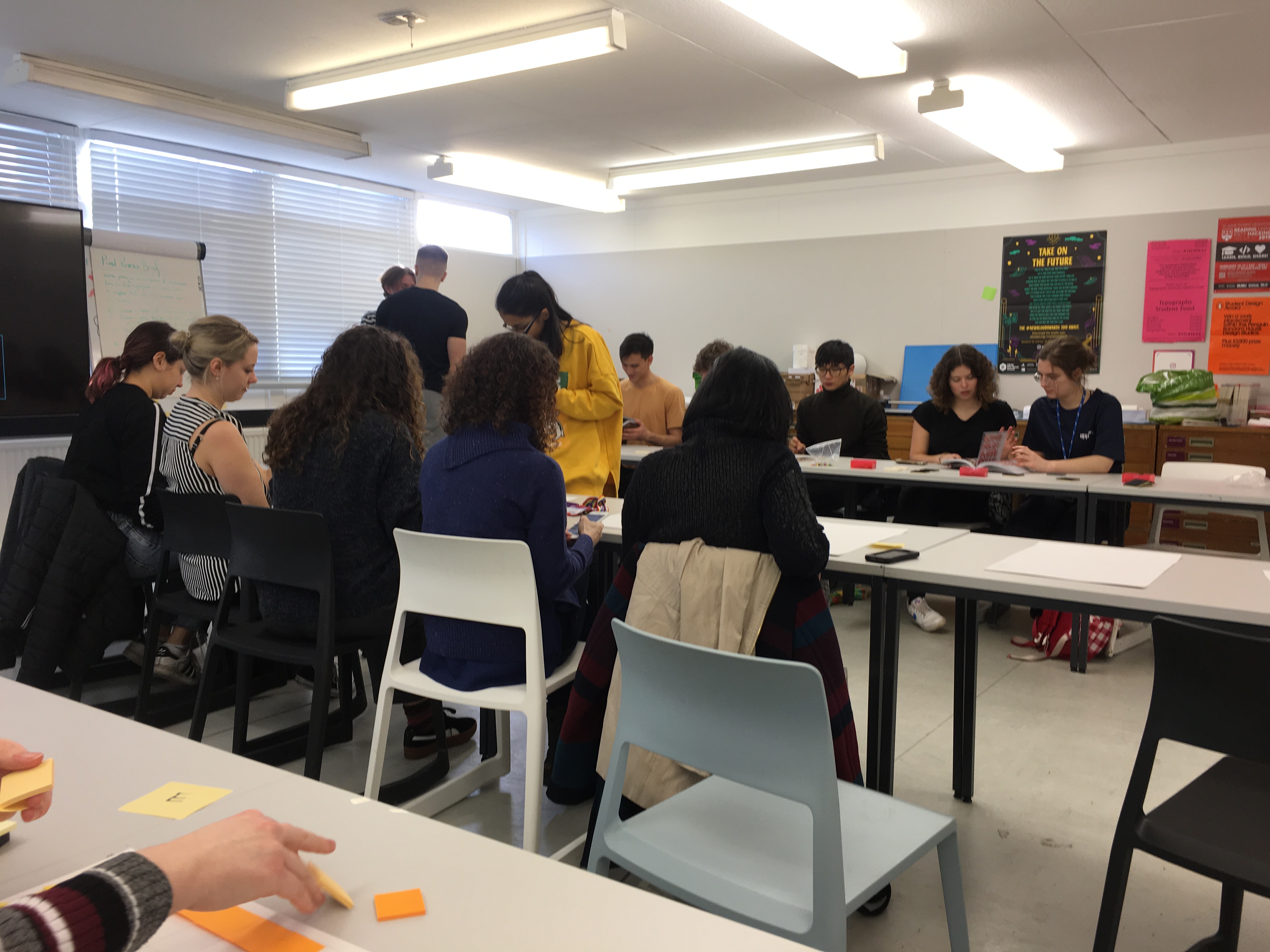
Other activities include the letterpress and the post-it-note workshops, as well as the MA typeface designer workshop run by Toshi himself. We managed to get some fantastic outputs which can be seen around the department, and created a great atmosphere which connected students through all years and staff members. It was truly something to be proud of. The following images were taken on the day of the event, and feature the baseline shift talk, both the letterpress and post-it workshops and the night itself. I think it’s safe to say it was thoroughly enjoyed by all.
Reflection
In reflection of the design work, and the event itself, I would say that it was a big success. The aims were all met and I went above and beyond the brief in order to make the day as great as possible. One thing I’d say I could’ve done better was been better in terms of sharing my files with my supervisor; I often didn’t send the files in the right format, however this was resolved after being alerted of my mistakes. I think the process was really eyeopening, and I have learnt so many new skills, as well as a LOT about pixel fonts (that’s what happens when you have to type up the characteristics of 200+ fonts!) ! I’m so glad I got the opportunity to work on this project, and I would love to explore pixel fonts in the future too.
👾GAME OVER 👾
Diversity team Tate Exchange 2020
Background
I am, We are… Different by Design is a student-led group from the School of Art and Communication Design advocating for diversity and inclusion within our creative field. For the last two years, we were kindly presented with the opportunity to host a workshop at the Tate Exchange in the Tate Modern. The Tate Exchange is a programme which encourages the connection between society and art. It invites the public and their associates to share a collaborative space where they can explore the impact of art on individuals, communities and societies. This year, as the new leaders of I Am, We Are…Different by Design we were responsible for organising and planning a two-day workshop.
Brief
This year, the school had decided on the theme of ‘Power’ for the Tate Exchange. There were multiple different directions they were thinking of taking this: power as an individual (people’s understanding of the word), power as a community (how power related to a group of people individuals are in), power in technology (how power is distributed to technology), and power in art (what power does the value of object have and is art powerful?). Our job was to relate diversity in design to one or more of these aspects. What we did was completely open, we were allowed to decide our activity and our audience. This real job is different from any other one you’ll come across since it wasn’t about physically designing an object but creating an event for the public to give them access to design.
Planning
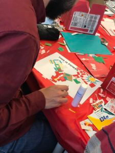
When we were first given the theme we were working with, the entire team immediately saw potential. There are many different meanings of power, and empowerment is often linked to diversity. When trying to come up with different ways we can interpret the specifics of power, we realised that we can allow people to show off their own idea of power and when they feel powerful for everybody to see. With the success of last year’s idea of the public making a design and us printing it on tote bags for them, we decided to keep that aspect. It is much more fun for people to show off their creative work and express their diversity than to just make something for themselves and keep it inside the Tate Exchange.
The whole event was planned through weekly meetings. This was a crucial step in the project. We got together with as many people on the team and our supervisor to discuss our developments and how to continue with this. Because of these weekly meetings, we had many opportunities to bounce ideas off of each other and fine-tune things as well as ensure we were on track. Without these weekly meetings, we probably would not have been as prepared as we were and would have been panicking to get everything done in time.
We will admit that we probably had it a little easier than the leaders did last year. Most of the basics had been rolled over from the previous time we helped at the Tate Exchange. However, it did still teach us how we have to adapt and update things, and it shows how it often works in the real world with the first person doing something having the most work. A basic budget and item list had already been made, but we had to update this with new suppliers and other materials that we didn’t need last time. Further, the technical aspect of the printer setup had also been created last year. But there were also many things we had to do differently, whether it be an improvement to last year or a different aspect we had to include.
Due to the success of last year’s event, we were given more dates to do our workshop. For this, we had to check with our other teammates what would be best suited since it would take place during a weekend and we all still had other coursework. Choosing to do two rather than three days and giving ourselves the Sunday for other commitments was what we agreed would work best for everyone. In the end, we also got some volunteers to help because others had to cancel. The numbers worked out perfectly as we had more people available on the Saturday when it was busier compared to the Friday.
Another change we decided to make was creating templates to help guide the public in creating their visual definition of power. These templates had prompts that allowed people to think about it further rather than just taking the first idea they had along the lines of power. We had noticed last time that some people would derail or not stay within the size constraints due to the printers and wanted to keep it more under control this time. The templates used the font from the zine we made last year, however, we kept away the many bright colours we used. This way it was still neutral and wouldn’t take away from the individual’s design while still keeping our group’s identity.
Lastly, we changed the way we presented people’s designs while we were at the Tate Exchange. Last year we put images into a grid and displayed that on a large screen. This wasn’t very dynamic, and many people didn’t even notice it. We tried coming up with different solutions, such as a dynamic grid. However, with how busy it gets and with limited time, we decided a simple PowerPoint that automatically loops through the slides was the most efficient way to do it. It worked out great, we occasionally had groups of people pointing out different designs to each other and it was funny to see kids wait for theirs to show up and then get very excited when it did. Using PowerPoint did mean setting up the laptops a bit differently, but we did all this beforehand.
As said before, this real job is different from most. Because of that, we also had to work with different kinds of equipment and required a health and safety briefing. We managed to get together the entire team and all the volunteers to have the briefing at the department a few days before the Tate Exchange. We all needed to know what to do since we were using technology and extreme heat in public. It’s something you don’t often consider when you are creating something yourself but suddenly becomes very important when there are liabilities.
Outcome
Based on positive reactions and engagement we can safely say the outcome of our workshops was a success once again. There was constant public engagement with our workshop throughout both days. The audience truly enjoyed the workshop. We saw excitement from people of all ages and backgrounds ranging from children to adults. While waiting for their bags many people expressed how cool the idea was and some even returned to the busy tables to create a second design. All the time and effort that went into the success of those two days at the Tate seemed to pay off as the reactions expressed by our teammates were also positive despite the long hours of working and travelling. Being able to provide people with a creative outlet, and seeing their excitement was rewarding in itself. It was also nice to receive positive feedback from Eric who praised the success of our workshops and our brilliant teamwork.
Reflection
Although the outcome was successful there were things we could learn from and have done differently for the process to run smoother. As it got closer to the date some members of the team had to commit to other responsibilities and so were unable to attend both dates. Therefore, our biggest issue became ensuring we had enough volunteers for both days. We had to find a way to quickly recruit volunteers at short notice. To prevent such an issue from occurring we could have made a list of volunteers and roles earlier and continuously updated it to identify where we were lacking people. This careful preparation would have prompted us to look for volunteers sooner.
Planning, organisation, communication, time management and leadership are key skills which apply to most typical real jobs. However, due to the nature of this real job the skills translated differently, especially in terms of communication and planning. As the Tate Exchange was in collaboration with the School of Art and Communication Design, learning to liaise efficiently between groups and individuals was essential. Also, directly interacting with the audience required a different kind of professionalism and manner where you must be mindful of the way you speak and behave when delivering the workshops from start to finish. Planning for this real job was different in the way that you must be thorough and prepare right until delivery as there is not a stage for trial and improvement. As meticulous as you are with planning, it is impossible to predict exactly what will happen on the day.
We were challenged to truly consider the perspective of the audience and learned to empathise with them. We built confidence in our communication skills and teamwork and learnt to be responsive and adaptive to changing situations. The skills gained from this real job can benefit and assist us in becoming well-rounded designers in the future.
Émile Niveduab book design
Background
Michael Twyman is retired Professor of Typography at the University of Reading. The founder of the Department of Typography and Graphic Communication, Michael has written over a dozen books and many articles, as well as lecturing all over the world. He has dedicated a large portion of his professional career to studying lithographic history. Émile Niveduab, écrivain-lithographe à Bordeaux dans les années 1830, explores, for the first time ever, Émile Niveduab, a key lithographer in France (1796–1877).
Deliverables
The key deliverable for this project was the book itself, featuring over 90 illustrations. The client felt that it was important that the book retained a French look and feel, as the text itself was in French. The supporting deliverable for the project was a promotional leaflet that was sent to the Musée de l’ Imprimerie et de la Communication graphique de Lyon, who displayed the final book.
Research
Researching was key to the success of this project, as I had no idea how to design something that looked French or adhered to French typographic conventions. The initial research stage consisted of an in-depth exploration of similar subject matter, both in French and English. A range of different texts were studied to analyse the typographic considerations, and several surprising points were noted:
- French writers do not use quotation marks, instead, they opt for ‘guillemets’, which require spacing either side
- There is always additional spacing around French colons and semi-colons
- Some French readers hate an accent on a capital letter (É), whereas some require it
- The target audience for Émile Nivedaub was a key focus throughout the research phase of the project. People who would buy this book would not only be interested in Lithography, but design as a whole, which meant that the typography (and typical ‘French’ typographic norms) had to be perfect.
Design development
The inner pages
After researching thoroughly, it was time to begin setting the inner pages of the book. With a specific page size required by the client (224 x 303mm), I quickly developed a grid (fig. 1) to maximise flexibility within the design and allow for multiple interesting combinations of text and image.

Figure 1: The grid, filled with images, footnotes and text.
With the grid completed, thework on the inner pages began. A sample of text was used to plan out the combination of typefaces that were appropriately ‘French looking’, but still legible and a pleasure to read. This was discussed at length with the client, but eventually it was decided that a French-style sans serif for headings and a legible serif for body text would be most agreeable, in combination with a legible sans serif for the footnotes and captions (Fig. 2, 3).

Figure 2: Typefaces used in the text

Figure 3: Text set in Minion Pro, headings in Parisine
To start with, I decided to copy the text for the book directly from Microsoft Word into the inDesign file and begin matching images and footnotes to it, but quickly ran into trouble when 10 pages had been completed and none of the italics were showing up. Four tries and several settings changes later, italics were successfully input, in an import straight from Word. After two chapters of sizing images, creating page layouts and matching up footnotes to link with the text, I met with the client to discuss changes. However, alterations caused issues within the inDesign file, as when I would change the layout of one page, all subsequent pages would shift, and the text would not link correctly with the images on said page. To fix this issue, I divided the book into chapters and ended the run-on of text for each section, so only one chapter at a time was affected by changes, not the entire book.
Near the end of the project, it was discovered that spacing between the apostrophes and letters was incorrect, which was catastrophic, as this spacing affected the layout on every page, in every chapter. The fundamental flaw was that the chosen body typeface (Minion pro) had been designed by an American typeface designer, which meant that he had not considered how French words (l’ecriture, l’anglaise, c’est) might need additional spacing between letters and the apostrophe. This was disappointing, as I had initially tested Minion pro with a sample from the text, with no complications. The trouble was, only certain combinations of apostrophe and letter were affected. This was a challenging problem to solve, as any attempt to modify the spacing of the words with the affected apostrophe either resulted in large layout changes throughout the book, or mis-spaced words. In the end, I developed a complicated GREP find and replace search to add a hair space after each apostrophe, but only when it was surrounded by a pair of letters, which solved the problem perfectly.

Figure 4: Using GREP to add spacing
The index was the last, and perhaps most challenging, part of the entire book. With three different levels of indentation, and sub-indentations within that, managing both the horizontal and vertical spacing was difficult. There was much design iteration to ensure the correct leading and indentation, as the index needed to have an indented second line when the text ran over (fig. 5). This was problematic as there were already multiple layers of indenting, but through careful experimentation, I was able to adjust the spacing accordingly to work incrementally (fig. 6).

Figure 5: Three levels of indentation


Figure 6: Indentation spacing
The cover
The cover was the most exciting part of the project, as the client had given me complete free reign over how it would look. From sketches, to developed ideas, it was always important that the cover fit the traditional style of the book (fig 7–10).


Figure 7: Initial sketches


Figure 8: Ideation
Throughout the iterative design process, different techniques were tried to give a more authentic feel to the cover. I tried printing white ink with letterpress onto coloured paper, and entertained the idea of getting a special printing plate made for Émile Niveduab (fig. 9). However, it was decided the book was to be printed in France, so I was unable to letterpress the labels.


Figure 9: Examples of letterpress printing for the cover
The cover initially featured a zoomed-in detail from one of Niveduab’s pieces of ephemera, but it quickly became apparent that the detail was not high resolution enough. Unfortunately, the image looked correct on-screen but when printed it was fuzzy. In retrospect, the cover should have been printed out at an earlier stage within the developmental process, but this error led the design to feature a large lithographic piece, which was stunningly detailed and high res enough to work at the required size.
The final design showcases the lithographic piece backwards, as Émile Niveduab himself would have seen the work as he created it, backwards, on a lithographic stone. This detail is aimed at the specific target audience of the book, almost a ‘secret message’, as those without lithographic knowledge will not be aware of this. The subtle turquoise was chosen as a calm and refined tone that contrasts well with the dark grey of the background.

Figure 10: Final cover design
The leaflet
After the book had been completed, the client requested a promotional leaflet to sell the text to potential stockists. It was imperative that the leaflet encompassed the look and feel of the book, as well as highlighting some of the most visually effective pages.
The client and I worked together to select four spreads that we thought would give the appropriate flavour of the book. From there, it was simple to replicate the style of the book (both the cover and the inner pages) to produce an effective leaflet, by carrying over key colours and typeface choices (fig. 11).


Figure 11: The final proposed leaflet
The leaflet gives a snapshot of what the reader might come to expect when they delve into Niveduab, with key important details from the book highlighted.
Reflection
Working so closely with a client was a new experience for me and an excellent learning opportunity. Michael Twyman is a genius with typography and having him critique my designs was in equal parts terrifying and rewarding. I have learnt to be far more detail-oriented throughout the course of the project, needing to be able to pick out the incorrect en-dash in 100 pages, or notice the stray widow after a layout change.
The key thing that I learned throughout the process was how to communicate effectively with a client. When I initially began meeting with Michael Twyman, I described to him my ideas verbally and he struggled to give feedback. However, as the project progressed, I learned to provide him with multiple drawn or rendered ideas, even if they were just rough sketches. This helped both the client and me to better understand the direction and allowed far more effective feedback to be given.
VG Logo

Background
The client for this project was one of the owners of a start-up company based in Luxembourg, called Voll Getestet (VG). The company is still in its infancy, but plan to start by selling their own line of pregnancy pillows. In the future, they are hoping to expand their business into other maternity products.
Restated brief
The client is looking for a logo that could be placed on labels and on their website. They were looking for a logo with a sleek modern style, preferably only using their initials ‘VG’ to help with their expansion into other countries in the future. They were open to some experimentation due to their broad requirements.
Aims
- Design a logo which will look good in colour and black and white
- Design a logo that works in both online and printed contexts
- Design a logo in a minimalist style
Audience
The audience for this Real Job would likely be pregnant women and mothers. The audience can also potentially expand to friends and family of pregnant women and mothers. We expect the audience to value a sense of safety and comfort during pregnancy, therefore the brand should reflect a sense of luxury, quality and serenity.
Expected Deliverables
- Logo – for online and printed use (PNG and EPS files)
- Logo Guidelines pdf, to include:
- Recommended accompanying typography
- Colours schemes
- Logo application advice
- Mock-ups of design in context
Research
In the beginning we asked the client to give us 10 adjectives to describe the company and brand. In their own words the company described themselves as, ‘calm, caring, clean, professional, pure, reliable and wholesome’. They didn’t want the design to be For inspiration our client suggested to us a large range of famous logos to that they enjoyed the look of, such as McDonalds, Amazon, Nike, PlayBoy, Pepsi, Ryanair, Dove, Ralph Lauren, Carrefour and Coca-Cola—this gave us a general idea that they wanted a simplistic and clean design. As mentioned they preferred something typographic, but were open to other suggestions.
For our research initial research, we began by exploring maternity related imagery and shapes. This led us to explore other logos for parenting and pregnancy. We kept our research very broad originally to help us explore this genre of logo design. We noticed reoccurring colours and motifs such as pastel colours, flowers and generally a lot of curved lines and soft edges.

From our research we wanted to create a logo which represented growth as with a child or a pregnant mother as her family expands. This has been symbolised with the use of dot in the bottom left corner, which grows to become the ‘V’ shape, then evolving further to the ‘G’. The letter G is the largest of the letters as we felt the curve represented similar shapes as a pregnant women’s side silhouette, hence this is the first part of the logo the eye is drawn to with the thickest of all the lines displayed. This design was also inspired by the golden ratio to help us represent the luxury and elegance only further expressed by using a serif typeface.
Design Development
From this research we went on to draft a few hand-drawn sketches for the logo design, using the common themes we had previously explored. It was by the recommendations of our supervisor that we do two main things at this stage; firstly to only sketch concept until the client has picked ones we liked and secondly to try to draw as many logos as possible to figure out every possible configuration we could.
**IMAGE // Sketches


From this, with the help of our Real Job supervisor, Rob Banham, and from advice from the weekly Real Job meeting, we selected our few logos to present to the client, keeping the all sketches we had already done in our back pocket just in case none of them were satisfactory (see below).


The client chose concept two. Knowing the basic premise the client preferred for the logo, we moved to working on this in Illustrator (see below). Neither of us had worked exactly with this approach to designing a logo before. But having done so much sketching beforehand and the client picked from a line-up of sketches, the designs real did feel like ‘concepts’ instead of finished designs. For one of us, in the past when they had shown more ‘designed’ concepts to clients, the client liked what they saw and didn’t ask for further revisions and iteration when really they might have needed it. Showing sketches instead of digital designs really proves to make sure the client considers

From this spread we decided to refine our ideas further, and between us explored our three favourite concepts further. This pushed us to design a range of three ideas for the logo with varying concepts behind them (see below). From this spread we picked our favourite iterations to present to our client.


In iteration 1 we wanted the typeface to express the forms we had consistently experienced thought our research on maternity, to represent a soft approach, this was enhanced by the italics to help express the difference of these few letters from any others on labels or documents.
In iteration 2 the use of the box surrounding the logo helps encase it, by bringing all the elements together helps pull this typeface-based logo into the form of an easily identifiable icon. The typeface here is very bold and stands strong, representing a strong family unit – a feature we thought would be helpful for if and when the company wanted to expand into other areas.
Iteration 3 was our most elaborate, the soft curves extending from the ‘g’ gave the logo a distinct look which helped give it the form of an image over lettering. As our research had shown a softer approach was more commonly used, we also opted for lower case lettering to express a quieter voice but retaining the impression of ‘luxury’ the client wanted. Obviously, iteration 4 is a variation on this same design; we decided to include it as they were both favourites of ours and we couldn’t choose between them ourselves.
We then went on to present five colour concepts for the logo, when not in black and white format as shown below. These were mainly based on pastel colours to represent the ‘calm, wholesome and professional’ feeling the client wanted.


After talking our client through each of the four final logo iterations and the colour concepts, iteration 2 was chosen as the one he wanted represent the company. But curiously, when choosing the colour design, he didn’t just pick one, he chose all of them. Although somewhat complimentary to the choices we made, it posed challenges for us. From the impression we got from the client, this exchange was simply for a logo and once it was done, the client preferred to have as much control over the design with himself and the other associates involved in the business; in his mind he wanted all of them for flexibility.
After these decisions, the client wanted a longer form of the logo with the SARL (the European version of LTD) for letterheads and other ‘official’ documents. We asked him if he wanted SARL on under the logo we already made for him too but he declined. We simply applied the typeface we used in the main logo (Bodini 72) for a range of options presented on the table below. We felt that all of these options were very clear and bold, helping the reflect the ‘high end’ aspect of our client’s company. The client chose option A3, seen below.

![]()
To round off this project, we delivered to the client a short document that explains to the client and to any future graphic designers they employ how to appropriately use the logo. This document ended up not being particularly long as it seems that the client wants to be in charge of the outward facing image of the business, so we left it somewhat adaptable with the recommendation that they maintain a document like this in the eventuality that they employ designers in the future.
Reflection & Conclusions
This project certainly taught us new approaches to developing a logo. Presenting sketches to a client at first seemed a little primitive, but actually had a lot of value for developing an appropriate concept and subsequent iterations. Designing a logo as a collaborative effort was also new to both of us and doing a project like this as a team was extremely valuable for getting perspective. We worked by exchanging files after every feedback session or meeting with the client, so in the end we both felt very equally involved in the design process this way.
Unfortunately, we both feel this project could have taken less time if our client was slightly more direct. Our relationship with him was a confusing one, there was much deliberation over what his role was in the company. Throughout the project we only communicated with him and initially he told he was passing it on the actual ‘owners’ of the business. But later he old us he was on of the founders of the company is his but he was reluctant to tell us this because he didn’t want to ‘intimidate us’. This meant that during our first few meetings till this came to light that we were unsure what to ask him as he originally represented himself as a middleman who would not be making these decisions, only passing on information. Neither of us apricated being lied to, especially for this reason. After it came to light that he was in fact the boss we experienced a rather rushed approach to the project, which although we were happy to oblige, it seemed conflicting to his previous manner towards the project. From this we have learnt how to deal with clients who are not very clear with their communication by being more direct with our questions and understanding of their involvement in the project.
Personally we are both in agreement that this would not be the logo we would have chosen to reflect this company as we feel it has a slightly too harsh approach. We both prefer the other iterations with a softer and curved appearance may have been more suitable. However, if our client is satisfied with the final design, we can’t ask for much more. We can’t wait to see them being used on their website and product labels as well as in emails and thought their expansion. We are both also feel we worked well as a team, separating the work equally, helping us expand on our teamwork skills.
by May & Connie
Ornamental plants: Our future invaders?
Real Job:
Seniz Husseyin led a team of Part 2 students to brand the University's gold medal winning display at the Chelsea Flower Show.
See more on typography.network
#mygreenstudy
Background
#mygreenstudy is a student-led project, run by three third-year BsC students at the University of Reading, supervised by Associate Professor of Botany, Alastair Culham.
As house plants has become a trend recently, the campaign was created to encourage students to have plants in their room, and use social media to promote the cause. The aim of the job was to design a visual identity for the campaign on both printed and digital platforms for the campaign, and had to be something that represented the student and study aspect, as well as the plants.
Brief
Deliverables
- Logo and visual identity on social media
- Poster for plant swap event, A3/A4, PDF, and needs to be editable by the client
- Advice on website templates
- Template design for plant profile posts on social media
Role allocation
Chia-Yi was in charge of the poster, Robin, the logo, and Joanne, the banner and Instagram template. We agreed to separate the roles, rather than take a more collaborative approach and all work on each deliverable, due to the quick turnaround. However, we did still keep in regular contact and had meetings with our clients every week, so had ample opportunity to advise each other.
Before deciding on this, we all drafted some initial logo designs for our first meeting, and then later decided on the delegation based on the feedback from the client.
Research and ideation
We decided to use two different personas before starting the design work – one plant ‘expert’ who wants to learn more, and one complete novice, to get the best spread of personalities to cater our ideas towards. We were in the unique position of the target audience being our age group, so this was a much easier task than usual.

The client offered this range of logos they collated for inspiration (see below), but upon viewing them, we felt they looked like council logos, and so decided to take a ‘devil’s advocate’ approach and produce other ideas. We produced a Pinterest board of ideas to base some initial drafts from: https://pin.it/he7424oztudfpa

Logo
Initial ideas

Design development
After ‘finalising’ the original, busy version of the logo with the client, it was suggested in real jobs that we try a completely different approach, and pitch this to the client. This was suggested with two weeks until the deadline, so originally we were unsure about the idea. However, having made some new drafts and discussed options on Trello, the client ended up liking the new logo and decided to opt for the second version.
It was designed as a rolling logo as it was important to the client that a wide range of plants be used – having just one would not properly encompass the project. The geometric approach was to link to the banner design, and the plant growing from the side is to mimic natural growth and establish a relationship between the elements.
Final stages
The clients decided to use both produced versions – the first ‘logo’ was used as a design to print on merchandise.
There was some debate as to whether to include the text on the final design, given its use on social media as a smaller icon. The client decided they wanted it and, despite the concern of legibility, is readable even at small scale.


Banner
Initial ideas
The clients were very clear on what they wanted for their banner and wanted to use their own images as a ‘background’ with the name of their project also included.

Design development
I tried this idea with darker images, and these worked better, but the client knew that they would want to change the pictures from time to time. With the way clipping masks had been used to create the knockout text would mean making a lot of banners to hand over to them, or having to contact us in the future, which would not be viable. Illustration-based banner designs were suggested so that there would be more continuity between the logo and the poster, but the client rejected this idea. Knowing they were set on photography, a stencilled effect was suggested by the client as although they liked the knockout text that had the plant image filling it, they thought that a white box around it would help it to work on a wider range of images with varying background colours.
Final stages
The simple design gives the banner a lot of versatility as it meant the client can create their own without our guidance. When uploading the banner to Youtube there were a few issues as the banner had to work on different screen sizes. The border of the stencil kept getting cropped out, and took a lot of troubleshooting to get it to work as it should. This meant creating a different banner size template to be used on Youtube to solve the issue.

Instagram template
Initial ideas
The template given to the client had to be editable as the client wanted to use it as a plant fact file, and would need to be able to input the plant-specific data. This was made in Powerpoint, creating more of a challenge to design something that looked professional due to the software limitations. The client wanted the template to include a large plant image of the plant, and to use icons to show user care information.
Design development
Developing from information fighting for space and hierarchy, we suggested that the client could make use of the carousel feature on Instagram. This would allow the image of the plant to be eye-catching and give the icons enough space to be clear and easily understood.
For watering, droplets were suggested by the client but at a distance these looked very nondescript, and so a watering can was used instead for a more direct action.
Deciding how to accurately show the temperature was a struggle – the client was very keen to have text on the template to help explain, but we advised that this was not viable given the space available on mobile, and that it means the icon wasn’t clear enough. We managed to work on the slider to show the ideal temperatures that worked well with the other icons and allowed for the client editability.

Final stages
Master slides were created to give the maximum amount of guidance to the client and prevent any long-term commitments for us. A guide was also made to help them use the template. The logo acting as a watermark was included as the client wanted their fact file to be recognisable to them, and acts as a ‘copyright’ at their request.

Poster
Initial ideas
The poster has the same editable requirements as Instagram template.


Design development
Bringing the concept of a recycling sign with plants and hand gesture further, the clients were looking for an organic and friendly poster. Instead of having a vector illustration of all components, a hand drawn style of illustration was adapted with no colour filled. A beige background and dark brown text is used to match the organic theme. The clients liked the overall style and illustration, and was kept the same on Instagram for consistency. We provided a few versions which have different placement of text and logo styles to let the clients to choose. Our supervisor suggested to have the plants illustration filled to create a focal point for the poster. All different versions of illustration were sent to the clients to select the best option.
Final stages
Final artwork is done in Word document, with the text put in different text boxes to make it editable. There are different positioning of text on the Instagram poster and printed version – the square formatting of Instagram images meant the text needed to be more readable, whereas on A3 printed poster, information was put below the illustration that leave more negative space for the title to stand out.


Reflection
We did face a few problems during the process, some of which have been covered already.
We initially had a lack of cohesion in design caused by our method of role allocation. We got around this problem by revising the logo so that it uses the same styling as the banner – these two are going to be adjacent on all platforms, so this was essential. We also made the illustrations on the poster the same style of colouring as the logo. Despite this issue, we feel we made the right choice to delegate the work in this way.
Ultimately, seeing the finished results in use and knowing that the clients are happy with the results shows that the needs have been met. They were put to use at their first plant swap event, and it was great to see our work in situ.


If you want to see the designs in action, and learn more about the campaign, here are the handles to their social media:
@mygreenstudy (Instagram)
@mygreenstudy (Twitter)
My green study (Facebook)
Robin Smith, Joanne Tunbridge, Chia-Yi Chu
R. U. Hacking? Society Rebrand
Real Job:
Anna Harding and Mitko Spasov delivered a complete rebrand for R. U. Hacking?, the Reading University Hacking Society.
See more on typography.network
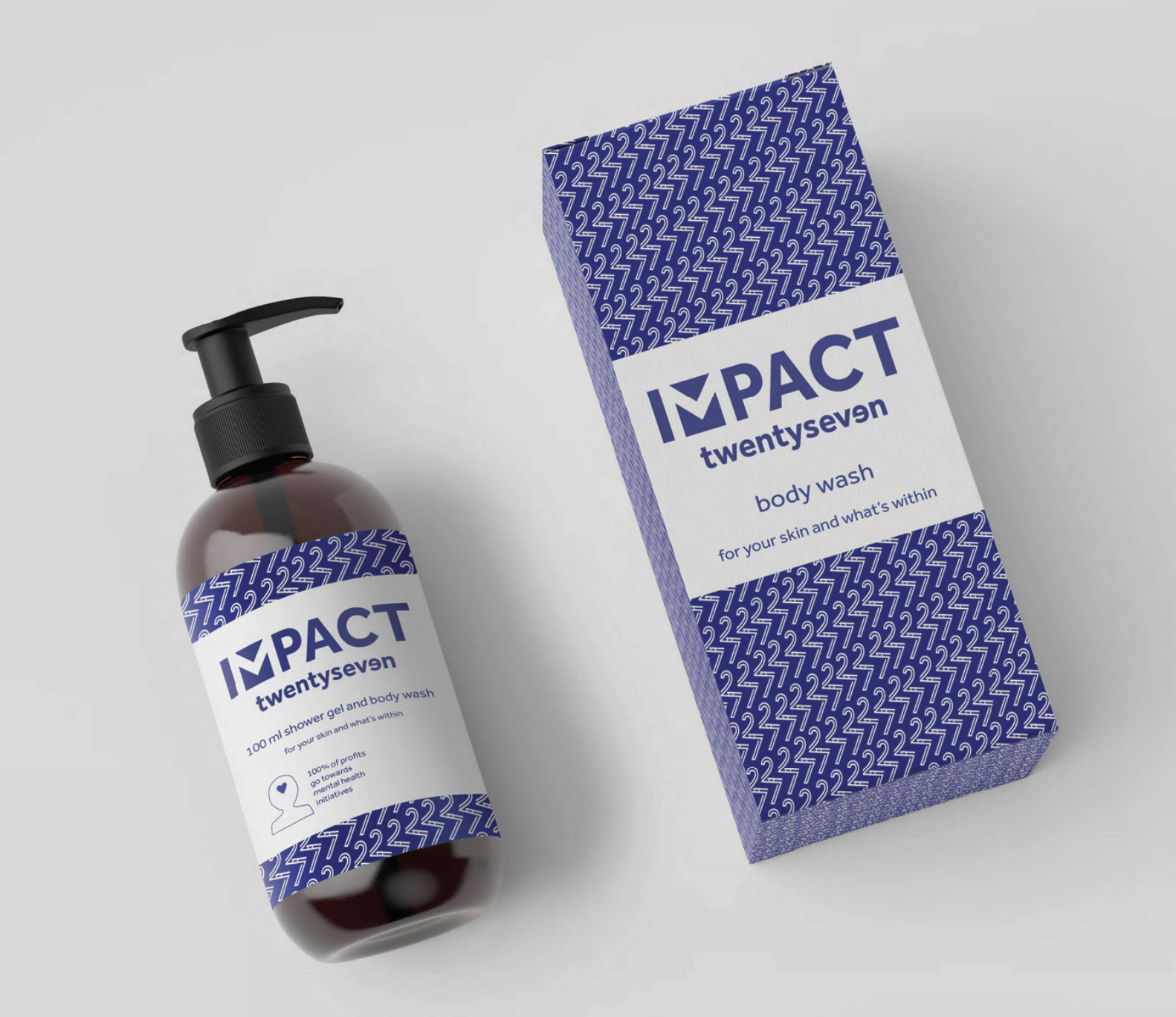
Impact TwentySeven – Brand Visual Identity Development
Background and briefing
Impact TwentySeven is a new charity start-up which is looking to harness the huge market potential of the beauty industry. The aim of the charity is to raise funds for mental health initiatives. The money will be generated through the sale of self-care products. 100% of the profits from the sales will either go back into the business to grow its market hold or it will be donated to mental health charities and projects.
For this project I worked as part of a 3 person team. The brief we received was to design a logo and brand that had enough impact to grab attention in the beauty industry but also represented the charitable aspects, mental health awareness and the fact that not everyone is perfect. We then had to design the packaging for the first product which is a body wash.
Initial steps
After being appointed to the job and having an initial meeting with the client we worked as a team to create a restated brief for this project. We gathered some specific points from our client about the brand she wanted:
- 100% of the profits are donated to mental health programmes.
- Inclusivity, imperfections are what make us better.
- Inspiring and motivating.
- 27 different emotions with a focus on mental health blue.
From gathering these points we then checked what the deliverables of the project are and created a schedule for the project. After some feedback from our supervisor and a few amendments we sent the client our restated brief.
We started with some research into the existing leaders of the cosmetic market such as Nivea, Dove, and many more. From this we gained an idea of the trends and we created some mood boards to gain an insight into what our client was really looking for in her new brand.
After this initial research we started on the design of the logo; we all sketched several ideas. We presented these to each other and chose a selection of them to develop. We presented these developed logos to the client over Skype. Using Skype allowed us to interact and communicate with our client in a more personal way than over emails and allowed us to have real time feedback on our work.


We developed the main logos that the client was interested in and chose to work more with the blue colours and skin tones that our client thought represented her brand vision the best.
A bump in the road
After working on the logo as a team and developing it into a near finished version we faced some bad news. We were emailed by our client saying that she no longer needed us for her project. Our client had won an award as a start-up company which included the free use of a professional design agency. This was a great opportunity for her new start up but meant that we were left without a client. Here we faced the difficult decision of whether to stop here and lose all the effort and time we had invested or to carry on with the project without a client making it a self-led project. We all decided that we couldn’t let our time go to waste and we carried on with the project.
We then met with our supervisor to get some advice of where to go from this situation and we decided that we would produce digital mock ups for the packaging which used our branding instead of the physical packaging which would have been produced for our client.
Packaging design
Once we had decided on the logo we edited and improved the previously supplied copy from our client. Using the edited copy and our branding which included the logo, colour schemes and patterns we started the design of the packaging.

We initially all produced some different designs but as we developed them we decided that it would be better if one of us designed each section of the packaging whilst working within the branding we had created. We started with the front and one of us designed this section using our brand style. I then replicated this style on the back of the packaging and used typographic variation to create a structure for the text-heavy back of the packaging. We worked on an icon for the bottle to show the fact that it is a charity and that all money raised goes to charitable causes. One of us designed the icons and myself, our other group member and some other peers gave feedback until we came to a good outcome for the charity icon.

We then did a test print of the digital mock-ups to check the size and legibility of all the type and information by printing our design at the correct scale. After a few minor adjustments from feedback in a real jobs meeting and a meeting with our supervisor (such as having the logo in blue instead of the black which it was originally and some type size issues on the back) we came to our mock-up outcome for this project.

Summary
Overall I think this project was a success. Even though we did lose our client due to an unexpected and uncontrollable circumstance, we did produce a design that was effective and taught us the importance of being self-critical in a team. From this project I learnt how you can seek lots of useful feedback from other places than just the main client. Some of these areas are meeting with peers and tutors, working in areas around your peers so they can look and suggest ideas and regular meetings with the supervisor of the project.
In the future when I am working on design projects I will seek as much feedback and thoughts from those around me and from any meetings in which I attend. I will also work more critically in a team and will be more comfortable in giving and receiving critical feedback to and from my peers.